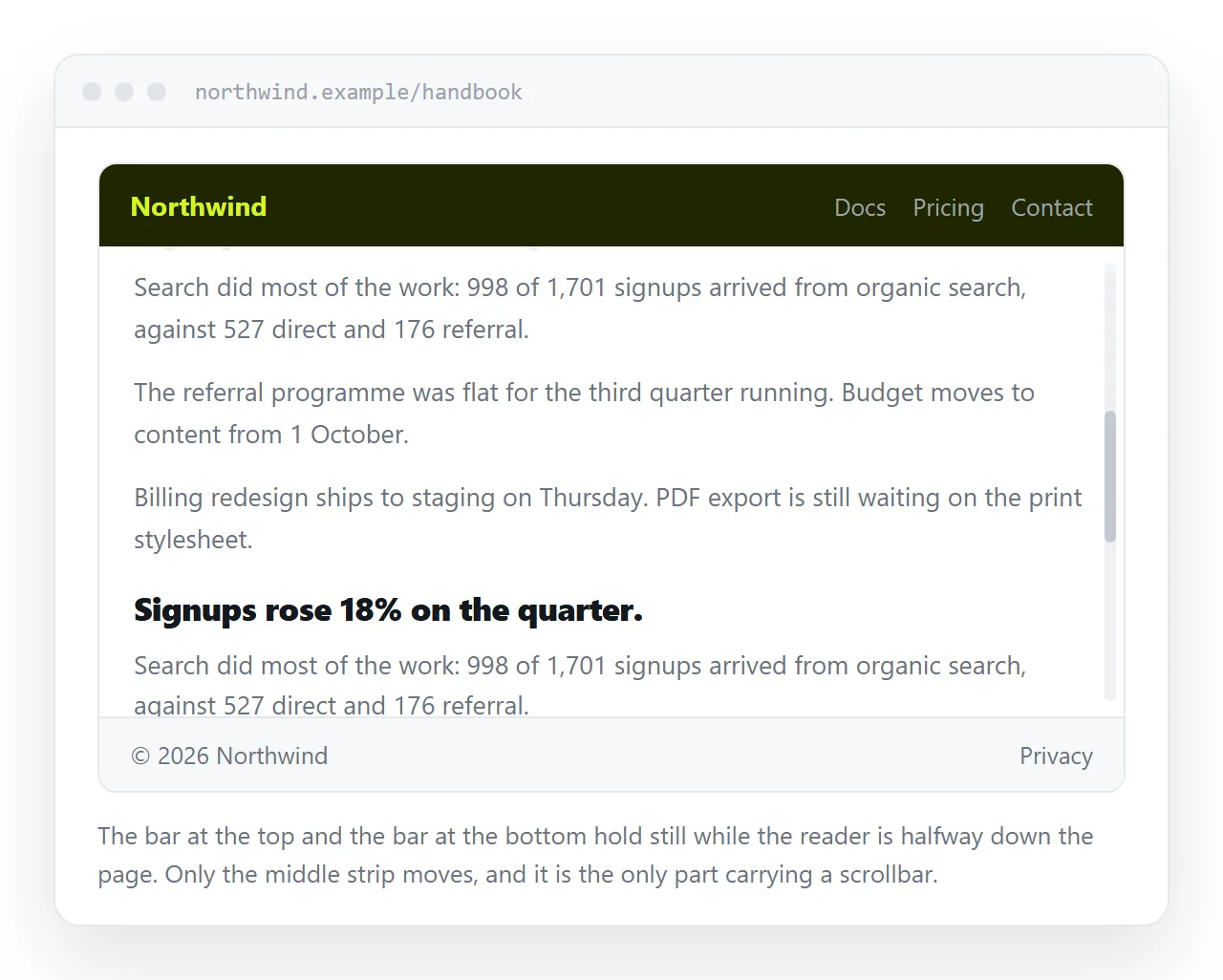
The reliable way to build an HTML fixed header and footer is a three row CSS grid on the body, not two elements with position: fixed.
body {
  margin: 0;
  height: 100dvh;
  display: grid;
  grid-template-rows: auto 1fr auto;
}
main { overflow: auto; min-height: 0; }
The grid reserves the header and footer rows by construction. There is no padding to keep in sync with a header height that changes when someone edits the title.
HTML fixed header and footer: why grid wins
| Grid rows | Two fixed boxes | |
|---|---|---|
| Space reserved for the bars | Automatic | Manual padding |
| Survives a header height change | Yes | No, padding goes stale |
| Scroll position preserved on resize | Yes | Yes |
| Anchor links land correctly | Yes | Need scroll-margin-top |
| Works inside a nested container | Yes | Fixed escapes to the viewport |
The second row is the one that bites later. A fixed header padded by 4rem looks right until someone adds a second line to the title, and then every page has content hidden behind the bar.
The two lines people miss
min-height: 0. A grid item's default minimum size is its content, so a 1fr row refuses to shrink below the content height and the scrollbar never appears. Setting min-height: 0 lets the row shrink and scroll.
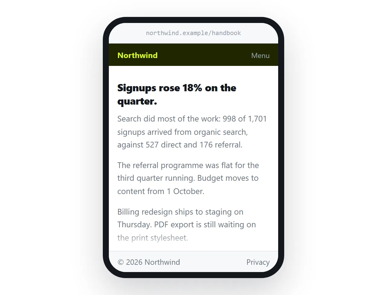
100dvh rather than 100vh. On phones the browser toolbar appears and disappears while scrolling. 100vh refers to the larger state, so a 100vh layout is taller than the visible area and the footer sits below the fold.
100dvh follows the current visible height. Keep a fallback for older engines:
body { height: 100vh; height: 100dvh; }
None of this works at all without the viewport meta tag in the head.
The position fixed version
Sometimes the page is not yours to restructure and two fixed boxes are the only option.
header { position: fixed; top: 0; left: 0; right: 0; height: 3.5rem; background: #0e1014; }
footer { position: fixed; bottom: 0; left: 0; right: 0; height: 3rem; background: #0e1014; }
body  { padding: 3.5rem 0 3rem; }
Three things to add when you do this.
The padding values must match the heights exactly, so declare both from custom properties rather than typing the numbers twice.
Anchor targets need scroll-margin-top equal to the header height, the same fix described in sticky headers.
And on a phone, the footer overlaps the browser's own bottom bar in some states. bottom: env(safe-area-inset-bottom) helps on devices with a home indicator.
When you want sticky instead
Fixed and grid both pin the bars permanently. Often that is more than the page needs.
A header that scrolls away and comes back when you scroll up keeps the full screen for reading. position: sticky with top: 0 gives you the simpler half of that with two lines and no reserved space.
Use fixed or grid when:
- The footer holds actions such as Save and Cancel that must always be reachable.
- The header holds a filter that applies to the scrolling content.
- The page is a tool rather than a document.
Use sticky when the page is something to read. A reader on a small screen values the pixels more than the permanent bar.
The keyboard on a phone
A fixed footer holding buttons sits above the on-screen keyboard on some devices and underneath it on others.
The reliable fix is to stop fixing it while an input has focus.
@media (max-height: 26rem) {
  footer { position: static; }
}
A short viewport height is a good proxy for the keyboard being open, and it needs no script. The footer rejoins the flow, the reader scrolls to it, and nothing is covered.
The alternative is the visual viewport API, which reports the real visible area. It is more precise and it is more code, so reach for it only if the media query is not enough.
Three rows that are not header, content, footer
The same grid handles a toolbar between the header and the content, or a status strip above the footer. Add rows rather than nesting containers.
grid-template-rows: auto auto 1fr auto;
Keep exactly one 1fr row. Two flexible rows means two scroll areas, and the reader has to work out which one their wheel is going to move.
Name the rows if the layout grows past four, because positional grid-row numbers become unreadable quickly. CSS grid covers named areas.
The footer that is not fixed but stays at the bottom
A different and more common requirement: the footer should sit at the bottom of the window when the page is short, and below the content when the page is long.
The same grid does it with no changes. With height: 100dvh and grid-template-rows: auto 1fr auto, a short page leaves the 1fr row empty and the footer sits at the bottom.
If you want the page to grow past the window instead, use min-height: 100dvh and drop overflow: auto from the middle row.
Printing
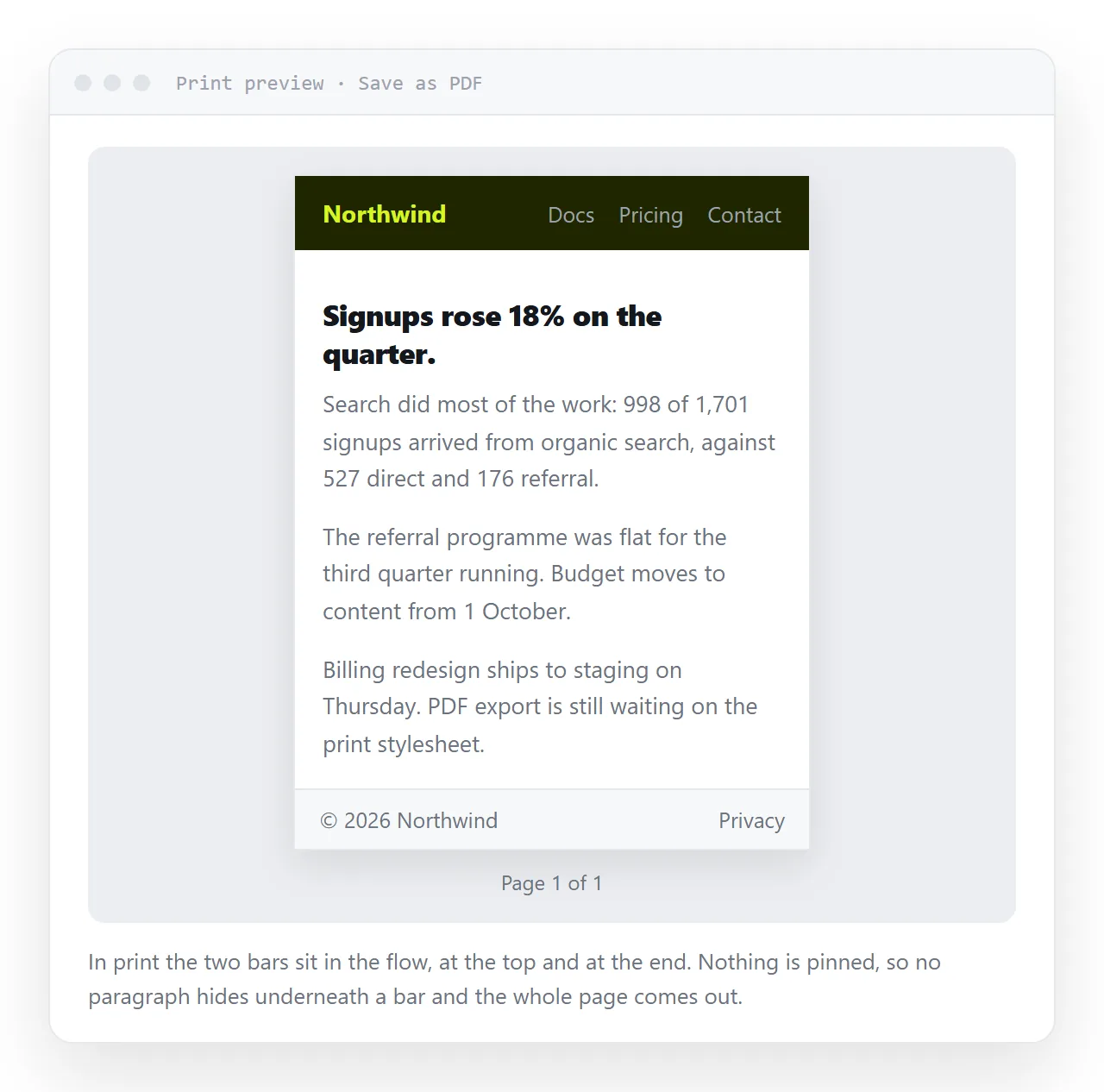
Fixed elements print once, and browsers disagree about where. A fixed footer can land in the middle of page one, or vanish.
@media print {
  body { display: block; height: auto; }
  header, footer { position: static; }
  main { overflow: visible; }
}
Resetting all three is necessary. Leaving overflow: auto on the scrolling region means only the visible portion prints, which is the version of this bug that reaches the reader before it reaches you.
Print stylesheets cover page breaks and link handling.
Checking it
Open the file in the HTML file opener and resize the window from full height down to about 400 pixels. The footer should stay at the bottom edge at every size.
Open the print preview and confirm the whole document is there, not just the first screen. Then narrow to phone width and scroll until the browser toolbar hides.
When it holds up, paste the HTML into a NOS document. The layout renders at the document's own address and the reader opens a link. The bar contents themselves are covered in navbars.