A sticky footer sits at the bottom of the window when the page is short, and after the content when the page is long. Make body a flex column at least one screen tall, and give main all the spare height:
body {
  margin: 0;
  min-height: 100vh;   /* fallback */
  min-height: 100dvh;
  display: flex;
  flex-direction: column;
}
main { flex: 1; }
Try it. The page starts short and the footer is already at the bottom. Make it long and the footer moves down with the content.
<!doctype html>
<html lang="en">
<head>
<meta charset="utf-8">
<meta name="viewport" content="width=device-width, initial-scale=1">
<title>Sticky footer with flexbox</title>
<style>
body {
margin: 0; /* the default 8px margin would add a scrollbar */
min-height: 100vh; /* fallback for older browsers */
min-height: 100dvh; /* at least as tall as the visible window */
display: flex;
flex-direction: column;
font-family: system-ui, sans-serif;
}
main { flex: 1; padding: 14px 18px; } /* main takes all the spare height */
header, footer { padding: 12px 18px; }
header { background: #1f2937; color: #fff; font-weight: 700; }
footer { background: #e8f5ec; color: #0f5132; border-top: 2px solid #34a853; }
button { font: inherit; padding: 6px 12px; border-radius: 8px; border: 1px solid #c5cad3; background: #fff; cursor: pointer; }
p { margin: 10px 0 0; color: #374151; line-height: 1.5; }
</style>
</head>
<body>
<header>My site</header>
<main>
<button id="toggle">Make the page long</button>
<p>A short page. The footer still sits at the bottom of the window.</p>
<div id="more"></div>
</main>
<footer>© 2026 My site · Footer</footer>
<script>
const more = document.getElementById('more');
const btn = document.getElementById('toggle');
btn.addEventListener('click', () => {
const long = more.children.length === 0;
more.innerHTML = long
? Array.from({ length: 12 }, (_, i) => `<p>Paragraph ${i + 1}. Now the footer follows the content.</p>`).join('')
: '';
btn.textContent = long ? 'Make the page short' : 'Make the page long';
});
</script>
</body>
</html>
The page needs three direct children of body: a header, a main and a footer. For what goes inside the footer itself, see the footer element guide.
Why the footer floats up on short pages
Block elements are only as tall as their content. With two paragraphs on the page, the footer ends right after them. Below it, the window shows whatever is left: an empty band that looks like a mistake.
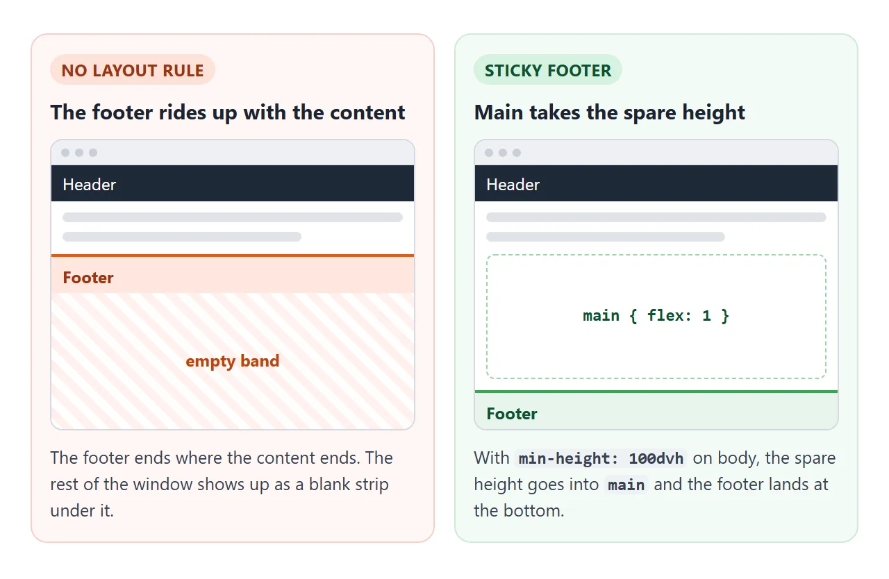
The fix has two parts, and both are needed:
- Make the page at least one screen tall.
min-height: 100dvhonbody. Usemin-height, notheight, so a long page can still grow. - Give the extra height to the content.
flex: 1onmaintells it to take all the space the other children do not use.
Without the first line, there is no spare height to hand out. Without the second, the spare height stays under the footer.
The flexbox version, line by line
display: flex with flex-direction: column stacks the header, main and footer from top to bottom, the same order they had before. Nothing visible changes until the page is taller than its content.
flex: 1 is shorthand for flex-grow: 1 plus a zero base size. Only main grows, so it absorbs all the extra height. flex-grow works through the math if you have several growing items.
There is a second way to write it. Leave main alone and put margin-top: auto on the footer. An auto margin in a flex container eats the free space, which pushes the footer down.
The difference: with flex: 1, the main area itself stretches, so a background colour on main fills the page.
The grid version: auto 1fr auto
Grid puts the whole rule on the parent. Three rows: the header takes its natural height, the middle row takes the rest, and the footer takes its natural height.
body {
  margin: 0;
  min-height: 100dvh;
  display: grid;
  grid-template-rows: auto 1fr auto;
}
This counts on exactly three children.
If you add a fourth, such as a nav between the header and main, the 1fr goes to the second child, the nav. The footer still lands at the bottom, but the wrong strip stretches. Wrap the extra element into the header, or add a row for it.
Sticky footer vs position: fixed and sticky
The name is confusing. A "sticky footer" is the layout above. position: sticky and position: fixed are CSS properties that solve different problems. Switch between the four below, on a short and a long page, and scroll each one.
<!doctype html>
<html lang="en">
<head>
<meta charset="utf-8">
<meta name="viewport" content="width=device-width, initial-scale=1">
<title>Four ways to put a footer at the bottom</title>
<style>
  body { margin: 0; font-family: system-ui, sans-serif; }

  /* 1. flex column */
  body.flex { min-height: 100dvh; display: flex; flex-direction: column; }
  body.flex main { flex: 1; }
  /* 2. grid: three rows, the middle one stretches */
  body.grid { min-height: 100dvh; display: grid; grid-template-rows: auto 1fr auto; }
  /* 3. fixed: always on screen, on top of the content */
  body.fixed footer { position: fixed; left: 0; right: 0; bottom: 0; }
  /* 4. sticky: on screen until you reach its real place */
  body.sticky footer { position: sticky; bottom: 0; }

  header { padding: 10px 14px; background: #1f2937; color: #fff; display: flex; flex-wrap: wrap; gap: 6px; align-items: center; }
  header b { margin-right: 4px; font-size: 14px; }
  button { font: 13px system-ui, sans-serif; padding: 5px 9px; border-radius: 7px; border: 1px solid #4b5563; background: #374151; color: #fff; cursor: pointer; }
  button[aria-pressed="true"] { background: #34a853; border-color: #34a853; }
  main { padding: 6px 14px 10px; }
  p { margin: 8px 0 0; color: #374151; line-height: 1.45; }
  .last { font-weight: 700; color: #b45309; }
  footer { padding: 10px 14px; background: #e8f5ec; color: #0f5132; border-top: 2px solid #34a853; font: 600 13px ui-monospace, Consolas, monospace; }
</style>
</head>
<body class="flex">
<header>
  <b>Method</b>
  <button data-m="none">none</button><button data-m="flex">flex</button><button data-m="grid">grid</button><button data-m="fixed">fixed</button><button data-m="sticky">sticky</button>
  <b style="margin-left:8px">Page</b>
  <button data-len="short">short</button><button data-len="long">long</button>
</header>
<main id="main"></main>
<footer id="foot"></footer>

<script>
  const css = {
    none: 'no rule: footer ends where content ends',
    flex: 'body: flex column; main { flex: 1 }',
    grid: 'body: grid-template-rows: auto 1fr auto',
    fixed: 'footer { position: fixed; bottom: 0 }',
    sticky: 'footer { position: sticky; bottom: 0 }',
  };
  let method = 'flex', len = 'short';

  function render() {
    document.body.className = method;
    const n = len === 'short' ? 1 : 16;
    let html = '';
    for (let i = 1; i < n; i++) html += `<p>Paragraph ${i} of the article.</p>`;
    html += '<p class="last">Last line of the content.</p>';
    document.getElementById('main').innerHTML = html;
    document.getElementById('foot').textContent = css[method];
    document.querySelectorAll('button').forEach((b) => {
      b.setAttribute('aria-pressed', b.dataset.m === method || b.dataset.len === len);
    });
  }

  document.querySelector('header').addEventListener('click', (e) => {
    const b = e.target.closest('button');
    if (!b) return;
    if (b.dataset.m) method = b.dataset.m;
    if (b.dataset.len) len = b.dataset.len;
    render();
  });
  render();
</script>
</body>
</html>
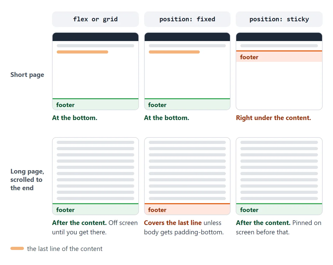
| Method | Short page | Long page | Use it when |
|---|---|---|---|
Flex column, main { flex: 1 } |
At the bottom of the window | After the content | The footer is ordinary page content |
Grid, auto 1fr auto |
At the bottom of the window | After the content | Same, and you prefer grid |
position: fixed; bottom: 0 |
At the bottom of the window | Always on screen, covering content | The footer is a toolbar or a cookie bar |
position: sticky; bottom: 0 |
Right under the content | On screen until you reach its real place | A long page needs its footer visible |
position: fixed takes the footer out of the page flow. Nothing makes room for it, so on a long page it covers the last lines. Add padding-bottom on body equal to the footer height. CSS position explains each value in detail.
If you want the header and footer both pinned with the content scrolling between them, that is a separate layout: fixed header and footer.
100vh or 100dvh on phones
On a desktop, 100vh and 100dvh are the same height. On a phone, the browser shows an address bar and sometimes a bottom toolbar, and hides them as you scroll.
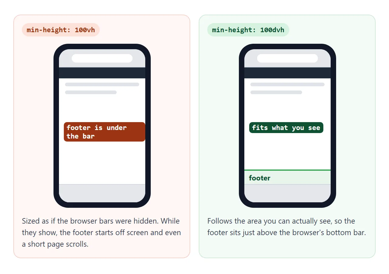
100vh is measured as if those bars were hidden. With the bars showing, a page that is exactly 100vh is taller than the screen, so the footer starts just out of view.
100dvh (dynamic viewport height) changes with the bars, so the footer stays in view.
Write both lines, 100vh first. A browser that does not understand dvh ignores that line and keeps the first one. CSS min-height covers the other viewport units.
A finished page layout
Here it is on a real-looking page: a header with a nav, a centred content column and a dark footer. It uses the grid version. Add sections and watch the footer wait at the bottom until the content needs the room.
<!doctype html>
<html lang="en">
<head>
<meta charset="utf-8">
<meta name="viewport" content="width=device-width, initial-scale=1">
<title>Sticky footer page layout</title>
<style>
* { box-sizing: border-box; }
body {
margin: 0;
min-height: 100vh;
min-height: 100dvh;
display: grid;
grid-template-rows: auto 1fr auto; /* header, main, footer */
font-family: system-ui, sans-serif; color: #1f2937; background: #f6f7f9;
}
header { display: flex; flex-wrap: wrap; align-items: center; gap: 6px 16px; padding: 12px 18px; background: #fff; border-bottom: 1px solid #e3e6eb; }
header strong { font-size: 17px; }
header nav { display: flex; gap: 14px; font-size: 14px; }
header a { color: #1d4ed8; text-decoration: none; }
main { width: 100%; max-width: 640px; margin: 0 auto; padding: 16px 18px; }
main h1 { font-size: 20px; margin: 0 0 6px; }
.card { background: #fff; border: 1px solid #e3e6eb; border-radius: 10px; padding: 12px 14px; margin-top: 10px; }
.tools { display: flex; gap: 8px; margin-top: 10px; }
button { font: inherit; font-size: 14px; padding: 6px 12px; border-radius: 8px; border: 1px solid #c5cad3; background: #fff; cursor: pointer; }
footer { display: flex; flex-wrap: wrap; justify-content: space-between; gap: 6px 16px; padding: 14px 18px; background: #1f2937; color: #d1d5db; font-size: 14px; }
footer a { color: #fff; }
</style>
</head>
<body>
<header>
<strong>Northwind Notes</strong>
<nav aria-label="Main"><a href="#">Home</a><a href="#">Archive</a><a href="#">About</a></nav>
</header>
<main>
<h1>Release notes</h1>
<p>Add sections and watch the footer. It waits at the bottom until the content needs the room.</p>
<div class="tools"><button id="add">Add a section</button><button id="reset">Reset</button></div>
<div id="list"></div>
</main>
<footer>
<span>© 2026 Northwind Notes</span>
<span><a href="#">Privacy</a> · <a href="#">Contact</a></span>
</footer>
<script>
const list = document.getElementById('list');
let count = 0;
document.getElementById('add').addEventListener('click', () => {
count++;
list.insertAdjacentHTML('beforeend',
`<section class="card"><b>Version 1.${count}</b><br>Small fixes and one new setting.</section>`);
});
document.getElementById('reset').addEventListener('click', () => {
list.innerHTML = '';
count = 0;
});
</script>
</body>
</html>
box-sizing: border-boxon everything, so padding never adds to themin-height.- The content column has
max-widthandmargin: 0 autoonmain. Onlymainis narrowed. The header and footer are separate grid items, so their backgrounds still run edge to edge. - The header and footer use
flex-wrap: wrap, so their links drop to a second line on a phone instead of overflowing.
When it does not work
| What you see | Cause | Fix |
|---|---|---|
| Footer floats in the middle of short pages | Nothing takes the spare height | flex: 1 on main |
Still floats, with flex: 1 in place |
The body is only as tall as its content | min-height: 100dvh on body |
| A short page scrolls by a few pixels | Default body margin, or padding without border-box |
margin: 0 on body; box-sizing: border-box |
Layout is on a wrapper div and has no effect |
min-height: 100% on the wrapper, but body has no set height |
Put min-height: 100dvh on the wrapper itself |
| The wrong section stretches in the grid version | More than three children, so 1fr hits the second one |
Keep three children, or add a row per child |
| Footer covers the last lines of a long page | position: fixed takes it out of the flow |
Use the flex version, or add padding-bottom to body |
| Footer is below the screen on a phone | 100vh counts the space under the address bar |
Add min-height: 100dvh after the 100vh line |
Share it as a link
Footer bugs show up at specific page lengths and screen sizes, which a screenshot cannot show. Someone reviewing the layout needs to resize the window, scroll, and try it on their phone.
To send the working version, paste the page into a NOS document and choose Create share link. HTML to link walks through it.
The page renders as written and its scripts run, so the people you send it to can add content and see the footer move. If you change the CSS later, the same link shows the new version.