flex-grow shares out free space. The browser first gives every flex item its flex-basis. Whatever is left in the row is split between the items in the ratio of their flex-grow values.
When the bases add up to more than the row, flex-shrink decides how much each item gives back.
Try it. Change grow, shrink and basis for three items and drag the container width. The panel shows the math, and the last line shows what the browser actually drew.
<!doctype html>
<html lang="en">
<head>
<meta charset="utf-8">
<meta name="viewport" content="width=device-width, initial-scale=1">
<title>Flex space calculator</title>
<style>
  body { margin: 0; padding: 14px; font-family: system-ui, sans-serif; background: #f4f5f7; color: #1d2330; }
  .controls { display: grid; grid-template-columns: repeat(3, 1fr); gap: 8px; }
  fieldset { margin: 0; padding: 8px; border: 1px solid #d5d9e0; border-radius: 10px; background: #fff; min-width: 0; }
  legend { font-size: 12px; font-weight: 700; padding: 0 4px; }
  label { display: flex; justify-content: space-between; gap: 4px; font-size: 12px; margin: 3px 0; }
  input[type=number] { width: 52px; font: inherit; }
  .width { margin: 12px 0 8px; font-size: 13px; }
  .width input { width: 100%; }

  /* the flex container: its width comes from the slider */
  .row { display: flex; height: 56px; background: repeating-linear-gradient(45deg, #fff, #fff 6px, #eef1f5 6px, #eef1f5 12px); outline: 2px solid #1d2330; }
  .item {
    min-width: 0;  /* min-width: 0 so only the math decides */
    box-shadow: inset 0 0 0 2px #fff; border-radius: 6px; color: #fff;
    font: 700 13px/1 system-ui, sans-serif; display: grid; place-items: center; overflow: hidden;
  }
  .a { background: #2563eb; } .b { background: #0f766e; } .c { background: #c2410c; }
  pre { margin: 10px 0 0; padding: 10px; background: #fff; border-radius: 10px; font: 12px/1.55 ui-monospace, Consolas, monospace; white-space: pre-wrap; }
</style>
</head>
<body>
<div class="controls" id="controls"></div>
<div class="width">Container width: <b id="cw"></b>
  <input type="range" id="slider" min="120" step="10">
</div>
<div class="row" id="row">
  <div class="item a">A</div><div class="item b">B</div><div class="item c">C</div>
</div>
<pre id="math"></pre>

<script>
  const items = [...document.querySelectorAll('.item')];
  const start = [{ g: 1, s: 1, b: 100 }, { g: 2, s: 1, b: 60 }, { g: 0, s: 1, b: 40 }];
  const controls = document.getElementById('controls');
  const slider = document.getElementById('slider');
  const row = document.getElementById('row');

  // one small form per item: grow, shrink, basis
  start.forEach((v, i) => {
    const name = 'ABC'[i];
    controls.insertAdjacentHTML('beforeend', `<fieldset><legend>${name}</legend>
      <label>grow <input type="number" min="0" step="1" value="${v.g}" data-k="g"></label>
      <label>shrink <input type="number" min="0" step="1" value="${v.s}" data-k="s"></label>
      <label>basis <input type="number" min="0" step="10" value="${v.b}" data-k="b"></label></fieldset>`);
  });
  const sets = [...controls.querySelectorAll('fieldset')];

  // the room we have: the row's full width, capped at 560px
  slider.max = Math.min(560, Math.floor(row.getBoundingClientRect().width));
  slider.value = Math.min(360, slider.max);

  function update() {
    const W = +slider.value;
    row.style.width = W + 'px';
    document.getElementById('cw').textContent = W + 'px';

    const v = sets.map(f => {
      const o = {};
      f.querySelectorAll('input').forEach(inp => o[inp.dataset.k] = Math.max(0, +inp.value || 0));
      return o;
    });
    v.forEach((o, i) => items[i].style.flex = `${o.g} ${o.s} ${o.b}px`);

    const sum = v.reduce((t, o) => t + o.b, 0);
    const free = W - sum;
    let lines = [`free space = ${W} - (${v.map(o => o.b).join(' + ')}) = ${free}px`];

    if (free >= 0) {
      // grow totals below 1 hand out only part of the space
      const G = Math.max(1, v.reduce((t, o) => t + o.g, 0));
      lines.push(`grow shares: ${v.map(o => o.g).join(' : ')}, divided by ${G}`);
      v.forEach((o, i) => {
        lines.push(`${'ABC'[i]}: ${o.b} + ${free} x ${o.g}/${G} = ${(o.b + free * o.g / G).toFixed(1)}px`);
      });
    } else {
      // shrinking is weighted by shrink x basis
      const S = v.reduce((t, o) => t + o.s * o.b, 0);
      lines.push(`too wide by ${-free}px. weights = shrink x basis: ${v.map(o => o.s * o.b).join(' : ')}`);
      v.forEach((o, i) => {
        const w = o.b - (S ? -free * o.s * o.b / S : 0);
        lines.push(`${'ABC'[i]}: ${o.b} - ${-free} x ${o.s * o.b}/${S || 1} = ${w.toFixed(1)}px` + (w < 0 ? '  (stops at 0, the rest comes off the others)' : ''));
      });
    }

    // what the browser actually drew
    lines.push('browser: ' + items.map((el, i) => `${'ABC'[i]} ${el.getBoundingClientRect().width.toFixed(1)}`).join(', '));
    document.getElementById('math').textContent = lines.join('\n');
  }

  controls.addEventListener('input', update);
  slider.addEventListener('input', update);
  update();
</script>
</body>
</html>
This article is about how the sizes are worked out. For a first tour of rows, gaps and alignment, start with CSS Flexbox.
Step 1: every item starts at flex-basis
flex-basis is the size an item starts from before any sharing. It can be a length like 120px, a percentage, or auto.
With auto, the browser uses the item's width if it has one, and its content size if not. Then it subtracts all the bases from the container's width. The result is the free space. It can be positive (room left) or negative (too wide).
Step 2: flex-grow shares the free space
When free space is positive, each item gets free space x its grow / total grow. Only the free space is shared, not the whole width.
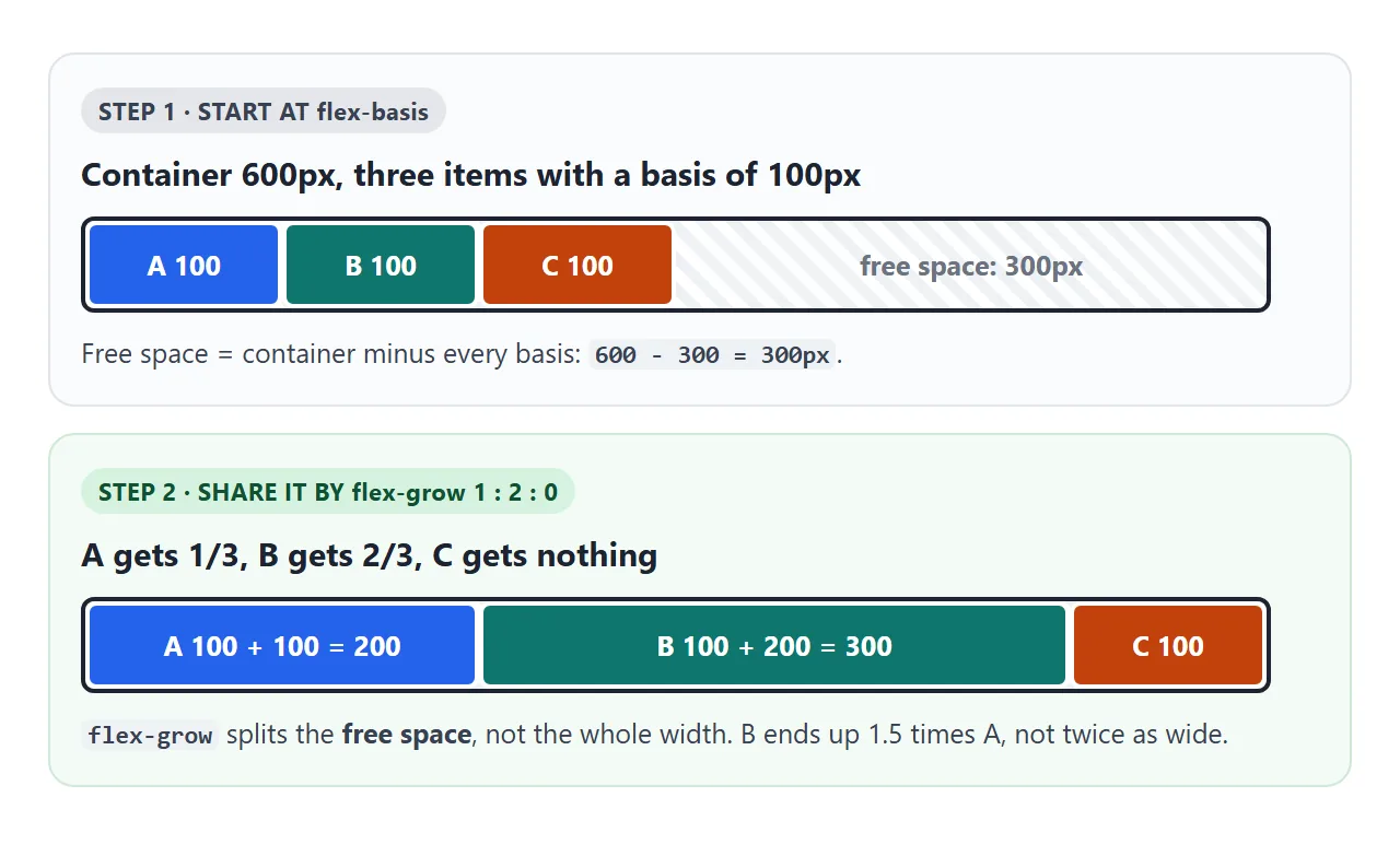
That is why flex-grow: 2 does not make an item twice as wide as one with flex-grow: 1. In the picture, B ends at 300px and A at 200px, because both started at 100px.
Two edge cases:
flex-grow: 0is the default. The item keeps its basis and takes nothing. If every item has 0, the free space stays empty at the end of the row.- Grow values that add up to less than 1 only hand out that fraction. One item with
flex-grow: 0.5takes half the free space, and the other half stays empty.
Step 3: flex-shrink removes overflow, weighted by size
When the bases add up to more than the container, items shrink. The default is flex-shrink: 1, so they all shrink unless told otherwise.
The cut is not split equally. Each item's share is flex-shrink x its basis, so a 200px item gives up twice as much as a 100px item.
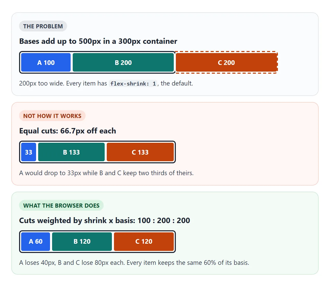
Strictly, the weight uses the basis without padding and border. In the calculator above, items have no padding or border, so the simple numbers match the browser exactly.
flex-shrink: 0 opts an item out. It keeps its basis and the others give up more. If nothing can shrink, the row overflows.
flex: 1 vs flex: auto vs flex: none
The flex shorthand sets all three values at once. The single-number form also sets the basis to 0%, and that changes the result.
| Shorthand | Expands to | Starts from | Result |
|---|---|---|---|
flex: 1 |
1 1 0% |
Zero | Equal widths |
flex: auto |
1 1 auto |
Content or width | Wider content stays wider |
flex: none |
0 0 auto |
Content or width | Never grows or shrinks |
flex: 0 0 200px |
0 0 200px |
200px | A fixed 200px item |
no flex set |
0 1 auto |
Content or width | Shrinks, never grows |
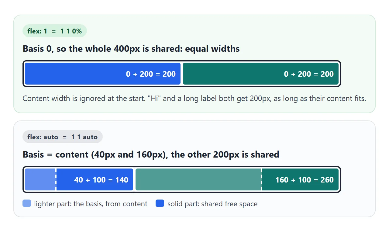
The same three labels in each row show the difference:
<!doctype html>
<html lang="en">
<head>
<meta charset="utf-8">
<meta name="viewport" content="width=device-width, initial-scale=1">
<title>flex: 1 vs flex: auto vs flex: none</title>
<style>
  body { margin: 0; padding: 14px; font-family: system-ui, sans-serif; background: #f4f5f7; color: #1d2330; }
  h3 { margin: 14px 0 6px; font: 700 14px ui-monospace, Consolas, monospace; }
  h3 span { font: 400 12px system-ui, sans-serif; color: #5b6270; }
  .row { display: flex; gap: 6px; padding: 6px; background: #fff; border: 1px solid #d5d9e0; border-radius: 10px; }
  .row div { padding: 10px 8px; border-radius: 6px; background: #dbeafe; font-size: 13px; }
  .row div small { display: block; margin-top: 4px; font: 700 11px ui-monospace, Consolas, monospace; color: #1e40af; }

  .one  div { flex: 1; }     /* = 1 1 0%   : start from zero, share everything */
  .auto div { flex: auto; }  /* = 1 1 auto : start from the content, share the rest */
  .none div { flex: none; }  /* = 0 0 auto : content width, never grow or shrink */
</style>
</head>
<body>
<h3>flex: 1 <span>equal widths</span></h3>
<div class="row one"><div>Hi</div><div>A much longer label</div><div>Medium text</div></div>

<h3>flex: auto <span>longer content gets a wider box</span></h3>
<div class="row auto"><div>Hi</div><div>A much longer label</div><div>Medium text</div></div>

<h3>flex: none <span>boxes hug their content</span></h3>
<div class="row none"><div>Hi</div><div>A much longer label</div><div>Medium text</div></div>

<script>
  // print each box's rendered width inside it
  function label() {
    document.querySelectorAll('.row div').forEach(d => {
      let s = d.querySelector('small');
      if (!s) { s = document.createElement('small'); d.append(s); }
      s.textContent = Math.round(d.getBoundingClientRect().width) + 'px';
    });
  }
  addEventListener('resize', label);
  label(); label();  // second pass: the labels themselves add a little width
</script>
</body>
</html>
Use flex: 1 for equal columns and flex: auto when items should keep the proportions of their content. Use flex: none for buttons and icons that must stay their natural size.
flex-basis vs width
When flex-basis is not auto, it wins over width in the main direction. An item with width: 300px; flex-basis: 100px starts at 100px.
min-width and max-width still apply after growing and shrinking. An item with flex: 1; max-width: 100px stops at 100px, and the space it did not take goes to the other items. Max width in CSS covers those limits in more detail.
In a flex-direction: column container, all of this happens with height instead of width.
Why items refuse to shrink: min-width: auto
A flex item has min-width: auto by default. For a flex item, this means "no narrower than my content". A long word, a URL, an image or a text input sets a floor, and flex-shrink stops there.
.main { flex: 1; min-width: 0; } /* allowed to shrink below its content */
overflow: hidden on the item also removes the floor. This is the same fix that text-overflow: ellipsis needs inside a flex row.
Three layouts that use it
These are the patterns that come up most. Drag the slider to narrow all three.
<!doctype html>
<html lang="en">
<head>
<meta charset="utf-8">
<meta name="viewport" content="width=device-width, initial-scale=1">
<title>Three flex-grow layouts</title>
<style>
  body { margin: 0; padding: 14px; font-family: system-ui, sans-serif; background: #f4f5f7; color: #1d2330; }
  .size { font-size: 13px; margin-bottom: 10px; }
  .size input { width: 100%; }
  #stage > div + div { margin-top: 14px; }
  h3 { margin: 0 0 6px; font-size: 13px; color: #5b6270; font-weight: 600; }

  /* 1. search bar: the input takes the rest of the row */
  .search { display: flex; gap: 6px; }
  .search input { flex: 1; min-width: 0; padding: 9px 10px; font: inherit; border: 1px solid #c9cdd4; border-radius: 8px; }
  .search button { flex: none; padding: 9px 14px; font: inherit; border: 0; border-radius: 8px; background: #2563eb; color: #fff; }

  /* 2. sidebar keeps its width, main grows */
  .page { display: flex; height: 110px; gap: 6px; }
  .side { flex: 0 0 120px; background: #0f766e; }
  .main { flex: 1; min-width: 0; background: #fff; border: 1px solid #d5d9e0; }
  .side, .main { border-radius: 8px; padding: 10px; font-size: 13px; box-sizing: border-box; }
  .side { color: #fff; }

  /* 3. toolbar: the title shrinks, the button never does */
  .bar { display: flex; align-items: center; gap: 8px; padding: 8px 10px; background: #1d2330; color: #fff; border-radius: 8px; }
  .title { flex: 1; min-width: 0; white-space: nowrap; overflow: hidden; text-overflow: ellipsis; font-size: 14px; }
  .save { flex-shrink: 0; padding: 7px 12px; border: 0; border-radius: 6px; background: #22c55e; color: #fff; font: 600 13px system-ui, sans-serif; }
</style>
</head>
<body>
<div class="size">Width of the three examples: <b id="w"></b>
  <input type="range" id="slider" min="200" step="10">
</div>

<div id="stage">
  <div>
    <h3>Search bar</h3>
    <form class="search" id="form">
      <input name="q" placeholder="Search notes" aria-label="Search">
      <button>Search</button>
    </form>
  </div>

  <div>
    <h3>Sidebar + main</h3>
    <div class="page">
      <div class="side">Sidebar<br>120px</div>
      <div class="main" id="main">Main</div>
    </div>
  </div>

  <div>
    <h3>Toolbar</h3>
    <div class="bar">
      <div class="title">Quarterly planning notes for the design review</div>
      <button class="save">Save</button>
    </div>
  </div>
</div>

<script>
  const slider = document.getElementById('slider');
  const stage = document.getElementById('stage');
  const main = document.getElementById('main');

  slider.max = Math.min(600, Math.floor(stage.getBoundingClientRect().width));
  slider.value = slider.max;

  function resize() {
    stage.style.width = slider.value + 'px';
    document.getElementById('w').textContent = slider.value + 'px';
    main.textContent = 'Main: ' + Math.round(main.getBoundingClientRect().width) + 'px';
  }
  slider.addEventListener('input', resize);
  resize();

  // demo only: show the query instead of sending it
  document.getElementById('form').addEventListener('submit', (e) => {
    e.preventDefault();
    const q = new FormData(e.target).get('q');
    e.target.querySelector('input').placeholder = q ? 'Searched: ' + q : 'Type something first';
    e.target.reset();
  });
</script>
</body>
</html>
/* Search bar: the input takes the rest of the row */
.search input  { flex: 1; min-width: 0; }
.search button { flex: none; }

/* Sidebar keeps 120px, main takes the rest */
.side { flex: 0 0 120px; }
.main { flex: 1; min-width: 0; }

/* Toolbar: the title gives way, the button does not */
.title { flex: 1; min-width: 0; overflow: hidden; text-overflow: ellipsis; white-space: nowrap; }
.save  { flex-shrink: 0; }
Each layout follows one rule: give flex: 1 and min-width: 0 to the item that should stretch, and flex: none or flex-shrink: 0 to the item that must not change.
When it does not work
| What you see | Cause | Fix |
|---|---|---|
flex-grow has no effect |
The property is on the container, not the items | Put flex or flex-grow on the children |
flex-grow has no effect |
The container is only as wide as its content, so there is no free space | Give the container a width, or use display: flex instead of inline-flex |
| The item stops growing early | A max-width on the item |
Remove or raise the max-width |
| An item will not shrink | min-width: auto keeps it at its content size |
min-width: 0 on the item |
| An item will not shrink | flex-shrink: 0 or flex: none |
Set flex-shrink: 1 |
| Columns are unequal | flex: auto starts each one from its content |
Use flex: 1 |
width is ignored |
flex-basis is set and not auto |
Set the size with flex-basis |
| Grow 2 is not twice as wide as grow 1 | Grow shares only the free space | Use flex-basis: 0, or flex: 1 and flex: 2 |
If items line up correctly but sit at the wrong end of the row, the property you want is justify-content.
Share it as a link
Flex sizing is easier to understand by dragging a width than by reading numbers. A screenshot shows one width only, and an .html file sent as an attachment may open as plain code on a phone.
To send the working version, paste the page into a NOS document and choose Create share link. HTML to link walks through it.
The page renders as written and its scripts run, so the people you send it to can drag the sliders themselves. If you change the code later, the same link shows the new version.