Add flex-wrap: wrap to a flex container and the items that do not fit move onto a new line. Put it on the container, next to display: flex, not on the items.
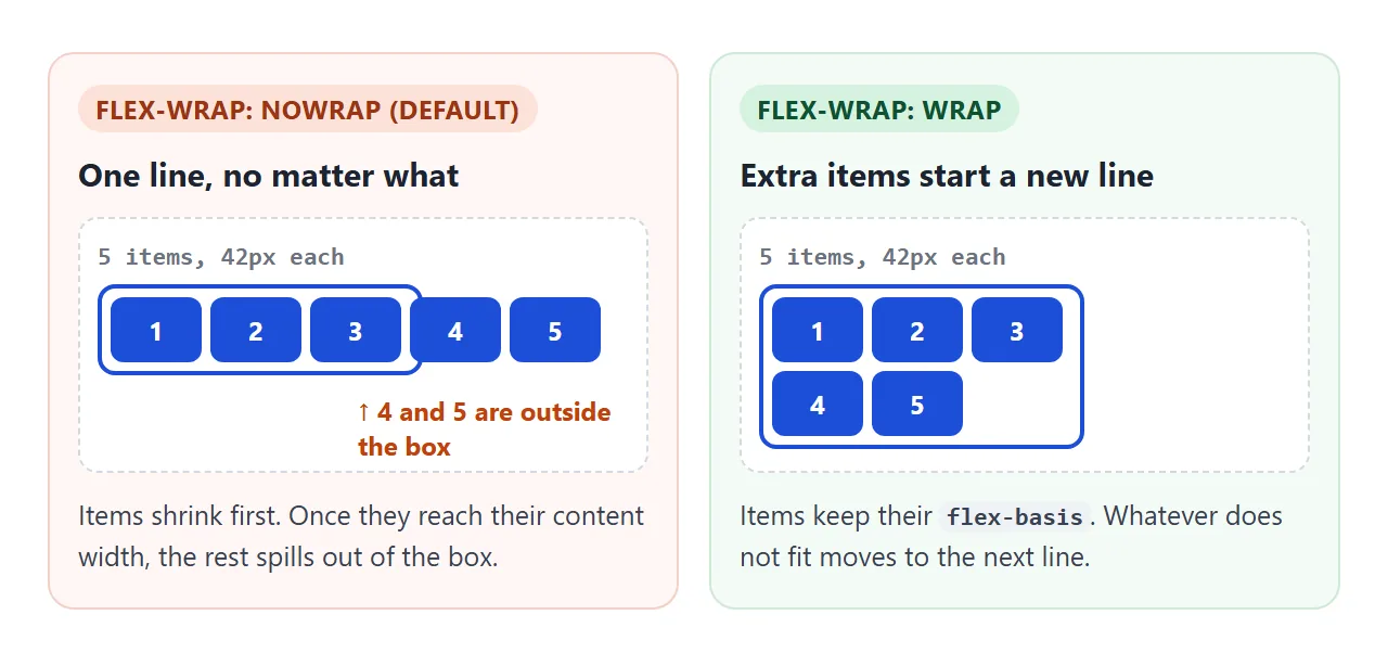
Without it, a flex container keeps every item on one line. Items that do not fit shrink, and when they cannot shrink any further they overflow the box.
.row { display: flex; flex-wrap: wrap; gap: 8px; }
Try it. Start with nowrap, add items until they spill out, then switch to wrap. Narrow the container and change flex-basis to see where the lines break.
<!doctype html>
<html lang="en">
<head>
<meta charset="utf-8">
<meta name="viewport" content="width=device-width, initial-scale=1">
<title>flex-wrap playground</title>
<style>
  body { margin: 0; padding: 16px; font-family: system-ui, sans-serif; background: #f4f5f7; color: #1d2330; }
  .controls { display: flex; flex-wrap: wrap; gap: 6px; align-items: center; margin-bottom: 8px; font-size: 13px; }
  .controls b { width: 100%; }
  button { font: inherit; font-size: 13px; padding: 6px 10px; border: 1px solid #c9ced8; border-radius: 8px; background: #fff; cursor: pointer; }
  button.on { background: #1d4ed8; border-color: #1d4ed8; color: #fff; }
  label { display: flex; align-items: center; gap: 6px; }
  input[type=range] { width: 110px; }
  input[type=text] { width: 70px; font: inherit; padding: 4px 6px; border: 1px solid #c9ced8; border-radius: 6px; }

  /* the flex container: the stripes show its edges */
  .box {
    display: flex;
    flex-wrap: nowrap;
    gap: 8px;
    width: 100%; box-sizing: border-box; padding: 6px;
    border: 2px solid #1d4ed8; border-radius: 10px;
    background: repeating-linear-gradient(45deg, #fff 0 8px, #eef2ff 8px 16px);
  }
  .item {
    flex-basis: 70px;  /* flex-grow 0 and flex-shrink 1 are the defaults */
    height: 38px; border-radius: 8px; white-space: nowrap;
    background: #1d4ed8; color: #fff; font-weight: 700; font-size: 13px;
    display: grid; place-items: center;
  }
  #status { font-size: 13px; margin: 8px 0 0; }
  #status.bad { color: #b45309; font-weight: 700; }
  code { display: block; margin-top: 8px; padding: 8px 10px; border-radius: 8px; background: #1d2330; color: #e5e7eb; font-size: 13px; white-space: pre; overflow-x: auto; }
</style>
</head>
<body>
<div class="controls" id="wrap">
  <b>flex-wrap</b>
  <button class="on">nowrap</button><button>wrap</button><button>wrap-reverse</button>
</div>
<div class="controls">
  <label>Width <input type="range" id="width" min="50" max="100" value="100"></label>
  <label>Items <input type="range" id="count" min="1" max="10" value="7"></label>
  <label>gap <input type="range" id="gap" min="0" max="24" value="8"></label>
  <label>flex-basis <input type="text" id="basis" value="70px"></label>
</div>

<div class="box" id="box"></div>
<p id="status"></p>
<code id="css"></code>

<script>
  const box = document.getElementById('box');
  const $ = (id) => document.getElementById(id);

  function render() {
    // rebuild the items
    box.innerHTML = '';
    for (let i = 1; i <= +$('count').value; i++) {
      const d = document.createElement('div');
      d.className = 'item';
      d.textContent = 'Item ' + i;
      d.style.flexBasis = $('basis').value;
      box.appendChild(d);
    }
    box.style.width = $('width').value + '%';
    box.style.gap = $('gap').value + 'px';

    // count lines (distinct tops) and check for overflow
    const items = [...box.children];
    const lines = new Set(items.map((el) => Math.round(el.getBoundingClientRect().top))).size;
    const overflow = box.scrollWidth > box.clientWidth + 1;
    const w = Math.round(items[0].getBoundingClientRect().width);
    const status = $('status');
    status.textContent = 'Container ' + box.clientWidth + 'px, ' + lines + (lines > 1 ? ' lines' : ' line') +
      ', each item ' + w + 'px wide' + (overflow ? ', items overflow the box' : '');
    status.className = overflow ? 'bad' : '';

    $('css').textContent = '.box {\n  display: flex;\n  flex-wrap: ' + box.style.flexWrap +
      ';\n  gap: ' + box.style.gap + ';\n}\n.item { flex-basis: ' + $('basis').value + '; }';
  }

  document.querySelectorAll('#wrap button').forEach((b) => b.addEventListener('click', () => {
    document.querySelectorAll('#wrap button').forEach((x) => x.classList.remove('on'));
    b.classList.add('on');
    box.style.flexWrap = b.textContent;
    render();
  }));
  ['width', 'count', 'gap', 'basis'].forEach((id) => $(id).addEventListener('input', render));
  box.style.flexWrap = 'nowrap';
  render();
</script>
</body>
</html>
nowrap, wrap and wrap-reverse
flex-wrap takes three values, and it goes on the flex container, the element with display: flex.
| Value | What happens when items do not fit |
|---|---|
nowrap (default) |
Items shrink, then overflow the container |
wrap |
Items move to a new line below |
wrap-reverse |
Items move to a new line above; the first line ends up at the bottom |
wrap-reverse only flips the order of the lines. Items inside each line still run left to right in a normal row.
It is rarely what you want for reading order, but it is handy for things that grow upward, such as a stack of chips above an input.
Why items shrink instead of wrapping
A line breaks when the next item's size would not fit. That size comes from flex-basis, or from width when the basis is auto. If you set neither, the size is the item's content, which is often small enough to fit.
With nowrap, the default flex-shrink: 1 squeezes items to fit one line. A flex item does not shrink below its content's minimum width by default, so past that point the row overflows.
With wrap, give the items a real size and the line breaks before they shrink.
In the playground, choose wrap and type auto as the basis. Each item is now only as wide as its label, so more of them fit on a line before one wraps.
gap with wrap: row-gap and column-gap
gap is the cleanest way to space wrapped items. Unlike margins, it only goes between items, so there is no extra space at the ends of each line or under the last line.
.tags {
  display: flex;
  flex-wrap: wrap;
  gap: 6px 10px; /* row-gap 6px, column-gap 10px */
}
The first value is row-gap, the space between lines. The second is column-gap, the space between items on a line. The same property works in CSS grid.
How many items per row
flex-wrap decides nothing on its own about how many items share a line. It fits as many as the items' sizes allow. So the number per row is set on the items, in one of three ways.
<!doctype html>
<html lang="en">
<head>
<meta charset="utf-8">
<meta name="viewport" content="width=device-width, initial-scale=1">
<title>How many items per row</title>
<style>
  body { margin: 0; padding: 16px; font-family: system-ui, sans-serif; background: #f4f5f7; color: #1d2330; }
  .controls { display: flex; flex-wrap: wrap; gap: 14px; align-items: center; font-size: 13px; margin-bottom: 4px; }
  label { display: flex; align-items: center; gap: 6px; }
  h2 { font-size: 13px; margin: 14px 0 4px; font-family: ui-monospace, Consolas, monospace; }
  .count { font-family: system-ui, sans-serif; font-weight: 400; color: #4b5563; }
  .count.bad { color: #b45309; font-weight: 700; }

  .row {
    display: flex; flex-wrap: wrap; gap: 12px; box-sizing: border-box;
    padding: 6px; border: 2px solid #1d4ed8; border-radius: 10px; background: #fff;
  }
  .row div { height: 34px; border-radius: 7px; background: #1d4ed8; color: #fff; font-size: 12px; display: grid; place-items: center; }

  /* A: percentages ignore the gap, so three do not fit */
  .pct div { flex: 0 0 33.333%; }
  /* B: take the gaps out first: 3 items share 100% minus 2 gaps */
  .calc div { flex: 0 0 calc((100% - 2 * 12px) / 3); }
  /* C: a minimum width; the row decides how many fit, then they grow */
  .min div { flex: 1 1 0; min-width: 90px; }

  body.nogap .row { gap: 0; }
  body.nogap .calc div { flex-basis: calc(100% / 3); }
</style>
</head>
<body>
<div class="controls">
  <label>Container width <input type="range" id="width" min="60" max="100" value="100"></label>
  <label><input type="checkbox" id="nogap"> gap: 0</label>
</div>

<h2>flex: 0 0 33.333% <span class="count"></span></h2>
<div class="row pct"><div>1</div><div>2</div><div>3</div><div>4</div><div>5</div><div>6</div></div>

<h2>flex: 0 0 calc((100% - 2 * 12px) / 3) <span class="count"></span></h2>
<div class="row calc"><div>1</div><div>2</div><div>3</div><div>4</div><div>5</div><div>6</div></div>

<h2>flex: 1 1 0; min-width: 90px <span class="count"></span></h2>
<div class="row min"><div>1</div><div>2</div><div>3</div><div>4</div><div>5</div><div>6</div></div>

<script>
  const rows = document.querySelectorAll('.row');

  function report() {
    rows.forEach((row) => {
      // items on the first line share the same top
      const kids = [...row.children];
      const top = kids[0].offsetTop;
      const n = kids.filter((k) => k.offsetTop === top).length;
      const label = row.previousElementSibling.querySelector('.count');
      const wanted = row.classList.contains('min') ? n : 3;
      label.textContent = '= ' + n + ' per row' + (n < wanted ? ' (wanted 3)' : '');
      label.className = 'count' + (n < wanted ? ' bad' : '');
    });
  }

  document.getElementById('width').addEventListener('input', (e) => {
    rows.forEach((r) => { r.style.width = e.target.value + '%'; });
    report();
  });
  document.getElementById('nogap').addEventListener('change', (e) => {
    document.body.classList.toggle('nogap', e.target.checked);
    report();
  });
  report();
</script>
</body>
</html>
- A percentage basis:
flex: 0 0 33.333%. This fits three only with no gap. With a gap, three thirds plus two gaps are wider than the container, and the third item wraps. - calc with the gap:
flex: 0 0 calc((100% - 2 * 12px) / 3). Take the gaps out first, then split. Always three, at any width. - A minimum width:
flex: 1 1 0; min-width: 90px. The line holds as many 90px items as fit, then they grow to fill it. The count changes with the screen, which is usually what a phone layout needs.
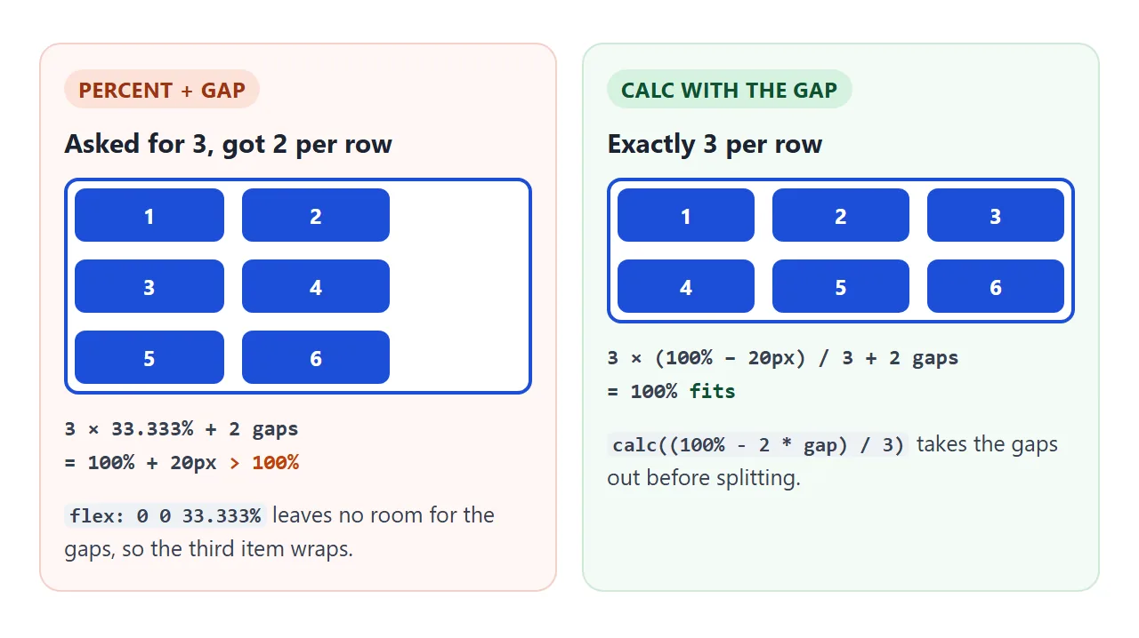
A percentage flex-basis is measured against the container's content width. The gap is not part of that sum, so it has to be subtracted by hand.
The last row problem
Every line in a wrapped flex container is laid out on its own. Free space, flex-grow and justify-content apply per line. That is fine for tags, but it breaks a grid of cards.
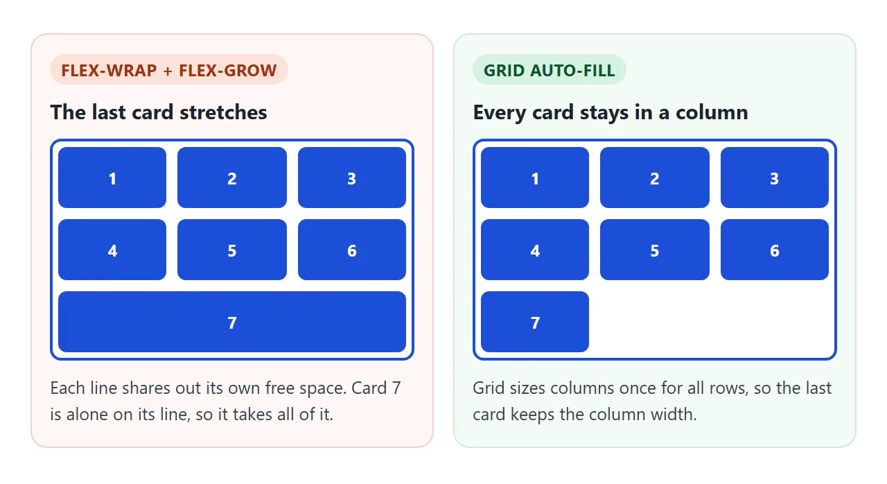
Two versions of the problem show up:
- Stretched cards: with
flex: 1 1 140px, cards on a short last line grow wider than the ones above. - Scattered cards: with
justify-content: space-between, two cards on the last line sit at the far left and far right. justify-content covers that case.
There are three fixes:
- Use grid when the items should form columns.
grid-template-columns: repeat(auto-fill, minmax(140px, 1fr))wraps and keeps every row aligned. CSS grid wrap explains auto-fill and auto-fit. - Use gap without space-between or flex-grow. The last line packs to the left and items keep their size.
- Add invisible fillers. Empty elements with the same
flexandheight: 0share the last line, so real cards keep their width.
.cards { display: flex; flex-wrap: wrap; gap: 10px; }
.cards > * { flex: 1 1 140px; }
.cards > .filler { height: 0; }
You need one fewer filler than the most cards a line can hold. A filler that lands on a line of its own still adds one row gap at the bottom.
The flex-flow shorthand
flex-flow sets flex-direction and flex-wrap in one line. The order does not matter.
.row { display: flex; flex-flow: row wrap; }
.stack { display: flex; flex-flow: column wrap; }
A column that wraps needs a height limit on the container. Without one, the column just grows taller and never needs a second column.
Wrapping and align-content
Once items wrap, there are several lines, and align-content places those lines in the container's height. It needs spare height to have an effect, so give the container a height or min-height.
With nowrap, the container has a single line that always fills its height, so align-content does nothing. With wrap it applies even when the items happen to fit on one line. align-items shows both properties side by side.
Big, uneven gaps between wrapped lines usually come from the default align-content: normal, which stretches the lines to fill a tall container. align-content: flex-start packs them at the top.
A finished example: toolbar, tags and cards
Three patterns that wrap on a phone. Resize the window, or open this page on a phone, and watch each one.
<!doctype html>
<html lang="en">
<head>
<meta charset="utf-8">
<meta name="viewport" content="width=device-width, initial-scale=1">
<title>flex-wrap in a real page</title>
<style>
body { margin: 0; padding: 16px; font-family: system-ui, sans-serif; background: #f4f5f7; color: #1d2330; }
h2 { font-size: 13px; margin: 18px 0 6px; color: #4b5563; }
h2:first-child { margin-top: 0; }
button { font: inherit; font-size: 13px; padding: 6px 10px; border: 1px solid #c9ced8; border-radius: 8px; background: #fff; cursor: pointer; }
button.on { background: #1d4ed8; border-color: #1d4ed8; color: #fff; }
/* 1. Toolbar: buttons stay together, the search box takes the rest,
and drops to its own line when there is no room */
.toolbar { display: flex; flex-wrap: wrap; gap: 8px; padding: 8px; border-radius: 10px; background: #fff; }
.group { display: flex; gap: 4px; }
.toolbar input { flex: 1 1 160px; min-width: 0; font: inherit; font-size: 14px; padding: 6px 10px; border: 1px solid #c9ced8; border-radius: 8px; }
/* 2. Tag cloud: every tag keeps its natural width */
.tags { display: flex; flex-wrap: wrap; gap: 6px 8px; margin: 0; padding: 0; list-style: none; }
.tags li { padding: 4px 10px; border-radius: 99px; background: #dbeafe; color: #1e3a8a; font-size: 13px; white-space: nowrap; }
/* 3. Cards: three ways to wrap them */
.tabs { display: flex; flex-wrap: wrap; gap: 6px; margin-bottom: 8px; }
.cards { gap: 10px; }
.cards .card { height: 60px; border-radius: 10px; background: #fff; box-shadow: 0 3px 10px rgba(0, 0, 0, .08); display: grid; place-items: center; font-weight: 700; }
.cards.flex, .cards.fillers { display: flex; flex-wrap: wrap; }
.cards.flex .card, .cards.fillers .card { flex: 1 1 140px; }
/* empty fillers take the same flex but no height, so the last row keeps its width */
.filler { display: none; }
.cards.fillers .filler { display: block; flex: 1 1 140px; height: 0; }
.cards.grid { display: grid; grid-template-columns: repeat(auto-fill, minmax(140px, 1fr)); }
#note { font-size: 13px; margin: 8px 0 0; }
</style>
</head>
<body>
<h2>Toolbar</h2>
<div class="toolbar">
<div class="group"><button type="button">Bold</button><button type="button">Italic</button><button type="button">Link</button></div>
<div class="group"><button type="button">Undo</button><button type="button">Redo</button></div>
<input type="search" placeholder="Search" aria-label="Search">
</div>
<h2>Tag cloud</h2>
<ul class="tags">
<li>html</li><li>css</li><li>flexbox</li><li>flex-wrap</li><li>responsive design</li>
<li>grid</li><li>gap</li><li>mobile</li><li>layout</li><li>align-content</li><li>tags</li>
</ul>
<h2>Card list</h2>
<div class="tabs" id="tabs">
<button class="on" data-mode="flex">flex-wrap</button>
<button data-mode="fillers">flex-wrap + fillers</button>
<button data-mode="grid">grid auto-fill</button>
<button id="add">+ card</button><button id="remove">− card</button>
</div>
<div class="cards flex" id="cards">
<div class="card">1</div><div class="card">2</div><div class="card">3</div><div class="card">4</div><div class="card">5</div>
<i class="filler"></i><i class="filler"></i><i class="filler"></i>
</div>
<p id="note"></p>
<script>
const cards = document.getElementById('cards');
const note = document.getElementById('note');
const notes = {
flex: 'flex: 1 1 140px. Cards on the last row grow to fill it, so they come out wider than the ones above.',
fillers: 'Three empty elements with the same flex share the last row, so real cards keep the column width.',
grid: 'repeat(auto-fill, minmax(140px, 1fr)). Every card sits in a column, whatever the count.'
};
document.querySelectorAll('#tabs button[data-mode]').forEach((b) => b.addEventListener('click', () => {
document.querySelectorAll('#tabs button[data-mode]').forEach((x) => x.classList.remove('on'));
b.classList.add('on');
cards.className = 'cards ' + b.dataset.mode;
note.textContent = notes[b.dataset.mode];
}));
document.getElementById('add').addEventListener('click', () => {
const n = cards.querySelectorAll('.card').length + 1;
const c = document.createElement('div');
c.className = 'card';
c.textContent = n;
cards.insertBefore(c, cards.querySelector('.filler')); // fillers stay at the end
});
document.getElementById('remove').addEventListener('click', () => {
const all = cards.querySelectorAll('.card');
if (all.length > 1) all[all.length - 1].remove();
});
note.textContent = notes.flex;
</script>
</body>
</html>
- Toolbar: button groups are flex items that never split, because each group is its own small flex row. The search box has
flex: 1 1 160px, so it fills what is left and wraps when less than 160px remains. - Tag cloud:
flex-wrap: wrapwithgap, andwhite-space: nowrapon each tag so a tag never breaks in the middle. - Cards: add or remove cards and switch modes. Only the flex-wrap mode stretches the last row.
flex-wrap or grid
| Use flex-wrap for | Use grid for |
|---|---|
| Items of different widths: tags, buttons, chips | Items that should line up in columns: cards, tiles |
| Rows where each line can differ | Rows that must match the ones above |
| One item that takes the leftover space | A fixed or automatic column count |
The two combine well. A grid of cards can contain a wrapping flex row of tags in each card. Flexbox covers the rest of the flex properties.
When it does not work
| What you see | Cause | Fix |
|---|---|---|
| Items squeeze together instead of wrapping | flex-wrap is still nowrap |
Add flex-wrap: wrap to the container |
Items still shrink with wrap set |
They have no flex-basis or width, so their content fits |
Set flex-basis or min-width on the items |
| Nothing wraps at all | flex-wrap is on the child, not the flex container |
Move it to the element with display: flex |
| One fewer item per row than planned | Percentage widths plus gap exceed 100% |
Use calc() to subtract the gaps |
align-content changes nothing |
Single-line container, or no spare height | flex-wrap: wrap and a height or min-height |
| Last row stretched or pushed to the edges | flex-grow or space-between works per line |
Grid, plain gap, or invisible fillers |
| The page scrolls sideways on a phone | A long word or a fixed width is wider than the screen | min-width: 0 on the item, or overflow-wrap: anywhere on the text |
Share it as a link
Wrapping is about widths, so it is best checked on the screen where it will be read. A screenshot shows only one width, and an .html attachment may not open as a page on a phone.
To send the working version, paste the page into a NOS document and choose Create share link. HTML to link walks through it.
The page renders as written and its scripts run, so the people you send it to can open it on their own phone and see how the rows wrap. If you change the code later, the same link shows the new version.