align-items sets where items sit across a flex or grid line. In a flex row that is up and down: top, middle, bottom, full height, or on a shared text line. On the container, display: flex; align-items: center; centres a row vertically.
Try it. The striped area is the free space across the line. Drag the height slider from auto upwards and watch what each value does with it.
<!doctype html>
<html lang="en">
<head>
<meta charset="utf-8">
<meta name="viewport" content="width=device-width, initial-scale=1">
<title>align-items playground</title>
<style>
  * { box-sizing: border-box; }
  body { margin: 0; padding: 16px; font-family: system-ui, sans-serif; background: #f4f5f7; color: #1d2330; }
  .controls { display: flex; flex-wrap: wrap; align-items: center; gap: 6px; margin-bottom: 8px; font-size: 13px; }
  .controls b { width: 100%; }
  button { font: inherit; padding: 6px 10px; border: 1px solid #c9ced8; border-radius: 8px; background: #fff; cursor: pointer; }
  button.on { background: #1d4ed8; border-color: #1d4ed8; color: #fff; }
  input[type=range] { flex: 1; min-width: 120px; }

  /* the flex container: stripes show the free space across the line */
  .box {
    display: flex;
    gap: 8px;
    margin-top: 10px; padding: 0; border: 2px solid #1d4ed8; border-radius: 10px;
    background: repeating-linear-gradient(45deg, #fff3d6 0 8px, #fde7b0 8px 16px);
  }
  .item {
    padding: 6px 10px; border-radius: 8px;
    background: #1d4ed8; color: #fff; font-weight: 700;
  }
  .big { font-size: 30px; }                   /* larger text, lower baseline */
  .box.fixed .item { height: 60px; }          /* a set height turns stretch off */
  code { display: block; margin-top: 10px; padding: 8px 10px; border-radius: 8px; background: #1d2330; color: #e5e7eb; font-size: 13px; white-space: pre; overflow-x: auto; }
</style>
</head>
<body>
<div class="controls" id="ai">
  <b>align-items</b>
  <button class="on">stretch</button><button>flex-start</button><button>center</button>
  <button>flex-end</button><button>baseline</button>
</div>
<div class="controls">
  <b>container height: <span id="hv">auto</span></b>
  <input type="range" id="h" min="0" max="220" step="10" value="0" aria-label="Container height">
</div>
<div class="controls" id="dir">
  <b>flex-direction</b>
  <button class="on">row</button><button>column</button>
  <button id="fixed">height: 60px on items</button>
</div>

<div class="box" id="box">
  <div class="item">One</div>
  <div class="item big">Two</div>
  <div class="item">Three<br>lines<br>tall</div>
</div>
<code id="css"></code>

<script>
  const box = document.getElementById('box');
  const css = document.getElementById('css');
  const h = document.getElementById('h');

  function show() {
    const height = box.style.height || 'auto';
    document.getElementById('hv').textContent = height;
    css.textContent = '.box {\n  display: flex;\n  flex-direction: ' + box.style.flexDirection +
      ';\n  align-items: ' + box.style.alignItems + ';\n  height: ' + height + ';\n}' +
      (box.classList.contains('fixed') ? '\n.item { height: 60px; }  /* stretch has nothing to do */' : '');
  }

  // one group of buttons sets one property on the container
  function group(id, prop) {
    const btns = document.querySelectorAll('#' + id + ' button:not(#fixed)');
    btns.forEach((b) => b.addEventListener('click', () => {
      btns.forEach((x) => x.classList.remove('on'));
      b.classList.add('on');
      box.style[prop] = b.textContent;
      show();
    }));
    box.style[prop] = btns[0].textContent;
  }
  group('ai', 'alignItems');
  group('dir', 'flexDirection');

  // 0 on the slider means height: auto (no free space across the line)
  h.addEventListener('input', () => {
    box.style.height = h.value === '0' ? '' : h.value + 'px';
    show();
  });

  document.getElementById('fixed').addEventListener('click', (e) => {
    e.target.classList.toggle('on', box.classList.toggle('fixed'));
    show();
  });
  show();
</script>
</body>
</html>
With the slider at auto, the container is only as tall as its tallest item. Three lines tall never moves, whatever value you pick, because only the shorter items have room. That explains most "align-items not working" questions.
The five values
align-items does not change the size of the line. It decides where each item goes inside it, and with stretch, how tall the item becomes.
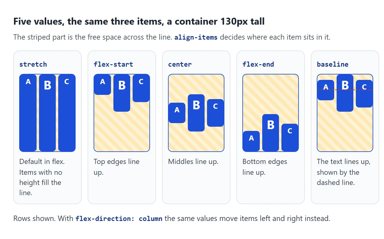
| Value | What each item does |
|---|---|
stretch |
Grows to the height of the line, if it has no height of its own. The default in flex. |
flex-start / start |
Sits at the top of the line. |
center |
Sits in the middle of the line. |
flex-end / end |
Sits at the bottom of the line. |
baseline |
Moves so the first line of text in every item sits on one baseline. |
The initial value is actually normal, which behaves as stretch in a flex container. That is why flex items in a row come out the same height even when you did not ask for it.
flex-start and start only differ with flex-wrap: wrap-reverse. flex-start follows the reversed lines and packs items at the bottom, while start stays at the top.
baseline: line up text of different sizes
center lines up the middles of the boxes. When items hold text of different sizes, that looks wrong: a large price and a small "/month" label end up with their letters at different heights.
baseline lines up the bottom of the letters instead, the line the text sits on. It uses the first line of text in each item. The finished example below uses it for a price.
.price { display: flex; align-items: baseline; gap: 2px; }
.price .amount { font-size: 40px; }
.price .per { font-size: 13px; }
For text inside a single line of inline content, vertical-align does a similar job. The vertical-align guide explains where that property applies and where it is ignored.
It works across the main axis
A flex container has a main axis, the direction items flow, and a cross axis at right angles to it. justify-content works along the main axis. align-items works across it.
In a row, across means vertical. Switch the playground to column and the axes swap: align-items now moves items left and right. Two things change at once:
stretchmeans full width. Column items fill the container's width by default, so a<button>in a flex column spans the whole column.centershrinks them. Withcenter, each item goes back to the width of its content and sits in the middle.
To centre things vertically in a column, you need justify-content instead. The center a div guide sets both properties for the classic centred box.
Why it does nothing: no room, or a fixed height
Free space across the line is the container height minus the item height. A container with height: auto grows to fit its tallest item. Items of equal height then leave no free space, and every value looks identical.
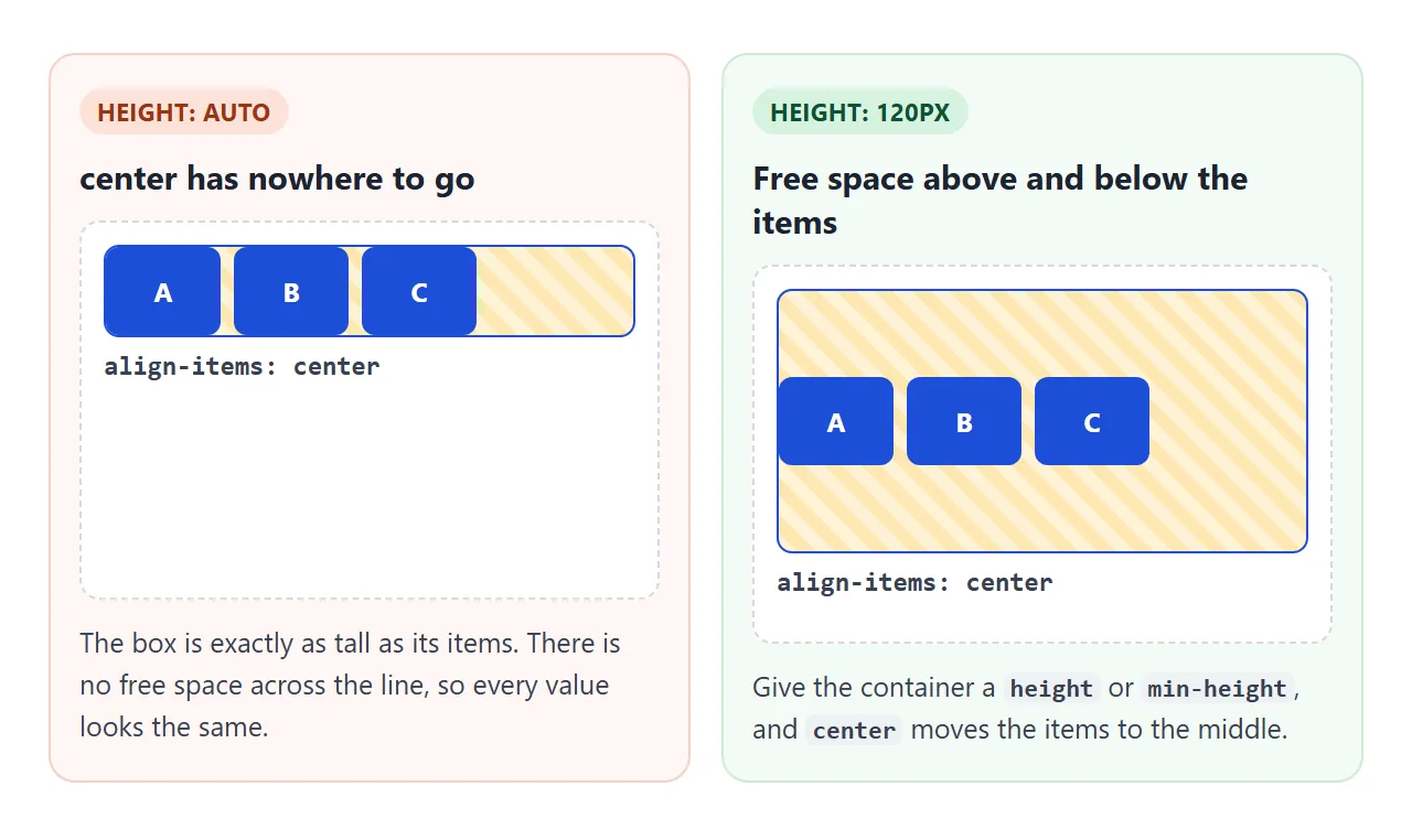
.hero {
  display: flex;
  align-items: center;  /* up and down, because the direction is row */
  min-height: 60vh;     /* without a height there is no room to centre in */
}
min-height is usually safer than height. The box still grows if the content gets taller, for example on a phone where text wraps onto more lines.
stretch has its own condition. It fills the line only when the item's height is auto. A fixed height wins, and max-height caps the stretch. Press height: 60px on items in the playground: the items stop at 60px even with stretch selected.
This is useful in both directions. Leave the height off cards you want equal. Set a height on an icon or a button you want kept at its own size, or give just that item a different align-self.
align-self: move one item
align-self goes on an item and overrides the container's align-items for that item only. It takes the same values, plus auto, which means "use the container's value".
.card { display: flex; flex-direction: column; }  /* children stretch to full width */
.card .badge { align-self: flex-start; }            /* this one keeps its own width */
An auto margin on the cross axis beats align-self. margin-top: auto on an item pushes it to the bottom of the line whatever align-self says.
align-items vs align-content
When items wrap onto several lines, there are two jobs. align-items places each item inside its own line. align-content places the lines themselves inside the container.
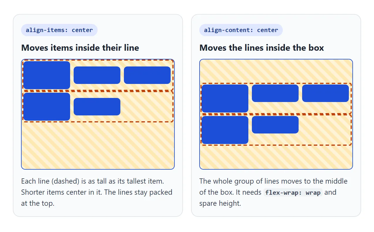
Try both switchers here. Then set nowrap and notice that align-content stops doing anything.
<!doctype html>
<html lang="en">
<head>
<meta charset="utf-8">
<meta name="viewport" content="width=device-width, initial-scale=1">
<title>align-items vs align-content</title>
<style>
  body { margin: 0; padding: 16px; font-family: system-ui, sans-serif; background: #f4f5f7; color: #1d2330; }
  .controls { display: flex; flex-wrap: wrap; gap: 6px; margin-bottom: 8px; font-size: 13px; }
  .controls b { width: 100%; }
  button { font: inherit; padding: 6px 10px; border: 1px solid #c9ced8; border-radius: 8px; background: #fff; cursor: pointer; }
  button.on { background: #1d4ed8; border-color: #1d4ed8; color: #fff; }

  /* a wrapping flex container, taller than its lines */
  .box {
    display: flex;
    flex-wrap: wrap;
    height: 230px; margin-top: 10px; border: 2px solid #1d4ed8; border-radius: 10px;
    background: repeating-linear-gradient(45deg, #fff3d6 0 8px, #fde7b0 8px 16px);
  }
  .item {
    width: calc(33% - 6px); margin: 3px;  /* three per line */
    border-radius: 8px;
    background: #1d4ed8; color: #fff; font-weight: 700; text-align: center;
  }
  .item:nth-child(3n+1) { padding: 14px 0; }   /* some items are taller than others */
  code { display: block; margin-top: 10px; padding: 8px 10px; border-radius: 8px; background: #1d2330; color: #e5e7eb; font-size: 13px; white-space: pre; overflow-x: auto; }
</style>
</head>
<body>
<div class="controls" id="ai">
  <b>align-items (inside each line)</b>
  <button class="on">stretch</button><button>flex-start</button><button>center</button><button>flex-end</button>
</div>
<div class="controls" id="ac">
  <b>align-content (the lines inside the box)</b>
  <button class="on">normal</button><button>flex-start</button><button>center</button>
  <button>flex-end</button><button>space-between</button>
</div>
<div class="controls" id="fw">
  <b>flex-wrap</b>
  <button class="on">wrap</button><button>nowrap</button>
</div>

<div class="box" id="box"></div>
<code id="css"></code>

<script>
  const box = document.getElementById('box');
  const css = document.getElementById('css');
  for (let i = 1; i <= 7; i++) box.insertAdjacentHTML('beforeend', '<div class="item">' + i + '</div>');

  function show() {
    css.textContent = '.box {\n  display: flex;\n  flex-wrap: ' + box.style.flexWrap +
      ';\n  align-items: ' + box.style.alignItems +
      ';\n  align-content: ' + box.style.alignContent + ';\n  height: 230px;\n}';
  }

  // one group of buttons sets one property on the container
  function group(id, prop) {
    const btns = document.querySelectorAll('#' + id + ' button');
    btns.forEach((b) => b.addEventListener('click', () => {
      btns.forEach((x) => x.classList.remove('on'));
      b.classList.add('on');
      box.style[prop] = b.textContent;
      show();
    }));
    box.style[prop] = btns[0].textContent;
  }
  group('ai', 'alignItems');
  group('ac', 'alignContent');
  group('fw', 'flexWrap');
  show();
</script>
</body>
</html>
align-content needs two things. The container must be multi-line, which means flex-wrap: wrap. And the container needs spare height. With nowrap the single line always fills the container, so there is nothing to place.
The default, normal, stretches the lines to share the spare height. That is why wrapped rows sometimes have unexpected gaps between them. align-content: flex-start packs the lines at the top.
A finished example: pricing cards
This row uses all three properties. The cards stretch to the same height, the prices sit on one baseline, and a badge opts out with align-self.
<!doctype html>
<html lang="en">
<head>
<meta charset="utf-8">
<meta name="viewport" content="width=device-width, initial-scale=1">
<title>Pricing cards with align-items</title>
<style>
  * { box-sizing: border-box; }
  body { margin: 0; padding: 16px; font-family: system-ui, sans-serif; background: #f4f5f7; color: #1d2330; }
  .controls { display: flex; flex-wrap: wrap; gap: 6px; margin-bottom: 12px; font-size: 13px; }
  button { font: inherit; padding: 6px 10px; border: 1px solid #c9ced8; border-radius: 8px; background: #fff; cursor: pointer; }
  button.on { background: #1d4ed8; border-color: #1d4ed8; color: #fff; }

  /* the row of cards: stretch (the default) makes every card as tall as the tallest */
  .plans { display: flex; flex-wrap: wrap; gap: 12px; align-items: stretch; }
  .plans.loose { align-items: flex-start; }

  /* each card is a column; its button is pushed to the bottom */
  .card {
    flex: 1 1 150px;
    display: flex; flex-direction: column; gap: 8px;
    padding: 16px; border-radius: 12px; background: #fff; box-shadow: 0 4px 14px rgba(0, 0, 0, .08);
  }
  .card h3 { margin: 0; font-size: 16px; }
  .card ul { margin: 0; padding-left: 18px; font-size: 13px; line-height: 1.6; }
  .card .buy { margin-top: auto; padding: 9px; border: 0; border-radius: 8px; background: #1d4ed8; color: #fff; font-weight: 700; }

  /* the price: three sizes of text sitting on one baseline */
  .price { display: flex; align-items: baseline; gap: 2px; }
  .price.center { align-items: center; }
  .cur { font-size: 18px; font-weight: 700; }
  .amt { font-size: 40px; font-weight: 800; line-height: 1; }
  .per { font-size: 13px; color: #6b7280; }

  /* one item opts out: the badge keeps its own width instead of stretching across the card */
  .badge {
    align-self: flex-start;
    padding: 3px 8px; border-radius: 99px; background: #fef3c7; color: #92400e; font-size: 12px; font-weight: 700;
  }
  .no-self .badge { align-self: auto; }
</style>
</head>
<body>
<div class="controls">
  <button id="t-price">Price: align-items: baseline</button>
  <button id="t-row">Cards: align-items: stretch</button>
  <button id="t-badge">Badge: align-self: flex-start</button>
</div>

<div class="plans" id="plans">
  <div class="card">
    <h3>Starter</h3>
    <div class="price"><span class="cur">$</span><span class="amt">0</span><span class="per">/month</span></div>
    <ul><li>1 project</li></ul>
    <button class="buy">Start free</button>
  </div>
  <div class="card">
    <span class="badge">Most popular</span>
    <h3>Team</h3>
    <div class="price"><span class="cur">$</span><span class="amt">29</span><span class="per">/month</span></div>
    <ul><li>10 projects</li><li>Shared folders</li><li>Comments</li><li>Version history</li></ul>
    <button class="buy">Choose Team</button>
  </div>
  <div class="card">
    <h3>Business</h3>
    <div class="price"><span class="cur">$</span><span class="amt">99</span><span class="per">/month</span></div>
    <ul><li>Unlimited projects</li><li>Admin roles</li></ul>
    <button class="buy">Contact us</button>
  </div>
</div>

<script>
  const plans = document.getElementById('plans');

  // each button flips one alignment so you can see what it was doing
  function toggle(id, on, off, apply) {
    const b = document.getElementById(id);
    let active = true;
    b.classList.add('on');
    b.addEventListener('click', () => {
      active = !active;
      b.classList.toggle('on', active);
      b.textContent = active ? on : off;
      apply(active);
    });
  }
  toggle('t-price', 'Price: align-items: baseline', 'Price: align-items: center', (on) =>
    document.querySelectorAll('.price').forEach((p) => p.classList.toggle('center', !on)));
  toggle('t-row', 'Cards: align-items: stretch', 'Cards: align-items: flex-start', (on) =>
    plans.classList.toggle('loose', !on));
  toggle('t-badge', 'Badge: align-self: flex-start', 'Badge: align-self: auto', (on) =>
    plans.classList.toggle('no-self', !on));
</script>
</body>
</html>
- Equal cards: the row keeps the default
stretch. Each card is a flex column, andmargin-top: autopins its button to the bottom. - Price:
align-items: baselineon the price row. Switch it tocenterand the "$" and "/month" float up. - Badge: inside a column card,
stretchwould make it full width.align-self: flex-startkeeps it the size of its text.
On a phone the cards wrap. stretch works per line, so cards on the same line match and a card alone on its line keeps its own height.
align-items in a grid
In a grid, align-items places each item inside its own grid cell, up and down. Grid items stretch to the full cell height by default, the same as flex. center or start shrink them to their content and place them in the cell.
align-self works on a single grid item the same way. align-content in a grid moves the row tracks when the rows are shorter than the container. The CSS Grid guide builds full layouts, and the flexbox guide covers the other flex properties.
When it does not work
| What you see | Cause | Fix |
|---|---|---|
center does not move anything |
The container has no height, so there is no free space | Add height or min-height to the container |
| Items do not stretch | The items have a fixed height or max-height |
Remove the height, or use min-height |
| Items move sideways, not up and down | flex-direction: column swaps the axes |
Use justify-content for vertical placement |
| Items in a column span the full width | The default stretch in a column |
align-items: flex-start or center |
align-content changes nothing |
One line only: flex-wrap is nowrap |
Add flex-wrap: wrap and a container height |
| Nothing changes at all | align-items is on the items, not the container |
Move it to the parent, or use align-self on the item |
align-self is ignored |
An auto margin on the cross axis wins | Remove margin-top: auto or margin-bottom: auto |
| Big gaps between wrapped rows | The default align-content stretches the lines |
align-content: flex-start |
Share it as a link
Alignment is easier to show than to describe. A screenshot shows one width and one set of values, and the person you send it to cannot switch between them.
To send the working version, paste the page into a NOS document and choose Create share link. HTML to link walks through it.
The page renders as written and its scripts run, so others can press each value and resize the window themselves. If you change the CSS later, the same link shows the new version.