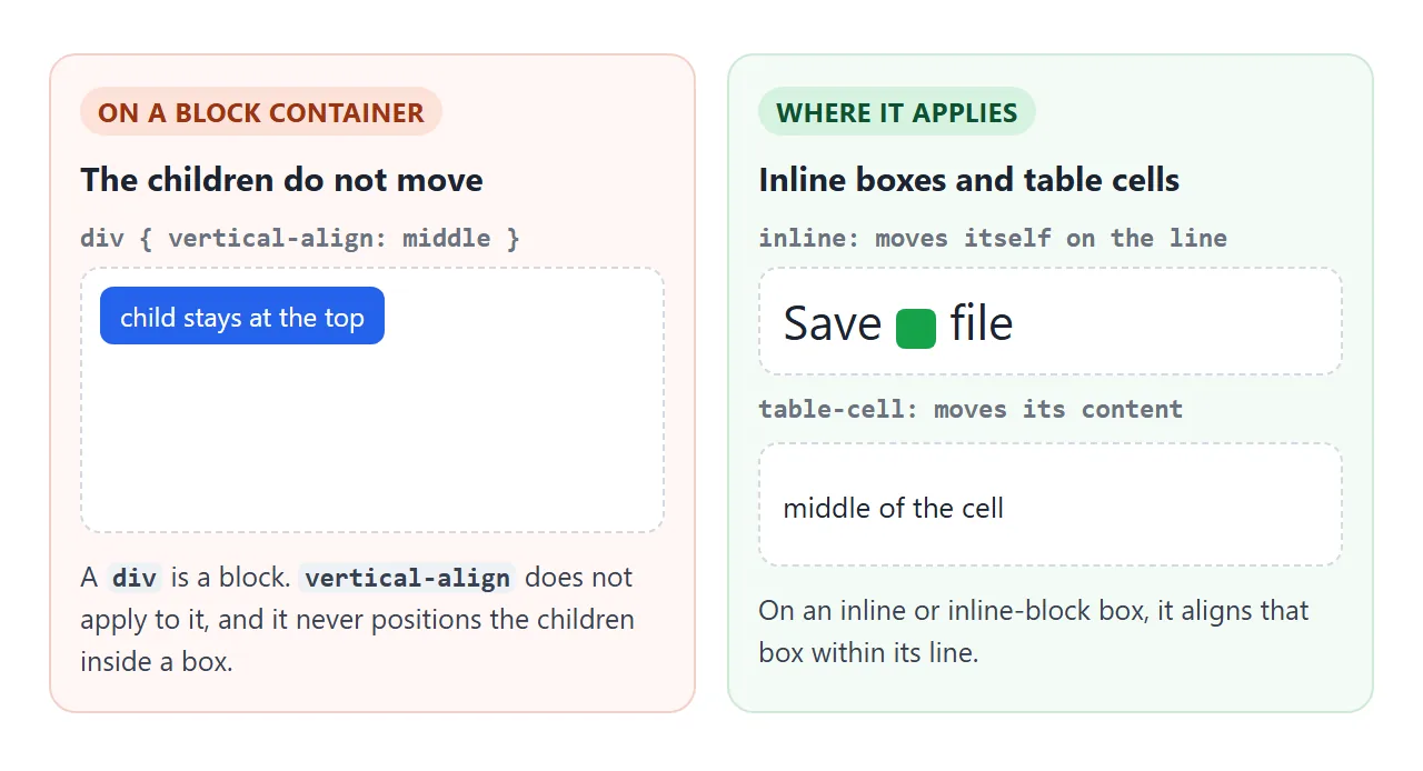
vertical-align: middle only works on inline-level boxes (text, <img>, <svg>, inline-block) and on table cells. On an inline box it moves that box up or down within its line of text.
On a table cell it moves the cell's content. On a normal <div> it does nothing at all.
So the answer depends on what you want. To line up an icon with the words beside it, vertical-align is the right tool. To center something inside a box, use display: flex with align-items: center, or display: grid with place-items: center.
Try every value first. The same value is applied to an icon, an image and an inline-block that sit on one line of text.
<!doctype html>
<html lang="en">
<head>
<meta charset="utf-8">
<meta name="viewport" content="width=device-width, initial-scale=1">
<title>vertical-align playground</title>
<style>
  body { margin: 0; padding: 16px; font-family: system-ui, sans-serif; background: #f4f5f7; color: #1d2330; }
  .values { display: flex; flex-wrap: wrap; gap: 6px; margin-bottom: 14px; }
  .values button {
    font: 600 13px ui-monospace, Consolas, monospace; padding: 6px 9px;
    border: 1px solid #cfd4dc; border-radius: 7px; background: #fff; cursor: pointer;
  }
  .values button.on { background: #1d4ed8; border-color: #1d4ed8; color: #fff; }
  .line {
    position: relative; background: #fff; border-radius: 10px;
    padding: 18px 14px; font-size: 30px; line-height: 2.2;
  }
  /* the three inline-level things we align */
  .icon { width: 1em; height: 1em; }
  .pic  { width: 44px; height: 44px; }
  .box  { display: inline-block; padding: 2px 8px; font-size: 14px; line-height: 1.4;
          background: #fde68a; border-radius: 6px; }
  /* red line = baseline of the text, blue line = baseline + half the x-height */
  .guide { position: absolute; left: 0; right: 0; height: 0; border-top: 1px dashed; pointer-events: none; }
  .base { border-color: #dc2626; }
  .mid  { border-color: #2563eb; }
  .probe { display: inline-block; width: 0; height: 0; }   /* its bottom sits on the baseline */
  .ex { display: inline-block; width: 0; height: 1ex; }    /* measures the x-height */
  .key { font-size: 13px; margin-top: 10px; color: #4b5563; }
  .key b { font-weight: 600; }
</style>
</head>
<body>
<div class="values" id="values">
  <button class="on">baseline</button><button>middle</button><button>top</button>
  <button>bottom</button><button>text-top</button><button>text-bottom</button>
  <button>super</button><button>sub</button><button>-4px</button>
</div>

<div class="line" id="line">Text
  <svg class="icon a" viewBox="0 0 24 24"><circle cx="12" cy="12" r="10" fill="#16a34a"/><path d="M7 12l3 3 7-7" stroke="#fff" stroke-width="2.5" fill="none"/></svg>
  xg <img class="pic a" alt="" src="data:image/svg+xml,%3Csvg xmlns='http://www.w3.org/2000/svg' viewBox='0 0 44 44'%3E%3Crect width='44' height='44' rx='8' fill='%23f97316'/%3E%3C/svg%3E">
  <span class="box a">inline-block</span><span class="probe" id="probe"></span><span class="ex" id="ex"></span>
  <div class="guide base" id="base"></div><div class="guide mid" id="mid"></div>
</div>
<p class="key"><b style="color:#dc2626">Red</b>: baseline. <b style="color:#2563eb">Blue</b>: baseline + half the x-height, where <code>middle</code> lines up.</p>

<script>
  const line = document.getElementById('line');
  const probe = document.getElementById('probe');
  const ex = document.getElementById('ex');

  function drawGuides() {
    const top = line.getBoundingClientRect().top;
    const baseline = probe.getBoundingClientRect().bottom - top;
    const xHeight = ex.getBoundingClientRect().height;
    document.getElementById('base').style.top = baseline + 'px';
    document.getElementById('mid').style.top = (baseline - xHeight / 2) + 'px';
  }

  document.getElementById('values').addEventListener('click', (e) => {
    if (e.target.tagName !== 'BUTTON') return;
    document.querySelectorAll('.values button').forEach((b) => b.classList.toggle('on', b === e.target));
    // apply the chosen value to the icon, the image and the inline-block
    document.querySelectorAll('.a').forEach((el) => { el.style.verticalAlign = e.target.textContent; });
    drawGuides();
  });

  addEventListener('resize', drawGuides);
  drawGuides();
</script>
</body>
</html>
What vertical-align actually moves
Every line of text has a baseline: the line that letters such as H and x sit on.
By default, every inline box on the line puts its own baseline on that line. For an image or an SVG that has no text, the bottom edge goes on the baseline.
vertical-align changes that for the element it is set on. It is not inherited, and it does not reach into the element's children. That is why putting it on a parent does nothing to the items inside.
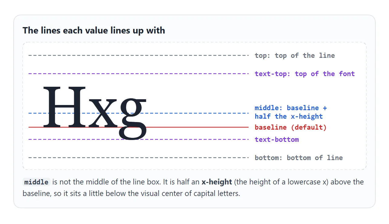
The values, and the lines they line up with
The values fall into two groups. Some are measured from the parent's text, and two are measured from the whole line box.
| Value | Lines up |
|---|---|
baseline |
The element's baseline with the parent's baseline (the default) |
middle |
The element's middle with the parent's baseline plus half its x-height |
text-top |
The element's top with the top of the parent's font |
text-bottom |
The element's bottom with the bottom of the parent's font |
top |
The element's top with the top of the whole line |
bottom |
The element's bottom with the bottom of the whole line |
sub / super |
The baseline with the parent's subscript or superscript position |
4px, -0.2em, 20% |
Raised by that amount above the baseline (negative lowers it; % is of line-height) |
The x-height is the height of a lowercase x in the font. Because middle aims at half of it, the middle of an icon set to middle lines up with the middle of the lowercase letters.
Next to capital letters it can look a pixel or two low.
When middle looks slightly off, a length gives exact control. vertical-align: -0.125em lowers an icon by an eighth of the font size and scales with it. SVG icons in HTML uses that value for icons sized in em.
Icons and badges next to text
Two common cases need different fixes.
- An icon inside a sentence. Give the icon
vertical-align: middleor a small negative length. The icon stays part of the text, so it wraps with it. - A button with an icon and a label. Make the button
display: inline-flexwithalign-items: center. Flex centers the icon and the label against each other, whatever their sizes.
.icon { width: 1em; height: 1em; vertical-align: -0.125em; }

.btn { display: inline-flex; align-items: center; gap: 8px; }
Mixed font sizes on one line make baseline alignment look uneven, because a large word raises the height of the whole line. A badge next to a heading is a typical case.
Set vertical-align: middle on the small badge, or put both in a flex row.
The gap under an image
An <img> is an inline element, so it sits on the baseline like a letter. The line keeps room below the baseline for the tails of g, p and y. That room shows up as a thin strip under the image, inside its container.
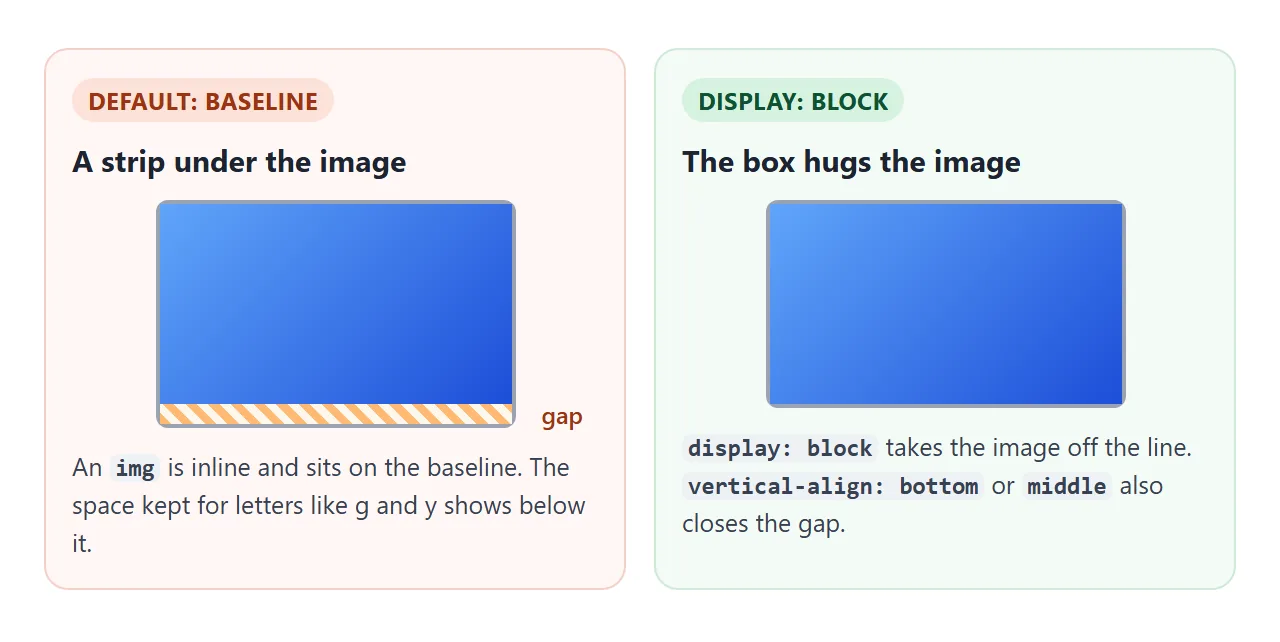
img { display: block; }         /* image is no longer on a line of text */
/* or keep it inline: */
img { vertical-align: middle; } /* bottom also works */
Table cells: the one place it moves content
On a <td> or <th>, or anything with display: table-cell, vertical-align controls where the content sits inside the cell. Only baseline, top, middle and bottom do something different there; the other values act like baseline.
td { vertical-align: top; }     /* long cells read better from the top */
td.avatar { vertical-align: middle; }
How to center something vertically in a box
For the contents of a <div>, change the container's layout mode. Compare the four boxes below; only the first one fails.
<!doctype html>
<html lang="en">
<head>
<meta charset="utf-8">
<meta name="viewport" content="width=device-width, initial-scale=1">
<title>vertical-align: middle does nothing on a div</title>
<style>
  body { margin: 0; padding: 14px; font-family: system-ui, sans-serif; background: #f4f5f7; color: #1d2330; }
  .grid { display: grid; grid-template-columns: repeat(auto-fit, minmax(160px, 1fr)); gap: 12px; }
  figure { margin: 0; }
  figcaption { font: 600 12.5px ui-monospace, Consolas, monospace; margin-bottom: 6px; }
  .frame { height: 130px; width: 100%; box-sizing: border-box; background: #fff;
           border: 1px dashed #aab1bd; border-radius: 10px; }
  .child { padding: 8px 12px; background: #2563eb; color: #fff; border-radius: 8px; font-size: 14px; }

  /* 1. does nothing: vertical-align is ignored on a block box */
  .v-align { vertical-align: middle; }

  /* 2. flex: align-items centers the child on the cross axis */
  .flex { display: flex; align-items: center; justify-content: center; }

  /* 3. grid: place-items sets both axes at once */
  .grid-center { display: grid; place-items: center; }

  /* 4. table-cell: here vertical-align does apply */
  .table { display: table; width: 100%; }  /* a table-cell needs a table around it to stretch */
  .cell { display: table-cell; vertical-align: middle; text-align: center; }
  .cell .child { display: inline-block; }

  .bad figcaption { color: #9a3412; }
  .good figcaption { color: #0f5132; }
</style>
</head>
<body>
<div class="grid">
  <figure class="bad">
    <figcaption>vertical-align: middle</figcaption>
    <div class="frame v-align"><div class="child">Stuck at top</div></div>
  </figure>
  <figure class="good">
    <figcaption>display: flex</figcaption>
    <div class="frame flex"><div class="child">Centered</div></div>
  </figure>
  <figure class="good">
    <figcaption>display: grid</figcaption>
    <div class="frame grid-center"><div class="child">Centered</div></div>
  </figure>
  <figure class="good">
    <figcaption>display: table-cell</figcaption>
    <div class="table"><div class="frame cell"><div class="child">Centered</div></div></div>
  </figure>
</div>
</body>
</html>
- Flex.
display: flex; align-items: center;centers the children across the row. Addjustify-content: centerto center them along it too. Flexbox covers the rest. - Grid.
display: grid; place-items: center;centers each child both ways in one line. See CSS grid. - One line of text. Set
line-heightequal to the box height. It fails as soon as the text wraps; line-height in CSS shows why. - Table cell.
display: table-cell; vertical-align: middle;works, but flex and grid do the same with fewer side effects.
.box { display: flex; align-items: center; justify-content: center; }

.box { display: grid; place-items: center; }
The box needs a height taller than its content, from height, min-height or the layout around it. With no spare height there is nothing to center within. Which display value to reach for in general is covered in CSS display.
A finished example
A centered hero, a badge beside a heading, a button with an icon, and a table whose cells center their content.
<!doctype html>
<html lang="en">
<head>
<meta charset="utf-8">
<meta name="viewport" content="width=device-width, initial-scale=1">
<title>Vertical alignment, finished</title>
<style>
  body { margin: 0; padding: 14px; font-family: system-ui, sans-serif; background: #f4f5f7; color: #1d2330; }

  /* hero: grid centers the content box both ways */
  .hero { display: grid; place-items: center; min-height: 170px; border-radius: 12px;
          background: linear-gradient(135deg, #1e3a8a, #0f766e); color: #fff; text-align: center; }
  .hero h2 { margin: 0 0 12px; font-size: 22px; }

  /* heading with a badge: vertical-align: middle on the inline badge */
  .badge { display: inline-block; vertical-align: middle; font-size: 12px; font-weight: 700;
           padding: 3px 8px; border-radius: 99px; background: #fbbf24; color: #1d2330; }

  /* button with icon: inline-flex centers icon and label */
  .btn { display: inline-flex; align-items: center; gap: 8px; padding: 10px 16px;
         border: 0; border-radius: 9px; background: #fff; color: #1d2330; font: 600 15px system-ui, sans-serif; cursor: pointer; }
  .btn svg { width: 18px; height: 18px; flex: none; }

  /* table: every cell middle-aligned */
  table { width: 100%; border-collapse: collapse; margin-top: 14px; background: #fff; border-radius: 10px; overflow: hidden; }
  td, th { vertical-align: middle; padding: 8px 10px; border-bottom: 1px solid #e5e7eb; text-align: left; font-size: 14px; }
  th { background: #f9fafb; font-size: 12px; text-transform: uppercase; color: #6b7280; }
  td img { display: block; width: 36px; height: 36px; border-radius: 50%; }   /* no gap under the image */
  #out { margin-top: 10px; font-size: 13px; color: #4b5563; min-height: 1.2em; }
</style>
</head>
<body>
<section class="hero">
  <div>
    <h2>Release notes <span class="badge">NEW</span></h2>
    <button class="btn" id="btn" type="button">
      <svg viewBox="0 0 24 24" aria-hidden="true"><path d="M12 3v12m0 0l-5-5m5 5l5-5M4 21h16" stroke="currentColor" stroke-width="2.2" fill="none" stroke-linecap="round"/></svg>
      Download
    </button>
  </div>
</section>

<table>
  <tr><th></th><th>Name</th><th>Notes</th></tr>
  <tr>
    <td><img alt="" src="data:image/svg+xml,%3Csvg xmlns='http://www.w3.org/2000/svg' viewBox='0 0 36 36'%3E%3Crect width='36' height='36' fill='%2360a5fa'/%3E%3C/svg%3E"></td>
    <td>Ana</td>
    <td>A long note that wraps onto two or three lines, while the name and picture stay centered next to it.</td>
  </tr>
  <tr>
    <td><img alt="" src="data:image/svg+xml,%3Csvg xmlns='http://www.w3.org/2000/svg' viewBox='0 0 36 36'%3E%3Crect width='36' height='36' fill='%2334d399'/%3E%3C/svg%3E"></td>
    <td>Jun</td>
    <td>Short.</td>
  </tr>
</table>
<div id="out"></div>

<script>
  let n = 0;
  document.getElementById('btn').addEventListener('click', () => {
    n += 1;
    document.getElementById('out').textContent = 'Download clicked ' + n + ' time' + (n > 1 ? 's' : '') + '.';
  });
</script>
</body>
</html>
When it does not work
| What you see | Cause | Fix |
|---|---|---|
vertical-align: middle on a div changes nothing |
It does not apply to block boxes | display: flex; align-items: center or display: grid; place-items: center |
| Set on the parent, the children do not move | It is not inherited and only moves the element itself | Put it on the icon or image, or use flex on the parent |
An icon set to middle looks a little low |
middle aims at half the x-height, not the center of capitals |
Use a length such as -0.125em, or inline-flex |
| A thin gap under an image | The image sits on the baseline, above the space for letter tails | display: block or vertical-align: bottom on the img |
| Items on a line look uneven | Mixed font sizes change the line height | vertical-align: middle on the small item, or a flex row |
| It does nothing inside a flex container | Flex items ignore vertical-align |
align-items on the container or align-self on the item |
middle centers inside a td but not inside a div |
Table cells are the only boxes whose content it moves | Use display: table-cell, or better, flex or grid |
Share it as a link
Alignment is easier to judge in a live page than in a screenshot. Sent as a link, the page runs its scripts, so the person you send it to can click through the values and resize the window themselves.
Paste the page into a NOS document and choose Create share link. HTML to link walks through it. If you change the CSS later, the same link shows the new version.