line-height sets the height of each line of text. Use a number without a unit, such as line-height: 1.5.
The browser multiplies it by the element's font size, so 16px text gets 24px lines and a 32px heading gets 48px lines, from the same one rule.
body { line-height: 1.5; }
Move the slider to see it. The font size stays at 18px; only the height of each line box changes. The readout shows the number you set and the pixels the browser works out.
<!doctype html>
<html lang="en">
<head>
<meta charset="utf-8">
<meta name="viewport" content="width=device-width, initial-scale=1">
<title>line-height slider</title>
<style>
  body { margin: 0; padding: 18px; font-family: system-ui, sans-serif; background: #f4f5f7; color: #1d2330; }
  .controls { display: flex; flex-wrap: wrap; gap: 10px 18px; align-items: center; margin-bottom: 14px; }
  .controls input[type=range] { width: 200px; }
  output { font: 600 14px ui-monospace, Consolas, monospace; background: #fff; padding: 4px 8px; border-radius: 6px; }
  .text {
    font-size: 18px;
    line-height: 1.5;           /* the slider changes this */
    margin: 0; padding: 0 12px; max-width: 34em;
    background: #fff; border-radius: 8px;
  }
  /* baseline grid: one line drawn at the bottom of every line box */
  .text.grid {
    background: #fff repeating-linear-gradient(
      to bottom, transparent 0 calc(var(--lh) - 1px), #93c5fd calc(var(--lh) - 1px) var(--lh));
  }
</style>
</head>
<body>
<div class="controls">
  <label>line-height <input type="range" id="lh" min="0.8" max="2.4" step="0.05" value="1.5"></label>
  <output id="out"></output>
  <label><input type="checkbox" id="grid" checked> show line boxes</label>
</div>

<p class="text grid" id="text">Line height is the height of each line box. The font size stays the same while you move the slider; only the space between the lines changes. Drag it low and the lines crowd together; drag it high and the paragraph falls apart into separate lines.</p>

<script>
  const text = document.getElementById('text');
  const lh = document.getElementById('lh');
  const out = document.getElementById('out');

  function update() {
    const ratio = Number(lh.value);
    text.style.lineHeight = ratio;                       // unitless: a multiple of font-size
    const px = parseFloat(getComputedStyle(text).lineHeight);  // the browser turns it into pixels
    text.style.setProperty('--lh', px + 'px');           // grid spacing follows the line box
    out.textContent = ratio.toFixed(2) + ' = ' + px.toFixed(1) + 'px at 18px';
  }
  lh.addEventListener('input', update);
  document.getElementById('grid').addEventListener('change', (e) => {
    text.classList.toggle('grid', e.target.checked);
  });
  update();
</script>
</body>
</html>
What line-height actually measures
Every line of text sits in an invisible line box. line-height is the height of that box, not the gap between lines. The text itself only needs part of it.
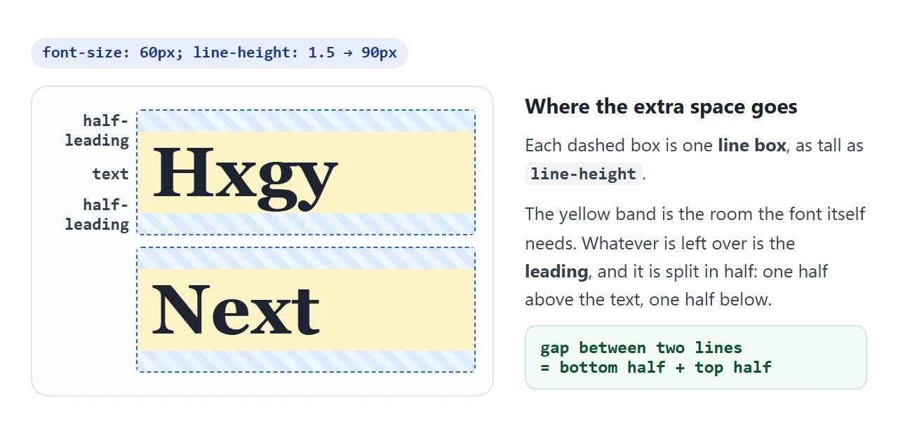
The leftover space is called leading (from the strips of lead typesetters put between lines).
CSS splits it in half and puts one half above the text and one half below. That is why a paragraph with a large line-height also has a little extra space above its first line.
Unitless, px, em or %: the values compared
line-height accepts several kinds of value. They look similar on one element. The difference shows up in the elements inside it.
| Value | Example | What children inherit | Good for |
|---|---|---|---|
| Number | 1.5 |
The number, recalculated per element | Almost everything |
| Length | 24px |
24px, whatever their font size | One element with a fixed size |
| em | 1.5em |
The length worked out on the parent | Rarely needed |
| Percent | 150% |
The length worked out on the parent | Rarely needed |
normal |
normal |
normal |
The browser default |
normal is the starting value. The browser takes the spacing from the font's own metrics, so it can look different when the font changes. A negative value is invalid and the declaration is ignored.
The inheritance trap: why headings get cramped
This is a common reason behind "line height not working" searches. Set line-height: 20px on a parent, and a 30px heading inside it inherits 20px lines. The lines are shorter than the text, so they overlap.
<!doctype html>
<html lang="en">
<head>
<meta charset="utf-8">
<meta name="viewport" content="width=device-width, initial-scale=1">
<title>line-height inheritance</title>
<style>
  body { margin: 0; padding: 16px; font-family: system-ui, sans-serif; background: #f4f5f7; color: #1d2330; }
  .controls { margin-bottom: 12px; font-size: 14px; }
  .row { display: grid; grid-template-columns: repeat(auto-fit, minmax(160px, 1fr)); gap: 12px; }
  .box { background: #fff; border-radius: 10px; padding: 12px; font-size: 14px; border: 2px solid #e1e4ea; }
  .box code { font-size: 12.5px; }
  .box h2 { font-size: 30px; margin: 10px 0; background: #fef3c7; }
  .box p { margin: 0; }
  .note { font: 600 12.5px ui-monospace, Consolas, monospace; margin-top: 10px; }

  /* the only difference between the two boxes */
  .fixed { line-height: 20px; }   /* children inherit 20px */
  .ratio { line-height: 1.5; }    /* children inherit 1.5 */
</style>
</head>
<body>
<label class="controls">Heading size <input type="range" id="size" min="16" max="40" value="30"> <span id="sv">30px</span></label>

<div class="row">
  <div class="box fixed">
    <code>line-height: 20px</code>
    <h2>A long heading that wraps</h2>
    <p>Body text at 14px looks fine with 20px.</p>
    <div class="note" id="n1"></div>
  </div>
  <div class="box ratio">
    <code>line-height: 1.5</code>
    <h2>A long heading that wraps</h2>
    <p>Body text at 14px gets 21px.</p>
    <div class="note" id="n2"></div>
  </div>
</div>

<script>
  const size = document.getElementById('size');
  const heads = document.querySelectorAll('h2');

  function update() {
    heads.forEach((h) => { h.style.fontSize = size.value + 'px'; });
    document.getElementById('sv').textContent = size.value + 'px';
    // what each heading actually got from its parent
    ['n1', 'n2'].forEach((id, i) => {
      document.getElementById(id).textContent =
        'h2 line-height: ' + getComputedStyle(heads[i]).lineHeight;
    });
  }
  size.addEventListener('input', update);
  update();
</script>
</body>
</html>
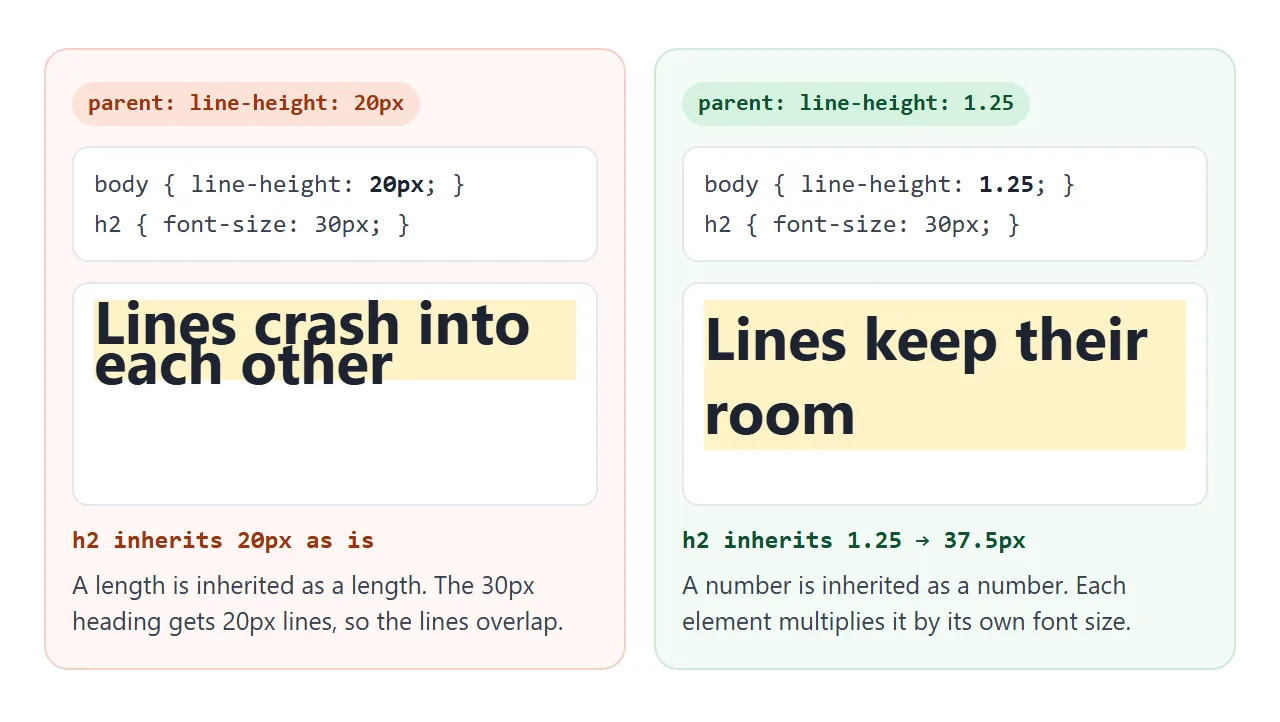
em and % do not help. They look relative, but the browser turns them into pixels on the parent, and the children inherit those pixels. Only a plain number stays relative all the way down.
Readable values for body text and headings
There is no single correct number, because fonts differ in how much room their letters take. Around 1.4 to 1.6 is common for body text. Long lines usually want the upper end, so the eye can find the start of the next line.
Headings need less. The gap grows with the font size, so 1.5 on a 40px heading makes 60px lines, 20px more than the font size.
A ratio around 1.1 to 1.3 keeps a wrapped heading reading as one unit. The h1 tag guide shows a heading styled this way.
The finished example sets all three levels. Press the button to compare it with the browser defaults.
<!doctype html>
<html lang="en">
<head>
<meta charset="utf-8">
<meta name="viewport" content="width=device-width, initial-scale=1">
<title>Readable article typography</title>
<style>
  body { margin: 0; padding: 14px; font-family: system-ui, sans-serif; background: #f4f5f7; }
  button { font: 600 14px system-ui, sans-serif; padding: 8px 14px; border-radius: 8px; border: 1px solid #c7ccd6; background: #fff; cursor: pointer; }
  article { background: #fff; padding: 4px 18px 16px; margin-top: 12px; border-radius: 10px; }
  .art { width: 100%; height: 110px; border-radius: 6px; background: linear-gradient(135deg, #bfdbfe, #fbcfe8); }

  /* "after": everything below applies only when the article has class="styled" */
  .styled { font-size: 17px; line-height: 1.6; color: #1f2937; max-width: 36em; }
  .styled h1 { font-size: 1.9em; line-height: 1.2; margin: 0.6em 0 0.3em; }
  .styled h2 { font-size: 1.3em; line-height: 1.25; margin: 1.4em 0 0.3em; }
  .styled p { margin: 0 0 1em; }
  .styled figure { margin: 1em 0; }
  .styled figcaption { font-size: 0.8em; line-height: 1.4; color: #6b7280; margin-top: 0.4em; }
</style>
</head>
<body>
<button id="toggle" aria-pressed="true">Showing: after (click for browser default)</button>

<article id="post" class="styled">
  <h1>Watering a balcony garden in summer</h1>
  <p>Pots dry out faster than garden beds. Water early in the morning, check the soil with a finger before you pour, and move the thirstiest plants out of the afternoon sun.</p>
  <figure>
    <div class="art" role="img" aria-label="Pink and blue gradient"></div>
    <figcaption>Captions are smaller, so they get a slightly tighter line height and a softer color.</figcaption>
  </figure>
  <h2>A heading that runs long enough to wrap onto a second line</h2>
  <p>Headings are big, so a ratio of 1.2 already leaves a clear gap. The body text below gets 1.6, which keeps longer paragraphs easy to follow from the end of one line to the start of the next.</p>
</article>

<script>
  const post = document.getElementById('post');
  const btn = document.getElementById('toggle');
  btn.addEventListener('click', () => {
    const on = post.classList.toggle('styled');  // remove the class = browser defaults
    btn.setAttribute('aria-pressed', on);
    btn.textContent = on ? 'Showing: after (click for browser default)' : 'Showing: browser default (click for after)';
  });
</script>
</body>
</html>
article { font-size: 17px; line-height: 1.6; max-width: 36em; }
article h1 { line-height: 1.2; }
article h2 { line-height: 1.25; }
article figcaption { font-size: 0.8em; line-height: 1.4; }
The font shorthand can set size and line height together: font: 17px/1.6 system-ui, sans-serif. The part after the slash is the line height. Font choice and the rest of the shorthand are covered in how to change the font in HTML.
Centering one line of text with line-height
An old trick centers a single line vertically: make line-height equal to the element's height. The one line box fills the element, and the text sits in the middle of it.
.btn { height: 44px; line-height: 44px; }
It breaks as soon as the text wraps. Each line is now 44px tall, so two lines need 88px and spill out of the button.
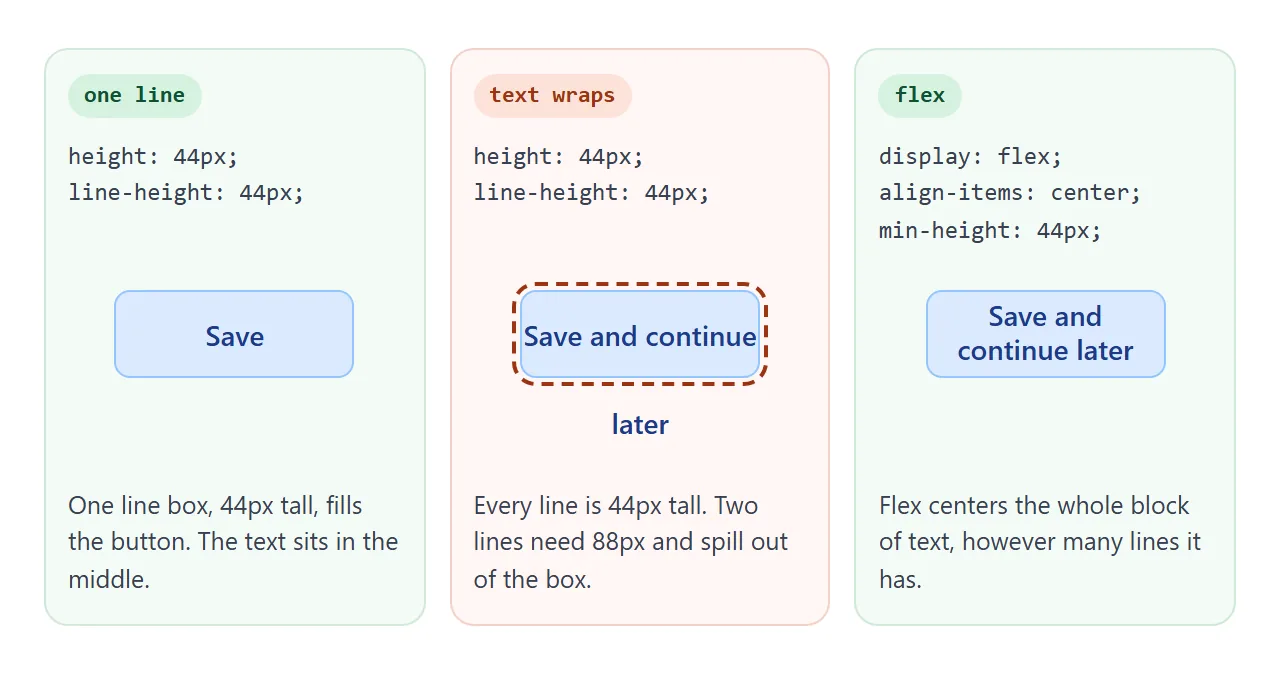
For anything that might wrap, use flex instead. It centers the whole block of text, however many lines it has. Flexbox explains the properties.
.btn {
  display: flex;
  align-items: center;
  justify-content: center;
  min-height: 44px;
  line-height: 1.2;
}
line-height on inline elements
On a <span>, <a> or <strong>, line-height behaves differently. The line box is as tall as everything in it, including an invisible starting box that carries the paragraph's own line-height. A smaller value on a span therefore cannot make its line shorter.
A larger value on a span does make that one line taller, which leaves an uneven gap in the paragraph.
Vertical padding on an inline element does not move the lines either; the background grows but may overlap the lines above and below. Set line-height on the block, such as the <p>, instead.
letter-spacing, briefly
letter-spacing controls the space between characters, not between lines. Body text usually needs none. Small positive values can help short all-caps labels.
Write it in em, such as letter-spacing: 0.05em, so it scales with the font size, for the same reason line-height works best as a number.
When it does not work
| What you see | Cause | Fix |
|---|---|---|
| Large headings have overlapping lines | A px, em or % line-height inherited from a parent | Use a unitless number on the parent |
| A span's line-height changes nothing | The paragraph's own line height sets the minimum | Set line-height on the block element |
| One line in a paragraph is taller | A span has a larger line-height or a large inline image | Remove it or set the same value on the block |
| Centered text spills out of its box | line-height equals height and the text wrapped |
Use display: flex; align-items: center |
| Text overlaps the next element or vanishes | line-height: 0 makes the box zero height; with overflow: hidden the text is clipped |
Use a positive value |
| Spacing changes when the font loads | normal depends on each font's metrics |
Set a number instead of normal |
| The value does nothing at all | A more specific rule wins, or the value is negative | Check the computed value in developer tools |
Share it as a link
Typography is easier to judge on a real screen than in a screenshot. The spacing that looks right on a laptop can feel crowded on a phone, and the person you ask needs to scroll through it at their own size.
To send the working version, paste the page into a NOS document and choose Create share link. HTML to link walks through it.
The page renders as written and its scripts run, so the people you send it to can move the sliders and flip the before and after view themselves. If you change the code later, the same link shows the new version.