Web font CSS is the @font-face rule that lets a page bring its own typeface, as a woff2 file embedded in the page or fetched from an address, instead of relying on whatever fonts the reader's machine happens to have.
It is how a brand face shows up identically everywhere, and it is also the most common reason a page arrives in a default serif: the font was referenced from a folder that did not travel.
This guide covers when a web font is worth it, the system font stack that is right for most documents, embedding as woff2 with font-display swap, and what fails.
body {
  font-family: -apple-system, "Segoe UI", Roboto, "Helvetica Neue", Arial, sans-serif;
}
That downloads nothing. Every machine matches one of those on the first or second name, and the page uses the reader's own interface typeface.
Why a system font stack is the right default for documents
Nothing to wait for. No request, no delay, no fallback flash.
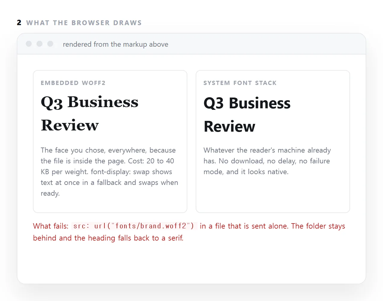
Nothing to fail. No address to go stale, no frame restriction to trip over, no offline case to worry about.
It looks native. The page uses the same typeface as the reader's system, which most people read as quality rather than as an absence of design.
For a report, dashboard, invoice or deck, that trade is almost always correct. A specific typeface matters when the page is a brand artefact; it rarely matters when the page is a working document.
When you do want a web font
@font-face {
  font-family: "Mine";
  src: url("https://example.com/mine.woff2") format("woff2");
  font-weight: 400;
  font-display: swap;
}
body { font-family: "Mine", -apple-system, sans-serif; }
Four things in that block matter.
woff2 only. It is the most compressed format and is supported by every browser worth serving. Older formats are bytes nobody needs.
font-display: swap. Text is drawn immediately in the fallback and swapped when the font arrives. Without it, browsers may hide text for up to three seconds — which looks like a page that failed to load.
A fallback in the stack. font-family: "Mine" alone falls back to a default serif if the font fails, which looks like a mistake. Name what should be used instead.
One weight per rule. Each weight is a separate file and a separate download. Four weights of one family is a large addition for little visible benefit — two is usually plenty.
The cost of loading from a font service
Convenient and it introduces a dependency. The page then works only where that service is reachable, which excludes offline machines, restrictive networks, and sandboxed frames that block outside requests.
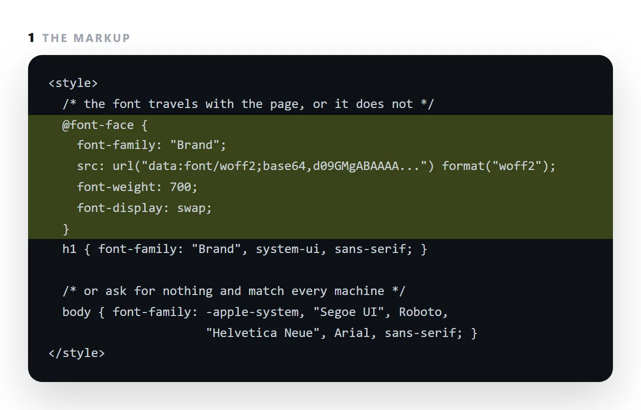
If the page has to survive being sent as a file, embed the font instead:
@font-face {
  font-family: "Mine";
  src: url("data:font/woff2;base64,d09GMgABAAAA…") format("woff2");
  font-display: swap;
}
The file gets larger by the size of the font — tens of kilobytes for a single text weight. See data URIs.
Layout shift when the font swaps
The fallback and the web font have different metrics, so text reflows when the swap happens. Two tools reduce it:
@font-face {
  font-family: "Mine";
  src: url("mine.woff2") format("woff2");
  size-adjust: 98%;           /* scale the fallback closer */
  ascent-override: 90%;       /* match the vertical metrics */
}
Or avoid the problem by choosing a fallback with similar proportions, which is easier and works everywhere.
Variable fonts
@font-face {
  font-family: "Mine";
  src: url("mine-var.woff2") format("woff2-variations");
  font-weight: 100 900;
}
One file covering every weight. Worth it if you genuinely use three or more weights — otherwise a single static weight is smaller.
The diagnosis order when text looks wrong
- Is the font named correctly, and is it a font the reader could possibly have?
- Is it referenced by a folder path that did not travel? See fonts not loading.
- Is it being requested over
httpfrom anhttpspage? That is mixed content and is blocked. - Is the page inside a frame that blocks outside requests?
All four end in the same place — the font is somewhere the page cannot reach — and all four are avoided by a system stack.
Decision table
| Situation | Use |
|---|---|
| A working document — report, dashboard, invoice | System font stack |
| A page that must work offline | System stack, or an embedded weight |
| A page rendered inside a restricted frame | System stack, or embedded |
| A branded page on your own site | A web font from your own domain |
| An email | System stack — web fonts rarely load |
| A single file sent as an attachment | System stack, or embedded |
Five of the six rows are the system stack, which is a fair summary of how often a specific typeface is worth its costs.
What it costs when it fails
| Failure | Symptom | Cause |
|---|---|---|
| Font never arrives | Fallback typeface throughout | A folder path, or a blocked request |
| Font arrives late | Text flashes and reflows | No size-adjust, or the wrong fallback |
| Text invisible briefly | Nothing renders for up to 3 seconds | font-display not set to swap |
| Works locally, not published | Fallback only | http font on an https page — mixed content |
The third row is the worst, because a blank page looks like a broken site rather than a slow font. font-display: swap costs one line and removes it.
What font-display does
While a web font downloads, the browser has to show something. font-display: swap draws the text at once in the fallback face and swaps in the real one when it arrives, so the page is readable immediately and flickers once. block hides the text for up to three seconds, which reads as a broken page on a slow connection. optional uses the font only if it is already cached.
For a document, swap is right, and choosing a fallback in the stack with similar width keeps the flicker small.
Subsetting
A full font file carries every glyph for every language it supports, often several hundred kilobytes per weight. A page in English needs a few hundred glyphs.
Subsetting tools cut the file to the characters actually used, and a subset woff2 for one weight is commonly under 20 KB, small enough to embed without thinking about it. Do it once for the brand face and keep the file with the template.
Choosing and embedding a font: 4 steps
- Decide whether the typeface is part of the message. A brand deck, yes. A weekly report, no: use the system stack and stop here.
- Convert to woff2 and keep only the weights used. Two weights at most; each is 20 to 40 KB.
- Embed it with
@font-faceandfont-display: swap. A data URI insrc, so the font travels with the file, and text shows at once in a fallback while it loads. - Check in a fresh window. If the typeface survives in a viewer that has never seen your folder, it survives for the reader. If it falls back, fonts not loading has the diagnosis.