To make text italic in HTML, wrap it in <em> or <i>, or give it font-style: italic in CSS. To make it bold, use <strong>, <b> or font-weight. The tag carries the meaning; the CSS decides the look.
Try the two CSS properties first. Switch the style and the weight, and watch both fonts.
<!doctype html>
<html lang="en">
<head>
<meta charset="utf-8">
<meta name="viewport" content="width=device-width, initial-scale=1">
<title>font-style and font-weight</title>
<style>
  body { margin: 0; padding: 14px; font-family: system-ui, sans-serif; background: #f4f5f7; color: #1d2330; }
  .bar { display: flex; flex-wrap: wrap; gap: 6px; margin-bottom: 8px; }
  button {
    font: 13px system-ui, sans-serif; padding: 6px 10px; border-radius: 8px;
    border: 1px solid #c9cdd4; background: #fff; cursor: pointer;
  }
  button[aria-pressed="true"] { background: #1d2330; color: #fff; border-color: #1d2330; }
  .sample { background: #fff; border-radius: 10px; padding: 10px 14px; margin-top: 8px; }
  .sample small { display: block; font: 12px system-ui, sans-serif; color: #6b7280; }
  .sample p { margin: 2px 0 0; font-size: 26px; }
  .serif p { font-family: Georgia, "Times New Roman", serif; }
  code { display: block; margin-top: 10px; font: 13px ui-monospace, Consolas, monospace; color: #0f5132; }
</style>
</head>
<body>
<div class="bar" id="styles">
  <button aria-pressed="true" data-v="normal">normal</button>
  <button data-v="italic">italic</button>
  <button data-v="oblique">oblique</button>
  <button data-v="oblique 30deg">oblique 30deg</button>
</div>
<div class="bar" id="weights">
  <button aria-pressed="true" data-v="400">400</button>
  <button data-v="700">700</button>
</div>

<div class="sample serif"><small>Serif (Georgia)</small><p>Rafting afloat</p></div>
<div class="sample sans"><small>Sans (system-ui)</small><p>Rafting afloat</p></div>
<code id="css"></code>

<script>
  const texts = document.querySelectorAll('.sample p');
  const css = document.getElementById('css');
  let style = 'normal', weight = '400';

  function render() {
    texts.forEach(p => { p.style.fontStyle = style; p.style.fontWeight = weight; });
    css.textContent = `p { font-style: ${style}; font-weight: ${weight}; }`;
  }

  // one pressed button per row
  function group(id, set) {
    const row = document.getElementById(id);
    row.addEventListener('click', (e) => {
      const b = e.target.closest('button');
      if (!b) return;
      row.querySelectorAll('button').forEach(x => x.setAttribute('aria-pressed', x === b));
      set(b.dataset.v);
      render();
    });
  }
  group('styles', v => style = v);
  group('weights', v => weight = v);
  render();
</script>
</body>
</html>
The short version:
- Pick the tag by meaning.
<em>for stress,<i>for a term or a foreign phrase,<cite>for a title,<strong>for importance,<b>for attention. - Or set the style in CSS. For a look with no meaning, put
font-styleorfont-weighton a class. - Load the real faces. A web font needs its italic and bold files as well.
- Decide about fake styles.
font-synthesiscontrols whether the browser fakes a missing face.
i, em, b and strong: meaning first
Four tags look alike, and each one means something different. The browser gives them a small default style, and that is all the "italic" or "bold" there is.
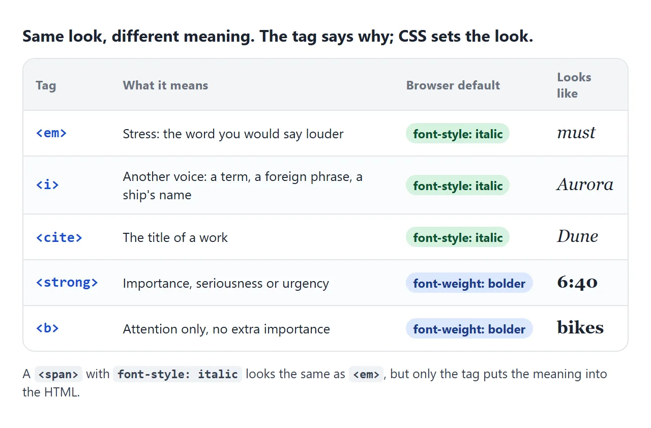
| Tag | Use it for | Default CSS |
|---|---|---|
<em> |
Stress that changes the sentence | font-style: italic |
<i> |
A term, a foreign phrase, a name | font-style: italic |
<strong> |
Importance or urgency | font-weight: bolder |
<b> |
Attention, no extra importance | font-weight: bolder |
<cite>, <dfn>, <var> and <address> are italic by default too. The meaning of each tag is covered in the em tag and the strong tag. This guide is about the CSS underneath.
font-style: italic, oblique and normal
font-style takes three values:
normalis upright text. Use it to switch italics off, for example onem.italicasks for the italic face of the font, with letters drawn for italic.obliqueasks for a slanted face and accepts an angle, such asoblique 10deg.
When a font has an italic face and no oblique one, oblique falls back to the italic face, and the two look the same. That is what the Georgia line in the example shows.
An angle only has a clear effect when the font can slant by degrees.
With Georgia, oblique 30deg drew three different results in a test across three browser engines: the italic face, upright text, and a fake slant. Use italic unless the font has a slant setting built in.
font-weight: numbers from 1 to 1000
font-weight accepts a number from 1 to 1000, or a keyword. normal is 400 and bold is 700. bolder and lighter step from the parent's weight, which is why the default for <strong> is not a fixed 700.
The number is a request. The browser picks the closest face the font actually has, following a fixed matching order.
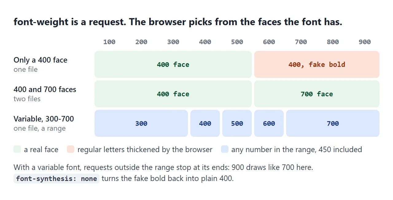
- A font with 400 and 700 faces draws 100 to 500 as regular and 600 to 900 as bold.
- A font with only a 400 face draws 600 and up as a fake bold, covered next.
- A variable font draws any number inside its range, such as 450.
Fake italic and fake bold: font-synthesis
When the face you ask for is missing, the browser may make one up. A fake italic tilts the upright letters. A fake bold thickens the regular strokes. This is called font synthesis.
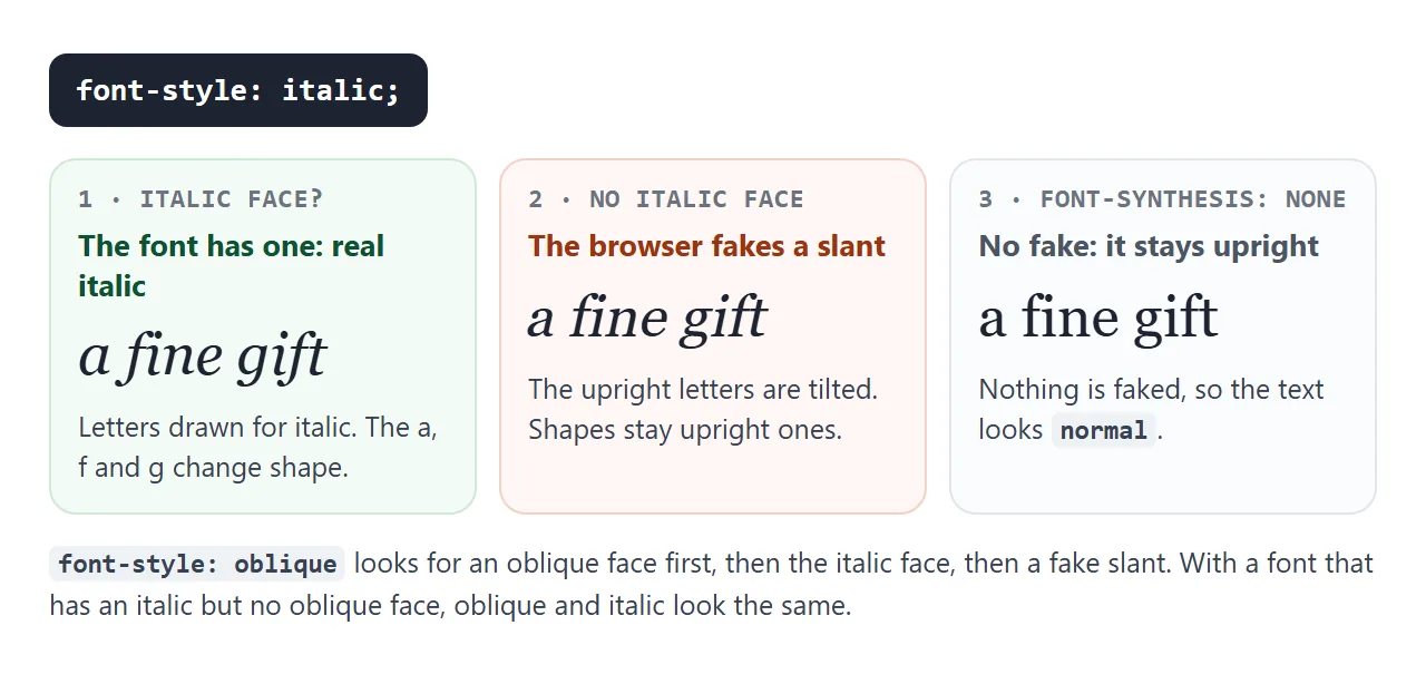
The example below loads a single upright face under a new family name, so every italic and bold in the right column has to be faked. Tick the box to switch synthesis off.
<!doctype html>
<html lang="en">
<head>
<meta charset="utf-8">
<meta name="viewport" content="width=device-width, initial-scale=1">
<title>Real and fake italic and bold</title>
<style>
  /* One upright face only, taken from a font already on the device.
     Asking this family for italic or bold makes the browser fake it. */
  @font-face {
    font-family: "Upright Only";
    src: local("Georgia"), local("Times New Roman"), local("Noto Serif"), local("DejaVu Serif");
    font-style: normal;
    font-weight: 400;
  }
  body { margin: 0; padding: 14px; font-family: system-ui, sans-serif; background: #f4f5f7; color: #1d2330; }
  .grid { display: grid; grid-template-columns: 1fr 1fr; gap: 10px; }
  .col { background: #fff; border-radius: 10px; padding: 10px 12px; }
  .col h3 { margin: 0 0 6px; font-size: 13px; }
  .col.real h3 { color: #0f5132; }
  .col.fake h3 { color: #9a3412; }
  .col p { margin: 6px 0; font-size: 24px; line-height: 1.2; }
  .col small { display: block; font: 11px system-ui, sans-serif; color: #6b7280; }
  .real p { font-family: Georgia, "Times New Roman", "Noto Serif", "DejaVu Serif", serif; }
  .fake p { font-family: "Upright Only", serif; }
  .i { font-style: italic; }
  .b { font-weight: 700; }
  body.nosynth .col p { font-synthesis: none; }  /* no fake italic, no fake bold */
  label { display: block; margin-top: 10px; font-size: 14px; }
  #status { margin: 6px 0 0; font-size: 12px; color: #6b7280; }
</style>
</head>
<body>
<div class="grid">
  <div class="col real">
    <h3>All faces installed</h3>
    <p><small>normal</small>a fine gift</p>
    <p class="i"><small>italic</small>a fine gift</p>
    <p class="b"><small>700</small>a fine gift</p>
  </div>
  <div class="col fake">
    <h3>Only the upright face</h3>
    <p><small>normal</small>a fine gift</p>
    <p class="i"><small>italic</small>a fine gift</p>
    <p class="b"><small>700</small>a fine gift</p>
  </div>
</div>
<label><input type="checkbox" id="synth"> <code>font-synthesis: none</code></label>
<p id="status"></p>

<script>
  document.getElementById('synth').addEventListener('change', (e) => {
    document.body.classList.toggle('nosynth', e.target.checked);
  });

  // Draw a line of text on a canvas and return its pixels
  const ctx = document.createElement('canvas').getContext('2d', { willReadFrequently: true });
  function ink(font) {
    ctx.clearRect(0, 0, 300, 150);
    ctx.font = font;
    ctx.fillText('a fine gift', 4, 60);
    return ctx.getImageData(0, 0, 300, 150).data.join();
  }

  // Say what this browser did with the one-face font
  const real = 'Georgia, "Times New Roman", "Noto Serif", "DejaVu Serif", serif';
  document.fonts.load('24px "Upright Only"').then((faces) => {
    const same = ink(`italic 24px "Upright Only"`) === ink(`italic 24px ${real}`);
    document.getElementById('status').textContent =
      !faces.length ? 'No matching font on this device, so both columns use the full font.'
      : same ? 'This browser found the real italic for the right column too, so both columns match.'
      : 'Right column: one upright face, so italic and bold are faked.';
  });
</script>
</body>
</html>
Spot the fake italic by the letters. In Georgia, the real italic changes the shape of a, f and g, while the fake one keeps the upright shapes and only leans. A fake bold can look smudged.
font-synthesis takes none, or a list of what the browser may fake, such as weight and style:
/* Never fake anything */
body { font-synthesis: none; }

/* Allow a fake bold, but never a fake italic */
body { font-synthesis: weight; }
With synthesis off, a missing italic stays upright and a missing bold stays regular. The better fix is to load the real faces, one @font-face rule each:
@font-face {
  font-family: "Body";
  src: url("body-bold-italic.woff2") format("woff2");
  font-weight: 700;
  font-style: italic;
}
Variable fonts: every weight in between
A variable font is one file that holds a whole range of weights. Declare the range in @font-face, and font-weight can ask for any number inside it:
@font-face {
  font-family: "Body";
  src: url("body-variable.woff2") format("woff2");
  font-weight: 300 700;
}
strong { font-weight: 650; }
A request outside the range stops at its nearest end, so 900 draws like 700 here. Prefer font-weight over font-variation-settings for weight: it still works when the page falls back to a font that is not variable. Web fonts covers loading the file.
A finished example: an emphasis style panel
This panel sets the look of strong, em, i and b in a short notice, and writes out the CSS as you go.
The line under the slider measures your device: it draws the weight on a canvas and compares the pixels with the other steps.
<!doctype html>
<html lang="en">
<head>
<meta charset="utf-8">
<meta name="viewport" content="width=device-width, initial-scale=1">
<title>Emphasis style panel</title>
<style>
  body { margin: 0; padding: 14px; font-family: system-ui, sans-serif; background: #f4f5f7; color: #1d2330; }
  .controls { display: grid; gap: 8px; font-size: 14px; }
  .controls label { display: flex; align-items: center; gap: 8px; flex-wrap: wrap; }
  input[type=range] { flex: 1; min-width: 140px; }
  #note { font-size: 12px; color: #6b7280; }

  /* The rules the panel edits, all through CSS variables */
  .article {
    --family: system-ui, sans-serif;
    --strong-weight: 700;
    --em-style: italic;
    margin-top: 12px; background: #fff; border-radius: 10px; padding: 12px 16px;
    font-family: var(--family); font-size: 17px; line-height: 1.55;
  }
  .article.nosynth { font-synthesis: none; }  /* no fake bold or italic */
  .article p { margin: 0 0 8px; }
  .article strong { font-weight: var(--strong-weight); }
  .article em { font-style: var(--em-style); }
  .article.highlight em { font-style: normal; background: linear-gradient(transparent 55%, #ffd84d 55%); }
  pre { margin: 10px 0 0; padding: 10px; border-radius: 8px; background: #1d2330; color: #d6f2df; font: 12.5px/1.5 ui-monospace, Consolas, monospace; white-space: pre-wrap; }
</style>
</head>
<body>
<div class="controls">
  <label>Font
    <select id="family">
      <option value="system-ui, sans-serif">Sans (system-ui)</option>
      <option value="Georgia, serif">Serif (Georgia)</option>
    </select>
  </label>
  <label>strong weight <input type="range" id="weight" min="100" max="900" step="50" value="700"> <output id="wout">700</output></label>
  <div id="note"></div>
  <label>em look
    <select id="em">
      <option value="italic">italic</option>
      <option value="oblique 10deg">oblique 10deg</option>
      <option value="highlight">no slant, highlight</option>
    </select>
  </label>
  <label><input type="checkbox" id="nosynth"> font-synthesis: none</label>
</div>

<div class="article" id="article">
  <p>The ferry leaves at <strong>6:40, not 7:00</strong>. You <em>must</em> have a ticket before boarding.</p>
  <p>The ship, the <i>Aurora</i>, carries <b>bikes</b> on the lower deck.</p>
</div>
<pre id="css"></pre>

<script>
  const $ = (id) => document.getElementById(id);
  const art = $('article');

  // Draw text on a canvas and return its pixels, to compare two weights
  const cv = document.createElement('canvas');
  cv.width = 320; cv.height = 50;
  const ctx = cv.getContext('2d', { willReadFrequently: true });
  function ink(weight, family) {
    ctx.clearRect(0, 0, cv.width, cv.height);
    ctx.font = `${weight} 30px ${family}`;
    ctx.fillText('Ferry 6:40 Aurora', 4, 36);
    return ctx.getImageData(0, 0, cv.width, cv.height).data.join();
  }
  // The other steps (100, 200 ... 900) that draw exactly like weight w
  function drawnLike(w, family) {
    const mine = ink(w, family);
    return [100, 200, 300, 400, 500, 600, 700, 800, 900]
      .filter(k => k != w && ink(k, family) === mine);
  }

  // [600, 800, 900] -> "600, 800 and 900"
  const list = (a) => a.length > 1 ? a.slice(0, -1).join(', ') + ' and ' + a.at(-1) : String(a[0]);

  function render() {
    const family = $('family').value, w = $('weight').value, em = $('em').value;
    const nosynth = $('nosynth').checked;
    art.style.setProperty('--family', family);
    art.style.setProperty('--strong-weight', w);
    art.style.setProperty('--em-style', em === 'highlight' ? 'normal' : em);
    art.classList.toggle('nosynth', nosynth);
    art.classList.toggle('highlight', em === 'highlight');
    $('wout').textContent = w;

    const like = drawnLike(w, family);
    $('note').textContent = like.length ? `On this device, ${w} draws exactly like ${list(like)}.`
      : w % 100 ? `On this device, ${w} is a weight of its own: the font is variable.`
      : `On this device, ${w} has a look of its own.`;

    const emRule = em === 'highlight'
      ? 'em { font-style: normal; background: linear-gradient(transparent 55%, #ffd84d 55%); }'
      : `em { font-style: ${em}; }`;
    $('css').textContent =
      `.article { font-family: ${family};${nosynth ? ' font-synthesis: none;' : ''} }\n` +
      `strong { font-weight: ${w}; }\n` + emRule;
  }

  ['family', 'weight', 'em', 'nosynth'].forEach(id => $(id).addEventListener('input', render));
  document.fonts.ready.then(render);
  render();
</script>
</body>
</html>
- On a device whose system font is variable, a weight such as 650 is a weight of its own.
- With a font that has fixed faces, 650 draws exactly like 600 or 700.
- The highlight option keeps
emmeaningful without italics, which helps in fonts where italics are hard to read.
When it does not work
| What you see | Cause | Fix |
|---|---|---|
| Italic text looks like tilted normal letters | No italic face loaded, so it is faked | Load the italic file with font-style: italic |
| Nothing turns italic | font-synthesis: none and no italic face |
Load the italic face, or allow style |
| 600 and 700 look the same | The font has no 600 face | Use a font with a 600 face, or a variable font |
| Bold looks smudged | Fake bold from a single regular face | Load the bold file |
oblique 20deg looks upright or plain italic |
The font has no slant axis | Use italic |
A strong inside light text is not bold |
bolder steps from a light parent |
Set strong { font-weight: 700; } |
| The italic web font never shows | The file did not load | See fonts not loading |
Share it as a link
Weights and italics depend on the fonts installed on each device, so a screenshot from your screen may not match what someone else sees. A link lets them open the page on their own device and try the controls.
Paste the page into a NOS document and choose Create share link. HTML to link walks through it. The page renders as written and its scripts run, so people can move the slider. Change the code later and the same link shows the new version.