Use <em> for stress emphasis: the word you would say differently if you read the sentence aloud. Where the <em> goes changes what the sentence means. Browsers show it in italics, but italics are only the default look. The tag carries the meaning.
Try it. Both panels hold the same seven words. Click a word to move the <em> onto it.
<!doctype html>
<html lang="en">
<head>
<meta charset="utf-8">
<meta name="viewport" content="width=device-width, initial-scale=1">
<title>Move the em, change the meaning</title>
<style>
body { margin: 0; padding: 14px; font-family: system-ui, sans-serif; background: #f4f5f7; color: #1d2330; }
.hint { margin: 0 0 10px; font-size: 13px; color: #5b6270; }
.row { display: grid; grid-template-columns: 1fr 1fr; gap: 12px; }
.panel { background: #fff; border-radius: 12px; padding: 14px; box-shadow: 0 4px 14px rgba(0, 0, 0, .08); }
.sentence { font: 20px/1.5 Georgia, serif; margin: 0 0 10px; }
.sentence button {
font: inherit; color: inherit; background: none; border: 0; padding: 0 1px;
cursor: pointer; border-radius: 4px;
}
.sentence button:hover { background: #eef1f5; }
.meaning { margin: 0 0 8px; font-size: 14px; }
code { display: block; font: 12px/1.4 ui-monospace, Consolas, monospace; background: #eef1f5; border-radius: 6px; padding: 6px 8px; overflow-wrap: anywhere; }
@media (max-width: 520px) { .row { grid-template-columns: 1fr; } }
</style>
</head>
<body>
<p class="hint">Click any word to put the <em> on it. Same words, different meaning.</p>
<div class="row">
<div class="panel" data-stress="I"><p class="sentence"></p><p class="meaning"></p><code></code></div>
<div class="panel" data-stress="money"><p class="sentence"></p><p class="meaning"></p><code></code></div>
</div>
<script>
const words = ['I', 'never', 'said', 'she', 'stole', 'my', 'money'];
// What a listener hears when that word is stressed
const meaning = {
I: 'Someone else said it.',
never: 'I did not say it, not once.',
said: 'I may have hinted it, but I did not say it.',
she: 'Someone else stole it.',
stole: 'She got it some other way.',
my: 'She stole someone else\'s money.',
money: 'She stole something else of mine.'
};
function render(panel) {
const stress = panel.dataset.stress;
const sentence = panel.querySelector('.sentence');
sentence.innerHTML = '';
words.forEach((w, i) => {
const b = document.createElement('button');
// The stressed word goes inside a real <em> element
if (w === stress) b.innerHTML = '<em>' + w + '</em>';
else b.textContent = w;
b.addEventListener('click', () => { panel.dataset.stress = w; render(panel); });
sentence.append(b, i < words.length - 1 ? ' ' : '.');
});
panel.querySelector('.meaning').textContent = meaning[stress];
panel.querySelector('code').textContent =
words.map(w => w === stress ? '<em>' + w + '</em>' : w).join(' ') + '.';
}
document.querySelectorAll('.panel').forEach(render);
</script>
</body>
</html>
"I never said she stole my money" is seven different claims, depending on the stressed word. Italics alone would not tell a screen reader or a search engine which one you meant. The <em> element does.
What em means, and what it does not
The HTML standard defines <em> as stress emphasis of its contents. It is for the spoken kind of stress, the one that changes the point of a sentence. It is not for making a paragraph look different or for marking a warning.
<p>Please do <em>not</em> feed the cat after midnight.</p>
For content that is important, serious or urgent, use <strong> instead. The strong tag covers that element and how it differs from <b>.
Keep <em> short. Wrapping a whole paragraph in it stresses every word, which means none of them stands out. If a block should look different, give it a class and style it.
Nesting <em> inside <em> is allowed and raises the level of stress. The browser default does not show the extra level: the inner one is simply italic again. Add a rule such as em em { font-weight: 600; } if the difference should be visible.
em vs i vs cite
Three elements are italic by default, and each means something else. Pick by meaning, then change the look with CSS if needed.
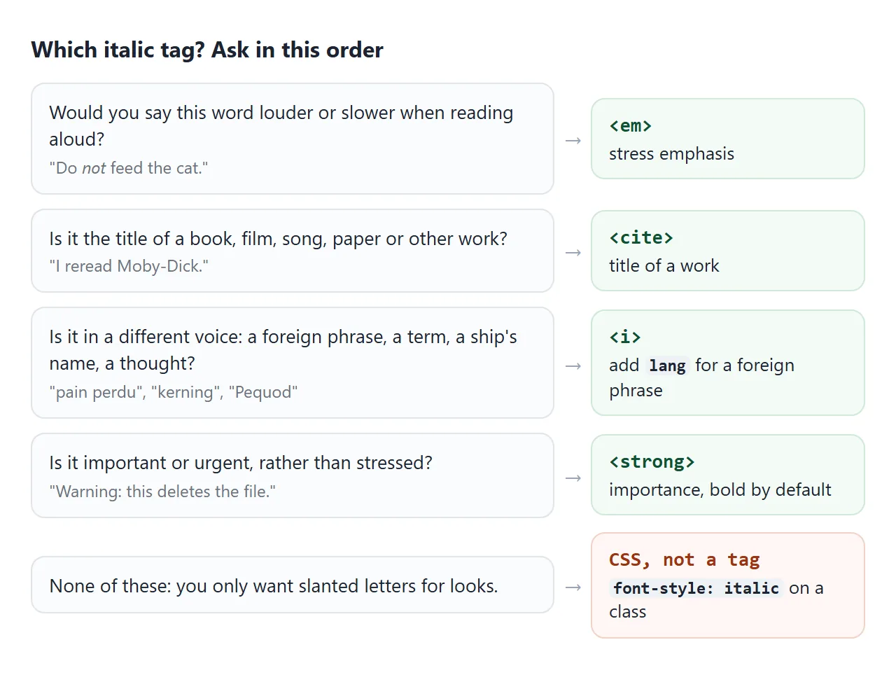
| Tag | Means | Example |
|---|---|---|
<em> |
Stress that changes the meaning | Do not feed the cat. |
<i> |
A different voice or mood | A foreign phrase, a term, a ship's name, a thought |
<cite> |
The title of a work | A book, film, song, painting or paper |
<span lang> |
Only the language, no voice change | A foreign place name set upright |
<i> is not an old presentational tag to avoid. The standard gives it a meaning: text set off from the normal prose. For a phrase in another language, add lang so screen readers and spell checkers treat it correctly.
<p>The menu called it <i lang="fr">pain perdu</i>, which is French toast.</p>
<p>I reread <cite>Moby-Dick</cite> last winter.</p>
<cite> is for the title of a work, not for the person who wrote it. To quote a longer passage from that work, the blockquote tag shows how to pair the quote with its source.
The next example lists all four. Tick Remove default styles and every line goes upright. Tick Outline the elements and you can see the tags are all still there.
<!doctype html>
<html lang="en">
<head>
<meta charset="utf-8">
<meta name="viewport" content="width=device-width, initial-scale=1">
<title>em vs i vs cite vs span</title>
<style>
body { margin: 0; padding: 14px; font-family: system-ui, sans-serif; background: #f4f5f7; color: #1d2330; }
.controls { display: flex; flex-wrap: wrap; gap: 8px 18px; margin-bottom: 10px; font-size: 14px; }
ul { list-style: none; margin: 0; padding: 0; display: grid; gap: 6px; }
li { display: grid; grid-template-columns: 118px 1fr; gap: 10px; align-items: baseline;
background: #fff; border-radius: 10px; padding: 7px 12px; }
.tag { font: 600 12px/1.3 ui-monospace, Consolas, monospace; color: #0f5132; }
.tag small { display: block; font: 12px system-ui, sans-serif; color: #5b6270; }
li p { margin: 0; font: 16px/1.4 Georgia, serif; }
/* "Remove default styles": the tags keep their meaning, only the look goes */
.plain em, .plain i, .plain cite { font-style: normal; }
/* "Outline the elements": shows the tags are still there */
.outline em, .outline i, .outline cite, .outline span[lang] {
outline: 2px dashed #2563eb; outline-offset: 1px; border-radius: 2px;
}
@media (max-width: 460px) {
body { padding: 10px; }
li { grid-template-columns: 1fr; gap: 0; padding: 6px 10px; }
.tag small { display: inline; margin-left: 6px; }
}
</style>
</head>
<body>
<div class="controls">
<label><input type="checkbox" id="plain"> Remove default styles</label>
<label><input type="checkbox" id="outline"> Outline the elements</label>
</div>
<ul id="list">
<li><span class="tag"><em><small>stress</small></span>
<p>Please do <em>not</em> feed the cat after midnight.</p></li>
<li><span class="tag"><i lang><small>foreign phrase</small></span>
<p>The menu called it <i lang="fr">pain perdu</i>, which is French toast.</p></li>
<li><span class="tag"><i><small>technical term</small></span>
<p>The space between two letters is adjusted by <i>kerning</i>.</p></li>
<li><span class="tag"><i><small>ship name</small></span>
<p>Ishmael signs on to the whaler <i>Pequod</i>.</p></li>
<li><span class="tag"><i><small>thought</small></span>
<p><i>Did I lock the door?</i> she wondered on the bus.</p></li>
<li><span class="tag"><cite><small>title of a work</small></span>
<p>I reread <cite>Moby-Dick</cite> last winter.</p></li>
<li><span class="tag"><span lang><small>language only</small></span>
<p>The team met in <span lang="de">München</span> in March.</p></li>
</ul>
<script>
const list = document.getElementById('list');
document.getElementById('plain').addEventListener('change', (e) => {
list.classList.toggle('plain', e.target.checked);
});
document.getElementById('outline').addEventListener('change', (e) => {
list.classList.toggle('outline', e.target.checked);
});
</script>
</body>
</html>
In Chromium, the accessibility tree reports <em> with the role emphasis. <i> and <cite> are exposed as plain text containers. The choice of tag is data that software can read. The italic look is only a default.
Italic, oblique and fake italics
CSS has three values for font-style: normal, italic and oblique. The difference shows when the font has its own italic face.
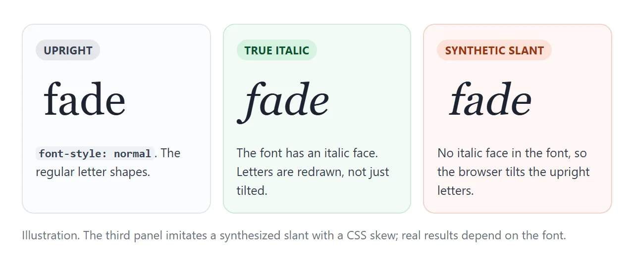
italicasks for the font's italic face, with letter shapes drawn for it.obliqueasks for a slanted face. You can give an angle, such asoblique 10deg.- If the font has neither face, the browser may synthesize a slant by tilting the upright letters.
A synthesized slant often looks wrong next to real italics: the letters keep their upright shapes and only lean. The fix is to load the italic file of the font as well, with its own @font-face rule and font-style: italic.
@font-face {
  font-family: "Body";
  src: url("body-italic.woff2") format("woff2");
  font-style: italic;
}
To stop the browser from faking it, set font-synthesis: none. Text with no italic face then stays upright, so you would style emphasis another way. Fonts not loading in HTML helps when the italic file itself does not arrive.
Styling emphasis without italics
Italics are hard to read in some fonts and at small sizes, and some scripts do not use them at all. You can change how <em> looks and keep its meaning.
/* A marker-style highlight */
.review em {
  font-style: normal;
  background: linear-gradient(transparent 50%, #ffd84d 50%);
}

/* Or a colour and weight */
.notes em { font-style: normal; font-weight: 600; color: #b42318; }
Scope the rule with a class, as above, so titles and foreign phrases elsewhere keep their italics. Colour alone is a weak signal for readers who cannot tell the colours apart, so pair it with weight or a background.
Icon fonts and the i tag
Many icon font libraries use an empty <i> as the icon holder, with a class that draws the glyph through CSS. It is a convention, not what <i> means in the standard.
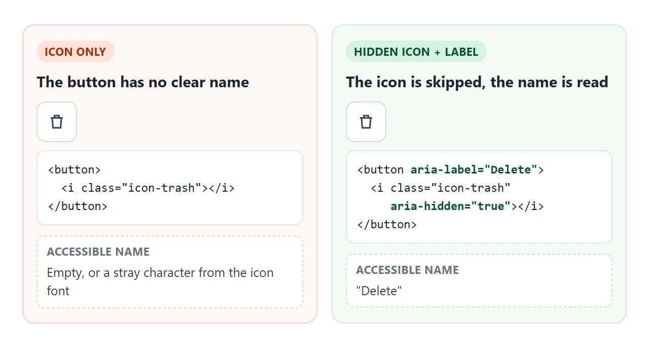
If the icon is inside a button or link, hide the icon and name the control:
<button aria-label="Delete">
  <i class="icon-trash" aria-hidden="true"></i>
</button>
Visible text next to the icon works as well, and then aria-label is not needed. aria-label explains when a label is the right tool.
A finished example: a book review
A short review uses all three elements: <cite> for the book, <i> for the ship's name and a French phrase, and <em> for the two stressed words. The buttons swap the look of <em> only.
<!doctype html>
<html lang="en">
<head>
<meta charset="utf-8">
<meta name="viewport" content="width=device-width, initial-scale=1">
<title>Book review with em, i and cite</title>
<style>
  body { margin: 0; padding: 14px; font-family: system-ui, sans-serif; background: #f4f5f7; color: #1d2330; }
  .controls { display: flex; flex-wrap: wrap; gap: 6px; align-items: center; margin-bottom: 12px; font-size: 14px; }
  .controls button { font: inherit; padding: 5px 10px; border: 1px solid #c9cdd4; border-radius: 99px; background: #fff; cursor: pointer; }
  .controls button[aria-pressed="true"] { background: #1d2330; color: #fff; border-color: #1d2330; }
  .review { background: #fff; border-radius: 12px; padding: 16px 18px; box-shadow: 0 4px 14px rgba(0, 0, 0, .08); max-width: 560px; }
  .review h2 { margin: 0 0 2px; font: 700 20px/1.3 Georgia, serif; }
  .review .by { margin: 0 0 10px; font-size: 13px; color: #5b6270; }
  .review p { font: 16px/1.6 Georgia, serif; margin: 0 0 10px; }

  /* Titles and foreign words stay italic (the browser default) */

  /* Emphasis styles, chosen by the buttons */
  .review.highlight em {
    font-style: normal;
    background: linear-gradient(transparent 50%, #ffd84d 50%);
  }
  .review.colour em { font-style: normal; font-weight: 600; color: #b42318; }
</style>
</head>
<body>
<div class="controls" id="controls">
  Stress style:
  <button type="button" data-style="" aria-pressed="true">Italic (default)</button>
  <button type="button" data-style="highlight" aria-pressed="false">Highlight</button>
  <button type="button" data-style="colour" aria-pressed="false">Colour</button>
</div>

<article class="review" id="review">
  <h2><cite>Moby-Dick</cite>, again</h2>
  <p class="by">Herman Melville, 1851</p>
  <p>
    The opening line is famous. Less famous: the <i>Pequod</i>
    does not sail until chapter 22. This is a book about a whale,
    but it is <em>also</em> a book about everything a whale touches.
  </p>
  <p>
    The chapters on rope, oil and anatomy read like a
    <i lang="fr">catalogue raisonné</i> of the whaling trade. Do <em>not</em> skip
    them. They are what makes the last hundred pages land.
  </p>
</article>

<script>
  const review = document.getElementById('review');
  const buttons = document.querySelectorAll('#controls button');
  buttons.forEach((btn) => {
    btn.addEventListener('click', () => {
      // Only the look of <em> changes; the markup stays the same
      review.className = 'review ' + btn.dataset.style;
      buttons.forEach((b) => b.setAttribute('aria-pressed', b === btn));
    });
  });
</script>
</body>
</html>
- Titles:
<cite>Moby-Dick</cite>, even inside a heading. - Different voice:
<i>Pequod</i>for the ship,<i lang="fr">for the French phrase. - Stress:
<em>also</em>and<em>not</em>, restyled with one class on the article.
When it does not work
| What you see | Cause | Fix |
|---|---|---|
| em text is not italic | A reset or theme sets font: inherit or font-style: normal on it |
Add em { font-style: italic; } after the reset |
| The italic looks like tilted upright letters | The font has no italic face, so the browser synthesized one | Load the italic file with font-style: italic in @font-face |
| Italics disappeared after adding a web font | Only the regular file of the font is loaded, and synthesis is off | Load the italic file, or remove font-synthesis: none |
| A screen reader reads a stray character on a button | An icon font <i> is exposed |
aria-hidden="true" on the icon, a name on the button |
| A whole paragraph is italic and nothing stands out | <em> wraps the paragraph |
Use a class for the block, <em> for the stressed words |
| Nested em looks the same as the outer em | The default style is italic at every level | Add em em { font-weight: 600; } or similar |
Share it as a link
A change in stress is easier to show than to describe. A screenshot shows one version of the sentence, and the person you send it to cannot move the <em> or switch the styles.
To send the working version, paste the page into a NOS document and choose Create share link. HTML to link walks through it.
The page renders as written and its scripts run, so people can click the words and toggles themselves. If you change the code later, the same link shows the new version.