font-variation-settings sets the axes of a variable font by four-letter tag: "wght" for weight, "wdth" for width, and so on. Each axis is a number range, so you can ask for weight 350 or width 82, not only the few styles a static font ships.
h1 { font-variation-settings: "wght" 650, "wdth" 85; }
Try it with a font already on the computer. Drag the two sliders and watch the CSS line change.
<!doctype html>
<html lang="en">
<head>
<meta charset="utf-8">
<meta name="viewport" content="width=device-width, initial-scale=1">
<title>font-variation-settings sliders</title>
<style>
  /* Give the installed variable font a name of our own.
     local() reads it from this device, nothing is downloaded. */
  @font-face {
    font-family: "Axis Sans";
    src: local("Bahnschrift");
    font-weight: 300 700;    /* the font's wght range */
    font-stretch: 75% 100%;  /* the font's wdth range */
  }
  body {
    margin: 0; padding: 16px;
    font-family: system-ui, sans-serif; background: #f4f5f7; color: #1d2330;
  }
  .sample {
    font-family: "Axis Sans", system-ui, sans-serif;
    font-size: clamp(40px, 12vw, 64px); line-height: 1.1;
    margin: 0 0 14px; white-space: nowrap;
    font-variation-settings: "wght" 400, "wdth" 100;
  }
  label { display: grid; grid-template-columns: 70px 1fr 44px; align-items: center; gap: 8px; font-size: 14px; margin: 6px 0; }
  input { width: 100%; }
  code { display: block; margin-top: 12px; padding: 8px 10px; border-radius: 8px; background: #fff; font: 13px ui-monospace, Consolas, monospace; }
  #status { font-size: 12px; color: #5b6270; margin: 10px 0 0; }
</style>
</head>
<body>
<p class="sample" id="sample">Variable</p>

<label>wght <input type="range" id="wght" min="300" max="700" value="400"> <span id="wghtOut">400</span></label>
<label>wdth <input type="range" id="wdth" min="75" max="100" value="100"> <span id="wdthOut">100</span></label>

<code id="css">font-variation-settings: "wght" 400, "wdth" 100;</code>
<p id="status">Checking for the font...</p>

<script>
  const sample = document.getElementById('sample');
  const wght = document.getElementById('wght');
  const wdth = document.getElementById('wdth');

  function update() {
    const value = `"wght" ${wght.value}, "wdth" ${wdth.value}`;
    sample.style.fontVariationSettings = value;  // one property holds every axis
    document.getElementById('wghtOut').textContent = wght.value;
    document.getElementById('wdthOut').textContent = wdth.value;
    document.getElementById('css').textContent = `font-variation-settings: ${value};`;
  }
  wght.addEventListener('input', update);
  wdth.addEventListener('input', update);

  // Did local("Bahnschrift") find a font on this device?
  document.fonts.load('40px "Axis Sans"')
    .then((faces) => faces.length > 0)
    .catch(() => false)  // a missing local() font rejects
    .then((found) => {
      document.getElementById('status').textContent = found
        ? 'Bahnschrift found on this device. Drag the sliders.'
        : 'Bahnschrift is not on this device (it comes with Windows), so the text will not change.';
    });
</script>
</body>
</html>
The example needs Bahnschrift, which Windows includes. On a device without it, the status line says so and the text stays still. This guide uses installed fonts only; for loading your own font file, see web fonts in CSS.
The five registered axes, and the property for each
Five axes have lowercase tags defined by the OpenType format. Each has a regular CSS property that sets it, and that property is the better tool whenever it exists.
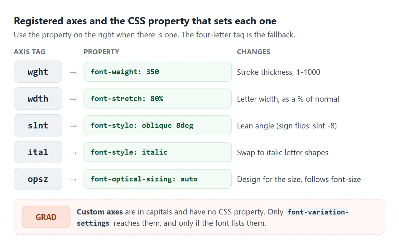
| Axis | Property | Example |
|---|---|---|
wght weight |
font-weight |
font-weight: 350 |
wdth width |
font-stretch |
font-stretch: 80% |
slnt slant |
font-style: oblique |
oblique 8deg |
ital italic |
font-style: italic |
font-style: italic |
opsz optical size |
font-optical-sizing |
auto (the default) |
The regular properties inherit one by one and fall back gracefully. If the font has no weight axis, font-weight: 350 still picks a close weight that it has. font-variation-settings has no fallback: an axis the font lacks is simply ignored.
A few details for each:
- wght:
font-weighttakes any number from 1 to 1000, not only the hundreds. - wdth:
font-stretchtakes a percentage. The keywords map to fixed values, socondensedis 75% andsemi-condensedis 87.5%. - slnt:
oblique 8degleans the text 8 degrees forward. The axis counts the other way, so the same lean is"slnt" -8. - ital: a separate set of italic letter shapes, switched on by
font-style: italic.
Values outside the font's range are clamped. With Bahnschrift, "wght" 900 renders exactly like "wght" 700, its maximum.
Using a font that is already installed
A variable font on the reader's device costs nothing to load. In our tests on Windows, the way you name it decided whether the axes worked.
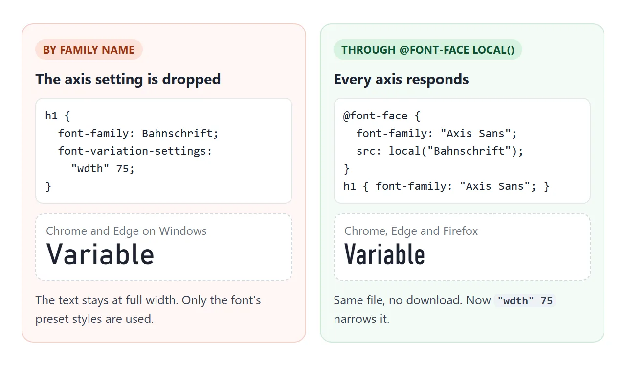
With font-family: Bahnschrift, Chrome and Edge ignored font-variation-settings entirely, and font-stretch: 80% snapped to one of the font's preset styles. Firefox applied both. Giving the font a new name with @font-face and src: local() made every axis respond in all three:
@font-face {
  font-family: "Axis Sans";
  src: local("Bahnschrift");   /* installed font, no download */
  font-weight: 300 700;        /* the wght range it covers */
  font-stretch: 75% 100%;      /* the wdth range it covers */
}
h1 { font-family: "Axis Sans", system-ui, sans-serif; }
The two range lines declare that this single face covers every weight and width in between, so the browser uses it across that whole range.
When the font is missing, local() finds nothing and the next family in the list is used.
To detect it in script, use document.fonts.load(). For a missing local() font it rejected in Chrome, Edge and Firefox, and the examples here use that for their status line.
Windows 11, where these examples were tested, includes Bahnschrift (weight and width), Segoe UI Variable (weight and optical size) and Sitka (optical size and weight).
Other systems have other fonts, so always end the list with system-ui or a generic family. For picking fallbacks, see the HTML font family list.
Optical size: font-optical-sizing
Type designed for 10px needs wider letters and sturdier strokes. Type at 60px looks better finer and tighter. The opsz axis holds both designs, and font-optical-sizing: auto makes the browser pick the point that matches the font size.
<!doctype html>
<html lang="en">
<head>
<meta charset="utf-8">
<meta name="viewport" content="width=device-width, initial-scale=1">
<title>font-optical-sizing: auto vs none</title>
<style>
  /* Sitka is a serif with an opsz (optical size) axis. local() = from this device. */
  @font-face {
    font-family: "Optical Serif";
    src: local("Sitka Text");
    font-weight: 400 700;
  }
  body {
    margin: 0; padding: 16px;
    font-family: system-ui, sans-serif; background: #f4f5f7; color: #1d2330;
  }
  .row { background: #fff; border-radius: 10px; padding: 8px 12px 10px; margin-bottom: 10px; overflow: hidden; }
  .row small { display: block; font: 12px ui-monospace, Consolas, monospace; color: #5b6270; }
  .text { font-family: "Optical Serif", Georgia, serif; font-size: 44px; line-height: 1.15; white-space: nowrap; }
  .auto { font-optical-sizing: auto; }  /* the default: opsz follows font-size */
  .none { font-optical-sizing: none; }  /* opsz stays at the font's default */
  label { display: grid; grid-template-columns: 80px 1fr 48px; align-items: center; gap: 8px; font-size: 14px; }
  input { width: 100%; }
  #status { font-size: 12px; color: #5b6270; margin: 8px 0 0; }
</style>
</head>
<body>
<label>font-size <input type="range" id="size" min="10" max="72" value="44"> <span id="sizeOut">44px</span></label>

<div class="row"><small>font-optical-sizing: auto</small><div class="text auto">Legible</div></div>
<div class="row"><small>font-optical-sizing: none</small><div class="text none">Legible</div></div>
<p id="status">Checking for the font...</p>

<script>
  const size = document.getElementById('size');
  size.addEventListener('input', () => {
    document.querySelectorAll('.text').forEach((el) => { el.style.fontSize = size.value + 'px'; });
    document.getElementById('sizeOut').textContent = size.value + 'px';
  });

  document.fonts.load('40px "Optical Serif"')
    .then((faces) => faces.length > 0)
    .catch(() => false)  // a missing local() font rejects
    .then((found) => {
      document.getElementById('status').textContent = found
        ? 'Sitka found. Above 11px (its default optical size) auto draws finer, tighter letters as the size grows. At 11px the lines match.'
        : 'Sitka is not on this device (it comes with Windows), so both lines look the same.';
    });
</script>
</body>
</html>
At 72px, the word measured 194px wide with auto and 244px with none. At 11px, Sitka's default optical size, both lines matched. Since auto is already the default, you rarely write it. Use none when you want one fixed design at every size.
To force a value, set the tag directly:
.caption { font-variation-settings: "opsz" 8; }
Custom axes and the override trap
Fonts can define their own axes with capital-letter tags, such as GRAD for grade, a weight change that keeps letter widths the same. No CSS property reaches them, so font-variation-settings is the only way.
The catch is that the property holds one list. A child's list replaces its parent's list, so axes set higher up are lost.
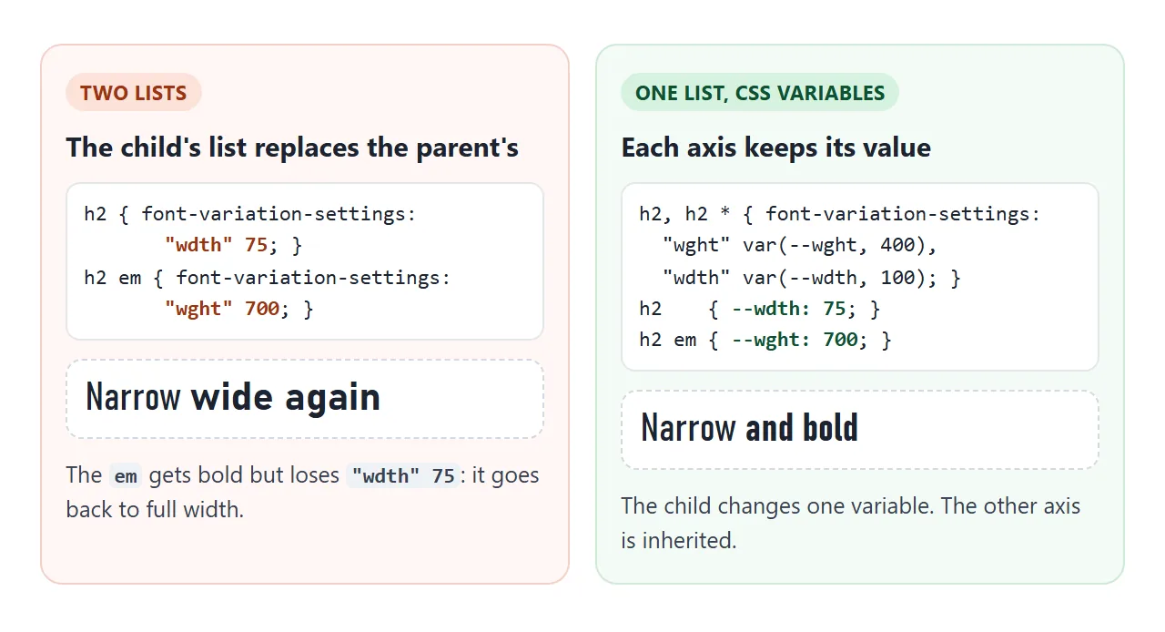
The fix is one rule that lists every axis, reading each value from a CSS variable:
h2, h2 * {
  font-variation-settings:
    "wght" var(--wght, 400),
    "wdth" var(--wdth, 100);
}
h2    { --wdth: 75; }
h2 em { --wght: 700; }
The rule has to match the children too (h2 *), because an inherited font-variation-settings arrives already filled in. font-feature-settings has the same one-list behaviour, covered in font feature settings.
When both are present, font-variation-settings wins. With font-weight: 300 and "wght" 700 on the same element, the text rendered at 700.
Animating the weight
A variable font can change weight smoothly. The simplest way is a transition or keyframes on font-weight, which is a number and interpolates:
.tab { font-weight: 350; transition: font-weight .25s; }
.tab:hover { font-weight: 700; }
font-variation-settings animates too, as long as both states list the same axes. When one keyframe listed an extra axis, all three browsers we tested jumped straight to the end value at the halfway point instead of gliding.
Bold text is usually wider, so a tab that gets bolder pushes the next tab along. Reserve the bold width with an invisible bold copy of the label:
.tab { display: inline-flex; flex-direction: column; }
.tab::after {
  content: attr(data-label); font-weight: 700;
  height: 0; overflow: hidden; visibility: hidden;
}
<!doctype html>
<html lang="en">
<head>
<meta charset="utf-8">
<meta name="viewport" content="width=device-width, initial-scale=1">
<title>Animating font weight</title>
<style>
  @font-face {
    font-family: "UI Var";
    src: local("Segoe UI Variable Text"), local("Segoe UI Variable");
    font-weight: 300 700;
  }
  body {
    margin: 0; padding: 16px;
    font-family: "UI Var", system-ui, sans-serif; background: #f4f5f7; color: #1d2330;
  }
  nav { display: flex; flex-wrap: wrap; gap: 4px; background: #fff; border-radius: 12px; padding: 6px; }
  .tab {
    border: 0; background: none; padding: 10px 12px; border-radius: 8px;
    font: inherit; font-size: 17px; font-weight: 350; color: inherit; cursor: pointer;
    transition: font-weight .25s ease;  /* weight is a number, so it animates smoothly */
  }
  .tab:hover, .tab:focus-visible, .tab[aria-current] { font-weight: 700; background: #eef1f5; }

  /* Reserve the bold width: an invisible bold copy of the label sets the size. */
  .reserve .tab { display: inline-flex; flex-direction: column; align-items: center; }
  .reserve .tab::after {
    content: attr(data-label); font-weight: 700;
    height: 0; overflow: hidden; visibility: hidden;
  }

  .pulse { font-size: 34px; margin: 22px 0 6px; animation: breathe 1.6s ease-in-out infinite alternate; }
  @keyframes breathe { from { font-weight: 300; } to { font-weight: 700; } }
  @media (prefers-reduced-motion: reduce) { .pulse { animation: none; } .tab { transition: none; } }

  label { font-size: 14px; display: block; margin: 12px 0 0; }
  #status { font-size: 12px; color: #5b6270; margin: 6px 0 0; }
</style>
</head>
<body>
<nav id="nav" class="reserve">
  <button class="tab" data-label="Home" aria-current="page">Home</button>
  <button class="tab" data-label="Pricing">Pricing</button>
  <button class="tab" data-label="Docs">Docs</button>
  <button class="tab" data-label="Contact">Contact</button>
</nav>
<label><input type="checkbox" id="reserve" checked> Reserve the bold width (untick, then hover a tab)</label>

<p class="pulse">Loading</p>
<p id="status">Checking for the font...</p>

<script>
  const nav = document.getElementById('nav');
  document.getElementById('reserve').addEventListener('change', (e) => {
    nav.classList.toggle('reserve', e.target.checked);
  });
  // Clicking a tab makes it the current one.
  nav.addEventListener('click', (e) => {
    const tab = e.target.closest('.tab');
    if (!tab) return;
    nav.querySelectorAll('.tab').forEach((t) => t.removeAttribute('aria-current'));
    tab.setAttribute('aria-current', 'page');
  });

  document.fonts.load('17px "UI Var"')
    .then((faces) => faces.length > 0)
    .catch(() => false)  // a missing local() font rejects
    .then((found) => {
      document.getElementById('status').textContent = found
        ? 'Using Segoe UI Variable from this device.'
        : 'Segoe UI Variable is not on this device, so your system font is used. If it has several weights but no weight axis, the text steps between them instead of gliding.';
    });
</script>
</body>
</html>
In the example with Segoe UI Variable, hovering Pricing without the reserved width moved the next tab by 6.9px; with it, by 0. The Loading line runs a looping keyframes animation on font-weight, switched off under prefers-reduced-motion.
The text is laid out again on each frame of a weight animation. For a few labels that is fine. For long paragraphs, prefer a short transition on hover over a constant loop.
When it does not work
| What you see | Cause | Fix |
|---|---|---|
| No axis changes anything | The font is not variable, or lacks that axis | Check the axes, or use font-weight for a fallback |
| Works in Firefox, not in Chrome | The system font is named directly in font-family |
Declare it with @font-face and src: local() |
| A custom axis is ignored | Tag in the wrong case, or not exactly four characters | Copy the tag from the font, for example "GRAD" |
| Weight stops at a limit | The value is outside the font's range | Stay inside the range, values are clamped |
| A child loses the parent's width or slant | Its own list replaced the whole list | One rule with CSS variables for each axis |
font-weight has no effect |
font-variation-settings sets "wght" too |
Remove "wght" from the list |
| The animation jumps | The two states list different axes | List the same axes in both, or animate font-weight |
| Neighbours shift on hover | Bold text is wider | Reserve the bold width with a hidden copy |
Share it as a link
Type is easier to judge on a live page than in a screenshot. A shared page lets the other person drag the sliders and hover the tabs, on their own device and with the fonts they have.
To send it, paste the page into a NOS document and choose Create share link. HTML to link walks through it.
The page renders as written and its scripts run, so the examples above work there too. If you change the code later, the same link shows the new version.