To control HTML table column width reliably, set table-layout: fixed on the table and declare the widths in a <colgroup>.
<table>
  <colgroup>
    <col style="width: 34%">
    <col style="width: 22%">
    <col style="width: 22%">
    <col style="width: 22%">
  </colgroup>
  <thead>...</thead>
  <tbody>...</tbody>
</table>
table { table-layout: fixed; width: 100%; }
td, th { overflow-wrap: anywhere; }
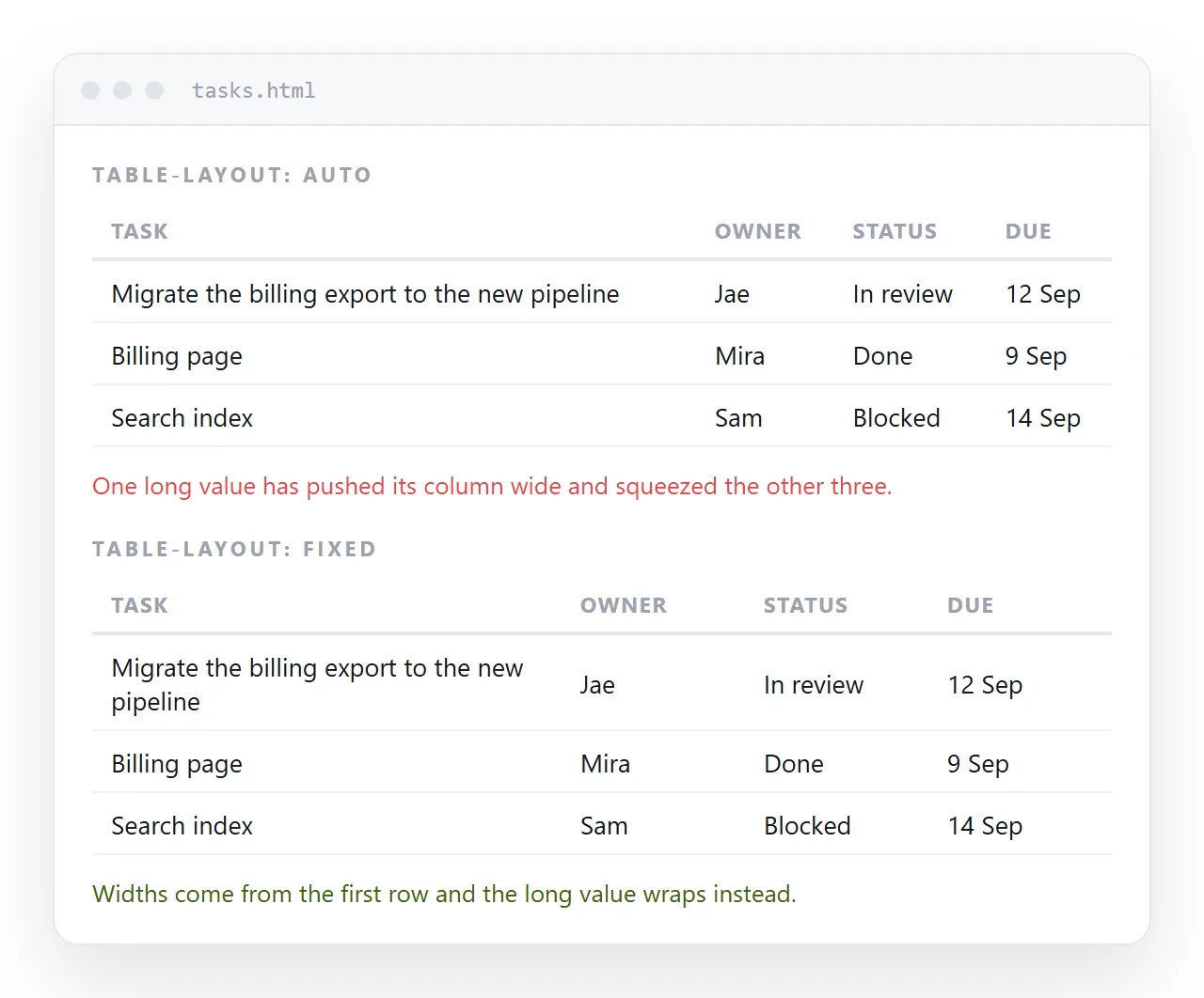
Without table-layout: fixed, a width on a cell is a suggestion the browser is free to overrule, and it usually does.
Why the default ignores you
The default is table-layout: auto. Under it the browser reads every cell in the table, works out the widest content each column must hold, and distributes the available space around that.
Your declared width joins the calculation as one input. A single long unbroken value in row forty outranks it, because the algorithm will not break that value if it can avoid it.
This is not a bug. Auto layout exists so a table with unknown content still looks sensible. It is the wrong tool once you know what the columns hold.
What fixed layout changes
auto |
fixed |
|
|---|---|---|
| Reads which rows | All of them | The first row, plus colgroup |
| Your widths | A hint | Authoritative |
| Long values | Widen the column | Wrap or overflow |
| Rendering | Table measured in full first | Draws as it streams |
Needs width on the table |
No | Yes, usually 100% |
Fixed layout needs a width on the table itself. Without one, the table falls back to shrinking around its content and the whole point is lost.
Where to declare the widths
Three places work. They are not equally maintainable.
<colgroup>with one<col>per column. All widths in one block at the top of the table. Change one number and the whole column moves. This is the version to use.- On the header cells.
th:nth-child(2) { width: 22%; }in the stylesheet. Fine, but the widths end up away from the markup. - On every cell. Repeats the same value down the column and drifts the moment someone edits one row. Avoid.
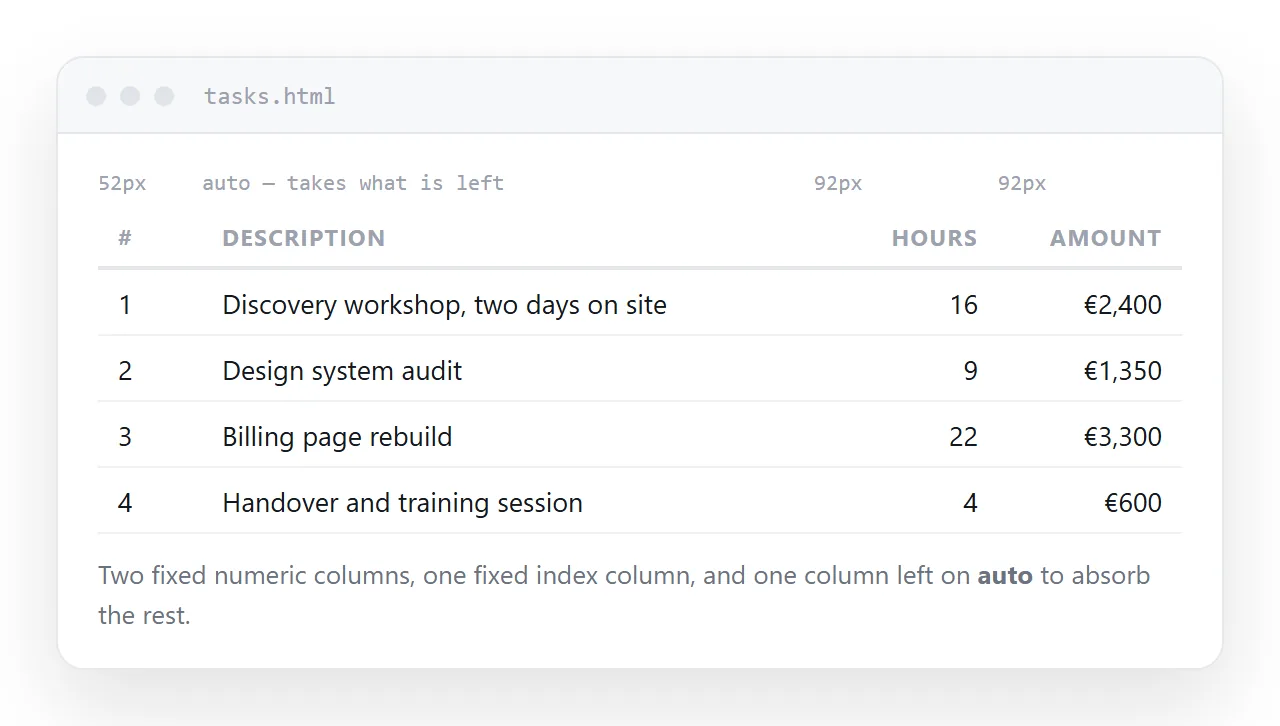
Under fixed layout you only need widths on enough columns to constrain the table. Leave one column without a width and it absorbs whatever is left.
Percentages, pixels, or both
Percentages let the table follow the screen, which matters because most readers are not on your monitor.
Pixels are right for columns with a known, small content: a checkbox, a status dot, a two digit rank. Mixing is normal.
col:nth-child(1) { width: 48px; }
col:nth-child(2) { width: auto; }
col:nth-child(3) { width: 120px; }
The auto column takes the remainder. One flexible column per table is usually the cleanest arrangement.
Stopping a long value from breaking the layout
Under fixed layout a long unbroken string, a URL or an identifier, will overflow its cell rather than widen it. Three ways to handle it.
- Wrap it.
overflow-wrap: anywherebreaks the string at the column edge. The safe default. - Clip it.
overflow: hidden; text-overflow: ellipsis; white-space: nowrap;shows one line with a trailing ellipsis. Good for identifiers nobody reads in full. - Give it room. Widen that column and narrow another. Sometimes the content is telling you the layout is wrong.
Column width on a narrow screen
Below about 600 pixels a five column table has nothing good to do with percentages. Each column gets too little room and every cell wraps to four lines.
At that point the answer is not a width. It is either a scrolling wrapper, so the columns keep their real widths and the table moves sideways, or a stacked layout where each row becomes a small block.
Overflow scroll covers the first, and responsive tables covers the choice between them. If you scroll, a sticky first column keeps the row labels in view.
Widths and borders
Under box-sizing: border-box, a declared width includes padding and border, which is what you want in a table. Under the default content-box it does not, and a column with generous padding ends up wider than the number you wrote.
Set it once for the page:
*, *::before, *::after { box-sizing: border-box; }
Box sizing goes through the difference, and border collapse covers how the borders themselves are counted.
Checking and sharing the result
Column widths are the part of a table most likely to change when it lands inside someone else's stylesheet, because a padding value two levels up can alter every measurement.
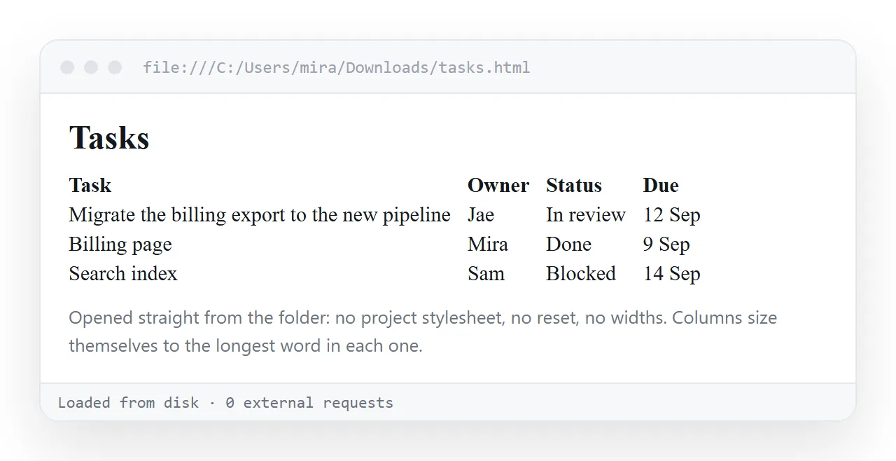
Open the file in the HTML file opener to see it with nothing inherited. Then narrow the window until the table is at phone width and check it again.
To hand it over, paste the HTML into a NOS document. It renders as written, at an address of its own.
Share, then Share link, then Create link produces a link that opens in one click. Editing a value later keeps the same address, so the link you sent stays current.