The <caption> tag gives an HTML table its title. Put it straight after <table>, as the first child. The browser draws it above the table, and screen readers read it as the table's name.
Next to it sit <colgroup> and <col>, which style whole columns at once.
<table>
  <caption>Opening hours, Main Street branch</caption>
  <colgroup>
    <col>
    <col class="times" span="2">
  </colgroup>
  <thead>
    <tr><th>Day</th><th>Opens</th><th>Closes</th></tr>
  </thead>
  <tbody>
    <tr><td>Mon - Fri</td><td>08:00</td><td>18:00</td></tr>
  </tbody>
</table>
Try the caption first. Move it to the bottom, change its alignment and type a new title.
<!doctype html>
<html lang="en">
<head>
<meta charset="utf-8">
<meta name="viewport" content="width=device-width, initial-scale=1">
<title>caption playground</title>
<style>
  body { margin: 0; padding: 14px; font-family: system-ui, sans-serif; background: #f4f5f7; color: #1d2330; }
  .controls { display: flex; flex-wrap: wrap; gap: 8px 16px; font-size: 13px; margin-bottom: 12px; }
  .controls fieldset { border: 0; padding: 0; margin: 0; display: flex; gap: 8px; align-items: center; }
  .controls legend { float: left; font-weight: 600; margin-right: 4px; }
  .controls input[type=text] { font: inherit; padding: 4px 6px; width: 190px; }

  table { border-collapse: collapse; background: #fff; font-size: 14px; }
  th, td { border: 1px solid #d5d9e0; padding: 6px 12px; text-align: left; }
  caption {
    caption-side: top;      /* top (default) or bottom */
    text-align: center;     /* line the title up with the table */
    padding: 6px 0;
    font-weight: 700;
  }
  .out { margin-top: 12px; font-size: 13px; background: #fff; border: 1px solid #e1e4ea; border-radius: 8px; padding: 8px 10px; }
  code { font-family: ui-monospace, Consolas, monospace; font-size: 12.5px; }
</style>
</head>
<body>
<div class="controls">
  <fieldset><legend>caption-side</legend>
    <label><input type="radio" name="side" value="top" checked> top</label>
    <label><input type="radio" name="side" value="bottom"> bottom</label>
  </fieldset>
  <fieldset><legend>text-align</legend>
    <label><input type="radio" name="align" value="left"> left</label>
    <label><input type="radio" name="align" value="center" checked> center</label>
    <label><input type="radio" name="align" value="right"> right</label>
  </fieldset>
  <label><b>Text</b> <input type="text" id="text" value="Opening hours, Main Street branch"></label>
</div>

<table id="hours">
  <caption id="cap">Opening hours, Main Street branch</caption>
  <thead><tr><th>Day</th><th>Opens</th><th>Closes</th></tr></thead>
  <tbody>
    <tr><td>Mon - Fri</td><td>08:00</td><td>18:00</td></tr>
    <tr><td>Saturday</td><td>09:00</td><td>14:00</td></tr>
    <tr><td>Sunday</td><td>Closed</td><td></td></tr>
  </tbody>
</table>

<div class="out">
  <code>table.caption.textContent</code> = <b id="name"></b><br>
  <small>Screen readers use this caption as the table's name.</small>
</div>

<script>
  const table = document.getElementById('hours');
  const cap = document.getElementById('cap');
  const name = document.getElementById('name');

  // table.caption is the table's first <caption> child
  const show = () => { name.textContent = '"' + table.caption.textContent + '"'; };

  document.querySelectorAll('input[name=side]').forEach((r) =>
    r.addEventListener('change', () => { cap.style.captionSide = r.value; }));

  document.querySelectorAll('input[name=align]').forEach((r) =>
    r.addEventListener('change', () => { cap.style.textAlign = r.value; }));

  document.getElementById('text').addEventListener('input', (e) => {
    cap.textContent = e.target.value;
    show();
  });

  show();
</script>
</body>
</html>
What the caption tag does
A caption is more than bold text over a table. It is part of the table, so it moves with the table and belongs to it in the page structure.
Screen readers use the caption text as the table's name, so a user hears the title when they reach the table.
A <p> or <h3> placed above the table looks the same on screen. It is separate text, though, and the table itself has no name. If the design needs a real heading, keep the heading and point the table at it with aria-labelledby.
In JavaScript, table.caption returns the table's first <caption> element, or null when there is none. The demo above uses it to show the current title. Page scripts cannot read the name a screen reader will announce, so the demo shows the caption text instead.
Moving and aligning the caption
Two CSS properties cover almost every layout:
caption-sidetakestop(the default) orbottom. The caption stays first in the HTML either way. Only where it is drawn changes.text-alignlines the title up. Browsers centre it by default, which looks odd over a left-aligned table.
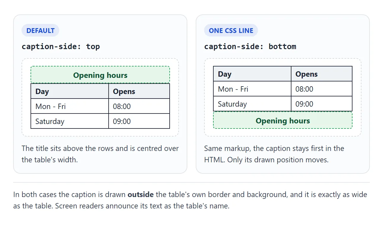
Two details surprise people. The caption is drawn outside the table's border and background, so a border on table does not wrap the title. And the caption is exactly as wide as the table. On a narrow table, a long title wraps onto several lines.
colgroup and col: one element per column
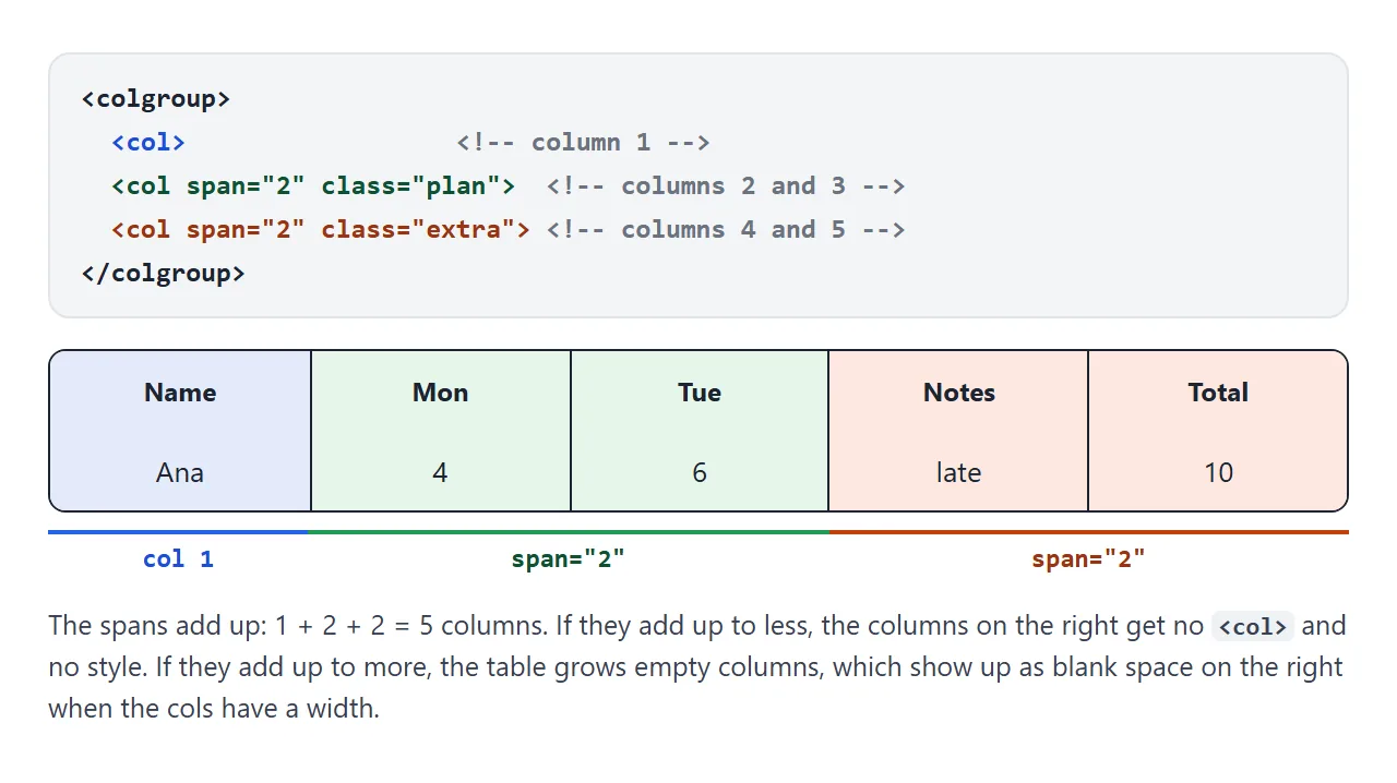
Tables are built from rows, so there is no column element holding the cells. <colgroup> fills that gap. It comes after the caption and before <thead>, and each <col> inside it stands for one column, counted from the left.
span lets one <col> cover several neighbouring columns. The spans are counted like the cells in a row, so they should add up to the number of columns.
Which CSS works on col
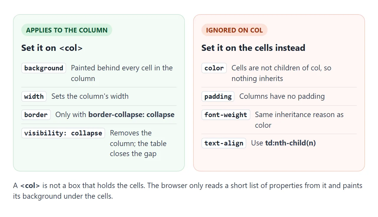
This is where most attempts go wrong. Because cells are not children of a <col>, nothing inherits from it. The browser reads only a short list of properties from a column:
Property on <col> |
Result |
|---|---|
background |
Painted behind every cell in the column |
width |
Sets the column width |
border |
Works only with border-collapse: collapse |
visibility: collapse |
Removes the column and closes the gap |
color, font-weight |
Ignored |
padding |
Ignored |
text-align |
Ignored |
Tick the boxes to check each one. Then switch the table to border-collapse: separate with the border box on, and watch the column border disappear.
<!doctype html>
<html lang="en">
<head>
<meta charset="utf-8">
<meta name="viewport" content="width=device-width, initial-scale=1">
<title>Which CSS works on col</title>
<style>
  body { margin: 0; padding: 14px; font-family: system-ui, sans-serif; background: #f4f5f7; color: #1d2330; }
  .toggles { display: grid; grid-template-columns: repeat(auto-fill, minmax(170px, 1fr)); gap: 6px 12px; font-size: 13px; margin-bottom: 12px; }
  .toggles code { font-family: ui-monospace, Consolas, monospace; font-size: 12px; }
  .ok { color: #0f5132; font-weight: 700; }
  .no { color: #9a3412; font-weight: 700; }

  table { border-collapse: collapse; background: #fff; font-size: 14px; }
  th, td { border: 1px solid #d5d9e0; padding: 6px 12px; text-align: left; }

  /* each class is one CSS property, set on the second <col> only */
  col.bg     { background: #fff3c4; }
  col.border { border: 3px solid #2563eb; }
  col.width  { width: 170px; }
  col.hide   { visibility: collapse; }
  col.color  { color: #c2410c; }
  col.pad    { padding: 20px; }
  col.bold   { font-weight: 700; }
  col.align  { text-align: right; }
  table.separate { border-collapse: separate; }
</style>
</head>
<body>
<div class="toggles" id="toggles">
  <label><input type="checkbox" value="bg"> <code>background</code> <span class="ok">works</span></label>
  <label><input type="checkbox" value="width"> <code>width</code> <span class="ok">works</span></label>
  <label><input type="checkbox" value="border"> <code>border</code> <span class="ok">collapsed only</span></label>
  <label><input type="checkbox" value="hide"> <code>visibility: collapse</code> <span class="ok">works</span></label>
  <label><input type="checkbox" value="color"> <code>color</code> <span class="no">ignored</span></label>
  <label><input type="checkbox" value="pad"> <code>padding</code> <span class="no">ignored</span></label>
  <label><input type="checkbox" value="bold"> <code>font-weight</code> <span class="no">ignored</span></label>
  <label><input type="checkbox" value="align"> <code>text-align</code> <span class="no">ignored</span></label>
  <label><input type="checkbox" id="separate"> table <code>border-collapse: separate</code></label>
</div>

<table id="t">
  <colgroup>
    <col>
    <col id="target">  <!-- the toggles add classes here -->
    <col>
  </colgroup>
  <thead><tr><th>Item</th><th>Column 2</th><th>Price</th></tr></thead>
  <tbody>
    <tr><td>Coffee</td><td>Hot</td><td>3.20</td></tr>
    <tr><td>Tea</td><td>Hot</td><td>2.80</td></tr>
    <tr><td>Juice</td><td>Cold</td><td>3.50</td></tr>
  </tbody>
</table>

<script>
  const col = document.getElementById('target');

  document.querySelectorAll('#toggles input[value]').forEach((box) =>
    box.addEventListener('change', () => col.classList.toggle(box.value, box.checked)));

  document.getElementById('separate').addEventListener('change', (e) =>
    document.getElementById('t').classList.toggle('separate', e.target.checked));
</script>
</body>
</html>
For the ignored properties, style the cells in that column directly. td:nth-child(3) selects the third cell of every row, which is the third column as long as no cell uses colspan. Rowspan and colspan explains how merged cells shift that count.
Column widths with col
width on a <col> sets the whole column in one place, instead of repeating it on every cell. Widths behave more predictably with table-layout: fixed on the table. HTML table column width covers that pattern in full, so here it is only one line:
col.label { width: 34%; }
A finished example: a pricing table
This comparison table uses all three pieces. The caption holds the title and a short note. A <col class="recommended"> paints the middle plan green and draws its border. A few lines of JavaScript highlight the column under the pointer.
<!doctype html>
<html lang="en">
<head>
<meta charset="utf-8">
<meta name="viewport" content="width=device-width, initial-scale=1">
<title>Pricing table with caption and col</title>
<style>
  body { margin: 0; padding: 14px; font-family: system-ui, sans-serif; background: #f4f5f7; color: #1d2330; }
  table { border-collapse: collapse; width: 100%; max-width: 560px; background: #fff; font-size: 14px; }
  caption { caption-side: top; text-align: left; padding: 0 0 10px; }
  caption b { display: block; font-size: 17px; }
  caption span { font-size: 12.5px; color: #5b6270; }
  th, td { border-bottom: 1px solid #e1e4ea; padding: 9px 8px; text-align: center; }
  th[scope=row] { text-align: left; font-weight: 600; }
  thead th { font-size: 15px; }

  col.label { width: 34%; }
  col.recommended { background: #e8f5ec; border: 2px solid #1f9d55; }  /* border needs border-collapse */
  col.hover { background: #eef3ff; }
  col.recommended.hover { background: #d3eedc; }
  .tag { display: block; font-size: 11px; color: #1f9d55; font-weight: 700; }
</style>
</head>
<body>
<table id="plans">
  <caption>
    <b>Compare plans</b>
    <span>Prices per month. Hover or tap a column to highlight it.</span>
  </caption>
  <colgroup>
    <col class="label">
    <col>
    <col class="recommended">
    <col>
  </colgroup>
  <thead>
    <tr><td></td><th scope="col">Basic</th><th scope="col">Team<span class="tag">Recommended</span></th><th scope="col">Business</th></tr>
  </thead>
  <tbody>
    <tr><th scope="row">Price</th><td>$0</td><td>$12</td><td>$29</td></tr>
    <tr><th scope="row">Users</th><td>1</td><td>10</td><td>Unlimited</td></tr>
    <tr><th scope="row">Storage</th><td>2 GB</td><td>100 GB</td><td>1 TB</td></tr>
    <tr><th scope="row">Share links</th><td>Yes</td><td>Yes</td><td>Yes</td></tr>
    <tr><th scope="row">Support</th><td>Email</td><td>Chat</td><td>Phone</td></tr>
  </tbody>
</table>

<script>
  const table = document.getElementById('plans');
  const cols = table.querySelectorAll('col');
  let current = null;

  const clear = () => { if (current) current.classList.remove('hover'); current = null; };

  // pointerover bubbles, so one listener on the table covers every cell (and taps on phones)
  table.addEventListener('pointerover', (e) => {
    const cell = e.target.closest('td, th');
    if (!cell || cell.cellIndex === 0) return clear();  // skip the label column
    const col = cols[cell.cellIndex];  // no colspan here, so cellIndex = column number
    if (col === current) return;
    clear();
    current = col;
    col.classList.add('hover');
  });

  // a finger also "leaves" as soon as it lifts, so on touch the tapped column stays lit
  table.addEventListener('pointerleave', (e) => { if (e.pointerType !== 'touch') clear(); });
</script>
</body>
</html>
CSS has no selector for "the column under the mouse", so the script does it:
- Listen on the table.
pointeroverbubbles up, so one listener hears every cell. - Find the column.
cell.cellIndexgives the cell's position in its row. With no merged cells, that is the column number. - Style the col. Add a
hoverclass tocols[cellIndex], and remove it from the previous column.
const cols = table.querySelectorAll('col');

table.addEventListener('pointerover', (e) => {
  const cell = e.target.closest('td, th');
  if (!cell) return;
  cols.forEach((c) => c.classList.remove('hover'));
  cols[cell.cellIndex].classList.add('hover');
});
One paint rule matters here. The browser paints backgrounds in layers: table, then columns, then rows, then cells. A background on a <tr> or <td> covers the column colour.
If you add zebra stripes to rows, the column highlight hides under them. Stripe the cells with a see-through colour, or highlight the cells instead of the col.
When it does not work
| What you see | Cause | Fix |
|---|---|---|
| The title shows, but the table has no name for screen readers | The title is a <p> or heading outside the table |
Use <caption>, or aria-labelledby on the table |
| The caption is written after the rows | The browser still draws it on top, but the HTML is invalid | Make <caption> the first child of <table> |
| Text colour on a col does nothing | Cells do not inherit from <col> |
Set color on td:nth-child(n) |
| Padding on a col does nothing | Columns have no padding | Set padding on the cells |
| The column border is missing | The table uses border-collapse: separate |
Use border-collapse: collapse |
| The column background is hidden | A tr or td background paints on top |
Remove it, or make it see-through |
| The wrong columns are styled | The span values do not add up to the column count |
Recount: every <col> covers span columns, default 1 |
| Blank space appears to the right of the table | The spans add up to more columns than the rows have | Lower the last span |
| The caption wraps into a narrow block | The caption is exactly as wide as the table | Shorten it, or give the table a wider width |
Borders on the table and its cells have their own rules. Border-collapse explains how collapsed and separate borders differ.
Share it as a link
A comparison table is easier to judge when people can try it. A screenshot cannot show the hover highlight, and an .html attachment may open as plain code on a phone.
To send the working version, paste the page into a NOS document and choose Create share link. HTML to link walks through it.
The page renders as written and its scripts run, so the people you send it to can hover the columns themselves. If you change the prices later, the same link shows the new version.