HTML text not wrapping means something turned wrapping off, because wrapping is the default behaviour of every block of text in a browser.
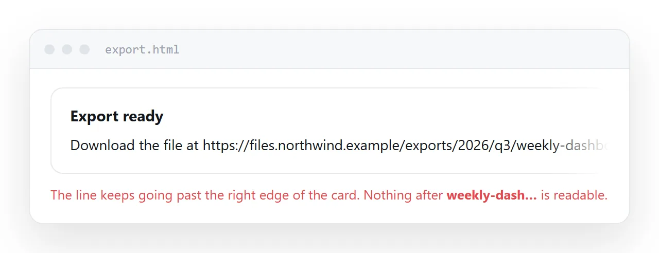
Inspect the element, open Computed, and filter for white-space. That one value answers the first question.
If it reads nowrap or pre, a rule is switching wrapping off. If it reads normal, wrapping is on and the container is the problem.
The four causes
| Computed value or condition | Cause | Fix |
|---|---|---|
white-space: nowrap |
An explicit rule, often inherited | Set white-space: normal |
white-space: pre |
Preserving source formatting | Use pre-wrap instead |
| Container wider than the screen | Fixed width, or padding on a 100% box | Use max-width, set box-sizing |
| Flex or grid item overflowing | min-width: auto on the item |
min-width: 0 |
| One long unbroken string | No space to break at | overflow-wrap: anywhere |
Work down the list in order. Fixing the last one first hides the first one rather than solving it.
white-space, and where it comes from
white-space inherits. A nowrap set on a table row or a navigation container applies to every descendant, including the paragraph you are looking at.
So the rule that is causing the problem may be several levels up. The inspector's Computed panel shows which rule won and where it was declared.
/* often written to keep a nav on one line */
.toolbar { white-space: nowrap; }

/* and then inherited by something that should wrap */
.toolbar .note { white-space: normal; }
For code blocks, pre is usually meant but pre-wrap is usually wanted. pre-wrap keeps your spaces and line breaks and still wraps long lines at the container edge.
The container is wider than you think
If wrapping is on and text still runs off, the text is wrapping correctly inside a box that is too wide.
Two common ways that happens:
/* a fixed width does not shrink on a phone */
.card { width: 720px; }        /* becomes */
.card { max-width: 720px; width: 100%; }

/* padding added to a full width box */
.card { width: 100%; padding: 24px; }   /* overflows by 48px */
.card { width: 100%; padding: 24px; box-sizing: border-box; }
Box sizing explains the second one. Setting box-sizing: border-box globally is the usual defence.
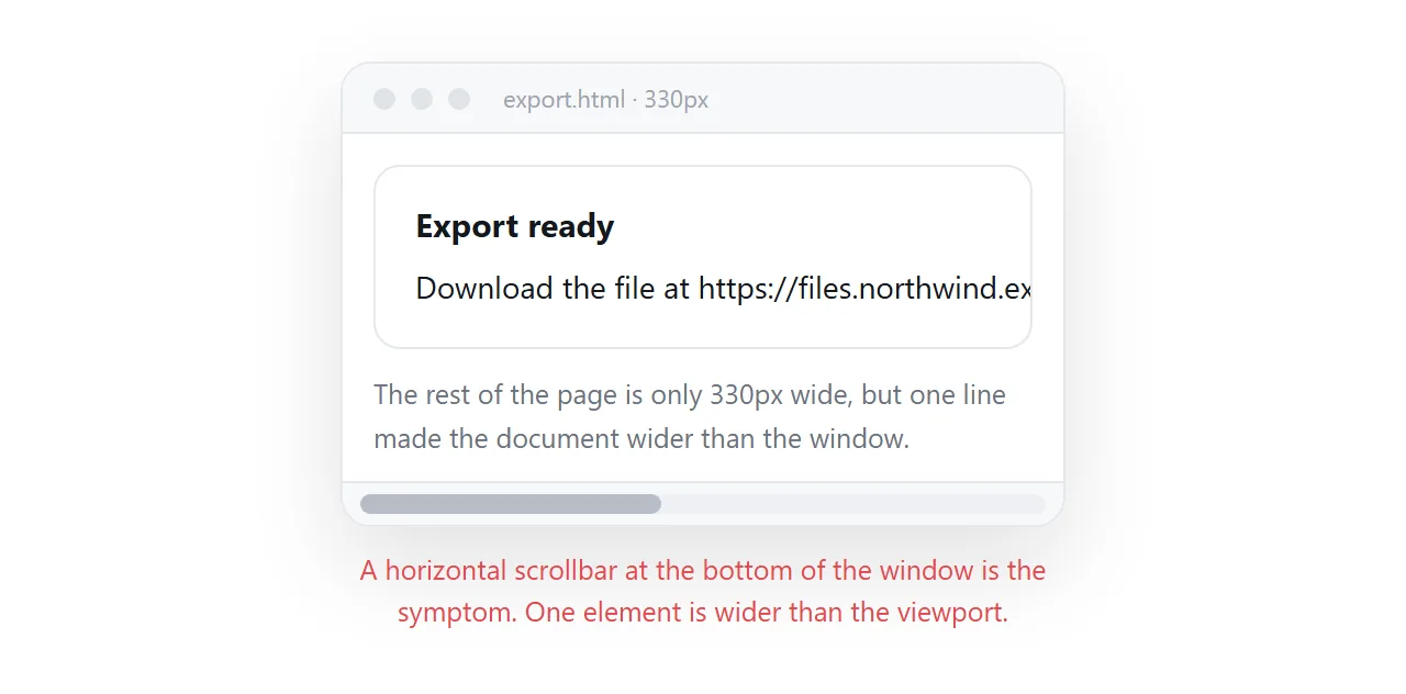
A horizontal scrollbar on a phone is the visible symptom. Narrow the inspector's device width and look for which element extends past the edge.
Flex and grid items that refuse to shrink
This one surprises people because nothing in the CSS mentions width.
A flex item has an implied min-width: auto, meaning it will not shrink below the size of its content. A long line of text inside it therefore pushes the item wider than its share.
.row { display: flex; gap: 16px; }
.row > * { min-width: 0; }
That one declaration fixes a large share of real layouts. The same applies to grid items, where the property is min-width: 0 for columns and min-height: 0 for rows.
Flexbox covers the sizing model this comes from.
Strings with nowhere to break
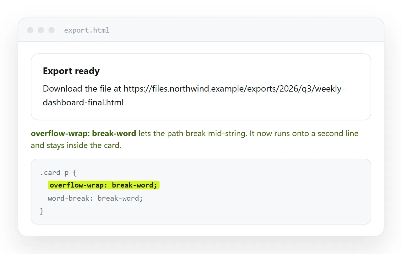
Normal wrapping breaks at spaces and hyphens. A long URL, a file path, a hash or an API key has none, so it is treated as one enormous word.
.body-copy { overflow-wrap: anywhere; }
overflow-wrap: anywhere permits a break inside the word only when there is no other option, which is the behaviour you want for prose that occasionally contains a URL.
word-break: break-all breaks anywhere regardless, which chops ordinary words mid syllable and reads badly. HTML word break compares the properties and shows when each is correct.
For a URL you would rather truncate than wrap:
.path {
  white-space: nowrap;
  overflow: hidden;
  text-overflow: ellipsis;
}
All three are required. text-overflow alone does nothing without the other two.
Tables are their own case
Table cells size themselves from their content, so a table ignores most of the above until you change how it computes widths.
table-layout: fixed plus explicit column widths is the combination that makes cells respect their bounds. HTML word wrap in a table covers it in full, including the overflow rules for the surrounding container.
Checking at the width your reader uses
Most of these problems only appear below about 480 pixels, and most authors work at 1400.
Open the device toolbar in the inspector and set a narrow width rather than dragging the window. Then scroll the page and watch for a horizontal scrollbar.
Confirm the page declares a viewport meta tag as well. Without it a phone renders at roughly 980 pixels wide and scales down, which hides wrapping problems behind unreadably small text.
Checklist
- Computed
white-spaceon the element isnormalorpre-wrap. - No fixed pixel widths on containers that need to shrink.
box-sizing: border-boxapplied.min-width: 0on flex and grid children.overflow-wrap: anywhereon prose that may contain URLs.- Tested at a narrow viewport with the viewport meta tag present.
Seeing the result the way a reader will
A layout problem is easiest to judge away from your own editor. Paste the page into a NOS document and it renders at an address of its own, which you can open on a phone with one tap.
Turning HTML into a link is that step, and because the text stays clickable in the document you can fix the wrapping without going back to the file.