To remove the space above and below text in CSS, add text-box: trim-both cap alphabetic to the element. The box then ends at the top of the capitals and at the baseline, so padding and margins are the visible gaps.
Try it. The dashed outline is the heading's box. Untick the box to see the space that is normally there.
<!doctype html>
<html lang="en">
<head>
<meta charset="utf-8">
<meta name="viewport" content="width=device-width, initial-scale=1">
<title>text-box-trim: before and after</title>
<style>
  body {
    margin: 0; padding: 16px;
    font-family: system-ui, sans-serif; background: #f4f5f7; color: #1d2330;
  }
  .bar { display: flex; flex-wrap: wrap; gap: 8px 16px; font-size: 14px; margin-bottom: 16px; }
  #sup { color: #5b6270; }
  h2 {
    margin: 0 0 16px; font-size: 44px; line-height: 1.2;
    background: #dbeafe; outline: 1px dashed #2563eb;  /* shows the box */
  }
  .btn {
    font: 600 18px/1.5 system-ui, sans-serif;
    padding: 12px 20px; border: 0; border-radius: 10px;
    background: #1d4ed8; color: #fff;
  }
  /* The one line this page is about */
  .trim h2, .trim .btn { text-box: trim-both cap alphabetic; }
  .out { font: 13px/1.6 ui-monospace, Consolas, monospace; margin-top: 16px; color: #374151; }
</style>
</head>
<body>
<div class="bar">
  <label><input type="checkbox" id="on" checked> text-box: trim-both cap alphabetic</label>
  <span id="sup"></span>
</div>

<div id="stage" class="trim">
  <h2 id="h">Trim the gap</h2>
  <button class="btn" id="b">Save changes</button>
</div>

<div class="out" id="out"></div>

<script>
  const stage = document.getElementById('stage');
  const out = document.getElementById('out');

  // Feature check: does this browser understand the property?
  const ok = CSS.supports('text-box', 'trim-both cap alphabetic');
  document.getElementById('sup').textContent =
    'This browser: ' + (ok ? 'supports text-box' : 'no text-box support, so nothing changes');

  function measure() {
    const h = document.getElementById('h').getBoundingClientRect().height;
    const b = document.getElementById('b').getBoundingClientRect().height;
    out.textContent = 'heading box: ' + h.toFixed(1) + 'px   button: ' + b.toFixed(1) + 'px';
  }

  document.getElementById('on').addEventListener('change', (e) => {
    stage.classList.toggle('trim', e.target.checked);
    measure();
  });
  measure();
</script>
</body>
</html>
With the Chromium build we tested, the 44px heading box went from 52.8px to 31.6px. The removed space was leading and the font's own room above and below the letters. Nothing visible changed except the outline.
Where the extra space comes from
A line box is taller than the letters in it, for two reasons. First, line-height adds half-leading above and below the text. Second, every font reserves room above its capitals for accents and room below the baseline for letters such as g and y.
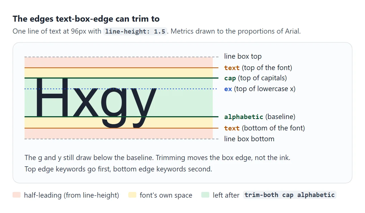
That room is useful between lines of a paragraph. At the outer edges of a heading or a button it just adds space you did not ask for. CSS line-height covers how half-leading is calculated.
The three properties
The feature is split into two properties and one shorthand.
| Property | What it sets | Values |
|---|---|---|
text-box-trim |
Which side to trim | none, trim-start, trim-end, trim-both |
text-box-edge |
Where to cut | Top: text, cap, ex. Bottom: text, alphabetic |
text-box |
Both at once | normal, or a trim value and edge values |
trim-start cuts above the first line and trim-end cuts below the last line. The edge value takes the top keyword first and the bottom keyword second:
h1 {
  text-box-trim: trim-both;
  text-box-edge: cap alphabetic;
}

/* the same thing, with the shorthand */
h1 { text-box: trim-both cap alphabetic; }
Choosing the edges
Switch the values below and watch the yellow box. The outline shows what layout sees.
<!doctype html>
<html lang="en">
<head>
<meta charset="utf-8">
<meta name="viewport" content="width=device-width, initial-scale=1">
<title>text-box-trim and text-box-edge values</title>
<style>
  body {
    margin: 0; padding: 14px 16px;
    font-family: system-ui, sans-serif; background: #f4f5f7; color: #1d2330;
  }
  .ctl { display: grid; grid-template-columns: 88px 1fr; gap: 6px 10px; align-items: center; font-size: 13px; }
  .ctl b { font: 600 12px ui-monospace, Consolas, monospace; }
  .opts { display: flex; flex-wrap: wrap; gap: 6px; }
  .opts button {
    font: 12px ui-monospace, Consolas, monospace; padding: 5px 8px;
    border: 1px solid #c9cdd4; border-radius: 6px; background: #fff; color: #1d2330; cursor: pointer;
  }
  .opts button.on { background: #1d4ed8; border-color: #1d4ed8; color: #fff; }
  .wrap { margin-top: 16px; padding: 20px 0; background: #fff; border-radius: 10px; text-align: center; }
  #sample {
    display: inline-block; margin: 0;
    font: 72px/1.4 Georgia, serif;
    background: #fde68a; outline: 1px dashed #b45309;  /* the box being trimmed */
  }
  .out { font: 13px/1.6 ui-monospace, Consolas, monospace; margin-top: 12px; color: #374151; white-space: pre-wrap; }
</style>
</head>
<body>
<div class="ctl">
  <b>trim</b>
  <div class="opts" data-part="trim">
    <button data-v="none">none</button><button data-v="trim-start">trim-start</button>
    <button data-v="trim-end">trim-end</button><button data-v="trim-both" class="on">trim-both</button>
  </div>
  <b>top edge</b>
  <div class="opts" data-part="over">
    <button data-v="text">text</button><button data-v="cap" class="on">cap</button><button data-v="ex">ex</button>
  </div>
  <b>bottom edge</b>
  <div class="opts" data-part="under">
    <button data-v="text">text</button><button data-v="alphabetic" class="on">alphabetic</button>
  </div>
</div>

<div class="wrap"><p id="sample">Hxgy</p></div>
<div class="out" id="out"></div>

<script>
  const sample = document.getElementById('sample');
  const out = document.getElementById('out');
  const state = { trim: 'trim-both', over: 'cap', under: 'alphabetic' };

  function apply() {
    // text-box-edge takes two keywords: top edge, then bottom edge
    sample.style.textBoxTrim = state.trim;
    sample.style.textBoxEdge = state.over + ' ' + state.under;
    const h = sample.getBoundingClientRect().height;
    out.textContent = 'text-box: ' + state.trim + ' ' + state.over + ' ' + state.under +
      '\nbox height: ' + h.toFixed(1) + 'px';
  }

  document.querySelectorAll('.opts').forEach((group) => {
    group.addEventListener('click', (e) => {
      const btn = e.target.closest('button');
      if (!btn) return;
      group.querySelectorAll('button').forEach((b) => b.classList.toggle('on', b === btn));
      state[group.dataset.part] = btn.dataset.v;
      apply();
    });
  });
  apply();
</script>
</body>
</html>
capcuts at the top of capital letters. It suits headings and buttons, which usually start with a capital.excuts at the top of lowercase letters such as x. It suits all-lowercase labels.alphabeticcuts at the baseline, the line letters sit on. Descenders keep drawing below it.textcuts at the font's own top or bottom, which removes the leading only.
Write both keywords. In the Chromium build we tested, a single cap was rejected as invalid, while cap alphabetic worked. The specification also lists ideographic keywords for Chinese, Japanese and Korean text; that build rejected those as well.
The shorthand fills in what you leave out. text-box: cap alphabetic means trim-both, and text-box: trim-end keeps the default edge, auto, which in our test cut at the font's text edges.
Buttons that centre optically
In a button, the hidden space sits between the padding and the letters. The font decides the space above the capitals and below the baseline, and the two need not match, so the label can sit slightly low or high even with equal padding.
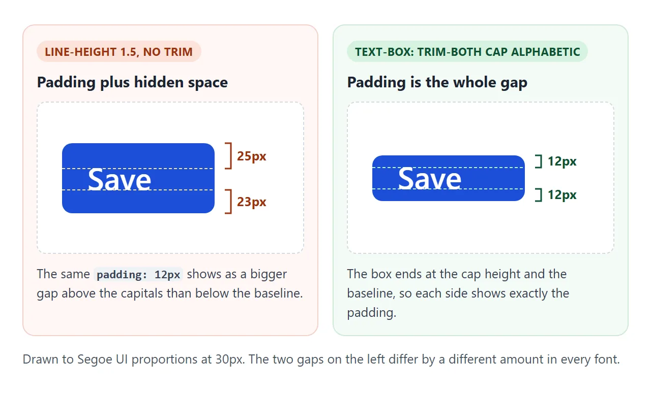
After trimming, the button box ends exactly at the cap height and the baseline. Equal padding-top and padding-bottom now give equal visible space. See styling HTML buttons for the rest of the button styles.
Headings and paragraphs that keep their spacing
The same thing happens between blocks. A 16px margin under a heading becomes a larger visible gap, because the heading carries space below its baseline and the paragraph carries space above its capitals.
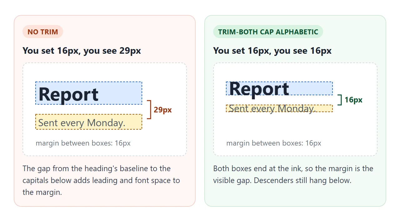
Trim both elements and the margin you write is the gap from the heading's baseline to the next capitals. That makes a spacing scale, such as 8px, 16px and 24px, show up on screen as written.
Where it applies and where it does not
text-box-trim works on block containers: headings, paragraphs, list items and inline-block buttons. Some cases behave in ways you might not expect:
- Flex and grid containers are not block containers. A button with
display: inline-flexdoes not trim. Put the label in a<span>: as a flex item it trims normally. - Only the outer lines are trimmed. In a paragraph of three lines, the top of line one and the bottom of line three are cut. The gaps between lines stay.
- It reaches into a first child block. If the first child has no padding or border between it and the trimmed parent, its first line is trimmed too.
- Ink is never clipped. Descenders and tall accents still draw outside the box.
text-box-edge is inherited, and text-box-trim is not, so you can set the edges once on body and add trim-both only where you need it.
Checking support and a fallback
A browser that does not know text-box ignores the declaration, and the text keeps its usual box. So check it in the browsers you care about, and make the untrimmed version acceptable. In JavaScript, a feature check looks like this:
const ok = CSS.supports('text-box', 'trim-both cap alphabetic');
In CSS, keep the padding that suits the untrimmed box as the default, and switch to the trimmed padding inside @supports:
.btn { line-height: 1.5; padding: 10px 18px; }

@supports (text-box: trim-both cap alphabetic) {
  .btn span { text-box: trim-both cap alphabetic; }
  .btn { padding-block: 14px; }
}
The finished card below uses that pattern for a heading, a badge and two flex buttons. The checkbox switches to the fallback, so you can compare the two.
<!doctype html>
<html lang="en">
<head>
<meta charset="utf-8">
<meta name="viewport" content="width=device-width, initial-scale=1">
<title>Optically centred buttons and headings</title>
<style>
  body {
    margin: 0; padding: 16px;
    font-family: system-ui, sans-serif; background: #eef1f5; color: #1d2330;
  }
  .card { max-width: 420px; padding: 20px; background: #fff; border-radius: 14px; box-shadow: 0 6px 20px rgba(0,0,0,.08); }
  .head { display: flex; align-items: center; gap: 10px; margin-bottom: 14px; }
  h3 { margin: 0; font-size: 26px; line-height: 1.3; }
  p { margin: 0 0 18px; font-size: 15px; line-height: 1.5; color: #4b5563; }
  .badge {
    font: 700 12px/1 system-ui, sans-serif; letter-spacing: .4px;
    padding: 6px 9px; border-radius: 99px; background: #dcfce7; color: #166534;
  }
  .row { display: flex; flex-wrap: wrap; gap: 10px; }
  .btn {
    display: inline-flex; align-items: center; gap: 8px;
    font: 600 16px/1.5 system-ui, sans-serif;
    padding: 10px 18px;  /* fallback: tuned for the untrimmed text box */ border-radius: 10px; border: 1px solid #1d4ed8;
    background: #1d4ed8; color: #fff; cursor: pointer;
  }
  .btn.ghost { background: #fff; color: #1d4ed8; }
  .btn svg { width: 16px; height: 16px; }

  /* Trim only where the browser understands it.
     .btn is a flex container, so trim the label inside it, not the button. */
  @supports (text-box: trim-both cap alphabetic) {
    h3, .badge, .btn span { text-box: trim-both cap alphabetic; }
    .btn { padding-block: 14px; }  /* the text no longer carries hidden space */
  }
  /* Switch used by the checkbox below: shows the fallback */
  .off h3, .off .badge, .off .btn span { text-box: normal; }
  .off .btn { padding-block: 10px; }

  .opt { margin-top: 16px; font-size: 14px; }
  #sup { display: block; margin-top: 6px; color: #5b6270; font-size: 13px; }
</style>
</head>
<body>
<div class="card" id="card">
  <div class="head">
    <h3>Weekly report</h3>
    <span class="badge">NEW</span>
  </div>
  <p>Numbers from Monday to Sunday, ready to send to the team.</p>
  <div class="row">
    <button class="btn" id="send">
      <svg viewBox="0 0 16 16" fill="none" stroke="currentColor" stroke-width="2"><path d="M2 8h11M9 4l4 4-4 4"/></svg>
      <span>Send report</span>
    </button>
    <button class="btn ghost" id="later"><span>Later</span></button>
  </div>
</div>

<div class="opt">
  <label><input type="checkbox" id="off"> Turn trimming off to compare</label>
  <span id="sup"></span>
</div>

<script>
  const ok = CSS.supports('text-box', 'trim-both cap alphabetic');
  document.getElementById('sup').textContent = ok
    ? 'This browser trims. Tick the box and watch the button text shift.'
    : 'This browser does not trim, so you see the fallback. The checkbox changes nothing.';

  document.getElementById('off').addEventListener('change', (e) => {
    document.getElementById('card').classList.toggle('off', e.target.checked);
  });
</script>
</body>
</html>
The two buttons stay the same height in both states because the padding changes with the trim. With the system font on our test machine, the label moved by 2px. Other fonts differ by other amounts, so check the font you use.
When it does not work
| What you see | Cause | Fix |
|---|---|---|
| Nothing changes | The browser does not support text-box |
Check with CSS.supports; keep a fallback |
| Nothing changes on a button | The button is a flex or grid container | Trim a <span> inside it |
| The rule is ignored | Single edge keyword such as cap |
Write two: cap alphabetic |
| Only the bottom is trimmed | The first child has padding or a border | Trim the child, or move the padding |
| Lines inside a paragraph are still spaced | Only the first and last lines are trimmed | Use line-height for the inner gaps |
| g and y hang past the box | Trimming does not clip ink | Leave room below with padding or margin |
| Text looks off-centre next to an icon | The icon aligns to the untrimmed box | Trim the label, then centre with align-items |
For centring whole boxes rather than text inside them, see how to center a div.
Share it as a link
Spacing is easier to judge in a live page than in a screenshot, because the reader can tick the switch and see the text move. An .html attachment may open as plain code on a phone.
To send the working version, paste the page into a NOS document and choose Create share link. HTML to link walks through it.
The page renders as written and its scripts run, so the people you send it to can compare trimmed and untrimmed text themselves. If you change the code later, the same link shows the new version.