The <h1> tag marks the main title of a page. HTML has six heading levels, <h1> to <h6>, and together they form the page's outline: h1 for the page, h2 for its sections, h3 for parts of a section.
The number describes rank, not size. Size belongs to CSS.
<h1>Home coffee guide</h1>
<h2>Beans</h2>
<h3>Light or dark roast</h3>
<h2>Grinding</h2>
Try it below. The right panel lists the page's headings as an outline. Turn on the two checkboxes to see the two most common mistakes.
<!doctype html>
<html lang="en">
<head>
<meta charset="utf-8">
<meta name="viewport" content="width=device-width, initial-scale=1">
<title>Heading outline viewer</title>
<style>
  body { margin: 0; padding: 12px; font-family: system-ui, sans-serif; background: #f4f5f7; color: #1d2330; }
  .wrap { display: grid; grid-template-columns: 1fr 1fr; gap: 12px; }
  @media (max-width: 560px) { .wrap { grid-template-columns: 1fr; } }
  .box { background: #fff; border-radius: 10px; padding: 12px 14px; box-shadow: 0 2px 8px rgba(0, 0, 0, .08); }
  .label { font-size: 12px; font-weight: 700; color: #6b7280; text-transform: uppercase; letter-spacing: .4px; }

  /* the sample page: small sizes so it fits the box */
  #page h1 { font-size: 20px; margin: 6px 0 4px; }
  #page h2 { font-size: 16px; margin: 10px 0 2px; }
  #page h3, #page h4 { font-size: 14px; margin: 8px 0 2px; }
  #page p { font-size: 13px; margin: 0; color: #4b5563; }

  /* the outline panel */
  #outline { list-style: none; margin: 8px 0 0; padding: 0; font-size: 14px; }
  #outline li { padding: 3px 0; border-left: 2px solid #e5e7eb; padding-left: 8px; margin: 2px 0; }
  #outline code { font-size: 12px; color: #2563eb; margin-right: 6px; }
  #outline li.bad { border-left-color: #ea580c; background: #fff7ed; }
  #warn { margin-top: 10px; font-size: 13px; line-height: 1.45; }
  #warn p { margin: 4px 0; padding: 6px 8px; border-radius: 6px; }
  .err { background: #fff7ed; color: #9a3412; }
  .ok { background: #ecfdf3; color: #0f5132; }
  .toggles { display: flex; flex-wrap: wrap; gap: 6px 14px; margin-top: 10px; font-size: 14px; }
</style>
</head>
<body>
<div class="wrap">
  <div class="box">
    <div class="label">Sample page</div>
    <div id="page">
      <h1>Home coffee guide</h1>
      <p id="sub">Everything you need for a good cup.</p>
      <h2>Beans</h2>
      <h3 id="roast">Light or dark roast</h3>
      <p>Light keeps more acidity.</p>
      <h2>Grinding</h2>
      <p>Grind right before brewing.</p>
      <h2>Brewing</h2>
      <h3>Pour-over</h3>
      <h3>French press</h3>
    </div>
    <div class="toggles">
      <label><input type="checkbox" id="skip"> Skip a level</label>
      <label><input type="checkbox" id="twoH1"> Make the subtitle an h1</label>
    </div>
  </div>
  <div class="box">
    <div class="label">Heading outline</div>
    <ul id="outline"></ul>
    <div id="warn"></div>
  </div>
</div>

<script>
  const page = document.getElementById('page');

  // Swap an element for the same content under a new tag name
  function retag(el, tag) {
    const n = document.createElement(tag);
    n.id = el.id;
    n.textContent = el.textContent;
    el.replaceWith(n);
  }

  function buildOutline() {
    const heads = page.querySelectorAll('h1,h2,h3,h4,h5,h6');
    const out = document.getElementById('outline');
    const warn = [];
    let prev = 0, h1s = 0;
    out.innerHTML = '';

    heads.forEach((h) => {
      const level = Number(h.tagName[1]);   // "H3" -> 3
      const li = document.createElement('li');
      li.style.marginLeft = (level - 1) * 16 + 'px';
      li.innerHTML = '<code>' + h.tagName.toLowerCase() + '</code>';
      li.append(h.textContent);
      if (level === 1) h1s++;
      if (prev && level > prev + 1) {         // jumped down more than one level
        li.className = 'bad';
        warn.push('h' + prev + ' is followed by h' + level + ': h' + (prev + 1) + ' is skipped.');
      }
      if (level === 1 && h1s > 1) {
        li.className = 'bad';
        warn.push('A second h1: the page now has two main titles.');
      }
      out.append(li);
      prev = level;
    });

    document.getElementById('warn').innerHTML = warn.length
      ? warn.map((w) => '<p class="err">' + w + '</p>').join('')
      : '<p class="ok">One h1, and no level is skipped.</p>';
  }

  document.getElementById('skip').addEventListener('change', (e) => {
    retag(document.getElementById('roast'), e.target.checked ? 'h4' : 'h3');
    buildOutline();
  });
  document.getElementById('twoH1').addEventListener('change', (e) => {
    retag(document.getElementById('sub'), e.target.checked ? 'h1' : 'p');
    buildOutline();
  });

  buildOutline();
</script>
</body>
</html>
What headings are for
A sighted reader skims a page by its big bold lines. The heading tags carry the same structure in the markup, where software can read it.
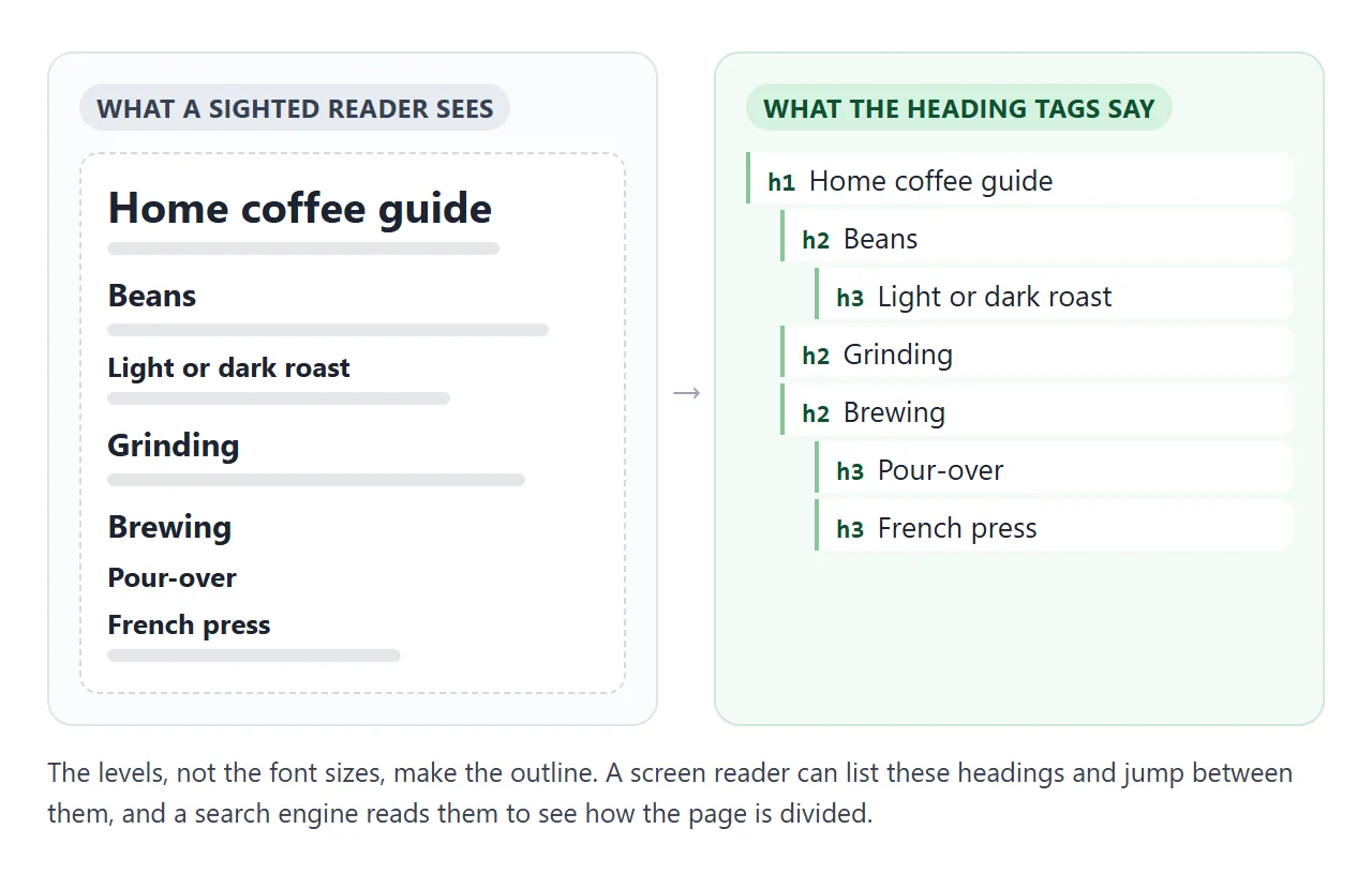
- Screen readers can list every heading on the page and jump from one to the next. Many screen reader users move around a page this way, so the headings work as a table of contents.
- Search engines read headings, together with the rest of the text, to understand what the page covers and how it is split into parts.
- Browser tools and extensions that build a contents list or reader view read the same tags.
This is part of semantic HTML: choosing the element that says what a thing is. A bold <div> can look like a heading, but nothing reading the markup will treat it as one.
One h1 per page
The h1 names the whole page. On an article it is the article's title; on a product page, the product name. One h1 per page is the common convention, and it keeps the answer to "what is this page?" in one place.
HTML itself does not forbid a second h1, and nothing breaks if there is one.
The problem is meaning. Two h1 elements tell a screen reader user there are two main titles, and neither the reader nor a search engine can tell which one the page is about.
The h1 is also not the <title> element. The title sits in the <head> and appears in the browser tab and in search results.
Meta description and title covers that side. Keep the two close in wording so the page matches the result someone clicked.
Do not skip levels
Under the h1, go down one level at a time. A section is an h2, a part of that section is an h3. Going back up is fine: after an h3 the next section starts with an h2 again.
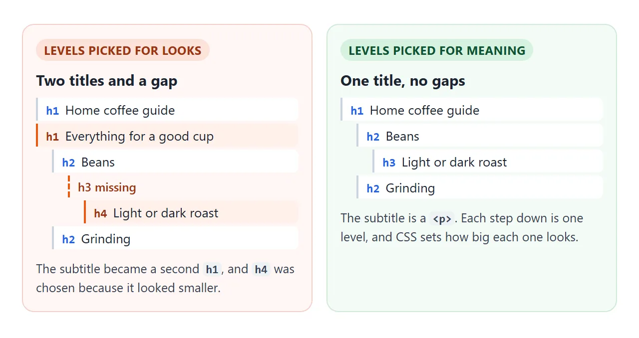
Jumping from h2 straight to h4 leaves a gap in the outline. Someone moving through the headings hears a level-four heading and can reasonably wonder whether a level-three section was missed.
These skips almost always come from picking a heading for its size. h4 looked right under that h2, so h4 it was. The fix is to use h3 and make it look however you want in CSS.
Default sizes and margins
Without any CSS, the browser gives every heading bold text, a font size and a top and bottom margin. The HTML standard lists these defaults, and they are all in em, so they scale with the surrounding text.
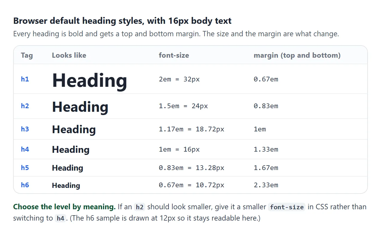
Two things surprise people. First, h5 and h6 are smaller than normal text by default. Second, the margins are large and grow for the lower levels, which is why a heading dropped into a card often leaves an odd gap above it.
Style the size with CSS
Pick the level for meaning, then set the look in a stylesheet. A small reset plus your own sizes is enough:
h1, h2, h3 {
  margin: 0 0 0.4em;   /* replace the default top and bottom margin */
  line-height: 1.15;
}
h1 { font-size: clamp(1.5rem, 1rem + 3vw, 2.75rem); }
h2 { font-size: clamp(1.2rem, 1rem + 1vw, 1.5rem); }
If headings in one place need to look quieter, target them in CSS instead of lowering the level:
.card h2 { font-size: 1.1rem; }
Compare the browser default with a reset and a fluid size:
<!doctype html>
<html lang="en">
<head>
<meta charset="utf-8">
<meta name="viewport" content="width=device-width, initial-scale=1">
<title>h1 default vs clamp()</title>
<style>
  body { margin: 0; padding: 14px; font-family: system-ui, sans-serif; background: #f4f5f7; color: #1d2330; }
  .wrap { display: grid; grid-template-columns: 1fr 1fr; gap: 12px; }
  @media (max-width: 560px) { .wrap { grid-template-columns: 1fr; } }
  .box { background: #fff; border-radius: 10px; padding: 0 14px 12px; box-shadow: 0 2px 8px rgba(0, 0, 0, .08); overflow-wrap: anywhere; }
  .label { font-size: 12px; font-weight: 700; color: #6b7280; text-transform: uppercase; letter-spacing: .4px; padding-top: 12px; }
  .box p { margin: 0; font-size: 14px; color: #4b5563; }
  .readout { margin-top: 10px; font: 12px/1.5 ui-monospace, Consolas, monospace; color: #2563eb; }
  #width { margin-top: 12px; font-size: 13px; color: #4b5563; }

  /* Right box: reset the margin, then a fluid size */
  .fluid h1 {
    margin: 0 0 .3em;
    font-size: clamp(1.5rem, 1rem + 3vw, 2.75rem);  /* 24px floor, 44px ceiling */
    line-height: 1.15;
    letter-spacing: -0.01em;
  }
  /* The left box has no h1 rule at all: those are the browser's defaults */
</style>
</head>
<body>
<div class="wrap">
  <div class="box">
    <div class="label">Browser default</div>
    <h1>Home coffee guide</h1>
    <p>font-size: 2em, margin: 0.67em 0</p>
    <div class="readout" data-for="0"></div>
  </div>
  <div class="box fluid">
    <div class="label">Reset + clamp()</div>
    <h1>Home coffee guide</h1>
    <p>clamp(1.5rem, 1rem + 3vw, 2.75rem)</p>
    <div class="readout" data-for="1"></div>
  </div>
</div>
<div id="width"></div>

<script>
  const heads = document.querySelectorAll('h1');

  // Show what the browser actually computed for each h1
  function show() {
    document.querySelectorAll('.readout').forEach((r) => {
      const cs = getComputedStyle(heads[r.dataset.for]);
      r.textContent = 'font-size ' + parseFloat(cs.fontSize).toFixed(1) + 'px, margin-top ' +
        parseFloat(cs.marginTop).toFixed(1) + 'px';
    });
    document.getElementById('width').textContent = 'Window width: ' + innerWidth +
      'px. Resize the window, or open this on a phone, and watch the right heading.';
  }

  addEventListener('resize', show);
  show();
</script>
</body>
</html>
A fluid h1 with clamp()
A 44px heading that looks right on a laptop can take four lines on a phone. clamp() lets the size follow the screen width between a floor and a ceiling:
h1 { font-size: clamp(1.5rem, 1rem + 3vw, 2.75rem); }
| Part | Value | What it does |
|---|---|---|
| Minimum | 1.5rem |
Never smaller than 24px (at the default 16px text size) |
| Preferred | 1rem + 3vw |
Grows with the width of the window |
| Maximum | 2.75rem |
Stops at 44px on wide screens |
vw is one percent of the viewport width. Adding a rem part keeps the heading from getting tiny on small screens and lets it follow the reader's text size setting.
For a page to use the phone's real width at all, it needs the viewport meta tag. More type settings, such as line height and font choice, are in how to change the font in HTML.
A finished article header
A real page puts these together: one h1, a subtitle in a paragraph, and section h2 elements with id values so each one can be linked.
<!doctype html>
<html lang="en">
<head>
<meta charset="utf-8">
<meta name="viewport" content="width=device-width, initial-scale=1">
<title>Article header with h1 and section links</title>
<style>
  * { box-sizing: border-box; }
  body { margin: 0; font-family: system-ui, sans-serif; color: #1d2330; line-height: 1.6; background: #fff; }
  article { max-width: 640px; margin: 0 auto; padding: 0 18px 40px; }

  /* Header: padding stops the h1 margin from leaking outside the coloured box */
  header { padding: 22px 18px 18px; margin: 0 -18px 8px; background: #f1f5ff; }
  h1 {
    margin: 0;
    font-size: clamp(1.6rem, 1rem + 3vw, 2.6rem);
    line-height: 1.15;
  }
  .subtitle { margin: 6px 0 12px; font-size: 1.05rem; color: #4b5563; }  /* a p, not a heading */
  nav ul { display: flex; flex-wrap: wrap; gap: 6px 14px; margin: 0; padding: 0; list-style: none; font-size: 14px; }
  nav a { color: #2563eb; }

  h2 {
    font-size: clamp(1.2rem, 1rem + 1vw, 1.5rem);
    margin: 1.4em 0 .3em;
    scroll-margin-top: 12px;       /* a little room when a link jumps here */
  }
  .self { margin-left: 6px; color: #9ca3af; text-decoration: none; font-weight: 400; }
  .self:hover, .self:focus { color: #2563eb; }
  p { margin: 0 0 .8em; }
</style>
</head>
<body>
<article>
  <header>
    <h1>Home coffee guide</h1>
    <p class="subtitle">Beans, grinding and brewing, without the jargon.</p>
    <nav aria-label="On this page">
      <ul>
        <li><a href="#beans">Beans</a></li>
        <li><a href="#grinding">Grinding</a></li>
        <li><a href="#brewing">Brewing</a></li>
      </ul>
    </nav>
  </header>

  <h2 id="beans">Beans <a class="self" href="#beans" aria-label="Link to this section">#</a></h2>
  <p>Buy whole beans roasted in the last few weeks. Light roasts keep more acidity and fruit; dark roasts taste of the roast itself.</p>
  <p>Keep them in a closed container away from light and heat.</p>

  <h2 id="grinding">Grinding <a class="self" href="#grinding" aria-label="Link to this section">#</a></h2>
  <p>Grind right before brewing. Coarse for a French press, medium for pour-over, fine for espresso.</p>
  <p>A burr grinder gives more even pieces than a blade grinder.</p>

  <h2 id="brewing">Brewing <a class="self" href="#brewing" aria-label="Link to this section">#</a></h2>
  <p>Start with about 60 grams of coffee per litre of water and adjust to taste.</p>
  <p>Water just off the boil works for most methods.</p>
  <p>Taste, change one thing, and taste again.</p>
</article>
</body>
</html>
<header>
  <h1>Home coffee guide</h1>
  <p class="subtitle">Beans, grinding and brewing, without the jargon.</p>
</header>
<h2 id="beans">Beans <a class="self" href="#beans" aria-label="Link to this section">#</a></h2>
The subtitle is a <p>: it describes the title, it is not a section. The # link lets someone copy an address that opens right at that section.
Linking to an anchor on the same page and building a table of contents go further with both.
When it does not work
| What you see | Cause | Fix |
|---|---|---|
| Outline jumps from h2 to h4 | A heading was picked for its size | Use the next level down and set font-size in CSS |
| Two main titles in the outline, or a subtitle listed as a section | The tagline under the h1 is an h1 or h2 |
Make the tagline a <p> |
| The h1 wraps onto three or four lines on a phone | A fixed font-size sized for a wide screen |
Use clamp() with a rem floor |
| A gap appears above a coloured header box | The heading's top margin collapses through its parent and pushes the box down | Set margin-top: 0 on the heading, or give the parent padding |
| A heading is on the page but screen readers skip it | It is hidden with display: none, which removes it for everyone |
Show it, or hide it only visually with a visually-hidden class |
The margin case needs a word. Vertical margins of blocks that touch can merge into one.
If an h1 is the first thing inside a header with a background and no padding or border on top, its margin ends up outside the header. Padding on the header, as in the finished example, stops that.
For a heading that should exist for screen readers but not be seen, the usual pattern keeps it in the page and shrinks it out of sight:
.visually-hidden {
  position: absolute; width: 1px; height: 1px;
  overflow: hidden; clip: rect(0 0 0 0); white-space: nowrap;
}
Share it as a link
Heading problems are easiest to see in the page itself: whether the title fits on a phone, whether the section links land where they should. A screenshot shows one width, and an .html attachment may open as plain code on a phone.
To send the working version, paste the page into a NOS document and choose Create share link. HTML to link walks through it.
The page renders as written and its scripts run, so people can resize it, tap the section links and check the outline themselves. If you change the headings later, the same link shows the new version.