Set text size in CSS with the font-size property, for example p { font-size: 1rem; }. The unit decides what the number is measured from.
px is a fixed length, em and % multiply the parent's size, rem multiplies the root (html) size, and vw is a share of the screen width.
Move the two sliders. The parent slider changes only the em and % rows. The root slider changes only the rem row.
<!doctype html>
<html lang="en">
<head>
<meta charset="utf-8">
<meta name="viewport" content="width=device-width, initial-scale=1">
<title>font-size units compared</title>
<style>
  html { font-size: 16px; }  /* the root: rem is measured from here */
  body { margin: 0; padding: 14px; font: 14px/1.4 system-ui, sans-serif; background: #f4f5f7; color: #1d2330; }
  .controls { display: grid; gap: 6px; margin-bottom: 12px; font-size: 13px; }
  .controls label { display: flex; align-items: center; gap: 8px; }
  .controls input { flex: 1; min-width: 0; }
  .controls b { width: 42px; text-align: right; }
  .parent { background: #fff; border: 2px dashed #9aa3b2; border-radius: 10px; padding: 8px 12px; }
  .parent > small { display: block; font-size: 12px; color: #5b6270; margin-bottom: 4px; }
  .row { display: flex; align-items: baseline; gap: 10px; border-top: 1px solid #eceef2; padding: 4px 0; }
  .row code { flex: 0 0 116px; font: 12px ui-monospace, Consolas, monospace; color: #5b6270; }
  .row span { flex: 1; min-width: 0; line-height: 1.15; }
  .row output { font: 700 12px ui-monospace, Consolas, monospace; color: #0f5132; }
  /* the five rules being compared */
  .px  { font-size: 20px; }
  .em  { font-size: 1.25em; }  /* 1.25 x the parent's size */
  .pc  { font-size: 125%; }    /* same as 1.25em */
  .rem { font-size: 1.25rem; } /* 1.25 x the root (html) size */
  .vw  { font-size: 3vw; }     /* 3% of the viewport width */
</style>
</head>
<body>
<div class="controls">
  <label>Parent font-size <input type="range" id="parent" min="10" max="30" value="16"> <b id="pv">16px</b></label>
  <label>Root (html) font-size <input type="range" id="root" min="12" max="24" value="16"> <b id="rv">16px</b></label>
</div>

<div class="parent" id="box">
  <small>Parent box</small>
  <div class="row"><code>20px</code><span class="px">Sample</span><output></output></div>
  <div class="row"><code>1.25em</code><span class="em">Sample</span><output></output></div>
  <div class="row"><code>125%</code><span class="pc">Sample</span><output></output></div>
  <div class="row"><code>1.25rem</code><span class="rem">Sample</span><output></output></div>
  <div class="row"><code>3vw</code><span class="vw">Sample</span><output></output></div>
</div>

<script>
  const box = document.getElementById('box');
  const parent = document.getElementById('parent');
  const root = document.getElementById('root');

  function update() {
    box.style.fontSize = parent.value + 'px';
    document.documentElement.style.fontSize = root.value + 'px';
    document.getElementById('pv').textContent = parent.value + 'px';
    document.getElementById('rv').textContent = root.value + 'px';
    // show the size the browser actually computed for each sample
    document.querySelectorAll('.row').forEach((row) => {
      const px = parseFloat(getComputedStyle(row.querySelector('span')).fontSize);
      row.querySelector('output').textContent = '= ' + Math.round(px * 10) / 10 + 'px';
    });
  }
  parent.addEventListener('input', update);
  root.addEventListener('input', update);
  window.addEventListener('resize', update);
  update();
</script>
</body>
</html>
The old <font size="4"> tag is obsolete in HTML. Size text with CSS instead, in a stylesheet or a style attribute. How to change the font in HTML covers where to put that CSS.
What each unit is measured from
| Unit | Example | Measured from | Follows the reader's text setting |
|---|---|---|---|
px |
16px |
Nothing, a fixed length | No |
em |
1.25em |
The parent's font size | Yes |
% |
125% |
The parent's font size (same as em) | Yes |
rem |
1.25rem |
The html element's font size |
Yes |
vw |
3vw |
The viewport width (1vw is 1%) | No |
| Keywords | small, large |
The browser default size | Yes |
In font-size, em means the parent's size, because the element has no size of its own yet. In every other property, such as padding: 1em, em means the element's own font size. That is why em padding on a button grows with the button's text.
Why em text shrinks in nested lists
A rule like li { font-size: 0.8em } looks harmless. In a nested list, though, the parent of an inner li is the outer li. Each level multiplies the size the level above already shrank.
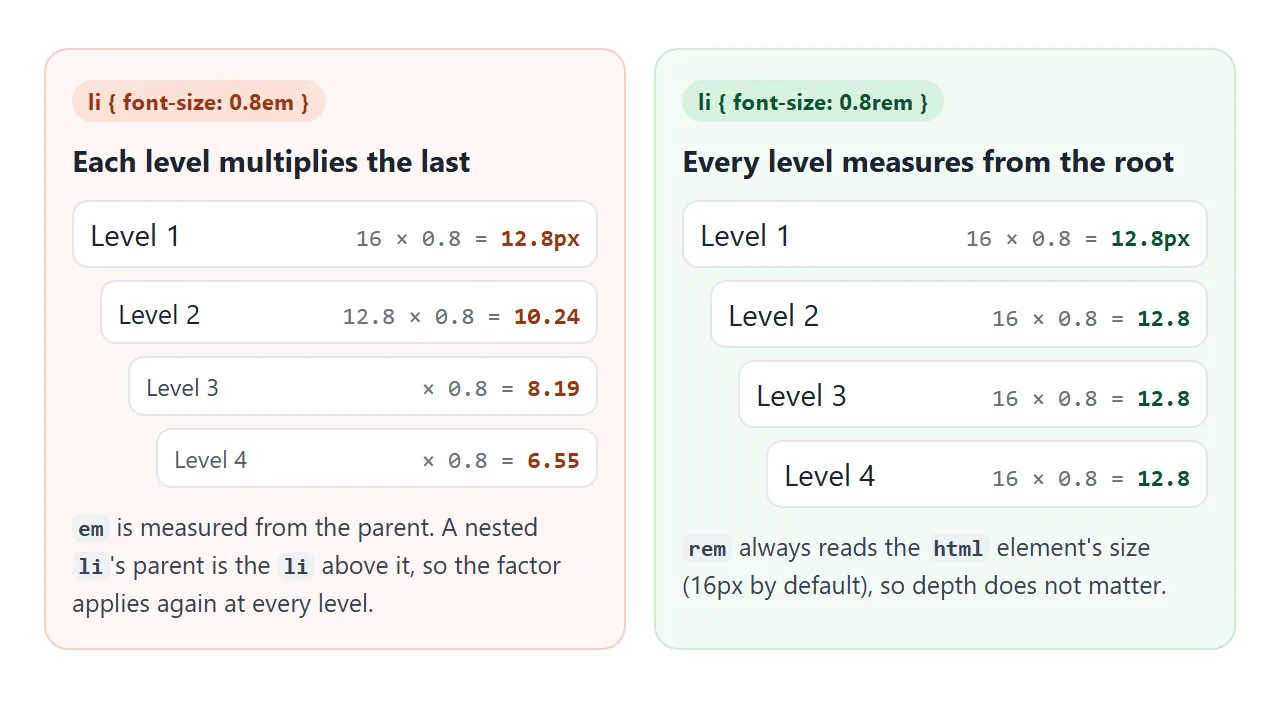
Drag the factor above 1 to see the opposite: the same rule makes deep items huge.
<!doctype html>
<html lang="en">
<head>
<meta charset="utf-8">
<meta name="viewport" content="width=device-width, initial-scale=1">
<title>The em compounding trap in nested lists</title>
<style>
  body { margin: 0; padding: 14px; font: 16px/1.4 system-ui, sans-serif; background: #f4f5f7; color: #1d2330; }
  .controls { font-size: 13px; display: flex; align-items: center; gap: 8px; margin-bottom: 12px; }
  .controls input { flex: 1; min-width: 0; }
  .cols { display: grid; grid-template-columns: 1fr 1fr; gap: 10px; }
  .col { background: #fff; border-radius: 10px; padding: 10px 8px 10px 10px; border: 1px solid #e1e4ea; overflow: hidden; }
  .col h3 { margin: 0 0 4px 8px; font-size: 13px; }
  .col h3 code { font-size: 12px; }
  .bad  h3 { color: #9a3412; }
  .good h3 { color: #0f5132; }
  ul { margin: 0; padding-left: 14px; }
  li { overflow-wrap: anywhere; }
  li output { font: 11px ui-monospace, Consolas, monospace; color: #6b7280; margin-left: 4px; }

  /* the only difference between the two lists */
  .bad  li { font-size: calc(var(--f) * 1em); }   /* times the PARENT li: compounds */
  .good li { font-size: calc(var(--f) * 1rem); }  /* times the ROOT: same at every level */
</style>
</head>
<body>
<div class="controls">
  <label for="f">Size factor</label>
  <input type="range" id="f" min="0.7" max="1.3" step="0.05" value="0.8">
  <b id="fv">0.8</b>
</div>

<div class="cols">
  <div class="col bad"><h3>li { font-size: <code id="c1">0.8em</code> }</h3><div class="list"></div></div>
  <div class="col good"><h3>li { font-size: <code id="c2">0.8rem</code> }</h3><div class="list"></div></div>
</div>

<script>
  // the same four-level list goes into both columns
  const html = '<ul><li>Level 1<ul><li>Level 2<ul><li>Level 3<ul><li>Level 4</li></ul></li></ul></li></ul></li></ul>';
  document.querySelectorAll('.list').forEach((el) => { el.innerHTML = html; });

  const f = document.getElementById('f');
  function update() {
    document.body.style.setProperty('--f', f.value);
    document.getElementById('fv').textContent = f.value;
    document.getElementById('c1').textContent = f.value + 'em';
    document.getElementById('c2').textContent = f.value + 'rem';
    // label every item with the size the browser computed
    document.querySelectorAll('li').forEach((li) => {
      let out = li.querySelector(':scope > output');
      if (!out) { out = document.createElement('output'); li.firstChild.after(out); }
      out.textContent = Math.round(parseFloat(getComputedStyle(li).fontSize) * 10) / 10 + 'px';
    });
  }
  f.addEventListener('input', update);
  update();
</script>
</body>
</html>
The fix is rem. It skips the parents and reads the root, so depth stops mattering. Keep em for things that should scale with the text right around them, such as a small inside a paragraph or an icon next to a label.
rem and the reader's text size setting
Browsers let readers pick a default font size. That setting changes the size of the medium keyword, which is where the html element starts. Everything measured from it, directly or through parents, follows. A px value was never measured from it, so it stays put.
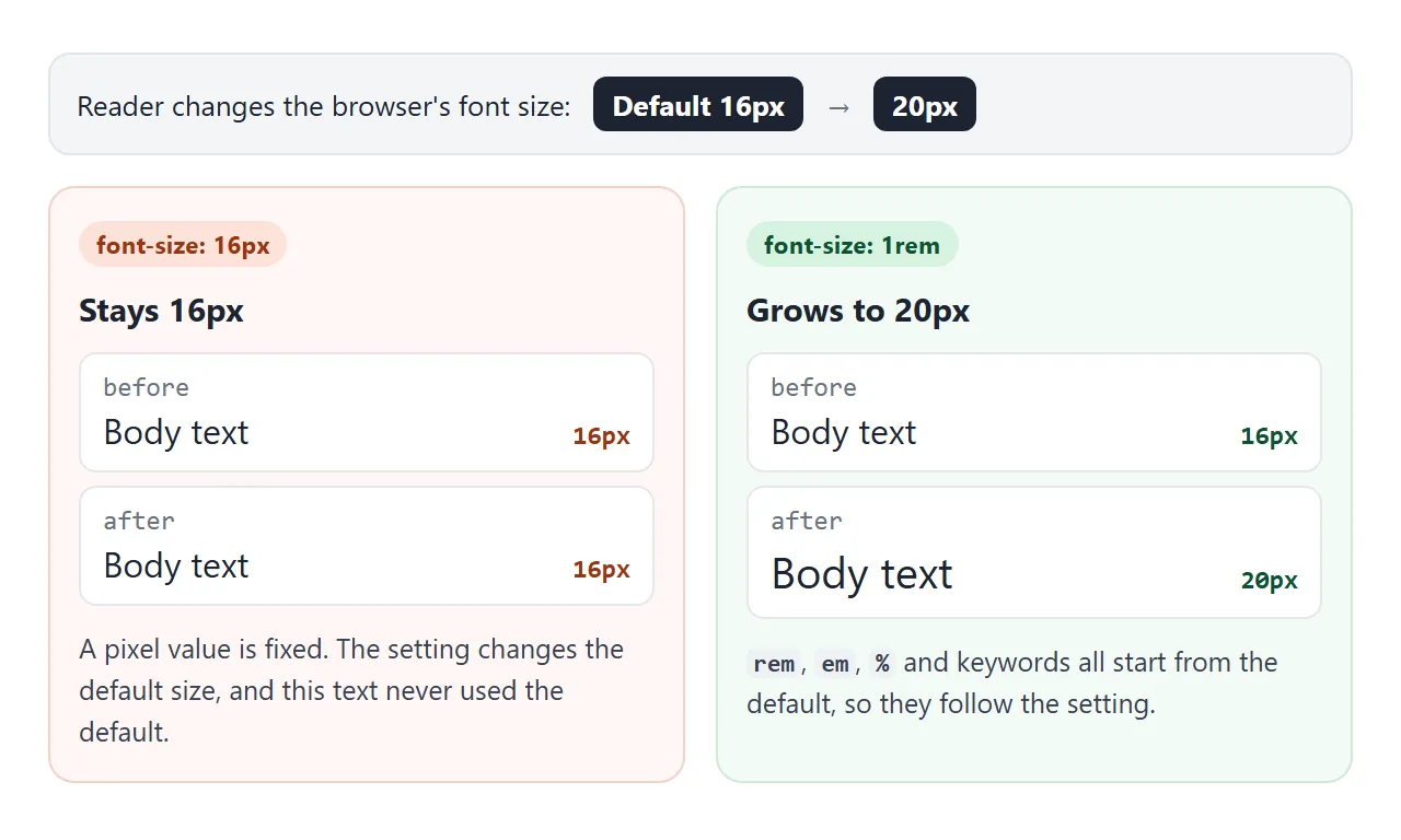
Browser zoom is a separate control. Zoom scales every length on the page, px included, so px text still gets bigger when a reader zooms. The text-size setting is the one px ignores.
The html { font-size: 62.5% } trick
Some stylesheets set the root to 62.5%. At the 16px default that makes 1rem equal 10px, so 1.6rem reads as 16px. Because it is a percentage, it still follows the reader's setting: at a 20px default, 1rem becomes 12.5px.
The cost is that every piece of text you do not size yourself now inherits 10px. That includes plain paragraphs and anything a widget or embed brings in. Set body { font-size: 1.6rem; } straight away if you use it.
Writing html { font-size: 10px; } in pixels is a different thing. A pixel root ignores the reader's setting, and every rem on the page inherits that.
Keywords: small, large, larger and smaller
medium is the browser default, 16px unless the reader changed it. small, large, x-large and the rest are fixed steps around it, and the browser picks the exact sizes.
larger and smaller are relative to the parent, one step up or down. They are handy for a quick one-off, but you do not control the ratio, so a type scale is easier to keep consistent in rem.
Fluid type with clamp()
A size in vw alone follows the screen with no limits. 4vw is 12.8px on a 320px phone and 57.6px on a 1440px desktop. clamp(min, preferred, max) keeps the growth but adds a floor and a ceiling.
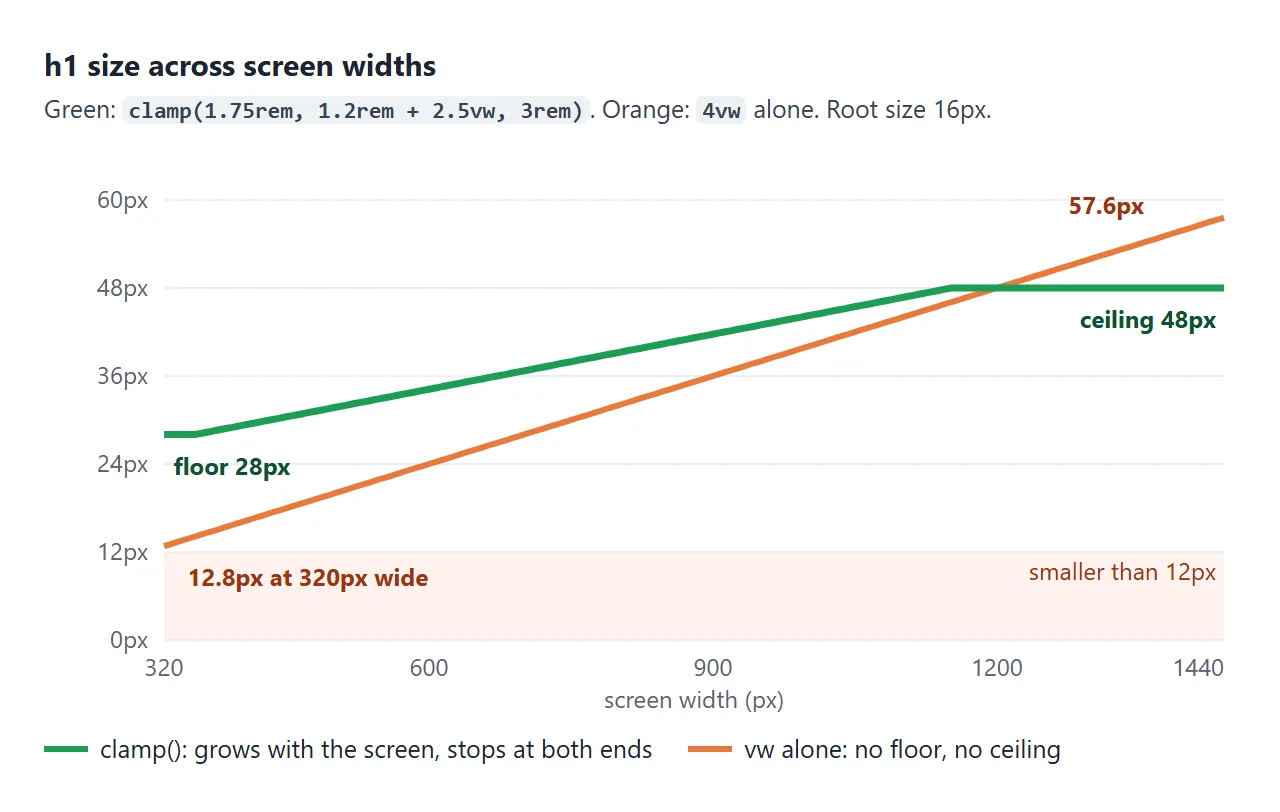
body  { font-size: clamp(1rem, 0.95rem + 0.25vw, 1.125rem); }
h1    { font-size: clamp(1.75rem, 1.2rem + 2.5vw, 3rem); }
h2    { font-size: clamp(1.3rem, 1.1rem + 1vw, 1.875rem); }
small { font-size: 0.875em; }
Write the floor and ceiling in rem, and add a rem part to the middle value. That way the whole scale still follows the reader's text setting. Text sized in vw alone does not grow with that setting.
Try both controls below. The preview is a small page of its own, so its vw values follow the preview's width, just as a real page follows the screen.
<!doctype html>
<html lang="en">
<head>
<meta charset="utf-8">
<meta name="viewport" content="width=device-width, initial-scale=1">
<title>A fluid type scale with clamp()</title>
<style>
  body { margin: 0; padding: 12px; font: 13px/1.4 system-ui, sans-serif; background: #f4f5f7; color: #1d2330; }
  .controls { display: grid; gap: 8px; margin-bottom: 10px; }
  .controls label { display: flex; align-items: center; gap: 8px; }
  .controls input { flex: 1; min-width: 0; }
  .seg { display: flex; gap: 4px; flex-wrap: wrap; align-items: center; }
  .seg button { font: inherit; padding: 5px 9px; border: 1px solid #c9cdd4; border-radius: 7px; background: #fff; cursor: pointer; }
  .seg button[aria-pressed="true"] { background: #1d2330; color: #fff; border-color: #1d2330; }
  #stage { overflow: hidden; }
  iframe { display: block; height: 380px; border: 2px solid #9aa3b2; border-radius: 10px; background: #fff; }
</style>
</head>
<body>
<div class="controls">
  <label>Screen width <input type="range" id="w" min="300" max="760"> <b id="wv"></b></label>
  <div class="seg">Reader's text size:
    <button data-root="16" aria-pressed="true">Default 16px</button>
    <button data-root="20" aria-pressed="false">Larger 20px</button>
    <button data-root="24" aria-pressed="false">Largest 24px</button>
  </div>
</div>
<div id="stage"><iframe id="page" title="Preview page"></iframe></div>

<script>
  // The type scale. Every size has a rem floor and ceiling, so it follows
  // the reader's text size, and a vw part, so it grows with the screen.
  const SCALE = `
    body  { font-size: clamp(1rem, 0.95rem + 0.25vw, 1.125rem); line-height: 1.55; }
    h1    { font-size: clamp(1.75rem, 1.2rem + 2.5vw, 3rem); line-height: 1.15; }
    h2    { font-size: clamp(1.3rem, 1.1rem + 1vw, 1.875rem); line-height: 1.25; }
    small { font-size: 0.875em; }  /* em: relative to the text around it */
  `;

  // Inside the preview, a script reports the computed sizes.
  function pageHtml(rootPx) {
    return `<!doctype html><meta name="viewport" content="width=device-width">
<style>
  html { font-size: ${rootPx}px; }  /* stands in for the browser text-size setting */
  body { margin: 0; padding: 14px 16px; font-family: system-ui, sans-serif; color: #1d2330; }
  h1, h2 { margin: 0 0 8px; } p { margin: 0 0 8px; }
  #sizes { font: 12px ui-monospace, Consolas, monospace; color: #0f5132; background: #eef7f1; padding: 6px 8px; border-radius: 6px; white-space: pre-wrap; }
  ${SCALE}
</style>
<pre id="sizes"></pre>
<h1>Fluid type</h1>
<h2>Section heading</h2>
<p>Body text sits at 1rem on a phone and grows a little on wide screens.
<small>Small print stays 0.875 of the text around it.</small></p>
<script>
  function show() {
    const px = (s) => Math.round(parseFloat(getComputedStyle(document.querySelector(s)).fontSize) * 10) / 10;
    document.getElementById('sizes').textContent =
      'width ' + innerWidth + 'px   h1 ' + px('h1') + '  h2 ' + px('h2') + '  body ' + px('p') + '  small ' + px('small');
  }
  addEventListener('resize', show); show();
<\/script>`;
  }

  const frame = document.getElementById('page');
  const w = document.getElementById('w');
  const stage = document.getElementById('stage');

  function setWidth() {
    w.max = stage.clientWidth - 4;  // fit the preview (and its 2px border) in the demo
    if (+w.value > +w.max) w.value = w.max;
    frame.style.width = w.value + 'px';
    document.getElementById('wv').textContent = w.value + 'px';
  }

  document.querySelectorAll('.seg button').forEach((btn) => {
    btn.addEventListener('click', () => {
      document.querySelectorAll('.seg button').forEach((b) => b.setAttribute('aria-pressed', b === btn));
      frame.srcdoc = pageHtml(btn.dataset.root);
    });
  });
  w.addEventListener('input', setWidth);
  window.addEventListener('resize', setWidth);
  frame.srcdoc = pageHtml(16);
  w.max = stage.clientWidth - 4;
  w.value = w.max;  // start at the widest the demo allows
  setWidth();
</script>
</body>
</html>
For heading levels and how big an h1 should be, see the h1 tag. This page is about the units.
Readable text on phones
The browser's 16px default is a good floor for body text on a phone. Keep smaller sizes for short things such as captions and labels. A long paragraph at 12px is hard to read on a small screen.
A phone only uses these sizes as written if the page has the viewport meta tag. Without it, mobile browsers lay the page out for a wide desktop screen and shrink the result.
Font size on inputs and buttons
Form controls do not pick up the page's font size. Browser default styles give them a smaller size of their own (13.33px in Chromium at the default setting), so a form can look smaller than the text around it.
input, button, select, textarea { font: inherit; }
Some mobile browsers also zoom the page in when a text box under 16px gets focus. A size of 1rem or more avoids it. Text input in HTML covers the rest of the box styling.
When it does not work
| What you see | Cause | Fix |
|---|---|---|
| Nested list items get tiny, or huge | em multiplies at each level |
Use rem on the nested element |
| Text ignores the reader's larger text setting | Size set in px, or the root set in px |
Use rem, and leave html at 100% or a percentage |
| Heading is tiny on a phone and huge on a desktop | Size set in vw alone |
Wrap it in clamp() with rem limits |
| One line has a bigger gap than the others | A larger inline element (or a sup) needs a taller line |
Set a smaller line-height on that element, 0 for sup |
| Inputs are smaller than the body text | Form controls do not inherit font-size |
font: inherit on form controls |
| Page zooms in when a phone user taps a box | The input's font size is under 16px | font-size: 1rem or more on the input |
| Everything is 10px after a stylesheet change | html { font-size: 62.5% } with no body size |
Set body { font-size: 1.6rem } |
The line gap problem comes from line-height: a span with bigger text brings a taller line with it. CSS line-height explains how the line box grows.
Share it as a link
Font sizes are hard to judge from a screenshot, because the screenshot has one width and one text setting. A shared page lets people drag the window, zoom and try it on their own phone.
Paste the page into a NOS document and choose Create share link. HTML to link walks through it.
The page renders as written and its scripts run, so the sliders in these examples work for whoever opens the link. If you change the code later, the same link shows the new version.