The letter-spacing property adds space between letters, and word-spacing adds space between words. Use an em value so the spacing grows and shrinks with the font size:
h1    { letter-spacing: -0.02em; }  /* a little tighter */
.tag  { letter-spacing: 0.1em; }    /* a little looser */
p     { word-spacing: 0.1em; }      /* wider gaps between words */
Move the sliders below. Switch between em and px, then change the text size and watch which samples keep their look. The grey line under each sample shows the pixels the browser worked out.
<!doctype html>
<html lang="en">
<head>
<meta charset="utf-8">
<meta name="viewport" content="width=device-width, initial-scale=1">
<title>letter-spacing and word-spacing playground</title>
<style>
  body { margin: 0; padding: 14px; font-family: system-ui, sans-serif; background: #f4f5f7; color: #1d2330; }
  .panel { max-width: 620px; margin: 0 auto; background: #fff; border-radius: 12px; padding: 14px 16px; box-shadow: 0 4px 16px rgba(0, 0, 0, .08); }
  .row { display: grid; grid-template-columns: 110px 1fr 70px; gap: 8px; align-items: center; font-size: 13px; margin: 6px 0; }
  .row output { font: 600 12px ui-monospace, Consolas, monospace; text-align: right; }
  .seg button { font: 600 12px system-ui, sans-serif; padding: 5px 12px; border: 1px solid #c9ced8; background: #fff; cursor: pointer; }
  .seg button:first-child { border-radius: 6px 0 0 6px; }
  .seg button:last-child { border-radius: 0 6px 6px 0; margin-left: -1px; }
  .seg button[aria-pressed="true"] { background: #1d2330; color: #fff; border-color: #1d2330; }

  /* every sample uses the same two variables */
  .samples { margin-top: 12px; border-top: 1px solid #e5e7eb; padding-top: 8px; }
  .samples > * {
    letter-spacing: var(--ls);
    word-spacing: var(--ws);
    margin: 10px 0 2px;
  }
  .heading { font-size: 2em; font-weight: 800; line-height: 1.15; }
  .body { font-size: 1em; line-height: 1.5; }
  .label { font-size: .75em; font-weight: 700; text-transform: uppercase; color: #8a5a00; }
  .samples small { display: block; font: 11px ui-monospace, Consolas, monospace; color: #6b7280; letter-spacing: normal; word-spacing: normal; margin: 0; }
</style>
</head>
<body>
<div class="panel">
  <div class="row"><span>Unit</span>
    <span class="seg"><button aria-pressed="true" data-unit="em">em</button><button aria-pressed="false" data-unit="px">px</button></span><span></span></div>
  <div class="row"><label for="ls">letter-spacing</label><input id="ls" type="range" min="-10" max="25" value="0"><output id="lsOut"></output></div>
  <div class="row"><label for="ws">word-spacing</label><input id="ws" type="range" min="0" max="50" value="0"><output id="wsOut"></output></div>
  <div class="row"><label for="size">Text size</label><input id="size" type="range" min="12" max="24" value="16"><output id="sizeOut"></output></div>

  <div class="samples" id="samples">
    <div class="heading">Big headline text</div><small></small>
    <div class="body">Body text is read for minutes at a time, so it usually keeps the font's normal spacing.</div><small></small>
    <div class="label">Small uppercase label</div><small></small>
  </div>
</div>

<script>
  const samples = document.getElementById('samples');
  const ls = document.getElementById('ls'), ws = document.getElementById('ws'), size = document.getElementById('size');
  let unit = 'em';

  // slider steps are hundredths of an em; in px mode, 0.01em at 16px = 0.16px
  function value(steps) {
    return unit === 'em' ? (steps / 100) + 'em' : (Math.round(steps * 1.6) / 10) + 'px';
  }

  function update() {
    samples.style.fontSize = size.value + 'px';
    samples.style.setProperty('--ls', value(+ls.value));
    samples.style.setProperty('--ws', value(+ws.value));
    document.getElementById('lsOut').textContent = value(+ls.value);
    document.getElementById('wsOut').textContent = value(+ws.value);
    document.getElementById('sizeOut').textContent = size.value + 'px';
    // show what the browser worked out for each sample, in pixels
    samples.querySelectorAll('small').forEach((note) => {
      const cs = getComputedStyle(note.previousElementSibling);
      note.textContent = 'font ' + cs.fontSize + ' · letter-spacing ' + cs.letterSpacing + ' · word-spacing ' + cs.wordSpacing;
    });
  }

  document.querySelectorAll('.seg button').forEach((btn) => {
    btn.addEventListener('click', () => {
      unit = btn.dataset.unit;
      document.querySelectorAll('.seg button').forEach((b) => b.setAttribute('aria-pressed', b === btn));
      update();
    });
  });
  [ls, ws, size].forEach((input) => input.addEventListener('input', update));
  update();
</script>
</body>
</html>
Typographers call this spacing tracking. It is different from kerning, which the font applies to particular letter pairs on its own.
The values letter-spacing and word-spacing accept
Both properties take the keyword normal or a length. The length is added to the font's own spacing, so 0 means no change and a negative number pulls the letters closer together.
| Value | What it does |
|---|---|
normal |
The font's own spacing. The initial value, and the way to undo an inherited value |
0.1em |
Adds a tenth of the element's font size after each letter |
2px |
Adds 2 pixels, whatever the font size |
-0.03em |
Takes space away. Letters can touch if you go too far |
letter-spacing applies to every character, spaces included. word-spacing applies only to the spaces between words. If you set both, a space between two words gets both amounts.
Both properties are inherited. Set them on a container and every element inside gets them, unless it sets its own.
Use em so the spacing scales
An em value is a share of the element's own font size. 0.1em is 1.6px on 16px text and 4.8px on 48px text, so a tracked label looks the same whether it is small or large.
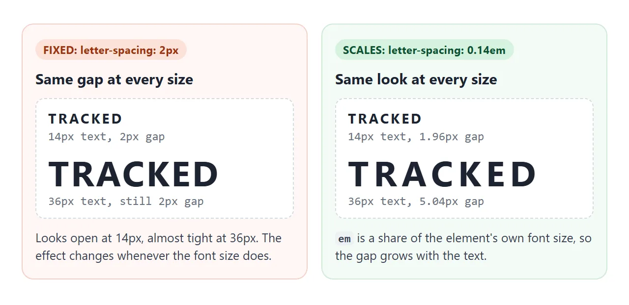
A px value ignores the font size. Spacing that looks right on a 12px label is almost invisible on a 40px heading. It also stays fixed when a media query or a user setting changes your text size.
Font size in CSS covers the units in detail.
One catch: the browser turns an em value into pixels on the element where you set it, and children inherit those pixels. Set letter-spacing: 0.5em on a 16px parent, and a 40px child inherits 8px, not 20px.
Set the spacing on the element whose text you are styling, or set it again on the child.
Tighten big headings, loosen small capitals
The right amount depends on size and case. Two patterns are common:
- Large, bold headings can look loose at display sizes. A small negative value, around
-0.01emto-0.03em, pulls them together. - Small capital labels, such as eyebrows, tags and buttons, can look cramped. A positive value, around
0.05emto0.2em, opens it up.
Body text is usually best left at normal. The font designer already spaced it for reading at length, and large changes in either direction make paragraphs harder to read.
These are starting points, not rules. Fonts differ, so judge the result on screen with your own font. Changing the font in HTML shows how to set one, and text-transform covers making labels uppercase without retyping them.
The extra space after the last letter
Browsers add the letter spacing after every character, including the last one. On a left-aligned heading you never notice. On a centred button label, the word sits slightly left of the middle, by half the spacing.
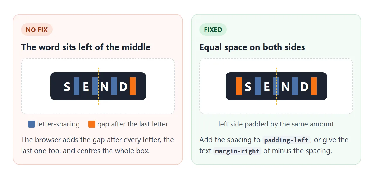
The demo below makes the spacing large enough to see. The blue box is the text, and the dashed line is the true middle of the button.
<!doctype html>
<html lang="en">
<head>
<meta charset="utf-8">
<meta name="viewport" content="width=device-width, initial-scale=1">
<title>Centered text with letter-spacing</title>
<style>
  body { margin: 0; padding: 14px; font-family: system-ui, sans-serif; background: #f4f5f7; color: #1d2330; }
  .wrap { max-width: 620px; margin: 0 auto; }
  .ctrl { display: flex; flex-wrap: wrap; gap: 8px 16px; align-items: center; font-size: 13px; margin-bottom: 12px; }
  .ctrl output { font: 600 12px ui-monospace, Consolas, monospace; }
  .grid { display: grid; grid-template-columns: repeat(auto-fit, minmax(170px, 1fr)); gap: 10px; }
  .case { background: #fff; border-radius: 10px; padding: 12px; text-align: center; }
  .case p { font-size: 12px; color: #4b5563; margin: 10px 0 0; line-height: 1.4; }
  .case code { font: 600 11.5px ui-monospace, Consolas, monospace; }

  .btn {
    position: relative;
    display: inline-block; min-width: 120px; box-sizing: border-box;
    padding: 12px 18px; border-radius: 8px;
    background: #1d2330; color: #fff;
    font-size: 15px; font-weight: 700; text-transform: uppercase;
    letter-spacing: var(--track);   /* set by the slider */
  }
  /* dashed line = the true middle of the button */
  .btn::after { content: ""; position: absolute; top: 0; bottom: 0; left: 50%; border-left: 1px dashed #fbbf24; }
  .btn span { background: rgba(96, 165, 250, .45); } /* shows the text box, trailing space included */

  /* fix 1: add the same amount on the left */
  .fix-pad { padding-left: calc(18px + var(--track)); }
  /* fix 2: pull the trailing space back out of the box */
  .fix-margin span { margin-right: calc(-1 * var(--track)); }
</style>
</head>
<body>
<div class="wrap">
  <div class="ctrl">
    <label for="t">letter-spacing</label>
    <input id="t" type="range" min="0" max="60" value="40">
    <output id="tOut"></output>
    <label><input type="checkbox" id="box" checked> show text box</label>
  </div>
  <div class="grid">
    <div class="case">
      <span class="btn"><span>Send</span></span>
      <p>No fix. The space after the last <b>D</b> pushes the word left of the dashed middle.</p>
    </div>
    <div class="case">
      <span class="btn fix-pad"><span>Send</span></span>
      <p><code>padding-left</code> grows by the same amount, so both sides match.</p>
    </div>
    <div class="case">
      <span class="btn fix-margin"><span>Send</span></span>
      <p>A negative <code>margin-right</code> on the text cancels the extra space.</p>
    </div>
  </div>
</div>

<script>
  const t = document.getElementById('t');
  function update() {
    const v = (t.value / 100) + 'em';
    document.documentElement.style.setProperty('--track', v);
    document.getElementById('tOut').textContent = v;
  }
  t.addEventListener('input', update);
  // toggle the blue highlight on the text boxes
  document.getElementById('box').addEventListener('change', (e) => {
    document.querySelectorAll('.btn span').forEach((s) => {
      s.style.background = e.target.checked ? '' : 'none';
    });
  });
  update();
</script>
</body>
</html>
There are two fixes:
/* 1. add the same amount on the left */
.btn { letter-spacing: 0.2em; padding-left: calc(18px + 0.2em); padding-right: 18px; }

/* 2. or cancel the trailing space on the text itself */
.btn span { margin-right: -0.2em; }
The negative margin makes the box measure a little narrower than the text. In a button that sizes itself to its content, a label of several words can then wrap onto two lines. Add white-space: nowrap to short labels, or use the padding fix.
Ligatures and connected scripts
Many fonts join certain letter pairs, such as fi and fl, into single shapes called ligatures.
When letter-spacing is not zero, browsers skip these optional ligatures so each letter can be spaced on its own. If a font's ligatures matter to your design, keep that text at normal.
Some writing systems connect their letters, Arabic among them. Spacing the letters apart can break those joins, and some browsers skip the spacing for such text instead.
Leave letter-spacing at normal on text in connected scripts, and use word-spacing or font-size if you need a different feel.
Test your layout with WCAG text spacing
Some readers override your spacing with a browser extension or a user style sheet, because wider spacing is easier for them to read. WCAG 2.2 success criterion 1.4.12, Text Spacing (level AA), asks that no content or function is lost when a user sets:
| Property | At least | On 16px text |
|---|---|---|
| Line height | 1.5 times the font size | 24px |
| Spacing after paragraphs | 2 times the font size | 32px |
| Letter spacing | 0.12 times the font size | 1.92px |
| Word spacing | 0.16 times the font size | 2.56px |
You do not have to use these values in your design. Your layout has to survive them.
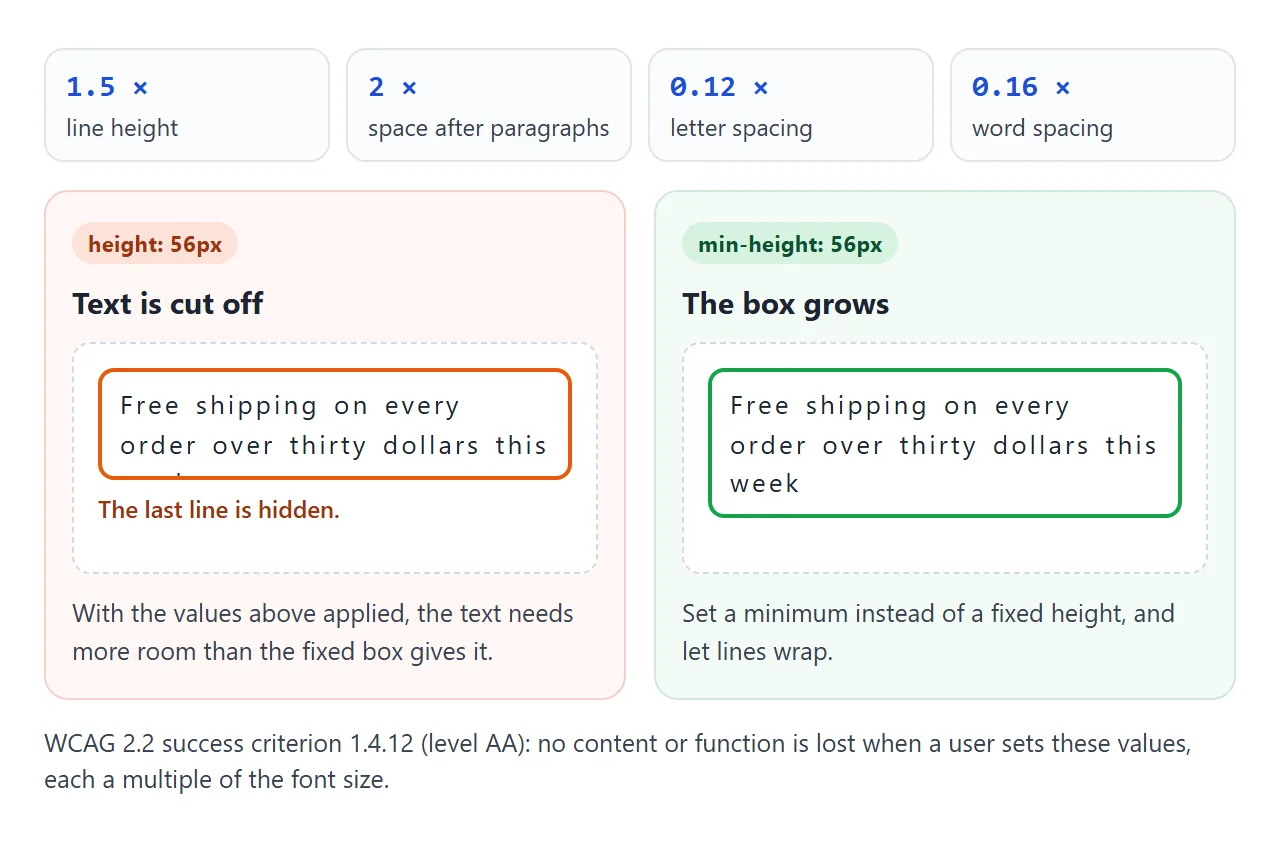
The finished example puts the patterns together: a tracked eyebrow label, a tight headline, body text at normal and a centred call-to-action. Press Text spacing test to apply the four values. Then tick Use fixed-height boxes and run it again.
<!doctype html>
<html lang="en">
<head>
<meta charset="utf-8">
<meta name="viewport" content="width=device-width, initial-scale=1">
<title>Hero section with letter-spacing, plus a text spacing test</title>
<style>
  body { margin: 0; padding: 14px; font-family: system-ui, sans-serif; background: #e9e6df; color: #1c1a17; }
  .hero {
    max-width: 620px; margin: 0 auto; padding: 28px 24px;
    border-radius: 16px; background: linear-gradient(135deg, #fffaf0, #f3e8d6);
  }
  /* 1. eyebrow: small, uppercase, tracked out */
  .eyebrow {
    font-size: 12px; font-weight: 700; text-transform: uppercase;
    letter-spacing: .2em; color: #9a3412; margin: 0 0 10px;
  }
  /* 2. headline: big and bold, tracked in a little */
  h1 {
    font-size: clamp(32px, 8vw, 54px); line-height: 1.05; font-weight: 800;
    letter-spacing: -.03em; margin: 0 0 14px;
  }
  /* 3. body: leave the font's own spacing alone */
  .lede { font-size: 17px; line-height: 1.5; max-width: 34em; margin: 0 0 18px; color: #3f3a33; }

  .cta {
    display: inline-block; padding: 13px 22px; border-radius: 99px;
    background: #1c1a17; color: #fff; text-decoration: none;
    font-size: 13px; font-weight: 700; text-transform: uppercase; letter-spacing: .15em;
    white-space: nowrap;   /* keep the label on one line */
  }
  .cta span { margin-right: -.15em; }      /* cancel the space after the last letter */
  .stats { display: flex; flex-wrap: wrap; gap: 10px; margin-top: 22px; }
  .stat { flex: 1 1 120px; box-sizing: border-box; min-height: 62px; background: #fff; border-radius: 10px; padding: 10px 12px; }
  .stat b { display: block; font-size: 22px; line-height: 1.2; letter-spacing: -.02em; }
  .stat small { display: block; font-size: 11px; line-height: 1.2; text-transform: uppercase; letter-spacing: .1em; color: #6b645a; }
  .fixed .stat { height: 62px; min-height: 0; overflow: hidden; } /* the fragile version */

  /* WCAG 1.4.12 text spacing values, applied on top of everything */
  .spacing-test * {
    line-height: 1.5 !important;
    letter-spacing: .12em !important;
    word-spacing: .16em !important;
  }
  .spacing-test p { margin-bottom: 2em !important; }

  .tools { max-width: 620px; margin: 12px auto 0; display: flex; flex-wrap: wrap; gap: 8px 14px; align-items: center; font-size: 13px; }
  .tools button { font: 600 13px system-ui, sans-serif; padding: 8px 14px; border-radius: 8px; border: 1px solid #1c1a17; background: #fff; cursor: pointer; }
  .tools button[aria-pressed="true"] { background: #1c1a17; color: #fff; }
  #report { max-width: 620px; margin: 8px auto 0; font-size: 13px; min-height: 18px; }
  .ok { color: #0f5132; } .bad { color: #9a3412; font-weight: 600; }
</style>
</head>
<body>
<section class="hero" id="hero">
  <p class="eyebrow">Field notes · Issue 12</p>
  <h1>Space is part of the letterform</h1>
  <p class="lede">Big headlines read better a little tighter, small capitals a little looser, and body text is best left as the font designer drew it.</p>
  <a class="cta" href="#"><span>Read the issue</span></a>
  <div class="stats">
    <div class="stat"><b>0.2em</b><small>Eyebrow tracking</small></div>
    <div class="stat"><b>-0.03em</b><small>Headline tracking</small></div>
    <div class="stat"><b>normal</b><small>Body text</small></div>
  </div>
</section>

<div class="tools">
  <button id="test" aria-pressed="false">Text spacing test</button>
  <label><input type="checkbox" id="fixed"> Use fixed-height boxes</label>
</div>
<p id="report"></p>

<script>
  const hero = document.getElementById('hero');
  const report = document.getElementById('report');

  // count elements whose content no longer fits inside them
  function check() {
    const clipped = [...hero.querySelectorAll('*')].filter((el) =>
      el.scrollHeight > el.clientHeight + 1 && getComputedStyle(el).overflow === 'hidden');
    report.className = clipped.length ? 'bad' : 'ok';
    report.textContent = clipped.length
      ? clipped.length + ' box(es) cut off their text.'
      : 'Nothing is cut off. The layout survives.';
    clipped.forEach((el) => { el.style.outline = '2px solid #ea580c'; });
  }

  function update() {
    hero.querySelectorAll('*').forEach((el) => { el.style.outline = ''; });
    hero.classList.toggle('spacing-test', test.getAttribute('aria-pressed') === 'true');
    hero.classList.toggle('fixed', document.getElementById('fixed').checked);
    check();
  }

  const test = document.getElementById('test');
  test.addEventListener('click', () => {
    test.setAttribute('aria-pressed', test.getAttribute('aria-pressed') !== 'true');
    update();
  });
  document.getElementById('fixed').addEventListener('change', update);
  update();
</script>
</body>
</html>
The test is a few lines of CSS. Add a class like this to your own page while you check it:
.spacing-test * {
  line-height: 1.5 !important;
  letter-spacing: 0.12em !important;
  word-spacing: 0.16em !important;
}
.spacing-test p { margin-bottom: 2em !important; }
The usual failures are fixed heights with overflow: hidden, labels that must stay on one line in a narrow box, and text placed over an image at an exact position. Use min-height and let text wrap. Line height in CSS covers the vertical side.
When it does not work
| What you see | Cause | Fix |
|---|---|---|
| Spacing looks right on one size and wrong on another | The value is in px | Use em |
| A child's spacing is too small for its large text | The parent's em was turned into px and inherited | Set letter-spacing on the child |
| Centred text sits slightly left | Spacing is added after the last letter too | Add the spacing to padding-left, or a negative margin-right on the text |
| A label wraps after the margin fix | The negative margin narrows the measured box | white-space: nowrap, or use the padding fix |
| fi and fl turned into separate letters | Non-zero spacing turns off optional ligatures | Keep that text at normal |
| Arabic or another connected script looks broken or unspaced | Spacing conflicts with joined letters | Leave letter-spacing at normal for that text |
| Only part of a line is spaced | The rule is on an inline element such as a span | Put it on the block, or on every span you mean |
| Nothing changes | Another rule wins, or a child resets it to normal | Check the computed value in the browser's developer tools |
Share it as a link
Spacing is hard to judge from a description or a screenshot, because the effect depends on the font size and the width of the screen. The person you send it to may also need to try the spacing test on their own device.
Paste the page into a NOS document and choose Create share link. HTML to link walks through it.
The page renders as written and its scripts run, so the people you send it to can move the sliders and press the test button themselves. If you change the code later, the same link shows the new version.