To indent text in CSS, put text-indent on the paragraph: p { text-indent: 2em; }. It moves only the first line of the block. Every line that wraps after it starts at the normal left edge. A negative value pulls the first line out instead.
Try it. Move the slider and watch the first line of each paragraph. The dashed outline is the edge of the paragraph box.
<!doctype html>
<html lang="en">
<head>
<meta charset="utf-8">
<meta name="viewport" content="width=device-width, initial-scale=1">
<title>CSS text-indent</title>
<style>
  body { margin: 0; padding: 16px; font-family: system-ui, sans-serif; background: #f4f5f7; color: #1d2330; }
  .controls { display: flex; flex-wrap: wrap; gap: 8px 16px; align-items: center; font-size: 14px; margin-bottom: 10px; }
  output { font: 600 13px ui-monospace, Consolas, monospace; background: #fff; padding: 3px 7px; border-radius: 6px; }
  .page { background: #fff; border-radius: 10px; padding: 14px 18px 14px 44px; max-width: 520px; }
  .page p { margin: 0; line-height: 1.55; font-size: 15px; outline: 1px dashed #b8bec8; }

  /* The one line this demo is about: only the first line of each paragraph moves */
  .page p { text-indent: 2em; }
</style>
</head>
<body>
<div class="controls">
  <label>text-indent <input type="range" id="size" min="-2" max="5" step="0.5" value="2"></label>
  <output id="code">text-indent: 2em;</output>
</div>
<div class="page" id="page">
  <p>The first line of this paragraph starts further in. Every line after it wraps back to the left edge of the box, which is drawn as a dashed outline.</p>
  <p>Drag the slider below zero. A negative value pulls the first line out to the left, past the edge of the box, while the other lines stay where they were.</p>
</div>

<script>
  const size = document.getElementById('size');
  const code = document.getElementById('code');
  const paras = document.querySelectorAll('#page p');

  size.addEventListener('input', () => {
    const value = size.value + 'em';
    paras.forEach((p) => { p.style.textIndent = value; });
    code.textContent = 'text-indent: ' + value + ';';
  });
</script>
</body>
</html>
What text-indent does, and what it does not
text-indent shifts the start of the first line inside a block. It does not move the box, and it does not change the lines below. That is the difference from padding-left or margin-left, which move every line.
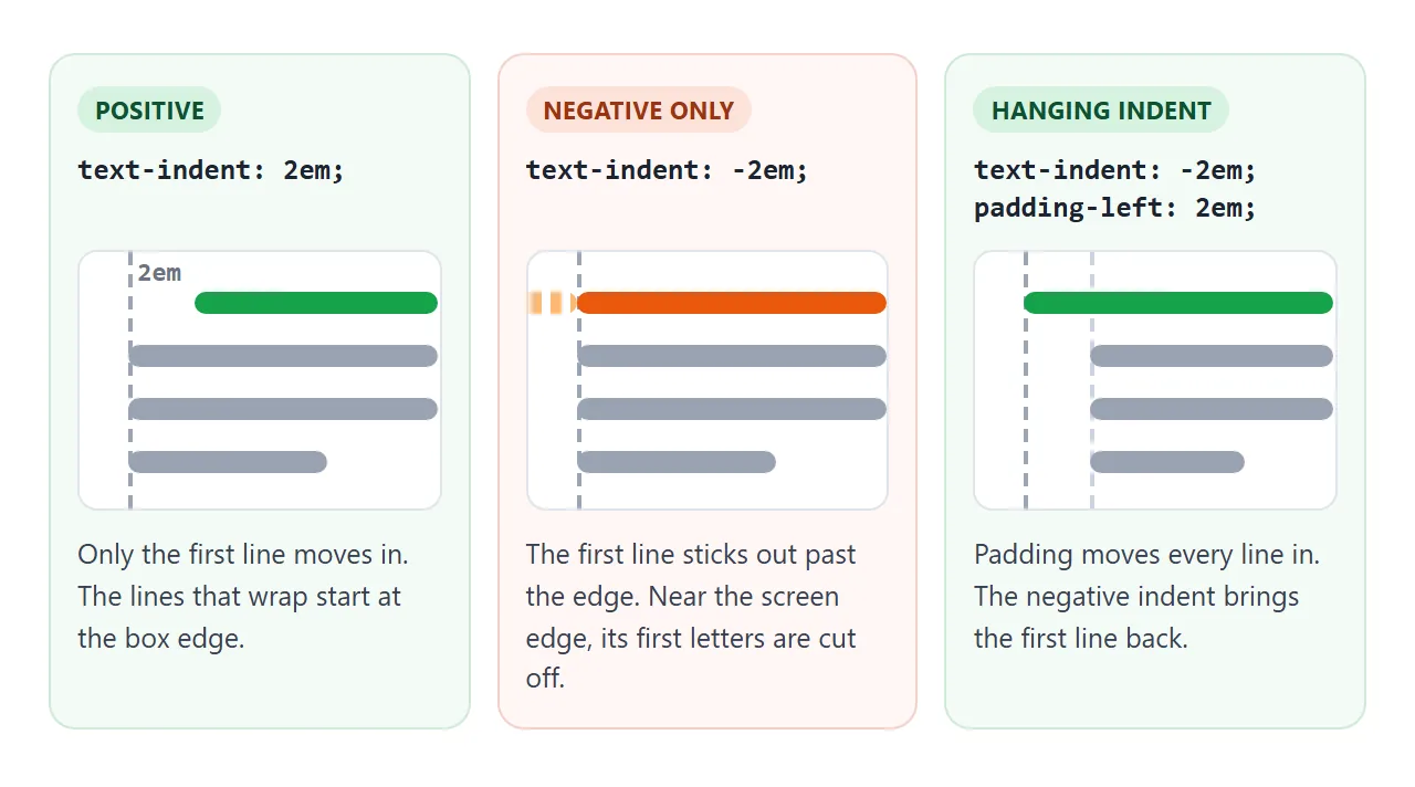
A few rules decide where it works:
- It needs a block container. A
p,div,lior an element withdisplay: inline-blockhas a first line. A plainspanoradoes not, so the value is ignored there. - It is inherited. Set it on a wrapper
divand every paragraph inside gets the same indent. In our test, a2emindent on a div gave its child paragraph a computed indent of32px. - Units matter.
emfollows the font size, which suits text. A percentage is taken from the width of the containing block, so10%in a 400px box is 40px.
Indent paragraphs the book way
Printed books separate paragraphs with an indent, not a blank line, and they leave the first paragraph after a heading flush left. The adjacent sibling selector does exactly that:
article p { margin: 0; }
article p + p { text-indent: 1.5em; }
p + p matches a paragraph only when another paragraph comes right before it. The opening paragraph has no paragraph before it, so it stays at the edge.
Pick one signal per page. An indent plus a gap between paragraphs marks each break twice. If you keep the gap, drop the indent.
Negative text-indent and the hanging indent
A hanging indent keeps the first line at the edge and indents the rest. Reference lists, glossaries and bibliographies use it so the first word of each entry stands out.
A negative text-indent alone pushes the first line past the edge of the box, where it can be clipped by overflow: hidden or the side of the screen. Add padding of the same size to fix it:
.sources p {
  padding-left: 2em;   /* every line moves in */
  text-indent: -2em;   /* the first line comes back */
}
This pair works in any browser that supports CSS at all, which makes it the safe default.
The hanging and each-line keywords
text-indent also takes two keywords after the length. hanging flips which lines are indented. each-line also indents the line after every forced break, such as a <br>.
<!doctype html>
<html lang="en">
<head>
<meta charset="utf-8">
<meta name="viewport" content="width=device-width, initial-scale=1">
<title>text-indent: hanging and each-line</title>
<style>
body { margin: 0; padding: 16px; font-family: system-ui, sans-serif; background: #f4f5f7; color: #1d2330; }
.choices { display: flex; flex-wrap: wrap; gap: 6px; margin-bottom: 8px; }
button { font: 600 13px ui-monospace, Consolas, monospace; padding: 7px 10px; border: 1px solid #c9cdd4; border-radius: 8px; background: #fff; color: #1d2330; cursor: pointer; }
button[aria-pressed="true"] { background: #1d2330; color: #fff; border-color: #1d2330; }
pre { margin: 0 0 10px; font: 13px ui-monospace, Consolas, monospace; background: #fff; padding: 8px 10px; border-radius: 8px; white-space: pre-wrap; }
.box { max-width: 520px; background: #fff; border-radius: 10px; padding: 12px 16px; margin-bottom: 10px; }
.box h3 { margin: 0 0 6px; font-size: 13px; color: #5b6270; }
.box p { margin: 0 0 8px; font-size: 15px; line-height: 1.5; outline: 1px dashed #b8bec8; }
#support { font-size: 13px; color: #5b6270; margin: 0; }
</style>
</head>
<body>
<div class="choices" id="choices">
<button data-css="text-indent: 2em;" aria-pressed="true">2em</button>
<button data-css="text-indent: 2em each-line;" aria-pressed="false">2em each-line</button>
<button data-css="text-indent: 2em hanging;" aria-pressed="false">2em hanging</button>
<button data-css="text-indent: -2em; padding-left: 2em;" aria-pressed="false">-2em + padding</button>
</div>
<pre id="code">text-indent: 2em;</pre>
<div class="box">
<h3>A poem with <br> line breaks</h3>
<p class="target">The fog comes in on little cat feet.<br>It sits looking over harbor and city<br>and then moves on.</p>
</div>
<div class="box">
<h3>A reference list</h3>
<p class="target">Lee, A. (2024). Setting type for the screen: a short guide to paragraphs, indents and spacing. Example Press.</p>
<p class="target">Park, J. (2025). Reading on small displays. Journal of Examples, 12(3), 45-67.</p>
</div>
<p id="support"></p>
<script>
const buttons = document.querySelectorAll('#choices button');
const code = document.getElementById('code');
const targets = document.querySelectorAll('.target');
// Start with the first choice applied
targets.forEach((p) => { p.style.cssText = buttons[0].dataset.css; });
buttons.forEach((btn) => {
btn.addEventListener('click', () => {
buttons.forEach((b) => b.setAttribute('aria-pressed', b === btn));
code.textContent = btn.dataset.css.replace('; ', ';\n');
targets.forEach((p) => { p.style.cssText = btn.dataset.css; });
});
});
// The keywords are newer than text-indent itself, so check before relying on them
document.getElementById('support').textContent =
'This browser understands the hanging and each-line keywords: ' +
(CSS.supports('text-indent', '2em hanging each-line') ? 'yes' : 'no');
</script>
</body>
</html>
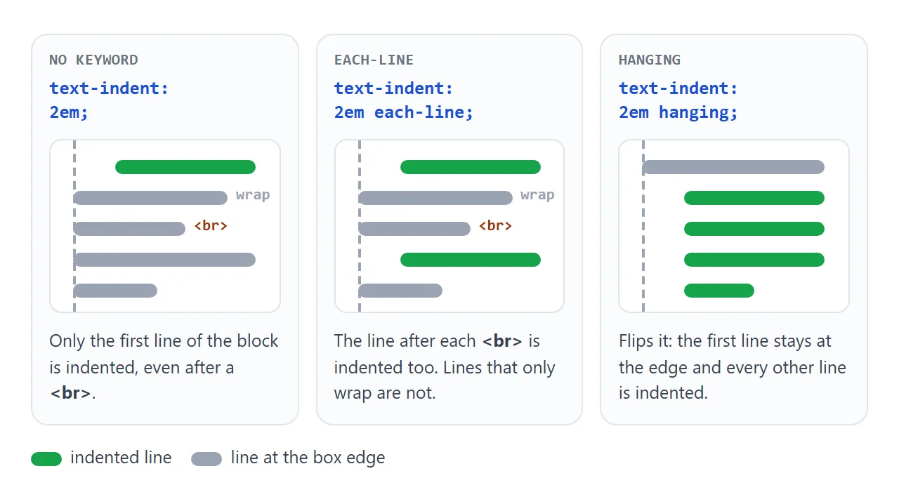
Two details are easy to miss. each-line does not touch lines that only wrap; it cares about forced breaks. And hanging on its own indents every line except the first, including lines after a <br>.
The keywords are newer than text-indent itself. All three browser engines we tested accepted them, but an older browser that does not will drop the whole declaration. Test with CSS.supports('text-indent', '2em hanging'), or keep the padding version when you need the result everywhere.
Drop caps with ::first-letter and initial-letter
A drop cap is a large first letter that sinks into the lines below it. ::first-letter selects that letter without an extra <span>. It also includes punctuation right before the letter, such as an opening quote mark.
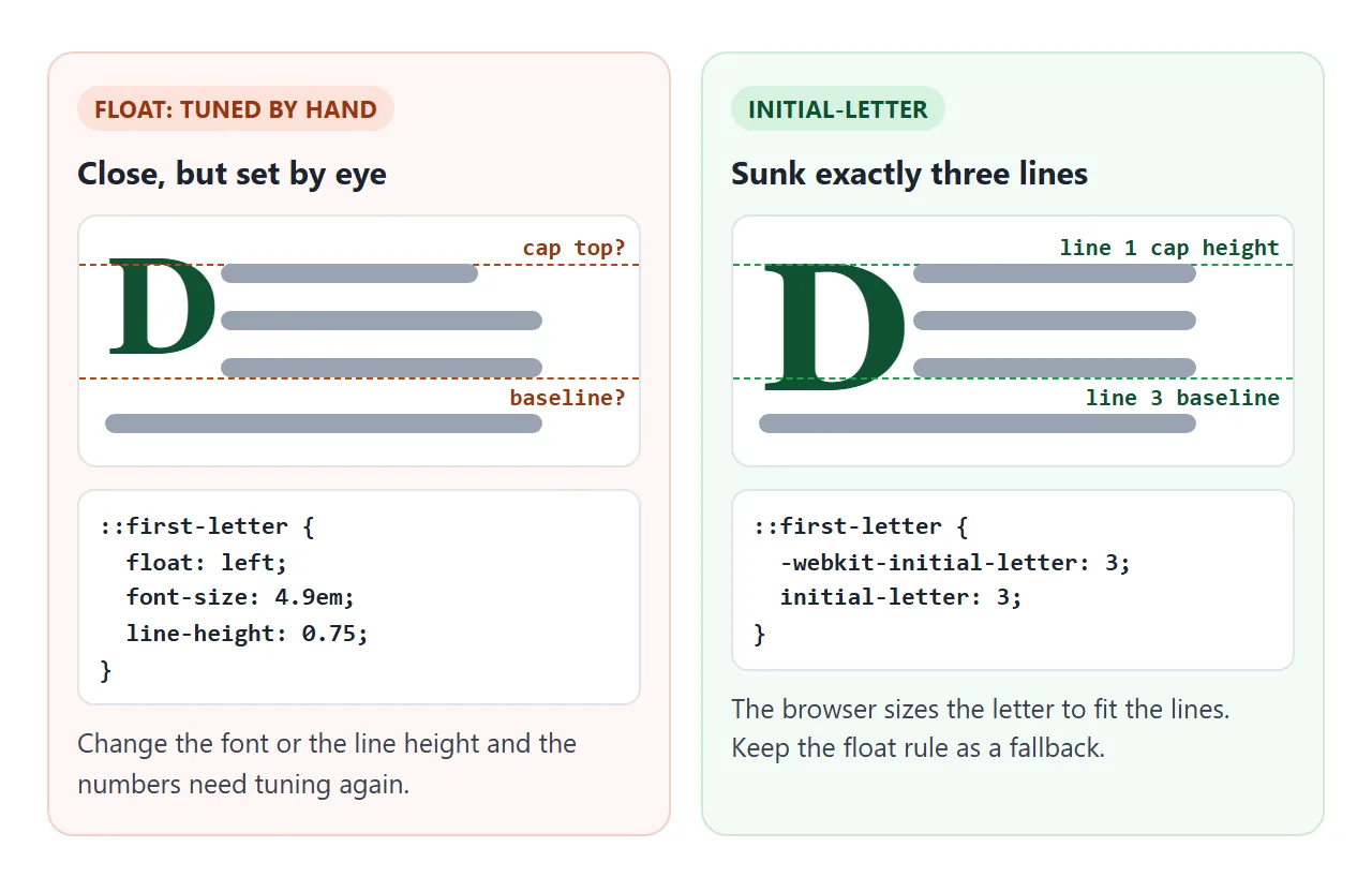
The older method floats the letter and sizes it by hand. initial-letter asks the browser to size and place it for a given number of lines.
/* Fallback: every browser */
.lead::first-letter {
  float: left;
  font-size: 4.9em;
  line-height: 0.75;
  margin: 0.06em 0.08em 0 0;
}
/* Where supported: sink the letter exactly 3 lines */
@supports (initial-letter: 3) or (-webkit-initial-letter: 3) {
  .lead::first-letter {
    float: none; font-size: inherit; line-height: inherit;
    -webkit-initial-letter: 3;
    initial-letter: 3;
  }
}
Not every browser has initial-letter yet, and some only accept the -webkit- form, so keep both lines and the fallback.
The float numbers depend on the font; change the typeface and you will need to adjust them. The CSS float guide covers how floats and wrapping text interact.
Style the first line with ::first-line
::first-line styles whatever text lands on the first line, and it updates as the width changes. A common book touch is small caps on the opening line:
.lead::first-line {
  font-variant: small-caps;
  letter-spacing: 0.04em;
}
It accepts font, color, background, letter-spacing, word-spacing, text-transform and text-decoration. Box properties such as margin and padding are ignored; we set margin-left: 40px on ::first-line and the text did not move. Use text-indent for that.
For uppercase and small caps in more depth, see CSS text-transform.
A finished page
Here all of it works together: a drop cap, a small-caps first line, book-style indents from the second paragraph on, and a hanging indent in the sources. Narrow the column and the first line and indents reflow.
<!doctype html>
<html lang="en">
<head>
<meta charset="utf-8">
<meta name="viewport" content="width=device-width, initial-scale=1">
<title>Drop cap, first line and indents</title>
<style>
body { margin: 0; padding: 16px; background: #f4f5f7; color: #1d2330; font-family: system-ui, sans-serif; }
article { background: #fff; border-radius: 10px; padding: 18px 20px; max-width: 560px; font-family: Georgia, serif; }
h1 { margin: 0 0 12px; font-size: 22px; }
article p { margin: 0; font-size: 16px; line-height: 1.55; }
/* Book style: no gap between paragraphs, indent every paragraph after the first */
article p + p { text-indent: 1.5em; }
/* Fallback drop cap: a floated first letter, sized by hand */
.lead::first-letter {
float: left;
font-size: 4.9em;
line-height: 0.75;
margin: 0.06em 0.08em 0 0;
color: #0f5132;
font-weight: bold;
}
/* Where the browser has initial-letter, it sinks the letter exactly 3 lines */
@supports (initial-letter: 3) or (-webkit-initial-letter: 3) {
.lead::first-letter {
float: none; font-size: inherit; line-height: inherit; margin: 0 0.1em 0 0;
-webkit-initial-letter: 3;
initial-letter: 3;
}
}
/* The first line of the opening paragraph in small caps */
.lead::first-line { font-variant: small-caps; letter-spacing: 0.04em; }
h2 { font-size: 15px; margin: 16px 0 6px; font-family: system-ui, sans-serif; }
/* Hanging indent for the sources: works in every browser */
.sources p { padding-left: 2em; text-indent: -2em; font-size: 14px; margin-bottom: 6px; }
.bar { margin-top: 12px; font-size: 13px; color: #5b6270; display: flex; flex-wrap: wrap; gap: 8px; align-items: center; }
button { font: 600 13px system-ui, sans-serif; padding: 6px 10px; border: 1px solid #c9cdd4; border-radius: 8px; background: #fff; color: #1d2330; cursor: pointer; }
</style>
</head>
<body>
<article id="story">
<h1>The printer’s apprentice</h1>
<p class="lead">Once the type was set, the apprentice checked every line against the proof. A missing space could shift a whole column, and the master printer noticed everything, even a comma set upside down in the last line of the page.</p>
<p>The second paragraph starts with an indent instead of a blank line. That is the book convention, and one selector, p + p, does it.</p>
<p>The third paragraph is indented the same way. The first paragraph is not, because nothing comes before it.</p>
<div class="sources">
<h2>Sources</h2>
<p>Lee, A. (2024). Setting type for the screen: a short guide to paragraphs, indents and spacing. Example Press.</p>
<p>Park, J. (2025). Reading on small displays. Journal of Examples, 12(3), 45-67.</p>
</div>
</article>
<div class="bar">
<button id="narrow">Narrow the column</button>
<span id="method"></span>
</div>
<script>
const story = document.getElementById('story');
document.getElementById('narrow').addEventListener('click', (e) => {
const narrow = story.style.maxWidth === '280px';
story.style.maxWidth = narrow ? '' : '280px';
e.target.textContent = narrow ? 'Narrow the column' : 'Widen the column';
});
// Show which drop cap rule this browser is using
const native = CSS.supports('initial-letter', '3') || CSS.supports('-webkit-initial-letter', '3');
document.getElementById('method').textContent =
'Drop cap made with: ' + (native ? 'initial-letter' : 'float (fallback)');
</script>
</body>
</html>
When it does not work
| What you see | Cause | Fix |
|---|---|---|
| Nothing is indented | The element is inline, such as a span |
Put it on a block, or use display: inline-block |
| Text inside a nested box is indented too | text-indent is inherited |
Set text-indent: 0 on the children |
Lines after a <br> are not indented |
Forced breaks do not restart the indent | Add each-line, or use separate paragraphs |
| The first letters are cut off | Negative indent with no padding | Add padding-left of the same size |
| A centered line sits off-center | The indent still applies with text-align: center |
Set text-indent: 0 on centered text |
| The drop cap floats too high or too low | Float values tuned for another font | Adjust line-height and margin, or use initial-letter |
margin on ::first-line does nothing |
Box properties do not apply to it | Use text-indent on the paragraph |
Text alignment and line spacing change how an indent reads. CSS text-align and CSS line-height cover both.
Share it as a link
Typography is judged on the real page. A screenshot freezes one width, and an .html attachment may show up as plain code on a phone.
Paste the page into a NOS document and choose Create share link. HTML to link walks through it.
The page renders as written and its scripts run, so the people you send it to can resize the column and see the indents and drop cap reflow. If you change the code later, the same link shows the new version.