text-align sets where each line of inline content sits inside a block: to the left, right, center, or stretched to both edges. Inline content means text, images, and inline-block elements such as buttons.
A block with a width, like a <div>, does not move. To center that, use margin: 0 auto.
Try it. Press each value and watch which items move and which one stays.
<!doctype html>
<html lang="en">
<head>
<meta charset="utf-8">
<meta name="viewport" content="width=device-width, initial-scale=1">
<title>What text-align moves</title>
<style>
  body { margin: 0; padding: 14px; font-family: system-ui, sans-serif; background: #f4f5f7; color: #1d2330; }
  .controls { display: flex; flex-wrap: wrap; gap: 6px; margin-bottom: 10px; }
  .controls button { font: inherit; font-size: 14px; padding: 6px 11px; border: 1px solid #c9ced8; border-radius: 8px; background: #fff; cursor: pointer; }
  .controls button.on { background: #1d2330; color: #fff; border-color: #1d2330; }
  label { display: block; font-size: 14px; margin-bottom: 10px; }
  code { font-family: ui-monospace, Consolas, monospace; font-size: 13px; }

  /* the container: text-align is set here and inherited by its content */
  .box { background: #fff; border: 1px dashed #a8b0bd; border-radius: 10px; padding: 12px; }
  .box p { margin: 0 0 10px; line-height: 1.5; }
  .pill { display: inline-block; padding: 7px 14px; border-radius: 99px; background: #2563eb; color: #fff; border: 0; font: inherit; }
  .block { width: 150px; margin-top: 10px; padding: 8px; border-radius: 8px; background: #fde2da; color: #9a3412; font-size: 14px; }
  .block.auto { margin-left: auto; margin-right: auto; background: #d6f2df; color: #0f5132; }
</style>
</head>
<body>
<div class="controls" id="controls">
  <button class="on">left</button><button>center</button><button>right</button><button>justify</button><button>start</button><button>end</button>
</div>
<label><input type="checkbox" id="auto"> Center the block with <code>margin: 0 auto</code></label>

<div class="box" id="box">
  <p>This paragraph is inline text. Every line inside it follows text-align, so it moves when you press a button above.</p>
  <img alt="" width="96" height="40" src="data:image/svg+xml,%3Csvg xmlns='http://www.w3.org/2000/svg' width='96' height='40'%3E%3Crect width='96' height='40' rx='8' fill='%23f59e0b'/%3E%3C/svg%3E">
  <br>
  <button class="pill">inline-block</button>
  <div class="block" id="block">A 150px block. text-align does not move it.</div>
</div>

<script>
  const box = document.getElementById('box');
  const buttons = document.querySelectorAll('#controls button');

  buttons.forEach((btn) => btn.addEventListener('click', () => {
    box.style.textAlign = btn.textContent;  // e.g. "center"
    buttons.forEach((b) => b.classList.toggle('on', b === btn));
  }));

  // margin-left/right: auto is what centers a block with a width
  document.getElementById('auto').addEventListener('change', (e) => {
    document.getElementById('block').classList.toggle('auto', e.target.checked);
  });
</script>
</body>
</html>
.box { text-align: center; } /* on the parent, not on the items */
The six values
| Value | Lines sit | Notes |
|---|---|---|
start |
Where lines begin | The initial value. Left in English, right with dir="rtl" |
end |
Where lines end | Right in English, left with dir="rtl" |
left |
Left edge | Same in every direction |
right |
Right edge | Same in every direction |
center |
In the middle | Each line is centered on its own |
justify |
Both edges | Spaces are stretched; the last line stays at start |
text-align is inherited. Set it once on a section, and every paragraph, list item and table cell inside picks it up, unless something sets its own value.
It moves inline content, not the block
A block box fills its own row in the layout. It is not sitting on a line of text, so there is nothing for text-align to shift. The text inside the block does get centered, because the block inherits the value.
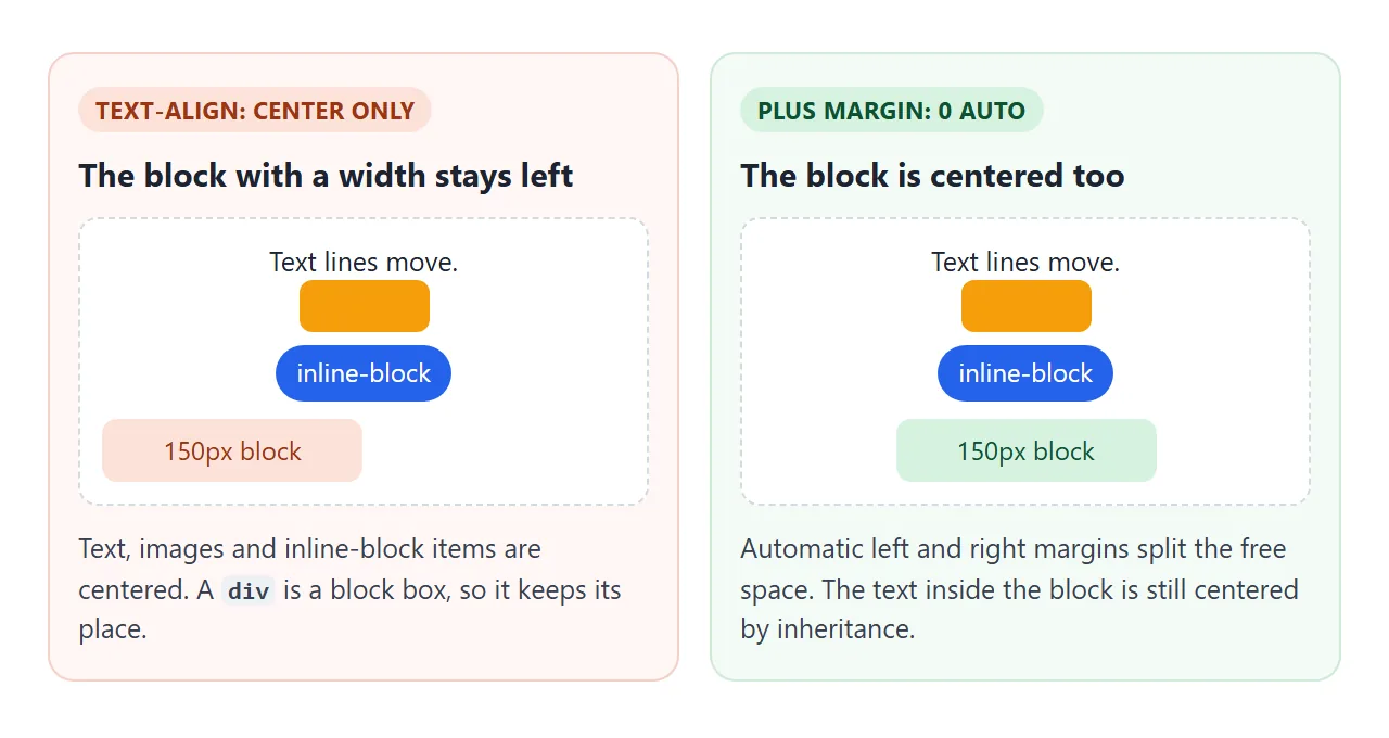
To center a block, give it a width and let the browser split the free space:
.card {
  width: 320px;      /* or max-width */
  margin: 0 auto;    /* equal space left and right */
}
If the parent is a flex container, text-align on it does not move the flex items either. They are blocks. Use justify-content: center on the container, covered in the flexbox guide. The display guide explains which elements are block and which are inline.
Centering images and buttons
An <img> is inline by default, and a <button> behaves like an inline-block. Both sit on a line, so text-align: center on the parent centers them. That is why one rule on a hero section centers the heading, the paragraph and the button together.
Two things break it. If the image has display: block (a common reset), text-align stops applying; use margin: 0 auto on the image.
If you put text-align on the image or the button itself, nothing happens, because the value is read from the element that holds the line.
Justify, gaps and hyphens
text-align: justify stretches the spaces in each line so both edges are straight. In a wide column the extra space is spread thin. In a narrow one, a line may hold two or three words, and the gaps between them grow wide.
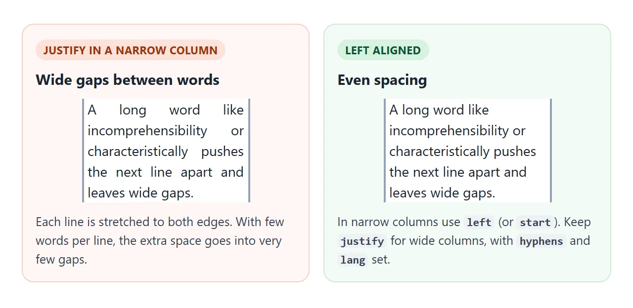
Drag the width down and switch between left and justify. Then try the hyphens menu and the last-line option.
<!doctype html>
<html lang="en">
<head>
<meta charset="utf-8">
<meta name="viewport" content="width=device-width, initial-scale=1">
<title>text-align: justify</title>
<style>
body { margin: 0; padding: 14px; font-family: system-ui, sans-serif; background: #f4f5f7; color: #1d2330; }
.controls { display: grid; gap: 8px; margin-bottom: 12px; font-size: 14px; }
.controls label { display: flex; align-items: center; gap: 8px; }
input[type=range] { flex: 1; max-width: 260px; }
select { font: inherit; }
output { font-family: ui-monospace, Consolas, monospace; }
.col {
width: 240px; max-width: 100%;
background: #fff; border-left: 3px solid #2563eb; border-right: 3px solid #2563eb;
padding: 0 6px; font-size: 16px; line-height: 1.55;
}
.col p { margin: 0; padding: 8px 0; }
</style>
</head>
<body>
<div class="controls">
<label>text-align
<select id="align"><option>left</option><option selected>justify</option></select>
</label>
<label>hyphens
<select id="hyph"><option>none</option><option selected>manual</option><option>auto</option></select>
</label>
<label><input type="checkbox" id="last"> text-align-last: justify</label>
<label>width <input type="range" id="width" min="140" max="560" value="240"> <output id="out">240px</output></label>
</div>
<!-- lang="en" tells the browser which hyphenation rules to use -->
<div class="col" id="col" lang="en">
<p>Justified text stretches the spaces in each line so both edges are straight. In a narrow column, a long word such as characteristically or incomprehensibility leaves a line with only two or three words, and the spaces between them grow very wide.</p>
<p>The soft hyphens in <i>in­ter­na­tion­al­iza­tion</i> are break points you add by hand.</p>
</div>
<script>
const col = document.getElementById('col');
const $ = (id) => document.getElementById(id);
$('align').addEventListener('change', (e) => col.style.textAlign = e.target.value);
$('hyph').addEventListener('change', (e) => col.style.hyphens = e.target.value);
$('last').addEventListener('change', (e) => col.style.textAlignLast = e.target.checked ? 'justify' : '');
$('width').addEventListener('input', (e) => {
col.style.width = e.target.value + 'px';
$('out').textContent = e.target.value + 'px';
});
// start state matches the selects
col.style.textAlign = 'justify';
col.style.hyphens = 'manual';
</script>
</body>
</html>
hyphens: manual(the default) breaks words only at soft hyphens you add with­. They do not depend on a dictionary.hyphens: autolets the browser hyphenate on its own. It needs alangattribute on the element or page, and a hyphenation dictionary for that language. If the browser has none, the text breaks as before.text-align-last: justifystretches the last line as well. Leave it off for paragraphs; it suits a single line such as a label row.
text-justify chooses how the space is added, for example inter-word or inter-character. Check how your target browsers handle it, and make sure the text still reads well without it.
Aligning table columns
Numbers are easier to compare when their last digits line up. Right-align numeric columns, and turn on tabular figures so each digit has the same width:
th, td { text-align: start; }
.num   { text-align: end; font-variant-numeric: tabular-nums; }
Header cells are centered by default in browsers, so set th explicitly or the heading will sit away from its column. For column widths, see table column width.
Right-to-left text: start and end
start and end follow the dir attribute. left and right never change. A layout written with start and end flips correctly when the same page is shown in Arabic or Hebrew.
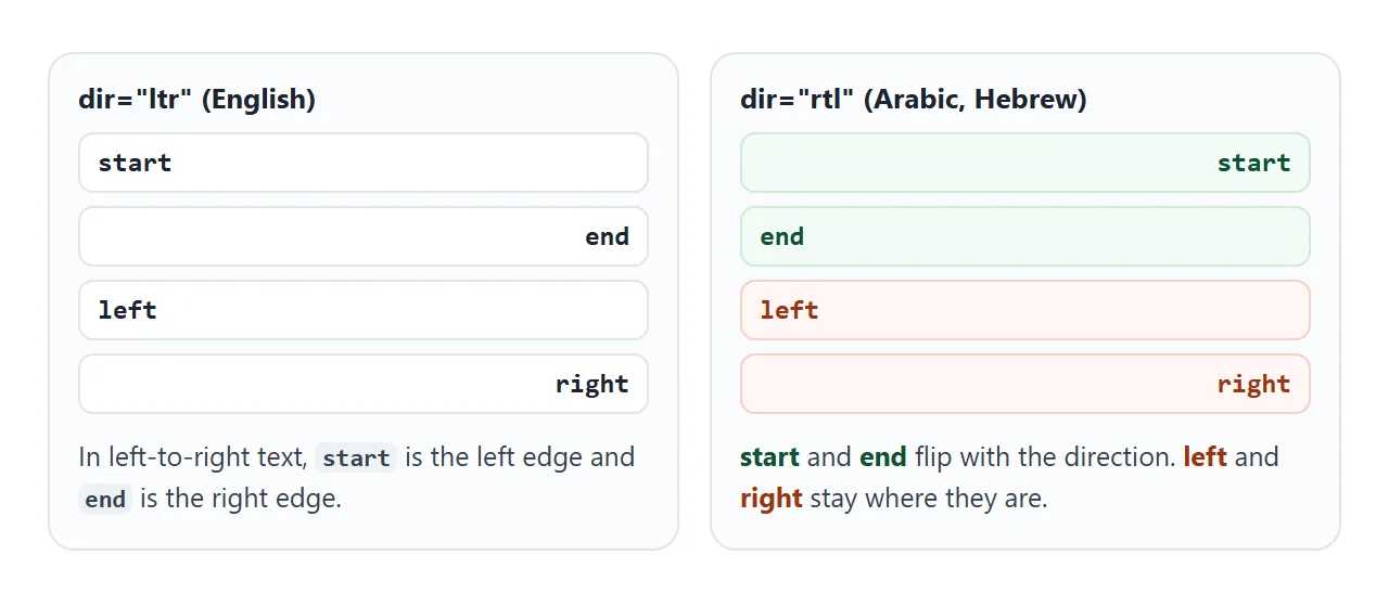
The finished example below puts the pieces together: a centered hero, a pricing table with the prices aligned at the end, and a card you can switch between ltr and rtl.
<!doctype html>
<html lang="en">
<head>
<meta charset="utf-8">
<meta name="viewport" content="width=device-width, initial-scale=1">
<title>text-align on a real page</title>
<style>
  body { margin: 0; font-family: system-ui, sans-serif; background: #f4f5f7; color: #1d2330; }

  /* 1. Centered hero: text, button and image are inline content */
  .hero { text-align: center; padding: 22px 16px; background: #fff; }
  .hero h1 { margin: 0 0 6px; font-size: 24px; }
  .hero p { max-width: 30em; margin: 0 auto 12px; color: #4b5563; } /* margin auto centers the block */
  .hero a { display: inline-block; padding: 9px 18px; border-radius: 8px; background: #2563eb; color: #fff; text-decoration: none; }

  /* 2. Pricing table: words at the start, numbers at the end */
  .wrap { padding: 14px 16px; }
  table { width: 100%; border-collapse: collapse; background: #fff; border-radius: 10px; overflow: hidden; }
  th, td { padding: 8px 10px; border-bottom: 1px solid #e5e7eb; text-align: start; }
  th { background: #eef1f5; font-size: 13px; }
  .num { text-align: end; font-variant-numeric: tabular-nums; } /* digits line up */
  tfoot td { font-weight: 700; border-bottom: 0; }

  /* 3. The same card in both directions */
  .row { display: flex; justify-content: space-between; align-items: center; margin-bottom: 8px; font-size: 14px; }
  .row button { font: inherit; padding: 5px 10px; border: 1px solid #c9ced8; border-radius: 8px; background: #fff; cursor: pointer; }
  .card { background: #fff; border-radius: 10px; padding: 10px 12px; }
  .card p { margin: 4px 0; padding: 4px 6px; border-radius: 6px; background: #f8fafc; font-size: 14px; }
  .s { text-align: start; } .e { text-align: end; } .l { text-align: left; }
</style>
</head>
<body>
<section class="hero">
  <h1>Team plan</h1>
  <p>Everything in the hero is centered by one text-align on the section.</p>
  <a href="#plans">See prices</a>
</section>

<div class="wrap" id="plans">
  <table>
    <thead><tr><th>Item</th><th class="num">Seats</th><th class="num">Price</th></tr></thead>
    <tbody>
      <tr><td>Starter</td><td class="num">1</td><td class="num">$9.00</td></tr>
      <tr><td>Team</td><td class="num">10</td><td class="num">$79.00</td></tr>
      <tr><td>Business</td><td class="num">100</td><td class="num">$690.00</td></tr>
    </tbody>
    <tfoot><tr><td>Total</td><td class="num">111</td><td class="num">$778.00</td></tr></tfoot>
  </table>
</div>

<div class="wrap">
  <div class="row"><span>Direction: <b id="dirName">ltr</b></span><button id="flip">Switch to rtl</button></div>
  <div class="card" id="card" dir="ltr">
    <p class="s">text-align: start</p>
    <p class="e">text-align: end</p>
    <p class="l">text-align: left (never flips)</p>
  </div>
</div>

<script>
  const card = document.getElementById('card');
  document.getElementById('flip').addEventListener('click', (e) => {
    const rtl = card.dir === 'ltr';
    card.dir = rtl ? 'rtl' : 'ltr';  // start/end follow dir, left/right do not
    document.getElementById('dirName').textContent = card.dir;
    e.target.textContent = 'Switch to ' + (rtl ? 'ltr' : 'rtl');
  });
</script>
</body>
</html>
When it does not work
| What you see | Cause | Fix |
|---|---|---|
| A div with a width stays on the left | text-align does not move blocks |
margin: 0 auto on the div, or flexbox on the parent |
| A full-width element never looks centered | It is width: 100%, so there is no free space around it |
Give it a smaller width or max-width |
| An image will not center | The image is display: block |
margin: 0 auto on the image |
| Nothing changes on a span or button | text-align was set on the inline item |
Set it on the parent block |
| Big gaps between words | justify in a narrow column |
Use start, widen the column, or add hyphens with lang |
| A form or list is centered by accident | text-align: center inherited from a section above |
Set text-align: start on the part that should not be centered |
| Text sits on the wrong side in RTL | left or right used instead of start/end |
Switch to start and end |
| Flex items do not move | Flex items are blocks | justify-content on the flex container |
Long words and URLs that overflow a narrow column are a wrapping problem, not an alignment one. Word break in HTML covers it.
Share it as a link
Alignment is easier to judge on the real page than in a screenshot, especially on a phone and in both directions. To send the working version, paste the page into a NOS document and choose Create share link. HTML to link walks through it.
The page renders as written and its scripts run, so the people you send it to can press the buttons and flip the direction themselves. If you change the code later, the same link shows the new version.