justify-content sets where items sit along the main axis of a flex or grid container. In a flex row that means left, centre, right or spread apart. Put it on the container, not the items: display: flex; justify-content: center; centres a row of items.
Try all six values. The striped area is free space, the part of the line the items do not use.
<!doctype html>
<html lang="en">
<head>
<meta charset="utf-8">
<meta name="viewport" content="width=device-width, initial-scale=1">
<title>justify-content playground</title>
<style>
  body { margin: 0; padding: 16px; font-family: system-ui, sans-serif; background: #f4f5f7; color: #1d2330; }
  .controls { display: flex; flex-wrap: wrap; gap: 6px; margin-bottom: 8px; }
  .controls b { width: 100%; font-size: 13px; }
  button { font: inherit; font-size: 13px; padding: 6px 10px; border: 1px solid #c9ced8; border-radius: 8px; background: #fff; cursor: pointer; }
  button.on { background: #1d4ed8; border-color: #1d4ed8; color: #fff; }

  /* the flex container: stripes show the free space justify-content hands out */
  .box {
    display: flex;
    justify-content: flex-start;
    height: 150px; margin-top: 12px; border: 2px solid #1d4ed8; border-radius: 10px;
    background: repeating-linear-gradient(45deg, #fff3d6 0 8px, #fde7b0 8px 16px);
  }
  .item {
    width: 64px; height: 40px; border-radius: 8px;
    background: #1d4ed8; color: #fff; font-weight: 700;
    display: grid; place-items: center;
  }
  .box.grow .item { flex-grow: 1; }  /* items eat the free space */
  code { display: block; margin-top: 10px; padding: 8px 10px; border-radius: 8px; background: #1d2330; color: #e5e7eb; font-size: 13px; white-space: pre; overflow-x: auto; }
</style>
</head>
<body>
<div class="controls" id="jc">
  <b>justify-content</b>
  <button class="on">flex-start</button><button>center</button><button>flex-end</button>
  <button>space-between</button><button>space-around</button><button>space-evenly</button>
</div>
<div class="controls" id="dir">
  <b>flex-direction</b>
  <button class="on">row</button><button>column</button>
  <button id="grow">flex-grow: 1 on items</button>
</div>

<div class="box" id="box">
  <div class="item">1</div><div class="item">2</div><div class="item">3</div>
</div>
<code id="css"></code>

<script>
  const box = document.getElementById('box');
  const css = document.getElementById('css');

  function show() {
    css.textContent = '.box {\n  display: flex;\n  flex-direction: ' + box.style.flexDirection +
      ';\n  justify-content: ' + box.style.justifyContent + ';\n}' +
      (box.classList.contains('grow') ? '\n.item { flex-grow: 1; }  /* no free space left */' : '');
  }

  // one group of buttons sets one property on the container
  function group(id, prop) {
    const btns = document.querySelectorAll('#' + id + ' button:not(#grow)');
    btns.forEach((b) => b.addEventListener('click', () => {
      btns.forEach((x) => x.classList.remove('on'));
      b.classList.add('on');
      box.style[prop] = b.textContent;
      show();
    }));
    box.style[prop] = btns[0].textContent;
  }
  group('jc', 'justifyContent');
  group('dir', 'flexDirection');

  document.getElementById('grow').addEventListener('click', (e) => {
    e.target.classList.toggle('on', box.classList.toggle('grow'));
    show();
  });
  show();
</script>
</body>
</html>
Turn on flex-grow: 1 and every button stops doing anything. That is the most common reason people search for "justify-content not working", and it is covered below.
The six values
justify-content never changes the size of an item. It takes the free space and decides where to put it.
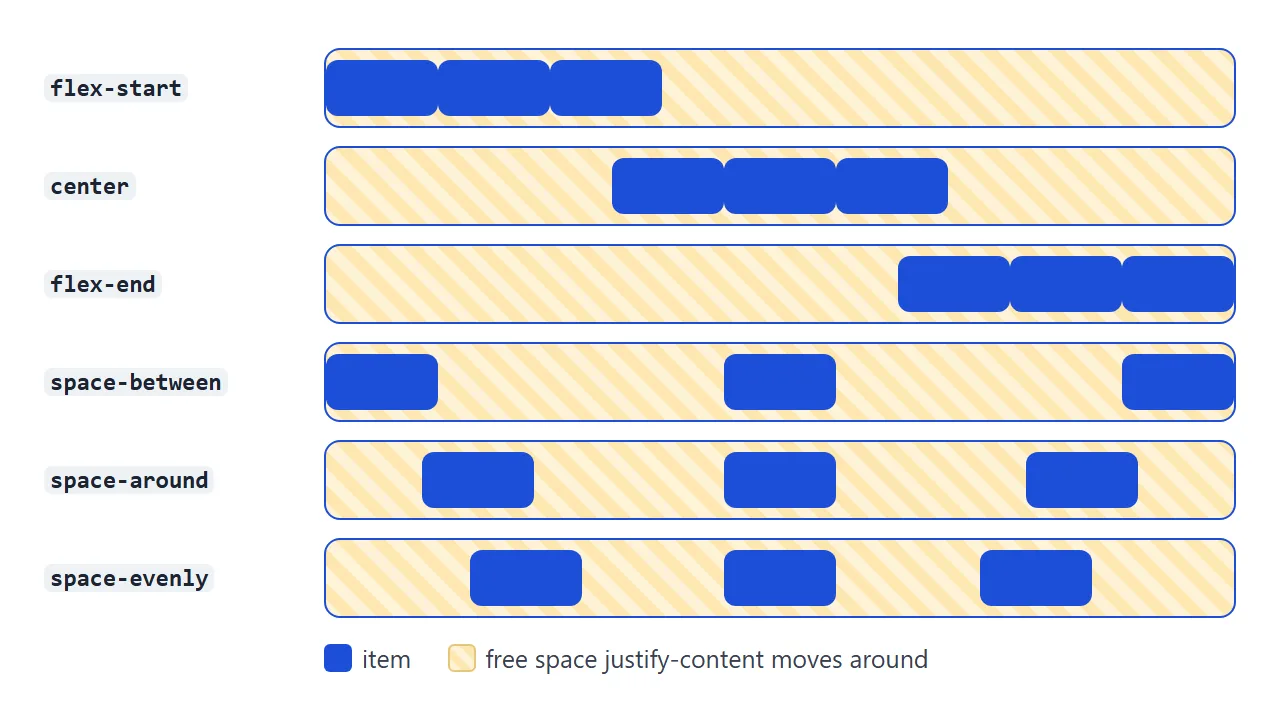
| Value | Where the free space goes |
|---|---|
flex-start |
All after the items. This is the default. |
center |
Half before, half after. |
flex-end |
All before the items. |
space-between |
Between the items only. The first and last touch the edges. |
space-around |
Around each item, so the ends get half a share. |
space-evenly |
Equal slices before, between and after. |
In a grid container you write start and end instead of flex-start and flex-end. Flexbox accepts both. They only differ with row-reverse: flex-start follows the flex direction and packs to the right, while start follows the text direction and packs to the left.
It works along the main axis
The main axis is the direction the items flow. In a row it runs left to right. Change flex-direction to column and it runs top to bottom, so justify-content now moves items up and down.
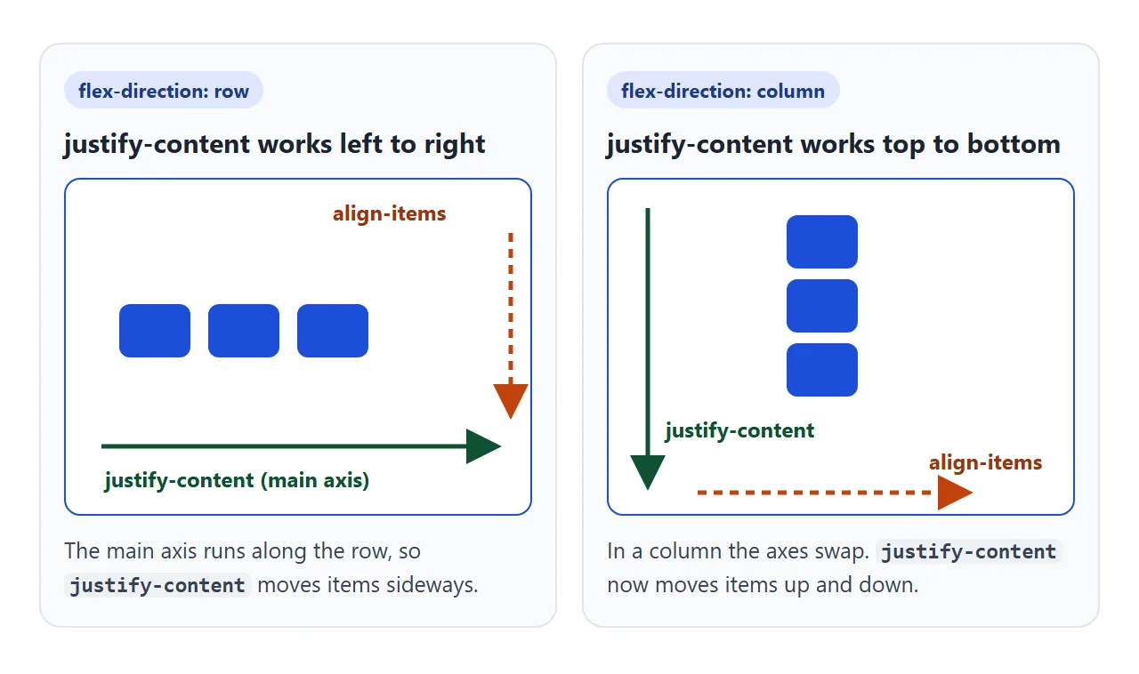
That is why vertical centring with justify-content: center needs two things: flex-direction: column and a height on the container. A column with no height is exactly as tall as its items, so there is no free space to share.
.hero {
  display: flex;
  flex-direction: column;
  justify-content: center;  /* up and down, because of column */
  min-height: 60vh;         /* without a height there is nothing to share */
}
justify-content vs align-items
The two properties split the job. justify-content works along the main axis and moves the whole group of items. align-items works across it and places each item inside the line.
<!doctype html>
<html lang="en">
<head>
<meta charset="utf-8">
<meta name="viewport" content="width=device-width, initial-scale=1">
<title>justify-content vs align-items</title>
<style>
body { margin: 0; padding: 16px; font-family: system-ui, sans-serif; background: #f4f5f7; color: #1d2330; }
.top { display: flex; flex-wrap: wrap; align-items: center; gap: 6px; font-size: 13px; }
button { font: inherit; padding: 6px 10px; border: 1px solid #c9ced8; border-radius: 8px; background: #fff; cursor: pointer; }
button.on { background: #1d4ed8; border-color: #1d4ed8; color: #fff; }
/* 3 x 3 table of small flex containers */
.table { display: grid; grid-template-columns: 70px repeat(3, 1fr); gap: 6px; margin-top: 12px; font-size: 12px; }
.head { font-weight: 700; align-self: end; text-align: center; overflow-wrap: anywhere; }
.side { font-weight: 700; align-self: center; overflow-wrap: anywhere; }
.cell {
display: flex; /* each cell is a flex container */
height: 80px; border: 1px solid #c9ced8; border-radius: 8px; background: #fff; cursor: pointer;
}
.cell.pick { outline: 3px solid #f59e0b; }
.dot { width: 22px; height: 22px; border-radius: 6px; background: #1d4ed8; }
code { display: block; margin-top: 12px; padding: 8px 10px; border-radius: 8px; background: #1d2330; color: #e5e7eb; font-size: 13px; white-space: pre; overflow-x: auto; }
</style>
</head>
<body>
<div class="top">
<span>flex-direction:</span>
<button class="on" data-dir="row">row</button>
<button data-dir="column">column</button>
</div>
<div class="table" id="table"></div>
<code id="css"></code>
<script>
const values = ['flex-start', 'center', 'flex-end'];
const table = document.getElementById('table');
const css = document.getElementById('css');
let dir = 'row', picked = null;
// column headers = justify-content, row headers = align-items
table.innerHTML = '<div class="side">align ↓<br>justify →</div>' +
values.map((v) => '<div class="head">' + v + '</div>').join('');
values.forEach((ai) => {
table.insertAdjacentHTML('beforeend', '<div class="side">' + ai + '</div>');
values.forEach((jc) => {
const cell = document.createElement('div');
cell.className = 'cell';
cell.style.justifyContent = jc;
cell.style.alignItems = ai;
cell.innerHTML = '<div class="dot"></div>';
cell.addEventListener('click', () => { picked = cell; show(); });
table.appendChild(cell);
});
});
function show() {
document.querySelectorAll('.cell').forEach((c) => {
c.style.flexDirection = dir;
c.classList.toggle('pick', c === picked);
});
const c = picked || document.querySelectorAll('.cell')[0];
css.textContent = '.cell {\n display: flex;\n flex-direction: ' + dir +
';\n justify-content: ' + c.style.justifyContent +
'; /* main axis */\n align-items: ' + c.style.alignItems + '; /* cross axis */\n}';
}
document.querySelectorAll('[data-dir]').forEach((b) => b.addEventListener('click', () => {
document.querySelectorAll('[data-dir]').forEach((x) => x.classList.remove('on'));
b.classList.add('on');
dir = b.dataset.dir;
show();
}));
show();
</script>
</body>
</html>
Centring one thing in both directions uses one of each:
.box { display: flex; justify-content: center; align-items: center; }
In a row, the middle column of the table moves sideways and the middle row moves vertically. Switch to column and the same cells move the other way. The flexbox guide covers the rest of the flex properties.
It needs free space
Free space is the container's size minus the items' size. If that is zero, every value looks the same.
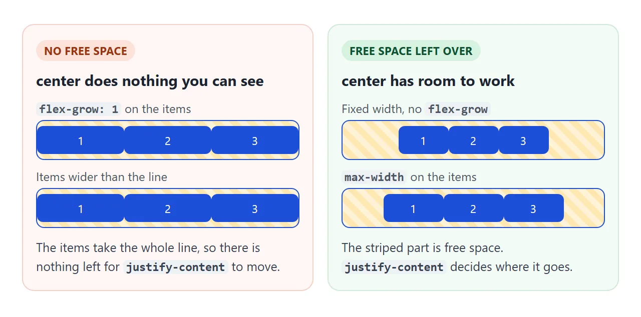
Three things remove free space. flex-grow makes the items stretch into it. Items with a large flex-basis or width fill the line and shrink to fit. And a column container with no height has none to begin with.
When you want items to grow but still be centred, cap them with max-width. They grow up to the cap, and whatever is left over goes back to justify-content.
gap vs space-between
Both put space between items, but they measure it differently. gap is a fixed distance you choose. The space-* values share out whatever is left, so the distance changes with the container width.
gap: 16px |
justify-content: space-between |
|
|---|---|---|
| Distance between items | Always 16px | Whatever is left over |
| Space at the edges | None | None |
| On a wider screen | Items stay together | Items drift apart |
They combine well. With both set, gap becomes the minimum distance and space-between shares out the rest. Without gap, items with space-between can end up touching when the line is nearly full.
Push one item with margin-left: auto
Flex items have no justify-self, so no alignment property moves one item on its own. An auto margin does. margin-left: auto on an item takes all the free space to its left, pushing it and everything after it to the right.
.nav { display: flex; align-items: center; gap: 14px; }
.nav a:first-of-type { margin-left: auto; }  /* logo left, links right */
Auto margins take the free space before justify-content sees it. With one auto margin in the line, justify-content has nothing left to place. The finished example below uses this for a nav bar, and the navbar guide builds a full one.
The last row of a wrapped list
space-between works line by line. In a wrapped list, the last row often has fewer items, and space-between still spreads them to the two ends. Two tiles land far left and far right, out of line with the columns above.
<!doctype html>
<html lang="en">
<head>
<meta charset="utf-8">
<meta name="viewport" content="width=device-width, initial-scale=1">
<title>justify-content in a real page</title>
<style>
  body { margin: 0; padding: 16px; font-family: system-ui, sans-serif; background: #f4f5f7; color: #1d2330; }
  h2 { font-size: 13px; margin: 18px 0 6px; color: #4b5563; }
  h2:first-child { margin-top: 0; }

  /* 1. Nav bar: logo left, links pushed right with an auto margin */
  .nav { display: flex; align-items: center; gap: 14px; padding: 10px 14px; border-radius: 10px; background: #1d2330; }
  .logo { color: #fff; font-weight: 800; }
  .nav a { color: #cbd5e1; text-decoration: none; font-size: 14px; }
  .nav a:first-of-type { margin-left: auto; }  /* takes all the free space */

  /* 2. Card footer: price and button at the two ends */
  .card { max-width: 320px; border-radius: 10px; background: #fff; box-shadow: 0 4px 14px rgba(0, 0, 0, .08); overflow: hidden; }
  .card p { margin: 0; padding: 14px; font-size: 14px; }
  .footer { display: flex; justify-content: space-between; align-items: center; padding: 10px 14px; border-top: 1px solid #e5e7eb; }
  .footer button { font: inherit; padding: 6px 12px; border: 0; border-radius: 8px; background: #1d4ed8; color: #fff; cursor: pointer; }

  /* 3. Wrapped list of tiles */
  .tiles { padding: 8px; border-radius: 10px; background: #fff; }
  .tiles span { padding: 8px 0; border-radius: 8px; background: #dbeafe; text-align: center; font-size: 13px; }
  .tiles.flex { display: flex; flex-wrap: wrap; justify-content: space-between; row-gap: 8px; }
  .tiles.flex span { width: 22%; }  /* 4 per row, 6 tiles: 2 end up on the last row */
  .tiles.grid { display: grid; grid-template-columns: repeat(4, 1fr); gap: 8px; }
  .tiles.gap { display: flex; flex-wrap: wrap; gap: 8px; }
  .tiles.gap span { width: calc((100% - 24px) / 4); }  /* 3 gaps of 8px per row */
  .tabs { display: flex; flex-wrap: wrap; gap: 6px; margin-bottom: 8px; }
  .tabs button { font: inherit; font-size: 13px; padding: 6px 10px; border: 1px solid #c9ced8; border-radius: 8px; background: #fff; cursor: pointer; }
  .tabs button.on { background: #1d4ed8; border-color: #1d4ed8; color: #fff; }
  #note { font-size: 13px; margin: 8px 0 0; }
</style>
</head>
<body>
<h2>Nav bar: margin-left: auto on the first link</h2>
<nav class="nav">
  <span class="logo">Acme</span>
  <a href="#pricing">Pricing</a><a href="#docs">Docs</a><a href="#login">Log in</a>
</nav>

<h2>Card footer: justify-content: space-between</h2>
<div class="card">
  <p>Starter plan. One project, share links included.</p>
  <div class="footer"><b>$9 / month</b><button type="button">Choose</button></div>
</div>

<h2>Wrapped list: the last-row problem</h2>
<div class="tabs" id="tabs">
  <button class="on" data-mode="flex">flex + space-between</button>
  <button data-mode="grid">grid</button>
  <button data-mode="gap">flex + gap</button>
</div>
<div class="tiles flex" id="tiles">
  <span>HTML</span><span>CSS</span><span>Flexbox</span><span>Grid</span><span>Forms</span><span>Tables</span>
</div>
<p id="note"></p>

<script>
  const tiles = document.getElementById('tiles');
  const note = document.getElementById('note');
  const notes = {
    flex: 'The last row has 2 tiles, so space-between pushes them to the two ends.',
    grid: 'Grid places tiles in fixed columns, so the last row lines up.',
    gap: 'No space-between: a fixed gap keeps the last row packed to the left.'
  };

  document.querySelectorAll('#tabs button').forEach((b) => b.addEventListener('click', () => {
    document.querySelectorAll('#tabs button').forEach((x) => x.classList.remove('on'));
    b.classList.add('on');
    tiles.className = 'tiles ' + b.dataset.mode;
    note.textContent = notes[b.dataset.mode];
  }));
  note.textContent = notes.flex;
</script>
</body>
</html>
There are two fixes. Use CSS Grid, which puts every tile in a fixed column. Or drop space-between and use gap with a fixed tile width, so the last row packs to the left.
The CSS Grid guide and grid wrap guide show grids that also change their column count on phones.
justify-content in a grid
In a grid, justify-content moves the column tracks, not the items inside them. It has an effect when the columns are narrower than the container, for example fixed 100px columns in a wide page. With 1fr columns the tracks already fill the width.
To place items inside their own cells, use justify-items on the grid, or justify-self on one item. Both work in grid. The display guide explains when to pick grid over flex.
When it does not work
| What you see | Cause | Fix |
|---|---|---|
| No value changes anything | The items fill the line, so there is no free space | Give items a width or max-width |
| Items stay stretched edge to edge | flex-grow or flex: 1 on the items |
Remove it, or cap it with max-width |
| Nothing moves at all | justify-content is on the items, not the container |
Move it to the parent with display: flex |
| It moves items up and down, not sideways | flex-direction: column swaps the axes |
Use align-items for sideways |
center does not centre vertically |
A column container with no height | Add height or min-height |
One item stays on the left with space-between |
There is only one item, so there is nothing to put space between | Use center, or an auto margin |
| Last row tiles jump to the edges | space-between on a wrapped list |
Use grid, or gap without space-between |
Share it as a link
Layout is easier to show than to describe. A screenshot shows one screen width, and the person you send it to cannot resize it or click through the values.
To send the working version, paste the page into a NOS document and choose Create share link. HTML to link walks through it.
The page renders as written and its scripts run, so others can resize the window and try each value themselves. If you change the CSS later, the same link shows the new version.