flex-direction goes on a flex container and sets which way its items flow. row (the default) lines them up side by side. column stacks them top to bottom. row-reverse and column-reverse do the same, starting from the other end.
Switch the direction below and watch the two arrows. Then change justify-content and align-items in each direction.
<!doctype html>
<html lang="en">
<head>
<meta charset="utf-8">
<meta name="viewport" content="width=device-width, initial-scale=1">
<title>flex-direction and its axes</title>
<style>
  body { margin: 0; padding: 14px; font-family: system-ui, sans-serif; background: #f4f5f7; color: #1d2330; }
  .dirs { display: flex; flex-wrap: wrap; gap: 6px; margin-bottom: 10px; }
  .dirs button {
    font: 600 13px ui-monospace, Consolas, monospace; padding: 7px 10px;
    border: 1px solid #cfd4dc; border-radius: 8px; background: #fff; cursor: pointer;
  }
  .dirs button[aria-pressed="true"] { background: #1d2330; color: #fff; border-color: #1d2330; }
  .pick { display: flex; flex-wrap: wrap; gap: 8px 16px; font-size: 13px; margin-bottom: 10px; }
  .pick select { font: 13px ui-monospace, Consolas, monospace; padding: 3px; }

  .stage { position: relative; }
  /* the flex container: this is the part to copy */
  .box {
    display: flex;
    flex-direction: row;
    height: 220px;
    padding: 34px 30px 30px 36px;  /* room for the arrows */
    gap: 8px;
    box-sizing: border-box;
    background: #fff; border: 1px dashed #b8bfca; border-radius: 12px;
  }
  .item {
    padding: 10px 16px; border-radius: 8px;
    background: #dbeafe; font: 700 16px system-ui, sans-serif;
  }
  .item:nth-child(2) { padding: 18px 26px; background: #fde68a; }
  .item:nth-child(3) { background: #d1fae5; }
  svg { position: absolute; inset: 0; width: 100%; height: 100%; pointer-events: none; }
  .code {
    margin-top: 10px; padding: 10px 12px; border-radius: 8px; background: #1d2330; color: #e5e7eb;
    font: 13px/1.5 ui-monospace, Consolas, monospace; white-space: pre-wrap;
  }
  .note { font-size: 13px; margin-top: 8px; }
  .m { color: #15803d; font-weight: 700; } .c { color: #1d4ed8; font-weight: 700; }
</style>
</head>
<body>
<div class="dirs" id="dirs">
  <button aria-pressed="true">row</button>
  <button aria-pressed="false">row-reverse</button>
  <button aria-pressed="false">column</button>
  <button aria-pressed="false">column-reverse</button>
</div>
<div class="pick">
  <label>justify-content
    <select id="jc"><option>flex-start</option><option>center</option><option>flex-end</option><option>space-between</option></select>
  </label>
  <label>align-items
    <select id="ai"><option>stretch</option><option>flex-start</option><option>center</option><option>flex-end</option></select>
  </label>
</div>

<div class="stage">
  <div class="box" id="box">
    <div class="item">1</div><div class="item">2</div><div class="item">3</div>
  </div>
  <svg id="axes" aria-hidden="true"></svg>
</div>
<p class="note"><span class="m">Green = main axis</span> (justify-content works along it).
  <span class="c">Blue = cross axis</span> (align-items works along it).</p>
<div class="code" id="code"></div>

<script>
  const box = document.getElementById('box');
  const svg = document.getElementById('axes');
  const jc = document.getElementById('jc');
  const ai = document.getElementById('ai');
  const buttons = document.querySelectorAll('#dirs button');

  // one arrow from (x1,y1) to (x2,y2) with a label
  function arrow(x1, y1, x2, y2, color, text, tx, ty, anchor, turn) {
    const a = Math.atan2(y2 - y1, x2 - x1), s = 8;
    const p1 = (x2 - s * Math.cos(a - 0.5)) + ',' + (y2 - s * Math.sin(a - 0.5));
    const p2 = (x2 - s * Math.cos(a + 0.5)) + ',' + (y2 - s * Math.sin(a + 0.5));
    return `<line x1="${x1}" y1="${y1}" x2="${x2}" y2="${y2}" stroke="${color}" stroke-width="2.5"/>` +
      `<polygon points="${x2},${y2} ${p1} ${p2}" fill="${color}"/>` +
      `<text x="${tx}" y="${ty}" fill="${color}" font-size="12" font-weight="700" text-anchor="${anchor}"` +
      (turn ? ` transform="rotate(90 ${tx} ${ty})"` : '') + `>${text}</text>`;
  }

  function draw() {
    const d = box.style.flexDirection || 'row';
    const w = box.offsetWidth, h = box.offsetHeight, e = 14;  // e = distance from the edge
    const G = '#15803d', B = '#1d4ed8';
    let out = '';
    if (d.startsWith('row')) {
      const [x1, x2] = d === 'row' ? [e + 20, w - e] : [w - e - 20, e];
      out += arrow(x1, e, x2, e, G, 'main axis', w / 2, e + 14, 'middle');
      out += arrow(e, e + 20, e, h - e, B, 'cross axis', e + 4, h / 2, 'middle', true);
    } else {
      const [y1, y2] = d === 'column' ? [e + 20, h - e] : [h - e - 20, e];
      out += arrow(e, y1, e, y2, G, 'main axis', e + 4, h / 2, 'middle', true);
      out += arrow(e + 20, e, w - e, e, B, 'cross axis', w - e - 4, e + 14, 'end');
    }
    svg.innerHTML = out;
    document.getElementById('code').textContent =
      `.box {\n  display: flex;\n  flex-direction: ${d};\n  justify-content: ${jc.value};\n  align-items: ${ai.value};\n  height: 220px;\n}`;
  }

  buttons.forEach((b) => b.addEventListener('click', () => {
    buttons.forEach((x) => x.setAttribute('aria-pressed', x === b));
    box.style.flexDirection = b.textContent;
    draw();
  }));
  jc.addEventListener('change', () => { box.style.justifyContent = jc.value; draw(); });
  ai.addEventListener('change', () => { box.style.alignItems = ai.value; draw(); });
  window.addEventListener('resize', draw);
  draw();
</script>
</body>
</html>
The items move, and so do the arrows. That second part is what catches people out.
The four values and their axes
Every flex container has two axes. The main axis runs the way the items flow. The cross axis runs across it. flex-direction picks the main axis, and the cross axis is whatever is left.
| Value | Items flow | Main axis | justify-content moves items | align-items moves items |
|---|---|---|---|---|
row |
Left to right | Horizontal | Left and right | Up and down |
row-reverse |
Right to left | Horizontal | Left and right | Up and down |
column |
Top to bottom | Vertical | Up and down | Left and right |
column-reverse |
Bottom to top | Vertical | Up and down | Left and right |
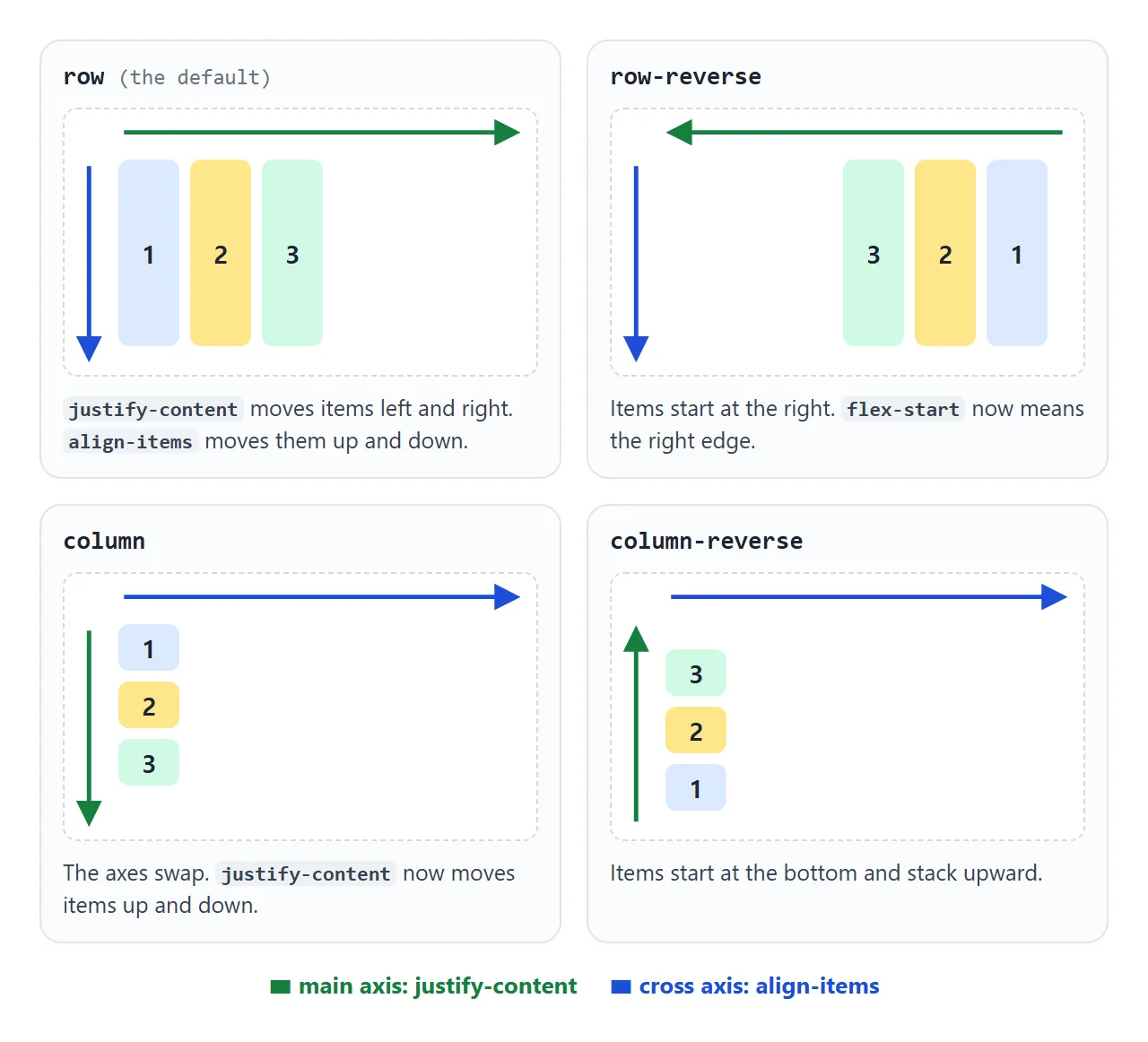
So justify-content is not "horizontal alignment". It is main-axis alignment, and in a column the main axis is vertical. justify-content and align-items cover every value of each.
The reverse values also flip what "start" means. In row-reverse, justify-content: flex-start packs items against the right edge. In column-reverse, it packs them at the bottom.
Why flex-direction: column seems not to work
The usual report is: the items stack, but justify-content: center does not centre them vertically. The column has no height, so it is exactly as tall as its items. There is no free space to share out.
<!doctype html>
<html lang="en">
<head>
<meta charset="utf-8">
<meta name="viewport" content="width=device-width, initial-scale=1">
<title>A column needs a height</title>
<style>
  body { margin: 0; padding: 14px; font-family: system-ui, sans-serif; background: #f4f5f7; color: #1d2330; }
  .pick { font-size: 13px; display: block; margin-bottom: 12px; }
  .pick select { font: 13px ui-monospace, Consolas, monospace; padding: 3px; }
  .pair { display: flex; gap: 12px; align-items: flex-start; }
  .side { flex: 1; min-width: 0; }
  .side h3 { font: 700 13px ui-monospace, Consolas, monospace; margin: 0 0 6px; }

  .col {
    display: flex;
    flex-direction: column;
    justify-content: center;   /* works top to bottom in a column */
    gap: 6px; padding: 10px;
    background: #fff; border: 1px dashed #b8bfca; border-radius: 10px;
  }
  .col.tall { height: 260px; }  /* the only difference */
  .col div { padding: 8px 10px; border-radius: 6px; background: #dbeafe; font-size: 14px; }
  .free { font: 12px ui-monospace, Consolas, monospace; margin: 6px 0 0; }
  .free.zero { color: #c2410c; } .free.some { color: #15803d; }
</style>
</head>
<body>
<label class="pick">justify-content on both columns
  <select id="jc"><option>center</option><option>flex-end</option><option>space-between</option><option>flex-start</option></select>
</label>

<div class="pair">
  <div class="side">
    <h3>no height</h3>
    <div class="col" id="a"><div>Inbox</div><div>Drafts</div><div>Sent</div></div>
    <p class="free" id="fa"></p>
  </div>
  <div class="side">
    <h3>height: 260px</h3>
    <div class="col tall" id="b"><div>Inbox</div><div>Drafts</div><div>Sent</div></div>
    <p class="free" id="fb"></p>
  </div>
</div>

<script>
  const jc = document.getElementById('jc');

  // free space = inner height minus the items and the gaps between them
  function freeSpace(col) {
    const cs = getComputedStyle(col);
    const inner = col.clientHeight - parseFloat(cs.paddingTop) - parseFloat(cs.paddingBottom);
    const items = [...col.children].reduce((sum, el) => sum + el.offsetHeight, 0);
    const gaps = parseFloat(cs.rowGap) * (col.children.length - 1);
    return Math.round(inner - items - gaps);
  }

  function show() {
    for (const [col, out] of [['a', 'fa'], ['b', 'fb']]) {
      const el = document.getElementById(col);
      el.style.justifyContent = jc.value;
      const px = freeSpace(el);
      const p = document.getElementById(out);
      p.textContent = 'free space: ' + px + 'px';
      p.className = 'free ' + (px > 0 ? 'some' : 'zero');
    }
  }
  jc.addEventListener('change', show);
  show();
</script>
</body>
</html>
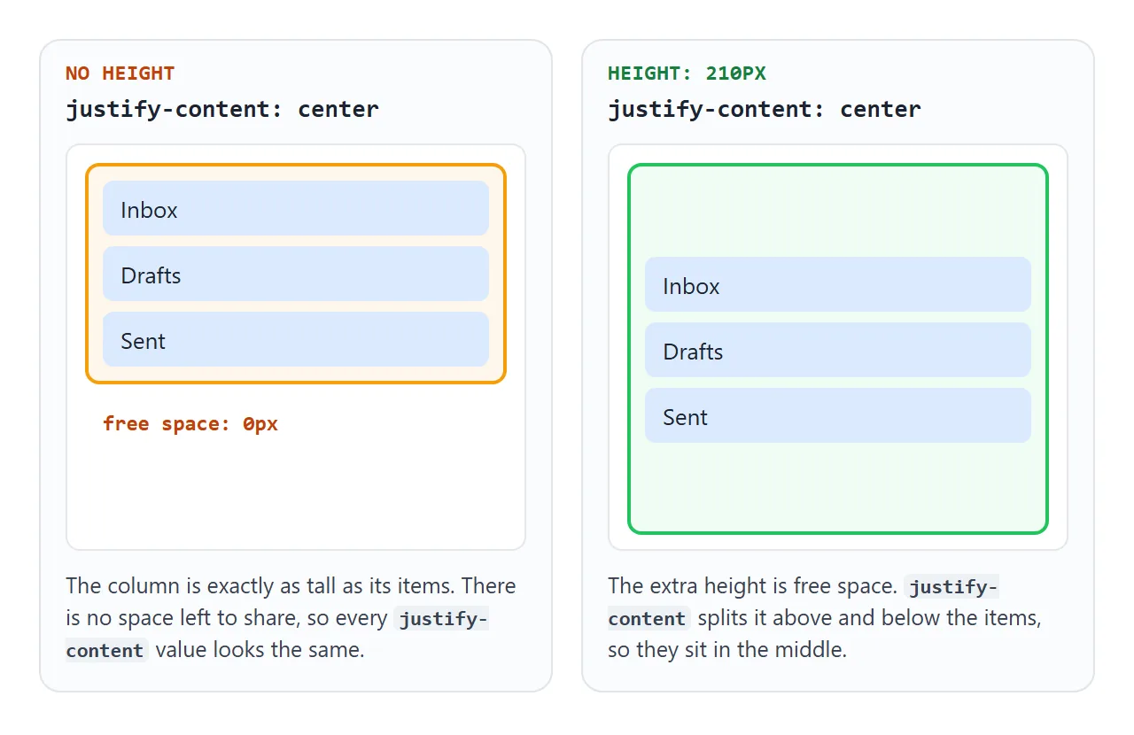
Give the container a height, a min-height, or let it fill a parent that has one. The page in the demo uses a fixed 260px. A full-screen layout would use min-height: 100vh on the container.
Two other surprises come with columns:
- Items stretch to the full width. The default
align-itemsstretches items along the cross axis, which is now the width. Setalign-items: flex-start(orcenter) to let them shrink to their content. margin-left: autostops splitting the row. In a row it pushes the item and everything after it to the right. In a column it only slides that one item to the right edge. To push an item to the bottom, usemargin-top: auto, and give the column a height.
Reverse values and the Tab key
row-reverse and column-reverse change where items are drawn, not their order in the HTML. The keyboard and screen readers still follow the HTML.
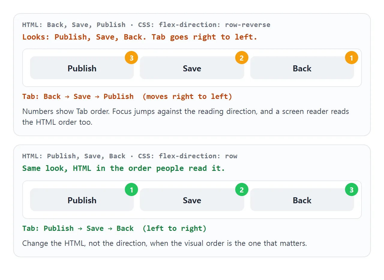
For a row of buttons or links, that means focus jumps backwards through what the reader sees. If the visual order is the one that matters, write the HTML in that order and use plain row.
Reverse values are fine when the order does not carry meaning, or when the flip is the point, as in the chat below. The same trade-off applies to the order property, covered in CSS order.
Right-to-left pages flip row
row does not mean "left to right". It means "the direction text runs". On a page or element with dir="rtl", such as Arabic or Hebrew text, row starts at the right edge and row-reverse starts at the left.
<nav dir="rtl" style="display: flex;">
  <a href="#">First</a>   <!-- drawn at the right edge -->
  <a href="#">Second</a>
</nav>
This is usually what you want: a translated page mirrors itself without new CSS. HTML dir="rtl" explains how direction is inherited. Columns are not affected, since they run top to bottom in both directions.
Row on wide screens, column on phones
The most common use of flex-direction is switching it. Items that sit side by side on a laptop stack on a phone. Write the column first, then switch to a row when there is room:
.profile {
  display: flex;
  flex-direction: column;
  gap: 12px;
}

@media (min-width: 600px) {
  .profile { flex-direction: row; }
}
A media query looks at the screen. If the same component can sit in a wide main area and a narrow sidebar, a container query is closer to what you mean, because it looks at the space the component actually has:
.profile-wrap { container-type: inline-size; }

@container (min-width: 420px) {
  .profile { flex-direction: row; }
}
The query checks the nearest ancestor with container-type, so the flex container sits inside a wrapper. After switching, recheck justify-content and align-items, because they now point the other way.
Writing it in one line with flex-flow
flex-flow sets flex-direction and flex-wrap together. flex-flow: row wrap is a row that breaks onto new lines. flex-flow: column wrap only starts a second column when the container has a height to run out of. flex-wrap covers wrapping in detail.
A finished example: a profile card and a chat
This example uses two directions for two jobs. The profile card is a column in a narrow container and a row from 420px up. Drag the slider to resize the container.
The chat below it uses column-reverse. The newest message is first in the HTML, and column-reverse draws it at the bottom. The scroll box also opens at the bottom, so the latest messages are in view without any scrolling code.
<!doctype html>
<html lang="en">
<head>
<meta charset="utf-8">
<meta name="viewport" content="width=device-width, initial-scale=1">
<title>Profile card and chat</title>
<style>
  body { margin: 0; padding: 14px; font-family: system-ui, sans-serif; background: #eceef1; color: #1d2330; }
  .ctl { font-size: 13px; display: flex; align-items: center; gap: 8px; flex-wrap: wrap; margin-bottom: 10px; }
  .ctl input { flex: 1; min-width: 120px; }
  .ctl output { font: 12px ui-monospace, Consolas, monospace; }

  /* the frame stands in for a phone or a sidebar: the slider resizes it */
  .frame { container-type: inline-size; max-width: 100%; }

  /* profile card: a column by default ... */
  .card {
    display: flex;
    flex-direction: column;
    align-items: center;
    gap: 12px; padding: 16px; text-align: center;
    background: #fff; border-radius: 14px; box-shadow: 0 4px 14px rgba(0, 0, 0, .08);
  }
  .avatar {
    width: 72px; height: 72px; border-radius: 50%; flex-shrink: 0;
    background: linear-gradient(135deg, #60a5fa, #a78bfa);
  }
  .card h2 { margin: 0; font-size: 18px; }
  .card p { margin: 4px 0 0; font-size: 13px; color: #4b5563; }
  .card button { font: inherit; font-size: 13px; padding: 7px 14px; border: 0; border-radius: 8px; background: #1d2330; color: #fff; }

  /* ... and a row once its container is 420px or wider */
  @container (min-width: 420px) {
    .card { flex-direction: row; text-align: left; }
    .card button { margin-left: auto; }  /* in a row, this pushes the button right */
  }

  /* chat: column-reverse keeps the newest message at the bottom */
  .chat {
    display: flex;
    flex-direction: column-reverse;
    gap: 6px; height: 220px; overflow-y: auto;
    margin-top: 12px; padding: 10px; box-sizing: border-box;
    background: #fff; border-radius: 14px;
  }
  .msg { max-width: 75%; padding: 7px 11px; border-radius: 12px; font-size: 14px; background: #eef1f5; align-self: flex-start; }
  .msg.me { background: #2563eb; color: #fff; align-self: flex-end; }
  form { display: flex; gap: 6px; margin-top: 8px; }
  form input { flex: 1; min-width: 0; font: inherit; padding: 8px 10px; border: 1px solid #cfd4dc; border-radius: 8px; }
  form button { font: inherit; padding: 8px 14px; border: 0; border-radius: 8px; background: #2563eb; color: #fff; }
  .state { font: 12px ui-monospace, Consolas, monospace; margin: 6px 0 0; color: #4b5563; }
</style>
</head>
<body>
<div class="ctl">
  <label for="w">Container width</label>
  <input id="w" type="range" min="260" max="620" value="520">
  <output id="wout"></output>
</div>

<div class="frame" id="frame">
  <div class="card" id="card">
    <div class="avatar"></div>
    <div>
      <h2>Mina Park</h2>
      <p>Product designer. Replies within a day.</p>
    </div>
    <button type="button">Message</button>
  </div>
  <p class="state" id="state"></p>

  <!-- newest message first in the HTML; column-reverse shows it at the bottom -->
  <div class="chat" id="chat">
    <div class="msg me">Perfect, see you then.</div>
    <div class="msg">Thursday at 3 works for me.</div>
    <div class="msg me">Can we move the review to Thursday?</div>
    <div class="msg">Sure, go ahead.</div>
    <div class="msg me">Hi Mina, quick question.</div>
    <div class="msg">Morning!</div>
    <div class="msg me">Good morning.</div>
    <div class="msg">Here are the new icons.</div>
    <div class="msg me">Thanks, looking now.</div>
  </div>
  <form id="send">
    <input id="text" placeholder="Type a message" autocomplete="off">
    <button>Send</button>
  </form>
</div>

<script>
  const w = document.getElementById('w');
  const frame = document.getElementById('frame');
  const card = document.getElementById('card');
  const chat = document.getElementById('chat');

  function resize() {
    w.max = Math.min(620, document.body.clientWidth - 28);  // never wider than the screen
    frame.style.width = w.value + 'px';
    document.getElementById('wout').textContent = frame.offsetWidth + 'px';
    document.getElementById('state').textContent =
      'card is flex-direction: ' + getComputedStyle(card).flexDirection;
  }
  w.addEventListener('input', resize);
  window.addEventListener('resize', resize);
  resize();

  document.getElementById('send').addEventListener('submit', (e) => {
    e.preventDefault();  // demo only: nothing is sent anywhere
    const input = document.getElementById('text');
    if (!input.value.trim()) return;
    const msg = document.createElement('div');
    msg.className = 'msg me';
    msg.textContent = input.value;
    chat.prepend(msg);   // first in the HTML = bottom of the chat
    chat.scrollTop = 0;  // with column-reverse, 0 is the bottom
    input.value = '';
  });
</script>
</body>
</html>
- Adding a message:
chat.prepend(msg)puts it first in the HTML, which is the bottom of the screen. - Scrolling: in a
column-reversescroll box,scrollTopis0at the bottom and goes negative as you scroll up. Setting it to0jumps back to the newest message. - Reading order: a screen reader reads the newest message first, because that is the HTML order. Decide whether that suits your page.
- Pushing the button right:
margin-left: autoon the button only applies in the row layout.
When it does not work
| What you see | Cause | Fix |
|---|---|---|
| flex-direction does nothing | The parent is not a flex container, or the property is on the items | display: flex and flex-direction both on the parent |
| justify-content does not move items vertically | The column has no height, so no free space | Give the container a height or min-height |
| justify-content moves items up and down instead of sideways | column makes the main axis vertical |
Use align-items for sideways |
| Items stretch to the full width in a column | The default align-items stretches them |
align-items: flex-start or center |
margin-left: auto no longer splits the row |
In a column it only slides that item right | margin-top: auto to push down, with a height |
| Tab moves backwards through the items | Reverse values do not change HTML order | Reorder the HTML and use row or column |
row starts on the right |
The element or page has dir="rtl" |
Expected for right-to-left text; check dir if not intended |
Share it as a link
A layout that changes direction is hard to show in a screenshot, because the interesting part is the switch. Sent as a link, the page runs, so the people you send it to can resize the container, press Tab and send a chat message themselves.
To share it, paste the page into a NOS document and choose Create share link. HTML to link walks through it. If you change the code later, the same link shows the new version.