The CSS order property moves a flex or grid item to a different place on screen without moving it in the HTML.
Every item starts at order: 0. Items are drawn from the lowest value to the highest, so order: -1 puts an item first and order: 1 puts it last.
Try it. Change the numbers, then click box A and press Tab a few times.
<!doctype html>
<html lang="en">
<head>
<meta charset="utf-8">
<meta name="viewport" content="width=device-width, initial-scale=1">
<title>CSS order playground</title>
<style>
  body { margin: 0; padding: 14px; font-family: system-ui, sans-serif; background: #f4f5f7; color: #1d2330; }
  .inputs { display: grid; grid-template-columns: repeat(5, 1fr); gap: 6px; }
  .inputs label { display: grid; gap: 3px; font-size: 12px; font-weight: 700; text-align: center; }
  .inputs input { width: 100%; box-sizing: border-box; font: inherit; font-weight: 400; text-align: center; padding: 4px 2px; }
  .switch { display: block; margin: 10px 0 8px; font-size: 13px; }

  /* the flex container: order only works on its direct children */
  .row { display: flex; gap: 8px; padding: 10px; background: #fff; border: 1px solid #d5d9e0; border-radius: 10px; }
  .row.off { display: block; }  /* not flex: order is ignored */
  .row button {
    width: 56px; height: 56px; border: 0; border-radius: 10px; color: #fff;
    font: 700 18px system-ui, sans-serif; cursor: pointer;
  }
  .row button:focus-visible { outline: 3px solid #f59e0b; outline-offset: 2px; }
  .row button small { display: block; font: 600 10px ui-monospace, Consolas, monospace; opacity: .85; }
  pre { margin: 10px 0 0; padding: 10px; background: #fff; border-radius: 10px; font: 12.5px/1.6 ui-monospace, Consolas, monospace; white-space: pre-wrap; }
  .tip { font-size: 12px; color: #5b6270; margin: 8px 0 0; }
</style>
</head>
<body>
<div class="inputs" id="inputs"></div>
<label class="switch"><input type="checkbox" id="flex" checked> Parent is <code>display: flex</code></label>

<div class="row" id="row">
  <button style="background:#2563eb">A<small>order 0</small></button>
  <button style="background:#0f766e">B<small>order 0</small></button>
  <button style="background:#c2410c">C<small>order 0</small></button>
  <button style="background:#7c3aed">D<small>order 0</small></button>
  <button style="background:#be185d">E<small>order 0</small></button>
</div>

<pre id="out"></pre>
<p class="tip">Click box A, then press Tab a few times. Focus follows the HTML, not the picture.</p>

<script>
  const row = document.getElementById('row');
  const boxes = [...row.children];
  const names = 'ABCDE';
  const inputs = document.getElementById('inputs');
  let focusPath = [];

  // one number input per box
  names.split('').forEach((n) => {
    inputs.insertAdjacentHTML('beforeend',
      `<label>${n}<input type="number" min="-9" max="9" value="0"></label>`);
  });
  const fields = [...inputs.querySelectorAll('input')];

  function update() {
    boxes.forEach((box, i) => {
      const v = parseInt(fields[i].value, 10) || 0;
      box.style.order = v;
      box.querySelector('small').textContent = 'order ' + v;
    });
    // visual order = sort the boxes by where they were drawn
    const visual = [...boxes].sort((a, b) =>
      a.getBoundingClientRect().left - b.getBoundingClientRect().left);
    document.getElementById('out').textContent =
      'HTML order (Tab, screen readers): ' + names.split('').join(' ') + '\n' +
      'Visual order (what you see):      ' + visual.map((b) => b.firstChild.textContent).join(' ') + '\n' +
      'Tab path so far: ' + (focusPath.join(' > ') || '(click A, then press Tab)');
  }

  boxes.forEach((box) => box.addEventListener('focus', () => {
    focusPath.push(box.firstChild.textContent);
    if (focusPath.length > 10) focusPath.shift();
    update();
  }));

  inputs.addEventListener('input', () => { focusPath = []; update(); });
  document.getElementById('flex').addEventListener('change', (e) => {
    row.classList.toggle('off', !e.target.checked);
    update();
  });

  // start with a reordered example: C first, A last
  fields[2].value = -1;
  fields[0].value = 1;
  update();
</script>
</body>
</html>
The boxes move, but focus still goes A, B, C, D, E. That split between what you see and what the keyboard does is the one thing to remember about order.
How order sorts items
The browser collects the order value of every direct child, then lays them out from lowest to highest. Only the ranking counts, so -1, 0, 2 and -100, 0, 50 produce the same layout.
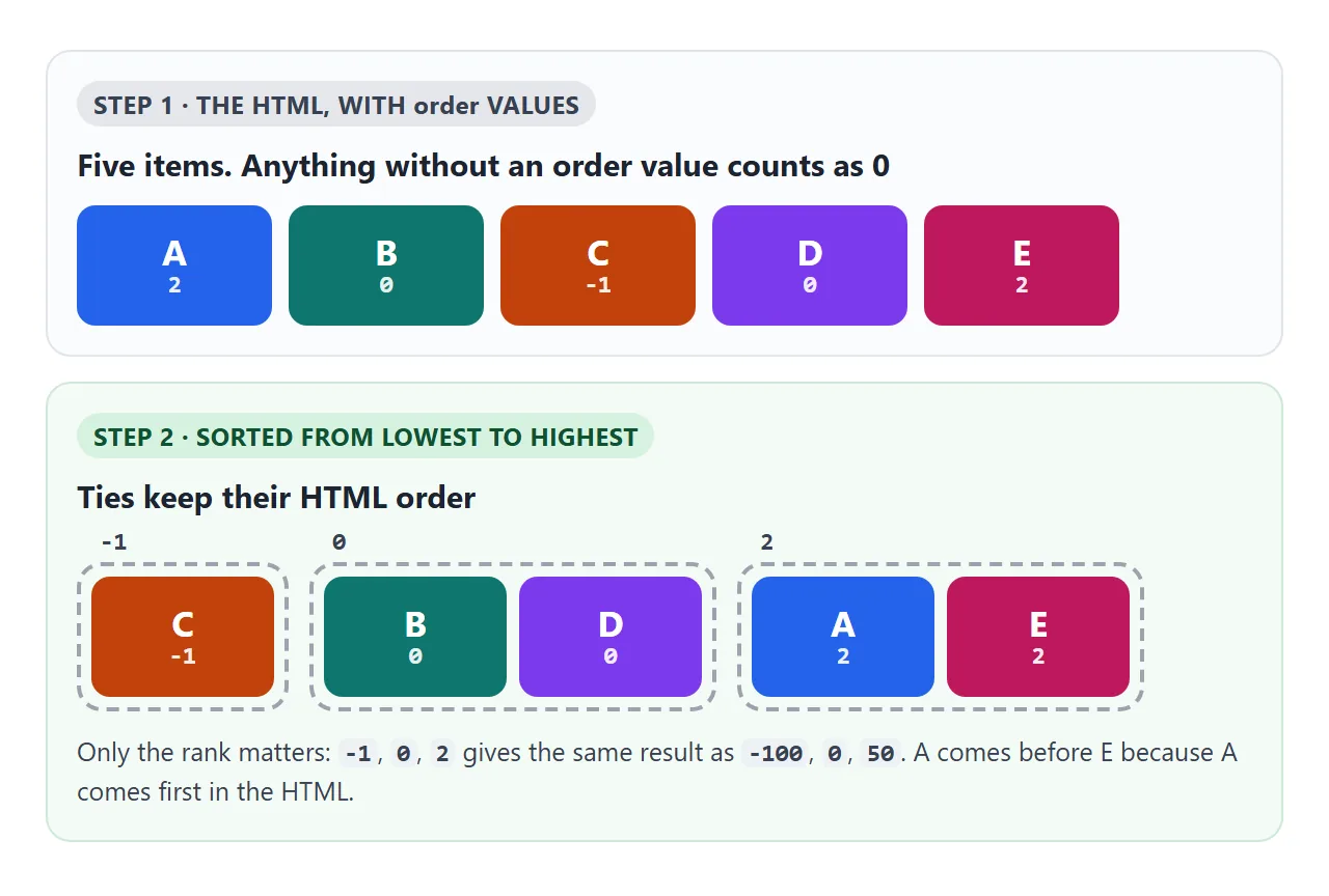
Two rules follow from that:
- Negative values are allowed.
order: -1is the simplest way to pull one item to the front while the rest keep their places. - Equal values keep the HTML order. Setting every item to
order: 3changes nothing. Only the difference between values moves anything.
.row { display: flex; }
.featured { order: -1; }  /* drawn first, still last in the HTML */
The order you see is not the order people Tab through
order only changes painting. The HTML source still decides the Tab order, and screen readers read the page in source order too.
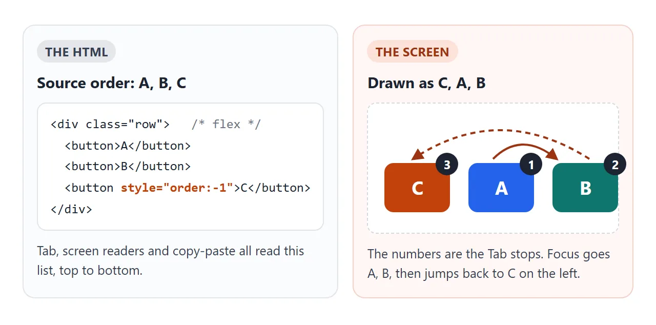
For a row of cards that nobody tabs through, that rarely matters. For links, buttons and form fields it does. A keyboard user watching the focus ring sees it skip ahead, then jump back to the start of the row.
Accessibility guidance covers this. WCAG, the Web Content Accessibility Guidelines, asks that when the order of content affects its meaning, the order in the code keeps that meaning (success criterion 1.3.2, meaningful sequence).
A safe habit: use order for small visual tweaks, and fix real reading order in the HTML. The tabindex guide explains why positive tabindex is not a good patch for this.
Reorder items for phones
The most common use is a layout that changes with the screen. A sidebar sits to the right on a wide screen, and on a phone it should come before the long text instead of after it.
- Make the parent a flex or grid container.
- Give the item an
ordervalue. - Put that rule inside a media query or container query, so it only applies on narrow screens.
- Press Tab through the page on both widths and check that focus still makes sense.
.page { display: flex; }  /* HTML: article, then sidebar */

@media (max-width: 600px) {
  .page { flex-direction: column; }
  .sidebar { order: -1; }  /* above the article on phones */
}
When the item is already the first thing a reader needs, a better fix is to move it up in the HTML and let the wide layout place it on the side. The finished example below shows both ways.
flex-direction: row-reverse vs order
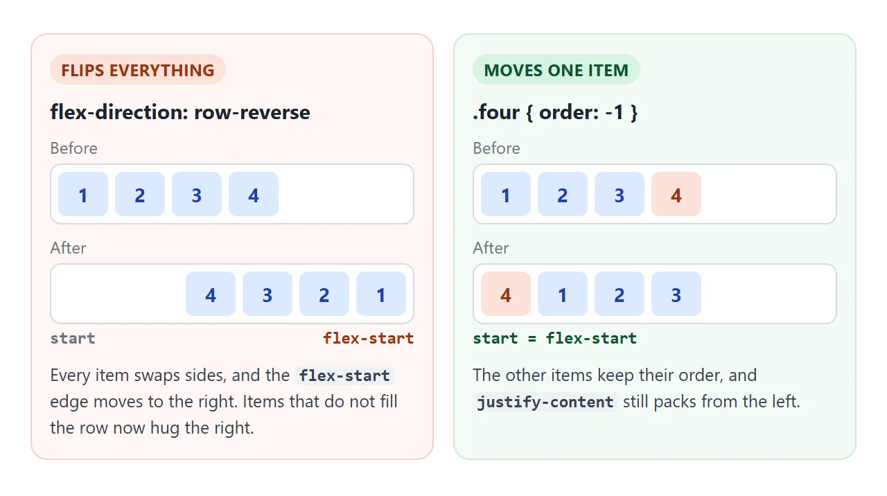
flex-direction: row-reverse and column-reverse flip every item at once. order moves the items you pick. They also affect alignment differently.
<!doctype html>
<html lang="en">
<head>
<meta charset="utf-8">
<meta name="viewport" content="width=device-width, initial-scale=1">
<title>row-reverse vs order</title>
<style>
  body { margin: 0; padding: 14px; font-family: system-ui, sans-serif; background: #f4f5f7; color: #1d2330; }
  .pick { font-size: 13px; margin-bottom: 6px; }
  .pick select { font: inherit; }
  h3 { margin: 12px 0 5px; font: 700 13px ui-monospace, Consolas, monospace; }
  h3 span { font: 400 12px system-ui, sans-serif; color: #5b6270; }
  .row { display: flex; gap: 6px; padding: 6px; background: #fff; border: 1px solid #d5d9e0; border-radius: 10px; }
  .row div { width: 44px; height: 38px; border-radius: 7px; background: #dbeafe; color: #1e40af;
             display: grid; place-items: center; font-weight: 700; }

  .reverse { flex-direction: row-reverse; }  /* flips every item, and the start edge */
  .moved .last { order: -1; background: #fde2da; color: #9a3412; }  /* moves one item only */
</style>
</head>
<body>
<label class="pick">justify-content on all three rows:
  <select id="jc">
    <option>flex-start</option><option>flex-end</option><option>start</option><option>end</option><option>center</option>
  </select>
</label>

<h3>flex-direction: row <span>(default)</span></h3>
<div class="row"><div>1</div><div>2</div><div>3</div><div>4</div><div class="last">5</div></div>

<h3>flex-direction: row-reverse <span>(all items flip)</span></h3>
<div class="row reverse"><div>1</div><div>2</div><div>3</div><div>4</div><div class="last">5</div></div>

<h3>.last { order: -1 } <span>(one item moves)</span></h3>
<div class="row moved"><div>1</div><div>2</div><div>3</div><div>4</div><div class="last">5</div></div>

<p style="font-size:12px;color:#5b6270;margin:10px 0 0">In row-reverse, <b>flex-start</b> is the right edge. <b>start</b> stays on the left.</p>

<script>
  const rows = document.querySelectorAll('.row');
  document.getElementById('jc').addEventListener('change', (e) => {
    rows.forEach((r) => { r.style.justifyContent = e.target.value; });
  });
</script>
</body>
</html>
row-reverse / column-reverse |
order |
|
|---|---|---|
| What moves | Every item, mirrored | Only items you give a value |
Where flex-start is |
The opposite edge | Unchanged |
| Tab and screen reader order | HTML order | HTML order |
| Typical use | A whole row or column in reverse | One item to the front or back |
In a reversed row, justify-content: flex-start packs items against the right edge, and flex-end against the left. The start and end values follow the writing direction instead, so start is still the left edge in English. The justify-content guide covers every value.
order in CSS grid
order works the same way on grid items. It changes the order in which the browser auto-places items into cells, so an item with order: -1 lands in the first free cell.
Items you place yourself are different. An item with an explicit grid-row and grid-column goes to that cell whatever its order value.
Grid also offers a cleaner way to reorder: name areas with grid-template-areas and change the map in a media query. The HTML stays in reading order and only the map changes. See grid-template-columns for the column side of that setup.
.product { display: grid; grid-template-areas: "photo" "buy" "details"; }
.photo { grid-area: photo; }
.buy { grid-area: buy; }
.details { grid-area: details; }

@media (min-width: 600px) {
  .product {
    grid-template-columns: 1fr 200px;
    grid-template-areas: "photo buy" "details buy";
  }
}
A finished example: a product page
This page has a photo, a buy box and a description. On a narrow screen the buy box should come right after the photo. Drag the width slider, press Tab through the controls, and compare the two methods.
<!doctype html>
<html lang="en">
<head>
<meta charset="utf-8">
<meta name="viewport" content="width=device-width, initial-scale=1">
<title>Product page that reorders on narrow screens</title>
<style>
  body { margin: 0; padding: 12px; font-family: system-ui, sans-serif; background: #f4f5f7; color: #1d2330; }
  .controls { display: grid; gap: 6px; font-size: 13px; margin-bottom: 10px; }
  .controls input[type=range] { width: 100%; }
  .modes label { margin-right: 12px; white-space: nowrap; }

  /* the frame's width comes from the slider; container queries read it */
  .frame { container-type: inline-size; max-width: 100%; }
  .layout { display: grid; gap: 10px; }
  .layout > section { background: #fff; border: 1px solid #d5d9e0; border-radius: 12px; padding: 12px; }
  .layout > section:focus-within { outline: 3px solid #f59e0b; }

  /* narrow: one column. Method 1 moves the details below the buy box with order */
  .layout.use-order .details { order: 1; }
  /* Method 2 names the areas instead; the HTML is already in this order */
  .layout.use-areas { grid-template-areas: "gallery" "buy" "details"; }

  /* wide: photo and details on the left, buy box on the right */
  @container (min-width: 540px) {
    .layout { grid-template-columns: 1fr 200px; align-items: start; }
    .layout.use-order .gallery, .layout.use-order .details { grid-column: 1; }
    .layout.use-order .buy { grid-column: 2; grid-row: 1 / span 2; }
    .layout.use-areas { grid-template-areas: "gallery buy" "details buy"; }
  }
  .use-areas .gallery { grid-area: gallery; }
  .use-areas .buy { grid-area: buy; }
  .use-areas .details { grid-area: details; }

  h2 { margin: 0 0 6px; font-size: 15px; }
  .photo { height: 120px; border-radius: 8px; background: linear-gradient(135deg, #93c5fd, #1e3a8a); }
  .photo.side { background: linear-gradient(135deg, #fcd34d, #b45309); }
  .thumbs { display: flex; gap: 6px; margin-top: 8px; }
  .thumbs button, .buy button, .buy select { font: inherit; font-size: 13px; padding: 5px 9px; }
  .price { font-size: 20px; font-weight: 700; margin: 0 0 8px; }
  .buy label { display: block; font-size: 12px; margin-bottom: 8px; }
  .buy .add { width: 100%; background: #0f766e; color: #fff; border: 0; border-radius: 8px; padding: 9px; }
  .msg { font-size: 12px; color: #0f5132; min-height: 16px; margin: 6px 0 0; }
  .details p { font-size: 13px; line-height: 1.5; margin: 0 0 8px; }
  summary { font-size: 13px; cursor: pointer; }

  .note { margin-top: 10px; padding: 10px; border-radius: 10px; font: 12px/1.6 ui-monospace, Consolas, monospace; white-space: pre-wrap; }
  .note.ok { background: #f4fbf6; border: 1px solid #cfe9d7; }
  .note.bad { background: #fff7f5; border: 1px solid #f3d1c8; }
</style>
</head>
<body>
<div class="controls">
  <label>Page width: <b id="wlabel"></b>
    <input type="range" id="width" min="280" step="10">
  </label>
  <div class="modes">
    <label><input type="radio" name="mode" value="order" checked> Method 1: <code>order</code></label>
    <label><input type="radio" name="mode" value="areas"> Method 2: HTML order + grid areas</label>
  </div>
</div>

<div class="frame" id="frame">
  <div class="layout use-order" id="layout">
    <section class="gallery" data-name="Photo">
      <div class="photo" id="photo"></div>
      <div class="thumbs">
        <button type="button" data-view="">Front</button>
        <button type="button" data-view="side">Side</button>
      </div>
    </section>
    <section class="details" data-name="Details">
      <h2>Canvas tote bag</h2>
      <p>Heavy cotton canvas with a zip top and one inside pocket. Holds a 14-inch laptop.</p>
      <details><summary>Care instructions</summary><p>Cold wash, hang to dry.</p></details>
    </section>
    <section class="buy" data-name="Buy box">
      <p class="price">$38</p>
      <label>Colour
        <select id="colour"><option>Navy</option><option>Sand</option></select>
      </label>
      <button type="button" class="add" id="add">Add to cart</button>
      <p class="msg" id="msg"></p>
    </section>
  </div>
</div>

<div class="note" id="note"></div>

<script>
  const frame = document.getElementById('frame');
  const layout = document.getElementById('layout');
  const slider = document.getElementById('width');
  const note = document.getElementById('note');
  const buy = layout.querySelector('.buy');
  const details = layout.querySelector('.details');

  // photo switcher and add to cart, so there is something to Tab through
  layout.querySelectorAll('.thumbs button').forEach((b) =>
    b.addEventListener('click', () => { document.getElementById('photo').className = 'photo ' + b.dataset.view; }));
  document.getElementById('add').addEventListener('click', () => {
    document.getElementById('msg').textContent = 'Added: ' + document.getElementById('colour').value;
  });

  function setMode(mode) {
    if (mode === 'order') {
      layout.className = 'layout use-order';
      layout.insertBefore(details, buy);   // HTML: photo, details, buy box
    } else {
      layout.className = 'layout use-areas';
      layout.insertBefore(buy, details);   // HTML: photo, buy box, details
    }
    report();
  }

  function report() {
    const secs = [...layout.children];
    const tab = secs.map((s) => s.dataset.name);
    // what the eye reads: top to bottom, then left to right
    const seen = [...secs].sort((a, b) => {
      const ra = a.getBoundingClientRect(), rb = b.getBoundingClientRect();
      return Math.abs(ra.top - rb.top) > 4 ? ra.top - rb.top : ra.left - rb.left;
    }).map((s) => s.dataset.name);
    const same = tab.join() === seen.join();
    note.className = 'note ' + (same ? 'ok' : 'bad');
    note.textContent =
      'You see:        ' + seen.join(' > ') + '\n' +
      'Tab goes:       ' + tab.join(' > ') + '\n' +
      (same ? 'Match. Keyboard and screen reader users get the same order.'
            : 'Mismatch. Focus jumps around the page when you press Tab.');
  }

  slider.max = Math.floor(frame.getBoundingClientRect().width);  // all the room there is
  slider.value = slider.max;
  function resize() {
    frame.style.width = slider.value + 'px';
    document.getElementById('wlabel').textContent = slider.value + 'px';
    report();
  }
  slider.addEventListener('input', resize);
  document.querySelectorAll('input[name=mode]').forEach((r) =>
    r.addEventListener('change', () => setMode(r.value)));
  resize();
</script>
</body>
</html>
- Method 1,
order: the layout looks right, but Tab visits the description before the buy box. The panel turns orange. - Method 2, source order plus grid areas: the HTML is photo, buy box, description. Wide and narrow layouts both match the Tab order.
- Container query: the layout reacts to the width of its own box, not the window, so the slider can resize it.
For more on how flex items line up and wrap, see the flexbox guide and flex-wrap.
When it does not work
| What you see | Cause | Fix |
|---|---|---|
| order has no effect at all | The parent is not display: flex or grid |
Set display: flex or display: grid on the parent |
| It works on some elements, not a nested one | order only applies to direct children |
Put order on the child of the container, or make the wrapper a flex container too |
| Changing the value moves nothing | Every item has the same value, so HTML order decides | Give the item a lower or higher value than its neighbours |
| Tab focus jumps around the page | Focus follows the HTML, not order |
Reorder the HTML, or use grid areas with HTML in reading order |
| Items stick to the wrong edge | row-reverse moved the flex-start edge |
Use order instead, or use start and end |
| A grid item ignores its order | It has an explicit grid-row and grid-column |
Remove the placement, or move it with grid-template-areas |
Share it as a link
Tab order is something people need to try, not read about. A screenshot cannot be tabbed through, and an .html attachment may open as plain code on a phone.
To send the working version, paste the page into a NOS document and choose Create share link. HTML to link walks through it.
The page renders as written and its scripts run, so the people you send it to can resize the layout and press Tab themselves. If you change the code later, the same link shows the new version.