The CSS gap property sets the space between the children of a flex, grid or multi-column container. It goes on the parent, not on the children, and it never adds space at the outer edges.
.row { display: flex; flex-wrap: wrap; gap: 16px; }
Try it below. Switch between margins on every card, the old negative margin fix, and gap. Watch the dashed box and the edge space in the note.
<!doctype html>
<html lang="en">
<head>
<meta charset="utf-8">
<meta name="viewport" content="width=device-width, initial-scale=1">
<title>gap vs margin</title>
<style>
  body { margin: 0; padding: 16px; font-family: system-ui, sans-serif; background: #f4f5f7; color: #1d2330; }
  .controls { display: flex; flex-wrap: wrap; gap: 8px; margin-bottom: 12px; }
  .controls button {
    font: inherit; font-size: 14px; padding: 7px 12px; border-radius: 8px;
    border: 1px solid #c9ced8; background: #fff; cursor: pointer;
  }
  .controls button[aria-pressed="true"] { background: #1d2330; color: #fff; border-color: #1d2330; }

  /* the container: a dashed outline so you can see its edges */
  .row {
    display: flex; flex-wrap: wrap;
    outline: 2px dashed #9aa3b2;
  }
  .card {
    flex: 0 0 110px; height: 70px; border-radius: 10px;
    background: #dbe7ff; display: grid; place-items: center; font-weight: 600;
  }

  /* 1. margins on every card: space leaks out at the edges */
  .row.margin .card { margin: 8px; }
  /* 2. the old fix: a negative margin on the row cancels the edge space */
  .row.hacks { margin: -8px; }
  .row.hacks .card { margin: 8px; }
  /* 3. gap: space only between cards, nothing at the edges */
  .row.gap { gap: 16px; }

  /* the parent: a solid line, to show when the row spills out of it */
  .wrap { border: 2px solid #f0a37a; border-radius: 4px; }
  #note { font-size: 14px; line-height: 1.45; margin: 12px 0 0; }
</style>
</head>
<body>
<div class="controls">
  <button data-mode="margin" aria-pressed="true">margin: 8px</button>
  <button data-mode="hacks" aria-pressed="false">margin + negative margin</button>
  <button data-mode="gap" aria-pressed="false">gap: 16px</button>
</div>

<div class="wrap">
  <div class="row margin" id="row">
    <div class="card">1</div><div class="card">2</div><div class="card">3</div>
    <div class="card">4</div><div class="card">5</div>
  </div>
</div>
<p id="note"></p>

<script>
  const row = document.getElementById('row');
  const note = document.getElementById('note');
  const text = {
    margin: 'Every card carries 8px on all sides, so 8px leaks out at every edge of the dashed box, and neighbours sit 16px apart.',
    hacks: 'A -8px margin on the dashed box cancels the edge space. The box is now 16px wider than its parent (orange line) and spills out on both sides.',
    gap: 'gap puts 16px between cards and between lines. The cards touch the edges on every side. No fixes needed.'
  };

  function measure() {
    // distance from the parent's inner top-left corner to the first card
    const r = row.parentElement.getBoundingClientRect();
    const c = row.firstElementChild.getBoundingClientRect();
    return Math.round(c.left - r.left - 2) + 'px left, ' + Math.round(c.top - r.top - 2) + 'px top';
  }

  document.querySelectorAll('.controls button').forEach((btn) => {
    btn.addEventListener('click', () => {
      document.querySelectorAll('.controls button').forEach((b) => b.setAttribute('aria-pressed', b === btn));
      row.className = 'row ' + btn.dataset.mode;
      note.textContent = text[btn.dataset.mode] + ' Edge space: ' + measure() + '.';
    });
  });
  note.textContent = text.margin + ' Edge space: ' + measure() + '.';
</script>
</body>
</html>
Where gap works: flexbox, grid and multi-column
gap is part of the box alignment rules shared by three layout modes. In any other layout it is accepted without error but has no effect.
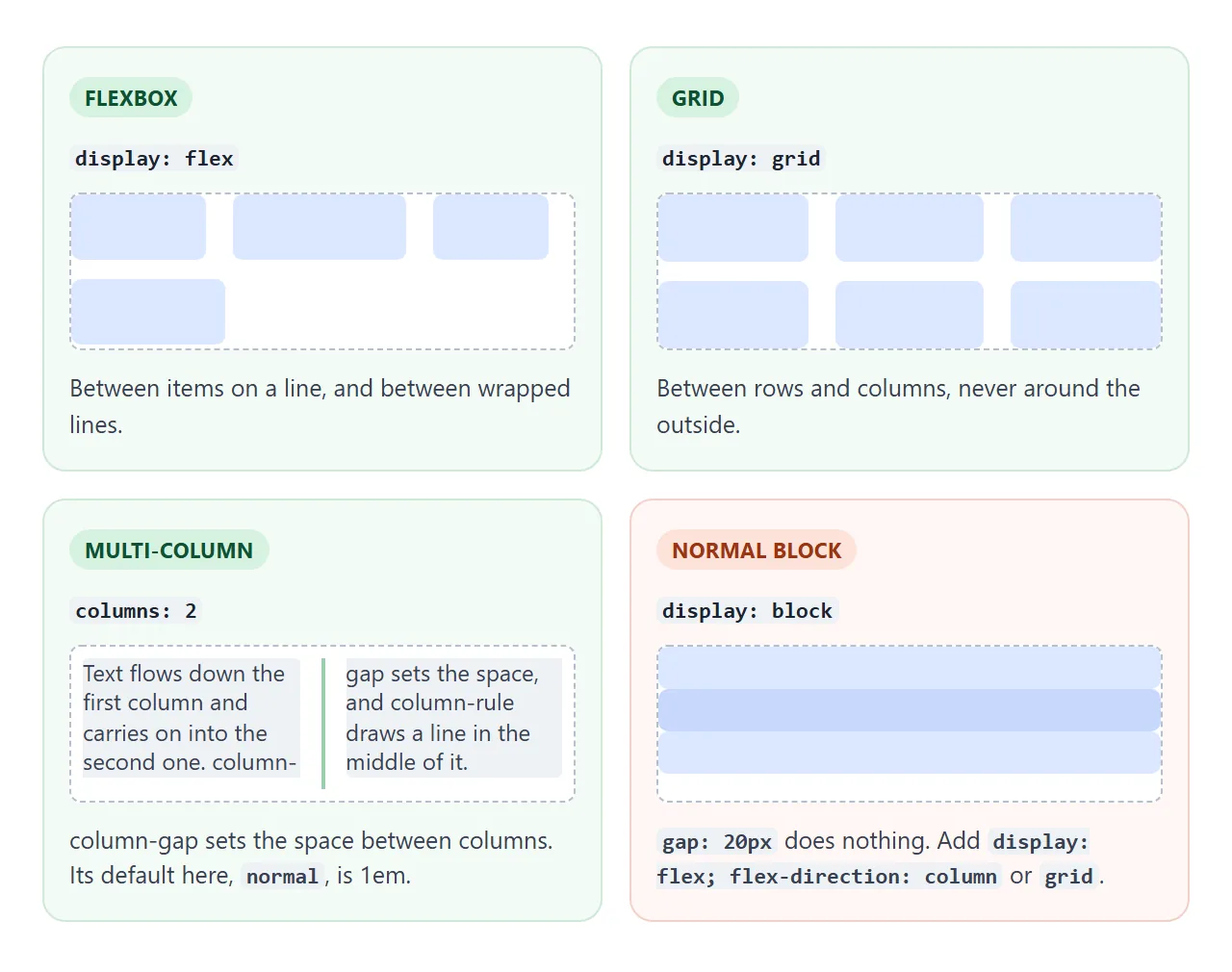
| Container | What row-gap does | What column-gap does | Default |
|---|---|---|---|
display: flex |
Space between wrapped lines | Space between items on a line | 0 |
display: grid |
Space between rows | Space between columns | 0 |
columns (multi-column) |
Not used in basic columns | Space between columns of text | 1em |
display: block |
Nothing | Nothing | |
display: table |
Nothing | Nothing | Use border-spacing |
With flex-direction: column, the items are stacked, so row-gap is the space between them. That makes a column flexbox a handy way to space a stack of blocks.
gap vs margin
Margins belong to each item. A card with margin: 8px carries 8px on all four sides, so the first and last cards push 8px of space out past the container. Two neighbours end up 16px apart, twice the edge space.
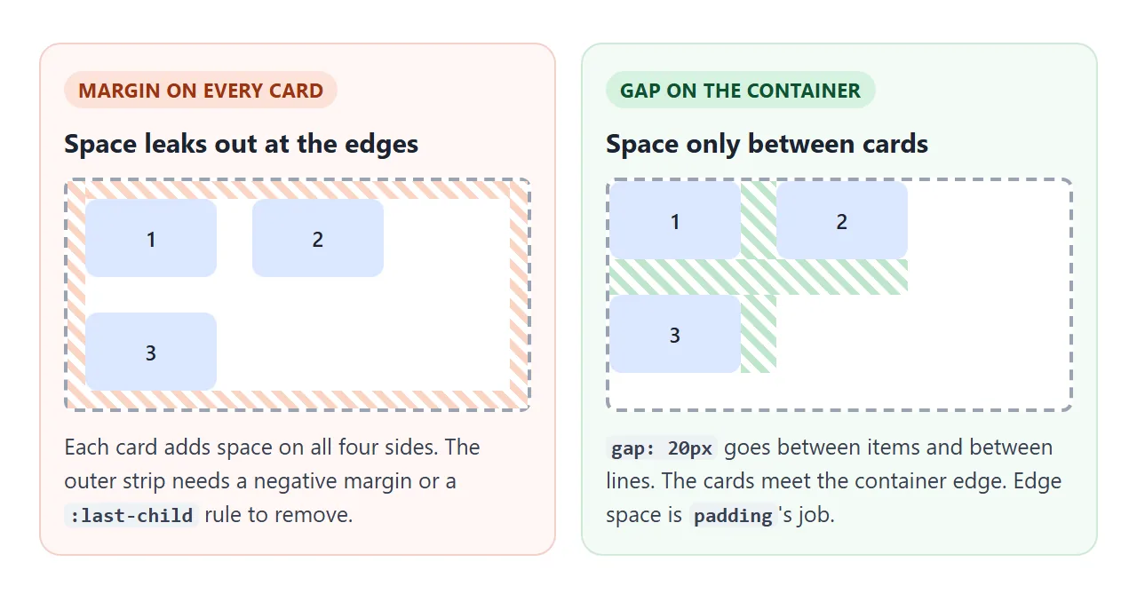
The usual fixes each have a cost:
- A negative margin on the container cancels the edge space, but the container becomes wider than its parent and can cause sideways scrolling.
- A
:last-childrule removes one margin, but in a wrapping row the last item on each line is not the last child, so those lines keep the extra space. * + *selectors such as.item + .item { margin-left: 8px }only work for one line.
gap needs none of them. Space goes between items and between lines, and nothing goes outside. For space around the outside, use padding on the container. The box model explains how padding and margin sit around content.
Margins are still right for spacing inside text, such as paragraphs in an article, where the parent is a normal block.
row-gap, column-gap and the shorthand
gap is shorthand for two properties. One value sets both. Two values set row-gap first, then column-gap.
.list { gap: 12px 24px; } /* 12px between lines, 24px between items */
Drag the sliders to change each direction on a wrapping flex list and on a three-column grid.
<!doctype html>
<html lang="en">
<head>
<meta charset="utf-8">
<meta name="viewport" content="width=device-width, initial-scale=1">
<title>row-gap and column-gap</title>
<style>
  body { margin: 0; padding: 16px; font-family: system-ui, sans-serif; background: #f4f5f7; color: #1d2330; }
  label { display: flex; align-items: center; gap: 10px; font-size: 14px; margin-bottom: 8px; }
  label input[type="range"] { flex: 1; max-width: 220px; }
  output { font: 600 13px ui-monospace, Consolas, monospace; min-width: 44px; }
  h2 { font-size: 14px; margin: 16px 0 6px; }
  code { font: 12.5px ui-monospace, Consolas, monospace; }

  /* both layouts read the same two variables */
  .box { --row: 12px; --col: 12px; row-gap: var(--row); column-gap: var(--col); outline: 2px dashed #9aa3b2; background: #fff; }
  .flex { display: flex; flex-wrap: wrap; }
  .flex > span { flex: 0 0 auto; padding: 8px 12px; border-radius: 99px; background: #dbe7ff; font-size: 14px; }
  /* the trap: three items at a third each, plus the gaps */
  .flex.thirds > span { flex: 0 0 33.333%; box-sizing: border-box; text-align: center; }

  .grid { display: grid; grid-template-columns: repeat(3, 1fr); }
  .grid > div { height: 48px; border-radius: 8px; background: #d6f2df; display: grid; place-items: center; font-size: 14px; }
  #flexNote { font-size: 13px; margin: 6px 0 0; color: #4b5563; min-height: 2.6em; }
</style>
</head>
<body>
<label>row-gap <input type="range" id="row" min="0" max="40" value="12"> <output id="rowOut">12px</output></label>
<label>column-gap <input type="range" id="col" min="0" max="40" value="12"> <output id="colOut">12px</output></label>
<label><input type="checkbox" id="thirds"> Give each tag <code>flex: 0 0 33.333%</code></label>

<h2>Flexbox with flex-wrap</h2>
<div class="box flex" id="flex">
  <span>HTML</span><span>CSS</span><span>JavaScript</span><span>Grid</span>
  <span>Flexbox</span><span>Variables</span><span>Forms</span>
</div>
<p id="flexNote"></p>

<h2>Grid, three columns</h2>
<div class="box grid" id="grid">
  <div>1</div><div>2</div><div>3</div><div>4</div><div>5</div><div>6</div>
</div>

<script>
  const boxes = document.querySelectorAll('.box');
  const flex = document.getElementById('flex');
  const note = document.getElementById('flexNote');

  function update() {
    const row = document.getElementById('row').value + 'px';
    const col = document.getElementById('col').value + 'px';
    boxes.forEach((b) => { b.style.setProperty('--row', row); b.style.setProperty('--col', col); });
    document.getElementById('rowOut').textContent = row;
    document.getElementById('colOut').textContent = col;

    flex.classList.toggle('thirds', document.getElementById('thirds').checked);
    // count how many tags share the first line
    const top = flex.children[0].offsetTop;
    const perLine = [...flex.children].filter((c) => c.offsetTop === top).length;
    note.textContent = flex.classList.contains('thirds')
      ? perLine + ' per line. Three thirds plus two gaps is wider than 100%, so the third tag wraps (set column-gap to 0 to fit three).'
      : perLine + ' tags on the first line. column-gap spaces tags on a line; row-gap spaces the lines.';
  }

  document.querySelectorAll('input').forEach((i) => i.addEventListener('input', update));
  update();
</script>
</body>
</html>
Older stylesheets use grid-gap, grid-row-gap and grid-column-gap. Browsers still accept those names, but they are the older grid-only spelling. Use gap in new code. For grid-specific uses, such as different space between particular rows, see CSS grid row gap.
Percentage gaps and the flex-wrap trap
A percentage column-gap is measured against the width of the container's content box, so column-gap: 5% in an 800px container is 40px.
A percentage row-gap is less useful. When the container's height comes from its content, the gap is worked out from a height that did not include it. The result is small, and the content spills out of the box.
Use a length such as px or rem for row-gap, unless the container has a set height.
The bigger trap is percentage widths plus gap. Three items at 33.333% fill the whole line on their own. Add two gaps and the total is wider than 100%, so the third item wraps. Tick the box in the example above to see it.
Subtract the gaps before dividing:
.item { flex: 0 0 calc((100% - 2 * 16px) / 3); }
CSS flex-wrap covers this and other ways to set items per row. In grid, the problem does not come up: fr units share the space that is left after the gaps. grid-template-columns shows how.
gap with margins and justify-content
gap does not replace margins that are still in the stylesheet. It adds to them. A child with margin-right: 24px in a container with gap: 30px sits 54px from its neighbour.
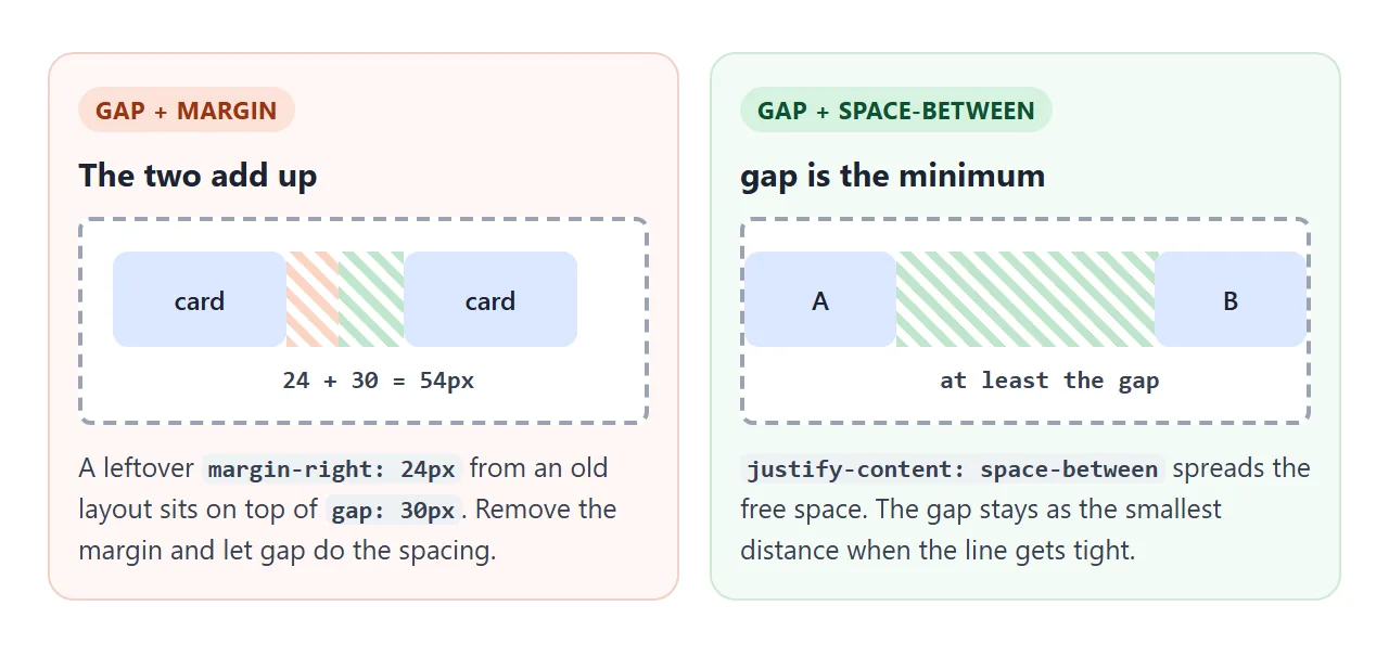
justify-content: space-between and gap work together. The browser first places the gaps, then shares out any space that is left. So the gap is the minimum distance between items.
On a wide screen, space-between decides the spacing. On a narrow one, the gap keeps items from touching.
A finished example: a spacing scale with CSS variables
Real pages use a few spacing sizes over and over. Put them in CSS variables and use gap for every space between elements, and padding for every space inside a box.
<!doctype html>
<html lang="en">
<head>
<meta charset="utf-8">
<meta name="viewport" content="width=device-width, initial-scale=1">
<title>Spacing tokens with gap</title>
<style>
  /* one spacing scale, built from one unit */
  :root {
    --unit: 4px;
    --space-1: calc(var(--unit) * 1);
    --space-2: calc(var(--unit) * 2);
    --space-3: calc(var(--unit) * 3);
    --space-4: calc(var(--unit) * 4);
    --space-6: calc(var(--unit) * 6);
  }
  * { box-sizing: border-box; }
  body { margin: 0; font-family: system-ui, sans-serif; background: #f4f5f7; color: #1d2330; }

  /* the page is a column of sections: gap between them, padding around them */
  .page { display: flex; flex-direction: column; gap: var(--space-6); padding: var(--space-4); max-width: 720px; margin: 0 auto; }

  header { display: flex; flex-wrap: wrap; align-items: center; justify-content: space-between; gap: var(--space-3); }
  header strong { font-size: 18px; }
  nav { display: flex; flex-wrap: wrap; gap: var(--space-2); }
  nav a { padding: var(--space-1) var(--space-2); border-radius: 6px; background: #fff; color: inherit; text-decoration: none; font-size: 14px; }

  .cards { display: grid; grid-template-columns: repeat(auto-fill, minmax(150px, 1fr)); gap: var(--space-4); }
  .card { display: flex; flex-direction: column; gap: var(--space-2); padding: var(--space-4); border-radius: 12px; background: #fff; }
  .card h3 { margin: 0; font-size: 15px; }
  .card p { margin: 0; font-size: 13px; color: #4b5563; line-height: 1.4; }

  form { display: grid; gap: var(--space-4); padding: var(--space-4); border-radius: 12px; background: #fff; }
  .field { display: grid; gap: var(--space-1); font-size: 14px; }
  .field input { font: inherit; padding: var(--space-2); border: 1px solid #c9ced8; border-radius: 8px; }
  .actions { display: flex; flex-wrap: wrap; gap: var(--space-2); }
  .actions button { font: inherit; font-size: 14px; padding: var(--space-2) var(--space-4); border-radius: 8px; border: 1px solid #1d2330; background: #1d2330; color: #fff; cursor: pointer; }
  .actions button[type="reset"] { background: #fff; color: #1d2330; }
  #out { margin: 0; font: 12.5px ui-monospace, Consolas, monospace; white-space: pre-wrap; color: #0f5132; }

  .density { display: flex; flex-wrap: wrap; align-items: center; gap: var(--space-2); font-size: 14px; }
  .density select { font: inherit; }
</style>
</head>
<body>
<div class="page">
  <label class="density">Density
    <select id="density">
      <option value="3px">Compact (unit 3px)</option>
      <option value="4px" selected>Default (unit 4px)</option>
      <option value="6px">Roomy (unit 6px)</option>
    </select>
  </label>

  <header>
    <strong>Studio</strong>
    <nav><a href="#work">Work</a><a href="#about">About</a><a href="#contact">Contact</a></nav>
  </header>

  <section class="cards" id="work">
    <article class="card"><h3>Brand refresh</h3><p>Logo, colours and a type scale.</p></article>
    <article class="card"><h3>Shop layout</h3><p>Product grid and checkout.</p></article>
    <article class="card"><h3>Newsletter</h3><p>A template that works on phones.</p></article>
    <article class="card"><h3>Dashboard</h3><p>Charts and filters for a team.</p></article>
  </section>

  <form id="contact">
    <div class="field"><label for="name">Name</label><input id="name" name="name" required></div>
    <div class="field"><label for="email">Email</label><input id="email" name="email" type="email" required></div>
    <div class="actions"><button type="submit">Send</button><button type="reset">Clear</button></div>
    <p id="out"></p>
  </form>
</div>

<script>
  // change one unit and every gap and padding on the page follows
  document.getElementById('density').addEventListener('change', (e) => {
    document.documentElement.style.setProperty('--unit', e.target.value);
  });

  // demo only: show what would be sent instead of sending it
  document.getElementById('contact').addEventListener('submit', (e) => {
    e.preventDefault();
    const data = new FormData(e.target);
    document.getElementById('out').textContent =
      'Would send:\n' + [...data].map(([k, v]) => k + ' = ' + v).join('\n');
  });
</script>
</body>
</html>
- One unit:
--unit: 4px, with--space-1to--space-6as multiples. - gap between, padding inside: the page column, the nav, the card grid, each card and the form fields all use
gap. No child has a spacing margin. - One switch: the density menu changes
--unit, and every gap and padding on the page changes with it.
The form shows what it would send instead of sending it. A real form would post to a server.
When it does not work
| What you see | Cause | Fix |
|---|---|---|
| gap has no effect | The parent is a normal block or a table | Set display: flex or display: grid on the parent |
| gap has no effect | gap is on the items, not their parent | Move it to the container |
| Items wrap one too early | Percentage widths plus gaps exceed 100% | Subtract the gaps with calc(), or use grid and fr |
| Space is bigger than the gap | Old margins on the children add to it | Remove the spacing margins |
| No space at the edges | gap never adds outer space | Add padding to the container |
| Items touch with space-between | No gap set, and the line is full | Add gap as the minimum distance |
| Grid is spaced, flex row is not | An older browser supports gap in grid but not in flexbox | Test in that browser, and use margins as the fallback if you must support it |
| Content spills below the box | Percentage row-gap in an auto-height container |
Use a length for row-gap |
One note on the older-browser case: @supports (gap: 1rem) does not detect flexbox support, because it answers yes for any browser that supports gap in grid.
Share it as a link
Spacing is easier to judge when people can resize the page themselves. A screenshot shows one width, and the gaps that look right on a laptop may crowd on a phone.
Paste the page into a NOS document and choose Create share link. HTML to link walks through it.
The page renders as written and its scripts run, so the people you send it to can drag the sliders and switch the density themselves. If you change the spacing scale later, the same link shows the new version.