To split text into columns, put one property on the container: columns: 14em for columns at least 14em wide, or column-count: 3 for exactly three.
The content flows down the first column and continues at the top of the next. You do not wrap each column in its own element.
Try it. Switch between a fixed count and a minimum width, and narrow the window to see the difference.
<!doctype html>
<html lang="en">
<head>
<meta charset="utf-8">
<meta name="viewport" content="width=device-width, initial-scale=1">
<title>CSS columns playground</title>
<style>
  body { margin: 0; padding: 12px; font-family: system-ui, sans-serif; background: #f4f5f7; color: #1d2330; }
  .controls { display: grid; grid-template-columns: repeat(auto-fit, minmax(160px, 1fr)); gap: 8px 14px; font-size: 13px; }
  .controls label { display: flex; align-items: center; gap: 6px; }
  .controls input[type=range] { flex: 1; min-width: 0; }
  output, #fit { font-weight: 700; }
  pre { margin: 10px 0 8px; padding: 8px 10px; background: #1d2330; color: #d6f2df; border-radius: 8px; font-size: 12px; white-space: pre-wrap; }
  .frame { height: 300px; overflow: auto; background: #fff; border: 1px solid #dfe3ea; border-radius: 10px; padding: 14px; }
  .frame p { margin: 0 0 .8em; font-size: 14px; line-height: 1.5; }

  /* The part this demo is about. The controls rewrite these values. */
  #text {
    column-count: 3;
    column-gap: 24px;
    column-rule: 1px solid #c9cdd4;
    column-fill: balance;
  }
</style>
</head>
<body>
<div class="controls">
  <label><input type="radio" name="mode" value="count" checked> column-count</label>
  <label><input type="radio" name="mode" value="width"> column-width</label>
  <label>count <input id="count" type="range" min="1" max="5" value="3"> <output id="countOut">3</output></label>
  <label>width <input id="width" type="range" min="100" max="320" step="10" value="180" disabled> <output id="widthOut">180px</output></label>
  <label>gap <input id="gap" type="range" min="0" max="48" step="4" value="24"> <output id="gapOut">24px</output></label>
  <label>rule <select id="rule"><option>solid</option><option>dotted</option><option>none</option></select></label>
  <label>fill <select id="fill"><option>balance</option><option value="auto">auto (height 220px)</option></select></label>
  <span>Columns now: <span id="fit">3</span></span>
</div>
<pre id="css"></pre>
<div class="frame">
  <div id="text">
    <p>Multi-column layout flows one block of text into several columns, the way a newspaper does. You do not wrap each column in its own element. The browser decides where each column ends.</p>
    <p>Set a number with column-count and the columns share the width equally, however narrow that makes them. Set column-width instead and the browser fits as many columns of at least that width as the box allows.</p>
    <p>The gap between columns is column-gap. A line drawn in the middle of that gap is column-rule. The rule takes no space of its own. A rule wider than the gap ends up behind the text.</p>
    <p>By default the columns are balanced: the content is split so the columns end at about the same height. With column-fill: auto and a fixed height, the first column fills to the bottom before the next one starts.</p>
    <p>Try a narrow screen. Three columns in a 390 pixel phone leave about a hundred pixels per column. A column-width of 180px gives one column on the phone and more on a wide screen, with no media query.</p>
  </div>
</div>

<script>
  const text = document.getElementById('text');
  const $ = (id) => document.getElementById(id);

  function update() {
    const byWidth = document.querySelector('[name=mode]:checked').value === 'width';
    $('count').disabled = byWidth;
    $('width').disabled = !byWidth;

    const s = text.style;
    s.columnCount = byWidth ? 'auto' : $('count').value;
    s.columnWidth = byWidth ? $('width').value + 'px' : 'auto';
    s.columnGap = $('gap').value + 'px';
    const rule = $('rule').value === 'none' ? 'none' : '1px ' + $('rule').value + ' #c9cdd4';
    s.columnRule = rule;
    s.columnFill = $('fill').value;
    s.height = $('fill').value === 'auto' ? '220px' : 'auto';  // auto needs a height to fill

    $('countOut').textContent = $('count').value;
    $('widthOut').textContent = $('width').value + 'px';
    $('gapOut').textContent = $('gap').value + 'px';
    $('css').textContent =
      (byWidth ? 'column-width: ' + s.columnWidth : 'column-count: ' + s.columnCount) + ';\n' +
      'column-gap: ' + s.columnGap + ';\ncolumn-rule: ' + rule + ';\n' +
      'column-fill: ' + s.columnFill + ';' + (s.height === '220px' ? '\nheight: 220px;' : '');

    // How many columns fit: the rule from the spec for column-width
    const W = text.clientWidth, g = +$('gap').value;
    $('fit').textContent = byWidth
      ? Math.max(1, Math.floor((W + g) / (+$('width').value + g)))
      : $('count').value;
  }

  document.querySelectorAll('input, select').forEach((el) => el.addEventListener('input', update));
  window.addEventListener('resize', update);
  update();
</script>
</body>
</html>
.article {
  columns: 14em;               /* as many 14em columns as fit */
  column-gap: 2em;
  column-rule: 1px solid #ccc; /* a line in the middle of each gap */
}
This is a different tool from grid-template-columns. Grid places items into cells you define. Multi-column takes one stream of content and cuts it into column-sized pieces.
column-count or column-width
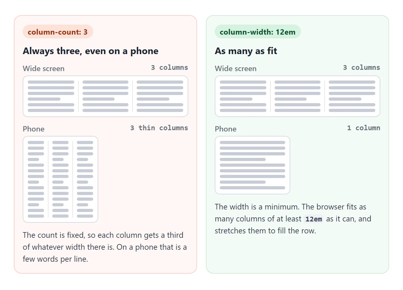
column-count fixes the number. Three columns stay three columns, so on a phone each one gets a third of about 390 pixels. That is a few words per line.
column-width sets a minimum. The browser fits as many columns of at least that width as the container allows, then stretches them to fill the row. The same rule gives one column on a phone and three on a laptop, with no media query.
The columns shorthand takes either value, or both. With both, the count becomes a maximum:
| You write | What happens |
|---|---|
columns: 3 |
Always 3 columns |
columns: 14em |
As many columns of at least 14em as fit |
columns: 14em 3 |
As many as fit, but never more than 3 |
column-count: 1 |
One column. Handy to switch off columns in a media query |
For body text, prefer a width. It keeps lines readable at every screen size.
column-gap and column-rule
column-gap is the space between columns. In a multi-column container its default, normal, is 1em. That is different from grid and flexbox, where normal is zero. The row-gap and gap guide covers the same property in grid.
column-rule draws a line in the middle of each gap. It takes the same values as border: width, style, color.
The rule takes no space of its own, so it never pushes the columns apart. A rule wider than the gap ends up behind the text.
column-span: all for headings
A heading inside a multi-column container normally sits in one column, wherever the text breaks. column-span: all makes it cross every column. The content before it is balanced into columns above it, and the content after it starts a new set below.
<!doctype html>
<html lang="en">
<head>
<meta charset="utf-8">
<meta name="viewport" content="width=device-width, initial-scale=1">
<title>column-span and break-inside</title>
<style>
  body { margin: 0; padding: 12px; font-family: system-ui, sans-serif; background: #f4f5f7; color: #1d2330; }
  .toggles { display: flex; flex-wrap: wrap; gap: 6px 16px; font-size: 13px; margin-bottom: 10px; }
  .toggles code { background: #e6e9ef; padding: 1px 4px; border-radius: 4px; }

  .cols {
    columns: 150px 3;             /* at least 150px wide, at most 3 columns */
    column-gap: 18px;
    column-rule: 1px dashed #c9cdd4;
    background: #fff; border: 1px solid #dfe3ea; border-radius: 10px; padding: 14px;
  }
  .cols p { margin: 0 0 10px; font-size: 13px; line-height: 1.45; }
  .cols h2 { margin: 4px 0 10px; font-size: 17px; padding: 6px 8px; background: #e8f0fe; border-radius: 6px; }
  .card { margin: 0 0 12px; padding: 10px; border-radius: 8px; background: #fef3e2; border: 1px solid #f3d6a8; font-size: 13px; line-height: 1.4; }
  .card b { display: block; margin-bottom: 4px; }

  /* The two switches */
  .span-on h2 { column-span: all; }       /* heading crosses every column */
  .avoid-on .card { break-inside: avoid; } /* a card is never cut in two */
</style>
</head>
<body>
<div class="toggles">
  <label><input type="checkbox" id="span"> <code>column-span: all</code> on the heading</label>
  <label><input type="checkbox" id="avoid"> <code>break-inside: avoid</code> on the cards</label>
</div>

<div class="cols" id="cols">
  <p>With column-span off, the heading below is just another block in the flow. It lands wherever the text happens to break.</p>
  <p>Turn it on and the heading crosses the full width. The text before it is balanced above, and the cards start a fresh set of columns below.</p>
  <h2>Section two: the cards</h2>
  <div class="card"><b>Card 1</b>Short card.</div>
  <div class="card"><b>Card 2</b>A card with a few lines of text in it.</div>
  <div class="card"><b>Card 3</b>Medium card, two lines.</div>
  <div class="card"><b>Card 4</b>The tallest card. Balancing wants every column to end at about the same height, and this card is taller than that height allows. Without break-inside: avoid, its top half ends one column and its bottom half starts the next, border and all.</div>
  <div class="card"><b>Card 5</b>Short card.</div>
  <div class="card"><b>Card 6</b>The last card.</div>
</div>

<script>
  const cols = document.getElementById('cols');
  document.getElementById('span').addEventListener('change', (e) => cols.classList.toggle('span-on', e.target.checked));
  document.getElementById('avoid').addEventListener('change', (e) => cols.classList.toggle('avoid-on', e.target.checked));
</script>
</body>
</html>
The element does not have to be a direct child of the column container. A heading nested inside a plain div still spans.
What stops it is an ancestor that starts its own layout context in between. Examples are a parent with overflow: hidden, display: flow-root, or a flex container.
There is no column-span: 2. The standard allows only none and all.
break-inside: avoid for cards and figures
Columns end where the content height says they end, even in the middle of a card or between an image and its caption. The top half lands at the bottom of one column and the rest at the top of the next.
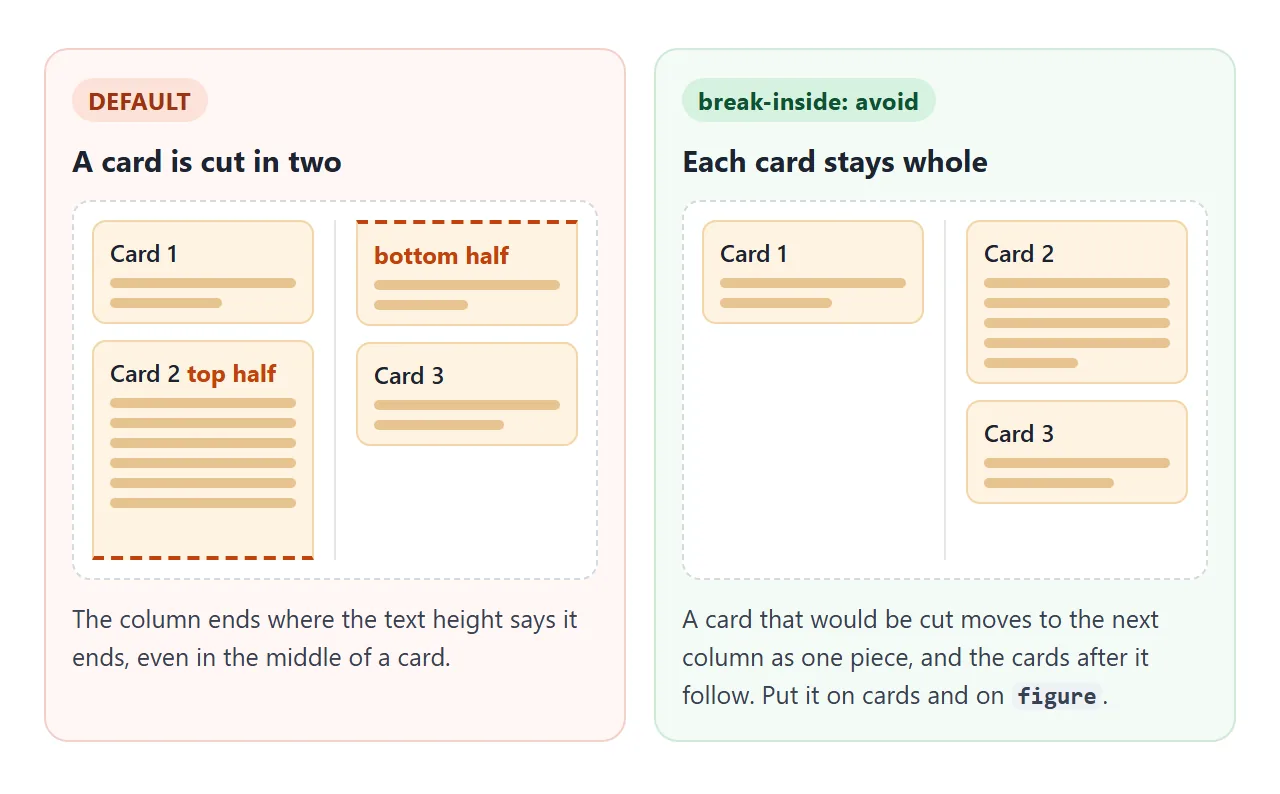
.card, figure { break-inside: avoid; }
The whole card then moves to the next column, and everything after it follows. Columns can come out less even, because the browser has fewer places to break. That is the trade.
column-fill: balance or auto
By default, column-fill: balance splits the content so every column ends at about the same height. That is what you want in almost every case.
column-fill: auto fills the first column to the bottom before starting the next. It only makes sense when the container has a height. Without one, the first column just keeps growing and takes all the content.
With a fixed height, watch for the other end too. If the content does not fit, the browser adds more columns to the right of the container.
Those overflow columns can run off the edge of the page. Pick the auto option in the playground above and scroll sideways to see them.
A finished example: a newspaper page and a card wall
The newspaper tab uses columns: 14em with a rule, a headline and a pull quote with column-span: all, and a figure with break-inside: avoid. The card wall uses the same idea for pictures of different heights.
<!doctype html>
<html lang="en">
<head>
<meta charset="utf-8">
<meta name="viewport" content="width=device-width, initial-scale=1">
<title>Newspaper and card wall with CSS columns</title>
<style>
  body { margin: 0; font-family: system-ui, sans-serif; background: #f4f5f7; color: #1d2330; }
  .tabs { display: flex; gap: 6px; padding: 10px 12px 0; }
  .tabs button { font: 600 13px system-ui, sans-serif; padding: 7px 12px; border: 1px solid #c9cdd4; border-radius: 8px 8px 0 0; background: #e6e9ef; cursor: pointer; }
  .tabs button[aria-selected=true] { background: #fff; border-bottom-color: #fff; }
  .view { background: #fff; margin: -1px 12px 12px; border: 1px solid #c9cdd4; border-radius: 0 10px 10px 10px; padding: 14px; height: 500px; overflow: auto; box-sizing: border-box; }
  .view[hidden] { display: none; }

  /* 1. Newspaper */
  .paper { font-family: Georgia, serif; columns: 14em; column-gap: 28px; column-rule: 1px solid #d5d9e0; }
  .paper .head { column-span: all; border-bottom: 3px double #1d2330; margin-bottom: 12px; }
  .paper h1 { margin: 0; font-size: 26px; line-height: 1.15; }
  .paper .by { font: 12px system-ui, sans-serif; color: #5b6270; margin: 6px 0 8px; }
  .paper p { margin: 0 0 10px; font-size: 14px; line-height: 1.55; text-align: justify; hyphens: auto; }
  .paper figure { margin: 0 0 12px; break-inside: avoid; }   /* never split a picture from its caption */
  .paper figure svg { display: block; width: 100%; height: auto; border-radius: 6px; }
  .paper figcaption { font: 12px system-ui, sans-serif; color: #5b6270; margin-top: 4px; }
  .paper blockquote { column-span: all; margin: 4px 0 14px; padding: 10px 0; border-block: 1px solid #d5d9e0; font-size: 19px; font-style: italic; text-align: center; }

  /* 2. Card wall: masonry-like, but the order runs down each column */
  .wall { columns: 150px; column-gap: 12px; }
  .tile { break-inside: avoid; margin: 0 0 12px; border-radius: 10px; overflow: hidden; background: #fff; border: 1px solid #e1e4ea; position: relative; }
  .tile .pic { display: block; }
  .tile p { margin: 0; padding: 8px 10px; font-size: 12.5px; }
  .tile .n { position: absolute; top: 8px; left: 8px; width: 26px; height: 26px; border-radius: 50%; background: rgba(29, 35, 48, .85); color: #fff; font: 700 13px/26px system-ui, sans-serif; text-align: center; }
  .note { font-size: 12.5px; color: #5b6270; margin: 0 0 10px; }
</style>
</head>
<body>
<div class="tabs" role="tablist">
  <button role="tab" aria-selected="true" data-view="paper">Newspaper</button>
  <button role="tab" aria-selected="false" data-view="wall">Card wall</button>
</div>

<div class="view" id="paper">
  <article class="paper">
    <header class="head">
      <h1>Harbour town opens its new library on the pier</h1>
      <div class="by">By the City Desk · Saturday edition</div>
    </header>
    <p>The library that residents voted for three years ago opened its doors this morning, on the old ferry pier at the end of Water Street. A queue formed before eight.</p>
    <p>Inside, the reading room faces the harbour through a single long window. The children's corner sits one floor down, closer to the water, with its own entrance from the boardwalk.</p>
    <figure>
      <svg viewBox="0 0 300 150" role="img" aria-label="Drawing of a low building on a pier">
        <rect width="300" height="150" fill="#cfe3f5"/>
        <rect y="100" width="300" height="50" fill="#5b8fc7"/>
        <rect x="40" y="62" width="200" height="40" fill="#f4efe6"/>
        <rect x="52" y="72" width="176" height="14" fill="#8fb3d9"/>
        <polygon points="30,62 250,62 240,50 40,50" fill="#b45309"/>
        <rect x="20" y="100" width="240" height="8" fill="#7c5a3a"/>
      </svg>
      <figcaption>The pier building, seen from the ferry.</figcaption>
    </figure>
    <p>The shelves hold about the same number of books as the old branch, but there is twice the floor space. The extra room went to tables, a small stage and a repair desk for bicycles.</p>
    <blockquote>"We wanted a room where you can read and watch the boats at the same time."</blockquote>
    <p>Opening hours run late on weekdays so that people coming off the evening ferry can stop in. On weekends the library opens an hour earlier than the market.</p>
    <p>The old branch on Hill Road will stay open until the end of the year. After that it becomes a workshop space run by the same staff.</p>
    <p>Library cards from the old branch work at the new one. Anyone without a card can sign up at the front desk with proof of address.</p>
  </article>
</div>

<div class="view" id="wall" hidden>
  <p class="note">Numbers follow the HTML order. They run down the first column, then down the next, not across the rows.</p>
  <div class="wall" id="wallGrid"></div>
</div>

<script>
  // Build the tiles: a gradient "photo" of a different height for each one
  const heights = [120, 80, 150, 95, 130, 70, 110, 160, 90, 125];
  const colors = [['#fde68a', '#f59e0b'], ['#bfdbfe', '#3b82f6'], ['#bbf7d0', '#22c55e'], ['#fbcfe8', '#ec4899'], ['#ddd6fe', '#8b5cf6']];
  const wall = document.getElementById('wallGrid');
  heights.forEach((h, i) => {
    const [a, b] = colors[i % colors.length];
    wall.insertAdjacentHTML('beforeend',
      `<div class="tile"><span class="n">${i + 1}</span>` +
      `<span class="pic" style="height:${h}px;background:linear-gradient(135deg,${a},${b})"></span>` +
      `<p>Photo ${i + 1}</p></div>`);
  });

  // Tabs
  document.querySelectorAll('[role=tab]').forEach((tab) => {
    tab.addEventListener('click', () => {
      document.querySelectorAll('[role=tab]').forEach((t) => {
        t.setAttribute('aria-selected', t === tab);
        document.getElementById(t.dataset.view).hidden = t !== tab;
      });
    });
  });
</script>
</body>
</html>
.wall { columns: 150px; column-gap: 12px; }
.tile { break-inside: avoid; margin: 0 0 12px; }
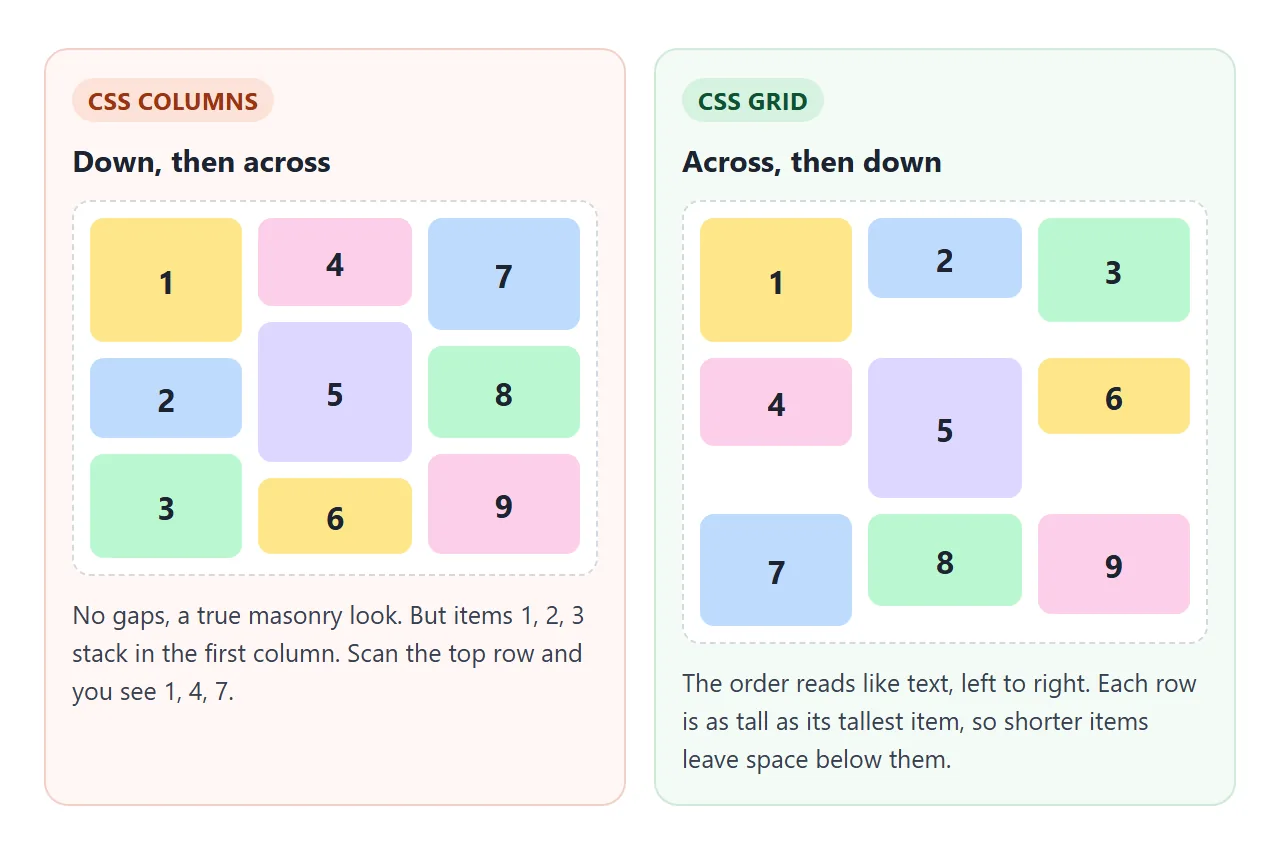
The wall looks like masonry, with no empty space under the short cards. Read the numbers, though. They run down the first column, then down the second.
Reading order, and when to use grid instead
Multi-column keeps the HTML order, and that order runs down each column. For an article that is exactly right. For a card wall it can surprise people. The newest card is at the top left, but the second newest sits under it, not beside it.
Keyboard focus follows the HTML order as well, so the Tab key also travels down one column before moving to the next.
Use grid when:
- The order across the top row matters, as in a feed or a list of search results.
- An item needs to cover 2 of 3 columns (
grid-column: span 2). - The rows should line up with each other.
For items that simply wrap onto new rows, flex-wrap and grid are the usual tools. For one image with text flowing around it, that is float.
When it does not work
| What you see | Cause | Fix |
|---|---|---|
| A card or image is cut between two columns | Columns break wherever the height ends | break-inside: avoid on the card or figure |
| Columns end at very different heights | column-fill: auto, or large unbreakable items |
Keep balance, and split very tall items |
| Everything sits in the first column | column-fill: auto with no height |
Remove it or give the container a height |
| Extra columns stick out on the right | Fixed height and more content than fits | Remove the height, or let the container scroll |
| The heading stays inside one column | An ancestor has overflow: hidden, flow-root or display: flex |
Remove that wrapper or move the heading out of it |
| Tiny columns on a phone | column-count fixes the number |
Use column-width or columns: 14em |
| The card order looks scrambled | Columns read down, then across | Use grid if the across order matters |
For the phone case to work at all, the page also needs the viewport meta tag. Without it, a phone lays the page out as if it were a wide desktop screen.
Share it as a link
A column layout depends on the screen it lands on. A screenshot shows one width, and an .html attachment may open as plain code on a phone.
To send the working version, paste the page into a NOS document and choose Create share link. HTML to link walks through it.
The page renders as written and its scripts run, so the people you send it to can resize it and see the columns reflow. If you change the code later, the same link shows the new version.