grid-template-columns sets the columns of a grid, one size per column, left to right. grid-template-columns: 200px 1fr 2fr makes three columns: 200px, then one share and two shares of the space that is left. grid-template-rows does the same for rows.
Try it. Pick a preset or type your own value, and change the number of items. The line under the grid shows each column in px, as the browser worked it out.
<!doctype html>
<html lang="en">
<head>
<meta charset="utf-8">
<meta name="viewport" content="width=device-width, initial-scale=1">
<title>grid-template-columns builder</title>
<style>
  body { margin: 0; padding: 14px; font-family: system-ui, sans-serif; background: #f4f5f7; color: #1d2330; }
  label { font-size: 13px; font-weight: 600; }
  .row { display: flex; gap: 8px; margin: 6px 0 8px; }
  #value {
    flex: 1; min-width: 0; padding: 8px 10px; border: 1px solid #c9cdd4; border-radius: 8px;
    font: 14px ui-monospace, Consolas, monospace;
  }
  #value.bad { border-color: #c2410c; background: #fff7f5; }
  #count { width: 56px; padding: 8px; border: 1px solid #c9cdd4; border-radius: 8px; font: inherit; }
  .presets { display: flex; flex-wrap: wrap; gap: 6px; margin-bottom: 12px; }
  .presets button {
    padding: 5px 8px; border: 1px solid #c9cdd4; border-radius: 6px; background: #fff;
    font: 12px ui-monospace, Consolas, monospace; cursor: pointer;
  }
  .presets button:hover { border-color: #2563eb; }

  /* the grid being tested: only grid-template-columns changes */
  #grid {
    display: grid;
    grid-template-columns: 200px 1fr 2fr;
    gap: 8px;
    padding: 8px; border-radius: 10px; background: #e6e9ef;
  }
  #grid div {
    min-height: 44px; padding: 6px; border-radius: 6px; background: #fff;
    font-size: 13px; overflow-wrap: anywhere;
  }
  #grid div b { color: #2563eb; }

  #out { margin-top: 10px; font-size: 13px; }
  #out code { font: 12px ui-monospace, Consolas, monospace; background: #fff; border: 1px solid #dde1e7; border-radius: 4px; padding: 1px 4px; margin: 2px 2px 0 0; display: inline-block; }
  #msg { color: #9a3412; font-size: 13px; min-height: 18px; }
</style>
</head>
<body>
<label for="value">grid-template-columns:</label>
<div class="row">
  <input id="value" value="200px 1fr 2fr" spellcheck="false" autocomplete="off">
  <input id="count" type="number" min="1" max="12" value="6" aria-label="Number of items">
</div>
<div class="presets" id="presets">
  <button>200px 1fr 2fr</button>
  <button>repeat(3, 1fr)</button>
  <button>auto 1fr auto</button>
  <button>minmax(150px, 1fr) 3fr</button>
  <button>repeat(auto-fit, minmax(120px, 1fr))</button>
  <button>[side] 120px [main] 1fr</button>
</div>
<div id="msg"></div>
<div id="grid"></div>
<div id="out"></div>

<script>
  const input = document.getElementById('value');
  const count = document.getElementById('count');
  const grid = document.getElementById('grid');
  const out = document.getElementById('out');
  const msg = document.getElementById('msg');

  function render() {
    const n = Math.max(1, Math.min(12, +count.value || 1));
    grid.innerHTML = '';
    for (let i = 1; i <= n; i++) {
      const d = document.createElement('div');
      d.innerHTML = '<b>' + i + '</b>' + (i === 2 ? ' a bit more text' : '');
      grid.appendChild(d);
    }
    const v = input.value.trim();
    // an invalid value is ignored by the browser, so check it first
    const ok = CSS.supports('grid-template-columns', v);
    input.classList.toggle('bad', !ok);
    msg.textContent = ok ? '' : 'Not a valid value. The browser would ignore the whole line.';
    if (ok) grid.style.gridTemplateColumns = v;
    // the computed value lists each column in px, after fr and minmax are resolved
    const tracks = getComputedStyle(grid).gridTemplateColumns;
    out.innerHTML = 'Computed columns: ' + tracks.match(/\[[^\]]*\]|\S+/g).map(t => '<code>' + t + '</code>').join('');
  }

  input.addEventListener('input', render);
  count.addEventListener('input', render);
  document.getElementById('presets').addEventListener('click', (e) => {
    if (e.target.tagName !== 'BUTTON') return;
    input.value = e.target.textContent;
    render();
  });
  window.addEventListener('resize', render);
  render();
</script>
</body>
</html>
The parent needs display: grid. Without it, grid-template-columns does nothing. For the bigger picture of grid itself, start with CSS grid. This page is about the column and row values.
The values a column can take
Each word in the list is one track (a column, or a row in grid-template-rows). You can mix kinds freely.
| Value | What the column does |
|---|---|
200px, 12rem |
Exactly that width |
25% |
A percentage of the grid's width, with gaps added on top |
1fr, 2fr |
A share of the space left over |
auto |
As wide as its content, then stretches if there is room |
min-content |
As narrow as the content allows |
max-content |
As wide as the content without wrapping |
minmax(150px, 1fr) |
Never below 150px, at most one share |
fit-content(300px) |
Content width, capped at 300px |
repeat(4, 1fr) |
Writes 1fr four times |
repeat() can repeat a pattern too: repeat(2, 100px 1fr) gives four columns. auto 1fr auto is a common row for a header: logo at its own width, a flexible middle, buttons at their own width.
How fr is calculated
The browser sizes fixed tracks first, then takes the gaps out, and only then shares what is left among the fr columns.
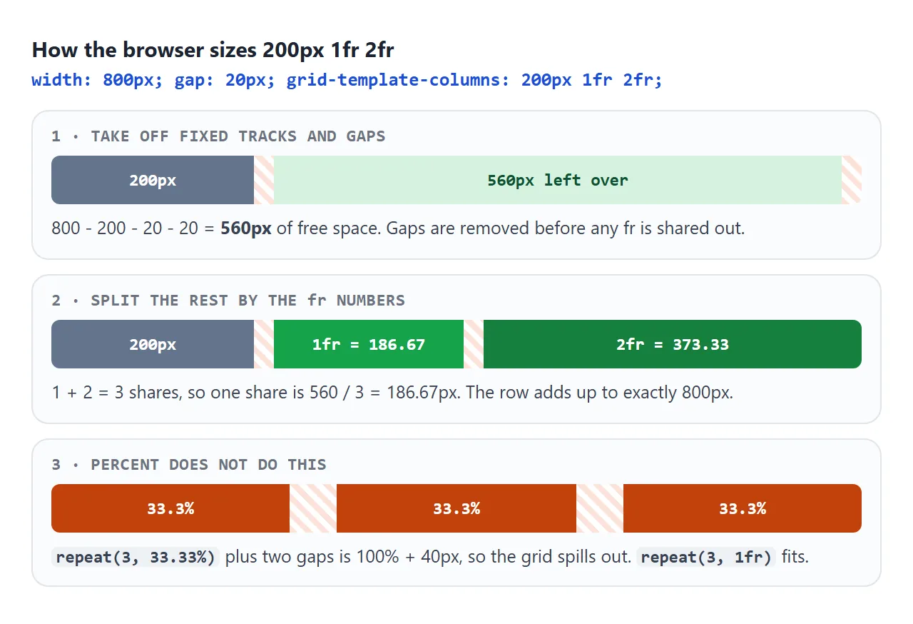
That is why repeat(3, 1fr) with a gap fits, and repeat(3, 33.33%) with a gap spills out. Percentages are taken from the full width, and the gaps are added on top.
If the fr numbers add up to less than 1, the columns do not fill the row. grid-template-columns: 0.5fr on its own gives one column half the width. Spacing between tracks is covered in CSS grid row gap.
minmax() and the 1fr minimum
minmax(min, max) gives a column a floor and a ceiling. minmax(150px, 1fr) never shrinks below 150px and never grows past one share.
The catch is that plain 1fr is itself a minmax(): it means minmax(auto, 1fr). The auto minimum will not go below the content's minimum width. One long URL is a single unbreakable piece, so its column grows and the grid overflows.
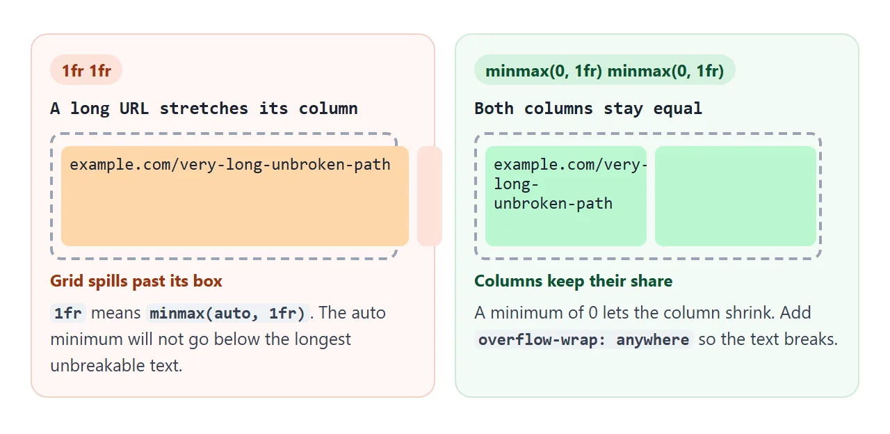
/* equal columns that stay equal, whatever is inside */
.grid { grid-template-columns: repeat(3, minmax(0, 1fr)); }
.grid > * { overflow-wrap: anywhere; }   /* let long words break */
min-width: 0 on the grid item works as well. overflow-wrap: anywhere on its own also helps, because it lets the content itself get narrower. More ways to break long text are in HTML word break.
auto-fill vs auto-fit
Inside repeat(), the count can be auto-fill or auto-fit instead of a number. The browser then makes as many columns as the width allows. Drag the width slider and remove items to see where they differ.
<!doctype html>
<html lang="en">
<head>
<meta charset="utf-8">
<meta name="viewport" content="width=device-width, initial-scale=1">
<title>auto-fill vs auto-fit</title>
<style>
  body { margin: 0; padding: 14px; font-family: system-ui, sans-serif; background: #f4f5f7; color: #1d2330; }
  .controls { display: flex; flex-wrap: wrap; align-items: center; gap: 8px 14px; font-size: 13px; margin-bottom: 12px; }
  .controls input[type=range] { width: 160px; }
  .controls button { width: 30px; height: 28px; border: 1px solid #c9cdd4; border-radius: 6px; background: #fff; font-size: 16px; cursor: pointer; }
  h3 { margin: 10px 0 4px; font: 600 13px ui-monospace, Consolas, monospace; }
  .note { font-size: 12px; color: #5b6270; margin: 2px 0 0; }

  .grid {
    display: grid;
    gap: 8px;
    padding: 8px; border-radius: 10px; box-sizing: border-box;
    background: #e6e9ef;
  }
  .fill { grid-template-columns: repeat(auto-fill, minmax(70px, 1fr)); }
  .fit  { grid-template-columns: repeat(auto-fit,  minmax(70px, 1fr)); }
  .grid div { height: 42px; border-radius: 6px; background: #fff; display: grid; place-items: center; font-weight: 600; }
  .fit div { background: #d6f2df; }
</style>
</head>
<body>
<div class="controls">
  <label>Width <input id="w" type="range" min="200" max="700" value="600"></label>
  <span id="wv">600px</span>
  <span>Items
    <button id="minus" aria-label="Fewer items">-</button>
    <b id="nv">3</b>
    <button id="plus" aria-label="More items">+</button>
  </span>
</div>

<h3>repeat(auto-fill, minmax(70px, 1fr))</h3>
<div class="grid fill" id="fill"></div>
<p class="note" id="fillInfo"></p>

<h3>repeat(auto-fit, minmax(70px, 1fr))</h3>
<div class="grid fit" id="fit"></div>
<p class="note" id="fitInfo"></p>

<script>
  const w = document.getElementById('w');
  let n = 3;

  function describe(el) {
    // computed columns: auto-fit reports its collapsed empty tracks as 0px
    const tracks = getComputedStyle(el).gridTemplateColumns.split(' ');
    const empty = tracks.filter(t => t === '0px').length;
    return tracks.length + ' tracks: ' + tracks.map(t => Math.round(parseFloat(t))).join(', ') + ' px' +
      (empty ? ' (' + empty + ' collapsed to 0)' : '');
  }

  function render() {
    const width = Math.min(+w.value, document.body.clientWidth - 28);
    document.getElementById('wv').textContent = width + 'px';
    for (const id of ['fill', 'fit']) {
      const g = document.getElementById(id);
      g.style.width = width + 'px';
      g.innerHTML = Array.from({ length: n }, (_, i) => '<div>' + (i + 1) + '</div>').join('');
      document.getElementById(id + 'Info').textContent = describe(g);
    }
    document.getElementById('nv').textContent = n;
  }

  w.addEventListener('input', render);
  document.getElementById('minus').addEventListener('click', () => { n = Math.max(1, n - 1); render(); });
  document.getElementById('plus').addEventListener('click', () => { n = Math.min(12, n + 1); render(); });
  window.addEventListener('resize', render);
  render();
</script>
</body>
</html>
auto-fillkeeps every column that fits, including empty ones. Items stay in a steady column width.auto-fitcollapses empty columns to 0, so the items you have spread across the row.
The size inside must have a fixed part. repeat(auto-fit, minmax(200px, 1fr)) is valid. repeat(auto-fit, 1fr) is not. How items move onto the next row is covered in CSS grid wrap.
Rows: grid-template-rows and grid-auto-rows
grid-template-rows takes the same values. The difference is height: a grid is usually as tall as its content, so there is no leftover space for fr to share. With height: auto, 1fr 1fr rows both become as tall as the taller row's content.
Give the grid a height to share and fr behaves like it does for columns:
body {
  display: grid;
  min-height: 100vh;
  grid-template-rows: auto 1fr auto;   /* header, content, footer at the bottom */
}
Rows you did not list are implicit rows. When there are more items than the template has cells, the grid adds rows and sizes them with grid-auto-rows, which is auto by default. grid-auto-rows: 120px or minmax(120px, auto) gives every card row the same starting height.
Named lines and grid-template-areas
Square brackets name the lines between columns. Items can then be placed by name instead of by number.
.page { grid-template-columns: [side] 200px [main] 1fr [end]; }
.content { grid-column: main / end; }
grid-template-areas goes further and draws the layout as text. Each string is a row, each word is a cell, and a repeated name joins cells into one area. Items pick an area with grid-area.
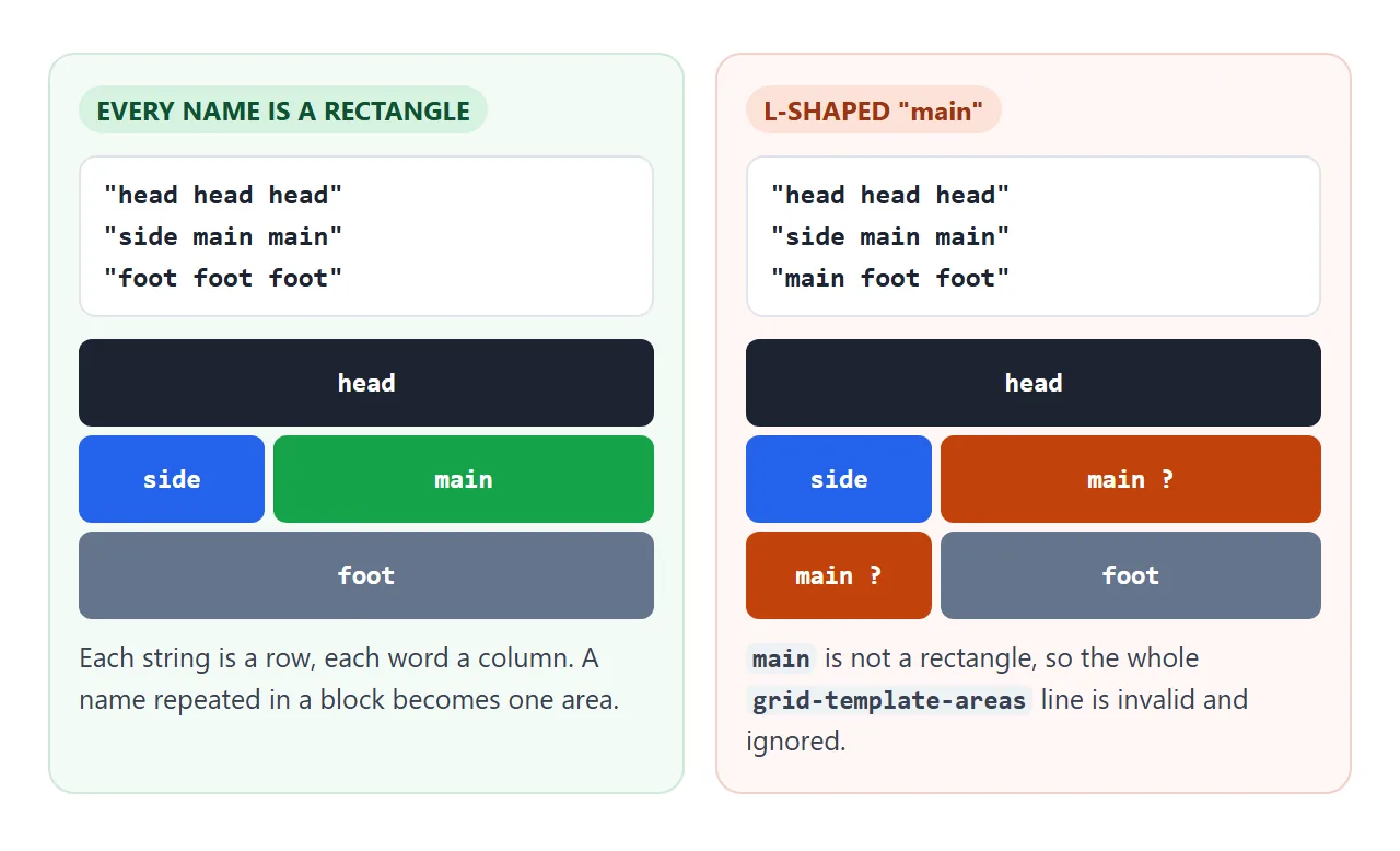
The areas set how many columns there are. Their widths still come from grid-template-columns. Each area also creates named lines, so main-start and main-end work in grid-column without being declared.
A finished layout
This page uses grid-template-areas for the frame and repeat(auto-fit, minmax(200px, 1fr)) for the cards. Narrow the page with the slider: below 520px, a second set of area strings stacks everything in one column.
<!doctype html>
<html lang="en">
<head>
<meta charset="utf-8">
<meta name="viewport" content="width=device-width, initial-scale=1">
<title>Page layout with grid-template-areas</title>
<style>
  body { margin: 0; padding: 12px; font-family: system-ui, sans-serif; background: #f4f5f7; color: #1d2330; }
  .controls { font-size: 13px; margin-bottom: 10px; display: flex; gap: 10px; align-items: center; flex-wrap: wrap; }
  .controls input { width: 180px; }

  /* the box whose width decides the layout */
  .frame { container-type: inline-size; max-width: 100%; margin: 0 auto; }

  .page {
    display: grid;
    grid-template-columns: 150px minmax(0, 1fr);
    grid-template-rows: auto 1fr auto;
    grid-template-areas:
      "head head"
      "side main"
      "foot foot";
    gap: 10px;
  }
  .page > * { border-radius: 10px; padding: 10px 12px; background: #fff; }
  .page > header { grid-area: head; background: #1d2330; color: #fff; font-weight: 700; }
  nav    { grid-area: side; font-size: 14px; }
  main   { grid-area: main; }
  footer { grid-area: foot; font-size: 12px; color: #5b6270; }
  nav a { display: block; color: #2563eb; text-decoration: none; padding: 3px 0; }

  /* narrow box: one column, the menu moves under the header */
  @container (max-width: 520px) {
    .page {
      grid-template-columns: minmax(0, 1fr);
      grid-template-rows: auto;
      grid-template-areas:
        "head"
        "side"
        "main"
        "foot";
    }
    nav a { display: inline-block; margin-right: 12px; }
  }

  /* the card gallery: as many 200px+ columns as fit, no breakpoints */
  .gallery {
    display: grid;
    grid-template-columns: repeat(auto-fit, minmax(min(200px, 100%), 1fr));
    gap: 10px;
  }
  .card { border: 1px solid #e1e4ea; border-radius: 8px; overflow: hidden; font-size: 13px; }
  .card i { display: block; height: 60px; }
  .card p { margin: 0; padding: 6px 8px; overflow-wrap: anywhere; }
  h2 { font-size: 15px; margin: 0 0 8px; }
</style>
</head>
<body>
<div class="controls">
  <label>Page width <input id="w" type="range" min="300" max="900" value="900"></label>
  <span id="wv"></span>
</div>

<div class="frame" id="frame">
  <div class="page">
    <header>Studio Notes</header>
    <nav><a href="#">Home</a><a href="#">Projects</a><a href="#">About</a></nav>
    <main>
      <h2>Recent work</h2>
      <div class="gallery">
        <div class="card"><i style="background:linear-gradient(135deg,#60a5fa,#a78bfa)"></i><p>Poster series</p></div>
        <div class="card"><i style="background:linear-gradient(135deg,#34d399,#059669)"></i><p>Garden map</p></div>
        <div class="card"><i style="background:linear-gradient(135deg,#fbbf24,#f97316)"></i><p>Menu redesign</p></div>
        <div class="card"><i style="background:linear-gradient(135deg,#f472b6,#e11d48)"></i><p>example.com/a-very-long-link-that-would-stretch-a-plain-1fr-column</p></div>
        <div class="card"><i style="background:linear-gradient(135deg,#94a3b8,#475569)"></i><p>Type specimen</p></div>
      </div>
    </main>
    <footer>Five cards, two templates, no fixed breakpoints for the gallery.</footer>
  </div>
</div>

<script>
  const w = document.getElementById('w');
  const frame = document.getElementById('frame');
  function render() {
    frame.style.width = w.value + 'px';
    document.getElementById('wv').textContent = frame.getBoundingClientRect().width.toFixed(0) + 'px';
  }
  w.addEventListener('input', render);
  window.addEventListener('resize', render);
  render();
</script>
</body>
</html>
Three details make it hold up:
- One place changes. The phone layout only rewrites
grid-template-columnsandgrid-template-areas. The items keep theirgrid-areanames. minmax(0, 1fr)for the main column, so the card with a long link cannot push the page wider.min(200px, 100%)inside the gallery'sminmax(), so one card still fits when the box is narrower than 200px.
The demo reacts to the width of its box with a container query, so the slider can move it. On a full page, @media (max-width: 520px) does the same job; see media queries. Aligning items inside the cells is justify-content and align-items.
When it does not work
| What you see | Cause | Fix |
|---|---|---|
| One column is much wider and the page scrolls sideways | Long word or URL; 1fr has an auto minimum |
minmax(0, 1fr) plus overflow-wrap: anywhere |
| Empty space at the end of the row | auto-fill keeps empty columns |
Use auto-fit |
| Columns spill past the container | Percent columns plus gap |
Use fr instead of % |
| The whole template is ignored | Invalid value, such as repeat(auto-fit, 1fr) |
Give the size a fixed part |
| Areas do nothing | An area is not a rectangle, or rows have different word counts | Make every string the same length and every name a block |
| Items appear in extra narrow columns | An item set grid-column past the last line, which adds implicit columns |
Check the line numbers, or set grid-auto-columns |
1fr rows do not fill the screen |
The grid has no height to share | Add min-height: 100vh |
Share it as a link
Grid layouts change with width, and a screenshot freezes one width. Someone checking your layout wants to resize it, and an .html attachment may open as plain code on a phone.
Paste the page into a NOS document and choose Create share link. HTML to link walks through it.
The page renders as written and its scripts run, so the people you send it to can move the sliders and try their own column values. If you change the code later, the same link shows the new version.