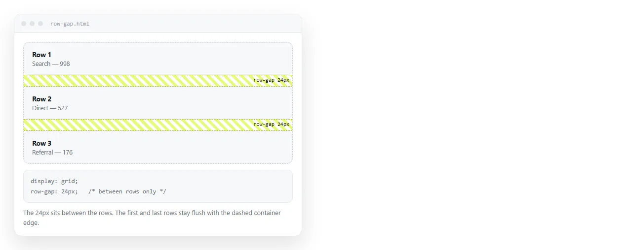
CSS grid row gap is set with row-gap, or with the first value of the gap shorthand, and it controls the space between rows only.
.list {
  display: grid;
  row-gap: 24px;
}
No space is added above the first row or below the last. That is by design, and it is what makes the property safe to use on a container you do not fully control.
The shorthand and its order
gap takes one or two values. Two values mean row first, then column.
.grid {
  display: grid;
  grid-template-columns: repeat(3, 1fr);
  gap: 32px 16px;   /* 32px between rows, 16px between columns */
}
The order matches grid-template-rows before grid-template-columns, and grid-area's row-then-column convention. When in doubt, rows come first in grid.
| Written | Row gap | Column gap |
|---|---|---|
gap: 16px |
16px | 16px |
gap: 32px 16px |
32px | 16px |
row-gap: 32px |
32px | Unchanged |
column-gap: 16px |
Unchanged | 16px |
gap: normal |
0 in grid | 0 in grid |
The old names grid-row-gap and grid-column-gap still work as aliases, but the unprefixed versions are the current ones and also apply to flex and multi-column layouts.
Why gap replaced margin-bottom
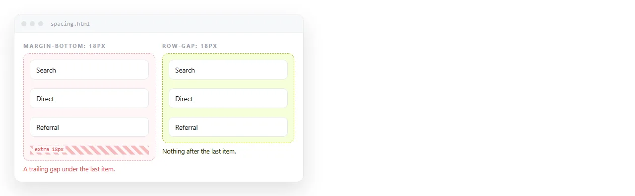
The margin approach needed a cleanup rule.
/* the old way */
.item { margin-bottom: 24px; }
.item:last-child { margin-bottom: 0; }
That override is fragile. It breaks when items reorder, when one is hidden, or when the list is rendered from data and the last item is conditional.
Gap has no trailing space to remove, so no override is needed. It also survives wrapping: in a wrapped grid the spacing between wrapped rows is the row gap, with no extra rules.
Gap does not collapse
Adjacent vertical margins in normal flow merge into one. A 20px bottom margin next to a 30px top margin produces 30px of space, not 50px.
Gaps never do this. A 24px row gap is 24px, regardless of what margins the items carry. If an item also has margin-top: 12px, the total becomes 36px, added rather than merged.
For that reason, mixing gap and vertical margins on the same items is the usual source of uneven spacing. Pick one.
Different spacing between specific rows
row-gap is a single value for the whole grid. To vary the spacing, use explicit row tracks with spacer rows, or add padding to the items in the section that needs more air.
.sheet {
  display: grid;
  grid-template-rows: auto 40px auto auto;  /* the 40px row is the spacer */
  row-gap: 12px;
}
The spacer row still gets the 12px gap on each side of it, so the visible separation is 64px. Account for that when choosing the number.
Units worth using
- rem for vertical rhythm that scales with the root font size.
row-gap: 1.5remstays proportional when a reader enlarges text. - px when the gap is a fixed structural value, such as the seam between panels in a dashboard.
- clamp() when the gap should grow with the viewport.
row-gap: clamp(12px, 3vw, 32px)is a common pattern. - Percentages resolve against the content box block size, which is often not what people expect. Avoid unless you have set an explicit height.
Gap in flex and columns
The property is not grid-only. It applies to flex containers and multi-column layouts with the same syntax.
.toolbar { display: flex; flex-wrap: wrap; gap: 8px 12px; }
.article { columns: 2; column-gap: 40px; }
In a wrapped flex container the row gap is what separates the lines, which is the main reason gap replaced the margin workarounds there too.
One difference: in multi-column layout, column-gap has an initial value of 1em rather than zero. Setting it explicitly is worth doing so the spacing does not track the font size by accident.
| Layout | Initial row gap | Initial column gap |
|---|---|---|
| Grid | 0 | 0 |
| Flex | 0 | 0 |
| Multi-column | Not applicable | 1em |
Gap and grid-template-areas
Named areas and gaps combine without conflict. The gap sits between the tracks, so an area spanning two columns absorbs the gap between them.
.page {
  display: grid;
  grid-template-columns: 240px 1fr;
  grid-template-areas:
    "side main"
    "side foot";
  gap: 20px 32px;
}
The side area spans both rows, so it has no 20px seam through it. Its total height is the two rows plus the row gap, which is what you want for a sidebar that runs the full height.
This is worth knowing because it is the usual reason a spanning element looks taller than the sum of its rows. The gap it absorbed is part of it.
A quick spacing scale
Arbitrary gap values across a document produce spacing that looks almost right and never quite aligns. A small scale fixes it.
:root {
  --s1: 8px;
  --s2: 16px;
  --s3: 24px;
  --s4: 40px;
}
.tight  { row-gap: var(--s1); }
.list   { row-gap: var(--s2); }
.cards  { gap: var(--s3) var(--s2); }
.blocks { row-gap: var(--s4); }
Four steps covers most documents. The rule of thumb is that the gap between groups should be visibly larger than the gap within a group, otherwise the grouping is not readable.
Gaps and separators
A common need is a visible rule between rows rather than blank space. Gap alone cannot draw one, since it is empty by definition.
.list { display: grid; row-gap: 0; }
.list > * + * { border-top: 1px solid rgba(255, 255, 255, .1); padding-top: 16px; }
Set the gap to zero and let border plus padding produce both the line and the spacing. Mixing gap with borders gives a line floating in the middle of the gap, which is usually not the intent.
Checking spacing before you send the page

Spacing problems are easiest to see at a width other than your own. Open the file in the HTML file opener and resize it.
To get a second opinion, paste the HTML into a document and turn it into a link. The reader opens the rendered page, not a file, and the address survives your next spacing adjustment.
Related reading: CSS grid for the track model, CSS grid wrap for responsive columns, and flexbox, which takes the same gap property.