Use grid-row and grid-column on the item. Each takes a start line and an end line: grid-row: 1 / 3 means "start at row line 1, stop at row line 3", which covers two rows. The numbers count the lines between tracks, not the cells.
Change the start and end values below and watch where the blue item lands. The numbers above and below the grid are the line numbers.
<!doctype html>
<html lang="en">
<head>
<meta charset="utf-8">
<meta name="viewport" content="width=device-width, initial-scale=1">
<title>Grid placement lab</title>
<style>
  body { margin: 0; padding: 14px; font-family: system-ui, sans-serif; background: #f4f5f7; color: #1d2330; }
  .controls { display: grid; grid-template-columns: auto 1fr 1fr; gap: 6px 8px; align-items: center; font-size: 13px; max-width: 420px; }
  .controls b { font-size: 12px; color: #5b6270; font-weight: 600; }
  select { font: inherit; padding: 4px; }
  .stage { position: relative; padding: 24px 20px 24px 24px; margin-top: 12px; }
  .grid {
    display: grid;
    grid-template-columns: repeat(4, minmax(0, 1fr));  /* explicit: 4 columns = lines 1-5 */
    grid-template-rows: repeat(3, 56px);               /* explicit: 3 rows = lines 1-4 */
    grid-auto-columns: 44px;   /* size of columns the browser adds */
    grid-auto-rows: 34px;      /* size of rows the browser adds */
    gap: 4px;
  }
  .cell { border: 1px dashed #b9c0cc; border-radius: 4px; background: #fff; }
  .cell.implicit { background: repeating-linear-gradient(45deg, #fff4e5 0 6px, #ffe8c7 6px 12px); border-color: #f0b46a; }
  .item {
    z-index: 1; border-radius: 6px; background: #2563eb; color: #fff;
    display: grid; place-items: center; font-weight: 700; font-size: 13px; opacity: .88;
  }
  .ln { position: absolute; font: 600 11px ui-monospace, Consolas, monospace; transform: translateX(-50%); }
  .ln.top { top: 4px; color: #1d4ed8; }
  .ln.bot { bottom: 4px; color: #9a3412; }
  .ln.row { transform: translateY(-50%); left: 6px; color: #1d4ed8; }
  pre { background: #1d2330; color: #e6edf3; padding: 10px 12px; border-radius: 8px; font-size: 13px; margin: 8px 0 4px; white-space: pre-wrap; }
  #note { font-size: 13px; margin: 0; min-height: 18px; }
  #note.warn { color: #9a3412; }
</style>
</head>
<body>
<div class="controls">
  <b></b><b>start</b><b>end</b>
  <span>grid-column</span>
  <select id="cs"></select><select id="ce"></select>
  <span>grid-row</span>
  <select id="rs"></select><select id="re"></select>
</div>

<div class="stage" id="stage">
  <div class="grid" id="grid"><div class="item" id="item">item</div></div>
</div>
<pre id="css"></pre>
<p id="note"></p>

<script>
  const grid = document.getElementById('grid');
  const item = document.getElementById('item');
  const stage = document.getElementById('stage');
  const fill = (id, list, value) => {
    const s = document.getElementById(id);
    s.innerHTML = list.map(v => `<option>${v}</option>`).join('');
    s.value = value;
    s.addEventListener('change', update);
  };
  fill('cs', ['1', '2', '3', '4', '5', '6', '-2', '-3', '-4', '-5'], '2');
  fill('ce', ['auto', 'span 1', 'span 2', 'span 3', 'span 4', '2', '3', '4', '5', '6', '7', '-1', '-2', '-3'], 'span 2');
  fill('rs', ['1', '2', '3', '4', '5', '-2', '-3', '-4'], '1');
  fill('re', ['auto', 'span 1', 'span 2', 'span 3', '2', '3', '4', '5', '6', '-1', '-2'], '3');

  function update() {
    const v = id => document.getElementById(id).value;
    const col = `${v('cs')} / ${v('ce')}`, row = `${v('rs')} / ${v('re')}`;
    grid.querySelectorAll('.cell').forEach(c => c.remove());
    stage.querySelectorAll('.ln').forEach(l => l.remove());
    item.style.gridColumn = col;
    item.style.gridRow = row;

    // count the tracks the browser ended up with (explicit + implicit)
    const cs = getComputedStyle(grid);
    const cols = cs.gridTemplateColumns.split(' ').length;
    const rows = cs.gridTemplateRows.split(' ').length;

    // draw one background cell per track so the grid is visible
    for (let r = 1; r <= rows; r++) for (let c = 1; c <= cols; c++) {
      const d = document.createElement('div');
      d.className = 'cell' + (c > 4 || r > 3 ? ' implicit' : '');
      d.style.gridArea = `${r} / ${c}`;
      grid.insertBefore(d, item);
    }
    drawLines(cols, rows);

    document.getElementById('css').textContent = `.item {\n  grid-column: ${col};\n  grid-row: ${row};\n}`;
    const extra = [];
    if (cols > 4) extra.push(`${cols - 4} implicit column${cols > 5 ? 's' : ''}`);
    if (rows > 3) extra.push(`${rows - 3} implicit row${rows > 4 ? 's' : ''}`);
    const note = document.getElementById('note');
    note.className = extra.length ? 'warn' : '';
    note.textContent = extra.length ? `Placed past the explicit grid: the browser added ${extra.join(' and ')} (striped).`
                                    : 'Inside the explicit 4 x 3 grid.';
  }

  // line numbers: positive above, negative (explicit lines only) below, row numbers on the left
  function drawLines(cols, rows) {
    const cells = [...grid.querySelectorAll('.cell')];
    const at = (r, c) => cells[(r - 1) * cols + (c - 1)];
    const label = (cls, text, x, y) => {
      const s = document.createElement('span');
      s.className = 'ln ' + cls; s.textContent = text;
      if (x != null) s.style.left = x + 'px';
      if (y != null) s.style.top = y + 'px';
      stage.appendChild(s);
    };
    const ox = grid.offsetLeft, oy = grid.offsetTop;
    for (let c = 1; c <= cols + 1; c++) {
      const cell = at(1, Math.min(c, cols));
      const x = ox + cell.offsetLeft + (c > cols ? cell.offsetWidth + 2 : -2);
      label('top', c, x);
      if (c <= 5) label('bot', c - 6, x);  // explicit lines 1-5 are also -5 to -1
    }
    for (let r = 1; r <= rows + 1; r++) {
      const cell = at(Math.min(r, rows), 1);
      label('row', r, null, oy + cell.offsetTop + (r > rows ? cell.offsetHeight + 2 : -2));
    }
  }
  update();
</script>
</body>
</html>
Setting grid-column: 5 / 7 or a row start of 4 pushes the item outside the four declared columns and three rows. The browser then adds striped tracks to hold it. That behaviour is covered further down.
Lines, not cells: how the numbers count
A grid with 4 columns has 5 column lines. Line 1 is the left edge, line 5 the right edge. The same grid also numbers its lines backwards: the right edge is -1, the left edge -5.
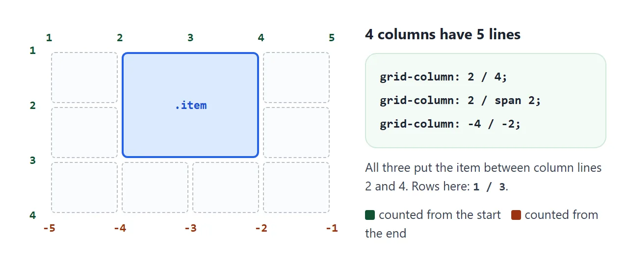
An item placed with grid-column: 2 / 4 sits between lines 2 and 4, so it covers columns 2 and 3. Most off-by-one errors come from reading the numbers as cells. If you want columns 2 and 3, the end line is 4.
The columns themselves come from grid-template-columns. CSS grid-template-columns covers fr, repeat() and minmax(). This guide assumes the tracks exist and is only about where items go.
start / end, span N, and the longhands
Each shorthand splits into two longhands:
| Shorthand | Same as |
|---|---|
grid-row: 2 / 4 |
grid-row-start: 2; grid-row-end: 4 |
grid-column: 1 / span 3 |
grid-column-start: 1; grid-column-end: span 3 |
grid-column: 3 |
grid-column-start: 3; grid-column-end: auto (one track) |
grid-column: span 2 |
Width of two tracks, position chosen by auto-placement |
span N means "cover N tracks" instead of naming an end line. It can go on either side: span 2 / 5 ends at line 5 and starts two tracks earlier, at line 3.
The shorthand sets both halves, including the half you left out. Write grid-column-start: 3 and then grid-column: span 2 in a later rule, and the start is reset. The item goes back to being auto-placed:
.item { grid-column-start: 3; }
.item.wide { grid-column: span 2; }  /* start is now span 2, not 3 */

/* keep both: say them together */
.item.wide { grid-column: 3 / span 2; }
Two edge cases are handled for you. If the end line comes before the start, as in 4 / 2, the browser swaps them. If start and end are the same line, the end is dropped and the item covers one track.
There is also grid-area, which takes all four at once in the order row start, column start, row end, column end: grid-area: 1 / 2 / 3 / 4. With named areas it takes a name instead, as described in grid template areas.
Negative numbers: -1 is the last explicit line
grid-column: 1 / -1 is the usual way to make an item span the full width, whatever the column count. It works because -1 counts back from the end of the explicit grid: the tracks you declared with grid-template-columns or grid-template-rows.
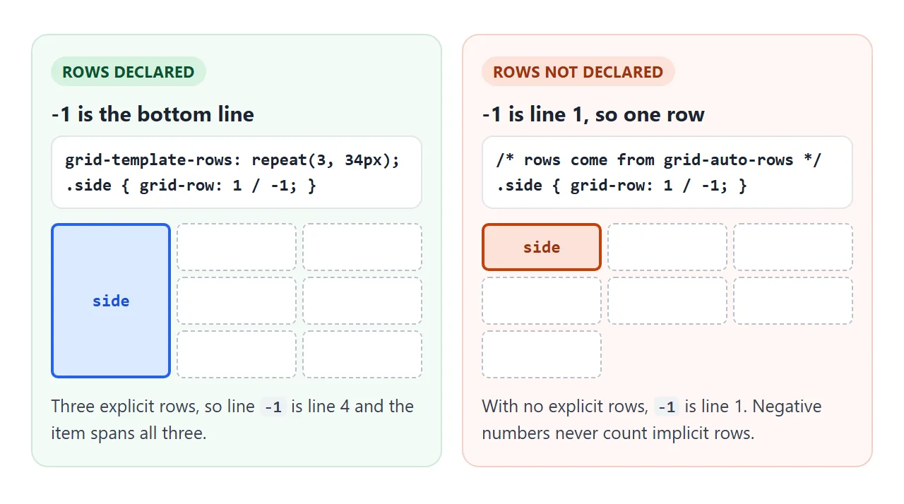
Rows are where this trips people up. Many grids declare only columns and let rows appear as needed. Those rows are implicit, so the explicit grid has a single row line. There, -1 is line 1, and grid-row: 1 / -1 covers one row.
To make an item run the full height, either declare the rows with grid-template-rows, or give the item a span that matches your content, such as grid-row: 1 / span 3.
Placing past the edge creates implicit tracks
A line number past the last explicit line does not fail. The browser adds implicit tracks until the line exists. In the lab above, grid-column: 5 / 7 on a 4-column grid adds two columns.
Implicit tracks are sized by grid-auto-columns and grid-auto-rows. Both default to auto, which sizes the track to its content. An empty implicit column can end up very narrow, and the item in it gets squeezed.
.grid {
  grid-template-columns: repeat(4, 1fr);  /* explicit */
  grid-auto-rows: 120px;                  /* size of any row the browser adds */
}
Negative numbers can do the same at the other end. grid-column: -7 / -6 on a 4-column grid adds columns before line 1. Positive numbers on implicit rows keep counting normally, so grid-row: 5 is fine in a grid that grows downward.
Two items in the same cell: overlap and z-index
Nothing stops two items from claiming the same lines. The grid does not push one aside, it stacks them. By default the item later in the HTML is drawn on top.
That is often what you want, for a caption over a photo, for example. Place both on the same area and use z-index to choose which is on top:
.photo, .caption { grid-column: 1 / span 2; grid-row: 2 / span 2; }
.caption { z-index: 1; align-self: end; }
Grid items respect z-index without position: relative. A value other than auto also starts a new stacking context, the same as on a positioned element. CSS z-index explains stacking contexts in detail.
Auto-placement and grid-auto-flow: dense
Items you do not place are auto-placed: the browser walks through the cells in order and puts each item in the next spot where it fits.
An item with span 2 that does not fit at the end of a row moves to the next row and leaves a hole.
<!doctype html>
<html lang="en">
<head>
<meta charset="utf-8">
<meta name="viewport" content="width=device-width, initial-scale=1">
<title>grid-auto-flow: row vs dense</title>
<style>
  body { margin: 0; padding: 14px; font-family: system-ui, sans-serif; background: #f4f5f7; color: #1d2330; }
  .bar { display: flex; gap: 6px; margin-bottom: 10px; }
  button { font: 600 13px system-ui, sans-serif; padding: 7px 12px; border-radius: 8px; border: 1px solid #c9cdd4; background: #fff; cursor: pointer; }
  button[aria-pressed="true"] { background: #1d2330; color: #fff; border-color: #1d2330; }
  .grid {
    display: grid;
    grid-template-columns: repeat(4, minmax(0, 1fr));
    grid-auto-rows: 52px;
    gap: 6px;
    grid-auto-flow: row;  /* the default; the buttons switch this */
    padding: 6px; border-radius: 10px;
    background: repeating-linear-gradient(45deg, #fde2da 0 6px, #fff7f5 6px 12px);  /* shows empty cells */
  }
  .grid > div {
    border-radius: 7px; background: #fff; box-shadow: 0 1px 3px rgba(0, 0, 0, .15);
    display: grid; place-items: center; font-weight: 700; font-size: 18px;
  }
  .grid > .wide { grid-column: span 2; background: #dbeafe; }
  .grid > .big { grid-column: span 3; background: #d6f2df; }
  code { font: 600 13px ui-monospace, Consolas, monospace; }
  p { font-size: 13px; margin: 10px 0 0; }
</style>
</head>
<body>
<div class="bar">
  <button id="row" aria-pressed="true">grid-auto-flow: row</button>
  <button id="dense" aria-pressed="false">dense</button>
</div>

<!-- the numbers are the DOM order -->
<div class="grid" id="grid">
  <div class="big">1</div><div class="wide">2</div><div>3</div><div class="wide">4</div>
  <div class="wide">5</div><div>6</div><div class="big">7</div><div>8</div>
  <div class="wide">9</div><div>10</div><div>11</div>
</div>
<p>Reading order on screen: <code id="order"></code></p>

<script>
  const grid = document.getElementById('grid');
  function setFlow(flow) {
    grid.style.gridAutoFlow = flow;
    document.getElementById('row').setAttribute('aria-pressed', flow === 'row');
    document.getElementById('dense').setAttribute('aria-pressed', flow === 'row dense');
    // sort the items by where they landed: top to bottom, then left to right
    const seen = [...grid.children].sort((a, b) => a.offsetTop - b.offsetTop || a.offsetLeft - b.offsetLeft);
    document.getElementById('order').textContent = seen.map(d => d.textContent).join(' ');
  }
  document.getElementById('row').addEventListener('click', () => setFlow('row'));
  document.getElementById('dense').addEventListener('click', () => setFlow('row dense'));
  setFlow('row');
</script>
</body>
</html>
grid-auto-flow: dense tells the browser to go back and fill earlier holes with later items that fit. The grid looks tighter, but items no longer appear in HTML order. In the demo, item 3 jumps ahead of item 2.
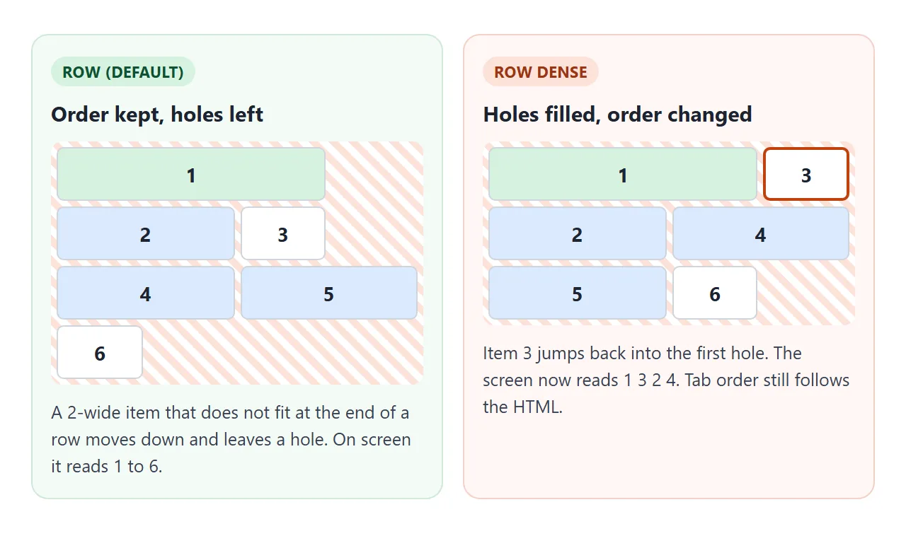
Keyboard focus and screen readers still follow the HTML order. For a photo wall that is fine. For a list of steps, links or buttons, keep the default. The order property has the same catch, covered in CSS flex order.
A finished gallery: featured 2 x 2, full-width banner, caption layer
This gallery puts every idea together. The banner spans 1 / -1. The featured photo covers two columns and two rows. The caption sits in the same cells with z-index: 1, and dense fills the space around it.
<!doctype html>
<html lang="en">
<head>
<meta charset="utf-8">
<meta name="viewport" content="width=device-width, initial-scale=1">
<title>Gallery with a featured 2x2 item</title>
<style>
  body { margin: 0; padding: 12px; font-family: system-ui, sans-serif; background: #f4f5f7; color: #1d2330; }
  .gallery {
    display: grid;
    grid-template-columns: repeat(4, minmax(0, 1fr));
    grid-template-rows: 56px;  /* explicit row 1 for the banner */
    grid-auto-rows: 150px;     /* every row after it is implicit */
    gap: 8px;
    grid-auto-flow: dense;  /* small tiles fill holes left around the featured one */
  }
  .banner {
    grid-column: 1 / -1;  /* first line to last explicit line: full width */
    grid-row: 1;
    border-radius: 10px; padding: 0 16px;
    display: flex; align-items: center; justify-content: space-between;
    background: linear-gradient(90deg, #1d2330, #3b4a6b); color: #fff;
  }
  .banner h2 { margin: 0; font-size: 17px; }
  .banner span { font-size: 12px; opacity: .8; }
  .photo {
    border: 0; border-radius: 10px; cursor: pointer; padding: 0;
    font: 600 12px system-ui, sans-serif; color: #fff;
    display: flex; align-items: flex-start; justify-content: flex-end;
  }
  .photo span { margin: 6px 8px; text-shadow: 0 1px 2px rgba(0, 0, 0, .4); }
  /* the featured photo and its caption share the same 2x2 area */
  .photo.featured, .caption { grid-column: 1 / span 2; grid-row: 2 / span 2; }
  .photo.featured { cursor: default; }
  .caption {
    z-index: 1;                     /* on top of the photo in the same cells */
    align-self: end;                /* sit at the bottom of the area */
    margin: 8px; padding: 8px 10px; border-radius: 8px;
    background: rgba(255, 255, 255, .92); font-size: 13px;
    pointer-events: none;
  }
  .caption b { display: block; font-size: 14px; }
  @media (max-width: 480px) {
    .gallery { grid-template-columns: repeat(2, minmax(0, 1fr)); grid-auto-rows: 80px; }
  }
</style>
</head>
<body>
<div class="gallery" id="gallery">
  <header class="banner"><h2>Field notes</h2><span>Tap a tile to feature it</span></header>
  <div class="caption" id="caption"></div>
  <button class="photo featured" style="background: linear-gradient(135deg, #f97316, #db2777)"><span>Dusk</span></button>
  <button class="photo" style="background: linear-gradient(135deg, #0ea5e9, #6366f1)"><span>Harbor</span></button>
  <button class="photo" style="background: linear-gradient(135deg, #22c55e, #0f766e)"><span>Moss</span></button>
  <button class="photo" style="background: linear-gradient(135deg, #facc15, #f97316)"><span>Field</span></button>
  <button class="photo" style="background: linear-gradient(135deg, #a855f7, #1e3a8a)"><span>Night</span></button>
  <button class="photo" style="background: linear-gradient(160deg, #94a3b8, #334155)"><span>Fog</span></button>
  <button class="photo" style="background: linear-gradient(135deg, #fb7185, #7c3aed)"><span>Bloom</span></button>
  <button class="photo" style="background: linear-gradient(135deg, #2dd4bf, #0369a1)"><span>Tide</span></button>
  <button class="photo" style="background: linear-gradient(135deg, #fde68a, #ca8a04)"><span>Sand</span></button>
</div>

<script>
  const caption = document.getElementById('caption');
  const showCaption = (photo) => {
    caption.innerHTML = `<b>${photo.textContent}</b>Featured: 2 columns x 2 rows`;
  };
  document.getElementById('gallery').addEventListener('click', (e) => {
    const photo = e.target.closest('.photo');
    if (!photo || photo.classList.contains('featured')) return;
    document.querySelector('.photo.featured').classList.remove('featured');
    photo.classList.add('featured');  // CSS moves it into the 2x2 area
    showCaption(photo);
  });
  showCaption(document.querySelector('.photo.featured'));
</script>
</body>
</html>
- Banner:
grid-column: 1 / -1works here because the columns are declared. It keeps spanning when the media query switches to two columns. - Featured:
grid-column: 1 / span 2; grid-row: 2 / span 2. Moving thefeaturedclass to another tile moves that tile into the slot. No coordinates in JavaScript. - Rows: only row 1 is declared. Every row below it is implicit and gets its height from
grid-auto-rows.
For a simpler photo grid without a featured item, see an image gallery in HTML.
When it does not work
| What you see | Cause | Fix |
|---|---|---|
grid-row: 1 / -1 covers only one row |
Rows are implicit, so -1 is line 1 |
Declare grid-template-rows, or use 1 / span N |
| Item is one track short or long | Counted cells instead of lines | End line = last column + 1 |
| Item lost its start column | A later grid-column: span N reset the start |
Write grid-column: 3 / span 2 |
| Extra narrow columns appear | A line number is past the explicit grid | Check the numbers, or set grid-auto-columns |
| Two items sit on top of each other | Both were placed on the same lines | Change one placement, or set z-index if the overlap is wanted |
| Items appear out of order | grid-auto-flow: dense or the order property |
Remove dense where order matters |
grid-column does nothing |
The element is not a direct child of the grid | Move the rule to the direct child, or make the parent a grid |
The last row catches wrappers. Only the grid container's children are grid items. A card wrapped in a link, or a list item's inner div, ignores grid-column because its parent is not the grid.
For the overall layout, including grids that adapt to phones with no media queries, start from CSS grid.
Share it as a link
A layout is easier to judge on a real screen than in a screenshot, especially one that changes at 480px. An .html file sent as an attachment may open as plain code on a phone.
To send the working version, paste the page into a NOS document and choose Create share link. HTML to link walks through it.
The page renders as written and its scripts run, so the people you send it to can tap the gallery tiles themselves. If you change the code later, the same link shows the new version.