grid-template-areas describes a layout as quoted strings. Each string is one row of the grid, each word is one cell, and a name repeated across cells becomes one area. A child element then takes an area with grid-area: name, and the browser puts it there.
Edit the strings below. The grid redraws as you type, and an invalid value shows why the browser rejected it.
<!doctype html>
<html lang="en">
<head>
<meta charset="utf-8">
<meta name="viewport" content="width=device-width, initial-scale=1">
<title>grid-template-areas editor</title>
<style>
body { margin: 0; padding: 12px; font-family: system-ui, sans-serif; background: #f4f5f7; color: #1d2330; }
label { display: block; font-size: 13px; font-weight: 600; margin-bottom: 4px; }
textarea {
width: 100%; box-sizing: border-box; height: 104px; padding: 8px 10px;
font: 14px/1.5 ui-monospace, Consolas, monospace; border: 1px solid #c9cdd4; border-radius: 8px;
}
.presets { display: flex; flex-wrap: wrap; gap: 6px; margin: 8px 0; }
.presets button { font-size: 12px; padding: 5px 9px; border: 1px solid #c9cdd4; border-radius: 99px; background: #fff; cursor: pointer; }
.msg { font-size: 13px; padding: 7px 10px; border-radius: 8px; margin-bottom: 8px; }
.ok { background: #e7f6ec; color: #0f5132; }
.err { background: #fde8e2; color: #9a3412; }
/* the live grid: its areas come from the textarea */
.grid {
display: grid;
grid-auto-columns: 1fr; /* every column the same width */
grid-auto-rows: minmax(56px, auto);
gap: 6px; padding: 6px; min-height: 180px;
background: #fff; border: 1px dashed #c9cdd4; border-radius: 10px;
}
.grid div {
display: grid; place-items: center; border-radius: 6px;
font: 600 13px ui-monospace, Consolas, monospace; color: #fff;
}
</style>
</head>
<body>
<label for="src">grid-template-areas (one string per row)</label>
<textarea id="src" spellcheck="false">"header header header"
"nav main aside"
"footer footer footer"</textarea>
<div class="presets">
<button data-v='"header header header" "nav main aside" "footer footer footer"'>Holy grail</button>
<button data-v='"header header" "main ." "footer footer"'>With an empty cell</button>
<button data-v='"a a" "a b"'>L-shape (invalid)</button>
<button data-v='"a a b" "c d"'>Uneven rows (invalid)</button>
</div>
<div class="msg" id="msg"></div>
<div class="grid" id="grid"></div>
<script>
const src = document.getElementById('src');
const grid = document.getElementById('grid');
const msg = document.getElementById('msg');
const colors = ['#2563eb', '#0f766e', '#b45309', '#7c3aed', '#be123c', '#4d7c0f', '#0369a1', '#a21caf'];
// explain why the browser rejected the value
function reason(rows) {
const counts = rows.map(r => r.length);
if (new Set(counts).size > 1) return 'Rows have different numbers of cells: ' + counts.join(', ') + '.';
const names = [...new Set(rows.flat())].filter(n => !/^\.+$/.test(n));
for (const n of names) {
let cells = 0, r0 = 99, r1 = -1, c0 = 99, c1 = -1;
rows.forEach((row, r) => row.forEach((cell, c) => {
if (cell !== n) return;
cells++; r0 = Math.min(r0, r); r1 = Math.max(r1, r); c0 = Math.min(c0, c); c1 = Math.max(c1, c);
}));
if (cells !== (r1 - r0 + 1) * (c1 - c0 + 1)) return 'Area "' + n + '" is not a rectangle.';
}
return 'Check the quotes: each row needs its own "double" or \'single\' quotes, no commas.';
}
function render() {
const value = src.value.trim();
grid.innerHTML = '';
// let the browser's own CSS parser judge the value
if (!value || !CSS.supports('grid-template-areas', value)) {
const rows = [...value.matchAll(/["']([^"']*)["']/g)].map(m => m[1].trim().split(/\s+/));
msg.className = 'msg err';
msg.textContent = 'Invalid, so the whole declaration is ignored. ' + reason(rows);
grid.style.gridTemplateAreas = '';
return;
}
grid.style.gridTemplateAreas = value;
const names = [...new Set(value.match(/[^\s"'.]+/g))];
names.forEach((n, i) => {
const d = document.createElement('div');
d.textContent = n;
d.style.gridArea = n; // the child picks its area by name
d.style.background = colors[i % colors.length];
grid.append(d);
});
msg.className = 'msg ok';
msg.textContent = 'Valid: ' + names.length + ' areas. Dots are empty cells.';
}
src.addEventListener('input', render);
document.querySelectorAll('.presets button').forEach(b =>
b.addEventListener('click', () => { src.value = b.dataset.v; render(); }));
render();
</script>
</body>
</html>
The editor asks the browser itself, with CSS.supports(), whether the value is valid. So what you see is the browser's own verdict, not a copy of the rules.
How the strings become a grid
Here is the classic page frame written as a map, and what the browser draws from it:
.page {
  display: grid;
  grid-template-columns: 200px 1fr 1fr;
  grid-template-areas:
    "header header header"
    "nav    main   ."
    "footer footer footer";
}
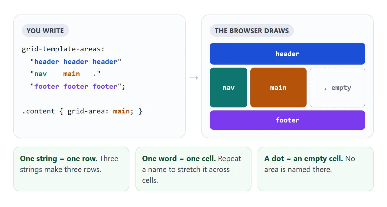
The rules are short, and the browser applies them strictly:
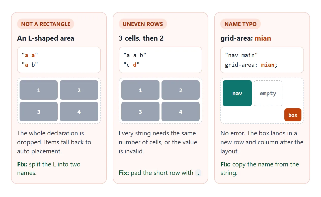
- Every string must have the same number of cells. Three cells in one row and two in the next is invalid.
- Every name must cover a rectangle. It can span several rows and columns, but not an L-shape, and it cannot appear in two separate places.
- A dot is an empty cell.
...also counts as one cell, which helps line the strings up. - Spaces between names are free. Pad with spaces so the columns line up; the browser only counts words.
Break rule 1 or 2 and the browser throws away the whole declaration, not only the broken row. The grid then acts as if you never wrote grid-template-areas.
Placing items with grid-area
On the children, grid-area takes the name as a plain word. The strings are quoted; the name on the child is not.
header { grid-area: header; }
nav    { grid-area: nav; }
main   { grid-area: main; }
footer { grid-area: footer; }
Two quiet failures come from this step.
A typo such as grid-area: mian is valid CSS, so nothing warns you. The browser treats the unknown name as a line that does not exist, and the item ends up in a new row and column after your layout.
A child with no grid-area at all is auto-placed into the first free cell, which may be a cell you meant for something else. Give every direct child an area, or a clear place of its own.
grid-area also accepts line numbers: grid-area: 1 / 1 / 2 / 3 means row start, column start, row end, column end. Names are easier to read and survive layout changes; numbers are handy for one-off overlaps.
Sizing areas and the grid-template shorthand
The strings decide how many rows and columns exist. They say nothing about size. Widths come from grid-template-columns and heights from grid-template-rows, one value per column or row, in the same order as the cells.
If the strings have more columns than you sized, the extra columns take their size from grid-auto-columns, which is auto by default. That is often why a column looks narrower than expected. grid-template-columns covers fr, minmax() and the other sizing values.
The grid-template shorthand puts sizes next to the map. Each string is followed by its row height, and the column widths go after a slash:
.page {
  display: grid;
  grid-template:
    "header header" auto
    "nav    main"   1fr
    "footer footer" auto
    / 200px 1fr;
}
In this form, repeat() is not allowed in the column list; write each width out. The shorthand also resets any grid-template-* value you set earlier, so keep one or the other.
Named lines you get for free
Every area creates names for the lines around it. An area called main gives you main-start and main-end, in both directions, without declaring anything.
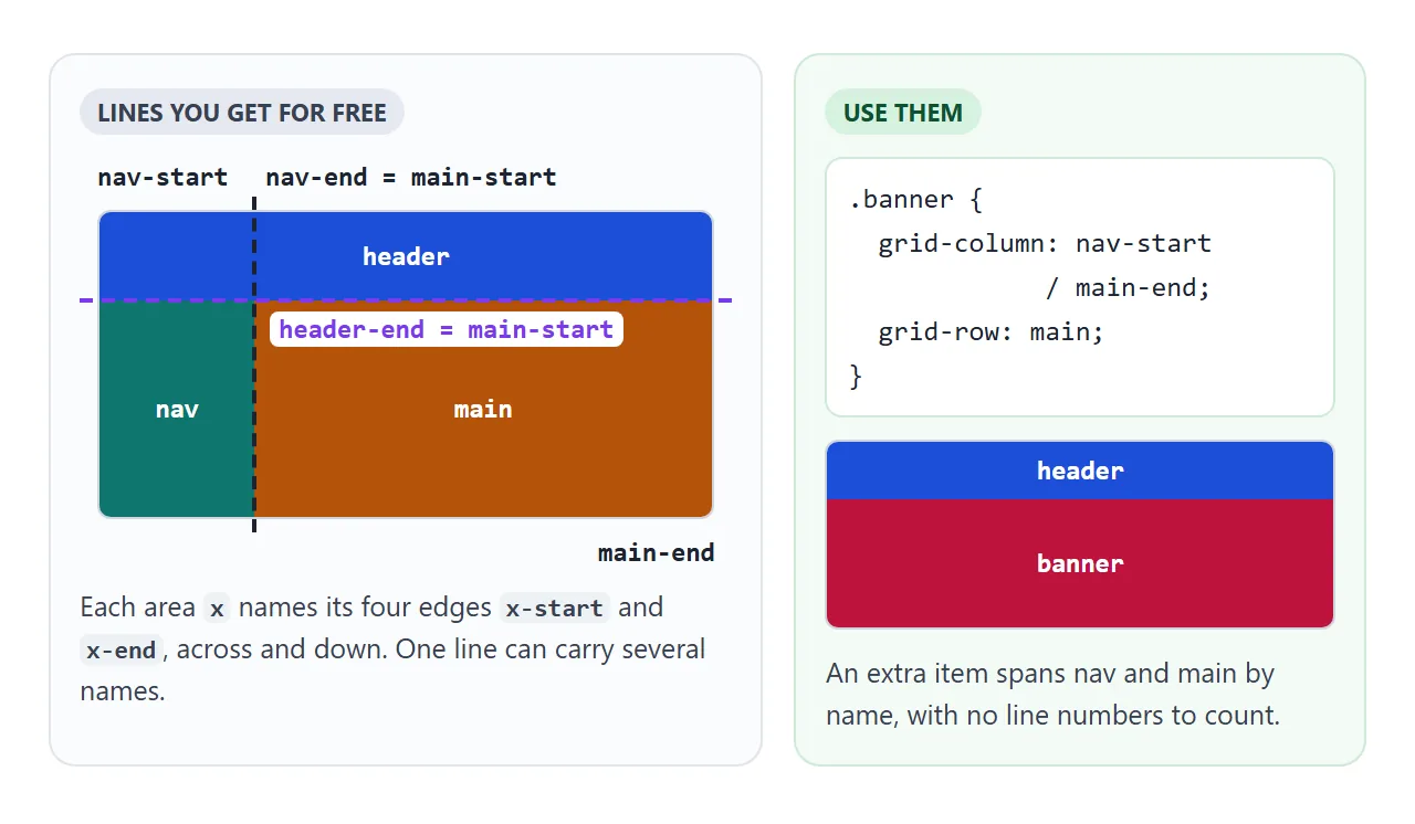
That lets an extra element cover several areas without counting line numbers:
.banner {
  grid-column: nav-start / main-end;
  grid-row: main;
}
grid-row: main works because a single name is read as main-start for the start edge and main-end for the end edge.
Responsive layouts: rewrite the strings
This is where areas pay off. The children keep their grid-area names, and only the map changes at each size. Drag the slider to narrow the container and watch three maps take turns.
<!doctype html>
<html lang="en">
<head>
<meta charset="utf-8">
<meta name="viewport" content="width=device-width, initial-scale=1">
<title>Responsive grid-template-areas</title>
<style>
  body { margin: 0; padding: 12px; font-family: system-ui, sans-serif; background: #f4f5f7; color: #1d2330; }
  .controls { display: flex; flex-wrap: wrap; gap: 8px 12px; align-items: center; font-size: 13px; margin-bottom: 10px; }
  .controls input { width: 190px; }
  .hint { font-size: 12px; color: #5b6270; margin: 0 0 10px; }

  /* the container: its width picks the layout */
  .frame { container-type: inline-size; max-width: 100%; margin: 0 auto; }

  .page {
    display: grid; gap: 8px;
    grid-template-columns: 110px minmax(0, 1fr) 110px;
    grid-template-areas:
      "header header header"
      "nav    main   aside"
      "footer footer footer";
  }
  header { grid-area: header; }
  main   { grid-area: main; min-height: 110px; }
  nav    { grid-area: nav; }
  aside  { grid-area: aside; }
  footer { grid-area: footer; }

  /* medium: the aside drops under main, nav keeps the left column */
  @container (max-width: 479px) {
    .page {
      grid-template-columns: 100px minmax(0, 1fr);
      grid-template-areas:
        "header header"
        "nav    main"
        "nav    aside"
        "footer footer";
    }
  }
  /* narrow: one column, nav moves above main */
  @container (max-width: 339px) {
    .page {
      grid-template-columns: minmax(0, 1fr);
      grid-template-areas: "header" "nav" "main" "aside" "footer";
    }
  }

  .page > * { background: #fff; border: 1px solid #e1e4ea; border-radius: 8px; padding: 8px; font-size: 13px; }
  .page b { display: block; margin-bottom: 6px; }
  .src { display: inline-block; font: 700 11px ui-monospace, Consolas, monospace; background: #1d2330; color: #fff; border-radius: 99px; padding: 2px 7px; }
  .page button { display: block; margin-top: 6px; font-size: 12px; padding: 4px 8px; }
  button:focus-visible { outline: 3px solid #ea580c; outline-offset: 2px; }
  #which { font-weight: 700; }
</style>
</head>
<body>
<div class="controls">
  <label for="w">Container width</label>
  <input id="w" type="range" min="240" max="640" value="640">
  <span><span id="px">640</span>px, layout: <span id="which">wide</span></span>
</div>
<p class="hint">The dark badge is the element's place in the HTML. Click a button, then press Tab: focus follows the HTML, not the picture.</p>

<div class="frame" id="frame">
  <div class="page">
    <header><b>header</b><span class="src">source 1</span><button>Header</button></header>
    <main><b>main</b><span class="src">source 2</span><button>Main</button></main>
    <nav><b>nav</b><span class="src">source 3</span><button>Nav</button></nav>
    <aside><b>aside</b><span class="src">source 4</span><button>Aside</button></aside>
    <footer><b>footer</b><span class="src">source 5</span><button>Footer</button></footer>
  </div>
</div>

<script>
  const frame = document.getElementById('frame');
  const w = document.getElementById('w');

  function update() {
    frame.style.width = w.value + 'px';
    const real = frame.getBoundingClientRect().width;   // capped by max-width on small screens
    document.getElementById('px').textContent = Math.round(real);
    document.getElementById('which').textContent = real < 340 ? 'narrow' : real < 480 ? 'medium' : 'wide';
  }
  w.addEventListener('input', update);
  window.addEventListener('resize', update);
  update();
</script>
</body>
</html>
On a full page, the second map goes in a media query:
@media (max-width: 600px) {
  .page {
    grid-template-columns: 1fr;
    grid-template-areas: "header" "nav" "main" "aside" "footer";
  }
}
The demo uses a container query instead, so the layout follows the width of its box rather than the window. Put container-type: inline-size on a wrapper, not on the grid itself: an element cannot query its own size. Media queries explains the breakpoint side.
Whenever you change the number of columns in the strings, change grid-template-columns in the same rule. A one-column map with a three-column size list leaves two empty tracks eating space.
Source order vs visual order
Areas move boxes on screen. They do not move them in the HTML. Keyboard focus, screen readers and copy-paste still follow the source order.
In the responsive demo, main comes before nav in the HTML. On narrow widths, nav is drawn above main, yet pressing Tab from the Main button moves focus to Nav, back up the page. That jump is confusing for keyboard users.
Write the HTML in the order it should be read, then use areas for the picture. Use landmark elements such as main and aside so the structure is clear without the layout. The same warning applies to the order property; see flexbox order.
A finished dashboard
A dashboard is a good fit for areas: a header, a side menu, a main chart, a column of numbers and a footer. The sidebar button swaps one class, and that class holds a different map and different column sizes.
<!doctype html>
<html lang="en">
<head>
<meta charset="utf-8">
<meta name="viewport" content="width=device-width, initial-scale=1">
<title>Dashboard layout with grid-template-areas</title>
<style>
  body { margin: 0; padding: 12px; font-family: system-ui, sans-serif; background: #eceef1; color: #1d2330; }
  .wrap { container-type: inline-size; }

  .dash {
    display: grid; gap: 10px;
    grid-template-columns: 150px minmax(0, 1fr) 170px;
    grid-template-rows: auto 1fr auto;
    grid-template-areas:
      "nav header header"
      "nav main   stats"
      "nav footer footer";
  }
  /* collapsed sidebar: new columns and new areas, same HTML */
  .dash.collapsed {
    grid-template-columns: 52px minmax(0, 1fr);
    grid-template-rows: auto auto 1fr auto;
    grid-template-areas:
      "nav header"
      "nav stats"
      "nav main"
      "nav footer";
  }
  /* narrow box: one column, whatever the toggle says */
  @container (max-width: 459px) {
    .dash, .dash.collapsed {
      grid-template-columns: minmax(0, 1fr);
      grid-template-rows: auto;
      grid-template-areas: "header" "nav" "stats" "main" "footer";
    }
  }

  .dash > * { background: #fff; border-radius: 10px; padding: 10px 12px; }
  .top    { grid-area: header; display: flex; justify-content: space-between; align-items: center; gap: 8px; background: #1d2330; color: #fff; }
  nav     { grid-area: nav; display: flex; flex-direction: column; gap: 4px; }
  main    { grid-area: main; }
  .stats  { grid-area: stats; display: flex; flex-direction: column; gap: 8px; background: transparent; padding: 0; }
  .bottom { grid-area: footer; font-size: 12px; color: #5b6270; }

  .top button { font-size: 12px; padding: 5px 10px; border-radius: 6px; border: 0; cursor: pointer; }
  nav a { display: flex; align-items: center; gap: 8px; color: #1d2330; text-decoration: none; font-size: 14px; padding: 4px; border-radius: 6px; }
  nav a:hover { background: #f0f2f5; }
  nav i { flex: none; width: 24px; height: 24px; border-radius: 6px; background: #2563eb; color: #fff; font: 700 12px/24px system-ui; text-align: center; font-style: normal; }
  .collapsed nav span { display: none; }          /* icons only */
  .collapsed nav { padding: 10px 8px; }
  .collapsed .stats { flex-direction: row; }      /* tiles side by side */

  .tile { flex: 1; background: #fff; border-radius: 10px; padding: 8px 12px; }
  .tile small { display: block; font-size: 12px; color: #5b6270; }
  .tile b { font-size: 20px; }
  h2 { font-size: 14px; margin: 0 0 10px; }
  .bars { display: flex; align-items: flex-end; gap: 6px; height: 110px; }
  .bars div { flex: 1; background: linear-gradient(#60a5fa, #2563eb); border-radius: 4px 4px 0 0; }

  @container (max-width: 459px) {
    nav { flex-direction: row; flex-wrap: wrap; }
    .stats { flex-direction: row; }
    .collapsed nav span { display: inline; }
  }
</style>
</head>
<body>
<div class="wrap">
  <div class="dash" id="dash">
    <header class="top">
      <b>Sales dashboard</b>
      <button id="toggle" aria-pressed="false">Collapse sidebar</button>
    </header>
    <nav>
      <a href="#"><i>O</i><span>Overview</span></a>
      <a href="#"><i>R</i><span>Reports</span></a>
      <a href="#"><i>C</i><span>Customers</span></a>
    </nav>
    <main>
      <h2>Orders per day</h2>
      <div class="bars">
        <div style="height:40%"></div><div style="height:65%"></div><div style="height:52%"></div>
        <div style="height:80%"></div><div style="height:70%"></div><div style="height:95%"></div><div style="height:60%"></div>
      </div>
    </main>
    <section class="stats">
      <div class="tile"><small>Revenue</small><b>$12.4k</b></div>
      <div class="tile"><small>Orders</small><b>318</b></div>
      <div class="tile"><small>Refunds</small><b>4</b></div>
    </section>
    <footer class="bottom">Sample numbers. Updated just now.</footer>
  </div>
</div>

<script>
  const dash = document.getElementById('dash');
  const toggle = document.getElementById('toggle');

  toggle.addEventListener('click', () => {
    const on = dash.classList.toggle('collapsed');   // CSS swaps the areas
    toggle.setAttribute('aria-pressed', on);
    toggle.textContent = on ? 'Expand sidebar' : 'Collapse sidebar';
  });
</script>
</body>
</html>
- Expanded:
"nav header header" "nav main stats" "nav footer footer", so the menu runs the full height. - Collapsed: a 52px icon column, and the stats move above the chart as a row of tiles.
- Narrow box: one column in reading order, whatever the toggle says. The container query rule lists both
.dashand.dash.collapsedso it wins either way.
The JavaScript only toggles a class. Every layout decision stays in CSS, where the maps sit next to each other and can be compared at a glance. For the rest of grid, start at CSS grid.
When it does not work
| What you see | Cause | Fix |
|---|---|---|
| Items stack in plain order, areas ignored | An area is not a rectangle | Split it into two names |
| Areas ignored after an edit | Rows have different cell counts | Pad short rows with . |
| Areas ignored, no visible mistake | Commas between strings, or a missing quote | One quoted string per row, separated by spaces |
| One item sits outside the layout | Name typo in grid-area |
Copy the name from the string |
| Item auto-placed in the next free cell | grid-area: "main" with quotes |
grid-area: main |
| An item lands in someone else's cell | That child has no grid-area |
Give every child an area |
| Nothing moves at all | The parent is not display: grid |
Add display: grid |
| A column is narrower than expected | Fewer column sizes than columns in the strings | One size per column in grid-template-columns |
When a layout looks wrong, open the browser's developer tools and select the grid container. The grid overlay can show area names on the page, which makes a typo or a missing column easy to spot.
Share it as a link
Layouts are easier to judge live than in a screenshot. The person you send it to can resize the window, press the toggle, and see the areas move. An .html attachment may open as plain code on a phone, which shows none of that.
Paste the page into a NOS document and choose Create share link. HTML to link walks through it.
The page renders as written and its scripts run, so the sliders and toggles work for whoever opens it. If you change the areas later, the same link shows the new version.