The <aside> tag marks content that is related to what is around it but separate from it. A page sidebar, a pull quote, a box of related links and an optional tip inside an article are all asides.
It has no special look. The browser shows it as an ordinary block. What it adds is meaning: an aside at the top level of the page becomes a complementary landmark that screen readers can list and jump to.
<main>
  <article>...</article>
</main>
<aside aria-label="About the author">
  <h2>About</h2>
  <p>...</p>
</aside>
The example below lists the landmarks of a small blog page. Turn the sidebar into a div, add a second sidebar, or label the pull quote, and watch the list change.
<!doctype html>
<html lang="en">
<head>
<meta charset="utf-8">
<meta name="viewport" content="width=device-width, initial-scale=1">
<title>aside landmark viewer</title>
<style>
  body { margin: 0; padding: 12px; font-family: system-ui, sans-serif; background: #f4f5f7; color: #1d2330; }
  .wrap { display: grid; grid-template-columns: 1.3fr 1fr; gap: 12px; }
  @media (max-width: 560px) { .wrap { grid-template-columns: 1fr; } }
  #page { background: #fff; border-radius: 10px; padding: 10px; font-size: 13px; }
  #page > * { border: 1px dashed #c3c8d1; border-radius: 8px; padding: 6px 8px; margin: 6px 0; }
  .cols { display: grid; grid-template-columns: 2fr 1fr; gap: 8px; }
  main, .rail aside, .rail div { border: 1px dashed #c3c8d1; border-radius: 8px; padding: 6px 8px; }
  .rail { display: grid; gap: 8px; align-content: start; }
  #page aside { border-color: #16a34a; background: #effaf3; }
  #page p { margin: 4px 0; }
  .quote { font-style: italic; }
  .panel { background: #fff; border-radius: 10px; padding: 10px 12px; font-size: 13px; }
  .panel h3 { margin: 0 0 8px; font-size: 14px; }
  #list { margin: 0 0 8px; padding-left: 18px; line-height: 1.6; }
  #msg { border-radius: 6px; padding: 6px 8px; margin: 6px 0 10px; }
  .warn { background: #fff4ec; color: #9a3412; }
  .ok { background: #ecf8f0; color: #0f5132; }
  label { display: block; margin: 5px 0; }
</style>
</head>
<body>
<div class="wrap">
  <div id="page">
    <header><b>Field Notes</b> blog</header>
    <div class="cols">
      <main>
        <article>
          <b>How we cut build time in half</b>
          <p>Article text goes here.</p>
          <aside class="quote" id="quote"><p>"The slowest step was the one nobody measured."</p></aside>
          <p>More article text.</p>
        </article>
      </main>
      <div class="rail">
        <aside id="side"><b>About the author</b><p>Links to other posts.</p></aside>
      </div>
    </div>
    <footer>Footer</footer>
  </div>

  <div class="panel">
    <h3>Landmarks a screen reader can list</h3>
    <ol id="list"></ol>
    <div id="msg"></div>
    <label><input type="checkbox" id="sideDiv"> Make the sidebar a div</label>
    <label><input type="checkbox" id="quoteLabel"> Label the pull quote aside</label>
    <label><input type="checkbox" id="second"> Add a second sidebar aside</label>
    <label><input type="checkbox" id="names"> Give the sidebars aria-labels</label>
  </div>
</div>

<script>
  const page = document.getElementById('page');

  // The HTML accessibility mapping rule: an aside is a landmark when it sits in body or main
  // (not inside article/section), or when it has a label.
  function isLandmark(el) {
    if (el.tagName !== 'ASIDE') return true;
    if (el.hasAttribute('aria-label')) return true;
    return !el.parentElement.closest('article, section, aside, nav');
  }
  const roles = { HEADER: 'banner', MAIN: 'main', ASIDE: 'complementary', FOOTER: 'contentinfo' };

  function render() {
    const list = document.getElementById('list');
    list.innerHTML = '';
    const found = [...page.querySelectorAll('header, main, aside, footer')].filter(isLandmark);
    found.forEach((el) => {
      const li = document.createElement('li');
      const name = el.getAttribute('aria-label');
      li.textContent = roles[el.tagName] + (name ? ' "' + name + '"' : '');
      list.appendChild(li);
    });
    const comp = found.filter((el) => el.tagName === 'ASIDE');
    const unnamed = comp.filter((el) => !el.getAttribute('aria-label')).length;
    const msg = document.getElementById('msg');
    if (comp.length > 1 && unnamed) {
      msg.className = 'warn';
      msg.textContent = comp.length + ' complementary landmarks, ' + unnamed + ' without a label. They cannot be told apart.';
    } else if (!comp.length) {
      msg.className = 'warn';
      msg.textContent = 'No complementary landmark. The page looks the same, but the sidebar cannot be jumped to.';
    } else {
      msg.className = 'ok';
      msg.textContent = comp.length + ' complementary landmark' + (comp.length > 1 ? 's, each labeled.' : '.');
    }
  }

  // swap an element's tag, keeping its id, class and children
  function retag(el, tag) {
    const n = document.createElement(tag);
    for (const a of el.attributes) n.setAttribute(a.name, a.value);
    while (el.firstChild) n.appendChild(el.firstChild);
    el.replaceWith(n);
  }

  function nameSidebars() {
    const on = document.getElementById('names').checked;
    [['side', 'About the author'], ['extra', 'Sponsor']].forEach(([id, label]) => {
      const el = document.getElementById(id);
      if (!el || el.tagName !== 'ASIDE') return;  // aria-label belongs on the aside, not a plain div
      on ? el.setAttribute('aria-label', label) : el.removeAttribute('aria-label');
    });
  }

  document.getElementById('sideDiv').addEventListener('change', (e) => {
    const side = document.getElementById('side');
    side.removeAttribute('aria-label');
    retag(side, e.target.checked ? 'div' : 'aside');
    nameSidebars(); render();
  });
  document.getElementById('quoteLabel').addEventListener('change', (e) => {
    const q = document.getElementById('quote');
    e.target.checked ? q.setAttribute('aria-label', 'Pull quote') : q.removeAttribute('aria-label');
    render();
  });
  document.getElementById('second').addEventListener('change', (e) => {
    if (e.target.checked) {
      const extra = document.createElement('aside');
      extra.id = 'extra';
      extra.innerHTML = '<b>Sponsor</b><p>An ad block.</p>';
      document.querySelector('.rail').appendChild(extra);
    } else {
      document.getElementById('extra').remove();
    }
    nameSidebars(); render();
  });
  document.getElementById('names').addEventListener('change', () => { nameSidebars(); render(); });

  render();
</script>
</body>
</html>
What "tangentially related" means
The HTML standard describes an aside as content tangentially related to the content around it, which could be considered separate from that content. In practice there is a simple test: skip the block and read on. If nothing is missing, it is an aside.
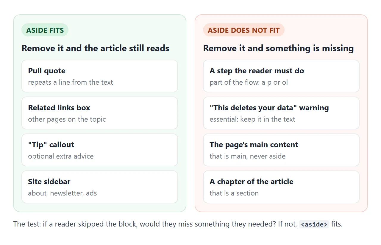
The meaning depends on where the aside sits. Inside an article, it relates to that article, so a pull quote or a tip belongs there.
Directly in the body, it relates to the whole page, so a site sidebar, a newsletter box or an ad goes there.
An aside is not a way to put something on the side. The name describes the role, not the position. A related-links box under the article is still an aside, and a main column floated to the right is still main.
The complementary landmark
Landmarks are the large regions of a page: banner, navigation, main, complementary, contentinfo. Screen readers offer a list of them, so a user can jump straight to the sidebar without reading the article first.
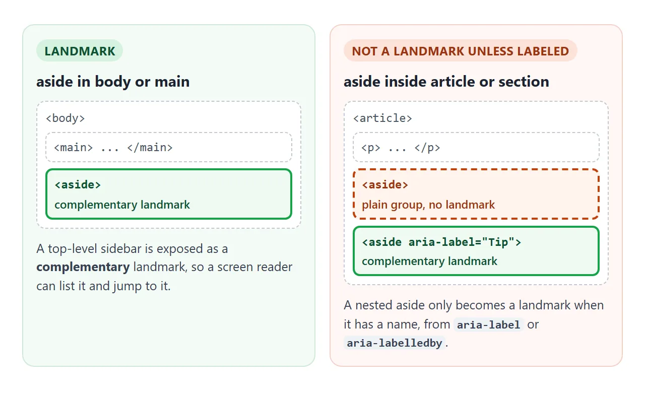
- In body or main: an aside is a complementary landmark with no extra attribute.
- Inside an article or section: under the HTML accessibility mapping rules it is only a landmark when it has a name. Add
aria-labeloraria-labelledbyif you want it listed. - Several of them: once a page has two complementary landmarks, label each one. "Complementary, complementary" in a landmark list tells nobody which is which.
Pointing aria-labelledby at the aside's own heading avoids writing the name twice. The aria-label guide covers when to use which. The nav tag follows the same labeling rule.
aside vs section vs div
These three are all blocks that look identical without CSS. They differ in what they tell the browser.
| Element | Means | Use it for | Landmark |
|---|---|---|---|
<aside> |
Related but separate content | Sidebars, pull quotes, related links, optional tips | Complementary, when top-level or labeled |
<section> |
A part of the content, usually with a heading | Chapters of an article, parts of a page | Region, only when labeled |
<div> |
Nothing | Wrappers for layout and styling | None |
If the block is the page's main content, it is main, never aside. The main tag guide covers the rest of the page shell, and semantic HTML the wider idea of choosing the element that means the thing.
Three everyday uses
One page can hold several asides at once. This one has an in-article tip, a related-links box at the end of the article, and a site sidebar next to it.
<!doctype html>
<html lang="en">
<head>
<meta charset="utf-8">
<meta name="viewport" content="width=device-width, initial-scale=1">
<title>Three uses of aside</title>
<style>
  body { margin: 0; padding: 14px; font-family: system-ui, sans-serif; background: #f4f5f7; color: #1d2330; font-size: 15px; line-height: 1.55; }
  .layout { display: grid; grid-template-columns: 1fr 190px; gap: 18px; max-width: 760px; margin: 0 auto; }
  @media (max-width: 600px) { .layout { grid-template-columns: 1fr; } }  /* phones: sidebar drops below */
  article { background: #fff; border-radius: 10px; padding: 14px 18px; }
  h1 { font-size: 20px; margin: 0 0 8px; }
  p { margin: 0 0 10px; }

  /* 1. callout inside the article */
  .tip { border-left: 4px solid #2563eb; background: #eff5ff; border-radius: 6px; padding: 8px 12px; margin: 0 0 10px; font-size: 14px; }
  .tip b { display: block; }

  /* 2. related links at the end of the article */
  .related { border-top: 1px solid #e1e4ea; padding-top: 10px; font-size: 14px; }
  .related h2, .sidebar h2 { font-size: 14px; margin: 0 0 6px; }
  .related ul { margin: 0; padding-left: 18px; }

  /* 3. site sidebar next to the article */
  .sidebar { background: #fff; border-radius: 10px; padding: 12px 14px; font-size: 14px; align-self: start; }
  .sidebar p { margin: 0 0 8px; }

  /* the "show outlines" switch */
  .show aside { outline: 2px dashed #16a34a; outline-offset: 3px; position: relative; }
  .show aside::before { content: attr(data-use); position: absolute; top: -12px; right: 6px; background: #16a34a; color: #fff; font: 700 11px/1 system-ui; padding: 3px 6px; border-radius: 99px; }
  .bar { max-width: 760px; margin: 0 auto 12px; font-size: 14px; }
  a { color: #1d4ed8; }
</style>
</head>
<body>
<label class="bar"><input type="checkbox" id="show"> Show which parts are aside elements</label>

<div class="layout" id="layout">
  <main>
    <article>
      <h1>Brewing coffee with a French press</h1>
      <p>Heat the water until it just stops boiling. Add coarse ground coffee to the press, pour, and stir once.</p>

      <aside class="tip" data-use="callout" aria-label="Tip">
        <b>Tip</b>
        A kitchen scale makes the result the same every morning. It is optional.
      </aside>

      <p>Wait four minutes, then push the plunger down slowly and pour right away so the coffee does not keep brewing.</p>

      <aside class="related" data-use="related links" aria-labelledby="rel-h">
        <h2 id="rel-h">Related guides</h2>
        <ul>
          <li><a href="#">Choosing a grinder</a></li>
          <li><a href="#">Cold brew in a jar</a></li>
        </ul>
      </aside>
    </article>
  </main>

  <aside class="sidebar" data-use="sidebar" aria-label="About this site">
    <h2>About</h2>
    <p>Short guides to everyday cooking, one technique per page.</p>
    <p><a href="#">All guides</a></p>
  </aside>
</div>

<script>
  document.getElementById('show').addEventListener('change', (e) => {
    document.getElementById('layout').classList.toggle('show', e.target.checked);
  });
</script>
</body>
</html>
Sidebar. Site-wide extras next to main: an author box, a newsletter form, links to categories. It is a direct child of the page layout, so it is a landmark.
Related links. A short list of other pages at the end of an article. It sits inside the article, so it gets aria-labelledby pointing at its heading.
Callout. A "Tip" or "Note" box inside the text. The test from above decides it. An optional tip fits an aside. A warning the reader must see is part of the main content, so keep it in the text as a styled p or div.
Pull quote. A line from the article repeated in large type. It is an aside, not a blockquote, because it quotes the same page rather than another source. The blockquote guide covers real quotations.
A sidebar that drops below on phones
A sidebar needs two columns on a wide screen and one on a phone. CSS grid does it in a few lines:
.layout {
  display: grid;
  grid-template-columns: 1fr 240px; /* article, sidebar */
  gap: 24px;
}
@media (max-width: 600px) {
  .layout { grid-template-columns: 1fr; } /* sidebar goes under */
}
In one column, items stack in source order. With main first and the aside second, the sidebar lands under the article on a phone, which is usually what you want.
For a sidebar that should come first on phones, put the aside first in the HTML. CSS grid shows a variant that needs no media query.
A sticky table of contents in an aside
A table of contents beside a long article is a classic aside. On a wide screen it stays in view while you scroll. On a phone it sits above the article as a collapsed block.
Two CSS lines make it sticky, and a third is easy to forget:
.toc {
  position: sticky;
  top: 16px;
  align-self: start; /* do not stretch to the row height */
}
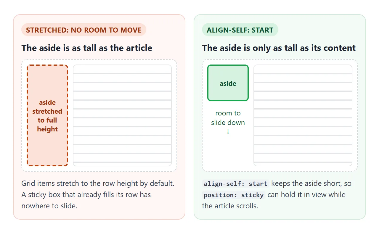
Grid and flex items stretch to fill the row. A stretched aside is as tall as the article, so sticky has no room to move it. align-self: start keeps it as tall as its content.
<!doctype html>
<html lang="en">
<head>
<meta charset="utf-8">
<meta name="viewport" content="width=device-width, initial-scale=1">
<title>Sticky table of contents in an aside</title>
<style>
  html { scroll-behavior: smooth; }
  body { margin: 0; font-family: system-ui, sans-serif; background: #f4f5f7; color: #1d2330; line-height: 1.6; }
  .layout {
    display: grid; grid-template-columns: 200px 1fr; gap: 24px;
    max-width: 820px; margin: 0 auto; padding: 16px;
  }
  .toc {
    position: sticky; top: 16px;
    align-self: start;  /* without this the grid stretches the aside and it cannot stick */
    background: #fff; border-radius: 10px; padding: 10px 14px; font-size: 14px;
  }
  .toc summary { font-weight: 700; cursor: pointer; }
  .toc ol { margin: 8px 0 0; padding-left: 20px; }
  .toc a { color: #1d4ed8; text-decoration: none; }
  .toc a.here { font-weight: 700; color: #0f5132; }
  article { background: #fff; border-radius: 10px; padding: 4px 20px 60vh; }  /* room so the last heading can reach the top */
  h2 { scroll-margin-top: 16px; font-size: 19px; margin: 22px 0 6px; }
  p { margin: 0 0 12px; }

  /* wide screens: always open, heading instead of a toggle */
  @media (min-width: 700px) {
    .toc summary { list-style: none; cursor: default; pointer-events: none; }
    .toc summary::-webkit-details-marker { display: none; }
  }
  /* phones: one column, the aside sits above the article and is not sticky */
  @media (max-width: 699px) {
    .layout { grid-template-columns: 1fr; gap: 12px; }
    .toc { position: static; }
  }
</style>
</head>
<body>
<div class="layout">
  <aside class="toc" aria-label="Table of contents">
    <details id="toc" open>
      <summary>On this page</summary>
      <ol>
        <li><a href="#soil">Soil</a></li>
        <li><a href="#light">Light</a></li>
        <li><a href="#water">Water</a></li>
        <li><a href="#repot">Repotting</a></li>
      </ol>
    </details>
  </aside>

  <main>
    <article>
      <h2 id="soil">Soil</h2>
      <p>Use a loose mix that drains in seconds. Bagged cactus soil works; add a handful of perlite for large pots.</p>
      <p>Heavy garden soil holds water around the roots for days, which is the most common way these plants are lost.</p>
      <p>If the pot has no drainage hole, move the plant to one that does before anything else.</p>
      <h2 id="light">Light</h2>
      <p>A bright window is best. Morning sun is gentle; strong afternoon sun through glass can scorch leaves that are not used to it.</p>
      <p>Stretched, pale growth that leans toward the glass means the plant wants more light.</p>
      <p>Turn the pot a quarter turn every week so it grows evenly.</p>
      <h2 id="water">Water</h2>
      <p>Water deeply, then wait until the soil is dry all the way down. Push a wooden skewer in: if it comes out clean, it is time.</p>
      <p>In winter the plant rests, so the gap between waterings grows much longer.</p>
      <p>Empty the saucer after watering so the roots do not sit in water.</p>
      <h2 id="repot">Repotting</h2>
      <p>Repot in spring, one pot size up. Let the roots dry for a day before you water again.</p>
      <p>Wear gloves or wrap the plant in folded paper if it has spines.</p>
      <p>That is all it needs. Most plants of this kind do better with less attention, not more.</p>
    </article>
  </main>
</div>

<script>
  const toc = document.getElementById('toc');
  const wide = matchMedia('(min-width: 700px)');

  // open on wide screens, collapsed on phones
  function fit() { toc.open = wide.matches; }
  wide.addEventListener('change', fit);
  fit();

  // on a phone, close the list after a link is chosen
  toc.addEventListener('click', (e) => {
    if (e.target.closest('a') && !wide.matches) toc.open = false;
  });

  // keep the list open on wide screens even if the summary is activated
  toc.addEventListener('toggle', () => { if (wide.matches && !toc.open) toc.open = true; });

  // mark the section currently at the top
  const links = [...toc.querySelectorAll('a')];
  const heads = links.map((a) => document.querySelector(a.getAttribute('href')));
  function mark() {
    let current = heads[0];
    heads.forEach((h) => { if (h.getBoundingClientRect().top < 80) current = h; });
    links.forEach((a) => a.classList.toggle('here', a.getAttribute('href') === '#' + current.id));
  }
  addEventListener('scroll', mark, { passive: true });
  mark();
</script>
</body>
</html>
The list sits in a details element. A few lines of JavaScript with matchMedia keep it open on wide screens and closed on phones. The table of contents guide covers the anchor links themselves, including headings that land under a sticky header.
When it does not work
| What you see | Cause | Fix |
|---|---|---|
| On a phone the sidebar is squeezed next to the article | Fixed two-column grid with no phone rule | Switch to one column in a media query |
| The sticky aside scrolls away | It is stretched to the row height | align-self: start on the aside |
| The sticky aside still scrolls away | An ancestor has overflow: hidden or auto |
Remove it, or make that ancestor the scrolling box |
| Sticky does nothing at all | No top value |
Add top: 16px or similar |
| The article itself is in an aside | aside used for main content | Use main for the main content |
| A landmark list shows two identical "complementary" entries | Several asides without names | aria-label or aria-labelledby on each |
| An aside in the middle of a paragraph splits it in two | aside inside p is not allowed | Close the p before the aside |
The last row is the HTML parser at work. A p can only hold inline content, so when the parser meets <aside> it closes the paragraph first.
The text after the aside ends up outside any paragraph, and the closing </p> creates an extra empty one.
Share it as a link
A layout that moves between one and two columns is hard to show in a screenshot, which captures only one width. Sending the file is not much better: on a phone, an .html attachment may open as plain code, or not at all.
To send the working version, paste the page into a NOS document and choose Create share link. HTML to link walks through it.
The page renders as written and its scripts run, so the people you send it to can open the table of contents and watch the sidebar drop on their own phone. If you change the code later, the same link shows the new version.