A sidebar in HTML is an <aside> placed next to <main>. HTML only names the parts. The side-by-side layout comes from CSS: make the wrapper a grid with two columns, a fixed width for the sidebar and the rest for the content.
<div class="layout">
  <aside class="sidebar">...</aside>
  <main>...</main>
</div>
Try it below. On a phone, or in a narrow window, the sidebar turns into a row of links on top.
<!doctype html>
<html lang="en">
<head>
<meta charset="utf-8">
<meta name="viewport" content="width=device-width, initial-scale=1">
<title>Sidebar layout</title>
<style>
  body { margin: 0; font-family: system-ui, sans-serif; color: #1d2330; background: #f4f5f7; }

  /* Two columns: a fixed-width sidebar and a main column that takes the rest */
  .layout {
    display: grid;
    grid-template-columns: 200px minmax(0, 1fr);
    min-height: 100vh;
  }

  .sidebar { background: #1f2937; color: #e5e7eb; padding: 16px; }
  .sidebar h2 { margin: 0 0 12px; font-size: 15px; }
  .sidebar nav { display: flex; flex-direction: column; gap: 4px; }
  .sidebar a { color: inherit; text-decoration: none; padding: 8px 10px; border-radius: 6px; font-size: 14px; }
  .sidebar a:hover, .sidebar a[aria-current] { background: #374151; }

  main { padding: 18px 22px; }
  main h1 { margin: 0 0 8px; font-size: 20px; }
  main p { margin: 0 0 10px; line-height: 1.5; font-size: 14px; }

  /* Phone: one column, the sidebar becomes a row of links on top */
  @media (max-width: 560px) {
    .layout { grid-template-columns: minmax(0, 1fr); min-height: 0; }
    .sidebar { padding: 10px 12px; }
    .sidebar h2 { display: none; }
    .sidebar nav { flex-direction: row; flex-wrap: wrap; }
  }
</style>
</head>
<body>
<div class="layout">
  <aside class="sidebar">
    <h2>My project</h2>
    <nav aria-label="Sections">
      <a href="#" aria-current="page">Overview</a>
      <a href="#">Tasks</a>
      <a href="#">Files</a>
      <a href="#">Settings</a>
    </nav>
  </aside>
  <main>
    <h1>Overview</h1>
    <p>The sidebar is 200px wide. The main column takes whatever width is left.</p>
    <p>Make the window narrower than 560px and the sidebar turns into a row of links above the content.</p>
  </main>
</div>
</body>
</html>
Two columns with CSS grid
The whole layout is one rule on the wrapper. The first column is the sidebar, the second is the content.
.layout {
  display: grid;
  grid-template-columns: 200px minmax(0, 1fr);
  min-height: 100vh;
}
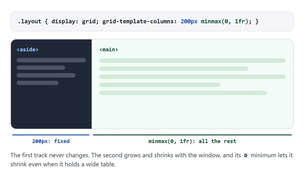
Why minmax(0, 1fr) and not plain 1fr? A 1fr track will not shrink below the minimum width of its content. A wide table or a long line of code inside main then pushes the page sideways.
The 0 minimum lets the column shrink, and the table can scroll inside its own box.
To put the sidebar on the right, swap the order: minmax(0, 1fr) 200px, with main first in the HTML. For three or more regions, named areas read better. The grid template areas guide covers that.
aside, nav or div?
The element does not change the look, but it tells screen readers what the column is.
| Sidebar holds | Element | Why |
|---|---|---|
| Site or app navigation | <nav>, inside the aside or on its own |
A navigation landmark users can jump to |
| Filters, related links, an author box | <aside> |
Related but separate from the main content |
| Only a wrapper for styling | <div> |
No meaning to add |
The demos here wrap a <nav aria-label="..."> in an aside. The aside tag guide explains the landmark rules in detail, and the nav tag guide covers labeling more than one menu.
A sticky sidebar
On a long page, a sidebar that stays in view as you scroll is useful for a table of contents or filters. Add position: sticky and a top offset:
.sidebar {
  position: sticky;
  top: 16px;
  align-self: start; /* the line that is easy to miss */
}
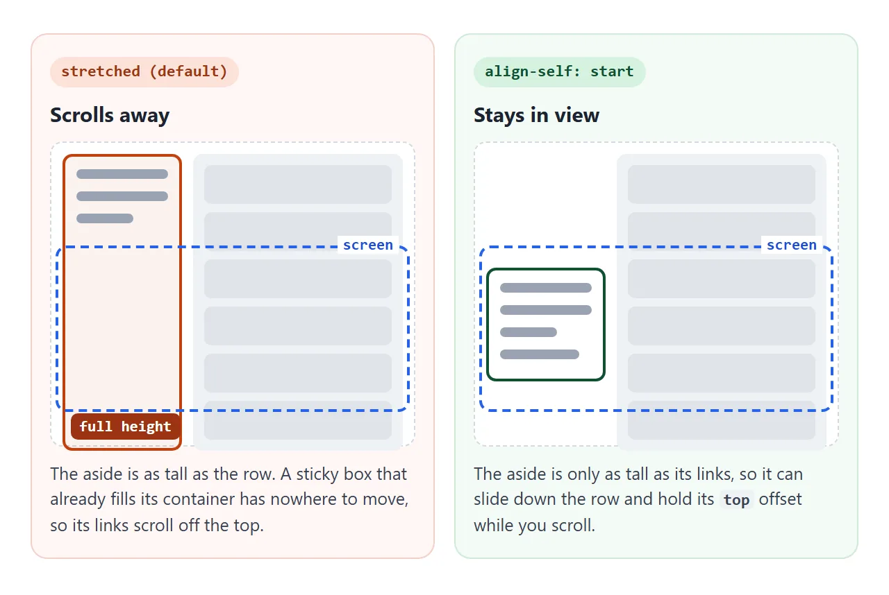
The third line matters. Grid and flex items stretch to the height of their row by default.
A sidebar as tall as the whole row has no room left to slide down, so it scrolls away like a normal block. Untick the box in this example to see it.
<!doctype html>
<html lang="en">
<head>
<meta charset="utf-8">
<meta name="viewport" content="width=device-width, initial-scale=1">
<title>Sticky sidebar</title>
<style>
  body { margin: 0; font-family: system-ui, sans-serif; color: #1d2330; background: #f4f5f7; }
  .bar {
    position: sticky; top: 0; z-index: 1;
    padding: 10px 14px; background: #fff; border-bottom: 1px solid #e1e4ea; font-size: 14px;
  }
  .layout { display: grid; grid-template-columns: 130px minmax(0, 1fr); gap: 14px; padding: 14px; }

  .sidebar {
    position: sticky;
    top: 56px;            /* stop below the bar */
    background: #fff; border: 1px solid #e1e4ea; border-radius: 10px; padding: 10px;
  }
  /* The fix: without it, grid stretches the sidebar to the full row height */
  .layout.fixed .sidebar { align-self: start; }

  .sidebar a { display: block; padding: 6px 4px; color: #1d4ed8; font-size: 14px; text-decoration: none; }
  main section { background: #fff; border-radius: 10px; padding: 12px 14px; margin-bottom: 12px; }
  main h2 { margin: 0 0 6px; font-size: 16px; }
  main p { margin: 0; font-size: 14px; line-height: 1.5; color: #4b5563; }
</style>
</head>
<body>
<div class="bar">
  <label><input type="checkbox" id="fix" checked> <code>align-self: start</code> on the sidebar</label>
</div>
<div class="layout fixed" id="layout">
  <aside class="sidebar">
    <nav aria-label="On this page">
      <a href="#">Intro</a>
      <a href="#">Setup</a>
      <a href="#">Usage</a>
      <a href="#">FAQ</a>
    </nav>
  </aside>
  <main>
    <section><h2>Intro</h2><p>Scroll this example. With the box ticked, the sidebar stays in view.</p></section>
    <section><h2>Setup</h2><p>Untick the box and scroll again. The sidebar now scrolls away with the page.</p></section>
    <section><h2>Usage</h2><p>The sidebar still has position: sticky. It simply has no room to move.</p></section>
    <section><h2>Examples</h2><p>A stretched item is as tall as the whole row, so it has no space to slide in.</p></section>
    <section><h2>Notes</h2><p>align-self: start makes it only as tall as its links.</p></section>
    <section><h2>FAQ</h2><p>Keep scrolling to the end to see where a sticky sidebar stops.</p></section>
  </main>
</div>
<script>
  const layout = document.getElementById('layout');
  document.getElementById('fix').addEventListener('change', (e) => {
    layout.classList.toggle('fixed', e.target.checked);
  });
</script>
</body>
</html>
If there is a fixed or sticky header, set top to the header height so the sidebar stops below it. The sticky header guide lists the other things that stop sticky from working.
Full height with its own scroll
Dashboards and admin screens often use a different pattern. The page itself never scrolls. The sidebar and the content each scroll on their own.
body {
  margin: 0;
  height: 100vh;
  height: 100dvh; /* follows the visible height on phones */
  display: grid;
  grid-template-columns: auto minmax(0, 1fr);
}
.side, main { overflow-y: auto; }
On phones, 100vh can be taller than the visible area while the browser's address bar is showing. The dvh unit follows the visible height. The first line stays as a fallback for browsers that do not know dvh.
A collapsible sidebar on phones
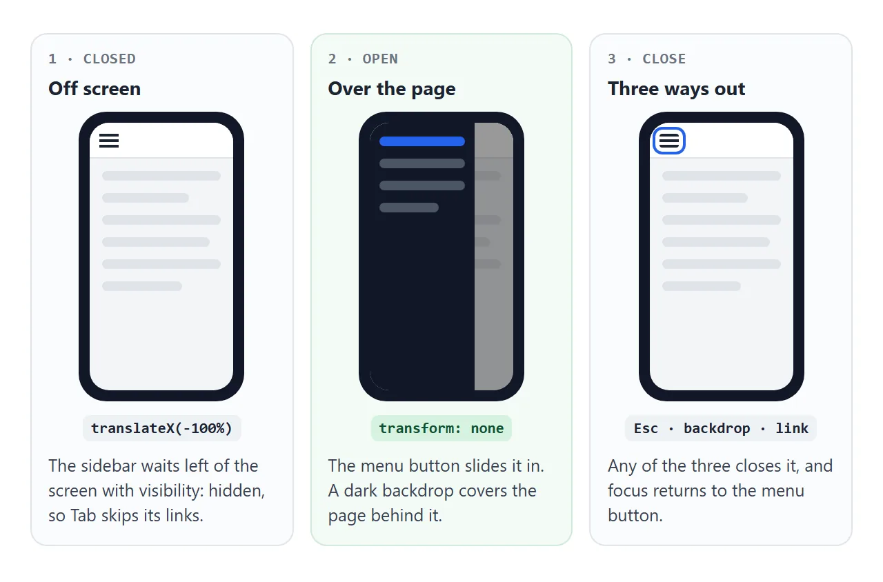
A 200px column takes too much of a phone screen. The usual answer is a drawer: the sidebar leaves the grid, waits off screen, and slides over the page when a menu button is pressed.
@media (max-width: 640px) {
  body { grid-template-columns: minmax(0, 1fr); }
  .side {
    position: fixed; inset: 0 auto 0 0; width: 240px;
    transform: translateX(-100%);
    visibility: hidden;
    transition: transform .2s, visibility 0s .2s;
  }
  body.open .side { transform: none; visibility: visible; transition: transform .2s; }
}
- Take it out of the grid.
position: fixedputs it over the page, and the grid drops to one column. - Park it off screen.
translateX(-100%)moves it exactly its own width to the left. - Hide it for real.
visibility: hiddenstops Tab from reaching links nobody can see. The delayed transition waits until the slide has finished before hiding. - Open it with a button. A
<button>toggles a class and updatesaria-expanded. - Give three ways out. Close on Escape, on a tap on the backdrop, and after a link is picked. Return focus to the menu button.
The hamburger menu guide goes deeper into the button and its icon. The breakpoint itself is an ordinary media query.
A finished dashboard sidebar
This one puts it all together. On a wide screen, the sidebar can collapse to a 60px icon rail. On a phone, it becomes the drawer above. The content column scrolls on its own, and the table scrolls sideways inside its box.
<!doctype html>
<html lang="en">
<head>
<meta charset="utf-8">
<meta name="viewport" content="width=device-width, initial-scale=1">
<title>Dashboard sidebar</title>
<style>
  * { box-sizing: border-box; }
  body {
    margin: 0; height: 100vh; height: 100dvh;
    display: grid; grid-template-columns: auto minmax(0, 1fr);
    font-family: system-ui, sans-serif; color: #1d2330; background: #f4f5f7;
  }

  /* Sidebar: its own scroll, full height */
  .side {
    width: 210px; overflow-y: auto; overflow-x: hidden;
    display: flex; flex-direction: column; gap: 4px; padding: 12px 10px;
    background: #111827; color: #d1d5db; transition: width .2s;
  }
  .brand { display: flex; align-items: center; gap: 12px; font-weight: 700; color: #fff; padding: 4px 8px 12px; white-space: nowrap; }
  .logo { flex: none; width: 24px; height: 24px; border-radius: 6px; background: #2563eb; display: grid; place-items: center; font-size: 13px; }
  .side a, .side button {
    display: flex; align-items: center; gap: 12px; padding: 9px 10px; border-radius: 8px;
    color: inherit; text-decoration: none; font: inherit; font-size: 14px; white-space: nowrap;
    background: none; border: 0; cursor: pointer; text-align: left;
  }
  .side a:hover, .side button:hover { background: #1f2937; }
  .side a[aria-current] { background: #2563eb; color: #fff; }
  .side svg { flex: none; width: 20px; height: 20px; fill: none; stroke: currentColor; stroke-width: 2; }
  #collapse { margin-top: auto; }

  /* Desktop collapsed: icons only. Labels stay readable to screen readers. */
  body.rail .side { width: 60px; }
  body.rail .label {
    position: absolute; width: 1px; height: 1px; overflow: hidden; clip-path: inset(50%);
  }
  body.rail #collapse svg { transform: scaleX(-1); }

  /* Main column: scrolls on its own */
  main { overflow-y: auto; padding: 14px 18px; }
  .top { display: flex; align-items: center; gap: 10px; margin-bottom: 12px; }
  .top h1 { margin: 0; font-size: 19px; }
  #menu { display: none; }
  .cards { display: grid; grid-template-columns: repeat(auto-fit, minmax(130px, 1fr)); gap: 10px; }
  .card { background: #fff; border-radius: 10px; padding: 12px; }
  .card b { display: block; font-size: 20px; }
  .card small { color: #6b7280; }
  .wide { overflow-x: auto; background: #fff; border-radius: 10px; margin-top: 12px; }
  table { border-collapse: collapse; width: 100%; min-width: 460px; font-size: 13px; }
  th, td { text-align: left; padding: 8px 12px; border-bottom: 1px solid #eef0f3; }
  .backdrop { display: none; }

  /* Phone: the sidebar becomes a drawer over the page */
  @media (max-width: 640px) {
    body { grid-template-columns: minmax(0, 1fr); }
    .side, body.rail .side {
      position: fixed; inset: 0 auto 0 0; z-index: 2; width: 240px;
      transform: translateX(-100%); visibility: hidden;
      transition: transform .2s, visibility 0s .2s;   /* hide after it slides out */
    }
    body.rail .label { position: static; width: auto; height: auto; clip-path: none; }
    body.open .side { transform: none; visibility: visible; transition: transform .2s; }
    body.open .backdrop { display: block; position: fixed; inset: 0; z-index: 1; background: rgba(0, 0, 0, .4); }
    #menu { display: flex; padding: 6px; border: 1px solid #d5d9e0; border-radius: 8px; background: #fff; cursor: pointer; }
    #menu svg { width: 20px; height: 20px; fill: none; stroke: currentColor; stroke-width: 2; }
    #collapse { display: none; }
  }
</style>
</head>
<body>
<aside class="side" id="side">
  <div class="brand"><span class="logo">A</span><span class="label">Acme Admin</span></div>
  <nav aria-label="Main" id="nav">
    <a href="#" aria-current="page"><svg viewBox="0 0 24 24"><path d="M3 11l9-7 9 7v9H3z"/></svg><span class="label">Overview</span></a>
    <a href="#"><svg viewBox="0 0 24 24"><path d="M4 20V10M10 20V4M16 20v-7M22 20H2"/></svg><span class="label">Reports</span></a>
    <a href="#"><svg viewBox="0 0 24 24"><path d="M3 7h18v13H3zM3 7l3-4h12l3 4"/></svg><span class="label">Orders</span></a>
    <a href="#"><svg viewBox="0 0 24 24"><circle cx="9" cy="8" r="4"/><path d="M2 21c0-4 3-6 7-6s7 2 7 6M17 4a4 4 0 010 8M22 21c0-3-2-5-4-6"/></svg><span class="label">Customers</span></a>
    <a href="#"><svg viewBox="0 0 24 24"><circle cx="12" cy="12" r="3"/><path d="M12 2v3M12 19v3M2 12h3M19 12h3M5 5l2 2M17 17l2 2M5 19l2-2M17 7l2-2"/></svg><span class="label">Settings</span></a>
  </nav>
  <button id="collapse" aria-expanded="true" aria-controls="side">
    <svg viewBox="0 0 24 24"><path d="M15 5l-7 7 7 7"/></svg><span class="label">Collapse</span>
  </button>
</aside>
<div class="backdrop" id="backdrop"></div>

<main>
  <div class="top">
    <button id="menu" aria-expanded="false" aria-controls="side" aria-label="Open menu">
      <svg viewBox="0 0 24 24"><path d="M3 6h18M3 12h18M3 18h18"/></svg>
    </button>
    <h1 id="title">Overview</h1>
  </div>
  <div class="cards">
    <div class="card"><small>Revenue</small><b>$12,480</b></div>
    <div class="card"><small>Orders</small><b>326</b></div>
    <div class="card"><small>Refunds</small><b>4</b></div>
  </div>
  <div class="wide">
    <table>
      <tr><th>Order</th><th>Customer</th><th>Status</th><th>Total</th></tr>
      <tr><td>#1042</td><td>Dana Whitfield</td><td>Paid</td><td>$84.00</td></tr>
      <tr><td>#1041</td><td>Omar Haddad</td><td>Shipped</td><td>$129.50</td></tr>
      <tr><td>#1040</td><td>Lena Park</td><td>Paid</td><td>$42.00</td></tr>
      <tr><td>#1039</td><td>Theo Brandt</td><td>Refunded</td><td>$18.00</td></tr>
      <tr><td>#1038</td><td>Ines Moreau</td><td>Shipped</td><td>$230.00</td></tr>
      <tr><td>#1037</td><td>Sam Okafor</td><td>Paid</td><td>$61.25</td></tr>
      <tr><td>#1036</td><td>Mia Novak</td><td>Paid</td><td>$97.40</td></tr>
      <tr><td>#1035</td><td>Ravi Menon</td><td>Shipped</td><td>$150.00</td></tr>
      <tr><td>#1034</td><td>Clara Diaz</td><td>Paid</td><td>$33.10</td></tr>
      <tr><td>#1033</td><td>Jon Eriksen</td><td>Paid</td><td>$76.80</td></tr>
      <tr><td>#1032</td><td>Aiko Sato</td><td>Shipped</td><td>$58.00</td></tr>
    </table>
  </div>
</main>

<script>
  const body = document.body;
  const menu = document.getElementById('menu');
  const collapse = document.getElementById('collapse');
  const phone = matchMedia('(max-width: 640px)');

  // Desktop: collapse to an icon rail and back
  collapse.addEventListener('click', () => {
    const rail = body.classList.toggle('rail');
    collapse.setAttribute('aria-expanded', !rail);
  });

  // Phone: open and close the drawer
  function setOpen(open) {
    body.classList.toggle('open', open);
    menu.setAttribute('aria-expanded', open);
    if (open) document.querySelector('#nav a').focus();
    else menu.focus();
  }
  menu.addEventListener('click', () => setOpen(true));
  document.getElementById('backdrop').addEventListener('click', () => setOpen(false));
  document.addEventListener('keydown', (e) => {
    if (e.key === 'Escape' && body.classList.contains('open')) setOpen(false);
  });

  // Picking a page marks it current, and closes the drawer on a phone
  document.getElementById('nav').addEventListener('click', (e) => {
    const link = e.target.closest('a');
    if (!link) return;
    e.preventDefault();  // one-page demo: no real pages to load
    document.querySelector('#nav [aria-current]').removeAttribute('aria-current');
    link.setAttribute('aria-current', 'page');
    document.getElementById('title').textContent = link.textContent;
    if (phone.matches) setOpen(false);
  });

  // Leaving phone width while the drawer is open: reset it
  phone.addEventListener('change', () => { body.classList.remove('open'); menu.setAttribute('aria-expanded', false); });
</script>
</body>
</html>
- Icon rail: a
railclass on body sets the sidebar width to 60px. Withgrid-template-columns: auto ..., the grid follows the new width. - Hidden labels, kept names: in the rail, labels are visually hidden with
clip-pathrather thandisplay: none, so screen readers still hear "Reports". - Current page:
aria-current="page"marks the active link and styles it too. - Reset on resize: a
matchMedialistener closes the drawer if the window grows past the phone width.
When it does not work
| What you see | Cause | Fix |
|---|---|---|
| The sidebar sits above the content, not beside it | The wrapper is not a grid or flex container | display: grid and two column widths |
| A wide table pushes the page sideways | The content track is 1fr, which will not shrink below its content |
Use minmax(0, 1fr) |
| The sticky sidebar scrolls away | It is stretched to the row height | align-self: start |
| Sticky still fails | No top value, or an ancestor has overflow: hidden, auto or scroll |
Add top, remove the overflow |
| On a phone the page is cut off at the bottom | 100vh is taller than the visible area |
Add height: 100dvh after it |
| Tab lands on links in the closed drawer | It is only moved off screen | Add visibility: hidden when closed |
| The whole layout is tiny on a phone | No viewport meta tag | Add the viewport meta tag |
Share it as a link
A sidebar is one of those layouts you need to click through to judge. A screenshot shows one width and one state, and an .html attachment may open as plain code on a phone.
To send the working version, paste the page into a NOS document and choose Create share link. HTML to link walks through it.
The page renders as written and its scripts run, so the people you send it to can collapse the sidebar and open the drawer on their own phones. If you change the code later, the same link shows the new version.