The <nav> tag wraps a block of major navigation links: the site menu, a table of contents, a breadcrumb, a pagination bar.
It looks like a plain block until you style it. What it adds is meaning. The browser exposes it as a navigation landmark, which screen readers can list and jump to.
<nav aria-label="Main">
  <ul>
    <li><a href="/guides" aria-current="page">Guides</a></li>
    <li><a href="/api">API</a></li>
    <li><a href="/pricing">Pricing</a></li>
  </ul>
</nav>
The example below reads the landmarks from a small page with querySelectorAll and lists them. Turn the labels off, or add a nav to the footer, and watch the list change.
<!doctype html>
<html lang="en">
<head>
<meta charset="utf-8">
<meta name="viewport" content="width=device-width, initial-scale=1">
<title>nav landmark viewer</title>
<style>
  body { margin: 0; padding: 12px; font-family: system-ui, sans-serif; background: #f4f5f7; color: #1d2330; }
  .wrap { display: grid; grid-template-columns: 1fr 1fr; gap: 12px; }
  @media (max-width: 560px) { .wrap { grid-template-columns: 1fr; } }
  #page { background: #fff; border-radius: 10px; padding: 10px; font-size: 13px; }
  #page header, #page main, #page footer, #page nav { border: 1px dashed #c3c8d1; border-radius: 8px; padding: 6px 8px; margin: 6px 0; }
  #page nav { border-color: #2563eb; background: #eff5ff; }
  #page ul { margin: 0; padding: 0; list-style: none; display: flex; flex-wrap: wrap; gap: 10px; }
  #page a { color: #1d4ed8; }
  .panel { background: #fff; border-radius: 10px; padding: 10px 12px; font-size: 13px; }
  .panel h3 { margin: 0 0 8px; font-size: 14px; }
  #list { margin: 0 0 8px; padding-left: 18px; line-height: 1.6; }
  .warn { background: #fff4ec; color: #9a3412; border-radius: 6px; padding: 6px 8px; margin: 6px 0 0; }
  .ok { background: #ecf8f0; color: #0f5132; border-radius: 6px; padding: 6px 8px; margin: 6px 0 0; }
  label { display: block; margin: 4px 0; }
</style>
</head>
<body>
<div class="wrap">
  <div id="page">
    <header>
      <b>Acme Docs</b>
      <nav aria-label="Main">
        <ul><li><a href="#">Guides</a></li><li><a href="#">API</a></li><li><a href="#">Pricing</a></li></ul>
      </nav>
    </header>
    <main>
      <nav aria-label="On this page">
        <ul><li><a href="#">Install</a></li><li><a href="#">Configure</a></li><li><a href="#">Deploy</a></li></ul>
      </nav>
      <p>Article text goes here.</p>
    </main>
    <footer id="foot">
      <ul><li><a href="#">Terms</a></li><li><a href="#">Privacy</a></li><li><a href="#">Contact</a></li></ul>
    </footer>
  </div>

  <div class="panel">
    <h3>Landmarks on this page</h3>
    <ol id="list"></ol>
    <div id="msg"></div>
    <label><input type="checkbox" id="nolabels"> Remove the aria-labels</label>
    <label><input type="checkbox" id="footnav"> Wrap the footer links in a nav too</label>
  </div>
</div>

<script>
  const page = document.getElementById('page');
  // element -> landmark role (top-level header/footer only, as in this sample)
  const roles = { HEADER: 'banner', NAV: 'navigation', MAIN: 'main', ASIDE: 'complementary', FOOTER: 'contentinfo' };

  function render() {
    const items = page.querySelectorAll('header, nav, main, aside, footer');
    const list = document.getElementById('list');
    list.innerHTML = '';
    items.forEach((el) => {
      const name = el.getAttribute('aria-label');
      const li = document.createElement('li');
      li.textContent = roles[el.tagName] + (name ? ' "' + name + '"' : '');
      list.appendChild(li);
    });
    // every nav needs a name once there is more than one
    const navs = page.querySelectorAll('nav');
    const unnamed = [...navs].filter((n) => !n.getAttribute('aria-label')).length;
    const msg = document.getElementById('msg');
    if (navs.length > 1 && unnamed) {
      msg.className = 'warn';
      msg.textContent = navs.length + ' navigation landmarks, ' + unnamed + ' without a label. A landmark list cannot tell them apart.';
    } else {
      msg.className = 'ok';
      msg.textContent = navs.length + ' navigation landmarks, each with its own label.';
    }
    if (document.querySelector('#foot nav')) {
      msg.textContent += ' The footer nav is optional: contentinfo already marks those links.';
    }
  }

  document.getElementById('nolabels').addEventListener('change', (e) => {
    page.querySelectorAll('nav').forEach((n) => {
      if (e.target.checked) { n.dataset.label = n.getAttribute('aria-label') || ''; n.removeAttribute('aria-label'); }
      else if (n.dataset.label) n.setAttribute('aria-label', n.dataset.label);
    });
    render();
  });

  document.getElementById('footnav').addEventListener('change', (e) => {
    const foot = document.getElementById('foot');
    if (e.target.checked) {
      const nav = document.createElement('nav');
      if (!document.getElementById('nolabels').checked) nav.setAttribute('aria-label', 'Footer');
      else nav.dataset.label = 'Footer';
      nav.appendChild(foot.querySelector('ul'));
      foot.appendChild(nav);
    } else {
      const nav = foot.querySelector('nav');
      foot.appendChild(nav.querySelector('ul'));
      nav.remove();
    }
    render();
  });

  render();
</script>
</body>
</html>
This article is about the element and its structure. For the flexbox layout, colours and the narrow screen pass, see HTML CSS navbar.
What the nav element does
HTML has a handful of elements that map to landmark roles. A top-level <header> is a banner, <main> is main, a top-level <footer> is contentinfo, and every <nav> is navigation.
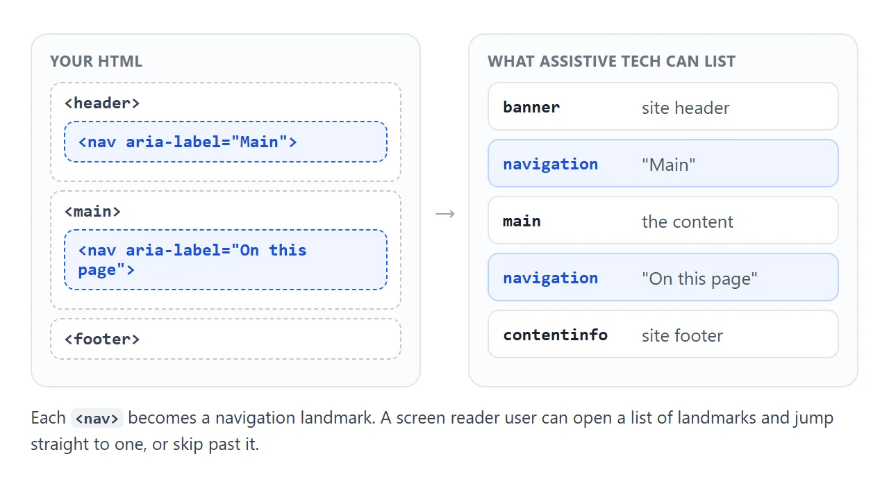
Screen readers offer commands to list landmarks or move to the next one. A user who knows the menu is in a navigation landmark can reach it, or skip it, in one step instead of tabbing through every link.
Nothing changes visually. <nav> is a block element with no default styles beyond that, so it looks exactly like a <div>.
nav vs div
The difference is only in meaning, and meaning is what other software reads.
<div> |
<nav> |
|
|---|---|---|
| Default look | Block, no styles | Block, no styles |
| Role exposed | None | navigation |
| Shows up in a landmark list | No | Yes |
| Needs extra attributes | role="navigation" to match |
No |
You can give a div role="navigation" and get the same landmark. Using <nav> gets there with no attribute, which is why semantic HTML prefers the native element.
When to use nav, and when not to
The HTML standard says <nav> is for major navigation blocks. Not every group of links qualifies.
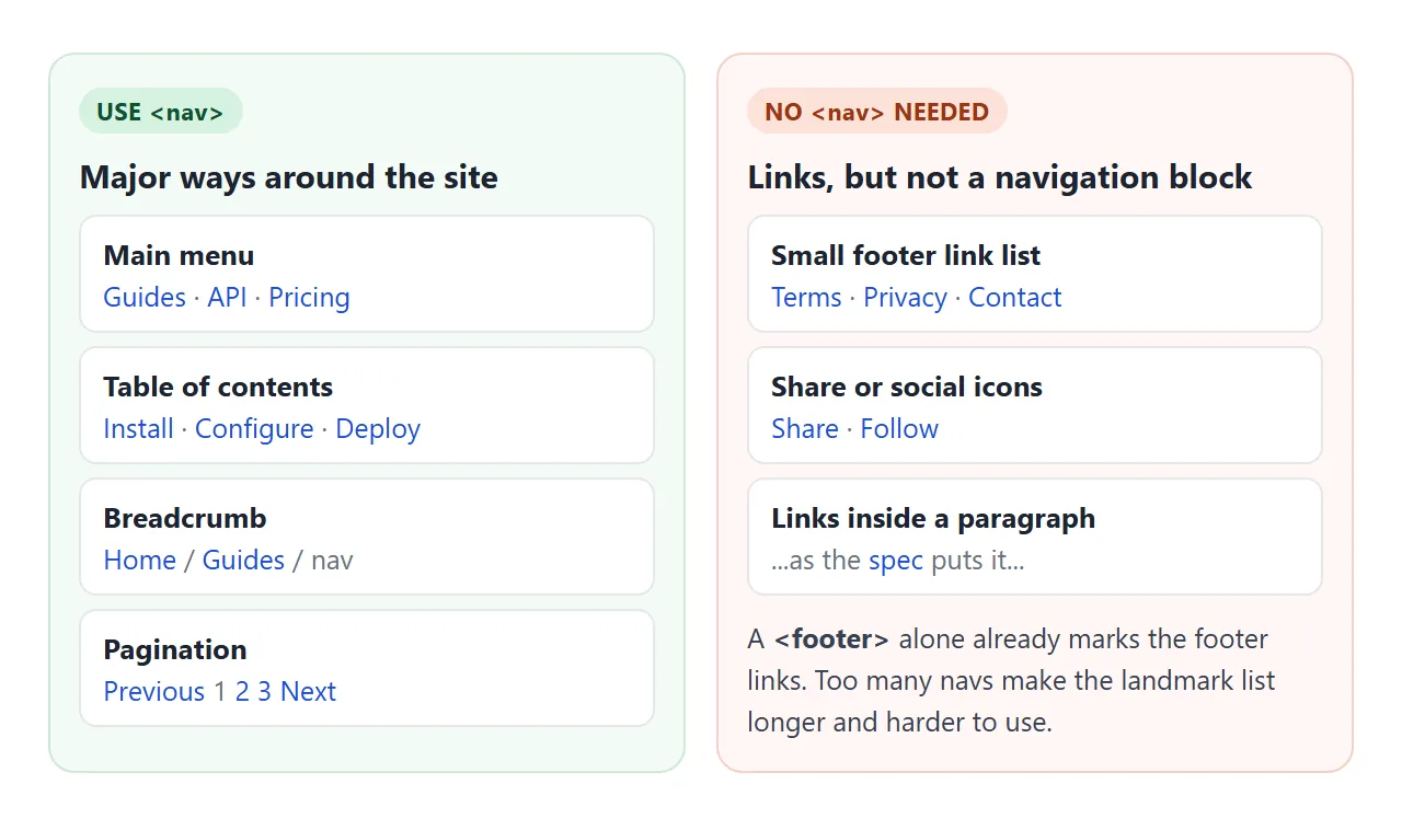
Good candidates:
- The main site menu in the header.
- A table of contents for a long page.
- A breadcrumb trail.
- Pagination between pages of results.
Usually not needed:
- A short list of footer links such as terms, privacy and contact. The standard notes that
<footer>alone is enough for these. - A row of share or social icons.
- Links inside a paragraph of text.
Every extra nav adds one more entry to the landmark list. Keep the list short enough to be useful.
Put a list inside
A nav does not have to contain a list. The standard allows any flow content, even a sentence with links. In practice a list is the better default.
With a <ul>, a screen reader announces the list and its item count before reading the links, so the user knows how long the menu is.
Use <ol> for a breadcrumb, where the order is the point. The ul tag covers removing the bullets and laying the items out in a row.
Keep the site logo outside the list. It is a link home, not a menu item.
Label every nav when there is more than one
One nav on a page needs no name. Two or more do, or the landmark list shows the same entry twice and the user has to enter each one to find out which is which.
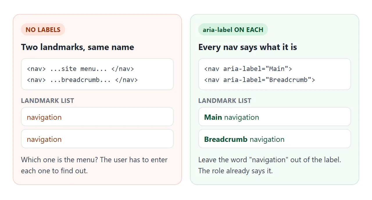
Give each nav a short aria-label:
<nav aria-label="Main">...</nav>
<nav aria-label="Breadcrumb">...</nav>
<nav aria-label="Pagination">...</nav>
Do not add the word "navigation" to the label. The role is announced already, so a label of "Main navigation" ends up read as "Main navigation navigation". If a visible heading already names the block, point to it with aria-labelledby instead.
Mark the current page with aria-current
A menu highlights the current page with colour, but colour is not announced. aria-current="page" on the link is. Screen readers announce it along with the link, so the user hears which page they are on.
It also makes a good CSS hook, so the visual and spoken states cannot drift apart:
nav a[aria-current="page"] { font-weight: 700; }
Breadcrumbs and pagination use the same attribute. Try both below with the mouse, or press Tab to move through the links and Enter to follow one.
<!doctype html>
<html lang="en">
<head>
<meta charset="utf-8">
<meta name="viewport" content="width=device-width, initial-scale=1">
<title>Breadcrumb and pagination navs</title>
<style>
  body { margin: 0; padding: 16px; font-family: system-ui, sans-serif; background: #f4f5f7; color: #1d2330; }
  .crumbs ol { display: flex; flex-wrap: wrap; margin: 0; padding: 0; list-style: none; font-size: 14px; }
  .crumbs li + li::before { content: "/"; margin: 0 8px; color: #9aa3b2; }
  .crumbs [aria-current="page"] { color: #1d2330; font-weight: 600; text-decoration: none; }
  a { color: #1d4ed8; }
  a:focus-visible { outline: 3px solid #f59e0b; outline-offset: 2px; border-radius: 4px; }
  .card { background: #fff; border-radius: 10px; padding: 14px; margin: 14px 0; min-height: 60px; }
  .pages ul { display: flex; flex-wrap: wrap; gap: 6px; margin: 0; padding: 0; list-style: none; }
  .pages a { display: inline-block; min-width: 40px; padding: 9px 10px; text-align: center; border-radius: 8px; background: #fff; text-decoration: none; }
  .pages a[aria-current="page"] { background: #1d4ed8; color: #fff; font-weight: 700; }
  .pages a[aria-disabled="true"] { color: #9aa3b2; }
  #status { font-size: 13px; color: #4b5563; margin-top: 10px; }
  code { background: #e8ebf0; border-radius: 4px; padding: 0 4px; }
</style>
</head>
<body>
<nav class="crumbs" aria-label="Breadcrumb">
  <ol>
    <li><a href="#home">Home</a></li>
    <li><a href="#guides">Guides</a></li>
    <li><a href="#nav" aria-current="page">The nav element</a></li>
  </ol>
</nav>

<div class="card" id="content">Results, page 1</div>

<nav class="pages" aria-label="Pagination">
  <ul>
    <li><a id="prev" aria-disabled="true">Previous</a></li>
    <li><a href="#p1" aria-current="page">1</a></li>
    <li><a href="#p2">2</a></li>
    <li><a href="#p3">3</a></li>
    <li><a href="#p4">4</a></li>
    <li><a id="next" href="#p2">Next</a></li>
  </ul>
</nav>
<div id="status"></div>

<script>
  const nav = document.querySelector('.pages');
  const last = 4;

  function go(n) {
    // move aria-current to the page link that matches
    nav.querySelectorAll('a[href^="#p"]:not(#prev):not(#next)').forEach((a) => {
      if (a.getAttribute('href') === '#p' + n) a.setAttribute('aria-current', 'page');
      else a.removeAttribute('aria-current');
    });
    // Previous / Next: a link with no href is not focusable, which suits a dead end
    setEdge(document.getElementById('prev'), n > 1 ? n - 1 : null);
    setEdge(document.getElementById('next'), n < last ? n + 1 : null);
    document.getElementById('content').textContent = 'Results, page ' + n;
    document.getElementById('status').innerHTML = 'aria-current="page" is on link <code>' + n + '</code>';
  }

  function setEdge(a, target) {
    if (target) { a.setAttribute('href', '#p' + target); a.removeAttribute('aria-disabled'); }
    else { a.removeAttribute('href'); a.setAttribute('aria-disabled', 'true'); }
  }

  nav.addEventListener('click', (e) => {
    const a = e.target.closest('a[href]');
    if (!a) return;
    e.preventDefault(); // a real site would load the next page here
    go(Number(a.getAttribute('href').slice(2)));
  });

  go(1);
</script>
</body>
</html>
The disabled Previous link has no href. A link without href is not focusable, so Tab skips it, and aria-disabled="true" says why it is grey.
A finished header: skip link, labelled nav, phone menu
The last piece is the skip link: the first link on the page, pointing to <main>. Keyboard users press Tab once, see it, and press Enter to jump past the whole menu.
<!doctype html>
<html lang="en">
<head>
<meta charset="utf-8">
<meta name="viewport" content="width=device-width, initial-scale=1">
<title>Header with skip link and main nav</title>
<style>
  body { margin: 0; font-family: system-ui, sans-serif; background: #f4f5f7; color: #1d2330; }
  /* skip link: off screen until it receives keyboard focus */
  .skip { position: absolute; left: 8px; top: -60px; padding: 10px 14px; background: #111827; color: #fff; border-radius: 8px; z-index: 10; }
  .skip:focus { top: 8px; }
  .bar { display: flex; align-items: center; gap: 16px; padding: 12px 16px; background: #fff; border-bottom: 1px solid #e1e4ea; }
  .logo { font-weight: 800; color: #1d2330; text-decoration: none; }
  .bar nav { margin-left: auto; }
  #menu { display: flex; gap: 18px; margin: 0; padding: 0; list-style: none; }
  #menu a { color: #374151; text-decoration: none; padding: 6px 0; }
  #menu a[aria-current="page"] { color: #1d4ed8; font-weight: 700; border-bottom: 2px solid #1d4ed8; }
  a:focus-visible, button:focus-visible { outline: 3px solid #f59e0b; outline-offset: 2px; }
  #toggle { display: none; font: inherit; padding: 8px 12px; border: 1px solid #c3c8d1; border-radius: 8px; background: #fff; }
  main { padding: 20px 16px; }
  main:focus { outline: none; }

  /* phones: the list becomes a panel under the bar, opened by the button */
  @media (max-width: 600px) {
    .bar { flex-wrap: wrap; }
    #toggle { display: block; margin-left: auto; }
    .bar nav { flex-basis: 100%; margin: 0; }
    #menu { display: none; flex-direction: column; gap: 0; }
    #menu.open { display: flex; }
    #menu a { display: block; padding: 12px 4px; border-top: 1px solid #eef0f3; }
  }
</style>
</head>
<body>
<a class="skip" href="#content">Skip to main content</a>

<header class="bar">
  <a class="logo" href="#top">Acme</a>
  <button id="toggle" type="button" aria-expanded="false" aria-controls="menu">Menu</button>
  <nav aria-label="Main">
    <ul id="menu">
      <li><a href="#guides" aria-current="page">Guides</a></li>
      <li><a href="#api">API</a></li>
      <li><a href="#pricing">Pricing</a></li>
      <li><a href="#contact">Contact</a></li>
    </ul>
  </nav>
</header>

<main id="content" tabindex="-1">
  <h1>Guides</h1>
  <p>Press Tab once: the skip link appears. Press Enter and focus lands here, past the menu.</p>
  <p>Make the window narrow, or open this on a phone, and the links fold into the Menu button.</p>
</main>

<script>
  const toggle = document.getElementById('toggle');
  const menu = document.getElementById('menu');

  function setOpen(open) {
    toggle.setAttribute('aria-expanded', String(open)); // screen readers announce expanded / collapsed
    menu.classList.toggle('open', open);
  }

  toggle.addEventListener('click', () => setOpen(toggle.getAttribute('aria-expanded') !== 'true'));

  // Escape closes the open menu and puts focus back on the button
  document.addEventListener('keydown', (e) => {
    if (e.key === 'Escape' && toggle.getAttribute('aria-expanded') === 'true') {
      setOpen(false);
      toggle.focus();
    }
  });
</script>
</body>
</html>
The parts, in order:
- Skip link.
<a class="skip" href="#content">placed off screen, moved into view with.skip:focus. Hiding it withdisplay: nonewould also make it unfocusable. - Target.
<main id="content" tabindex="-1">. Thetabindexlets main take focus when the link is followed. tabindex explains the -1 value. - Labelled nav.
<nav aria-label="Main">with a list andaria-currenton the active link. - Menu button. Shown under 600 pixels. It carries
aria-expandedandaria-controls, and the script flipsaria-expandedon every click. Escape closes it and returns focus to the button.
Keep the button outside the <nav> or inside it; either works. What matters is that the button is a real <button> and reports its state.
When it does not work
| What you see | Cause | Fix |
|---|---|---|
| The landmark list shows "navigation" twice | Two navs with no label | aria-label on each, with different names |
| The landmark list is long and noisy | A nav around every group of links | Keep nav for major blocks, leave footer and share links in plain lists |
| The current page is not announced | Only a CSS class marks it | Add aria-current="page" and style that |
| The skip link never appears | Hidden with display: none, or no :focus style |
Move it off screen and bring it back on :focus |
| Enter on the skip link does nothing | No element has the matching id |
Give <main> the id the link points to |
| The menu button does not say if it is open | No aria-expanded |
Set it to "false" and flip it in the click handler |
| The label is read as "Main navigation navigation" | The word is in the label | Use aria-label="Main" |
Share it as a link
Landmarks and focus order are easier to check than to describe. A screenshot shows neither, and an .html attachment may open as plain code on a phone.
To send a working page, paste it into a NOS document and choose Create share link. HTML to link walks through it.
The page renders as written and its scripts run, so the people you send it to can tab through the menu and open it themselves. If you change the code later, the same link shows the new version.