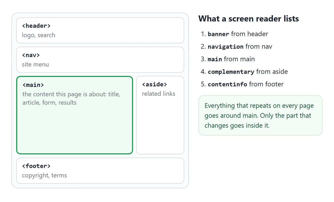
The <main> tag wraps the primary content of a page: the title and the text, form or results that this page exists for. Use it once per page. Leave the site header, menu, sidebar and footer outside it.
<body>
  <header>...</header>
  <nav>...</nav>
  <main id="content">
    <h1>Release notes</h1>
    ...
  </main>
  <aside>...</aside>
  <footer>...</footer>
</body>
On screen, main is a plain block. What it adds is meaning: the browser exposes it as the main landmark.
The example lists the landmarks of a small page. Swap main for a div, add a second one, or nest it, and watch the list and the warnings change.
<!doctype html>
<html lang="en">
<head>
<meta charset="utf-8">
<meta name="viewport" content="width=device-width, initial-scale=1">
<title>main landmark checker</title>
<style>
body { margin: 0; padding: 12px; font-family: system-ui, sans-serif; background: #f4f5f7; color: #1d2330; }
.wrap { display: grid; grid-template-columns: 1fr 1fr; gap: 12px; }
@media (max-width: 560px) { .wrap { grid-template-columns: 1fr; } }
#page { background: #fff; border-radius: 10px; padding: 10px; font-size: 13px; }
#page header, #page nav, #page main, #page aside, #page footer, #page article, #page div {
border: 1px dashed #c3c8d1; border-radius: 8px; padding: 6px 8px; margin: 6px 0;
}
#page main, #page [role="main"] { border: 2px solid #16a34a; background: #f1fbf4; }
#page div#main:not([role]) { border-color: #ea580c; background: #fff7f1; }
.t { font: 600 11px ui-monospace, Consolas, monospace; color: #6b7280; display: block; }
.panel { background: #fff; border-radius: 10px; padding: 10px 12px; font-size: 13px; }
.panel h3 { margin: 0 0 8px; font-size: 14px; }
#list { margin: 0 0 8px; padding-left: 20px; line-height: 1.6; }
.msg { border-radius: 6px; padding: 6px 8px; margin: 6px 0 0; }
.warn { background: #fff4ec; color: #9a3412; }
.ok { background: #ecf8f0; color: #0f5132; }
label { display: block; margin: 5px 0; }
</style>
</head>
<body>
<div class="wrap">
<div id="page"></div>
<div class="panel">
<h3>Landmarks on this page</h3>
<ol id="list"></ol>
<div id="msgs"></div>
<label><input type="checkbox" id="useDiv"> Use <div id="main"> instead of <main></label>
<label><input type="checkbox" id="addRole"> Add role="main" to that div</label>
<label><input type="checkbox" id="second"> Add a second <main></label>
<label><input type="checkbox" id="hide"> Give the second main the hidden attribute</label>
<label><input type="checkbox" id="nest"> Put main inside an <article></label>
</div>
</div>
<script>
const page = document.getElementById('page');
const $ = (id) => document.getElementById(id);
// implicit landmark role of each element (top-level header/footer only)
const roles = { HEADER: 'banner', NAV: 'navigation', MAIN: 'main', ASIDE: 'complementary', FOOTER: 'contentinfo' };
function build() {
const tag = $('useDiv').checked ? 'div' : 'main';
const attrs = tag === 'div' ? ' id="main"' + ($('addRole').checked ? ' role="main"' : '') : '';
let main = '<' + tag + attrs + '><span class="t"><' + tag + attrs.replace(/"/g, '"') + '></span>Article text</' + tag + '>';
if ($('nest').checked) main = '<article><span class="t"><article></span>' + main + '</article>';
let second = '';
if ($('second').checked) {
const h = $('hide').checked ? ' hidden' : '';
second = '<main' + h + '><span class="t"><main' + h + '></span>Another view</main>';
}
page.innerHTML =
'<header><span class="t"><header></span>Acme<nav><span class="t"><nav></span>Home · Docs · Blog</nav></header>' +
main + second +
'<aside><span class="t"><aside></span>Related links</aside>' +
'<footer><span class="t"><footer></span>© Acme</footer>';
}
function check() {
// every element that is or may be a landmark, skipping hidden ones
const els = [...page.querySelectorAll('header, nav, main, aside, footer, [role]')]
.filter((el) => !el.closest('[hidden]'));
$('list').innerHTML = '';
els.forEach((el) => {
const li = document.createElement('li');
li.textContent = el.getAttribute('role') || roles[el.tagName];
$('list').appendChild(li);
});
const out = [];
const mains = els.filter((el) => el.tagName === 'MAIN' || el.getAttribute('role') === 'main');
if (mains.length === 0) out.push(['warn', 'No main landmark. There is nothing to jump to.']);
if (mains.length > 1) out.push(['warn', mains.length + ' visible main landmarks. Only one main may be shown at a time.']);
page.querySelectorAll('main').forEach((m) => {
const bad = m.parentElement.closest('article, aside, header, footer, nav, section');
if (bad) out.push(['warn', 'main is inside <' + bad.tagName.toLowerCase() + '>. It must not be.']);
});
if (!out.length) out.push(['ok', 'One main landmark, in a valid place.']);
$('msgs').innerHTML = '';
out.forEach(([cls, text]) => {
const p = document.createElement('p');
p.className = 'msg ' + cls;
p.textContent = text;
$('msgs').appendChild(p);
});
}
function update() {
$('addRole').disabled = !$('useDiv').checked;
$('hide').disabled = !$('second').checked;
build();
check();
}
document.querySelectorAll('input').forEach((i) => i.addEventListener('change', update));
update();
</script>
</body>
</html>
What goes inside main
Ask what changes from page to page. On a blog, the post changes and the header does not. On a search page, the results change and the search box in the header may not.
- Inside: the page's
<h1>, the article, the form, the results, the in-page table of contents. - Outside: the logo, the site search, the site menu, a sidebar of related links, the copyright footer.
A sidebar that belongs to this one article, such as a pull quote, may sit inside main as an <aside>. A sidebar repeated on every page belongs next to main.
One visible main per page
The HTML standard allows only one main element without the hidden attribute. Two visible mains give two main landmarks, and neither is clearly the content.
Single-page apps that keep several views in the document can still use a main per view. Hide every inactive one with the hidden attribute:
<main id="inbox">...</main>
<main id="settings" hidden>...</main>
Switch views by moving hidden, not by toggling a CSS class. display: none from a class hides the view, but only the attribute satisfies the rule.
Watch for one trap: a CSS rule such as main { display: flex } overrides hidden, and both views show at once.
Where main is allowed to sit
main belongs at the top of the structure. The standard only allows it inside html, body, div, a form without an accessible name, or a custom element.
So these are all wrong: main inside <article>, <section>, <aside>, <header>, <footer> or <nav>. The reverse is fine. An article or several section elements inside main is the usual shape of a content page.
A wrapper div around everything is fine too. Layout wrappers such as <div class="page"> do not break the rule, because div is on the allowed list.
main vs div id="main"
Many older layouts use <div id="main">. It looks identical, and it still works for CSS. What it lacks is a role.
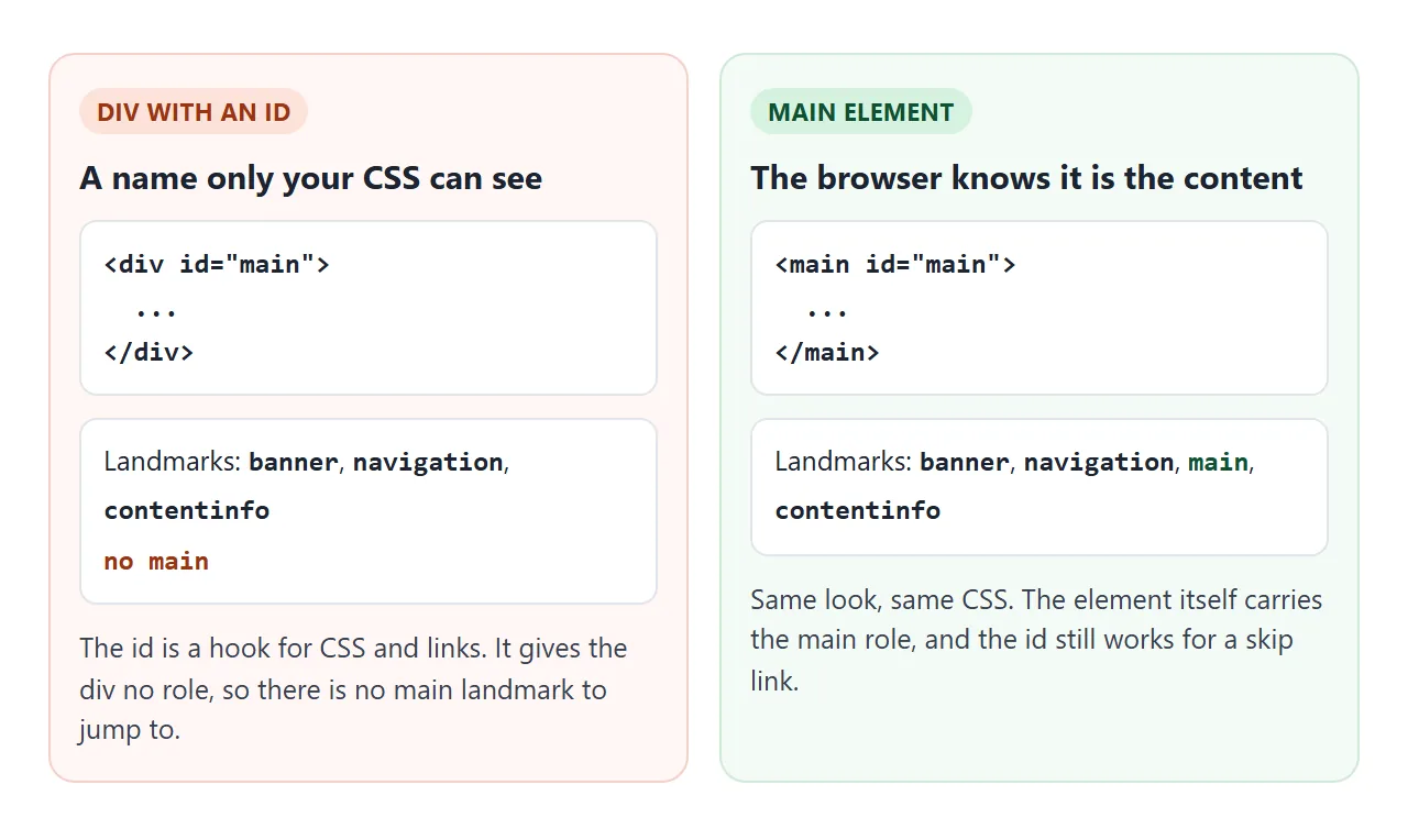
<div id="main"> |
<main> |
<section> |
|
|---|---|---|---|
| Landmark | None | main | Region, only when it has a name |
| How many per page | Any | One visible | Any |
| Can sit inside article | Yes | No | Yes |
If you cannot change the markup, role="main" on the div gives the same landmark. When you can, switch the tag. The id can stay, and it is useful for the next part.
The skip link target
A skip link is the first link on the page, pointing at main. A keyboard user presses Tab once, sees it, presses Enter, and lands past the whole menu. The nav tag guide covers the header side of it.
The main side needs two attributes: an id that matches the link, and tabindex="-1".
<!doctype html>
<html lang="en">
<head>
<meta charset="utf-8">
<meta name="viewport" content="width=device-width, initial-scale=1">
<title>Skip link to main</title>
<style>
  body { margin: 0; font-family: system-ui, sans-serif; background: #f4f5f7; color: #1d2330; }
  /* off screen until it gets keyboard focus */
  .skip {
    position: absolute; left: 8px; top: -60px; z-index: 10;
    background: #1d2330; color: #fff; padding: 10px 14px; border-radius: 8px;
  }
  .skip:focus { top: 8px; }
  header { background: #fff; padding: 12px 14px; border-bottom: 1px solid #e1e4ea; }
  nav ul { list-style: none; margin: 8px 0 0; padding: 0; display: flex; flex-wrap: wrap; gap: 6px 14px; }
  nav a { color: #1d4ed8; }
  main { padding: 14px; }
  main:focus { outline: 3px solid #16a34a; outline-offset: -3px; }
  .status { margin: 0 14px 14px; padding: 8px 10px; border-radius: 8px; background: #fff; font-size: 14px; }
  .status b { font-family: ui-monospace, Consolas, monospace; }
  label { display: block; margin: 0 14px 8px; font-size: 14px; }
</style>
</head>
<body>
<a class="skip" href="#content">Skip to main content</a>
<header>
  <b>Acme Store</b>
  <nav aria-label="Main">
    <ul>
      <li><a href="#">Phones</a></li><li><a href="#">Laptops</a></li><li><a href="#">Tablets</a></li>
      <li><a href="#">Audio</a></li><li><a href="#">Cameras</a></li><li><a href="#">Gaming</a></li>
      <li><a href="#">Watches</a></li><li><a href="#">TV</a></li><li><a href="#">Deals</a></li>
      <li><a href="#">Help</a></li>
    </ul>
  </nav>
</header>

<main id="content" tabindex="-1">
  <h1 style="margin:0 0 6px;font-size:20px">Today's deals</h1>
  <p style="margin:0 0 8px">Press Tab once, then Enter. Then press Tab again.</p>
  <a href="#">First link inside main</a>
</main>

<label><input type="checkbox" id="noTab"> Remove tabindex="-1" from main</label>
<p class="status">Focus is on: <b id="where">body</b></p>

<script>
  const main = document.getElementById('content');
  const where = document.getElementById('where');

  // show which element holds focus right now
  function report() {
    const el = document.activeElement;
    where.textContent = el.tagName.toLowerCase() + (el.id ? '#' + el.id : '') +
      (el.tagName === 'A' ? ' "' + el.textContent + '"' : '');
  }
  document.addEventListener('focusin', report);
  document.addEventListener('focusout', () => setTimeout(report));

  document.getElementById('noTab').addEventListener('change', (e) => {
    if (e.target.checked) main.removeAttribute('tabindex');
    else main.setAttribute('tabindex', '-1');
  });
</script>
</body>
</html>
- With
tabindex="-1", Enter moves focus ontomainitself. The next Tab continues from there. - Without it, main cannot take focus. In Chromium, focus falls back to the body, though the next Tab still continues inside main. Tick the checkbox to see it.
The value -1 lets a link or a script focus main without adding a stop to the Tab order. tabindex explains the values.
Keep the footer at the bottom with main flex: 1
On a short page, the footer rises to wherever the content ends, and the lower half of the window stays empty. The fix is three lines of flexbox.
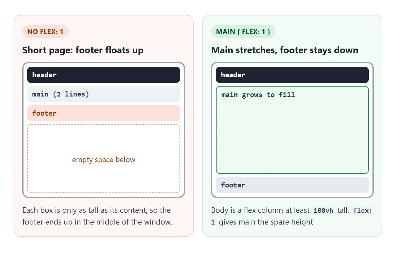
body {
  min-height: 100vh;
  display: flex;
  flex-direction: column;
}
main { flex: 1; }
Body becomes a column at least one window tall. flex: 1 hands all the spare height to main, which pushes the footer down. On a long page there is no spare height, and the footer simply follows the content. Flexbox covers the property in full.
With a sidebar, wrap main and aside in a row and give the row flex: 1 instead. That is what the finished example does.
<!doctype html>
<html lang="en">
<head>
<meta charset="utf-8">
<meta name="viewport" content="width=device-width, initial-scale=1">
<title>Page shell with a sticky footer</title>
<style>
  * { box-sizing: border-box; }
  body {
    margin: 0; font-family: system-ui, sans-serif; color: #1d2330; background: #f4f5f7;
    min-height: 100vh;       /* at least one screen tall */
    display: flex;
    flex-direction: column;  /* header, middle, footer stacked */
  }
  header { background: #1d2330; color: #fff; padding: 10px 16px; display: flex; flex-wrap: wrap; gap: 6px 18px; align-items: center; }
  header nav { display: flex; flex-wrap: wrap; gap: 14px; }
  header a { color: #cfe0ff; }
  .middle {
    flex: 1;                 /* takes all spare height, so the footer sits at the bottom */
    display: flex; gap: 16px; padding: 16px;
  }
  main { flex: 1; background: #fff; border-radius: 10px; padding: 14px 16px; }
  aside { width: 180px; background: #fff; border-radius: 10px; padding: 14px 16px; font-size: 14px; }
  footer { background: #e6e9ef; padding: 10px 16px; font-size: 14px; }
  main h1 { margin: 0 0 8px; font-size: 20px; }
  .controls { display: flex; flex-wrap: wrap; gap: 8px 16px; align-items: center; margin-bottom: 8px; font-size: 14px; }
  /* the broken version, for comparison */
  body.broken .middle { flex: none; }
  /* phones: sidebar drops under the main content */
  @media (max-width: 600px) {
    .middle { flex-direction: column; padding: 10px; }
    aside { width: auto; }
  }
</style>
</head>
<body>
<header>
  <b>Acme</b>
  <nav aria-label="Main"><a href="#">Home</a><a href="#">Docs</a><a href="#">Blog</a></nav>
</header>

<div class="middle">
  <main>
    <h1>Release notes</h1>
    <div class="controls">
      <button id="more" type="button">Add a paragraph</button>
      <button id="less" type="button">Remove one</button>
      <label><input type="checkbox" id="broken"> Remove flex: 1</label>
    </div>
    <div id="text"><p>Version 2.4 is out.</p></div>
  </main>
  <aside>
    <b>On this page</b>
    <p>Related releases and links.</p>
  </aside>
</div>

<footer>© Acme · Terms · Privacy</footer>

<script>
  const text = document.getElementById('text');
  document.getElementById('more').addEventListener('click', () => {
    const p = document.createElement('p');
    p.textContent = 'Paragraph ' + (text.children.length + 1) + '. More notes about this release.';
    text.appendChild(p);
  });
  document.getElementById('less').addEventListener('click', () => {
    if (text.children.length > 1) text.lastElementChild.remove();
  });
  document.getElementById('broken').addEventListener('change', (e) => {
    document.body.classList.toggle('broken', e.target.checked);
  });
</script>
</body>
</html>
When it does not work
| What you see | Cause | Fix |
|---|---|---|
| Two main landmarks are listed | Two main elements without hidden |
Keep one visible, add hidden to the rest |
| A validator flags main | main is inside article, section or header |
Move it up to body or a plain div |
| No main landmark at all | Layout uses <div id="main"> |
Change the tag to main, or add role="main" |
| Footer floats in the middle of a short page | Nothing takes the spare height | Flex column on body, flex: 1 on main |
| The skip link scrolls, but focus stays behind | main is not focusable | Add tabindex="-1" to main |
| A hidden view still shows | CSS display on main overrides hidden |
Add main[hidden] { display: none; } |
Share it as a link
Landmarks and focus are hard to show in a screenshot, and an .html attachment may open as plain code on a phone. A working page lets people press Tab and see for themselves.
Paste the page into a NOS document and choose Create share link. HTML to link walks through it.
The page renders as written and its scripts run, so the people you send it to can try the skip link and resize the layout. If you change the code later, the same link shows the new version.