A page footer is a <footer> element placed as a child of <body>, after <main>.
In that position it is the page's contentinfo landmark, the part screen reader users can jump to for contact details, links and the copyright line. The same tag inside an <article> is just that article's footer.
Try it first. Move the page footer around and watch which footers count as landmarks.
<!doctype html>
<html lang="en">
<head>
<meta charset="utf-8">
<meta name="viewport" content="width=device-width, initial-scale=1">
<title>Which footer is a landmark?</title>
<style>
  body { margin: 0; padding: 14px; font-family: system-ui, sans-serif; background: #f4f5f7; color: #1d2330; }
  .controls { display: flex; flex-wrap: wrap; gap: 6px 16px; margin-bottom: 12px; font-size: 14px; }
  .controls label { display: flex; align-items: center; gap: 6px; }
  .wrap { display: grid; grid-template-columns: 1fr 1fr; gap: 12px; }
  @media (max-width: 560px) { .wrap { grid-template-columns: 1fr; } }
  .box { background: #fff; border: 1px solid #dde1e7; border-radius: 10px; padding: 10px; }
  .box h2 { margin: 0 0 8px; font-size: 13px; text-transform: uppercase; letter-spacing: .04em; color: #5b6472; }
  /* outline every element of the sample page so you can see the nesting */
  #sample * { display: block; margin: 4px 0; padding: 4px 8px; border: 1px dashed #b8c0cc; border-radius: 6px; font-size: 13px; }
  #sample footer { border-color: #2563eb; background: #eff5ff; }
  #tree { list-style: none; margin: 0; padding: 0; font: 13px/1.5 ui-monospace, Consolas, monospace; }
  #tree li { padding: 3px 6px; border-radius: 5px; }
  .land { background: #e3f5e9; color: #0f5132; }
  .none { background: #f1f2f4; color: #5b6472; }
  #warn { margin: 8px 0 0; font-size: 13px; color: #9a3412; min-height: 1.4em; }
</style>
</head>
<body>
<div class="controls">
  <label>Page footer sits in
    <select id="where">
      <option value="body">body</option>
      <option value="div">a plain div</option>
      <option value="main">main</option>
      <option value="section">section</option>
    </select>
  </label>
  <label><input type="checkbox" id="second"> Add a second page footer</label>
</div>

<div class="wrap">
  <div class="box"><h2>Sample page</h2><div id="sample"></div></div>
  <div class="box"><h2>Roles (built from the rule)</h2><ul id="tree"></ul><p id="warn"></p></div>
</div>

<script>
  const sample = document.getElementById('sample');
  const where = document.getElementById('where');
  const second = document.getElementById('second');

  // The rule: header and footer are landmarks only when no
  // article, aside, main, nav or section sits between them and body.
  const SCOPES = 'article, aside, main, nav, section';
  function roleOf(el) {
    const tag = el.tagName.toLowerCase();
    if (tag === 'main') return 'main';
    if (tag === 'article') return 'article';
    if (tag === 'header' || tag === 'footer') {
      if (el.parentElement.closest(SCOPES)) return null;  // scoped: not a landmark
      return tag === 'header' ? 'banner' : 'contentinfo';
    }
    return undefined;  // not listed
  }

  function build() {
    const pageFooter = '<footer>page footer: © 2026 Acme</footer>';
    const extra = second.checked ? '<footer>second page footer</footer>' : '';
    const article = '<article>article<footer>article footer: by Ana, 3 May</footer></article>';
    let html;
    if (where.value === 'main') html = `<header>header</header><main>main${article}${pageFooter}</main>`;
    else if (where.value === 'section') html = `<header>header</header><main>main${article}</main><section>section${pageFooter}</section>`;
    else if (where.value === 'div') html = `<header>header</header><main>main${article}</main><div>div${pageFooter}</div>`;
    else html = `<header>header</header><main>main${article}</main>${pageFooter}`;
    sample.innerHTML = html + extra;

    const tree = document.getElementById('tree');
    tree.innerHTML = '';
    let count = 0;
    sample.querySelectorAll('*').forEach((el) => {
      const role = roleOf(el);
      if (role === undefined) return;
      const depth = (function d(n) { let k = 0; while ((n = n.parentElement) !== sample) k++; return k; })(el);
      const li = document.createElement('li');
      const tag = '<' + el.tagName.toLowerCase() + '>';
      li.textContent = '  '.repeat(depth) + tag + '  ' + (role ? role + (role === 'article' ? '' : ' landmark') : 'not a landmark');
      li.className = role && role !== 'article' ? 'land' : 'none';
      li.dataset.role = role || 'none';
      if (role === 'contentinfo') count++;
      tree.append(li);
    });
    document.getElementById('warn').textContent =
      count === 0 ? 'No contentinfo landmark: the page footer is inside a scoping element.'
      : count > 1 ? count + ' contentinfo landmarks. A page should have one.' : '';
  }

  where.addEventListener('change', build);
  second.addEventListener('change', build);
  build();
</script>
</body>
</html>
The list on the right is built from one rule in the script, the same rule the HTML accessibility mapping uses. Scroll down for the columns, the layout and a finished footer.
Page footer vs article footer
<footer> holds information about its nearest section: who wrote it, when, related links, copyright. Which section that is depends on where the tag sits.
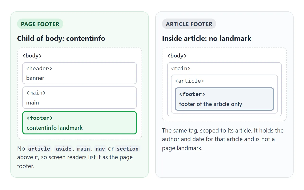
If there is an article, aside, main, nav or section between the footer and body, it belongs to that element. Otherwise it belongs to the page and gets the contentinfo role.
| Where the footer sits | Role | Typical content |
|---|---|---|
Child of body |
contentinfo landmark | Site links, contact, copyright |
Inside a plain div in body |
contentinfo landmark | Same, a div does not scope it |
Inside article |
No landmark | Author, date, tags of that post |
Inside section or aside |
No landmark | Notes for that section |
Inside main |
No landmark | Nothing site-wide should go here |
Use one page footer. Two footers at body level produce two contentinfo landmarks, and the demo above warns about it. The standard also says a footer may not contain another header or footer.
What goes inside a site footer
Pick the element that says what each part is. The browser and assistive technology then know without extra attributes.
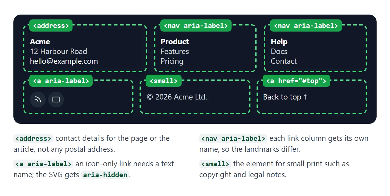
<footer class="site-footer">
  <nav aria-label="Product">
    <h2>Product</h2>
    <ul><li><a href="/pricing">Pricing</a></li></ul>
  </nav>
  <address>
    <a href="mailto:hello@example.com">hello@example.com</a>
  </address>
  <small>© 2026 Acme Ltd.</small>
</footer>
- Link columns:
navwith anaria-labelwhen a column repeats major navigation. <address>: contact details of the page or article owner, not any address in the text.<small>: small print such as copyright and legal lines. CSS still sets its size.
A short list of terms and privacy links can stay a plain list without nav. The nav tag explains when a nav is worth it.
A multi-column footer that stacks on phones
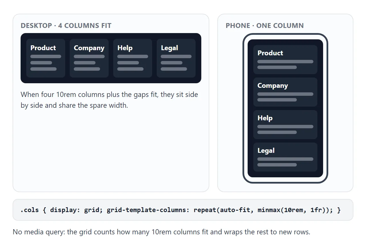
One grid line makes four columns on a laptop and one on a phone, with no media query.
.cols {
  display: grid;
  grid-template-columns: repeat(auto-fit, minmax(10rem, 1fr));
  gap: 18px 24px;
}
minmax(10rem, 1fr) says a column is at least 10rem wide. auto-fit makes as many columns as fit and wraps the rest to the next row. Drag the width slider and watch the count.
<!doctype html>
<html lang="en">
<head>
<meta charset="utf-8">
<meta name="viewport" content="width=device-width, initial-scale=1">
<title>Footer columns that stack</title>
<style>
  body { margin: 0; padding: 14px; font-family: system-ui, sans-serif; background: #f4f5f7; color: #1d2330; }
  .controls { font-size: 14px; margin-bottom: 12px; display: flex; flex-wrap: wrap; align-items: center; gap: 8px; }
  .controls input { width: 180px; }

  .site-footer { background: #fff; border: 1px solid #dde1e7; border-radius: 10px; padding: 18px; }
  /* as many 10rem columns as fit; on a phone that is one */
  .cols {
    display: grid;
    grid-template-columns: repeat(auto-fit, minmax(10rem, 1fr));
    gap: 18px 24px;
  }
  .cols h2 { font-size: 14px; margin: 0 0 6px; }
  .cols ul { list-style: none; margin: 0; padding: 0; }
  .cols li { margin: 4px 0; }
  .cols a { color: #1d4ed8; font-size: 14px; }

  form { margin-top: 18px; padding-top: 14px; border-top: 1px solid #e5e7eb; display: flex; flex-wrap: wrap; gap: 8px; align-items: end; }
  form label { display: grid; gap: 4px; font-size: 14px; flex: 1 1 14rem; }
  form input { font: inherit; padding: 8px 10px; border: 1px solid #b8c0cc; border-radius: 6px; }
  form button { font: inherit; padding: 8px 14px; border: 0; border-radius: 6px; background: #1d4ed8; color: #fff; cursor: pointer; }
  #sent { font-size: 13px; color: #0f5132; margin: 8px 0 0; min-height: 1.4em; }
  small { display: block; margin-top: 12px; color: #4b5563; }
</style>
</head>
<body>
<div class="controls">
  <label for="w">Footer width</label>
  <input type="range" id="w" min="260" max="900" value="900">
  <span id="info"></span>
</div>

<footer class="site-footer" id="footer">
  <div class="cols">
    <div><h2>Product</h2><ul><li><a href="#">Features</a></li><li><a href="#">Pricing</a></li><li><a href="#">Changelog</a></li></ul></div>
    <div><h2>Company</h2><ul><li><a href="#">About</a></li><li><a href="#">Jobs</a></li><li><a href="#">Press</a></li></ul></div>
    <div><h2>Help</h2><ul><li><a href="#">Docs</a></li><li><a href="#">Contact</a></li><li><a href="#">Status</a></li></ul></div>
    <div><h2>Legal</h2><ul><li><a href="#">Terms</a></li><li><a href="#">Privacy</a></li><li><a href="#">Cookies</a></li></ul></div>
  </div>

  <form id="news">
    <label>Monthly newsletter
      <input type="email" name="email" required placeholder="you@example.com" autocomplete="email">
    </label>
    <button>Subscribe</button>
  </form>
  <p id="sent" role="status"></p>

  <small>© 2026 Acme Ltd.</small>
</footer>

<script>
  const footer = document.getElementById('footer');
  const range = document.getElementById('w');
  const info = document.getElementById('info');

  // Count the columns the grid actually made
  function report() {
    const cols = getComputedStyle(footer.querySelector('.cols')).gridTemplateColumns.split(' ').length;
    info.textContent = footer.offsetWidth + 'px wide, ' + cols + (cols === 1 ? ' column' : ' columns');
  }
  range.addEventListener('input', () => { footer.style.maxWidth = range.value + 'px'; report(); });
  addEventListener('resize', report);
  report();

  // Demo only: show what would be sent instead of sending it
  document.getElementById('news').addEventListener('submit', (e) => {
    e.preventDefault();
    const data = new FormData(e.target);
    document.getElementById('sent').textContent = 'Would send: email=' + data.get('email');
    e.target.reset();
  });
</script>
</body>
</html>
The newsletter form is a real form with a label and type="email", so the browser checks the address before submit. The demo stops at preventDefault(). On a live site, point the form at your mailing service:
<form action="https://your-list-service.example/subscribe" method="post">
Keep the footer at the bottom of short pages
On a page with little content, the footer rises to wherever the content ends and leaves an empty band below it. Make body a flex column at least one window tall, and let main take the spare height:
body { min-height: 100vh; display: flex; flex-direction: column; }
main { flex: 1; }
On a long page there is no spare height, so the footer simply follows the content. The main tag guide walks through this layout with a sidebar.
If the footer must stay on screen while the page scrolls, that is a different layout, covered in fixed header and footer.
Social icons and back-to-top links need names
An icon-only link has no text, so a screen reader has nothing to announce, or reads the file name. Give the link a name and hide the drawing:
<a href="https://example.com/feed" aria-label="RSS feed">
  <svg viewBox="0 0 24 24" aria-hidden="true">...</svg>
</a>
aria-label covers the attribute in detail.
A back-to-top link is one line: <a href="#top">Back to top</a>.
The HTML standard treats the fragment #top as the top of the document even with no element of that id. For a button that appears after scrolling, see back to top button.
A dark footer with readable small text
Dark footers are common, and their small grey text is often too faint. WCAG asks for a contrast ratio of at least 4.5:1 for normal-size text and 3:1 for large text.
| Text | Colour on #111827 | Contrast | Passes 4.5:1 |
|---|---|---|---|
| Body text | #d1d5db | 12.0:1 | Yes |
| Copyright in small | #9ca3af | 7.0:1 | Yes |
| Grey often used | #4b5563 | 2.4:1 | No |
Smaller type needs the same ratio, not a lower one. Keep link underlines, or another cue that is not colour alone, and give links a visible :focus-visible outline.
A finished site footer
Everything above in one page: a sticky footer layout, contact details in address, three labelled navs, named social icons, the copyright in small and a back-to-top link.
<!doctype html>
<html lang="en">
<head>
<meta charset="utf-8">
<meta name="viewport" content="width=device-width, initial-scale=1">
<title>A complete site footer</title>
<style>
  * { box-sizing: border-box; }
  /* sticky footer: body is a column at least one window tall, main takes the spare height */
  body { margin: 0; min-height: 100vh; display: flex; flex-direction: column; font-family: system-ui, sans-serif; color: #1d2330; background: #f4f5f7; }
  main { flex: 1; padding: 16px 20px; }
  header { padding: 12px 20px; background: #fff; border-bottom: 1px solid #e5e7eb; display: flex; justify-content: space-between; align-items: center; gap: 10px; }
  header b { font-size: 18px; }
  header button { font: inherit; font-size: 14px; padding: 6px 10px; border: 1px solid #b8c0cc; border-radius: 6px; background: #fff; cursor: pointer; }
  main p { max-width: 60ch; line-height: 1.55; }

  /* dark footer: every text colour below passes 4.5:1 on #111827 */
  .site-footer { background: #111827; color: #d1d5db; padding: 28px 20px 18px; font-size: 14px; }
  .site-footer a { color: #f3f4f6; }
  .site-footer a:focus-visible { outline: 2px solid #93c5fd; outline-offset: 2px; }
  .grid { display: grid; grid-template-columns: repeat(auto-fit, minmax(9.5rem, 1fr)); gap: 22px 28px; }
  .brand { font-size: 20px; font-weight: 700; color: #fff; margin: 0 0 6px; }
  address { font-style: normal; line-height: 1.6; }
  .site-footer h2 { font-size: 13px; letter-spacing: .06em; text-transform: uppercase; color: #fff; margin: 0 0 8px; }
  .site-footer ul { list-style: none; margin: 0; padding: 0; }
  .site-footer li { margin: 6px 0; }
  .social { display: flex; gap: 10px; margin-top: 12px; }
  .social a { display: grid; place-items: center; width: 40px; height: 40px; border-radius: 50%; background: #1f2937; }
  .social svg { width: 20px; height: 20px; fill: none; stroke: currentColor; stroke-width: 2; stroke-linecap: round; stroke-linejoin: round; }
  .bottom { margin-top: 24px; padding-top: 14px; border-top: 1px solid #374151; display: flex; flex-wrap: wrap; justify-content: space-between; gap: 8px; }
  .bottom small { color: #9ca3af; font-size: 13px; }
</style>
</head>
<body>
<header id="top">
  <b>Acme</b>
  <button id="len" aria-pressed="false">Make the page long</button>
</header>

<main id="content">
  <h1>Short page</h1>
  <p>This page has one paragraph, and the footer still sits at the bottom of the window.</p>
</main>

<footer class="site-footer">
  <div class="grid">
    <div>
      <p class="brand">Acme</p>
      <address>
        12 Harbour Road, Leeds<br>
        <a href="mailto:hello@example.com">hello@example.com</a><br>
        <a href="tel:+441130000000">+44 113 000 0000</a>
      </address>
      <div class="social">
        <!-- the name lives on the link; the drawing is hidden from screen readers -->
        <a href="#" aria-label="RSS feed"><svg viewBox="0 0 24 24" aria-hidden="true"><path d="M4 11a9 9 0 0 1 9 9M4 4a16 16 0 0 1 16 16"/><circle cx="5" cy="19" r="1"/></svg></a>
        <a href="#" aria-label="Email newsletter"><svg viewBox="0 0 24 24" aria-hidden="true"><rect x="3" y="5" width="18" height="14" rx="2"/><path d="m3 7 9 6 9-6"/></svg></a>
        <a href="#" aria-label="Video channel"><svg viewBox="0 0 24 24" aria-hidden="true"><rect x="2" y="5" width="20" height="14" rx="3"/><path d="m10 9 5 3-5 3z"/></svg></a>
      </div>
    </div>
    <nav aria-label="Product">
      <h2>Product</h2>
      <ul><li><a href="#">Features</a></li><li><a href="#">Pricing</a></li><li><a href="#">Changelog</a></li></ul>
    </nav>
    <nav aria-label="Company">
      <h2>Company</h2>
      <ul><li><a href="#">About</a></li><li><a href="#">Jobs</a></li><li><a href="#">Press</a></li></ul>
    </nav>
    <nav aria-label="Help">
      <h2>Help</h2>
      <ul><li><a href="#">Docs</a></li><li><a href="#">Contact</a></li><li><a href="#">Status</a></li></ul>
    </nav>
  </div>

  <div class="bottom">
    <small>© <span id="year">2026</span> Acme Ltd. All rights reserved.</small>
    <a href="#top">Back to top ↑</a>
  </div>
</footer>

<script>
  document.getElementById('year').textContent = new Date().getFullYear();

  // Demo toggle: add paragraphs to see the footer follow long content
  const btn = document.getElementById('len');
  const main = document.getElementById('content');
  const short = main.innerHTML;
  btn.addEventListener('click', () => {
    const long = btn.getAttribute('aria-pressed') === 'false';
    btn.setAttribute('aria-pressed', long);
    btn.textContent = long ? 'Make the page short' : 'Make the page long';
    main.innerHTML = long
      ? '<h1>Long page</h1>' + '<p>A long page pushes the footer below the window. Scroll down, then use Back to top.</p>'.repeat(14)
      : short;
  });
</script>
</body>
</html>
When it does not work
| What you see | Cause | Fix |
|---|---|---|
| Footer floats mid-page on short pages | Nothing takes the spare height | Flex column on body, flex: 1 on main |
| Two or more contentinfo landmarks | Several footers at body level | Keep one page footer, scope the rest in article or section |
| No contentinfo landmark at all | Page footer is inside main or section | Move it to be a child of body |
| Screen reader says "link" with no name | Icon link without text | aria-label on the link, aria-hidden on the SVG |
| Landmark list shows several unnamed navigations | Footer navs without labels | aria-label on each nav, or drop nav for short lists |
| Copyright line hard to read | Grey small text below 4.5:1 | Lighten the text or darken the background |
| Columns squeeze into slivers on a phone | Fixed repeat(4, 1fr) |
repeat(auto-fit, minmax(10rem, 1fr)) |
Share it as a link
A footer is easiest to review on the device where people will see it. A screenshot shows one width only, and a zipped template needs someone to open it locally.
Paste the page into a NOS document and choose Create share link. HTML to link walks through it.
The page renders as written and its scripts run, so reviewers can narrow the window, tab through the links and try the form. If you change the code later, the same link shows the new version.