A hamburger menu is a <button> with three lines drawn in CSS. Clicking it flips aria-expanded between "false" and "true". The CSS reads that attribute to turn the lines into an X and slide the links into view.
A media query hides the button on wide screens, where the links fit in one row.
Click the icon below, then turn on slow motion to watch each line move.
<!doctype html>
<html lang="en">
<head>
<meta charset="utf-8">
<meta name="viewport" content="width=device-width, initial-scale=1">
<title>Hamburger icon to X</title>
<style>
  body {
    margin: 0; min-height: 100vh; display: grid; place-content: center; gap: 14px;
    font-family: system-ui, sans-serif; background: #f4f5f7; color: #1d2330; text-align: center;
  }
  .burger {
    position: relative; width: 48px; height: 48px; margin: 0 auto;
    border: 0; border-radius: 10px; background: #1d2330; cursor: pointer;
  }
  .burger:focus-visible { outline: 3px solid #2563eb; outline-offset: 3px; }

  /* the three lines: 24px wide, 4px tall, centres 8px apart */
  .burger span {
    position: absolute; left: 12px; width: 24px; height: 4px;
    border-radius: 2px; background: #fff;
    transform-origin: center;  /* the default, written out: each line turns around its own middle */
    transition: transform .25s ease, opacity .2s ease;
  }
  .burger span:nth-child(1) { top: 14px; }
  .burger span:nth-child(2) { top: 22px; }
  .burger span:nth-child(3) { top: 30px; }

  /* open: move the outer lines to the middle, then turn them */
  .burger[aria-expanded="true"] span:nth-child(1) { transform: translateY(8px) rotate(45deg); }
  .burger[aria-expanded="true"] span:nth-child(2) { opacity: 0; }
  .burger[aria-expanded="true"] span:nth-child(3) { transform: translateY(-8px) rotate(-45deg); }

  /* people who ask for less motion get an instant swap */
  @media (prefers-reduced-motion: reduce) {
    .burger span { transition: none; }
  }

  .slow .burger span { transition-duration: 1.2s; }
  code { font: 600 13px ui-monospace, Consolas, monospace; background: #e6e9ef; border-radius: 5px; padding: 2px 6px; }
  label { font-size: 13px; color: #5b6270; }
</style>
</head>
<body>
<button class="burger" id="burger" type="button" aria-label="Menu" aria-expanded="false">
  <span></span><span></span><span></span>
</button>
<div>aria-expanded = <code id="state">false</code></div>
<label><input type="checkbox" id="slow"> Slow motion</label>

<script>
  const burger = document.getElementById('burger');

  burger.addEventListener('click', () => {
    const open = burger.getAttribute('aria-expanded') === 'true';
    burger.setAttribute('aria-expanded', String(!open));  // the CSS reads this attribute
    document.getElementById('state').textContent = String(!open);
  });

  // only for this demo: stretch the animation so you can watch it
  document.getElementById('slow').addEventListener('change', (e) => {
    document.body.classList.toggle('slow', e.target.checked);
  });
</script>
</body>
</html>
This page is about the menu button and its panel. Building the bar itself is covered in HTML and CSS navbar, and the <nav> element and its landmark role in the HTML nav tag.
Start with a real button
The markup is short, and every attribute has a job:
<button class="burger" type="button" aria-label="Menu"
        aria-expanded="false" aria-controls="site-menu">
  <span></span><span></span><span></span>
</button>
<nav aria-label="Main">
  <ul class="menu" id="site-menu"> ... links ... </ul>
</nav>
<button>gets focus with Tab and firesclickon Enter and Space by itself. A<div>with a click listener does neither.aria-label="Menu"gives the icon a name. The three empty spans have no text to read out.aria-expandedsays whether the menu is open. It must change every time the menu does.aria-controlspoints at theidof the list the button opens.
Draw the icon and animate it into an X
Each line is a <span> with position: absolute, a width, a height and a background. Pseudo-elements (::before and ::after on one span) work too. Separate spans are easier to read and to animate one by one.
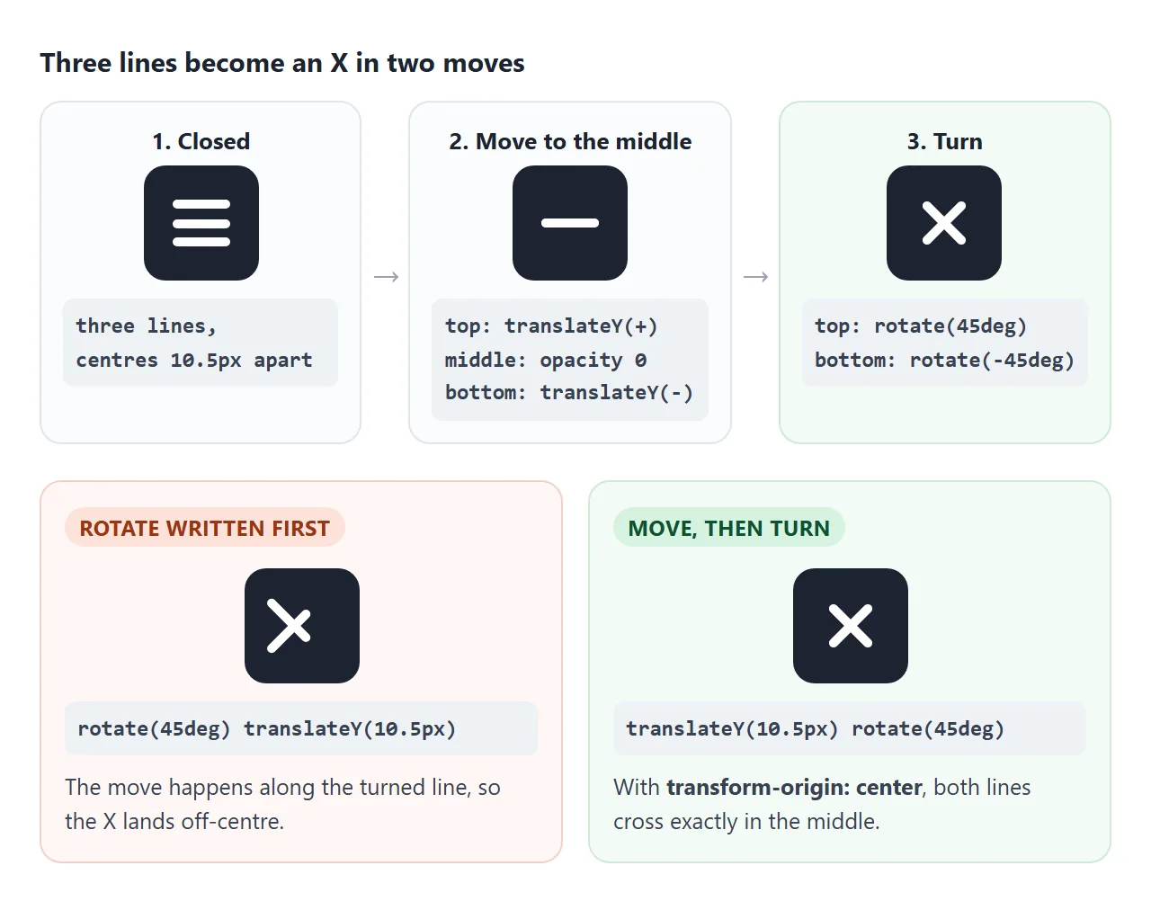
The open state is two moves. The top line slides down to the middle and turns 45 degrees. The bottom line slides up and turns -45 degrees. The middle line fades out.
.burger span { transition: transform .25s ease, opacity .2s ease; }
.burger[aria-expanded="true"] span:nth-child(1) { transform: translateY(8px) rotate(45deg); }
.burger[aria-expanded="true"] span:nth-child(2) { opacity: 0; }
.burger[aria-expanded="true"] span:nth-child(3) { transform: translateY(-8px) rotate(-45deg); }
The distance (8px here) is the gap between the centres of two neighbouring lines. Get it wrong and the X is lopsided.
Order matters inside transform. translateY(8px) rotate(45deg) moves straight down, then turns. rotate(45deg) translateY(8px) moves along the turned line, so the X lands off-centre. CSS transform explains the order rule.
Some people set their system to reduce motion. Respect it with one rule:
@media (prefers-reduced-motion: reduce) {
  .burger span { transition: none; }
}
Drop-down or off-canvas drawer
The button and the script stay the same. Only the CSS for the closed and open list changes. Switch between the two versions here:
<!doctype html>
<html lang="en">
<head>
<meta charset="utf-8">
<meta name="viewport" content="width=device-width, initial-scale=1">
<title>Drop-down or drawer</title>
<style>
  body { margin: 0; padding: 14px; font-family: system-ui, sans-serif; background: #f4f5f7; color: #1d2330; }
  .pick { display: flex; justify-content: center; gap: 6px; margin-bottom: 12px; font-size: 14px; }
  .pick label { padding: 6px 12px; border: 1px solid #c9cdd4; border-radius: 99px; background: #fff; cursor: pointer; }
  .pick label:has(input:checked) { background: #1d2330; color: #fff; border-color: #1d2330; }
  .pick input { accent-color: #fff; margin: 0 4px 0 0; }

  /* a phone-sized page */
  .screen {
    position: relative; max-width: 340px; height: 310px; margin: 0 auto;
    overflow: hidden; border: 1px solid #d5d9e0; border-radius: 16px; background: #fff;
  }
  .bar {
    position: relative; z-index: 3; height: 52px; padding: 0 8px 0 16px;
    display: flex; align-items: center; justify-content: space-between;
    background: #fff; border-bottom: 1px solid #e5e7eb; font-weight: 700;
  }
  .content { padding: 16px; }
  .content i { display: block; height: 10px; margin: 0 0 10px; border-radius: 5px; background: #eceef2; }

  /* the burger from the first example, a little smaller */
  .burger { position: relative; width: 40px; height: 40px; border: 0; border-radius: 8px; background: none; cursor: pointer; }
  .burger span { position: absolute; left: 9px; width: 22px; height: 3px; border-radius: 2px; background: #1d2330; transition: transform .25s, opacity .2s; }
  .burger span:nth-child(1) { top: 12px; } .burger span:nth-child(2) { top: 18.5px; } .burger span:nth-child(3) { top: 25px; }
  .burger[aria-expanded="true"] span:nth-child(1) { transform: translateY(6.5px) rotate(45deg); }
  .burger[aria-expanded="true"] span:nth-child(2) { opacity: 0; }
  .burger[aria-expanded="true"] span:nth-child(3) { transform: translateY(-6.5px) rotate(-45deg); }

  /* closed: moved out of view AND visibility: hidden, so Tab and screen readers skip it */
  .menu {
    position: absolute; z-index: 2; margin: 0; padding: 8px 0; list-style: none; background: #fff;
    visibility: hidden;
    transition: transform .25s ease, visibility 0s .25s;  /* hide only after the slide ends */
  }
  .menu a { display: block; padding: 11px 18px; color: #1d2330; text-decoration: none; }
  .menu a:hover, .menu a:focus-visible { background: #eef2ff; }

  .menu.drop   { top: 52px; left: 0; right: 0; transform: translateY(-100%); box-shadow: 0 10px 20px rgba(0,0,0,.1); }
  .menu.drawer { top: 52px; bottom: 0; right: 0; width: 72%; transform: translateX(100%); box-shadow: -8px 0 20px rgba(0,0,0,.12); }

  .menu.open { visibility: visible; transform: none; transition: transform .25s ease, visibility 0s; }

  .shade { position: absolute; inset: 52px 0 0; z-index: 1; background: rgba(15,23,42,.35); opacity: 0; pointer-events: none; transition: opacity .25s; }
  .shade.on { opacity: 1; pointer-events: auto; }

  @media (prefers-reduced-motion: reduce) {
    .menu, .menu.open, .burger span, .shade { transition: none; }
  }
</style>
</head>
<body>
<div class="pick" role="radiogroup" aria-label="Menu style">
  <label><input type="radio" name="style" value="drop" checked>Drop-down</label>
  <label><input type="radio" name="style" value="drawer">Drawer</label>
</div>

<div class="screen">
  <div class="bar">
    Acme
    <button class="burger" id="burger" type="button" aria-label="Menu" aria-expanded="false" aria-controls="menu">
      <span></span><span></span><span></span>
    </button>
  </div>
  <ul class="menu drop" id="menu">
    <li><a href="#">Home</a></li>
    <li><a href="#">Products</a></li>
    <li><a href="#">Pricing</a></li>
    <li><a href="#">Contact</a></li>
  </ul>
  <div class="shade" id="shade"></div>
  <div class="content"><i></i><i style="width:80%"></i><i></i><i style="width:60%"></i><i></i><i style="width:70%"></i><i></i><i style="width:85%"></i></div>
</div>

<script>
  const burger = document.getElementById('burger');
  const menu = document.getElementById('menu');
  const shade = document.getElementById('shade');

  function setOpen(open) {
    burger.setAttribute('aria-expanded', String(open));
    menu.classList.toggle('open', open);
    shade.classList.toggle('on', open && menu.classList.contains('drawer'));
  }

  burger.addEventListener('click', () => setOpen(burger.getAttribute('aria-expanded') !== 'true'));
  shade.addEventListener('click', () => setOpen(false));
  menu.addEventListener('click', (e) => { if (e.target.closest('a')) { e.preventDefault(); setOpen(false); } });

  // switch between the two versions: only the class on the list changes
  document.querySelectorAll('input[name="style"]').forEach((r) => r.addEventListener('change', () => {
    setOpen(false);
    menu.className = 'menu ' + r.value;
  }));
</script>
</body>
</html>
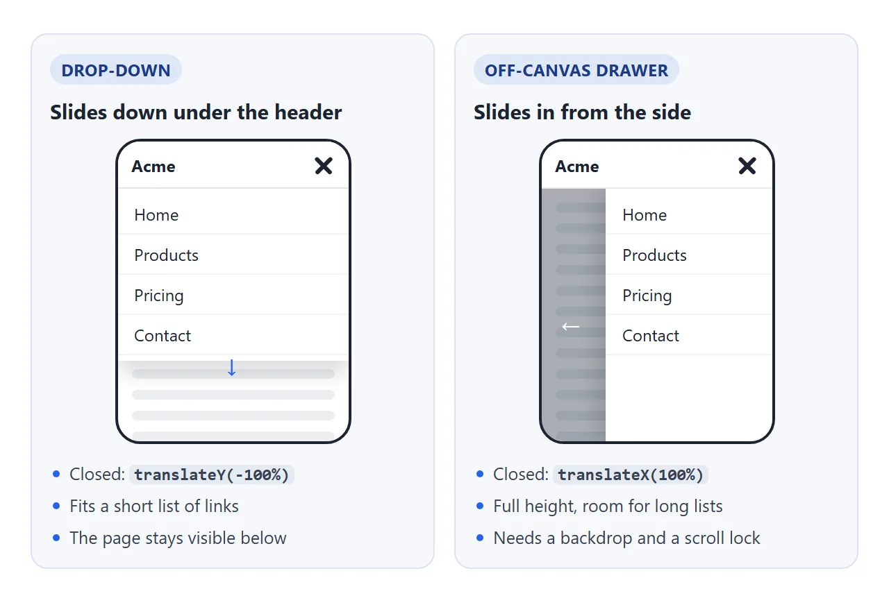
| Drop-down | Off-canvas drawer | |
|---|---|---|
| Closed position | translateY(-100%) |
translateX(100%) |
| Room for links | Short lists | Full screen height |
| Page behind | Still visible | Covered by a backdrop |
| Scroll lock | Only if it covers the screen | Yes |
In both, the closed list has visibility: hidden as well as the transform. Moving a list off screen does not stop Tab from reaching its links. visibility: hidden does, and it also hides them from screen readers.
To keep the slide visible on the way out, delay the visibility change until the transition ends:
.menu      { visibility: hidden;  transition: transform .25s, visibility 0s .25s; }
.menu.open { visibility: visible; transition: transform .25s, visibility 0s; transform: none; }
Only on narrow screens
Write the narrow layout first, then undo it at the width where the links fit in one row. The finished example uses 700px:
@media (min-width: 700px) {
  .burger, .backdrop { display: none; }
  .menu { position: static; display: flex; visibility: visible; transform: none; transition: none; }
}
Pick the number by measuring your own labels. A general introduction to breakpoints is in media queries.
The script needs the same number. window.matchMedia('(min-width: 700px)') fires a change event when the screen crosses it, and that is where you close a menu that was left open.
Close it on Escape, link click and outside click
A menu that only closes from its own button feels stuck. Besides the button, four exits are expected, and all five should call the same function.
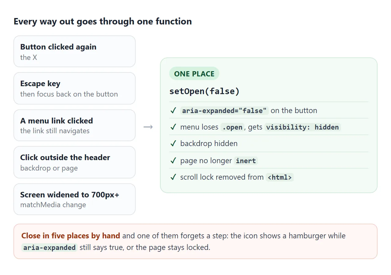
function setOpen(open) {
  burger.setAttribute('aria-expanded', String(open));
  menu.classList.toggle('open', open);
  backdrop.hidden = !open;
  main.inert = open;
  document.documentElement.classList.toggle('menu-open', open);
}
- Escape: a
keydownlistener ondocumentcheckse.key === 'Escape', closes, then callsburger.focus(). - Link click: a click listener on the list closes when the target is inside an
<a>. The link still navigates. - Outside click: a click listener on
documentcloses when the target is not inside the header. - Widening past the breakpoint: the
matchMediachange listener closes.
Focus and scroll lock
Focus should never be lost. After Escape it goes back to the button, because the element that had focus just disappeared. When the list comes right after the button in the page, Tab already moves into it, so opening can leave focus where it is.
A panel that covers the page needs two more things:
inerton the page behind. Tab then cannot move into content hidden under the backdrop, and clicks there are ignored.- A scroll lock. Toggle a class on
<html>and give itoverflow: hidden, so the page behind stays put while the menu is open.
Here is everything together. The frame in this article is narrower than 700px, so it shows the phone layout.
<!doctype html>
<html lang="en">
<head>
<meta charset="utf-8">
<meta name="viewport" content="width=device-width, initial-scale=1">
<title>Responsive header with a hamburger menu</title>
<style>
  body { margin: 0; font-family: system-ui, sans-serif; color: #1d2330; background: #fff; }
  html.menu-open { overflow: hidden; }  /* scroll lock while the menu is open */

  .site-header {
    position: sticky; top: 0; z-index: 10; height: 56px; padding: 0 12px 0 20px;
    display: flex; align-items: center; justify-content: space-between;
    background: #fff; border-bottom: 1px solid #e5e7eb;
  }
  .logo { font-weight: 800; color: #1d2330; text-decoration: none; }

  .burger { position: relative; width: 44px; height: 44px; border: 0; border-radius: 8px; background: none; cursor: pointer; }
  .burger:focus-visible, .menu a:focus-visible { outline: 3px solid #2563eb; outline-offset: 2px; }
  .burger span { position: absolute; left: 10px; width: 24px; height: 3px; border-radius: 2px; background: #1d2330; transition: transform .25s, opacity .2s; }
  .burger span:nth-child(1) { top: 13.5px; } .burger span:nth-child(2) { top: 20.5px; } .burger span:nth-child(3) { top: 27.5px; }
  .burger[aria-expanded="true"] span:nth-child(1) { transform: translateY(7px) rotate(45deg); }
  .burger[aria-expanded="true"] span:nth-child(2) { opacity: 0; }
  .burger[aria-expanded="true"] span:nth-child(3) { transform: translateY(-7px) rotate(-45deg); }

  /* narrow screens (the default): the list is a panel under the header */
  .menu {
    position: fixed; top: 56px; left: 0; right: 0; margin: 0; padding: 8px 0; list-style: none;
    background: #fff; border-bottom: 1px solid #e5e7eb; box-shadow: 0 12px 24px rgba(0,0,0,.12);
    visibility: hidden; opacity: 0; transform: translateY(-8px);
    transition: opacity .2s, transform .2s, visibility 0s .2s;
  }
  .menu.open { visibility: visible; opacity: 1; transform: none; transition: opacity .2s, transform .2s, visibility 0s; }
  .menu a { display: block; padding: 12px 20px; color: #1d2330; text-decoration: none; font-size: 17px; }
  .menu a:hover { background: #f1f5f9; }

  .backdrop { position: fixed; inset: 56px 0 0; z-index: 5; background: rgba(15,23,42,.4); }

  /* 700px and wider: no button, the links sit in the bar */
  @media (min-width: 700px) {
    .burger, .backdrop { display: none; }
    .menu {
      position: static; display: flex; gap: 4px; padding: 0;
      visibility: visible; opacity: 1; transform: none; box-shadow: none; border: 0; transition: none;
    }
    .menu a { padding: 8px 12px; border-radius: 8px; font-size: 15px; }
  }

  @media (prefers-reduced-motion: reduce) {
    .menu, .menu.open, .burger span { transition: none; }
  }

  main { max-width: 640px; margin: 0 auto; padding: 8px 20px 40px; line-height: 1.6; }
  h2 { margin: 26px 0 6px; font-size: 19px; scroll-margin-top: 64px; }  /* clear the sticky header */
</style>
</head>
<body>
<header class="site-header">
  <a class="logo" href="#top">Northwind</a>
  <button class="burger" id="burger" type="button" aria-label="Menu" aria-expanded="false" aria-controls="site-menu">
    <span></span><span></span><span></span>
  </button>
  <nav aria-label="Main">
    <ul class="menu" id="site-menu">
      <li><a href="#features">Features</a></li>
      <li><a href="#pricing">Pricing</a></li>
      <li><a href="#faq">FAQ</a></li>
      <li><a href="#contact">Contact</a></li>
    </ul>
  </nav>
</header>
<div class="backdrop" id="backdrop" hidden></div>

<main id="main">
  <p id="top">Open the menu, then try Tab, Escape, a link, or a click on the dark area. The page behind does not scroll while it is open.</p>
  <h2 id="features">Features</h2>
  <p>Plans, invoices and reports in one place. Everything updates as soon as someone on the team changes it.</p>
  <p>Import from a spreadsheet in one step, then keep editing in the browser.</p>
  <h2 id="pricing">Pricing</h2>
  <p>One plan for small teams, one for larger ones. Both include every feature.</p>
  <p>Pay monthly or yearly. You can switch at any time.</p>
  <h2 id="faq">FAQ</h2>
  <p>Can I export my data? Yes, to CSV at any time.</p>
  <p>Is there a free trial? Yes, fourteen days.</p>
  <h2 id="contact">Contact</h2>
  <p>Write to hello@example.com and we answer within one working day.</p>
</main>

<script>
  const burger = document.getElementById('burger');
  const menu = document.getElementById('site-menu');
  const backdrop = document.getElementById('backdrop');
  const main = document.getElementById('main');
  const wide = window.matchMedia('(min-width: 700px)');  // same value as the CSS

  function isOpen() { return burger.getAttribute('aria-expanded') === 'true'; }

  function setOpen(open) {
    burger.setAttribute('aria-expanded', String(open));
    menu.classList.toggle('open', open);
    backdrop.hidden = !open;
    main.inert = open;                                            // Tab cannot wander behind the menu
    document.documentElement.classList.toggle('menu-open', open); // scroll lock
  }

  burger.addEventListener('click', () => setOpen(!isOpen()));

  // Escape closes and puts focus back on the button
  document.addEventListener('keydown', (e) => {
    if (e.key === 'Escape' && isOpen()) { setOpen(false); burger.focus(); }
  });

  // a link was chosen: close, and let the link do its job
  menu.addEventListener('click', (e) => { if (e.target.closest('a') && isOpen()) setOpen(false); });

  // a click anywhere outside the header closes it (the backdrop counts as outside)
  document.addEventListener('click', (e) => {
    if (isOpen() && !e.target.closest('.site-header')) setOpen(false);
  });

  // widened to desktop while open: reset, or the lock and backdrop stay behind
  wide.addEventListener('change', (e) => { if (e.matches) setOpen(false); });
</script>
</body>
</html>
The CSS-only checkbox hack
A menu can open without JavaScript. A hidden checkbox holds the state and a <label> acts as the button:
<input type="checkbox" id="nav-toggle" class="visually-hidden">
<label for="nav-toggle">Menu</label>
<ul class="menu"> ... </ul>

<style>
  .menu { display: none; }
  #nav-toggle:checked ~ .menu { display: block; }
</style>
It works for a mouse, but it costs accessibility.
Screen readers announce a checkbox, checked or not, instead of a menu button that is expanded or collapsed. If the checkbox gets display: none, keyboard users cannot reach it at all. Escape, outside clicks and focus return need script anyway.
Use it for a quick prototype. For a live site, the button version above is barely longer.
When it does not work
| What you see | Cause | Fix |
|---|---|---|
| Tab skips the menu button, Enter does nothing | The button is a <div> or <span> |
Use <button type="button"> |
| Links are hidden but Tab still lands on them | The closed list is only moved off screen | Add visibility: hidden when closed |
| Menu stays open after widening to desktop | Nothing resets state at the breakpoint | Close in a matchMedia change listener |
| The page scrolls behind the open drawer | No scroll lock | Toggle a class with overflow: hidden on <html> |
| The X is lopsided or the lines swing from a corner | transform-origin is not centre, or rotate is written before translate |
Keep transform-origin: center and write translateY(...) rotate(...) |
| Screen readers say "collapsed" while the menu is open | aria-expanded not updated |
Set it inside the one open/close function |
| The icon changes but the menu does not | The CSS reads a class, the script sets the attribute (or the reverse) | Drive both from the same attribute or class |
Share it as a link
A menu is easier to judge by using it than by looking at it. A screenshot shows one state, and an .html attachment may open as plain code on a phone, which is exactly where the hamburger appears.
To send the working version, paste the page into a NOS document and choose Create share link. HTML to link walks through it.
The page renders as written and its scripts run, so the people you send it to can open and close the menu on their own phones. If you change the code later, the same link shows the new version.