The short answer: flex items and grid items have min-width: auto by default, and for them auto means "never narrower than my content". A long file name or URL then pushes the layout wider than the screen.
Setting min-width: 0 on the item removes that floor, so it shrinks like you expected.
Try it. The row below holds an icon, a long file name and a button. Tick the box, then drag the width slider.
<!doctype html>
<html lang="en">
<head>
<meta charset="utf-8">
<meta name="viewport" content="width=device-width, initial-scale=1">
<title>min-width: 0 in a flex row</title>
<style>
  body { margin: 0; padding: 16px; font-family: system-ui, sans-serif; background: #f4f5f7; color: #1d2330; }
  .controls { display: flex; flex-wrap: wrap; gap: 8px 18px; font-size: 14px; margin-bottom: 14px; }
  .controls label { display: flex; align-items: center; gap: 6px; }
  code { font: 13px ui-monospace, Consolas, monospace; background: #e6e9ef; padding: 1px 4px; border-radius: 4px; }
  .stage { overflow: hidden; padding: 2px; }   /* anything pushed out of the row is cut off here */

  .row {
    display: flex; align-items: center; gap: 10px;
    width: min(var(--w, 320px), 100%);          /* never wider than the page */
    box-sizing: border-box; padding: 10px;
    background: #fff; border: 2px dashed #b8c0cc; border-radius: 12px;
  }
  .icon { flex: none; width: 40px; height: 40px; border-radius: 8px; background: #fde2da; color: #9a3412;
          display: grid; place-items: center; font: 700 12px system-ui; }
  .info { flex: 1; }                            /* min-width is auto by default */
  .info.fixed { min-width: 0; }                 /* the fix: allowed to shrink below its content */
  .name { white-space: nowrap; overflow: hidden; text-overflow: ellipsis; font-weight: 600; }
  .meta { font-size: 13px; color: #6b7280; }
  .btn  { flex: none; padding: 8px 14px; border: 0; border-radius: 8px; background: #2563eb; color: #fff; font: 600 14px system-ui; }

  #status { font-size: 14px; margin: 14px 0 0; padding: 8px 10px; border-radius: 8px; }
  #status.bad { background: #fff1ec; color: #9a3412; }
  #status.ok  { background: #e7f6ec; color: #0f5132; }
</style>
</head>
<body>
<div class="controls">
  <label><input type="checkbox" id="fix"> <code>min-width: 0</code> on the middle item</label>
  <label>Row width <input type="range" id="w" min="180" max="460" value="320"> <span id="wv">320px</span></label>
</div>

<div class="stage">
  <div class="row" id="row">
    <div class="icon">PDF</div>
    <div class="info" id="info">
      <div class="name">quarterly-report-final-v3-approved-by-finance-2026.pdf</div>
      <div class="meta">2.4 MB, edited today</div>
    </div>
    <button class="btn" id="btn">Share</button>
  </div>
</div>
<p id="status"></p>

<script>
  const row = document.getElementById('row');
  const info = document.getElementById('info');
  const btn = document.getElementById('btn');
  const status = document.getElementById('status');

  function report() {
    // how far the button sticks out past the row's inner edge (padding 10px + border 2px)
    const inner = row.getBoundingClientRect().right - 12;
    const out = Math.round(btn.getBoundingClientRect().right - inner);
    const w = Math.round(info.getBoundingClientRect().width);
    const mw = getComputedStyle(info).minWidth;
    if (out > 0) {
      status.className = 'bad';
      status.textContent = 'min-width: ' + mw + '. The middle item stays ' + w + 'px wide, and the Share button is pushed ' + out + 'px out of the row.';
    } else {
      status.className = 'ok';
      status.textContent = 'min-width: ' + mw + '. The middle item shrank to ' + w + 'px, the name ends in "...", and the button fits.';
    }
  }

  document.getElementById('fix').addEventListener('change', (e) => {
    info.classList.toggle('fixed', e.target.checked);
    report();
  });
  document.getElementById('w').addEventListener('input', (e) => {
    row.style.setProperty('--w', e.target.value + 'px');
    document.getElementById('wv').textContent = e.target.value + 'px';
    report();
  });
  window.addEventListener('resize', report);
  report();
</script>
</body>
</html>
Without the fix, the middle item stays as wide as the file name and the button is pushed out. With it, the item shrinks to the space left, and text-overflow: ellipsis shortens the name.
What min-width does
min-width sets a floor. The element can be wider, but never narrower. It is the opposite of max-width, which sets a ceiling.
| Property | What it sets | Default |
|---|---|---|
width |
The size you ask for | auto |
max-width |
The largest it may get | none |
min-width |
The smallest it may get | auto |
When they disagree, min-width wins. width: 500px; max-width: 300px; min-width: 400px gives a 400px box. A percentage such as min-width: 50% is measured against the width of the containing block.
On an ordinary block, auto behaves as 0, so min-width: 0 there does nothing. The default only turns into something else on flex items and grid items. That is where the trouble starts.
Why flex items overflow: the automatic minimum size
For a flex item, min-width: auto becomes an automatic minimum size. The browser works it out from the content.
In practice it is the item's min-content width: the widest thing that cannot be broken, such as a long word, a URL, an image or a line with white-space: nowrap.
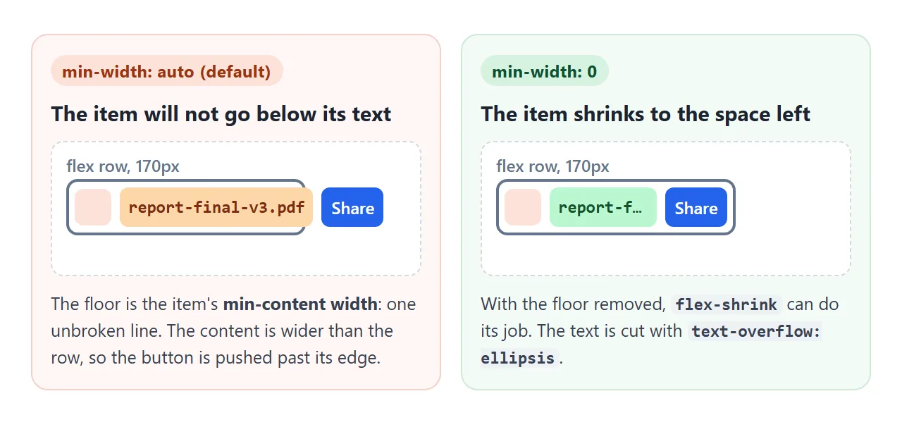
flex-shrink can only shrink an item down to that floor. If the content is one unbroken line, the floor is the whole line, and the row overflows.
There are two ways to remove the floor:
.info { flex: 1; min-width: 0; }        /* shrinks, overflow stays visible */
.info { flex: 1; overflow: hidden; }    /* shrinks, and clips what sticks out */
A flex item whose overflow is hidden, auto or scroll is a scroll container, and scroll containers get no automatic minimum. overflow: clip is not a scroll container, so it keeps the floor. min-width: 0 is the clearer choice because it says what you mean.
If the item has a width smaller than its content, that width becomes the floor instead. The flex rules behind flex: 1 and shrinking are in CSS flex-grow.
Nested flex and text-overflow: every level needs it
Ellipsis inside a flex row has a second catch. min-width: 0 has to go on every flex item between the text and the row, not only the one closest to the text.
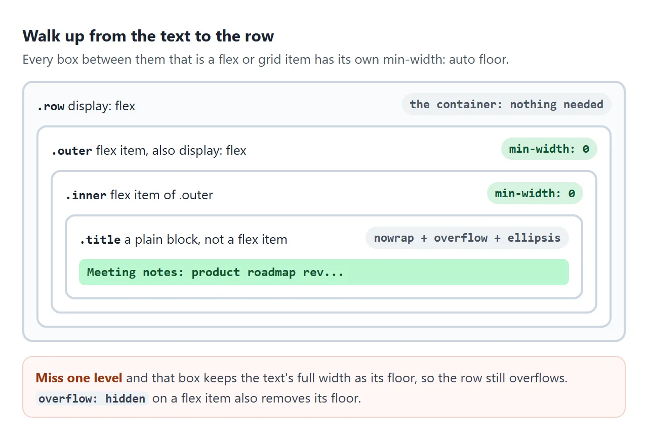
In the demo, .outer is a flex item of the row and also a flex container. .inner is a flex item inside it. Each has its own automatic minimum, and each one is worked out from the full title.
<!doctype html>
<html lang="en">
<head>
<meta charset="utf-8">
<meta name="viewport" content="width=device-width, initial-scale=1">
<title>Nested flex and grid: where min-width: 0 goes</title>
<style>
  body { margin: 0; padding: 16px; font-family: system-ui, sans-serif; background: #f4f5f7; color: #1d2330; }
  h3 { font-size: 15px; margin: 0 0 8px; }
  section { background: #fff; border: 1px solid #e1e4ea; border-radius: 12px; padding: 12px; margin-bottom: 14px; }
  .controls { display: flex; flex-wrap: wrap; gap: 6px 16px; font-size: 14px; margin-bottom: 10px; }
  .controls label { display: flex; align-items: center; gap: 6px; }
  code { font: 13px ui-monospace, Consolas, monospace; background: #e6e9ef; padding: 1px 4px; border-radius: 4px; }
  .clip { overflow: hidden; }                   /* cuts off whatever gets pushed out */
  .row, .grid { width: min(340px, 100%); box-sizing: border-box; }
  .status { font-size: 13.5px; margin: 10px 0 0; padding: 7px 9px; border-radius: 8px; }
  .status.bad { background: #fff1ec; color: #9a3412; }
  .status.ok  { background: #e7f6ec; color: #0f5132; }

  /* A: a flex item that is itself a flex container */
  .row   { display: flex; align-items: center; gap: 8px; border: 2px dashed #b8c0cc; border-radius: 10px; padding: 8px; }
  .outer { flex: 1; display: flex; align-items: center; gap: 8px; }
  .inner { flex: 1; }
  .outer.fixed, .inner.fixed { min-width: 0; }
  .tag   { flex: none; font: 600 12px system-ui; background: #fef3c7; color: #92400e; padding: 3px 7px; border-radius: 99px; }
  .title { white-space: nowrap; overflow: hidden; text-overflow: ellipsis; font-weight: 600; }
  .btn   { flex: none; border: 0; border-radius: 8px; background: #2563eb; color: #fff; padding: 7px 12px; font: 600 13px system-ui; }

  /* B: two grid columns, one holds a long unbroken link */
  .grid  { display: grid; gap: 8px; border: 2px dashed #b8c0cc; border-radius: 10px; padding: 8px; }
  .card  { background: #f1f5f9; border-radius: 8px; padding: 8px; font-size: 13px; overflow-wrap: break-word; }
</style>
</head>
<body>
<section>
  <h3>A. Nested flex: every level needs it</h3>
  <div class="controls">
    <label><input type="checkbox" id="outerFix"> <code>.outer</code> min-width: 0</label>
    <label><input type="checkbox" id="innerFix"> <code>.inner</code> min-width: 0</label>
  </div>
  <div class="clip">
    <div class="row" id="row">
      <div class="outer" id="outer">
        <span class="tag">Draft</span>
        <div class="inner" id="inner"><div class="title" id="title">Meeting notes: product roadmap review with the design and data teams</div></div>
      </div>
      <button class="btn" id="btn">Open</button>
    </div>
  </div>
  <p class="status" id="statusA"></p>
</section>

<section>
  <h3>B. Grid: 1fr or minmax(0, 1fr)</h3>
  <div class="controls">
    <label><input type="radio" name="cols" value="1fr 1fr" checked> <code>1fr 1fr</code></label>
    <label><input type="radio" name="cols" value="minmax(0, 1fr) minmax(0, 1fr)"> <code>minmax(0, 1fr) minmax(0, 1fr)</code></label>
  </div>
  <div class="clip">
    <div class="grid" id="grid" style="grid-template-columns: 1fr 1fr">
      <div class="card" id="c1">Source: https://example.com/reports/2026/q3/revenue-by-region-and-channel-final.csv</div>
      <div class="card" id="c2">Short note.</div>
    </div>
  </div>
  <p class="status" id="statusB"></p>
</section>

<script>
  const $ = (id) => document.getElementById(id);

  function reportA() {
    const edge = $('row').getBoundingClientRect().right - 10;   // row's inner right edge
    const pushed = $('btn').getBoundingClientRect().right > edge + 0.5;
    // the inner box may also spill out of .outer and run under the button
    const spills = $('inner').getBoundingClientRect().right > $('outer').getBoundingClientRect().right + 0.5;
    const bad = pushed || spills;
    const s = $('statusA');
    s.className = 'status ' + (bad ? 'bad' : 'ok');
    s.textContent = bad
      ? (pushed ? 'The button is pushed out.' : 'The title spills out of .outer and runs under the button.') +
        ' Still at min-width: auto: ' +
        [$('outer'), $('inner')].filter((el) => getComputedStyle(el).minWidth === 'auto')
          .map((el) => '.' + el.id).join(' and ') + '.'
      : 'Both levels can shrink. The title ends in "..." and the button fits.';
  }

  function reportB() {
    const w1 = Math.round($('c1').getBoundingClientRect().width);
    const w2 = Math.round($('c2').getBoundingClientRect().width);
    const equal = Math.abs(w1 - w2) < 2;
    const s = $('statusB');
    s.className = 'status ' + (equal ? 'ok' : 'bad');
    s.textContent = 'Column widths: ' + w1 + 'px and ' + w2 + 'px.' +
      (equal ? ' Equal, and the link wraps inside its card.' : ' The long link stretched the first column.');
  }

  $('outerFix').addEventListener('change', (e) => { $('outer').classList.toggle('fixed', e.target.checked); reportA(); });
  $('innerFix').addEventListener('change', (e) => { $('inner').classList.toggle('fixed', e.target.checked); reportA(); });
  document.querySelectorAll('input[name=cols]').forEach((r) => r.addEventListener('change', () => {
    $('grid').style.gridTemplateColumns = r.value;
    reportB();
  }));
  window.addEventListener('resize', () => { reportA(); reportB(); });
  reportA(); reportB();
</script>
</body>
</html>
Tick only one box and the status line names the level that is still at auto. With only .outer fixed, the button stays inside the row, but the title spills out of .outer and runs under the button.
The element that shows the dots needs three rules of its own: white-space: nowrap, overflow: hidden and text-overflow: ellipsis. The full recipe, including several lines and tables, is in CSS text overflow ellipsis.
Grid: 1fr vs minmax(0, 1fr)
Grid items have the same default. A grid column written as 1fr is short for minmax(auto, 1fr), and that auto minimum reads the items' content.
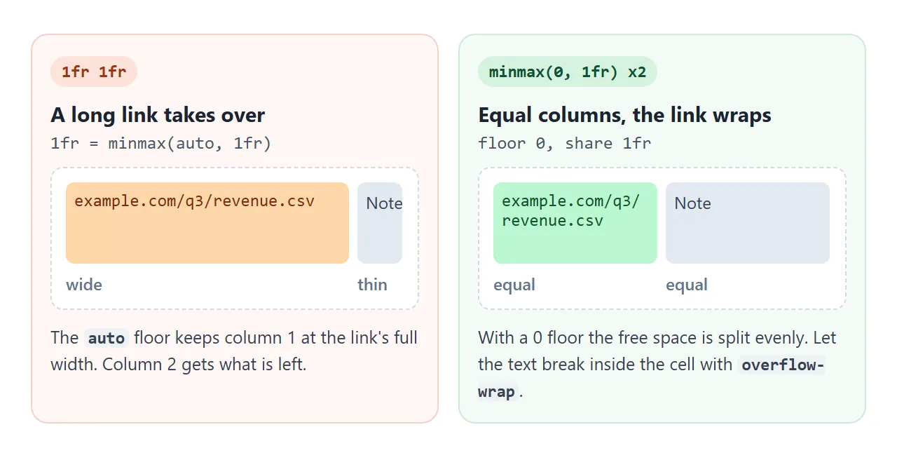
Part B of the demo above shows the result. With 1fr 1fr, the card holding a long link takes most of the width. With minmax(0, 1fr) the columns are equal, and the link wraps inside its card.
.grid { grid-template-columns: repeat(3, minmax(0, 1fr)); }
min-width: 0 on the grid item also works.
One detail from the demo: the card uses overflow-wrap: break-word, which lets the link wrap once the column is narrow but does not lower the item's floor. overflow-wrap: anywhere does lower it. More about columns is in CSS grid-template-columns.
The same problem in a column: min-height: 0
In a flex column, the automatic minimum works on height. A panel with flex: 1 inside a fixed-height column will not shrink below its content, so its overflow: auto never scrolls. The fix is min-height: 0 on that panel.
The vertical version, with 100vh and 100dvh, is covered in CSS min-height.
min(), max() and clamp() for floors that fit a phone
A fixed floor such as min-width: 320px is its own overflow risk: on a screen narrower than 320px, the box sticks out. min() keeps the floor but caps it at the space available.
.card    { min-width: min(320px, 100%); }         /* 320px floor, never wider than the parent */
.sidebar { width: clamp(96px, 28%, 180px); }      /* 28% of the width, kept between 96px and 180px */
.cards   { grid-template-columns: repeat(auto-fill, minmax(min(130px, 100%), 1fr)); }
clamp(MIN, VALUE, MAX) returns VALUE, raised to MIN or lowered to MAX when it goes past them. If MIN is larger than MAX, MIN wins. max(a, b) picks the larger value, which is useful as a floor inside another calculation.
A finished layout that never overflows
This example puts the pieces together. Drag the width down to 220px and nothing sticks out.
<!doctype html>
<html lang="en">
<head>
<meta charset="utf-8">
<meta name="viewport" content="width=device-width, initial-scale=1">
<title>A layout that never overflows</title>
<style>
  body { margin: 0; padding: 14px; font-family: system-ui, sans-serif; background: #f4f5f7; color: #1d2330; }
  .controls { font-size: 14px; margin-bottom: 10px; display: flex; flex-wrap: wrap; align-items: center; gap: 8px; }
  #status { font-size: 13.5px; margin: 10px 0 0; padding: 7px 9px; border-radius: 8px; }
  #status.bad { background: #fff1ec; color: #9a3412; }
  #status.ok  { background: #e7f6ec; color: #0f5132; }

  .app {
    display: grid;
    grid-template-columns: clamp(96px, 28%, 180px) minmax(0, 1fr);  /* sidebar 96-180px, main takes the rest */
    gap: 10px;
    width: min(var(--w, 640px), 100%);
    box-sizing: border-box; padding: 10px;
    background: #fff; border: 2px dashed #b8c0cc; border-radius: 12px;
  }
  .side { background: #eef2ff; border-radius: 8px; padding: 8px; font-size: 13px; }
  .side div { padding: 5px 6px; border-radius: 6px; white-space: nowrap; overflow: hidden; text-overflow: ellipsis; }
  .side .on { background: #c7d2fe; font-weight: 600; }
  /* main is a grid too: its one column needs the 0 floor, or a long file name widens it */
  main { display: grid; grid-template-columns: minmax(0, 1fr); gap: 10px; align-content: start; }

  /* file rows: the text column may shrink, so long names end in "..." */
  .file { display: flex; align-items: center; gap: 8px; padding: 6px 8px; background: #f8fafc; border-radius: 8px; font-size: 13px; }
  .file .name { flex: 1; min-width: 0; white-space: nowrap; overflow: hidden; text-overflow: ellipsis; }
  .file .size { flex: none; color: #6b7280; }

  /* code: scrolls sideways inside its own box instead of widening the page */
  pre { margin: 0; overflow-x: auto; background: #1e293b; color: #e2e8f0; border-radius: 8px; padding: 8px 10px; font: 12.5px ui-monospace, Consolas, monospace; }

  /* cards: at least 130px each, but never wider than the column */
  .cards { display: grid; gap: 8px; grid-template-columns: repeat(auto-fill, minmax(min(130px, 100%), 1fr)); }
  .card { background: #ecfdf5; border-radius: 8px; padding: 8px; font-size: 13px; overflow-wrap: anywhere; }
</style>
</head>
<body>
<div class="controls">
  <label for="w">Page width</label>
  <input type="range" id="w" min="220" max="640" value="640">
  <span id="wv">640px</span>
</div>

<div class="app" id="app">
  <nav class="side">
    <div class="on">All files</div>
    <div>Shared with the finance team</div>
    <div>Archive 2025</div>
  </nav>
  <main>
    <div class="file"><span class="name">quarterly-report-final-v3-approved-by-finance-2026.pdf</span><span class="size">2.4 MB</span></div>
    <div class="file"><span class="name">team-offsite-photos-october-full-resolution.zip</span><span class="size">310 MB</span></div>
    <pre>curl -O https://example.com/files/quarterly-report-final-v3-approved-by-finance-2026.pdf</pre>
    <div class="cards">
      <div class="card">Storage: 41% used</div>
      <div class="card">Shared links: 12</div>
      <div class="card">Last sync: https://example.com/sync/status/2026-09-26</div>
    </div>
  </main>
</div>
<p id="status"></p>

<script>
  const app = document.getElementById('app');
  const status = document.getElementById('status');

  function report() {
    // find any element whose right edge passes the app's inner edge
    const edge = app.getBoundingClientRect().right - 12 + 0.5;
    const out = [...app.querySelectorAll('*')].filter((el) => el.getBoundingClientRect().right > edge);
    const cols = getComputedStyle(app).gridTemplateColumns;
    status.className = out.length ? 'bad' : 'ok';
    status.textContent = out.length
      ? out.length + ' element(s) stick out of the layout.'
      : 'Columns: ' + cols + '. Nothing sticks out.';
  }

  document.getElementById('w').addEventListener('input', (e) => {
    app.style.setProperty('--w', e.target.value + 'px');
    document.getElementById('wv').textContent = e.target.value + 'px';
    report();
  });
  window.addEventListener('resize', report);
  report();
</script>
</body>
</html>
To fix an overflow like this in your own page:
- Find the box that sticks out. It usually holds a long name, a URL, an image or a code block.
- Walk up to the row. Every flex or grid item between that content and the row gets
min-width: 0. - Use
minmax(0, 1fr)for grid columns that can hold long content. - Handle the content itself. Cut it with
text-overflow: ellipsis, wrap it withoverflow-wrap, or let it scroll withoverflow-x: auto.
Step 2 is easy to miss. In this layout, main is a grid item of the page and also a grid container. Its own column needs minmax(0, 1fr), or the long file names widen it even though the page column is already fixed.
When it does not work
| What you see | Cause | Fix |
|---|---|---|
| A button is pushed off the end of a flex row | The item with long text has min-width: auto |
min-width: 0 on that item |
| min-width: 0 is set and it still overflows | A flex item further up still has the floor | Add min-width: 0 to every level |
| No ellipsis, the text just runs on | The text element lacks nowrap or overflow: hidden |
Add all three ellipsis rules |
| One grid column is much wider than the others | 1fr keeps an auto minimum |
minmax(0, 1fr) |
A pre block makes the page scroll sideways |
The pre and the items around it keep the code's width |
overflow-x: auto on the pre, min-width: 0 on the items around it |
| overflow: clip did not help | clip does not make a scroll container |
Use min-width: 0 or overflow: hidden |
| A box is too wide on a phone | A fixed min-width larger than the screen |
min-width: min(320px, 100%) |
| A scroll panel in a flex column never scrolls | Its min-height is auto |
min-height: 0 on the panel |
Share it as a link
Layout bugs like this one show up at one width and vanish at another, so a screenshot shows only one of them. A live page lets someone drag the slider and see it for themselves.
Paste the page into a NOS document and choose Create share link. HTML to link walks through it.
The page renders as written and its scripts run, so the people you send it to can resize and click through the demo. If you change the code later, the same link shows the new version.