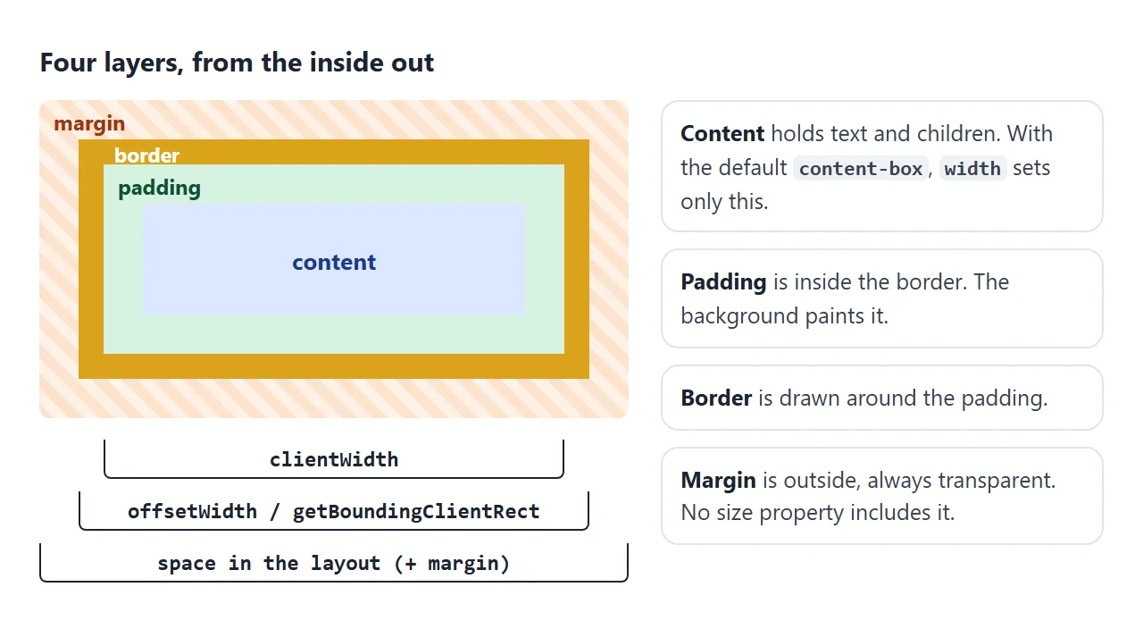
The CSS box model says every element is drawn as four nested rectangles: the content, then padding around it, then a border, then margin outside.
By default, width and height set only the content. Padding and border are added on top, and margin sits outside everything.
Try it. Move the sliders and switch between the two box-sizing values. The table reads the sizes the browser actually drew.
<!doctype html>
<html lang="en">
<head>
<meta charset="utf-8">
<meta name="viewport" content="width=device-width, initial-scale=1">
<title>CSS box model playground</title>
<style>
  body { margin: 0; padding: 14px; font-family: system-ui, sans-serif; background: #f4f5f7; color: #1d2330; }
  .controls { display: grid; grid-template-columns: repeat(auto-fit, minmax(160px, 1fr)); gap: 6px 16px; font-size: 13px; }
  .controls label { display: flex; align-items: center; gap: 8px; }
  .controls input[type=range] { flex: 1; min-width: 0; }
  .controls b { width: 42px; text-align: right; font-variant-numeric: tabular-nums; }
  .sizing { margin: 10px 0; display: flex; gap: 6px; flex-wrap: wrap; }
  .sizing button { font: inherit; font-size: 13px; padding: 6px 10px; border-radius: 8px; border: 1px solid #c9cdd4; background: #fff; cursor: pointer; }
  .sizing button[aria-pressed=true] { background: #1d2330; color: #fff; border-color: #1d2330; }

  /* The orange area is the margin: this wrapper shrinks to the box's margin edge */
  .margin-area { display: flow-root; width: max-content; background: repeating-linear-gradient(45deg, #fde2cc 0 6px, #fff1e6 6px 12px); }
  #box {
    width: 160px; height: 50px;
    padding: 16px; border: 6px solid #d9a31a; margin: 12px;
    /* blue = content box, green = padding box */
    background: linear-gradient(#dbe8ff, #dbe8ff) content-box, #d6f2df padding-box;
    font-size: 12px; overflow: hidden;
  }
  .legend { display: flex; flex-wrap: wrap; gap: 10px; font-size: 12px; margin: 10px 0 6px; }
  .legend i { display: inline-block; width: 12px; height: 12px; border-radius: 3px; vertical-align: -2px; margin-right: 4px; }
  table { border-collapse: collapse; font-size: 13px; width: 100%; max-width: 460px; background: #fff; }
  td { padding: 5px 8px; border-top: 1px solid #e5e7eb; }
  td:last-child { text-align: right; font-weight: 700; font-variant-numeric: tabular-nums; }
  code { font: 12px ui-monospace, Consolas, monospace; }
</style>
</head>
<body>
<div class="controls">
  <label>width <input type="range" id="w" min="60" max="200" value="160"><b id="wv"></b></label>
  <label>padding <input type="range" id="p" min="0" max="30" value="16"><b id="pv"></b></label>
  <label>border <input type="range" id="bd" min="0" max="12" value="6"><b id="bdv"></b></label>
  <label>margin <input type="range" id="m" min="0" max="20" value="12"><b id="mv"></b></label>
</div>
<div class="sizing">
  <button id="cb" aria-pressed="true">box-sizing: content-box</button>
  <button id="bb" aria-pressed="false">box-sizing: border-box</button>
</div>

<div class="margin-area"><div id="box">content</div></div>

<div class="legend">
  <span><i style="background:#dbe8ff"></i>content</span>
  <span><i style="background:#d6f2df"></i>padding</span>
  <span><i style="background:#d9a31a"></i>border</span>
  <span><i style="background:#fde2cc"></i>margin</span>
</div>

<table>
  <tr><td>CSS <code>width</code> you wrote</td><td id="r-css"></td></tr>
  <tr><td><code>clientWidth</code> (content + padding)</td><td id="r-client"></td></tr>
  <tr><td><code>offsetWidth</code> (+ border)</td><td id="r-offset"></td></tr>
  <tr><td><code>getBoundingClientRect().width</code></td><td id="r-rect"></td></tr>
  <tr><td>Space taken, with margin</td><td id="r-space"></td></tr>
</table>

<script>
  const box = document.getElementById('box');
  const $ = (id) => document.getElementById(id);
  let sizing = 'content-box';

  function update() {
    const w = $('w').value, p = $('p').value, bd = $('bd').value, m = $('m').value;
    box.style.width = w + 'px';
    box.style.padding = p + 'px';
    box.style.borderWidth = bd + 'px';
    box.style.margin = m + 'px';
    box.style.boxSizing = sizing;
    $('wv').textContent = w; $('pv').textContent = p; $('bdv').textContent = bd; $('mv').textContent = m;

    // Measure what the browser actually drew
    const rect = box.getBoundingClientRect();
    const cs = getComputedStyle(box);
    const space = rect.width + parseFloat(cs.marginLeft) + parseFloat(cs.marginRight);
    $('r-css').textContent = w + 'px';
    $('r-client').textContent = box.clientWidth + 'px';
    $('r-offset').textContent = box.offsetWidth + 'px';
    $('r-rect').textContent = rect.width + 'px';
    $('r-space').textContent = space + 'px';
  }

  function setSizing(value) {
    sizing = value;
    $('cb').setAttribute('aria-pressed', value === 'content-box');
    $('bb').setAttribute('aria-pressed', value === 'border-box');
    update();
  }

  document.querySelectorAll('input').forEach((i) => i.addEventListener('input', update));
  $('cb').addEventListener('click', () => setSizing('content-box'));
  $('bb').addEventListener('click', () => setSizing('border-box'));
  update();
</script>
</body>
</html>
With the starting values, width: 160px plus 16px of padding and a 6px border on each side gives a box 204px wide. Add the 12px margins and the element takes 228px in the layout.
The four layers of a box
Each layer has its own property, and each behaves a little differently.
| Layer | Property | Background shows? | Notes |
|---|---|---|---|
| Content | width, height |
Yes | Holds the text and child elements |
| Padding | padding |
Yes | Cannot be negative |
| Border | border |
Border color | Style needed, e.g. solid |
| Margin | margin |
No, always transparent | Can be negative or auto |
Two things take no space at all: outline and box-shadow. They are painted outside the border without moving anything, which is why they are handy for debugging. Borders are covered in detail in CSS border.
How width is counted. Under the default box-sizing: content-box, the drawn width is:
width + padding-left + padding-right + border-left + border-right
Under box-sizing: border-box, the drawn width is simply width, and the content shrinks to make room. A common reset switches every element to border-box. box-sizing explains that rule and why the default is what it is.
In the demo, set border-box and push padding to 30 and border to 12 with a width of 60. The box stays 84px wide. Padding and border cannot shrink, so a border-box element is never narrower than both of them together.
Padding vs margin
Both add space, but in different places. Padding pushes the content away from the element's own edge. Margin pushes other elements away.
| Padding | Margin | |
|---|---|---|
| Where | Inside the border | Outside the border |
| Background | Filled by the element's background | Transparent |
| Clickable area | Part of the element | Not part of the element |
| Negative values | Not allowed | Allowed |
auto |
Not allowed | Takes up free space |
| Vertical collapsing | Never | Between blocks in normal flow |
Both use the same shorthand. One value sets all four sides. Two values set top and bottom, then left and right. Four values go clockwise from the top:
.box {
  margin: 20px;              /* all four sides */
  margin: 10px 24px;         /* top and bottom 10, left and right 24 */
  padding: 8px 16px 12px 4px; /* top, right, bottom, left */
  margin-top: 32px;          /* one side only */
}
Percentages use the width. padding-top: 10% is 10% of the containing block's width, not its height. The same goes for margin. This surprises people who expect vertical percentages to follow height.
margin: auto centers blocks. A block with a set width and margin: 0 auto gets equal left and right margins, so it sits in the middle.
In normal flow, auto on top and bottom margins counts as 0. Center a div covers the vertical cases, and max-width pairs well with auto margins for readable columns.
Negative margins pull. margin-top: -20px moves the element up 20px and the content after it follows.
Negative left and right margins on a block without a set width make it wider than its parent, one way to let an image run to the edges of a padded card.
Why vertical margins collapse
When two block elements sit one above the other in normal flow, their vertical margins do not add up. They collapse into one margin, the size of the larger one. Horizontal margins never collapse.
<!doctype html>
<html lang="en">
<head>
<meta charset="utf-8">
<meta name="viewport" content="width=device-width, initial-scale=1">
<title>Margin collapse lab</title>
<style>
  body { margin: 0; padding: 14px; font-family: system-ui, sans-serif; background: #f4f5f7; color: #1d2330; }
  .lab { display: grid; gap: 12px; }
  .panel { background: #fff; border: 1px solid #e1e4ea; border-radius: 12px; padding: 12px; }
  h3 { margin: 0 0 4px; font-size: 14px; }
  .note { margin: 0 0 10px; font-size: 12px; color: #5b6270; }
  .opts { display: flex; flex-wrap: wrap; gap: 4px 12px; font-size: 13px; margin-bottom: 10px; }
  .readout { font-size: 13px; margin-top: 10px; padding: 8px; border-radius: 8px; background: #f4f5f7; }
  .readout b { font-variant-numeric: tabular-nums; }

  /* The test area is its own formatting context, so nothing leaks out of it */
  .area { display: flow-root; background: #fafbfc; border: 1px dashed #c9cdd4; }

  /* Case 1: two siblings */
  .first  { margin: 0 0 30px; background: #dbe8ff; padding: 6px; font-size: 13px; }
  .second { margin: 20px 0 0; background: #d6f2df; padding: 6px; font-size: 13px; }
  .as-flex { display: flex; flex-direction: column; }

  /* Case 2: parent and first child */
  .above  { background: #e5e7eb; padding: 6px; font-size: 13px; }
  .parent { background: #fde2cc; }
  .child  { margin-top: 30px; background: #d6f2df; padding: 6px; font-size: 13px; }
  .fix-padding { padding-top: 1px; }
  .fix-border  { border-top: 1px solid #c2410c; }
  .fix-root    { display: flow-root; }
  .fix-flex    { display: flex; flex-direction: column; }
</style>
</head>
<body>
<div class="lab">
  <div class="panel">
    <h3>1. Two paragraphs</h3>
    <p class="note">Blue has margin-bottom: 30px. Green has margin-top: 20px.</p>
    <div class="opts">
      <label><input type="checkbox" id="sib-flex"> put them in a flex column</label>
    </div>
    <div class="area" id="sib-area">
      <p class="first" id="p1">First paragraph</p>
      <p class="second" id="p2">Second paragraph</p>
    </div>
    <div class="readout">Measured gap: <b id="sib-gap"></b></div>
  </div>

  <div class="panel">
    <h3>2. Parent and first child</h3>
    <p class="note">Only the green child has margin-top: 30px. The orange parent has none.</p>
    <div class="opts" id="fixes">
      <label><input type="radio" name="fix" value="" checked> no fix</label>
      <label><input type="radio" name="fix" value="fix-padding"> padding-top: 1px</label>
      <label><input type="radio" name="fix" value="fix-border"> border-top</label>
      <label><input type="radio" name="fix" value="fix-root"> display: flow-root</label>
      <label><input type="radio" name="fix" value="fix-flex"> display: flex</label>
    </div>
    <div class="area">
      <div class="above" id="above">Element above</div>
      <div class="parent" id="parent"><div class="child" id="child">Child</div></div>
    </div>
    <div class="readout">
      Gap above the parent: <b id="gap-out"></b><br>
      Gap inside, parent top to child: <b id="gap-in"></b>
    </div>
  </div>
</div>

<script>
  const $ = (id) => document.getElementById(id);
  // Distance in px between one element's bottom edge and another's top edge
  const gap = (a, b) => Math.round(b.getBoundingClientRect().top - a.getBoundingClientRect().bottom);
  const topGap = (outer, inner) => Math.round(inner.getBoundingClientRect().top - outer.getBoundingClientRect().top);

  function measure() {
    const g = gap($('p1'), $('p2'));
    $('sib-gap').textContent = g + 'px' + (g === 30 ? ' (collapsed: the larger margin wins)' : ' (30 + 20, not collapsed)');

    const out = gap($('above'), $('parent'));
    const inside = topGap($('parent'), $('child'));
    $('gap-out').textContent = out + 'px' + (out >= 30 ? ' (the child’s margin escaped)' : '');
    $('gap-in').textContent = inside + 'px' + (inside >= 30 ? ' (margin stays inside)' : '');
  }

  $('sib-flex').addEventListener('change', (e) => {
    $('sib-area').classList.toggle('as-flex', e.target.checked);
    measure();
  });

  document.querySelectorAll('input[name=fix]').forEach((r) => r.addEventListener('change', () => {
    $('parent').className = 'parent ' + r.value;
    measure();
  }));

  measure();
</script>
</body>
</html>
The demo shows the two cases.
- Siblings.
margin-bottom: 30pxfollowed bymargin-top: 20pxgives a 30px gap, not 50px. If one margin is negative, the two are added: 30px and -10px give 20px. - Parent and first child. If nothing separates them, a child's top margin collapses with its parent's. The margin appears above the parent, and the child touches the parent's top edge.
The same happens with the last child's bottom margin when the parent's height is auto.
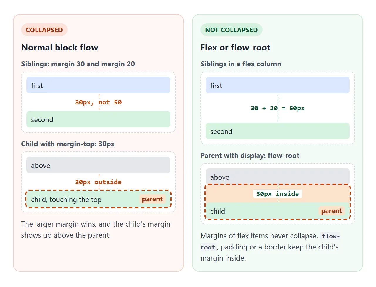
Collapsing stops when any of these is true:
- The parent has padding or a border on that side. One pixel is enough.
- The parent is
display: flow-root. It starts a new block formatting context, and margins do not collapse through one. - The parent is a flex or grid container. Margins of flex and grid items never collapse.
- The element is floated, absolutely positioned or
inline-block.
A simple habit avoids most of this: space siblings with gap in a flex or grid container, or give margins in one direction only, such as margin-bottom on every block.
Inline elements and vertical spacing
Elements such as <span>, <a> and <strong> are inline by default. They flow inside a line of text, and the box model applies only partly:
widthandheightare ignored.- Left and right padding, border and margin work and push the neighboring text.
- Top and bottom margins have no effect on layout.
- Top and bottom padding and border are painted, but the line does not grow to fit them, so they overlap the lines above and below.
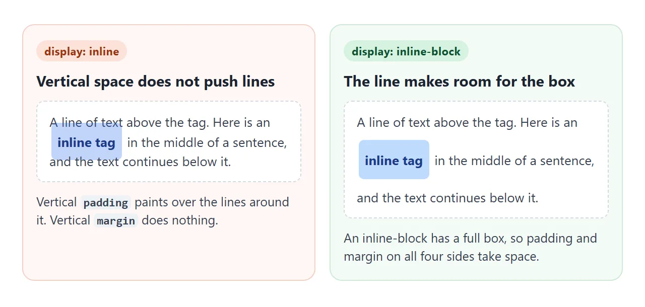
To give an inline element real vertical space, set display: inline-block. It still sits in the line of text, but it has a full box. CSS display compares the display values, and the span tag shows where inline wrappers are useful.
Measuring a box in DevTools and JavaScript
Browser developer tools draw the box model for the selected element.
In Chrome and Edge, open the Elements panel and look at the Computed tab. In Firefox, open the Inspector and look under Layout. Hovering an element in the element tree highlights its margin, border, padding and content on the page in different colors.
From JavaScript, four readings cover most needs:
| Reading | Includes | Notes |
|---|---|---|
el.clientWidth |
Content + padding | Excludes border and scrollbar. Rounded to a whole number. 0 on inline elements |
el.offsetWidth |
Content + padding + border | Includes a scrollbar. Rounded. Ignores transforms |
el.getBoundingClientRect().width |
Content + padding + border | Fractional. Includes transforms such as scale() |
getComputedStyle(el).marginLeft |
One margin | A string such as "12px" |
None of them includes margin. To get the space an element takes in the layout:
const rect = el.getBoundingClientRect();
const cs = getComputedStyle(el);
const outerWidth = rect.width + parseFloat(cs.marginLeft) + parseFloat(cs.marginRight);
The first demo runs exactly this code on every slider move.
A finished example: a card with balanced spacing
Spacing gets easier when each kind of space has one job. In this card set, padding makes the space inside each card, gap makes the space between cards and between the parts of a card, and one margin-top: auto pushes the button to the bottom.
<!doctype html>
<html lang="en">
<head>
<meta charset="utf-8">
<meta name="viewport" content="width=device-width, initial-scale=1">
<title>Cards with balanced spacing</title>
<style>
  *, *::before, *::after { box-sizing: border-box; }
  body { margin: 0; padding: 16px; font-family: system-ui, sans-serif; background: #f4f5f7; color: #1d2330; }
  .toggle { font-size: 13px; margin-bottom: 12px; display: flex; gap: 8px; align-items: center; }

  /* Outside spacing: the container's gap, never margins on the cards */
  .cards { display: flex; flex-wrap: wrap; gap: 16px; }

  /* Inside spacing: padding on the card, gap between its children */
  .card {
    flex: 1 1 140px;  /* wrap onto a new row below 140px */
    display: flex; flex-direction: column; gap: 10px;
    padding: 18px; border: 1px solid #e1e4ea; border-radius: 14px; background: #fff;
  }
  .card h3, .card p { margin: 0; }  /* the flex gap does the spacing */
  .card h3 { font-size: 16px; }
  .card p { font-size: 13px; line-height: 1.5; color: #4b5563; }
  .thumb { height: 56px; border-radius: 10px; background: linear-gradient(135deg, #93c5fd, #a7f3d0); }
  .card a {
    margin-top: auto;  /* auto margin pushes the button to the bottom */
    align-self: start; padding: 8px 14px; border-radius: 8px;
    background: #1d2330; color: #fff; font-size: 13px; text-decoration: none;
  }

  /* Overlay: paint each layer so you can see which property made which space */
  .show .cards { background: repeating-linear-gradient(45deg, #fde2cc 0 6px, #fff1e6 6px 12px); }
  .show .card { background: linear-gradient(#dbe8ff, #dbe8ff) content-box, #d6f2df padding-box; border-color: #d9a31a; }
  .show .card > * { outline: 1px dashed #2563eb; }
  .legend { display: none; flex-wrap: wrap; gap: 10px; font-size: 12px; margin-top: 12px; }
  .show .legend { display: flex; }
  .legend i { display: inline-block; width: 12px; height: 12px; border-radius: 3px; vertical-align: -2px; margin-right: 4px; }
</style>
</head>
<body>
<label class="toggle"><input type="checkbox" id="layers"> Show box layers</label>

<div class="cards">
  <article class="card">
    <div class="thumb"></div>
    <h3>Padding</h3>
    <p>Space inside the border. The background fills it.</p>
    <a href="#padding">Read more</a>
  </article>
  <article class="card">
    <div class="thumb"></div>
    <h3>Gap</h3>
    <p>Space between items in a flex or grid container. It never collapses.</p>
    <a href="#gap">Read more</a>
  </article>
  <article class="card">
    <div class="thumb"></div>
    <h3>Margin</h3>
    <p>Here only margin-top: auto, which pushes the button down.</p>
    <a href="#margin">Read more</a>
  </article>
</div>

<div class="legend">
  <span><i style="background:#dbe8ff"></i>card content</span>
  <span><i style="background:#d6f2df"></i>card padding</span>
  <span><i style="background:#d9a31a"></i>card border</span>
  <span><i style="background:#fde2cc"></i>gap between cards</span>
  <span><i style="border:1px dashed #2563eb"></i>each child box</span>
</div>

<script>
  document.getElementById('layers').addEventListener('change', (e) => {
    document.body.classList.toggle('show', e.target.checked);
  });
</script>
</body>
</html>
- Inside the card:
padding: 18pxon the card. The content never touches the border. - Between cards:
gap: 16pxon the container. The cards have no margins, so nothing collapses and nothing doubles at the edges. - Between the parts of a card: the card is a flex column with
gap: 10px, and the default margins ofh3andpare set to 0. - Button at the bottom:
margin-top: autoin a flex column takes all the free space above the button, so buttons line up across cards of different lengths.
When it does not work
| What you see | Cause | Fix |
|---|---|---|
The element is wider than its width |
content-box adds padding and border |
box-sizing: border-box |
| A 100% wide box overflows its parent | Same, padding and border on top of 100% | box-sizing: border-box |
| The gap between blocks is smaller than both margins together | Vertical margins collapsed | Use gap in flex or grid, or margins in one direction only |
A child's margin-top pushes the parent down instead |
Parent-child collapse | Padding, a border or display: flow-root on the parent |
margin-top on a span or link does nothing |
Inline elements ignore vertical margins | display: inline-block |
padding-top: 10% is taller than expected |
Percentages are taken from the width | Use a fixed length, or aspect-ratio for ratios |
margin: 0 auto does not center |
The block has no set width, or it is inline | Set a width or max-width and display: block |
Percentage padding was the old way to keep a box at a fixed ratio. CSS aspect-ratio does the same job directly.
Share it as a link
Spacing problems are easier to show than to describe. A screenshot cannot be inspected, and the person you send it to cannot toggle the layers or read the measured sizes.
To send a working version, paste the page into a NOS document and choose Create share link. HTML to link walks through it.
The page renders as written and its scripts run, so the people you send it to can move the sliders and flip the fixes themselves. If you change the code later, the same link shows the new version.