The CSS aspect-ratio property gives a box a fixed shape. Set its width, leave its height as auto, and write aspect-ratio: 16 / 9. The browser works out the height from the width, so the box keeps that shape at every screen size.
Try it. Pick a ratio and drag the width slider.
<!doctype html>
<html lang="en">
<head>
<meta charset="utf-8">
<meta name="viewport" content="width=device-width, initial-scale=1">
<title>aspect-ratio playground</title>
<style>
  body { margin: 0; padding: 16px; font-family: system-ui, sans-serif; background: #f4f5f7; color: #1d2330; }
  .presets { display: flex; flex-wrap: wrap; gap: 6px; margin-bottom: 10px; }
  .presets button {
    font: 600 14px system-ui, sans-serif; padding: 7px 12px; border-radius: 8px;
    border: 1px solid #cfd4dc; background: #fff; cursor: pointer;
  }
  .presets button.on { background: #1d4ed8; border-color: #1d4ed8; color: #fff; }
  label { display: flex; align-items: center; gap: 10px; font-size: 14px; margin-bottom: 8px; }
  input[type=range] { flex: 1; max-width: 260px; }
  .size { margin: 0 0 10px; font-size: 14px; }
  pre { margin: 0 0 8px; font: 13px ui-monospace, Consolas, monospace; background: #fff; border-radius: 8px; padding: 8px 10px; border: 1px solid #e1e4ea; }

  .box {
    width: 200px;           /* the slider changes this */
    aspect-ratio: 16 / 9;   /* height is worked out from the width */
    border-radius: 10px;
    background: linear-gradient(135deg, #60a5fa, #1d4ed8);
  }
</style>
</head>
<body>
<div class="presets" id="presets">
  <button data-r="1 / 1">1 / 1</button>
  <button data-r="4 / 3">4 / 3</button>
  <button data-r="16 / 9" class="on">16 / 9</button>
  <button data-r="9 / 16">9 / 16</button>
  <button data-r="21 / 9">21 / 9</button>
</div>
<label>width <input type="range" id="w" min="60" max="260" step="10" value="200"> <span id="wv">200px</span></label>
<pre id="css"></pre>
<p class="size">Browser drew it at <b id="size"></b></p>
<div class="box" id="box"></div>

<script>
  const box = document.getElementById('box');
  const w = document.getElementById('w');
  const buttons = document.querySelectorAll('#presets button');

  function show() {
    const r = box.getBoundingClientRect();
    // print the CSS and the size the browser worked out
    document.getElementById('css').textContent =
      'width: ' + w.value + 'px;\naspect-ratio: ' + box.style.aspectRatio + ';';
    document.getElementById('size').textContent = Math.round(r.width) + ' x ' + Math.round(r.height) + ' px';
    document.getElementById('wv').textContent = w.value + 'px';
  }

  buttons.forEach((b) => b.addEventListener('click', () => {
    buttons.forEach((x) => x.classList.toggle('on', x === b));
    box.style.aspectRatio = b.dataset.r;
    show();
  }));

  w.addEventListener('input', () => { box.style.width = w.value + 'px'; show(); });
  window.addEventListener('resize', show);

  box.style.aspectRatio = '16 / 9';
  show();
</script>
</body>
</html>
.box {
  width: 100%;
  aspect-ratio: 16 / 9;  /* width / height */
}
The first number is the width, the second is the height. 1 / 1 is a square, 4 / 3 is a classic photo or slide shape, 9 / 16 is a tall phone video, and 21 / 9 is a wide banner.
It only works when one side is auto
aspect-ratio does not override sizes you set yourself. It fills in a side you left as auto.
With the width set, the height follows. With the height set on a block, the width follows. With both set, there is nothing left to work out and the ratio is ignored.
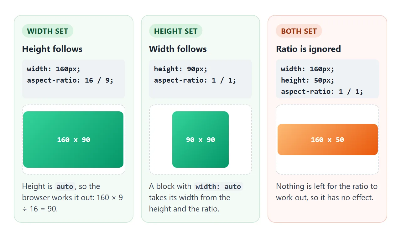
The property works on any box that takes a width: divs, sections, buttons, iframes, video and canvas elements. It does not work on an inline element such as a plain <span>, because inline boxes ignore width and height. Give it display: inline-block or block first.
The ratio applies to the box set by box-sizing. With the default content-box, padding is added outside the ratio, so a padded 16:9 box comes out a little taller. With box-sizing: border-box, the whole box including padding has the exact ratio.
Common ratios and where they fit
| Ratio | Shape | Typical use |
|---|---|---|
1 / 1 |
Square | Thumbnails, avatars, product tiles |
4 / 3 |
Slightly wide | Card pictures, slides, older photos |
3 / 2 |
Wider | Camera photos |
16 / 9 |
Wide | Video frames, embeds, hero banners |
9 / 16 |
Tall | Phone video, story cards |
21 / 9 |
Very wide | Banners and cinema-style strips |
A single number also works: aspect-ratio: 2 means 2 / 1. For ratios that do not divide evenly, such as 16 / 9, keep the two-number form so the value stays exact.
When content is taller than the box
aspect-ratio sets a preferred height, not a hard limit. On a normal div, content that needs more room makes the box grow, and the ratio breaks. This is on purpose: the browser prefers stretching the box over letting text spill out.
Press Add text and watch the three cards.
<!doctype html>
<html lang="en">
<head>
<meta charset="utf-8">
<meta name="viewport" content="width=device-width, initial-scale=1">
<title>aspect-ratio and overflowing content</title>
<style>
  body { margin: 0; padding: 16px; font-family: system-ui, sans-serif; background: #f4f5f7; color: #1d2330; }
  .bar { display: flex; gap: 8px; align-items: center; margin-bottom: 14px; }
  .bar button {
    font: 600 14px system-ui, sans-serif; padding: 8px 14px; border-radius: 8px;
    border: 1px solid #cfd4dc; background: #fff; cursor: pointer;
  }
  .row { max-width: 420px; display: grid; grid-template-columns: repeat(3, 1fr); gap: 10px; }
  .row h3 { margin: 0 0 4px; font: 700 13px ui-monospace, Consolas, monospace; }
  .row .h { margin: 0 0 6px; font-size: 12px; color: #6b7280; }

  .card {
    aspect-ratio: 1 / 1;
    padding: 8px; box-sizing: border-box;
    border-radius: 10px; background: #fff; border: 2px solid #cbd5e1;
    font-size: 13px; line-height: 1.35;
  }
  .keep-size { min-height: 0; }   /* keeps the square, extra text spills out */
  .scroll    { overflow: auto; }  /* keeps the square, extra text scrolls */
</style>
</head>
<body>
<div class="bar">
  <button id="add">Add text</button>
  <button id="reset">Reset</button>
</div>
<div class="row">
  <div><h3>ratio only</h3><p class="h" data-for="a"></p><div class="card" id="a"></div></div>
  <div><h3>min-height: 0</h3><p class="h" data-for="b"></p><div class="card keep-size" id="b"></div></div>
  <div><h3>overflow: auto</h3><p class="h" data-for="c"></p><div class="card scroll" id="c"></div></div>
</div>

<script>
  const cards = document.querySelectorAll('.card');
  const line = 'More text in the card. ';
  let n = 1;

  function render() {
    cards.forEach((c) => {
      c.textContent = line.repeat(n);
      const r = c.getBoundingClientRect();
      // show whether the card is still square
      document.querySelector('[data-for="' + c.id + '"]').textContent =
        Math.round(r.width) + ' x ' + Math.round(r.height) + ' px';
    });
  }

  document.getElementById('add').addEventListener('click', () => { if (n < 10) n++; render(); });
  document.getElementById('reset').addEventListener('click', () => { n = 1; render(); });
  window.addEventListener('resize', render);
  render();
</script>
</body>
</html>
You have two ways to hold the shape:
overflow: autokeeps the square and adds a scrollbar inside the card. This is the safe choice for text.min-height: 0keeps the square and lets the extra text spill out of it. Use it when the content is decoration you can clip, or pair it withoverflow: hidden.
The old padding-top hack, and why you can drop it
Before aspect-ratio, a 16:9 video frame took a wrapper with padding-top: 56.25% and height: 0. Percentage padding is measured from the width, so the empty wrapper got the right height. The iframe was then placed on top of it with absolute positioning.
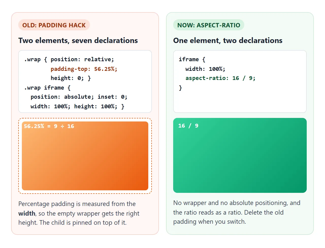
With aspect-ratio, the iframe sizes itself:
iframe {
  width: 100%;
  height: auto;          /* beats the height attribute in the markup */
  aspect-ratio: 16 / 9;
  border: 0;
}
When you switch, delete the padding from the old wrapper. If padding-top: 56.25% stays next to aspect-ratio, the padding is added on top of the ratio height and the box comes out far taller.
The iframe guide covers the rest of the embed code, and embedding YouTube applies this to a real player.
Flex and grid: when stretching wins
In a flex row, items stretch to the height of the row by default (align-items: stretch). A stretched height counts as a set height, so a square item next to a taller neighbour turns into a tall rectangle.
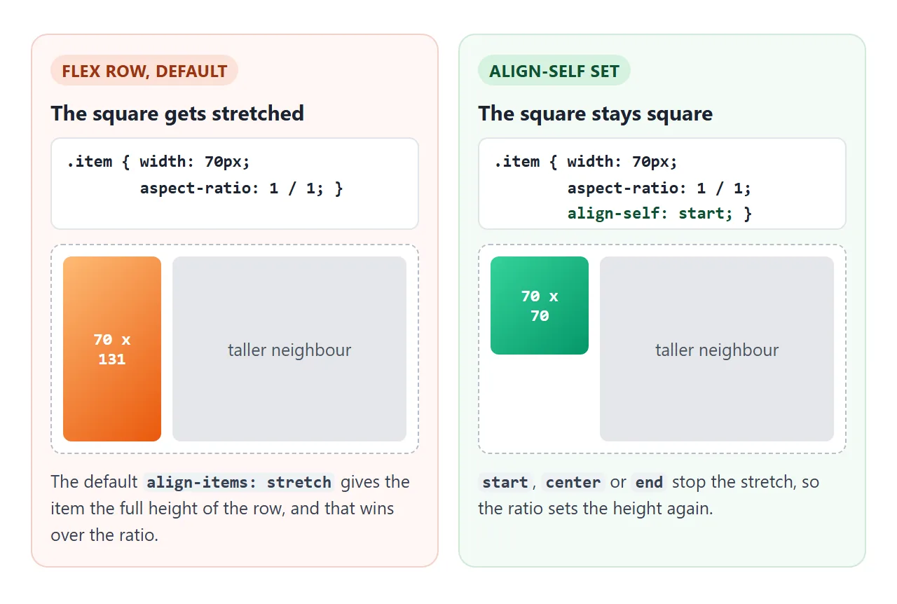
Set align-self: start (or center, end) on the item, or align-items: start on the row. Grid behaves differently: an item with aspect-ratio is not stretched by default, so square tiles in a CSS grid stay square unless you set align-self: stretch yourself.
Square tiles and images with object-fit
A thumbnail grid is the classic use. The grid sets each column's width, and aspect-ratio: 1 / 1 sets the height, so every tile is square at any screen size.
Pictures need one more line. A 3:2 photo forced into a square box gets squashed, unless you add object-fit: cover to crop it instead. object-fit explains the other values.
.thumbs { display: grid; grid-template-columns: repeat(auto-fill, minmax(72px, 1fr)); gap: 6px; }
.thumbs img { width: 100%; aspect-ratio: 1 / 1; object-fit: cover; }
If you only need a single image to scale without stretching, you may not need aspect-ratio at all. Keeping an image's aspect ratio covers height: auto and the width and height attributes.
A finished example: a responsive page
This layout uses all three shapes: a 16:9 video area with a play button, square thumbnails, and cards with 4:3 pictures. There is no real video; the frame is a styled box, so it runs anywhere.
<!doctype html>
<html lang="en">
<head>
<meta charset="utf-8">
<meta name="viewport" content="width=device-width, initial-scale=1">
<title>Responsive layout with aspect-ratio</title>
<style>
body { margin: 0; padding: 16px; font-family: system-ui, sans-serif; background: #f4f5f7; color: #1d2330; }
label { display: flex; align-items: center; gap: 10px; font-size: 14px; margin-bottom: 12px; }
input[type=range] { flex: 1; max-width: 240px; }
.page { width: 100%; margin: 0 auto; }
h2 { font-size: 15px; margin: 16px 0 8px; }
/* 1. Video placeholder: always 16:9, whatever the width */
.video {
aspect-ratio: 16 / 9;
border-radius: 12px; background: linear-gradient(135deg, #1e293b, #334155);
display: grid; place-items: center; position: relative;
}
.play {
width: 64px; aspect-ratio: 1 / 1; border-radius: 50%; border: 0; cursor: pointer;
background: rgba(255, 255, 255, .9); font-size: 22px; color: #1e293b;
}
.status { position: absolute; left: 12px; bottom: 10px; color: #cbd5e1; font-size: 13px; }
/* 2. Square thumbnails: the grid sets the width, aspect-ratio the height */
.thumbs { display: grid; grid-template-columns: repeat(auto-fill, minmax(72px, 1fr)); gap: 6px; }
.thumbs img {
width: 100%; aspect-ratio: 1 / 1;
object-fit: cover; /* crop the 3:2 picture instead of squashing it */
border-radius: 8px; display: block;
}
/* 3. Cards with a 4:3 picture area */
.cards { display: grid; grid-template-columns: repeat(auto-fill, minmax(150px, 1fr)); gap: 10px; }
.card { background: #fff; border-radius: 10px; overflow: hidden; border: 1px solid #e1e4ea; }
.card .pic { aspect-ratio: 4 / 3; }
.card p { margin: 0; padding: 8px 10px 10px; font-size: 13px; }
</style>
</head>
<body>
<label>Page width <input type="range" id="w" min="40" max="100" step="5" value="100"> <span id="wv">100%</span></label>
<div class="page" id="page">
<div class="video">
<button class="play" id="play" aria-label="Play">▶</button>
<span class="status" id="status">16 / 9 placeholder</span>
</div>
<h2>Square thumbnails (1 / 1 + object-fit)</h2>
<div class="thumbs" id="thumbs"></div>
<h2>Cards (4 / 3 picture)</h2>
<div class="cards">
<div class="card"><div class="pic" style="background:linear-gradient(135deg,#fde68a,#f59e0b)"></div><p>Morning trail</p></div>
<div class="card"><div class="pic" style="background:linear-gradient(135deg,#a7f3d0,#059669)"></div><p>Forest cabin</p></div>
<div class="card"><div class="pic" style="background:linear-gradient(135deg,#bfdbfe,#2563eb)"></div><p>Lake view</p></div>
</div>
</div>
<script>
// A 3:2 picture made with inline SVG, so the example needs no image files
const colors = ['#f472b6', '#60a5fa', '#34d399', '#fbbf24', '#a78bfa', '#f87171', '#22d3ee', '#fb923c'];
const thumbs = document.getElementById('thumbs');
colors.forEach((c, i) => {
const svg = '<svg xmlns="http://www.w3.org/2000/svg" width="300" height="200">' +
'<rect width="300" height="200" fill="' + c + '"/>' +
'<circle cx="150" cy="100" r="60" fill="white" fill-opacity=".5"/></svg>';
const img = document.createElement('img');
img.src = 'data:image/svg+xml,' + encodeURIComponent(svg);
img.alt = 'Thumbnail ' + (i + 1);
thumbs.appendChild(img);
});
// Narrow the page to watch every box keep its shape
const w = document.getElementById('w');
w.addEventListener('input', () => {
document.getElementById('page').style.width = w.value + '%';
document.getElementById('wv').textContent = w.value + '%';
});
const play = document.getElementById('play');
let playing = false;
play.addEventListener('click', () => {
playing = !playing;
play.innerHTML = playing ? '❚❚' : '▶';
play.setAttribute('aria-label', playing ? 'Pause' : 'Play');
document.getElementById('status').textContent = playing ? 'Playing (placeholder)' : '16 / 9 placeholder';
});
</script>
</body>
</html>
Nothing in this page sets a height in pixels. Each box gets its width from the layout and its height from its ratio, which is why narrowing the page never distorts anything.
When it does not work
| What you see | Cause | Fix |
|---|---|---|
| The box ignores the ratio | Both width and height are set | Set one side to auto |
| An iframe stays 315px tall | The height attribute in the markup sets the height |
Add height: auto in CSS, or remove the attribute |
| The box grows past its shape | Content is taller than the ratio allows | overflow: auto, or min-height: 0 |
| A square in a flex row is tall | The row stretches its items | align-self: start on the item |
| The box is about twice as tall | The old padding hack is still there | Remove padding-top and height: 0 |
| Nothing happens on a span | Inline boxes ignore width and height | display: inline-block or block |
| An empty box disappears | Absolutely positioned or floated, it shrinks to its content, so width and height are both 0 | Give it a width, or left and right |
| The image inside is squashed | The img fills the box without cropping | object-fit: cover on the img |
Share it as a link
Layouts that depend on screen width are hard to judge from a screenshot. A screenshot shows one width, and an .html attachment may open as plain code on a phone.
To send the working version, paste the page into a NOS document and choose Create share link. HTML to link walks through it.
The page renders as written and its scripts run, so the people you send it to can open it on their own phone and drag the sliders. If you change the code later, the same link shows the new version.