object-fit tells an <img> or <video> how to fill a box whose shape does not match the picture. cover fills the box and crops the edges, contain shows the whole picture with empty bars, and the default, fill, stretches it.
It only matters once the element has a fixed width and height.
Try it. The three boxes are the same size; the pictures are wide, tall and small. Click each value.
<!doctype html>
<html lang="en">
<head>
<meta charset="utf-8">
<meta name="viewport" content="width=device-width, initial-scale=1">
<title>object-fit values</title>
<style>
  body { margin: 0; padding: 16px; font-family: system-ui, sans-serif; background: #f4f5f7; color: #1d2330; }
  .buttons { display: flex; flex-wrap: wrap; gap: 6px; margin-bottom: 14px; }
  .buttons button {
    font: 600 14px system-ui, sans-serif; padding: 7px 12px; border-radius: 8px;
    border: 1px solid #cfd4dc; background: #fff; cursor: pointer;
  }
  .buttons button[aria-pressed="true"] { background: #1d2330; color: #fff; border-color: #1d2330; }
  .row { display: flex; gap: 12px; flex-wrap: wrap; }
  figure { margin: 0; font-size: 13px; color: #4b5563; text-align: center; }

  /* The box: a fixed width AND height. object-fit decides how the picture fills it. */
  .row img {
    display: block;
    width: min(26vw, 170px);
    height: min(26vw, 170px);
    object-fit: fill;               /* changed by the buttons */
    background: repeating-linear-gradient(45deg, #e5e7eb 0 6px, #fff 6px 12px); /* shows empty space */
    outline: 2px dashed #2563eb; outline-offset: -1px;
    margin-bottom: 6px;
  }
  code { font: 600 14px ui-monospace, Consolas, monospace; }
  #note { margin: 14px 0 0; font-size: 14px; line-height: 1.5; min-height: 3em; }
</style>
</head>
<body>
<div class="buttons" id="buttons">
  <button aria-pressed="true">fill</button>
  <button>contain</button>
  <button>cover</button>
  <button>none</button>
  <button>scale-down</button>
</div>

<div class="row">
  <figure><img id="wide" alt="A wide landscape"><figcaption>wide 320 x 160</figcaption></figure>
  <figure><img id="tall" alt="A tall lighthouse scene"><figcaption>tall 120 x 240</figcaption></figure>
  <figure><img id="small" alt="A small badge"><figcaption>small 64 x 64</figcaption></figure>
</div>

<p id="note"></p>

<script>
  // Stand-in photos drawn in SVG. In your page these would be normal image files.
  // preserveAspectRatio="none" lets the SVG stretch the way a photo would.
  const svg = (w, h, inner) => 'data:image/svg+xml,' + encodeURIComponent(
    `<svg xmlns="http://www.w3.org/2000/svg" width="${w}" height="${h}" viewBox="0 0 ${w} ${h}" preserveAspectRatio="none">${inner}</svg>`);

  document.getElementById('wide').src = svg(320, 160,
    '<rect width="320" height="160" fill="#8ecae6"/><circle cx="160" cy="44" r="20" fill="#ffb703"/>' +
    '<path d="M0 120 L70 60 L130 110 L200 50 L320 125 V160 H0Z" fill="#2a9d8f"/>' +
    '<rect x="18" y="100" width="34" height="28" fill="#e63946"/><path d="M14 102 L35 84 L56 102Z" fill="#9d0208"/>' +
    '<rect x="290" y="92" width="8" height="30" fill="#6b4226"/><circle cx="294" cy="86" r="16" fill="#1b4332"/>');

  document.getElementById('tall').src = svg(120, 240,
    '<rect width="120" height="240" fill="#1d3557"/><circle cx="88" cy="28" r="12" fill="#f1faee"/>' +
    '<rect y="170" width="120" height="70" fill="#457b9d"/>' +
    '<path d="M50 170 L54 90 H66 L70 170Z" fill="#f1faee"/><rect x="52" y="112" width="16" height="10" fill="#e63946"/>' +
    '<rect x="50" y="78" width="20" height="12" fill="#ffb703"/><path d="M20 214 H48 L42 224 H26Z" fill="#e9c46a"/>');

  document.getElementById('small').src = svg(64, 64,
    '<rect width="64" height="64" rx="14" fill="#6d28d9"/><path d="M18 34 L28 44 L47 22" stroke="#fff" stroke-width="7" fill="none" stroke-linecap="round"/>');

  const notes = {
    'fill': 'Stretches the picture to the box on both axes. Proportions are lost. This is the default.',
    'contain': 'Scales until the whole picture fits. Nothing is cut; the leftover space shows as bars.',
    'cover': 'Scales until the box is full. Proportions are kept; whatever sticks out is cropped.',
    'none': 'Keeps the natural size and centres it. Big pictures are cropped, small ones leave space.',
    'scale-down': 'Uses none or contain, whichever is smaller. It never makes a picture bigger than its file.',
  };

  const imgs = document.querySelectorAll('.row img');
  const buttons = document.querySelectorAll('#buttons button');
  const note = document.getElementById('note');

  function choose(value) {
    imgs.forEach((img) => { img.style.objectFit = value; });
    buttons.forEach((b) => b.setAttribute('aria-pressed', b.textContent === value));
    note.innerHTML = '<code>object-fit: ' + value + ';</code> ' + notes[value];
  }

  buttons.forEach((b) => b.addEventListener('click', () => choose(b.textContent)));
  choose('fill');
</script>
</body>
</html>
The whole rule is short:
img {
  width: 200px;
  height: 200px;
  object-fit: cover;
}
The five values of object-fit
Every value answers one question: what happens when the box and the picture have different shapes?
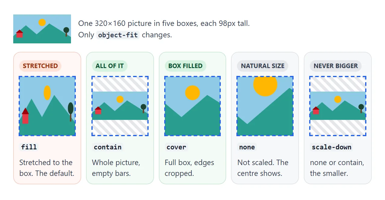
| Value | Keeps proportions | Fills the whole box | What you lose |
|---|---|---|---|
fill (default) |
No | Yes | The proportions: it is stretched |
contain |
Yes | No | Space: empty bars on two sides |
cover |
Yes | Yes | The edges: they are cropped |
none |
Yes | Only by chance | Size control: it stays at the file's size |
scale-down |
Yes | No | Nothing extra: it is none or contain, whichever is smaller |
In practice, two values do most of the work. Use cover for photos, where losing an edge is fine. Use contain for logos, charts and screenshots, where every part has to stay visible.
scale-down is useful for icons and small logos. A small file stays at its own size instead of being blown up and blurred; a large one shrinks to fit.
Why object-fit needs a width and a height
object-fit works on the gap between the box's shape and the picture's shape. If one side is auto, the browser sizes the box from the picture, so the shapes already match and there is nothing to fit.
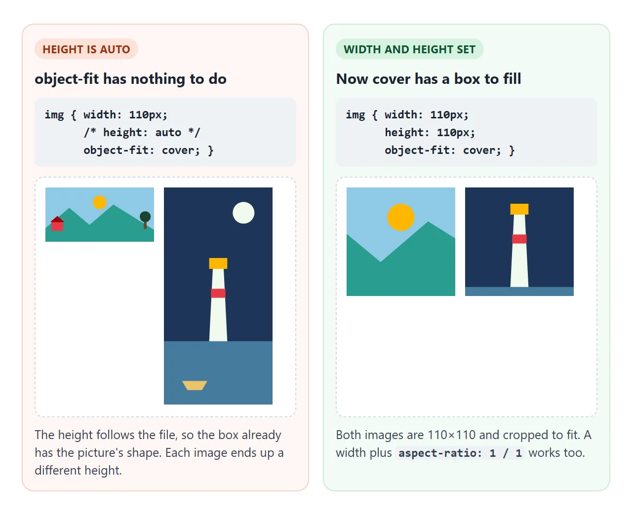
Starter stylesheets often contain img { max-width: 100%; height: auto; }. That line is right for responsive images, and it is also why object-fit can appear to do nothing.
When the width must stay flexible, fix the shape with aspect-ratio instead of a pixel height:
.thumb {
  width: 100%;
  aspect-ratio: 4 / 3;   /* height follows the width */
  object-fit: cover;
}
A percentage height needs a parent with a set height. With height: 100% inside a parent whose height is auto, the image falls back to auto and the crop disappears again.
Choosing the visible part with object-position
With cover, the browser keeps the centre by default. object-position moves the crop. It takes the same values as background-position: keywords such as top or left, percentages, or lengths.
<!doctype html>
<html lang="en">
<head>
<meta charset="utf-8">
<meta name="viewport" content="width=device-width, initial-scale=1">
<title>object-position picker</title>
<style>
  body { margin: 0; padding: 16px; font-family: system-ui, sans-serif; background: #f4f5f7; color: #1d2330; }
  .tabs { display: flex; gap: 6px; margin-bottom: 14px; }
  .tabs button, .grid button { font: 600 14px system-ui, sans-serif; border: 1px solid #cfd4dc; background: #fff; border-radius: 8px; cursor: pointer; }
  .tabs button { padding: 7px 12px; }
  .tabs button[aria-pressed="true"] { background: #1d2330; color: #fff; border-color: #1d2330; }
  .layout { display: flex; gap: 16px; flex-wrap: wrap; align-items: flex-start; }

  /* A square box with a cover-cropped picture. object-position picks the part you keep. */
  #photo {
    display: block; width: 180px; height: 180px;
    object-fit: cover;
    object-position: 50% 50%;       /* the default: keep the centre */
    border-radius: 12px;
  }

  .grid { display: grid; grid-template-columns: repeat(3, 44px); gap: 6px; }
  .grid button { height: 44px; padding: 0; }
  .grid button[aria-pressed="true"] { background: #16a34a; border-color: #16a34a; }
  .full { position: relative; display: inline-block; margin-top: 14px; }
  .full img { display: block; height: 110px; opacity: .45; }
  #window { position: absolute; border: 3px solid #16a34a; box-sizing: border-box; background: none; }
  p { font-size: 14px; line-height: 1.5; margin: 12px 0 0; }
  code { font: 600 14px ui-monospace, Consolas, monospace; }
  .label { font-size: 13px; color: #4b5563; margin: 0 0 6px; max-width: 150px; }
</style>
</head>
<body>
<div class="tabs" id="tabs">
  <button aria-pressed="true" data-img="wide">Wide photo</button>
  <button data-img="tall">Tall photo</button>
</div>

<div class="layout">
  <img id="photo" alt="Cropped photo">
  <div>
    <p class="label">Click where the focus should be:</p>
    <div class="grid" id="grid"></div>
  </div>
</div>
<p class="label" style="margin-top:14px; max-width:none">The whole photo, and the part the box keeps:</p>
<div class="full" style="margin-top:0"><img id="whole" alt=""><div id="window"></div></div>
<p id="out"></p>

<script>
  // Stand-in photos drawn in SVG, with something different at each edge.
  // preserveAspectRatio="none" lets the SVG stretch the way a photo would.
  const svg = (w, h, inner) => 'data:image/svg+xml,' + encodeURIComponent(
    `<svg xmlns="http://www.w3.org/2000/svg" width="${w}" height="${h}" viewBox="0 0 ${w} ${h}" preserveAspectRatio="none">${inner}</svg>`);
  const photos = {
    wide: { w: 360, h: 160, src: svg(360, 160,
      '<rect width="360" height="160" fill="#8ecae6"/><circle cx="180" cy="44" r="20" fill="#ffb703"/>' +
      '<path d="M0 120 L80 60 L140 110 L220 50 L360 125 V160 H0Z" fill="#2a9d8f"/>' +
      '<rect x="18" y="100" width="34" height="28" fill="#e63946"/><path d="M14 102 L35 84 L56 102Z" fill="#9d0208"/>' +
      '<rect x="326" y="92" width="8" height="30" fill="#6b4226"/><circle cx="330" cy="86" r="16" fill="#1b4332"/>') },
    tall: { w: 120, h: 280, src: svg(120, 280,
      '<rect width="120" height="280" fill="#1d3557"/><circle cx="88" cy="26" r="12" fill="#f1faee"/>' +
      '<rect y="200" width="120" height="80" fill="#457b9d"/>' +
      '<path d="M50 200 L54 110 H66 L70 200Z" fill="#f1faee"/><rect x="52" y="132" width="16" height="10" fill="#e63946"/>' +
      '<rect x="50" y="98" width="20" height="12" fill="#ffb703"/><path d="M20 250 H48 L42 260 H26Z" fill="#e9c46a"/>') },
  };

  const photo = document.getElementById('photo');
  const whole = document.getElementById('whole');
  const win = document.getElementById('window');
  const out = document.getElementById('out');
  const grid = document.getElementById('grid');
  let current = 'wide', x = 50, y = 50;

  // Nine buttons: 0%, 50%, 100% on each axis
  [0, 50, 100].forEach((py) => [0, 50, 100].forEach((px) => {
    const b = document.createElement('button');
    b.setAttribute('aria-label', `object-position ${px}% ${py}%`);
    b.addEventListener('click', () => { x = px; y = py; update(); });
    grid.append(b);
  }));

  function update() {
    const p = photos[current];
    photo.style.objectPosition = `${x}% ${y}%`;
    grid.querySelectorAll('button').forEach((b, i) =>
      b.setAttribute('aria-pressed', i === (y / 50) * 3 + x / 50));

    // Draw the part of the photo the box keeps (cover scale = the larger ratio)
    const box = photo.clientWidth, shown = whole.clientWidth / p.w;
    const scale = Math.max(box / p.w, box / p.h);
    const vw = box / scale, vh = box / scale;               // visible area, in photo pixels
    Object.assign(win.style, {
      width: vw * shown + 'px', height: vh * shown + 'px',
      left: (p.w - vw) * x / 100 * shown + 'px', top: (p.h - vh) * y / 100 * shown + 'px',
    });
    const cut = p.w > p.h ? 'left and right, so only the first number moves it' : 'top and bottom, so only the second number moves it';
    out.innerHTML = `<code>object-position: ${x}% ${y}%;</code> This photo is cropped at the ${cut}.`;
  }

  document.querySelectorAll('#tabs button').forEach((t) => t.addEventListener('click', () => {
    current = t.dataset.img;
    document.querySelectorAll('#tabs button').forEach((b) => b.setAttribute('aria-pressed', b === t));
    photo.src = whole.src = photos[current].src;  // update() runs again on load
  }));
  whole.addEventListener('load', update);  // sizes are known once the picture has loaded
  photo.src = whole.src = photos.wide.src;
</script>
</body>
</html>
The first number is horizontal and the second vertical. 0% keeps the left or top edge, 100% keeps the right or bottom, and 50% 50% is the default.
A picture wider than the box is only cropped at the sides, so only the first number changes anything. A taller picture is cropped at the top and bottom, and only the second number matters. For portraits, object-position: 50% 20% keeps faces in frame.
object-fit vs background-size
The same two ideas exist for CSS backgrounds under different names. object-fit belongs to real <img> and <video> elements; background-size belongs to background-image.
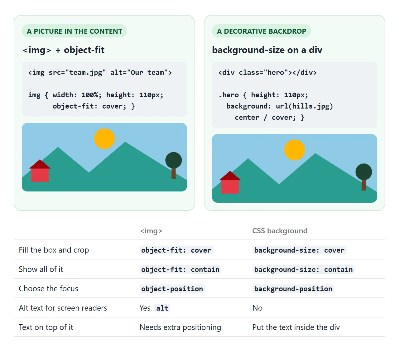
Choose by what the picture is. If it is content, such as a product photo or a chart, use <img> with alt text and object-fit. If it is decoration behind text, such as a banner backdrop, a background image with background-size: cover is simpler.
Setting object-fit on a <div> with a background does nothing, and background-size on an <img> only affects that image's own background, not the picture.
Square avatars and even thumbnails
Uploaded photos come in every shape. object-fit: cover turns them into tiles of one shape without editing the files.
<!doctype html>
<html lang="en">
<head>
<meta charset="utf-8">
<meta name="viewport" content="width=device-width, initial-scale=1">
<title>Thumbnails and avatars with object-fit</title>
<style>
  body { margin: 0; padding: 16px; font-family: system-ui, sans-serif; background: #f4f5f7; color: #1d2330; }
  h2 { font-size: 15px; margin: 0 0 10px; }
  label { display: inline-flex; gap: 6px; align-items: center; font-size: 14px; margin-bottom: 12px; cursor: pointer; }

  /* Uniform thumbnails: every tile is square, whatever shape the file is */
  .thumbs { display: grid; grid-template-columns: repeat(auto-fill, minmax(92px, 1fr)); gap: 8px; }
  .thumbs img {
    display: block;            /* no gap under the image */
    width: 100%;
    aspect-ratio: 1 / 1;       /* the height comes from the width */
    object-fit: cover;         /* fill the square, crop the rest */
    border-radius: 10px;
  }
  .off .thumbs img { object-fit: fill; }  /* the toggle: what happens without it */

  /* Round avatars: a square box, cropped, then rounded */
  .people { display: flex; gap: 18px; margin-top: 18px; flex-wrap: wrap; }
  .people figure { margin: 0; text-align: center; font-size: 13px; color: #4b5563; }
  .avatar {
    display: block; width: 64px; height: 64px;
    object-fit: cover;
    object-position: 50% 20%;  /* keep the face, which sits near the top */
    border-radius: 50%;
    border: 3px solid #fff; box-shadow: 0 2px 8px rgba(0, 0, 0, .15);
    margin: 0 auto 6px;
  }
  .off .avatar { object-fit: fill; }
</style>
</head>
<body>
<label><input type="checkbox" id="toggle" checked> object-fit: cover</label>

<div id="page">
  <h2>Gallery (six files, six different shapes)</h2>
  <div class="thumbs" id="thumbs"></div>

  <h2 style="margin-top:18px">Team</h2>
  <div class="people" id="people"></div>
</div>

<script>
  // Stand-in photos drawn in SVG. In your page these would be normal image files.
  // preserveAspectRatio="none" lets the SVG stretch the way a photo would.
  const svg = (w, h, inner) => 'data:image/svg+xml,' + encodeURIComponent(
    `<svg xmlns="http://www.w3.org/2000/svg" width="${w}" height="${h}" viewBox="0 0 ${w} ${h}" preserveAspectRatio="none">${inner}</svg>`);

  // A simple scene: sky, sun and hills, stretched to any size
  const scene = (w, h, sky, hill) => svg(w, h,
    `<rect width="${w}" height="${h}" fill="${sky}"/><circle cx="${w / 2}" cy="${h * 0.3}" r="${Math.min(w, h) * 0.12}" fill="#ffb703"/>` +
    `<ellipse cx="${w * 0.3}" cy="${h}" rx="${w * 0.5}" ry="${h * 0.35}" fill="${hill}"/>` +
    `<ellipse cx="${w * 0.8}" cy="${h}" rx="${w * 0.4}" ry="${h * 0.25}" fill="#1b4332"/>`);

  // A portrait photo: tall, with the face in the upper part
  const person = (skin, shirt, bg) => svg(300, 400,
    `<rect width="300" height="400" fill="${bg}"/><rect x="60" y="210" width="180" height="190" rx="70" fill="${shirt}"/>` +
    `<circle cx="150" cy="120" r="62" fill="${skin}"/><circle cx="128" cy="112" r="7" fill="#1d2330"/><circle cx="172" cy="112" r="7" fill="#1d2330"/>` +
    `<path d="M126 146 Q150 164 174 146" stroke="#1d2330" stroke-width="6" fill="none" stroke-linecap="round"/>`);

  const files = [
    [400, 200, '#8ecae6', '#2a9d8f'], [200, 300, '#bde0fe', '#52b788'], [300, 300, '#ffd6a5', '#e76f51'],
    [500, 180, '#cdb4db', '#6d597a'], [180, 320, '#a8dadc', '#457b9d'], [320, 240, '#fde68a', '#588157'],
  ];
  const thumbs = document.getElementById('thumbs');
  files.forEach(([w, h, sky, hill]) => {
    const img = new Image();
    img.src = scene(w, h, sky, hill);
    img.alt = `Landscape, ${w} x ${h}`;
    thumbs.append(img);
  });

  const people = document.getElementById('people');
  [['Ana', '#f1c27d', '#2563eb', '#dbeafe'], ['Ben', '#8d5524', '#16a34a', '#dcfce7'], ['Chloe', '#ffdbac', '#db2777', '#fce7f3']]
    .forEach(([name, skin, shirt, bg]) => {
      const fig = document.createElement('figure');
      fig.innerHTML = `<img class="avatar" src="${person(skin, shirt, bg)}" alt="${name}"><figcaption>${name}</figcaption>`;
      people.append(fig);
    });

  // Turn object-fit off to see what the same CSS does without it
  document.getElementById('toggle').addEventListener('change', (e) => {
    document.getElementById('page').classList.toggle('off', !e.target.checked);
  });
</script>
</body>
</html>
.thumbs img {
  display: block;
  width: 100%;
  aspect-ratio: 1 / 1;
  object-fit: cover;
}

.avatar {
  width: 64px;
  height: 64px;
  object-fit: cover;
  object-position: 50% 20%;
  border-radius: 50%;
}
- Thumbnails: a grid sets the width,
aspect-ratiosets the height, andcoverfills the square. The HTML image gallery guide builds a full gallery around this. - Round avatars: crop to a square first with
cover, then round it withborder-radius: 50%. Rounding an uncropped rectangle gives an oval. - Faces:
object-positionkeeps the top part, where the face usually is.
If you only want an image to scale without distortion and do not need a fixed box, keeping an image's aspect ratio covers the height: auto approach.
object-fit on video
object-fit works the same way on <video>. A video already keeps its proportions without it, because the HTML standard's built-in styles give video the value contain. That is why a video in the wrong-shaped box shows black bars.
To fill a banner edge to edge, set object-fit: cover on the video, with a width and height on the element.
<video src="clip.mp4" autoplay muted loop playsinline
       style="width: 100%; height: 240px; object-fit: cover"></video>
When it does not work
| What you see | Cause | Fix |
|---|---|---|
| Nothing changes, nothing is cropped | The height is auto, so the box already has the picture's shape |
Set a height, or a width plus aspect-ratio |
| Still nothing, even with a height | object-fit is on a wrapping <div> |
Put it on the <img> or <video> itself |
| A background picture ignores it | Backgrounds are not replaced elements | Use background-size and background-position |
| The image looks squashed | width and height attributes with the default fill |
Add object-fit: cover or contain |
height: 100% does not crop |
The parent's height is auto |
Give the parent a height, or use aspect-ratio |
| A thin gap below the image | An <img> is inline and sits on the text baseline |
display: block on the image |
| The face is cut off | cover keeps the centre by default |
object-position: 50% 20% or top |
The gap under images is a display question rather than an object-fit one; CSS display explains inline boxes.
Share it as a link
A crop is easiest to judge on the screen where it will be seen. Send a working page instead of a screenshot, and the other person can resize the window or open it on a phone and see how each image fills its box.
Paste the page into a NOS document and choose Create share link. HTML to link walks through it.
The page renders as written and its scripts run, so the value buttons and the focus picker work for whoever opens the link. If you change the CSS later, the same link shows the new version.