object-view-box tells an <img>, <video> or <canvas> which rectangle of its picture to show. You write the rectangle with inset(), the same way you would cut in from each edge.
The element keeps its size and the rectangle fills it, so a smaller rectangle means a closer zoom.
Try it first. Each button sets one object-view-box value on the same image.
<!doctype html>
<html lang="en">
<head>
<meta charset="utf-8">
<meta name="viewport" content="width=device-width, initial-scale=1">
<title>object-view-box basics</title>
<style>
  body { margin: 0; padding: 14px; font-family: system-ui, sans-serif; background: #f4f5f7; color: #1d2330; }
  .photo {
    display: block; width: 100%; max-width: 480px;
    aspect-ratio: 16 / 10;           /* fixed box, so the layout never jumps */
    border-radius: 10px;
    object-view-box: inset(0);       /* the whole picture */
  }
  .btns { display: flex; flex-wrap: wrap; gap: 6px; margin: 12px 0 8px; }
  button { font: inherit; font-size: 13px; padding: 7px 10px; border: 1px solid #c9cdd4; border-radius: 8px; background: #fff; cursor: pointer; }
  button.on { background: #1d4ed8; border-color: #1d4ed8; color: #fff; }
  code { display: block; font: 13px ui-monospace, Consolas, monospace; background: #fff; border: 1px solid #e1e4ea; border-radius: 8px; padding: 8px 10px; }
  #support { font-size: 13px; margin: 8px 0 0; }
</style>
</head>
<body>
<img class="photo" id="photo" alt="A drawn landscape with a house, a tree, mountains and a sun">

<div class="btns">
  <button class="on" data-box="inset(0)">Whole picture</button>
  <button data-box="inset(25%)">Zoom 2x, centre</button>
  <button data-box="inset(0 50% 50% 0)">Top-left quarter</button>
  <button data-box="inset(50% 57.5% 10% 2.5%)">The house</button>
</div>
<code id="out">object-view-box: inset(0);</code>
<p id="support"></p>

<script>
  // A 640 x 400 picture drawn in SVG, so the example needs no image file.
  const svg = `<svg xmlns="http://www.w3.org/2000/svg" width="640" height="400">
    <rect width="640" height="400" fill="#bfe0ff"/>
    <circle cx="520" cy="110" r="42" fill="#ffd34d"/>
    <path d="M0 300 L140 150 L250 260 L360 120 L560 300 Z" fill="#6b8fb3"/>
    <path d="M0 300 Q160 250 320 300 T640 290 V400 H0 Z" fill="#4caf6a"/>
    <path d="M100 272 L150 232 L200 272 Z" fill="#d9534f"/>
    <rect x="110" y="270" width="80" height="60" fill="#fff"/>
    <rect x="140" y="295" width="20" height="35" fill="#8a5a3c"/>
    <rect x="415" y="290" width="10" height="40" fill="#7a4e2d"/>
    <circle cx="420" cy="280" r="26" fill="#2e7d4f"/>
    <text x="262" y="362" font-size="11" font-family="sans-serif" fill="#fff">zoom in to read me</text>
  </svg>`;
  const photo = document.getElementById('photo');
  photo.src = 'data:image/svg+xml,' + encodeURIComponent(svg);

  const out = document.getElementById('out');
  document.querySelectorAll('button').forEach((btn) => {
    btn.addEventListener('click', () => {
      photo.style.objectViewBox = btn.dataset.box;   // crop and zoom in one line
      out.textContent = 'object-view-box: ' + btn.dataset.box + ';';
      document.querySelectorAll('button').forEach((b) => b.classList.toggle('on', b === btn));
    });
  });

  const ok = CSS.supports('object-view-box', 'inset(0)');
  document.getElementById('support').textContent = ok
    ? 'This browser supports object-view-box.'
    : 'This browser ignores object-view-box, so the picture stays whole.';
</script>
</body>
</html>
If the image does not change when you press the buttons, your browser ignores the property. The support section below has the engines we tested and a fallback.
How inset() picks the rectangle
inset() takes up to four values in the order top, right, bottom, left, like margin. Each value cuts in from that edge of the picture.
One value cuts the same amount from all four sides, so inset(25%) keeps the middle half in each direction: a 2x zoom on the centre.
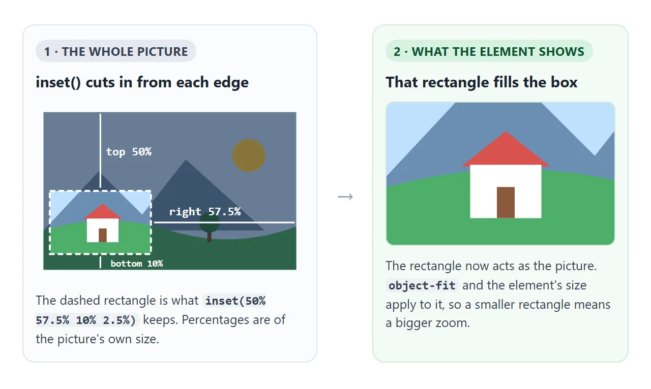
Percentages are measured against the picture's own size, not the element's. On a 640 by 400 picture, inset(0 50% 0 0) keeps the left 320 by 400 pixels, whatever size the element has on screen.
Negative values reach past the edge of the picture. The extra area is empty, so the picture zooms out and leaves a blank strip. In Chromium 147 the property also accepted xywh() and rect(), and the computed value came back written as inset().
object-view-box vs object-fit and object-position
The existing tools already crop. object-fit with cover scales the picture until it fills the box and cuts off the rest. object-position slides the picture to choose which part survives. What neither can do is zoom further in than "just enough to cover".
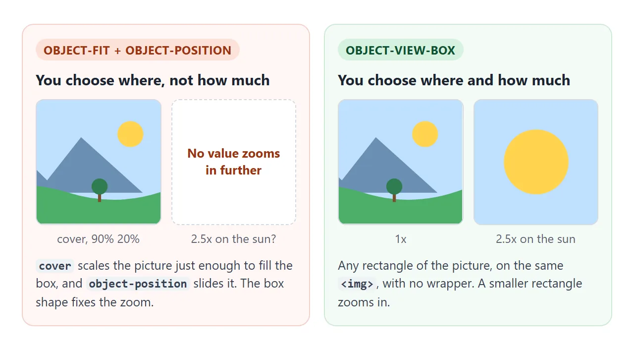
Drag the slider below. The left image is stuck at one scale. The middle one zooms with object-view-box. The right one does the same job the older way, with a wrapper that hides the overflow and a transform: scale() on the image.
<!doctype html>
<html lang="en">
<head>
<meta charset="utf-8">
<meta name="viewport" content="width=device-width, initial-scale=1">
<title>object-fit vs object-view-box vs a wrapper</title>
<style>
  body { margin: 0; padding: 14px; font-family: system-ui, sans-serif; background: #f4f5f7; color: #1d2330; }
  .row { display: grid; grid-template-columns: repeat(3, 1fr); gap: 10px; }
  .cell h3 { margin: 0 0 6px; font-size: 13px; }
  .cell p { margin: 6px 0 0; font-size: 12px; color: #5b6270; line-height: 1.4; }
  .sq { display: block; width: 100%; aspect-ratio: 1; border-radius: 8px; }

  /* A: object-fit crops to fill the box. The scale is fixed. */
  #fit { object-fit: cover; object-position: 90% 20%; }

  /* B: object-view-box picks any rectangle of the picture. */
  #view { object-view-box: inset(0 0 0 37.5%); }

  /* C: the older way, an extra wrapper that hides the overflow. */
  .wrap { overflow: hidden; border-radius: 8px; aspect-ratio: 1; }
  #wrapped { display: block; width: 100%; height: 100%; object-fit: cover; object-position: 90% 20%; transform-origin: 76% 27.5%; }

  label { display: block; margin: 14px 0 4px; font-size: 13px; }
  input { width: 100%; max-width: 360px; }
  code { display: block; margin-top: 8px; font: 12px ui-monospace, Consolas, monospace; background: #fff; border: 1px solid #e1e4ea; border-radius: 8px; padding: 7px 9px; word-break: break-all; }
</style>
</head>
<body>
<div class="row">
  <div class="cell"><h3>object-fit</h3><img class="sq" id="fit" alt="Landscape, object-fit"><p>Crops to fill. Cannot zoom.</p></div>
  <div class="cell"><h3>object-view-box</h3><img class="sq" id="view" alt="Landscape, object-view-box"><p>Any rectangle, any zoom. One element.</p></div>
  <div class="cell"><h3>wrapper + scale</h3><div class="wrap"><img id="wrapped" alt="Landscape, wrapper"></div><p>Works everywhere. Needs a second element.</p></div>
</div>

<label for="z">Zoom on the sun: <b id="zv">1x</b></label>
<input id="z" type="range" min="1" max="4" step="0.1" value="1">
<code id="out">object-view-box: inset(0 0 0 37.5%);</code>

<script>
  const svg = `<svg xmlns="http://www.w3.org/2000/svg" width="640" height="400">
    <rect width="640" height="400" fill="#bfe0ff"/>
    <circle cx="520" cy="110" r="42" fill="#ffd34d"/>
    <path d="M0 300 L140 150 L250 260 L360 120 L560 300 Z" fill="#6b8fb3"/>
    <path d="M0 300 Q160 250 320 300 T640 290 V400 H0 Z" fill="#4caf6a"/>
    <path d="M100 272 L150 232 L200 272 Z" fill="#d9534f"/>
    <rect x="110" y="270" width="80" height="60" fill="#fff"/>
    <rect x="415" y="290" width="10" height="40" fill="#7a4e2d"/>
    <circle cx="420" cy="280" r="26" fill="#2e7d4f"/>
  </svg>`;
  const src = 'data:image/svg+xml,' + encodeURIComponent(svg);
  document.querySelectorAll('img').forEach((img) => (img.src = src));

  const W = 640, H = 400;           // the picture's own size
  const cx = 520, cy = 110;         // the point to zoom on (the sun)
  const pct = (v, total) => +(v / total * 100).toFixed(2) + '%';

  function zoom(z) {
    // a square view box, side = picture height / zoom, kept inside the picture
    const s = H / z;
    const x = Math.min(Math.max(cx - s / 2, 0), W - s);
    const y = Math.min(Math.max(cy - s / 2, 0), H - s);
    const box = `inset(${pct(y, H)} ${pct(W - x - s, W)} ${pct(H - y - s, H)} ${pct(x, W)})`;
    document.getElementById('view').style.objectViewBox = box;
    document.getElementById('wrapped').style.transform = `scale(${z})`;
    document.getElementById('out').textContent = 'object-view-box: ' + box + ';';
    document.getElementById('zv').textContent = z + 'x';
  }
  document.getElementById('z').addEventListener('input', (e) => zoom(+e.target.value));
</script>
</body>
</html>
object-fit + object-position |
object-view-box |
Wrapper + scale() |
|
|---|---|---|---|
| Crops the picture | Yes | Yes | Yes |
| Zooms past cover | No | Yes | Yes |
| Extra element | No | No | Yes, a clipping parent |
| Animates | Position only | The whole rectangle | The transform |
| Engines that applied it in our test | Chromium, Firefox, WebKit | Chromium only | Chromium, Firefox, WebKit |
object-view-box and object-fit work together. The view box is applied first and turns the rectangle into the picture. object-fit then fits that rectangle into the element.
Keep the element's size fixed
An image without a set width and height takes its layout size from its picture. With object-view-box, the rectangle counts as the picture.
In Chromium 147, a 400 by 200 image with inset(0 50% 0 0) was laid out at 200 by 200. Change the rectangle and the page moves.
Give the image a fixed box instead:
.photo {
  width: 100%;
  aspect-ratio: 16 / 10;
  object-view-box: inset(25%);
}
Keep the rectangle in the same proportions as the box. With the default object-fit: fill, a tall rectangle in a wide box is stretched. If the proportions must differ, use object-fit: cover so the extra is cropped instead of squashed.
Avoid contain and none when the box is bigger than the rectangle. In Chromium 147 the room around the rectangle showed the neighbouring parts of the picture, not empty space.
Animate a zoom
Because the property interpolates, a zoom is a transition on the image itself. Click a spot on the picture below. The script builds a rectangle 1/2.5 of the size, centred on the click and kept inside the picture, and the transition does the rest.
<!doctype html>
<html lang="en">
<head>
<meta charset="utf-8">
<meta name="viewport" content="width=device-width, initial-scale=1">
<title>Click to zoom with object-view-box</title>
<style>
  body { margin: 0; padding: 14px; font-family: system-ui, sans-serif; background: #f4f5f7; color: #1d2330; }
  figure { margin: 0; max-width: 480px; }
  .zoom { display: block; width: 100%; aspect-ratio: 16 / 10; border-radius: 10px; cursor: zoom-in; }
  .zoom.on { cursor: zoom-out; }

  /* Browsers with object-view-box: animate the view box itself. */
  @supports (object-view-box: inset(0)) {
    .zoom { object-view-box: inset(0); transition: object-view-box .45s ease; }
  }

  /* Fallback: scale the image inside the figure, which hides the overflow. */
  @supports not (object-view-box: inset(0)) {
    figure { overflow: hidden; border-radius: 10px; }
    .zoom { transition: transform .45s ease; }
    .zoom.on { transform: scale(2.5); }
  }

  figcaption { font-size: 13px; color: #5b6270; margin-top: 8px; }
  code { display: block; margin-top: 8px; font: 12px ui-monospace, Consolas, monospace; background: #fff; border: 1px solid #e1e4ea; border-radius: 8px; padding: 7px 9px; word-break: break-all; }
</style>
</head>
<body>
<figure>
  <img class="zoom" id="pic" alt="A drawn landscape. Click a spot to zoom in on it.">
  <figcaption>Click or tap any spot to zoom in 2.5x. Click again to zoom out.</figcaption>
</figure>
<code id="out">object-view-box: inset(0);</code>

<script>
  const svg = `<svg xmlns="http://www.w3.org/2000/svg" width="640" height="400">
    <rect width="640" height="400" fill="#bfe0ff"/>
    <circle cx="520" cy="110" r="42" fill="#ffd34d"/>
    <path d="M0 300 L140 150 L250 260 L360 120 L560 300 Z" fill="#6b8fb3"/>
    <path d="M0 300 Q160 250 320 300 T640 290 V400 H0 Z" fill="#4caf6a"/>
    <path d="M100 272 L150 232 L200 272 Z" fill="#d9534f"/>
    <rect x="110" y="270" width="80" height="60" fill="#fff"/>
    <rect x="140" y="295" width="20" height="35" fill="#8a5a3c"/>
    <rect x="415" y="290" width="10" height="40" fill="#7a4e2d"/>
    <circle cx="420" cy="280" r="26" fill="#2e7d4f"/>
    <text x="262" y="362" font-size="11" font-family="sans-serif" fill="#fff">zoom in to read me</text>
  </svg>`;
  const pic = document.getElementById('pic');
  pic.src = 'data:image/svg+xml,' + encodeURIComponent(svg);

  const Z = 2.5;
  const hasViewBox = CSS.supports('object-view-box', 'inset(0)');
  const out = document.getElementById('out');

  pic.addEventListener('click', (e) => {
    const on = pic.classList.toggle('on');
    // where the click landed, as a fraction of the image box (0 to 1)
    const r = pic.getBoundingClientRect();
    const fx = (e.clientX - r.left) / r.width;
    const fy = (e.clientY - r.top) / r.height;

    if (!hasViewBox) {
      pic.style.transformOrigin = `${fx * 100}% ${fy * 100}%`;
      out.textContent = on ? `transform: scale(${Z}); /* fallback */` : 'transform: none;';
      return;
    }
    // a view box 1/Z of the size, centred on the click, kept inside the picture
    const s = 1 / Z;
    const left = Math.min(Math.max(fx - s / 2, 0), 1 - s);
    const top = Math.min(Math.max(fy - s / 2, 0), 1 - s);
    const p = (v) => +(v * 100).toFixed(1) + '%';
    const box = on ? `inset(${p(top)} ${p(1 - left - s)} ${p(1 - top - s)} ${p(left)})` : 'inset(0)';
    pic.style.objectViewBox = box;
    out.textContent = 'object-view-box: ' + box + ';';
  });
</script>
</body>
</html>
The CSS side is two lines on the image:
.zoom {
  object-view-box: inset(0);
  transition: object-view-box .45s ease;
}
Setting a new value from JavaScript starts the transition:
img.style.objectViewBox = 'inset(55% 57% 5% 3%)';
The transition ran from inset(0) to percentage values in Chromium 147. Keyframes also work: @keyframes or element.animate() with objectViewBox in each frame. For more on timing and easing, see CSS transition.
Browser support and a fallback
We opened the examples in the three browser engines that ship with Playwright. Chromium 147 applied object-view-box. Firefox 148 and WebKit 26.4, the engine behind Safari, dropped the declaration and showed the whole picture.
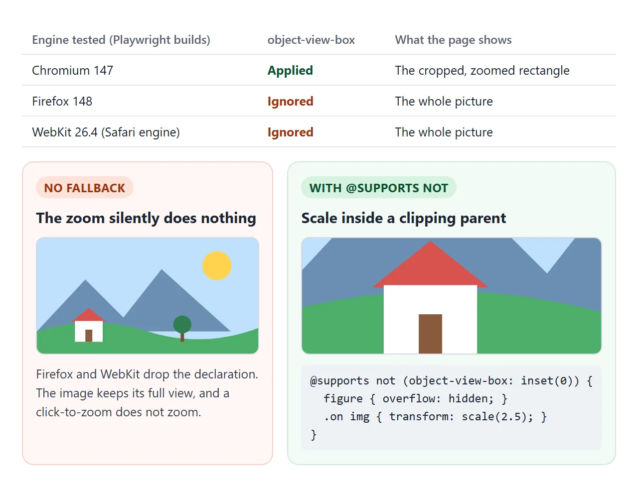
An unsupported property is not an error, it is skipped. The image still shows, just uncropped. For a static crop that may be enough. For a zoom it is not, because the click does nothing.
The fallback is the wrapper method, applied only where the property is missing. In the click-to-zoom example, the <figure> is already there to hold the caption, so it becomes the clipping parent:
@supports not (object-view-box: inset(0)) {
  figure { overflow: hidden; }
  .zoom { transition: transform .45s ease; }
  .zoom.on { transform: scale(2.5); }
}
JavaScript can make the same test and choose which path to take:
const hasViewBox = CSS.supports('object-view-box', 'inset(0)');
In the fallback, set transform-origin to the clicked point so the zoom grows from where the user tapped. In Firefox 148 and WebKit 26.4 the example scaled to 2.5x with the clicked spot still under the pointer.
Video and canvas
object-view-box applies to replaced elements, not only images. In Chromium 147 it cropped a playing <video>, a video poster and a drawn <canvas> the same way. That gives a "punch in" on a video without re-encoding it.
The video tag guide covers the element itself.
For a zoom that follows the pointer or supports pinch, the image zoom on click guide has a version that works in every engine.
When it does not work
| What you see | Cause | Fix |
|---|---|---|
| Nothing changes at all | The browser ignores the property | Add the @supports not fallback |
| The page jumps when the zoom changes | The image has no fixed size | Set width and aspect-ratio |
| The zoomed picture looks stretched | The rectangle and the box have different shapes | Match the proportions, or use object-fit: cover |
| Parts outside the rectangle show at the sides | object-fit: contain or none in a larger box |
Use fill or cover |
| A blank strip appears at one edge | A negative inset value | Keep each value at 0 or more |
| The zoom jumps instead of gliding | No transition on the property | Add transition: object-view-box |
| The crop is in the wrong place | Percentages taken as the element's size | They are of the picture's own size |
Share it as a link
A zoom has to be clicked to be judged, and a screenshot only shows one frame of it. An .html attachment may open as plain code on a phone, or not open at all.
To send the working version, paste the page into a NOS document and choose Create share link. HTML to link walks through it.
The page renders as written and its scripts run, so the people you send it to can click and zoom themselves. If you change the code later, the same link shows the new version.