object-position sets where the picture sits inside an <img> or <video> box. It works like background-position, but for real image elements. The default is 50% 50%, the centre.
You only see it once object-fit leaves something over: cover crops part of the picture, contain and none leave empty space. Then object-position decides which part you keep.
Try it. Switch the fit, press a keyword, or drag the sliders.
<!doctype html>
<html lang="en">
<head>
<meta charset="utf-8">
<meta name="viewport" content="width=device-width, initial-scale=1">
<title>object-position playground</title>
<style>
  body { margin: 0; padding: 16px; font-family: system-ui, sans-serif; background: #f4f5f7; color: #1d2330; }
  .row { display: flex; flex-wrap: wrap; gap: 6px; margin-bottom: 10px; align-items: center; }
  .row span { font-size: 13px; color: #4b5563; min-width: 62px; }
  button { font: 600 13px system-ui, sans-serif; padding: 6px 10px; border: 1px solid #cfd4dc; background: #fff; border-radius: 8px; cursor: pointer; }
  button[aria-pressed="true"] { background: #1d2330; color: #fff; border-color: #1d2330; }
  label { font-size: 13px; display: flex; align-items: center; gap: 8px; margin: 4px 0; }
  input[type="range"] { width: 160px; }

  /* The box: fixed size, striped background so empty space shows */
  #photo {
    display: block;
    width: min(280px, 100%);
    height: 200px;
    object-fit: cover;
    object-position: 50% 50%;
    border-radius: 10px;
    background: repeating-linear-gradient(45deg, #e5e7eb 0 8px, #d1d5db 8px 16px);
    margin-top: 10px;
  }
  pre { font: 600 14px ui-monospace, Consolas, monospace; background: #1d2330; color: #e5e7eb; padding: 10px 12px; border-radius: 8px; margin: 12px 0 0; white-space: pre-wrap; }
  .note { font-size: 13px; color: #4b5563; margin: 8px 0 0; line-height: 1.45; }
</style>
</head>
<body>
<div class="row" id="fits"><span>object-fit</span>
  <button data-fit="cover" aria-pressed="true">cover</button>
  <button data-fit="contain">contain</button>
  <button data-fit="none">none</button>
  <button data-fit="fill">fill</button>
</div>
<div class="row" id="keys"><span>keywords</span>
  <button data-x="0" data-y="50">left</button>
  <button data-x="50" data-y="50">center</button>
  <button data-x="100" data-y="50">right</button>
  <button data-x="50" data-y="0">top</button>
  <button data-x="50" data-y="100">bottom</button>
</div>
<label>x <input type="range" id="x" min="0" max="100" value="50"> <b id="xv">50%</b></label>
<label>y <input type="range" id="y" min="0" max="100" value="50"> <b id="yv">50%</b></label>

<img id="photo" alt="A red hot-air balloon over green hills">
<pre id="out"></pre>
<p class="note" id="note"></p>

<script>
  // Stand-in photo, 600 x 300, with the balloon on the right. Use your own photo.jpg instead.
  document.getElementById('photo').src = 'data:image/svg+xml,' + encodeURIComponent(
    '<svg xmlns="http://www.w3.org/2000/svg" width="600" height="300" viewBox="0 0 600 300">' +
    '<defs><linearGradient id="s" x2="0" y2="1"><stop offset="0" stop-color="#7cc4ec"/><stop offset="1" stop-color="#d9f0fb"/></linearGradient></defs>' +
    '<rect width="600" height="300" fill="url(#s)"/><circle cx="70" cy="60" r="28" fill="#ffd166"/>' +
    '<path d="M0 230 Q150 170 300 225 T600 210 V300 H0Z" fill="#52b788"/><path d="M0 270 Q200 235 420 268 T600 260 V300 H0Z" fill="#2d6a4f"/>' +
    '<ellipse cx="480" cy="90" rx="38" ry="46" fill="#e63946"/><path d="M446 110 L472 150 H488 L514 110Z" fill="#c1121f"/>' +
    '<rect x="470" y="150" width="20" height="16" rx="2" fill="#7f5539"/></svg>');

  const photo = document.getElementById('photo');
  const xs = document.getElementById('x'), ys = document.getElementById('y');
  const notes = {
    cover: 'cover: the picture is wider than the box, so only x changes anything.',
    contain: 'contain: the empty bars are above and below, so only y changes anything.',
    none: 'none: the picture keeps its own size, so both x and y move it.',
    fill: 'fill: the picture is stretched to the box. Nothing is left to move.',
  };

  function render() {
    photo.style.objectPosition = xs.value + '% ' + ys.value + '%';
    document.getElementById('xv').textContent = xs.value + '%';
    document.getElementById('yv').textContent = ys.value + '%';
    document.getElementById('out').textContent =
      'img {\n  object-fit: ' + photo.style.objectFit + ';\n  object-position: ' + photo.style.objectPosition + ';\n}';
    document.getElementById('note').textContent = notes[photo.style.objectFit];
  }

  document.getElementById('fits').addEventListener('click', (e) => {
    const b = e.target.closest('button'); if (!b) return;
    document.querySelectorAll('#fits button').forEach((x) => x.setAttribute('aria-pressed', x === b));
    photo.style.objectFit = b.dataset.fit;
    render();
  });
  document.getElementById('keys').addEventListener('click', (e) => {
    const b = e.target.closest('button'); if (!b) return;
    xs.value = b.dataset.x; ys.value = b.dataset.y;  // "top" is 50% 0%, and so on
    render();
  });
  xs.addEventListener('input', render);
  ys.addEventListener('input', render);

  photo.style.objectFit = 'cover';
  render();
</script>
</body>
</html>
The whole rule for a cropped image that keeps its right side:
img {
  width: 280px;
  height: 200px;
  object-fit: cover;
  object-position: right center;
}
If you have not used object-fit yet, CSS object-fit covers cover, contain and the rest. This guide is about the second property: moving the crop.
The values: keywords, percentages and lengths
object-position takes one to four parts. The first is horizontal and the second vertical, unless keywords say otherwise.
| You write | Browser reads it as | Meaning |
|---|---|---|
center |
50% 50% |
The default |
top |
50% 0% |
One value: the other axis is centred |
left |
0% 50% |
Keep the left edge |
right bottom |
100% 100% |
Keyword order is free |
75% 30% |
75% 30% |
Horizontal first, then vertical |
20px |
20px 50% |
Left edge 20px in from the box |
left 10% |
0% 10% |
Keyword first, then a number |
10% left |
invalid | A number before left is read as the horizontal value, so the pair clashes |
The browser drops an invalid declaration, and the image keeps whatever object-position applied without it, usually the centre.
Offsets from the right or bottom edge
A plain length measures from the left or top: 20px 10px puts the picture 20px in from the left and 10px down. To measure from the other edges, name the edge before the length:
.logo {
  width: 200px;
  height: 120px;
  object-fit: none;
  /* 12px in from the right edge, 8px up from the bottom */
  object-position: right 12px bottom 8px;
}
The browser stores that as the calc() form below, so the two lines are equivalent.
object-position: calc(100% - 12px) calc(100% - 8px);
Nothing stops a value from moving the picture off part of the box. A percentage below 0% or above 100%, or a length that shifts it too far, leaves a strip uncovered, and the box's own background shows there.
With cover that looks like a bug. With a small picture inside a larger tile, it can be exactly what you want.
How percentages work
A percentage lines up the same point of the picture and of the box. 0% puts the picture's left edge on the box's left edge. 100% puts the right edges together. 50% puts the centres together.
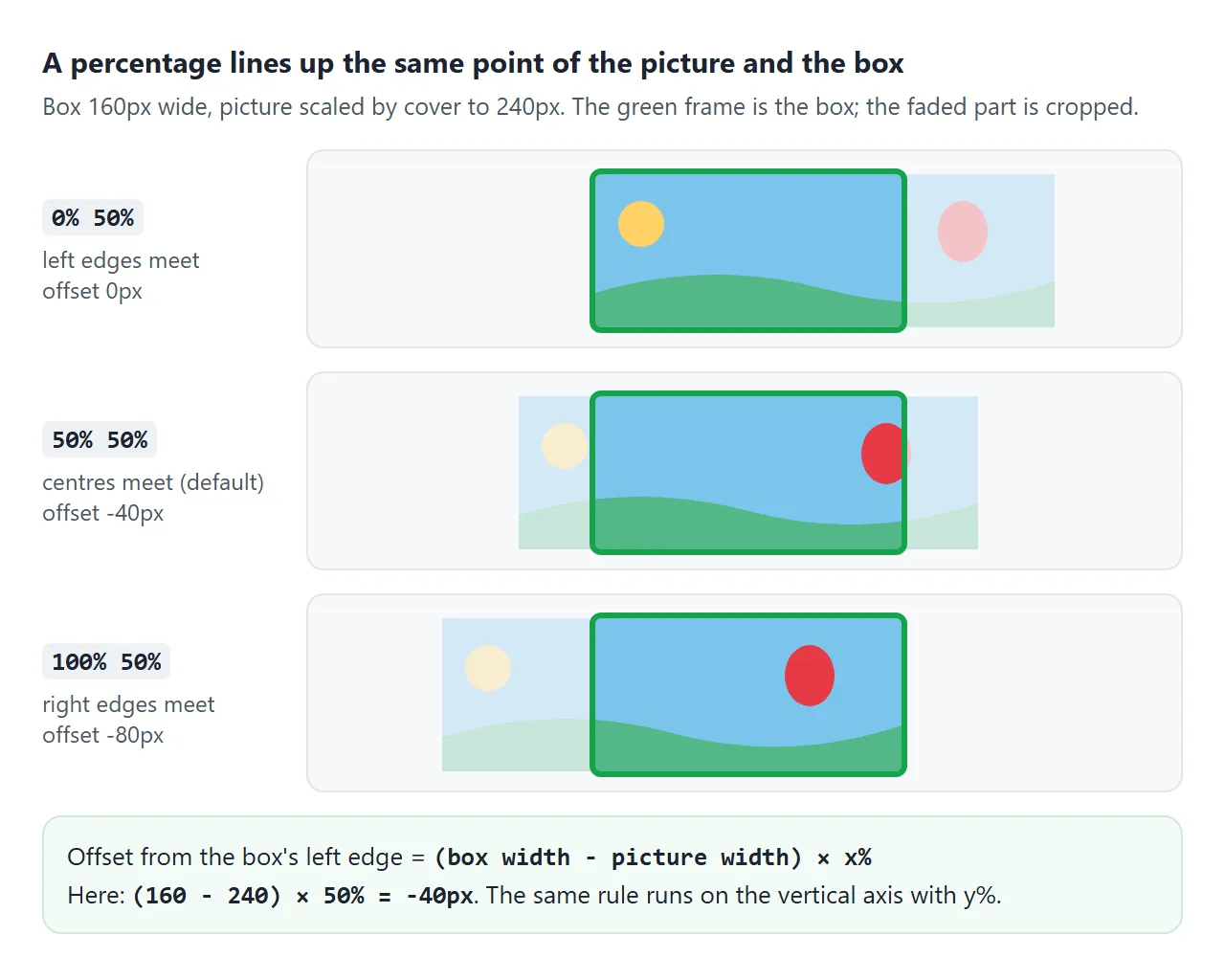
The offset the browser uses is (box - picture) × percentage, on each axis. With cover, the picture is larger than the box, so the result is negative and the picture shifts left or up.
This is why percentages feel natural for cropping. Any value from 0% to 100% keeps the picture covering the box, and never opens a gap at an edge.
Which axis it can move
object-position moves the picture only along an axis where the picture and the box differ in size. That depends on object-fit.
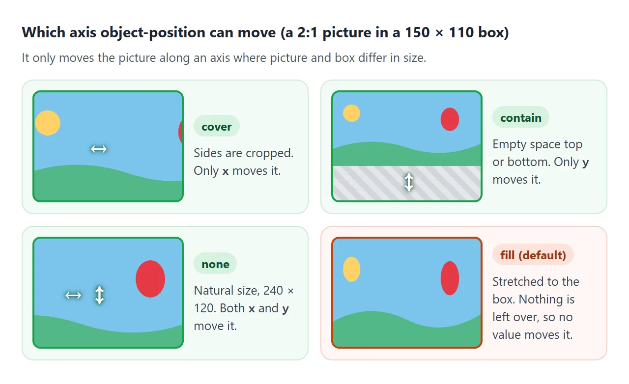
- cover: the picture overflows on one axis. A wide picture in a squarer box is cropped at the sides, so only the first value matters.
- contain: the picture is too small on one axis. The empty space is on that axis, so only that value moves it.
- none: the picture keeps its own size, so it can be larger or smaller on both axes, and both values count.
- fill: the default. The picture is stretched to the box, nothing is left over, and no value changes anything.
Focal-point cropping for avatars and banners
One photo often appears in several shapes: a round avatar, a wide banner, a tall card on a phone. With the centre crop, the subject can fall out of one of them. Setting the focal point as percentages keeps it in all of them.
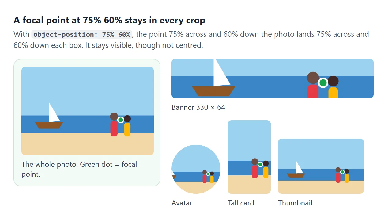
The reason is the formula above. A point at p% of the picture always lands at p% of the box, whatever the two sizes are. The point is never cropped. It is also not centred, unless p is 50%.
Click or drag on the photo below. Every crop uses the same two custom properties.
<!doctype html>
<html lang="en">
<head>
<meta charset="utf-8">
<meta name="viewport" content="width=device-width, initial-scale=1">
<title>Focal point cropping</title>
<style>
  body { margin: 0; padding: 16px; font-family: system-ui, sans-serif; background: #f4f5f7; color: #1d2330; }
  p { font-size: 13px; color: #4b5563; margin: 0 0 8px; }

  /* The full photo. Click or drag on it to set the focal point. */
  .pick { position: relative; width: min(360px, 100%); cursor: crosshair; touch-action: none; }
  /* draggable="false" on the img stops the browser dragging a copy of the photo */
  .pick img { display: block; width: 100%; border-radius: 8px; user-select: none; }
  #dot { position: absolute; width: 18px; height: 18px; margin: -9px 0 0 -9px; border-radius: 50%;
         border: 3px solid #fff; background: #16a34a; box-shadow: 0 1px 4px rgba(0,0,0,.4); pointer-events: none; box-sizing: border-box; }

  /* Every crop reads the same two custom properties */
  .crops { --fx: 50%; --fy: 50%; display: flex; flex-wrap: wrap; gap: 12px; align-items: flex-end; margin-top: 14px; }
  .crops img { display: block; object-fit: cover; object-position: var(--fx) var(--fy); border-radius: 8px; }
  .crops .avatar { width: 88px; height: 88px; border-radius: 50%; }
  .crops .banner { width: 100%; height: 70px; }
  .crops .tall   { width: 90px; height: 150px; }
  .crops .wide   { width: 150px; height: 90px; }
  figure { margin: 0; }
  figure.full { width: 100%; }
  figcaption { font-size: 12px; color: #4b5563; margin-top: 4px; }
  pre { font: 600 13px ui-monospace, Consolas, monospace; background: #1d2330; color: #e5e7eb; padding: 10px 12px; border-radius: 8px; margin: 12px 0 0; }
</style>
</head>
<body>
<p>Click or drag on the photo to choose what must stay in view.</p>
<div class="pick" id="pick"><img id="full" draggable="false" alt="Two people on a beach, a sailing boat on the left"><div id="dot"></div></div>

<div class="crops" id="crops">
  <figure class="full"><img class="banner" alt=""><figcaption>Banner</figcaption></figure>
  <figure><img class="avatar" alt=""><figcaption>Avatar</figcaption></figure>
  <figure><img class="tall" alt=""><figcaption>Phone card</figcaption></figure>
  <figure><img class="wide" alt=""><figcaption>Thumbnail</figcaption></figure>
</div>
<pre id="out"></pre>

<script>
  // Stand-in photo, 600 x 400: a boat on the left, two people on the right. Use your own photo instead.
  const src = 'data:image/svg+xml,' + encodeURIComponent(
    '<svg xmlns="http://www.w3.org/2000/svg" width="600" height="400" viewBox="0 0 600 400">' +
    '<rect width="600" height="220" fill="#9bd1f0"/><rect y="220" width="600" height="80" fill="#3a86c8"/><rect y="300" width="600" height="100" fill="#f2d8a7"/>' +
    '<path d="M60 250 H190 L170 280 H80Z" fill="#8d5524"/><path d="M125 250 V160 L175 245Z" fill="#fff"/>' +
    '<circle cx="420" cy="230" r="18" fill="#6d4c41"/><rect x="404" y="250" width="32" height="70" rx="12" fill="#e63946"/>' +
    '<circle cx="480" cy="240" r="16" fill="#3e2723"/><rect x="466" y="258" width="28" height="62" rx="11" fill="#ffb703"/></svg>');
  document.querySelectorAll('img').forEach((img) => { img.src = src; });

  const pick = document.getElementById('pick');
  const crops = document.getElementById('crops');
  const dot = document.getElementById('dot');

  function setFocus(fx, fy) {
    // The point at fx% fy% of the photo lands at fx% fy% of every box
    crops.style.setProperty('--fx', fx + '%');
    crops.style.setProperty('--fy', fy + '%');
    dot.style.left = fx + '%';
    dot.style.top = fy + '%';
    document.getElementById('out').textContent = 'object-position: ' + fx + '% ' + fy + '%;';
  }

  function fromPointer(e) {
    const r = pick.getBoundingClientRect();
    const clamp = (v) => Math.round(Math.min(100, Math.max(0, v)));
    setFocus(clamp((e.clientX - r.left) / r.width * 100), clamp((e.clientY - r.top) / r.height * 100));
  }
  pick.addEventListener('pointerdown', (e) => { pick.setPointerCapture(e.pointerId); fromPointer(e); });
  pick.addEventListener('pointermove', (e) => { if (pick.hasPointerCapture(e.pointerId)) fromPointer(e); });

  setFocus(75, 65);  // start on the two people
</script>
</body>
</html>
In a real page, store the focal point with each image, from your CMS or by hand, and pass it through custom properties:
<img class="photo" src="team.jpg" alt="Our team"
     style="--fx: 75%; --fy: 60%">
.photo {
  object-fit: cover;
  object-position: var(--fx, 50%) var(--fy, 50%);
}
.avatar { width: 64px; height: 64px; border-radius: 50%; }
.banner { width: 100%; height: 180px; }
The 50% fallbacks keep the centre crop for images without a focal point. For head-and-shoulders portraits, a value such as 50% 25% keeps the upper part, where the face usually is. Check it against your own photos.
Animating object-position
object-position can be transitioned and used in @keyframes. Keywords animate too: left and right become 0% and 100%, and the browser moves smoothly between them.
<!doctype html>
<html lang="en">
<head>
<meta charset="utf-8">
<meta name="viewport" content="width=device-width, initial-scale=1">
<title>Animating object-position</title>
<style>
  body { margin: 0; padding: 16px; font-family: system-ui, sans-serif; background: #f4f5f7; color: #1d2330; }
  h3 { font-size: 14px; margin: 0 0 8px; }
  img { display: block; object-fit: cover; border-radius: 10px; }

  /* 1. Slow pan across a wide banner, back and forth */
  .banner {
    width: 100%; height: 120px;
    animation: pan 8s ease-in-out infinite alternate;
  }
  @keyframes pan {
    from { object-position: left center; }
    to   { object-position: right center; }
  }
  .banner.paused { animation-play-state: paused; }

  /* 2. Hover or focus: slide the crop to the other side */
  .cards { display: flex; gap: 12px; flex-wrap: wrap; }
  .card { width: 150px; height: 150px; object-position: 0% 50%; transition: object-position .6s ease; }
  .card:hover, .card:focus { object-position: 100% 50%; outline: none; }

  /* Respect the system setting for less motion */
  @media (prefers-reduced-motion: reduce) {
    .banner { animation: none; }
    .card { transition: none; }
  }
  button { font: 600 13px system-ui, sans-serif; padding: 6px 10px; border: 1px solid #cfd4dc; background: #fff; border-radius: 8px; cursor: pointer; margin: 8px 0 16px; }
  p { font-size: 13px; color: #4b5563; margin: 8px 0 0; }
</style>
</head>
<body>
<h3>Keyframes: the banner pans on its own</h3>
<img class="banner" id="banner" alt="A red hot-air balloon over green hills">
<button id="toggle">Pause</button>

<h3>Transition: hover or tap a square</h3>
<div class="cards">
  <img class="card" tabindex="0" alt="Hills with the sun on the left and a balloon on the right">
  <img class="card" tabindex="0" alt="The same photo, second copy">
</div>
<p>Both squares start on the left edge (0% 50%) and slide to the right edge (100% 50%).</p>

<script>
  // Stand-in photo, 900 x 300. Use your own photo.jpg instead.
  const src = 'data:image/svg+xml,' + encodeURIComponent(
    '<svg xmlns="http://www.w3.org/2000/svg" width="900" height="300" viewBox="0 0 900 300">' +
    '<defs><linearGradient id="s" x2="0" y2="1"><stop offset="0" stop-color="#7cc4ec"/><stop offset="1" stop-color="#d9f0fb"/></linearGradient></defs>' +
    '<rect width="900" height="300" fill="url(#s)"/><circle cx="80" cy="70" r="30" fill="#ffd166"/>' +
    '<path d="M0 230 Q220 170 450 225 T900 210 V300 H0Z" fill="#52b788"/><path d="M0 270 Q300 235 630 268 T900 260 V300 H0Z" fill="#2d6a4f"/>' +
    '<ellipse cx="800" cy="100" rx="38" ry="46" fill="#e63946"/><path d="M766 120 L792 160 H808 L834 120Z" fill="#c1121f"/>' +
    '<rect x="790" y="160" width="20" height="16" rx="2" fill="#7f5539"/></svg>');
  document.querySelectorAll('img').forEach((img) => { img.src = src; });

  const banner = document.getElementById('banner');
  document.getElementById('toggle').addEventListener('click', (e) => {
    const paused = banner.classList.toggle('paused');
    e.target.textContent = paused ? 'Play' : 'Pause';
  });
</script>
</body>
</html>
A slow pan across a banner, back and forth:
.banner {
  object-fit: cover;
  animation: pan 8s ease-in-out infinite alternate;
}
@keyframes pan {
  from { object-position: left center; }
  to   { object-position: right center; }
}
For a hover effect, put a transition on the image and change object-position under :hover. Add :focus as well, with tabindex="0" on the image, so keyboard users get the same effect.
Moving pictures can bother people who are sensitive to motion. Turn the loop off for anyone who asked their system for less motion:
@media (prefers-reduced-motion: reduce) {
  .banner { animation: none; }
}
When it does not work
| What you see | Cause | Fix |
|---|---|---|
| No value changes anything | object-fit is fill, the default |
Set cover, contain or none |
| Still nothing changes | The image has height: auto, so the box has the picture's shape |
Give it a fixed height or an aspect-ratio |
| Only one of the two values works | cover crops on one axis only |
Change the value for the cropped axis |
| The value is ignored | A number before a horizontal keyword, as in 10% left |
Put the keyword first, or use two numbers |
| A gap appears at one edge | A length or a percentage outside 0% to 100% | Use percentages between 0% and 100% with cover |
It has no effect on a div background |
It only applies to replaced elements such as img and video |
Use background-position for backgrounds |
For backgrounds, the matching pair is background-size and background-position. CSS background-size covers both.
Share it as a link
Cropping is easier to judge when people can see it in their own browser. A screenshot shows one window size, but a live page lets them resize the window, move the focal point and watch the banner pan.
To send the working version, paste the page into a NOS document and choose Create share link. HTML to link walks through it. The page renders as written and its scripts run, so the people you send it to can drag the focal point themselves.
If you change the code later, the same link shows the new version.