To round corners in CSS, set border-radius on the element: border-radius: 12px; rounds all four corners by 12 pixels. There is no HTML tag or attribute for it. Without a stylesheet, use the style attribute: <div style="border-radius: 12px">.
The background, the border and the box shadow all follow the curve. Try it below: move a slider, then tick the checkbox for oval corners.
<!doctype html>
<html lang="en">
<head>
<meta charset="utf-8">
<meta name="viewport" content="width=device-width, initial-scale=1">
<title>border-radius generator</title>
<style>
  body {
    margin: 0; padding: 16px;
    font-family: system-ui, sans-serif; background: #f4f5f7; color: #1d2330;
  }
  .stage { display: grid; place-items: center; height: 170px; }
  #box {
    width: 240px; height: 140px; max-width: 100%;
    background: linear-gradient(135deg, #6366f1, #06b6d4);
    border: 3px solid #1e3a8a;
    box-sizing: border-box;
  }
  .sliders { display: grid; grid-template-columns: 1fr 1fr; gap: 6px 16px; margin-top: 10px; }
  label { display: grid; font-size: 13px; gap: 2px; }
  input[type=range] { width: 100%; }
  .v { display: none; }            /* vertical sliders: shown in ellipse mode */
  .ellipse .v { display: grid; }
  .toggle { display: flex; align-items: center; gap: 6px; margin-top: 10px; font-size: 14px; }
  pre {
    margin: 12px 0 0; padding: 10px 12px; border-radius: 8px;
    background: #1d2330; color: #e5f0ff; font-size: 14px; white-space: pre-wrap;
  }
</style>
</head>
<body>
<div class="stage"><div id="box"></div></div>

<label class="toggle"><input type="checkbox" id="ellipse"> Elliptical corners (slash syntax)</label>

<div class="sliders" id="sliders">
  <label>Top-left <input type="range" min="0" max="120" value="24" data-i="0"></label>
  <label>Top-right <input type="range" min="0" max="120" value="24" data-i="1"></label>
  <label>Bottom-left <input type="range" min="0" max="120" value="24" data-i="3"></label>
  <label>Bottom-right <input type="range" min="0" max="120" value="24" data-i="2"></label>
  <label class="v">Top-left, vertical <input type="range" min="0" max="120" value="12" data-i="4"></label>
  <label class="v">Top-right, vertical <input type="range" min="0" max="120" value="12" data-i="5"></label>
  <label class="v">Bottom-left, vertical <input type="range" min="0" max="120" value="12" data-i="7"></label>
  <label class="v">Bottom-right, vertical <input type="range" min="0" max="120" value="12" data-i="6"></label>
</div>

<pre id="out"></pre>

<script>
  const box = document.getElementById('box');
  const out = document.getElementById('out');
  const ellipse = document.getElementById('ellipse');
  const sliders = document.getElementById('sliders');

  // Shortest form of four values: top-left, top-right, bottom-right, bottom-left
  function short(v) {
    const [a, b, c, d] = v.map(n => n + 'px');
    if (a === b && b === c && c === d) return a;
    if (a === c && b === d) return a + ' ' + b;
    if (b === d) return a + ' ' + b + ' ' + c;
    return a + ' ' + b + ' ' + c + ' ' + d;
  }

  function update() {
    const r = [];
    sliders.querySelectorAll('input').forEach(s => { r[s.dataset.i] = +s.value; });
    let css = short(r.slice(0, 4));
    if (ellipse.checked) css += ' / ' + short(r.slice(4, 8));  // horizontal / vertical
    box.style.borderRadius = css;
    out.textContent = 'border-radius: ' + css + ';';
  }

  sliders.addEventListener('input', update);
  ellipse.addEventListener('change', () => {
    sliders.classList.toggle('ellipse', ellipse.checked);
    update();
  });
  update();
</script>
</body>
</html>
The general border property, including width, style and colour, is covered in the CSS border guide. This page goes deeper into the corners.
One to four values
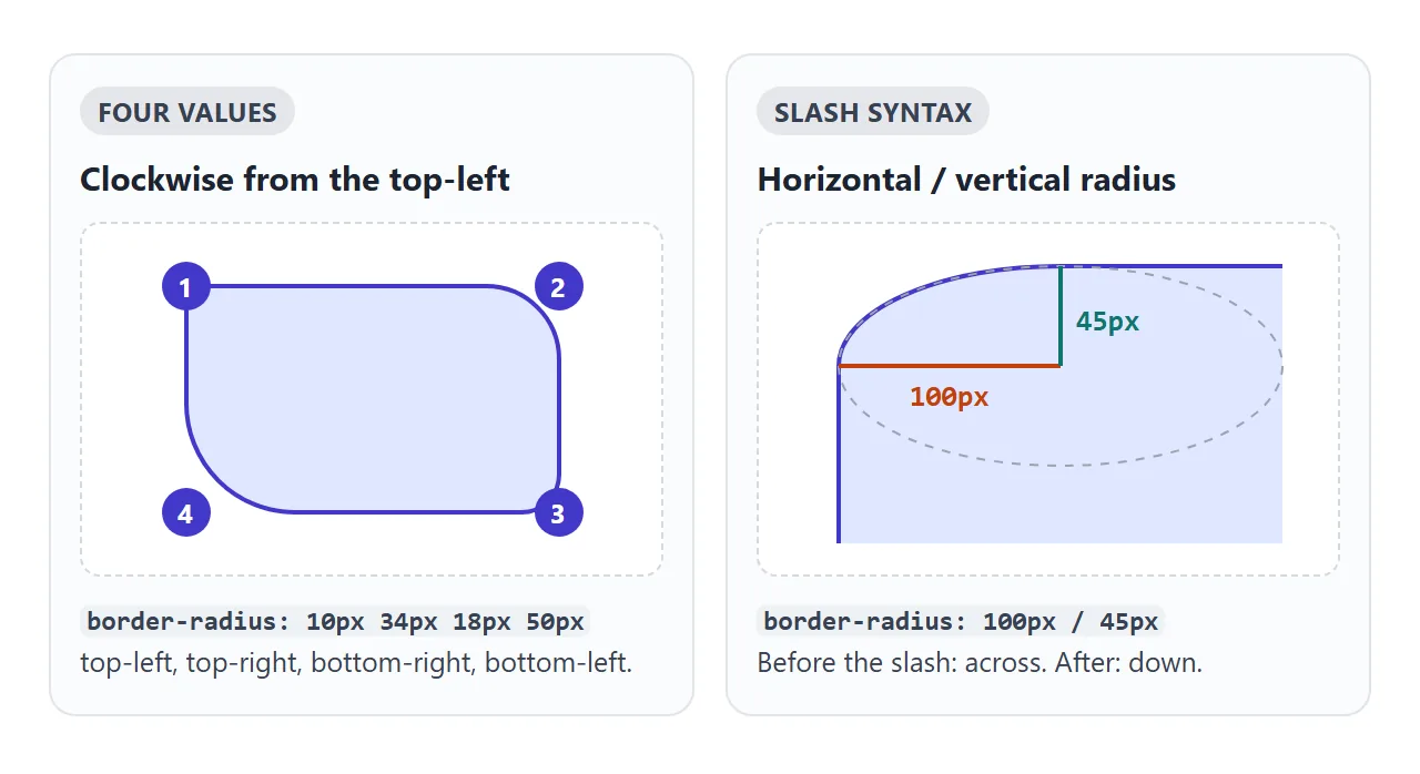
border-radius is a shorthand. Like margin, it takes one to four values, and they go clockwise from the top-left corner.
| Value | Top-left | Top-right | Bottom-right | Bottom-left |
|---|---|---|---|---|
12px |
12px | 12px | 12px | 12px |
12px 4px |
12px | 4px | 12px | 4px |
12px 4px 20px |
12px | 4px | 20px | 4px |
12px 4px 20px 0 |
12px | 4px | 20px | 0 |
With two values, the first covers the top-left and bottom-right, the second the other two. With three, the middle value covers both the top-right and the bottom-left.
To change one corner only, use the longhand property. It is clearer than a four-value line when you only need one sharp corner:
.bubble { border-radius: 18px; border-bottom-right-radius: 4px; }
The four longhands are border-top-left-radius, border-top-right-radius, border-bottom-right-radius and border-bottom-left-radius.
Oval corners with the slash
Each corner is really a quarter of an ellipse, with a horizontal radius and a vertical radius. A single value sets both to the same length, so the corner is a quarter circle.
A slash sets them separately. Values before the slash are the horizontal radii, values after it are the vertical radii:
.tab  { border-radius: 40px / 16px; }          /* wide, shallow corners */
.egg  { border-radius: 50% / 60% 60% 40% 40%; } /* taller at the top */
Each side of the slash follows the same one-to-four value rules. The longhand takes two values with a space and no slash: border-top-left-radius: 40px 16px.
Circles, ovals and pills
Percentages are measured from the element's own box. The horizontal radius is a percentage of the width, and the vertical radius is a percentage of the height.
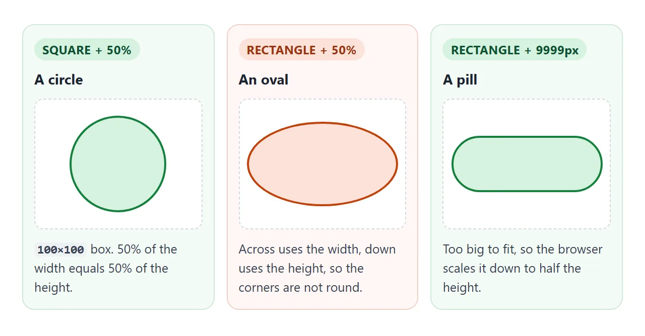
- Circle: equal width and height, then
border-radius: 50%. A smallaspect-ratio: 1helps when only the width is set. - Oval:
50%on a rectangle. This is correct CSS, and a common surprise when a circle was the goal. - Pill: a very large length such as
9999px. When the radii are too big to fit, the browser scales them all down by the same factor. Every corner ends up at half the height, which leaves round ends.
Use a length, not a percentage, for pills. 50% on a wide button makes an oval, not round ends.
Children poke out of the corners
border-radius rounds the element it is set on. It does not clip what is inside. A header, image or coloured child with square corners still paints over the curve.
<!doctype html>
<html lang="en">
<head>
<meta charset="utf-8">
<meta name="viewport" content="width=device-width, initial-scale=1">
<title>Nested rounded corners</title>
<style>
  body {
    margin: 0; padding: 16px;
    font-family: system-ui, sans-serif; background: #f4f5f7; color: #1d2330;
  }
  h3 { margin: 0 0 8px; font-size: 15px; }
  .row { display: flex; flex-wrap: wrap; gap: 16px; }
  .part { flex: 1 1 250px; }
  .btns { display: flex; flex-wrap: wrap; gap: 6px; margin: 10px 0 6px; }
  button {
    font: inherit; font-size: 13px; padding: 6px 10px; cursor: pointer;
    border: 1px solid #c9cdd4; border-radius: 999px; background: #fff;
  }
  button[aria-pressed=true] { background: #1d2330; color: #fff; border-color: #1d2330; }
  code { font-size: 13px; background: #e7eaf0; padding: 1px 4px; border-radius: 4px; }
  p { font-size: 13px; margin: 4px 0 0; color: #4b5260; }

  /* Part 1: a card with an image inside it */
  .card {
    width: 220px; padding: 12px; border-radius: 24px;   /* outer radius 24px, padding 12px */
    background: #fff; box-shadow: 0 4px 14px rgba(0, 0, 0, .12);
  }
  .card .img {
    height: 110px; border-radius: 24px;
    background: linear-gradient(135deg, #f59e0b, #ef4444);
  }
  .card b { display: block; margin-top: 10px; font-size: 14px; }

  /* Part 2: a rounded box with a square header inside */
  .panel {
    width: 220px; border-radius: 24px;
    background: #fff; border: 2px solid #1d2330;
  }
  .panel .head { height: 56px; background: #2563eb; }   /* no radius of its own */
  .panel .text { padding: 12px; font-size: 14px; }
</style>
</head>
<body>
<div class="row">
  <div class="part">
    <h3>1. Inner radius</h3>
    <div class="card"><div class="img" id="img"></div><b>Card title</b></div>
    <div class="btns" id="inner">
      <button data-r="24px" aria-pressed="true">Same: 24px</button>
      <button data-r="12px">24 - 12 = 12px</button>
    </div>
    <p id="innerNote"></p>
  </div>

  <div class="part">
    <h3>2. Overflow</h3>
    <div class="panel" id="panel"><div class="head"></div><div class="text">The header has no radius.</div></div>
    <div class="btns" id="overflow">
      <button data-o="visible" aria-pressed="true">visible</button>
      <button data-o="hidden">hidden</button>
      <button data-o="clip">clip</button>
    </div>
    <p id="overNote"></p>
  </div>
</div>

<script>
  const img = document.getElementById('img');
  const panel = document.getElementById('panel');

  // Make one button in a group look pressed
  function press(group, btn) {
    group.querySelectorAll('button').forEach(b => b.setAttribute('aria-pressed', b === btn));
  }

  document.getElementById('inner').addEventListener('click', (e) => {
    const btn = e.target.closest('button');
    if (!btn) return;
    press(e.currentTarget, btn);
    img.style.borderRadius = btn.dataset.r;
    document.getElementById('innerNote').innerHTML =
      'Image: <code>border-radius: ' + btn.dataset.r + '</code>';
  });

  document.getElementById('overflow').addEventListener('click', (e) => {
    const btn = e.target.closest('button');
    if (!btn) return;
    press(e.currentTarget, btn);
    panel.style.overflow = btn.dataset.o;
    document.getElementById('overNote').innerHTML =
      'Panel: <code>overflow: ' + btn.dataset.o + '</code>';
  });

  // Show the starting state
  document.querySelector('#inner button').click();
  document.querySelector('#overflow button').click();
</script>
</body>
</html>
Add overflow: hidden or overflow: clip to the rounded element. Both clip the content to the inside edge of the curve.
The difference is scrolling. overflow: hidden still lets a script scroll the box. overflow: clip forbids all scrolling and does not make the element a scroll container, so position: sticky children keep working against the page.
Either one also clips anything meant to stick out, such as a dropdown or a tooltip inside the card. If that happens, round the child itself instead of clipping.
Nested corners: inner = outer - padding
A card with an image inset by padding looks off when both use the same radius. The gap at the corners is wider than along the sides, so the inner corners look too round.
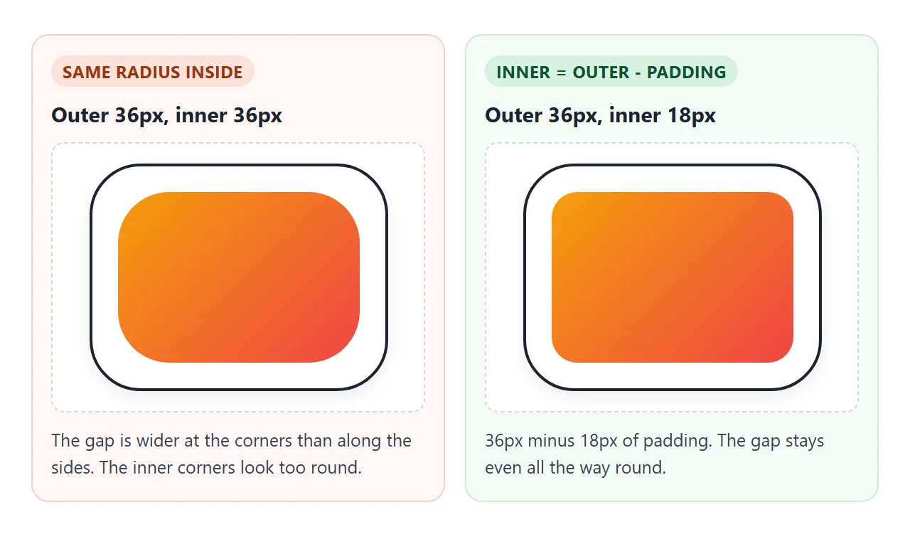
A rule of thumb that works: inner radius = outer radius - padding. If the card has a visible border, subtract its width too:
.card     { border-radius: 24px; padding: 12px; }
.card img { border-radius: 12px; } /* 24 - 12 */
When the padding is as large as the outer radius, the inner radius reaches 0. Square inner corners are then correct.
Rounding images and videos
Put border-radius straight on the <img> or <video>. The picture is clipped to the curve, and no wrapper is needed.
img.avatar {
  width: 64px; height: 64px;
  object-fit: cover;    /* crop a non-square photo to the square */
  border-radius: 50%;
}
Round avatars need a square box first. A rectangular photo with 50% becomes an oval. object-fit crops the photo to fill the square without stretching it.
If the image sits inside a rounded card with no radius of its own, the card needs overflow: hidden, as in the example above.
Blob shapes with eight values
Use all four values on both sides of the slash, and the corners stop matching. The result is a soft, uneven shape, often called a blob:
.blob { border-radius: 30% 70% 70% 30% / 30% 30% 70% 70%; }
border-radius can be animated, so two blob shapes in a @keyframes rule make it morph slowly. The finished example below does this, and turns the animation off for readers who ask their system to reduce motion.
<!doctype html>
<html lang="en">
<head>
<meta charset="utf-8">
<meta name="viewport" content="width=device-width, initial-scale=1">
<title>border-radius in a real page</title>
<style>
  body {
    margin: 0; padding: 16px;
    font-family: system-ui, sans-serif; background: #f4f5f7; color: #1d2330;
  }
  h3 { margin: 18px 0 8px; font-size: 14px; color: #5b6270; }
  h3:first-child { margin-top: 0; }

  /* Avatars: a square plus 50% makes a circle */
  .avatars { display: flex; gap: 10px; }
  .avatar {
    width: 48px; height: 48px; border-radius: 50%;
    display: grid; place-items: center;
    color: #fff; font-weight: 700;
  }

  /* Pill tags: a huge radius is scaled down to half the height */
  .tags { display: flex; flex-wrap: wrap; gap: 8px; }
  .tag {
    padding: 5px 12px; border-radius: 9999px;
    background: #e0e7ff; color: #3730a3; font-size: 13px;
  }

  /* Chat bubbles: round everywhere except the corner near the speaker */
  .chat { display: flex; flex-direction: column; gap: 8px; max-width: 360px; }
  .bubble { max-width: 75%; padding: 9px 13px; font-size: 14px; line-height: 1.4; }
  .them { align-self: flex-start; background: #fff; border-radius: 18px 18px 18px 4px; }
  .me   { align-self: flex-end; background: #2563eb; color: #fff; border-radius: 18px 18px 4px 18px; }

  /* Blob: eight values, animated */
  .blob {
    width: 150px; height: 150px;
    background: linear-gradient(135deg, #22c55e, #06b6d4);
    border-radius: 30% 70% 70% 30% / 30% 30% 70% 70%;
    animation: morph 6s ease-in-out infinite alternate;
  }
  @keyframes morph {
    to { border-radius: 60% 40% 30% 70% / 60% 30% 70% 40%; }
  }
  /* Respect the "reduce motion" system setting */
  @media (prefers-reduced-motion: reduce) {
    .blob { animation: none; }
  }
</style>
</head>
<body>
<h3>Avatars: border-radius: 50%</h3>
<div class="avatars">
  <div class="avatar" style="background:#6366f1">AK</div>
  <div class="avatar" style="background:#f59e0b">MJ</div>
  <div class="avatar" style="background:#10b981">SL</div>
</div>

<h3>Pill tags: border-radius: 9999px</h3>
<div class="tags">
  <span class="tag">Design</span><span class="tag">CSS</span><span class="tag">Beginner friendly</span>
</div>

<h3>Chat bubbles: one sharp corner</h3>
<div class="chat">
  <div class="bubble them">Did the rounded corners work?</div>
  <div class="bubble me">Yes. One sharp corner points at the speaker.</div>
</div>

<h3>Blob: eight values with a slash</h3>
<div class="blob" id="blob"></div>
</body>
</html>
- Avatars: a 48px square and
border-radius: 50%. - Tags:
border-radius: 9999pxon inline padding. - Chat bubbles:
18px 18px 18px 4pxfor incoming messages and18px 18px 4px 18pxfor outgoing ones. The sharp corner points at the speaker. - Blob: eight values, with
@media (prefers-reduced-motion: reduce) { .blob { animation: none; } }.
For shapes that corners cannot make, such as triangles, stars or arrows, clip-path cuts the element to any polygon.
When it does not work
| What you see | Cause | Fix |
|---|---|---|
| A child pokes out of the rounded corner | border-radius does not clip content |
overflow: hidden or overflow: clip on the rounded element |
| An image stays square inside a rounded card | The card is rounded, the image is not clipped | overflow: hidden on the card, or a radius on the image |
| A table or its cells keep square borders | border-collapse: collapse |
border-collapse: separate with border-spacing: 0 |
50% gives an oval, not a circle |
The box is not square | Equal width and height, or aspect-ratio: 1 |
| A wide button has oval ends | 50% on a rectangle |
Use a length such as 9999px |
| The focus outline is a square around a round button | Some browsers, mainly older versions, draw outline without the curve |
A ring with box-shadow: 0 0 0 3px, which always follows the radius |
| Nothing is rounded at all | A typo, or a later rule sets border-radius: 0 |
Check the element's computed styles in the browser's developer tools |
The table fix is covered step by step in border-collapse for HTML tables.
Share it as a link
Rounded corners, shadows and a morphing blob are hard to judge from a screenshot, and an .html attachment may open as plain code on a phone.
To send the working page, paste it into a NOS document and choose Create share link. HTML to link walks through it.
The page renders as written and its scripts run, so the people you send it to can move the sliders themselves. If you change the code later, the same link shows the new version.