The <img> tag puts a picture on a page. It has no closing tag, and it needs two attributes: src, the file to show, and alt, the text that stands in for the picture.
Add width and height as well, so the page does not jump while the file loads.
<img src="photos/shoe.jpg" alt="Red running shoe, side view" width="800" height="600">
Try the attributes one at a time. The blue box is a container narrower than the picture.
<!doctype html>
<html lang="en">
<head>
<meta charset="utf-8">
<meta name="viewport" content="width=device-width, initial-scale=1">
<title>img attribute playground</title>
<style>
  body { margin: 0; padding: 16px; font-family: system-ui, sans-serif; background: #f4f5f7; color: #1d2330; }
  .toggles { display: flex; flex-wrap: wrap; gap: 6px 14px; margin-bottom: 10px; font-size: 14px; }
  .toggles label { display: flex; align-items: center; gap: 6px; cursor: pointer; }
  code { font: 600 13px ui-monospace, Consolas, monospace; }
  button {
    font: 600 14px system-ui, sans-serif; padding: 7px 12px; border-radius: 8px;
    border: 1px solid #1d2330; background: #1d2330; color: #fff; cursor: pointer;
  }
  pre {
    margin: 10px 0; padding: 8px 10px; border-radius: 8px; background: #fff; border: 1px solid #e1e4ea;
    font: 12.5px/1.5 ui-monospace, Consolas, monospace; white-space: pre-wrap; word-break: break-all;
  }

  /* The container is narrower than the 600px picture. Blue shows its edges. */
  .stage { max-width: 320px; background: #cfe3ff; overflow: auto; }
  .after { max-width: 320px; margin: 0; padding: 8px 10px; background: #fff; font-size: 14px; border: 1px solid #e1e4ea; }

  /* These classes are switched on and off by the checkboxes */
  .fit  { max-width: 100%; }
  .auto { height: auto; }
  .block { display: block; }

  #readout { margin: 10px 0 0; font-size: 14px; line-height: 1.6; }
  .bad { color: #b42318; font-weight: 600; }
  .good { color: #0f7a3d; font-weight: 600; }
</style>
</head>
<body>
<div class="toggles">
  <label><input type="checkbox" id="dims"> <code>width="600" height="300"</code></label>
  <label><input type="checkbox" id="fit"> <code>max-width: 100%</code></label>
  <label><input type="checkbox" id="auto"> <code>height: auto</code></label>
  <label><input type="checkbox" id="block"> <code>display: block</code></label>
</div>
<button id="replay">Replay loading (1.5 s)</button>

<pre id="code"></pre>

<div class="stage" id="stage"><img id="pic" alt="Blue mountains under a yellow sun" src="data:image/svg+xml,%3Csvg xmlns='http://www.w3.org/2000/svg' width='600' height='300' viewBox='0 0 600 300'%3E%3Crect width='600' height='300' fill='%238ecae6'/%3E%3Ccircle cx='470' cy='80' r='36' fill='%23ffb703'/%3E%3Cpath d='M0 300 L150 130 L260 240 L360 110 L520 280 L600 200 V300Z' fill='%233b6e8f'/%3E%3Cpath d='M0 300 L120 225 L240 290 L380 205 L600 300Z' fill='%232a9d8f'/%3E%3C/svg%3E"></div>
<p class="after" id="after">This paragraph sits under the image.</p>

<p id="readout"></p>

<script>
  const img = document.getElementById('pic');
  const stage = document.getElementById('stage');
  const after = document.getElementById('after');
  const box = (id) => document.getElementById(id);
  let moved = null;  // how far the paragraph jumped on the last replay

  function apply() {
    if (box('dims').checked) { img.setAttribute('width', 600); img.setAttribute('height', 300); }
    else { img.removeAttribute('width'); img.removeAttribute('height'); }
    img.classList.toggle('fit', box('fit').checked);
    img.classList.toggle('auto', box('auto').checked);
    img.classList.toggle('block', box('block').checked);
    show();
  }

  function show() {
    const css = ['fit', 'auto', 'block'].filter((k) => box(k).checked)
      .map((k) => ({ fit: 'max-width: 100%;', auto: 'height: auto;', block: 'display: block;' })[k]);
    box('code').textContent =
      '<img src="mountains.svg" alt="Blue mountains"' +
      (box('dims').checked ? ' width="600" height="300"' : '') + '>\n' +
      'img { ' + (css.join(' ') || '/* no CSS */') + ' }';

    const r = img.getBoundingClientRect();
    const gap = Math.round(stage.getBoundingClientRect().top + stage.clientHeight - r.bottom);  // clientHeight skips the scrollbar
    const ratio = r.height ? (r.width / r.height).toFixed(2) : '-';
    const lines = [];
    lines.push('Image box: ' + Math.round(r.width) + ' x ' + Math.round(r.height) + ' px, ratio ' + ratio + ' (the file is 2.00)' +
      (ratio !== '2.00' && r.height ? ' <span class="bad">stretched</span>' : ''));
    lines.push('Wider than the container: ' + (r.width > stage.clientWidth + 1
      ? '<span class="bad">yes, it overflows</span>' : '<span class="good">no</span>'));
    lines.push('Blue gap under the image: ' + (gap > 0
      ? '<span class="bad">' + gap + ' px</span>' : '<span class="good">0 px</span>'));
    if (moved !== null) lines.push('Paragraph moved while loading: ' + (moved > 0
      ? '<span class="bad">' + moved + ' px</span>' : '<span class="good">0 px</span>'));
    box('readout').innerHTML = lines.join('<br>');
  }

  // Demo only: this picture lives inside the page, so it would appear at once.
  // Replay holds src back for 1.5 s to imitate a slow network. The img is hidden
  // meanwhile, and alt is held back too: an img with no src is drawn as a broken
  // image or as its alt text, which a loading image is not.
  box('replay').addEventListener('click', () => {
    const src = img.src, alt = img.alt;
    img.removeAttribute('src'); img.removeAttribute('alt');
    img.style.visibility = 'hidden';
    const before = after.getBoundingClientRect().top;
    moved = null; show();
    setTimeout(() => {
      img.addEventListener('load', () => {
        img.style.visibility = '';
        moved = Math.round(after.getBoundingClientRect().top - before);
        show();
      }, { once: true });
      img.alt = alt; img.src = src;
    }, 1500);
  });

  document.querySelectorAll('.toggles input').forEach((c) => c.addEventListener('change', () => { moved = null; apply(); }));
  img.addEventListener('load', show);
  apply();
</script>
</body>
</html>
Start with everything off: the picture spills out of the box and a thin blue strip shows under it. Tick all four and replay loading: the paragraph stays still.
The attributes, one by one
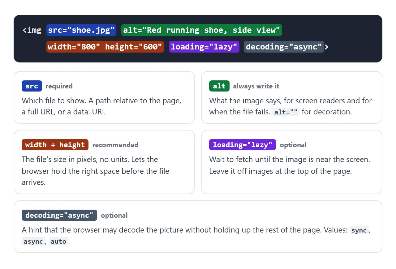
| Attribute | What it does | Skip it and |
|---|---|---|
src |
The file to show | Nothing loads |
alt |
Text that replaces the image | Screen readers may read the file name |
width, height |
Reserve space at the right ratio | The page jumps as images arrive |
loading="lazy" |
Wait until the image is near the screen | Every image downloads at once |
decoding="async" |
Decode without holding up the page | Usually no visible change |
srcset, sizes |
Offer several file sizes | Phones download the large file |
src takes a path relative to the page, such as photos/shoe.jpg, a full URL, or a data URI that holds the picture inside the page.
The demos here use data URIs, because an example has to work with no files next to it. Embedding an image in the HTML shows how to make one.
alt: what the picture says, or nothing
alt is read aloud by screen readers and shown by the browser when the file cannot load. Write what the image tells the reader, not what it looks like: "Chart: sales doubled in March" beats "bar chart".
A picture that is pure decoration, such as a divider or a background flourish, gets an empty value: alt="". That tells screen readers to skip it.
Leaving alt out altogether is different, and some screen readers then read the file name instead. Writing alt text goes deeper.
title is not a replacement. It shows a tooltip when a mouse hovers, and nothing on a touch screen.
alt |
title |
|
|---|---|---|
| Read by screen readers | Yes, as the image itself | Not reliably |
| Shown when the file fails | Yes | No |
| Shown on mouse hover | No | Yes, as a tooltip |
| Needed | On every image | Rarely |
width and height stop the page jumping
Without width and height, the browser learns the picture's size only when the file arrives. Until then it holds no space, and everything under the image moves down when it appears.
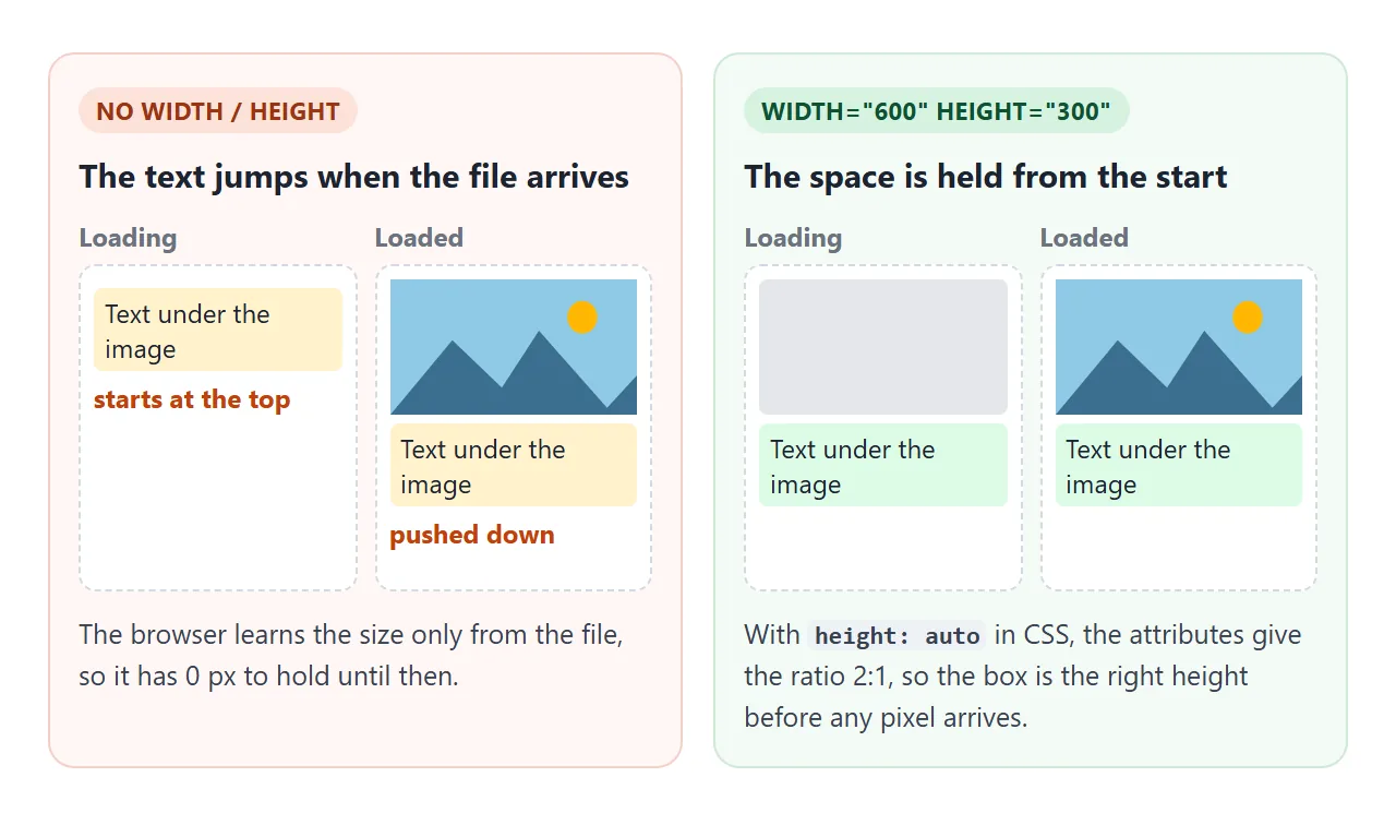
The numbers are the file's size in pixels, without px. The browser turns them into an aspect ratio. Pair them with this CSS:
img {
  max-width: 100%;  /* never wider than the container */
  height: auto;     /* height follows the width at the file's ratio */
  display: block;   /* no gap under the image */
}
The height: auto line matters. With max-width but no height: auto, the width shrinks and the height attribute stays, so the picture is squashed. Tick the width, height and max-width boxes in the playground, leave height auto off, and the readout says "stretched".
Keeping an image's aspect ratio covers images of unknown size.
The gap under an image
An <img> is inline by default. It sits on the text baseline like a large letter, and the line keeps a few pixels under the baseline for letters such as g and p. That strip shows up as a gap under the image.
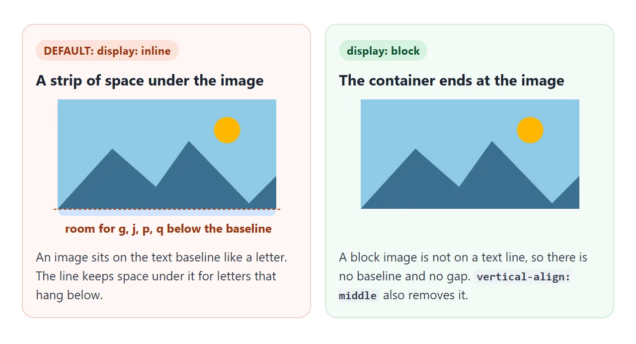
display: block takes the image out of the text line, so the gap disappears. vertical-align: middle or bottom also works when the image must stay inline, for example an icon inside a sentence. CSS display explains the difference.
When the file does not load
A wrong path, a typo in the file name or a server refusing the request all end the same way: the error event fires, and the browser shows the alt text in the image's place.
<!doctype html>
<html lang="en">
<head>
<meta charset="utf-8">
<meta name="viewport" content="width=device-width, initial-scale=1">
<title>Broken image and fallback</title>
<style>
  body { margin: 0; padding: 16px; font-family: system-ui, sans-serif; background: #f4f5f7; color: #1d2330; }
  .row { display: grid; grid-template-columns: repeat(auto-fit, minmax(160px, 1fr)); gap: 12px; }
  figure { margin: 0; padding: 10px; background: #fff; border: 1px solid #e1e4ea; border-radius: 10px; }
  figcaption { font-size: 13px; line-height: 1.45; color: #4b5563; margin-top: 8px; }
  code { font: 600 12.5px ui-monospace, Consolas, monospace; color: #1d2330; }

  img {
    display: block; max-width: 100%; height: auto;
    background: #eef1f5;   /* shows the space the img takes */
    outline: 1px dashed #9aa3b2;
  }
  #log { margin: 12px 0 0; font-size: 13px; color: #4b5563; }
</style>
</head>
<body>
<div class="row">
  <figure>
    <!-- Wrong path: the file does not exist -->
    <img src="photos/Team.JPG" alt="Five people at a table, laughing" width="300" height="200">
    <figcaption><b>With alt.</b> The file fails, and the browser shows the alt text in its place.</figcaption>
  </figure>
  <figure>
    <img src="photos/Team.JPG" alt="" width="300" height="200">
    <figcaption><b>With <code>alt=""</code>.</b> No words to fall back on, only an empty box. Right for decoration, wrong for content.</figcaption>
  </figure>
  <figure>
    <img src="photos/Team.JPG" alt="Five people at a table, laughing" width="300" height="200" class="has-fallback">
    <figcaption><b>With a fallback.</b> The <code>error</code> event swaps in a placeholder picture.</figcaption>
  </figure>
</div>
<p id="log">Waiting for the images to fail...</p>

<script>
  // A small grey "no image" picture, stored inside the page
  const FALLBACK = 'data:image/svg+xml,' + encodeURIComponent(
    '<svg xmlns="http://www.w3.org/2000/svg" width="300" height="200">' +
    '<rect width="300" height="200" fill="#e5e7eb"/>' +
    '<path d="M110 130 L140 95 L160 115 L175 100 L200 130Z" fill="#9ca3af"/>' +
    '<circle cx="182" cy="80" r="9" fill="#9ca3af"/>' +
    '<text x="150" y="160" font-family="sans-serif" font-size="16" fill="#4b5563" text-anchor="middle">Image unavailable</text></svg>');

  const log = document.getElementById('log');
  let failed = 0;

  document.querySelectorAll('img').forEach((img) => {
    const onFail = () => {
      failed++;
      log.textContent = 'error event fired on ' + failed + ' of 3 images.';
      if (img.classList.contains('has-fallback')) img.src = FALLBACK;  // once: the fallback cannot fail again
    };
    img.addEventListener('error', onFail, { once: true });
    // The image may have failed before this script ran
    if (img.complete && img.naturalWidth === 0) img.dispatchEvent(new Event('error'));
  });
</script>
</body>
</html>
To show a placeholder instead, swap src when the error event fires. The short version sits on the tag:
<img src="photos/team.jpg" alt="Five people at a table"
     onerror="this.onerror = null; this.src = 'images/placeholder.svg'">
this.onerror = null matters. If the placeholder is missing too, the handler would otherwise run again and again.
The demo uses addEventListener with { once: true } for the same reason. It also checks img.complete && img.naturalWidth === 0, because an image can fail before the script runs.
A fallback hides the symptom. To find the cause, see images not showing in HTML.
loading, decoding and srcset
loading="lazy" lets the browser wait to fetch an image until it is close to the screen. A long page of product photos then loads only the rows the reader reaches.
Leave it off images that are visible when the page opens, or they may arrive later than they would have.
decoding="async" is a hint that the browser may decode the picture without holding up the rest of the page. It is safe to add, and often makes no visible difference.
srcset offers the same picture in several sizes, and sizes tells the browser how wide the image will be drawn:
<img src="shoe-800.jpg" alt="Red running shoe, side view" width="800" height="600"
     srcset="shoe-400.jpg 400w, shoe-800.jpg 800w, shoe-1600.jpg 1600w"
     sizes="(max-width: 600px) 100vw, 50vw">
The browser picks the smallest file that looks sharp on the screen. Making an image responsive covers srcset, sizes and the picture element.
A finished example: a product grid
Everything above in one place. Each card's image has alt, width and height, loading="lazy" and decoding="async", plus the three CSS lines. The demo holds each file back for a moment to imitate a slow network.
<!doctype html>
<html lang="en">
<head>
<meta charset="utf-8">
<meta name="viewport" content="width=device-width, initial-scale=1">
<title>Product cards with img</title>
<style>
  body { margin: 0; padding: 16px; font-family: system-ui, sans-serif; background: #f4f5f7; color: #1d2330; }
  .bar { margin-bottom: 12px; font-size: 14px; }
  #status { display: block; margin-top: 8px; min-height: 2.9em; line-height: 1.45; }  /* fixed room, so the text itself moves nothing */
  button {
    font: 600 14px system-ui, sans-serif; padding: 7px 12px; border-radius: 8px;
    border: 1px solid #1d2330; background: #1d2330; color: #fff; cursor: pointer;
  }
  .grid { display: grid; grid-template-columns: repeat(auto-fill, minmax(150px, 1fr)); gap: 12px; }
  .card { background: #e9edf2; border: 1px solid #e1e4ea; border-radius: 12px; overflow: hidden; }  /* grey shows until the picture arrives */
  .info { background: #fff; padding: 10px 12px 12px; }

  /* The four lines every content image wants */
  .card img {
    display: block;       /* no gap under the image */
    width: 100%;          /* fill the card */
    height: auto;         /* keep the ratio from width/height */
  }
  .card h3 { font-size: 15px; margin: 0 0 2px; }
  .card p { font-size: 14px; margin: 0; color: #4b5563; }
  .foot { margin-top: 12px; padding: 10px 12px; background: #fff; border: 1px dashed #9aa3b2; border-radius: 10px; font-size: 14px; }
</style>
</head>
<body>
<div class="bar">
  <button id="replay">Replay slow loading</button>
  <span id="status"></span>
</div>

<div class="grid">
  <!-- In your page: src="mug.jpg" instead of data-pic="mug" -->
  <div class="card">
    <img data-pic="mug" alt="White mug with a blue stripe" width="400" height="300" loading="lazy" decoding="async">
    <div class="info"><h3>Stripe mug</h3><p>$14</p></div>
  </div>
  <div class="card">
    <img data-pic="plant" alt="Small green plant in a terracotta pot" width="400" height="300" loading="lazy" decoding="async">
    <div class="info"><h3>Desk plant</h3><p>$22</p></div>
  </div>
  <div class="card">
    <img data-pic="lamp" alt="Yellow desk lamp with a round shade" width="400" height="300" loading="lazy" decoding="async">
    <div class="info"><h3>Reading lamp</h3><p>$39</p></div>
  </div>
  <div class="card">
    <img data-pic="book" alt="Stack of three notebooks in red, teal and navy" width="400" height="300" loading="lazy" decoding="async">
    <div class="info"><h3>Notebook set</h3><p>$12</p></div>
  </div>
</div>
<div class="foot" id="foot">This box sits under the grid. Watch whether it moves while the pictures load.</div>

<script>
  // Stand-in product photos drawn in SVG (400 x 300, the same ratio as the attributes)
  const svg = (inner) => 'data:image/svg+xml,' + encodeURIComponent(
    '<svg xmlns="http://www.w3.org/2000/svg" width="400" height="300"><rect width="400" height="300" fill="#f3efe7"/>' + inner + '</svg>');
  const pics = {
    mug: svg('<rect x="140" y="90" width="110" height="130" rx="12" fill="#fff" stroke="#cbd5e1" stroke-width="3"/>' +
      '<rect x="140" y="140" width="110" height="22" fill="#2563eb"/><path d="M250 120 h24 a26 26 0 0 1 0 52 h-24" fill="none" stroke="#cbd5e1" stroke-width="10"/>'),
    plant: svg('<path d="M150 170 h100 l-14 80 h-72Z" fill="#c2410c"/><path d="M200 170 C170 120 150 110 130 100 C165 100 190 130 200 170 C205 110 230 85 265 80 C240 110 215 135 200 170Z" fill="#2a9d8f"/>'),
    lamp: svg('<ellipse cx="200" cy="245" rx="60" ry="10" fill="#374151"/><rect x="195" y="140" width="10" height="105" fill="#374151"/>' +
      '<path d="M140 145 L170 75 h60 l30 70Z" fill="#fbbf24"/>'),
    book: svg('<rect x="120" y="190" width="160" height="30" rx="4" fill="#1e3a8a"/><rect x="130" y="158" width="150" height="30" rx="4" fill="#0f766e"/>' +
      '<rect x="115" y="126" width="165" height="30" rx="4" fill="#b91c1c"/>'),
  };

  const imgs = document.querySelectorAll('.card img');
  const foot = document.getElementById('foot');
  const status = document.getElementById('status');

  // Demo only: these pictures live inside the page, so they would appear at once.
  // Each one is held back for a moment to imitate a slow network. The img is hidden
  // meanwhile, and alt is held back too: an img with no src is drawn as a broken
  // image or as its alt text, which a loading image is not.
  function load(delay) {
    const top = foot.getBoundingClientRect().top;
    let done = 0;
    imgs.forEach((img, i) => {
      const alt = img.dataset.alt || (img.dataset.alt = img.alt);
      img.removeAttribute('src'); img.removeAttribute('alt');
      img.style.visibility = 'hidden';
      setTimeout(() => {
        img.addEventListener('load', () => {
          img.style.visibility = '';
          done++;
          const moved = Math.round(foot.getBoundingClientRect().top - top);
          status.textContent = done + ' of ' + imgs.length + ' loaded. The box below moved ' + moved + ' px.';
        }, { once: true });
        img.alt = alt;
        img.src = pics[img.dataset.pic];
      }, delay * (i + 1));
    });
    status.textContent = '0 of ' + imgs.length + ' loaded. The space is already reserved.';
  }

  document.getElementById('replay').addEventListener('click', () => load(500));
  load(400);
</script>
</body>
</html>
- Write src and alt. Describe what the image says, or use
alt=""for decoration. - Add width and height. The file's pixel size, without units.
- Add the three CSS lines.
max-width: 100%,height: auto,display: block. - Lazy-load images further down. Add
loading="lazy"to images not visible when the page opens.
The grey comes from the card's background showing through while the image is still empty. To crop pictures of different shapes into equal boxes, use object-fit.
When it does not work
| What you see | Cause | Fix |
|---|---|---|
| The alt text or a broken icon shows | The file did not load: wrong path, or the server refused it | Check the path from the page's folder |
| Works on your computer, broken online | File name case: Photo.JPG is not photo.jpg on many servers |
Match the case exactly |
| A thin gap under the image | The image is inline and sits on the baseline | display: block |
| The image is squashed or stretched | width and height fixed at a different ratio |
height: auto in CSS |
| The page jumps as images appear | No width and height |
Add the file's pixel size |
| The image spills out of its box | It is wider than the container | max-width: 100% |
| The top image appears late | loading="lazy" on an image visible at once |
Remove loading="lazy" there |
Share it as a link
Images are easy to lose when a page travels. An .html file sent on its own loses every picture it points to with a relative path, because the image files stay on your computer.
Pictures embedded as data URIs or inline SVG travel inside the page.
To send the working version, paste the page into a NOS document and choose Create share link. HTML to link walks through it.
The page renders as written and its scripts run, so the fallback and the lazy grid behave the same for the people you send it to. If you change the code later, the same link shows the new version.