Responsive images come down to two CSS lines, plus a srcset attribute when one file is not the right weight for every screen.
img { max-width: 100%; height: auto; }
The HTML to make image responsive behaviour reliable is short. The judgement is in deciding which of the three routes below a given picture needs.

The HTML to make image responsive: the minimum
max-width: 100% stops the picture growing past its container. A 1600 pixel image in a 360 pixel column no longer pushes a horizontal scrollbar onto the page.
height: auto keeps the proportions as that width changes. Without it, a height set anywhere else wins and the picture squashes.
Use max-width, not width. width: 100% enlarges a small image to fill the column, which turns a 200 pixel icon into a blurred band.
Check the head before blaming the CSS:
<meta name="viewport" content="width=device-width,initial-scale=1">
Without it a phone pretends to be a desktop and scales the whole page down, so nothing in your layout responds. The viewport meta tag covers what it does.
Serving different files per screen
The two lines above resize one file. They do not change how many bytes the reader downloads.
That becomes the problem with photographs. A 2400 pixel export is wasteful on a phone, and a 600 pixel one looks soft on a large monitor.
srcset offers the browser a choice:
<img
  src="photo-1200.jpg"
  srcset="photo-600.jpg 600w, photo-1200.jpg 1200w, photo-2400.jpg 2400w"
  sizes="(max-width: 700px) 100vw, 700px"
  alt="Site entrance"
  width="1200" height="800">
Read it in two halves.
srcset lists the files and the actual pixel width of each, marked with w. That number is a fact about the file, not a request.
sizes tells the browser how wide the image will be displayed, before layout is calculated. Here: the full viewport width on small screens, otherwise 700 pixels.
The browser combines the two with the device pixel density and picks one. src stays as the fallback for anything that does not understand the attribute.
Get sizes wrong and the selection is wrong, so keep it honest about your layout. It is the part most often left at a copied value that no longer matches the design.
The picture element
srcset offers the same image at different sizes. picture offers different images.
<picture>
  <source media="(max-width: 700px)" srcset="hero-square.jpg">
  <source type="image/webp" srcset="hero-wide.webp">
  <img src="hero-wide.jpg" alt="Team at the opening" width="1600" height="900">
</picture>
Two separate jobs are visible there. The first source swaps in a squarer crop on phones, where a wide banner becomes a thin sliver.
The second offers a modern format, with the img as the fallback for anything that cannot read it.
The img is required. It carries the alt text and it is what renders when no source matches.

Choosing between the three
| Situation | Use |
|---|---|
| Screenshots and diagrams in a document | max-width: 100% and height: auto |
| Logos and icons | The same, with a sensible max-width in pixels |
| Photographs on a public page | Add srcset and sizes |
| A banner that needs a different crop on phones | picture with a media condition |
| Offering a newer format with a fallback | picture with a type condition |
| Charts and line art | SVG, which scales with no files to choose between |
Most internal documents stop at the first row. srcset is worth the extra exports when the page is public and image weight is real.
SVG in HTML covers the last row, where responsiveness is free because the image is drawn rather than sampled.
Details that keep it honest
- Keep
widthandheighton the tag. Browsers use them as a ratio and reserve space, so the page does not jump while images load. - Add
loading="lazy"to anything below the fold. Not to the first image, which you want immediately. - Add
display: blockto remove the few pixels of baseline gap under an image in a coloured box. - Write real
alttext. Responsiveness does not help a reader who cannot see the picture. Alt text covers the writing. - Watch for fixed widths elsewhere. A container with
width: 900pxoverflows a phone whatever the image does.
Proportions are a separate question
Responsive means the image fits the space. It does not mean the proportions are right, and the two are fixed by different rules.
If pictures are stretched rather than overflowing, the cause is a second dimension set somewhere, and keeping an image at its aspect ratio is the page for it.

Testing it where it matters
Resizing a desktop window catches most of it. Opening the page on an actual phone catches the rest, including the missing viewport tag.
Paste the HTML into a NOS document to get an address you can open on a handset, rather than emailing a file to yourself that a phone may refuse to open.
The address holds as you adjust the rules, so you can fix a sizes value and reload the same link.
Turning HTML into a link is that step, and the HTML file opener checks that the images survive outside their original folder at all.
Reading the network tab
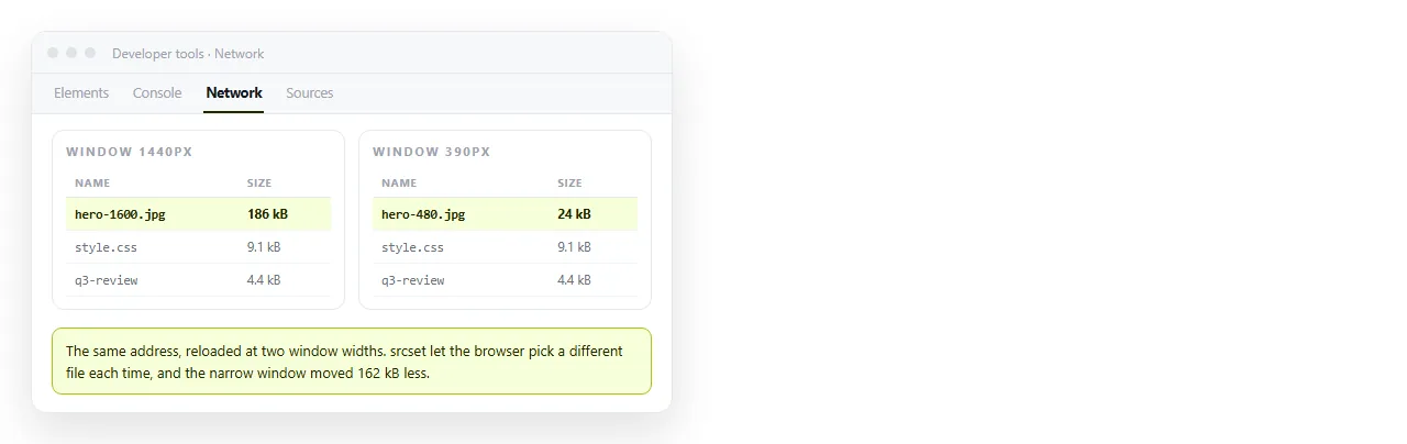
The browser tells you which file it chose, which is the only way to know whether sizes is honest.
Open the developer tools, go to the network tab, filter to images and reload. The file name that arrives is the browser's decision.
Narrow the window to phone width and reload again. A different, smaller file should arrive. If the same large one comes down at every width, either sizes is wrong or the srcset widths do not match the actual files.
One more thing shows up there. Images loaded on a page the reader never scrolls to are wasted bytes, and loading="lazy" removes them from the initial load.