An HTML image map is a set of clickable regions drawn over one image, defined by pixel coordinates in a <map> element and linked to the image with usemap.
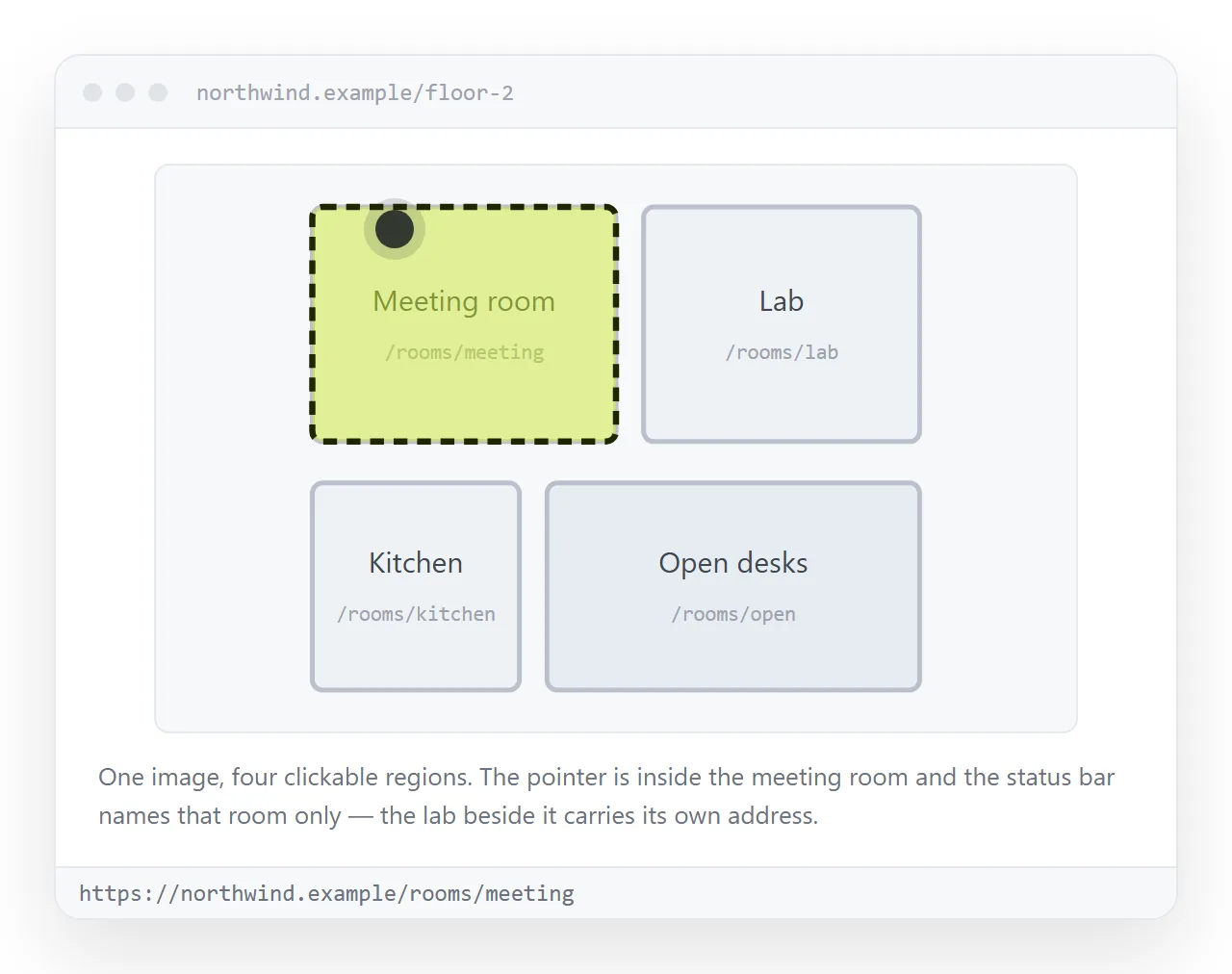
One picture, several destinations. A floor plan where each room links to a different page, a product photo where each part opens its own spec.
The two tags involved
The image carries a usemap attribute. The map carries a matching name. Inside the map, each <area> is one clickable region.
<img src="floorplan.png" usemap="#rooms" alt="Office floor plan">

<map name="rooms">
  <area shape="rect" coords="12,40,180,220" href="/rooms/studio" alt="Studio">
  <area shape="circle" coords="320,150,60" href="/rooms/booth" alt="Recording booth">
  <area shape="poly" coords="400,30,520,30,520,180,460,220,400,180"
        href="/rooms/kitchen" alt="Kitchen">
</map>
The # in usemap is required. Without it the map is not found and every region is dead, which is the single most common reason an image map does nothing at all.
What the coordinates mean
| shape | coords | Read as |
|---|---|---|
rect |
x1,y1,x2,y2 |
Top left corner, then bottom right corner |
circle |
x,y,r |
Centre point, then radius |
poly |
x1,y1,x2,y2,... |
Corner after corner, closed automatically |
default |
none | Everything not covered by another area |
Every number is a pixel measured from the top left of the image at its natural size. Not the displayed size. That distinction is the whole problem.
Why the regions drift on a responsive page
If your CSS says img { max-width: 100%; }, the image shrinks on a narrow screen. The coordinates do not shrink with it.
The result is a page where the rooms are clickable slightly up and to the left of where they appear, and on a phone the offset is large enough that every region is wrong.
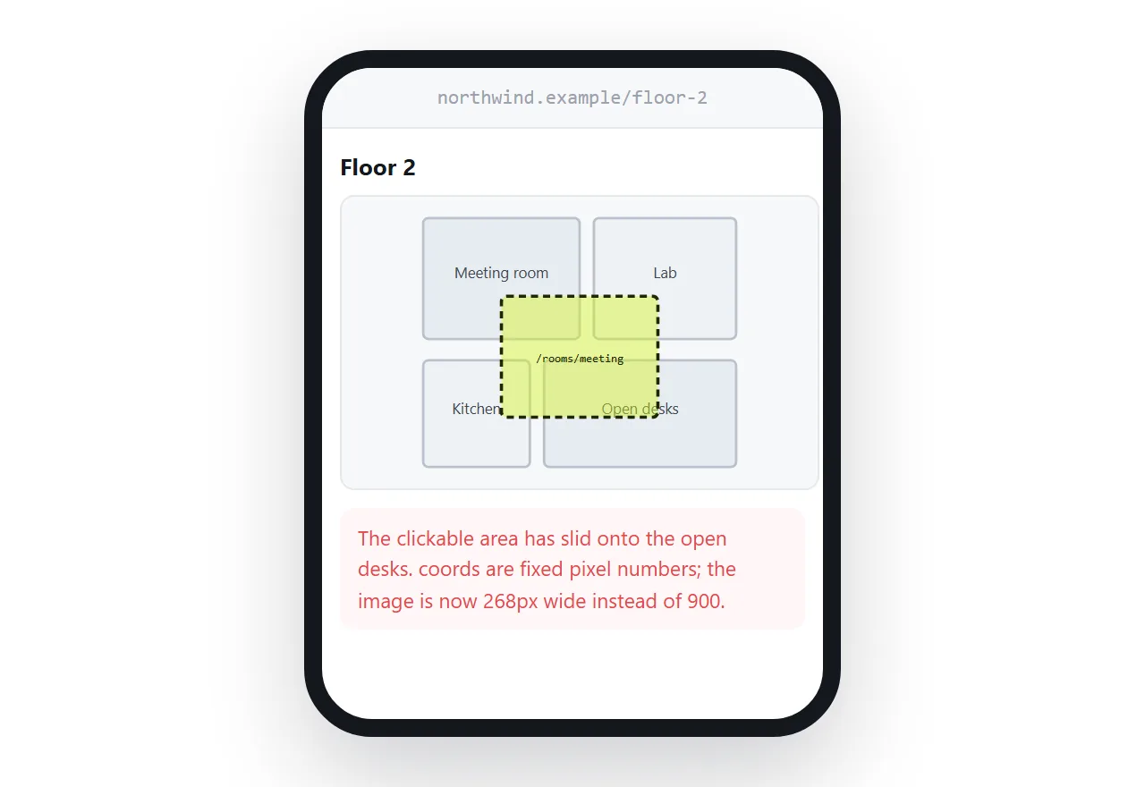
Browsers do not rescale coords for you, and there is no CSS property that fixes it. You have three real options.
- Keep the image at a fixed width. Honest, and fine for an internal diagram nobody opens on a phone.
- Recalculate in JavaScript. Listen for resize, multiply every coordinate by
img.clientWidth / img.naturalWidth, rewrite thecoordsstrings. This works and is about fifteen lines. - Drop
mapentirely. Use percentage positioned links, or inline SVG. Both scale for free.
The replacement most people end up using
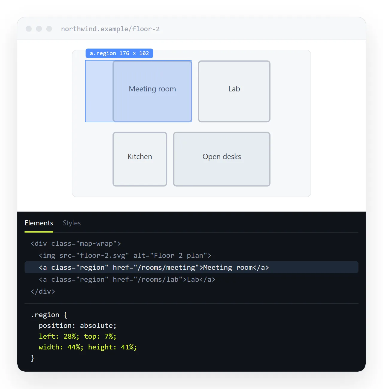
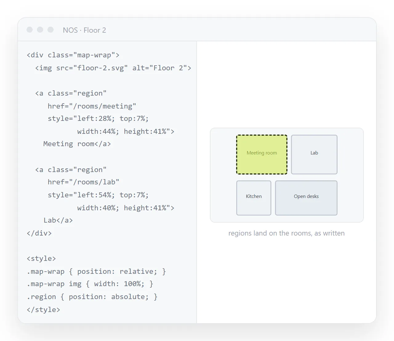
A wrapper with position: relative, and anchors positioned in percentages on top of it. Percentages are of the wrapper, so they follow the image at every size.
<div style="position:relative; max-width:640px">
  <img src="floorplan.png" alt="Office floor plan" style="width:100%; display:block">
  <a href="/rooms/studio"
     style="position:absolute; left:2%; top:18%; width:26%; height:40%"
     aria-label="Studio"></a>
  <a href="/rooms/booth"
     style="position:absolute; left:44%; top:30%; width:18%; height:28%"
     aria-label="Recording booth"></a>
</div>
Rectangles only, unless you add clip-path for odd shapes. In exchange the regions stay put at every width.
You also get focus outlines that work, and hover styling written in ordinary CSS, which <area> does not really offer. A CSS hover transition on those anchors makes the regions visible on pointer devices.
The percentages are worked out once from the original image. Divide each pixel coordinate by the image width or height and multiply by a hundred. A spreadsheet does the whole set in a minute.
When inline SVG is the better answer
If the diagram is vector art rather than a photo, skip the bitmap. Put the SVG in the HTML and wrap each shape in an <a>.
<svg viewBox="0 0 640 400" role="img" aria-label="Office floor plan">
  <a href="/rooms/studio"><rect x="12" y="40" width="168" height="180" fill="#2a3242"/></a>
  <a href="/rooms/booth"><circle cx="320" cy="150" r="60" fill="#334155"/></a>
</svg>
The viewBox handles scaling, so the coordinates keep their meaning at any size. You also get per shape hover fills, and you can change the colour from CSS rather than exporting a second file.
Accessibility, briefly
- Each
<area>needs analt. It is the link text, not decoration. Empty alt on a linked area leaves a screen reader reading the URL. - The parent
<img>still needs its ownaltdescribing the picture as a whole. - Areas are keyboard focusable in order of appearance, so write them in reading order.
- For the overlay approach, use
aria-labelon each anchor since there is no visible text inside it.
Whichever technique you pick, the regions should not be the only route to those pages. A plain list of the same links underneath costs nothing and covers every reader who cannot use the picture.
Checking it before you send it
Image maps fail quietly. The page looks correct and the clicks land in the wrong place, so nobody reports it as broken.
Open the page at three widths and click one region at each. If the image file sits next to the HTML rather than being embedded, it will not travel with the file, and the map ends up floating over nothing.
To hand the diagram to someone, paste the HTML into a NOS document and send the link. The regions keep working and the page renders as written.
The address stays the same when you move a room, so a corrected coordinate is an edit rather than a second email with a second copy of the file. Turning HTML into a link is that step.
When an image map is the wrong tool
Three cases where the effort is better spent elsewhere.
- The regions are already rectangles in a grid. Use a plain layout of linked cards with the image split into pieces. Easier to label, easier to reorder.
- The picture is a chart. Charts want live data, not a frozen picture with hotspots. A chart shared as a link stays current.
- There are more than about a dozen regions. Maintaining that many coordinate sets by hand goes wrong quickly. Generate them, or move to SVG where each shape carries its own geometry.
An image map remains a good fit for one thing in particular: a photograph or a scanned plan where the regions follow real objects that cannot be rebuilt as markup.