HTML charts without JavaScript are easier to share than any other kind, because there is no library to load and nothing to break in a year.
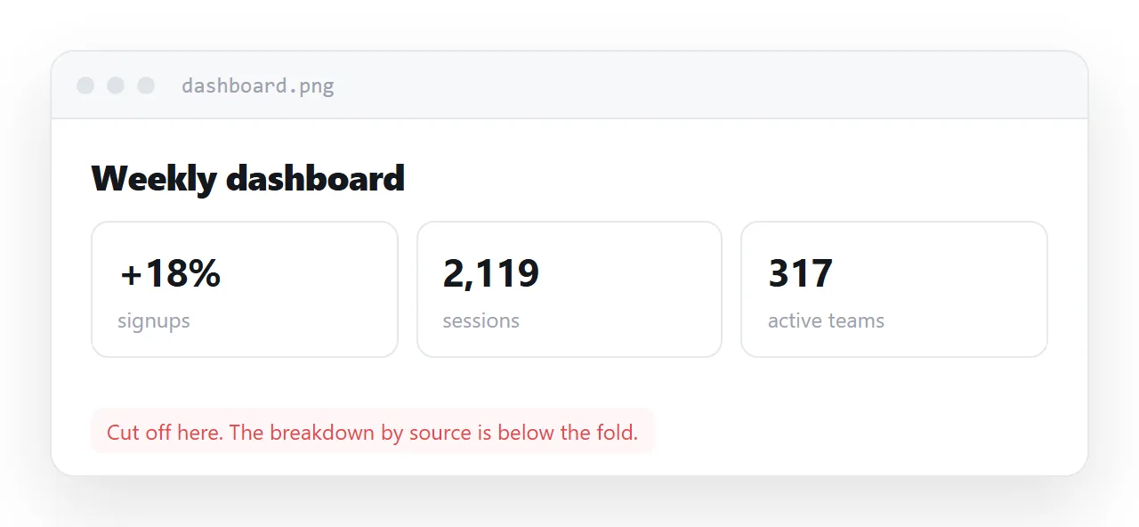
Most charts get sent as screenshots instead, and a screenshot removes exactly the thing that makes a chart trustworthy: the numbers underneath it.
This guide covers a bar chart that needs no library at all, when SVG or a library is the right tool, the accessibility details that make the chart readable to everyone, and the four steps to share the chart at an address.
Most charts are shared as screenshots, and a screenshot removes exactly the thing that makes a chart trustworthy: the numbers underneath it.
What the screenshot costs
- The figures cannot be copied into anyone's own notes.
- A screen reader finds nothing at all.
- It is one fixed width, so it is unreadable on a phone if captured wide.
- It is frozen, and nothing about it says when it was taken.
- Nobody can check your arithmetic, so nobody argues — which sounds convenient and means the chart is not doing its job.
HTML charts without JavaScript: the bar chart
This is worth knowing because it removes the main reason people reach for a screenshot in the first place — a chart library felt like too much setup.
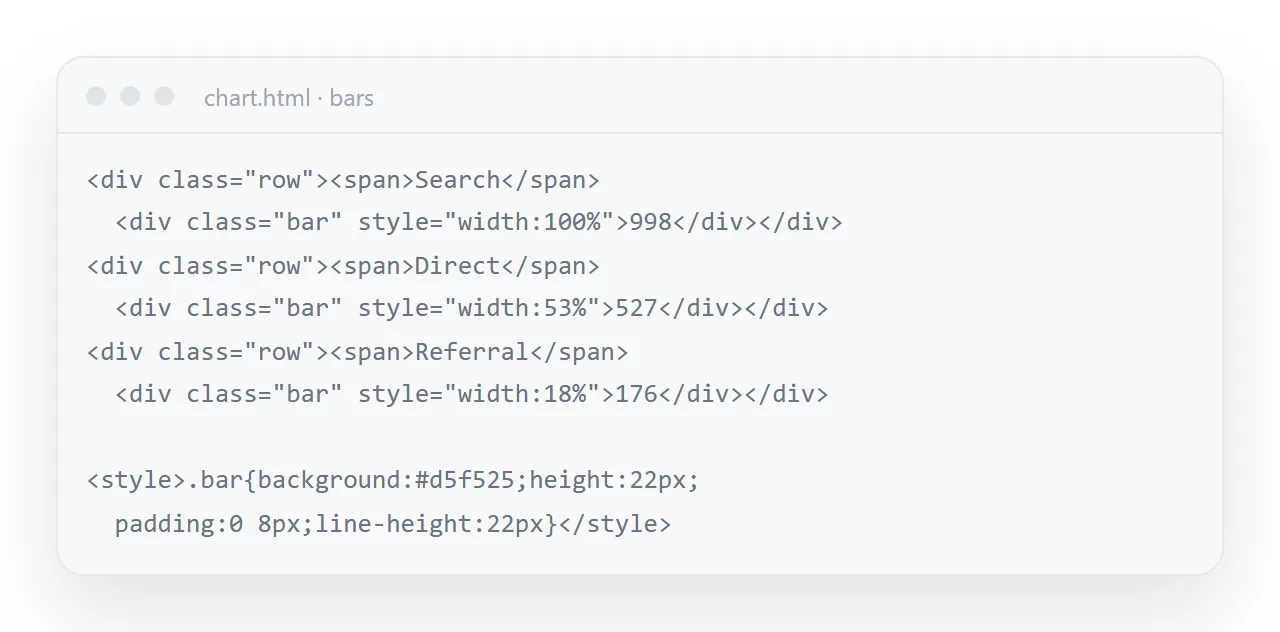
<style>
  .row { display: grid; grid-template-columns: 130px 1fr 62px; gap: 11px; align-items: center; margin: 8px 0; }
  .track { height: 20px; background: #f4f4f5; border-radius: 6px; overflow: hidden; }
  .fill { display: block; height: 100%; background: #2a78d6; border-radius: 6px; transition: width .4s; }
  .n { text-align: right; font-variant-numeric: tabular-nums; }
</style>

<div class="row">
  <span>Search</span>
  <span class="track"><i class="fill" style="width:78%"></i></span>
  <span class="n">998</span>
</div>
Two things that trip people up. The bar element must be display: block — a span is inline by default and inline elements ignore width and height entirely, which produces a chart with no visible bars and no error message. And overflow: hidden on the track is what makes the rounded corners clip properly.
The value appears twice: as the bar width and as text. That is deliberate — the text is what a screen reader reads and what a reader copies.
When to use SVG instead
For anything that is not a set of horizontal bars — line charts, scatter plots, diagrams — inline SVG is the right tool. It goes in the markup as text, so it is embedded by definition, stays sharp at any zoom, and its colours can be driven by CSS variables so it adapts to dark mode.
Every diagram on this site is inline SVG for those reasons.
When a library is worth it
Multi-series plots with hover detail, zooming, and thousands of points. That is a real requirement and hand-writing it is a waste of a day.
If you use one, embed it in the page rather than loading it from someone else's address — otherwise the chart works until that address changes, and then a page you sent six months ago is blank.
Accessibility, concretely
An image of a chart conveys nothing to a screen reader, and alt="bar chart" conveys nothing either. What works:
<figure role="group" aria-label="Signups by source: search 998, direct 527, shared links 418, referrals 176">
  <!-- the bars -->
  <figcaption>Signups by source, week of 7 Sep. Total 2,119.</figcaption>
</figure>
The label states the actual values. The caption states the period and the base number — without which no percentage in the chart can be interpreted.
Put the base number on the chart
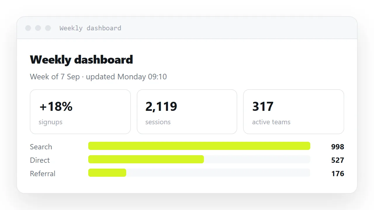
The most common flaw in a shared chart is a percentage with no denominator. Search: 47% is unverifiable. Search: 998 of 2,119 (47%) can be checked. If the chart is worth sharing, it is worth making checkable.
Sharing it
Publish the page and send the link. The chart reflows on a phone, the numbers stay copyable, and when next week's figures come in you edit the page rather than distributing a new picture.
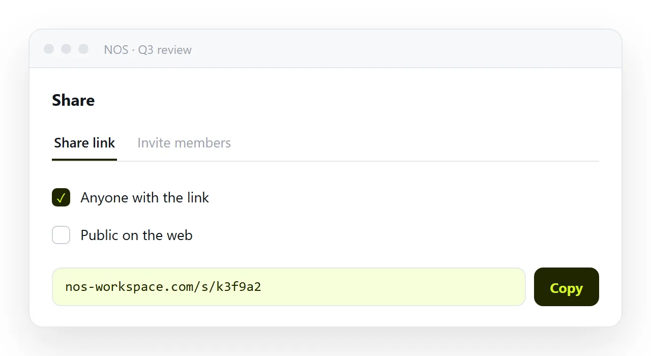
In NOS the pasted chart HTML renders exactly as written at a fixed address, and the numbers in it are clickable text. Updating the week means typing over the values — the link you sent stays the current chart.
Updating it without breaking it
The weekly update to a bar chart is two edits per row: the number in the text and the width in the style attribute. Keep the largest bar at 100% and scale the others against it, so the widths stay proportional when the leader changes.
If the update happens every week, write the widths from the numbers with six lines of script on load, and then the only thing to edit is the numbers themselves.
When the chart is part of a report
A single chart is a page. A chart inside a report is a section, and it wants the same things: the values as text, the base in the caption, and an id on its heading so that a link can land on it. Sharing a report covers anchors; the chart itself does not change.
Colour, and the one thing about it
Use one colour for the bars and a second, brighter one for the bar you want the reader to look at. Five colours for five bars carry no information and force the reader to look for a legend.
If the chart has to read in print or for a colour-blind reader, the numbers next to the bars already do that job, which is another reason to keep them as text rather than as pixels.
Sharing the chart as a link: 4 steps
- Write the values as text next to the bars. The bar shows the magnitude; the text is what a reader copies and what a screen reader reads.
- Put the base number and the period in the caption.
998 of 2,119 (47%), week of 7 Sep. A percentage without its denominator cannot be checked, and a chart that cannot be checked does not get argued with, which means it is not doing its job. - Paste the chart into a NOS document and copy the share link. Share, then Share link, then Create link. The chart reflows on a phone and every number stays selectable. Turning HTML into a link is this step.
- Update the values on the page next week. Type over the numbers and the bar widths. The link you sent is the current chart; nobody is holding last week's picture.