Responsive images in HTML mean offering the browser several files and letting it load the one that fits. You list the files in srcset, describe the display width in sizes, and the browser picks one before the page is laid out.
If an image only overflows its column, that is a CSS fix, covered in making an image responsive with max-width. This guide is about the other half: which file arrives, and why.
Try it first. Move the slider to change the sizes value and watch which file the browser chooses.
<!doctype html>
<html lang="en">
<head>
<meta charset="utf-8">
<meta name="viewport" content="width=device-width, initial-scale=1">
<title>srcset with w descriptors and sizes</title>
<style>
  body { margin: 0; padding: 14px; font-family: system-ui, sans-serif; background: #f4f5f7; color: #1d2330; }
  label { display: block; font-size: 14px; margin-bottom: 6px; }
  input[type=range] { width: 100%; }
  .stats { display: flex; flex-wrap: wrap; gap: 6px; margin: 10px 0; font-size: 13px; }
  .stats span { background: #fff; border-radius: 6px; padding: 5px 8px; }
  .stats b { color: #0f5132; }
  ul { list-style: none; padding: 0; margin: 0 0 10px; display: flex; flex-wrap: wrap; gap: 6px; font: 13px ui-monospace, Consolas, monospace; }
  li { padding: 4px 8px; border-radius: 6px; background: #e4e7ec; color: #6b7280; }
  li.on { background: #0f5132; color: #fff; }
  code { display: block; font: 12px ui-monospace, Consolas, monospace; background: #fff; border-radius: 6px; padding: 7px 9px; margin-bottom: 10px; overflow-wrap: anywhere; }
  img { display: block; max-width: 100%; height: auto; border-radius: 8px; }
</style>
</head>
<body>
<label for="slot">Display width (the <b>sizes</b> value): <b id="slotOut"></b></label>
<input id="slot" type="range" min="200" max="900" step="20" value="360">

<div class="stats">
  <span>Screen density: <b id="dpr"></b></span>
  <span>Pixels needed: <b id="need"></b></span>
  <span>Browser chose: <b id="chosen">...</b></span>
</div>
<ul id="list"></ul>
<code id="markup"></code>
<div id="stage"></div>

<script>
  const widths = [320, 640, 960, 1280];  // the files you exported, by pixel width
  const colors = ['#fde2da', '#cfe8ff', '#d4f5dc', '#fff3a8'];
  const slot = document.getElementById('slot');
  let urls = [];

  // Stand-in "photo" file: an SVG that prints its own width
  function file(w, i) {
    const h = Math.round(w * 0.4);
    const svg = `<svg xmlns="http://www.w3.org/2000/svg" width="${w}" height="${h}">
      <rect width="100%" height="100%" fill="${colors[i]}"/>
      <text x="50%" y="58%" font-family="sans-serif" font-size="${h * 0.4}" text-anchor="middle">${w}w</text></svg>`;
    // blob: URLs behave like real files here (see the article for data: URIs)
    return URL.createObjectURL(new Blob([svg], { type: 'image/svg+xml' }));
  }

  function render() {
    const px = Number(slot.value);
    const dpr = window.devicePixelRatio;
    // New file URLs each time, like a first visit: nothing cached to reuse
    urls.forEach((u) => URL.revokeObjectURL(u));
    urls = widths.map(file);

    const img = new Image();
    img.alt = 'Sample image';
    img.sizes = px + 'px';
    img.srcset = urls.map((u, i) => `${u} ${widths[i]}w`).join(', ');
    img.style.width = px + 'px';

    const now = urls;
    img.addEventListener('load', () => {
      const i = now.indexOf(img.currentSrc);  // currentSrc = the file actually used
      document.getElementById('chosen').textContent = widths[i] + 'w';
      document.querySelectorAll('#list li').forEach((li, n) => li.classList.toggle('on', n === i));
      document.querySelectorAll('#list li').forEach((li, n) => {
        li.textContent = `${widths[n]}w = ${(widths[n] / px).toFixed(2)}x`;
      });
    });

    document.getElementById('stage').replaceChildren(img);
    document.getElementById('slotOut').textContent = px + 'px';
    document.getElementById('dpr').textContent = dpr + 'x';
    document.getElementById('need').textContent = Math.round(px * dpr) + 'px';
    document.getElementById('markup').textContent =
      `srcset="photo-320.jpg 320w, photo-640.jpg 640w, photo-960.jpg 960w, photo-1280.jpg 1280w" sizes="${px}px"`;
  }

  document.getElementById('list').innerHTML = widths.map(() => '<li></li>').join('');
  slot.addEventListener('input', render);
  render();
</script>
</body>
</html>
The same slider position picks a bigger file on a high-density phone than on a basic monitor. That is the whole idea: one <img>, a different download per screen.
The markup, line by line
A complete responsive <img> has four parts:
<img
  src="photo-960.jpg"
  srcset="photo-640.jpg 640w, photo-960.jpg 960w, photo-1280.jpg 1280w"
  sizes="(max-width: 700px) 100vw, 700px"
  width="1280" height="720"
  alt="Harbour at sunrise">
srcsetlists the files.960wis a fact about the file: it is 960 pixels wide. It is not a rule about when to use it.sizessays how wide the image will be drawn. Conditions are checked left to right. The first true one wins, and the last value, without a condition, is the default.srcis the fallback for anything that ignoressrcset.widthandheightgive the proportions, so the page does not jump when the file arrives.
How the browser picks a file
The browser has to choose before CSS has placed the image. That is why sizes exists: it is your promise about the layout, made early.
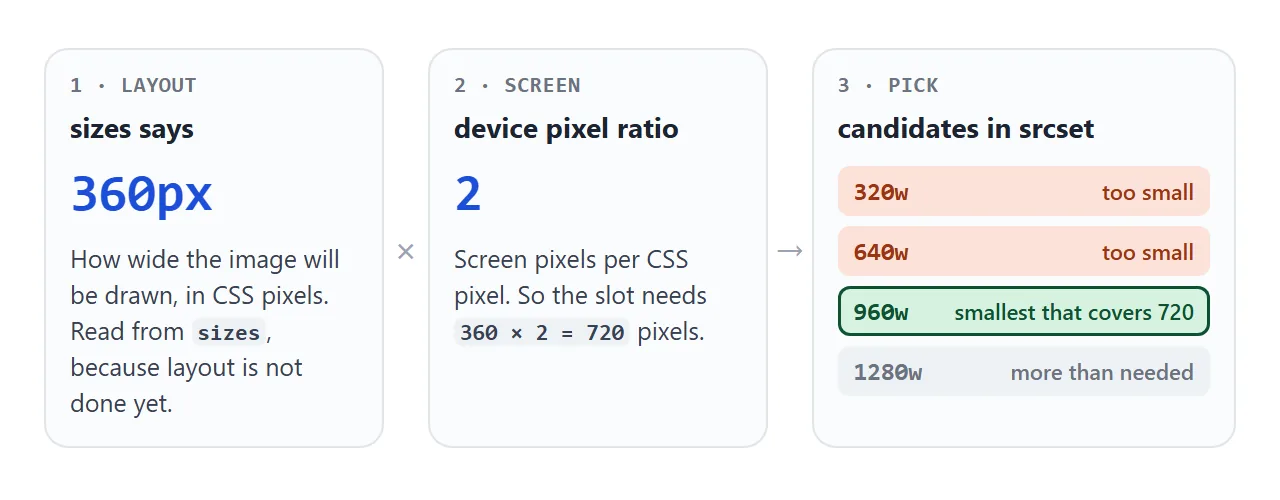
- Find the slot width from
sizes. Here, 360 CSS pixels. - Multiply by the screen's device pixel ratio. A density of 2 needs 720 pixels.
- Choose from
srcset. In our Chrome tests, it was always the smallest file at least that wide, here 960w.
The specification does not force that last step. It lets the browser weigh other things, so treat "smallest that covers" as the usual result, not a guarantee.
x descriptors: for images with a fixed size
When an image is always drawn at the same size, such as a 160 pixel logo, the width of the layout does not matter. Only the screen density does. That is what x descriptors are for.
<!doctype html>
<html lang="en">
<head>
<meta charset="utf-8">
<meta name="viewport" content="width=device-width, initial-scale=1">
<title>srcset with x descriptors</title>
<style>
body { margin: 0; padding: 14px; font-family: system-ui, sans-serif; background: #f4f5f7; color: #1d2330; }
.row { display: flex; flex-wrap: wrap; gap: 14px; align-items: center; }
#logo { width: 160px; height: 80px; border-radius: 10px; background: #fff; }
.out { font-size: 14px; line-height: 1.7; }
.out b { color: #0f5132; }
pre { font: 12px/1.5 ui-monospace, Consolas, monospace; background: #fff; border-radius: 8px; padding: 10px; margin: 12px 0 0; white-space: pre-wrap; overflow-wrap: anywhere; }
</style>
</head>
<body>
<div class="row">
<img id="logo" alt="Logo" width="160" height="80">
<div class="out">
This screen: <b id="dpr"></b><br>
File shown: <b id="chosen">...</b>
</div>
</div>
<pre><img src="logo-160.png"
srcset="logo-320.png 2x, logo-480.png 3x"
width="160" height="80" alt="Logo"></pre>
<script>
// Three versions of one logo: 160, 320 and 480 pixels wide
const names = ['logo-160.png (src, counts as 1x)', 'logo-320.png (2x)', 'logo-480.png (3x)'];
const urls = [160, 320, 480].map((w) => {
const svg = `<svg xmlns="http://www.w3.org/2000/svg" width="${w}" height="${w / 2}">
<rect width="100%" height="100%" fill="#cfe8ff"/>
<text x="50%" y="62%" font-family="sans-serif" font-size="${w / 5}" text-anchor="middle">${w}px</text></svg>`;
return URL.createObjectURL(new Blob([svg], { type: 'image/svg+xml' }));
});
const logo = document.getElementById('logo');
logo.addEventListener('load', () => {
// currentSrc tells you which candidate the browser used
document.getElementById('chosen').textContent = names[urls.indexOf(logo.currentSrc)];
});
logo.srcset = `${urls[1]} 2x, ${urls[2]} 3x`;
logo.src = urls[0];
document.getElementById('dpr').textContent = window.devicePixelRatio + 'x';
</script>
</body>
</html>
<img src="logo-160.png"
     srcset="logo-320.png 2x, logo-480.png 3x"
     width="160" height="80" alt="Logo">
The src file counts as the 1x candidate, so you do not need to repeat it. sizes is not used with x descriptors.
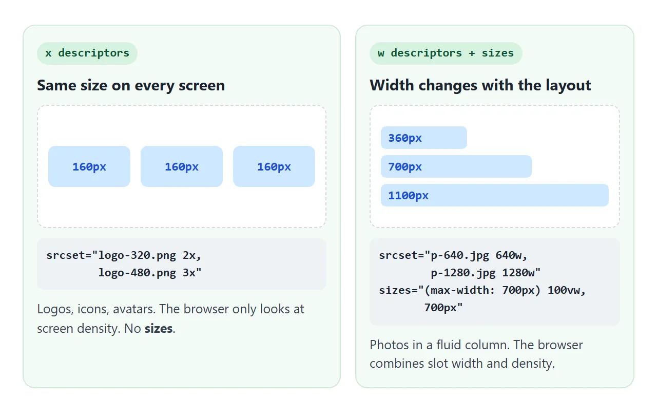
x descriptors |
w descriptors |
|
|---|---|---|
| The number means | Screen density the file is for | Real pixel width of the file |
Needs sizes |
No | Yes, or it assumes 100vw |
| Good for | Logos, icons, avatars | Photos in a fluid layout |
Mix in one srcset |
Not allowed | Not allowed |
The picture element: media and type
srcset offers the same image at different sizes. <picture> lets you offer different images: a square crop for phones, or a newer file format with a fallback.
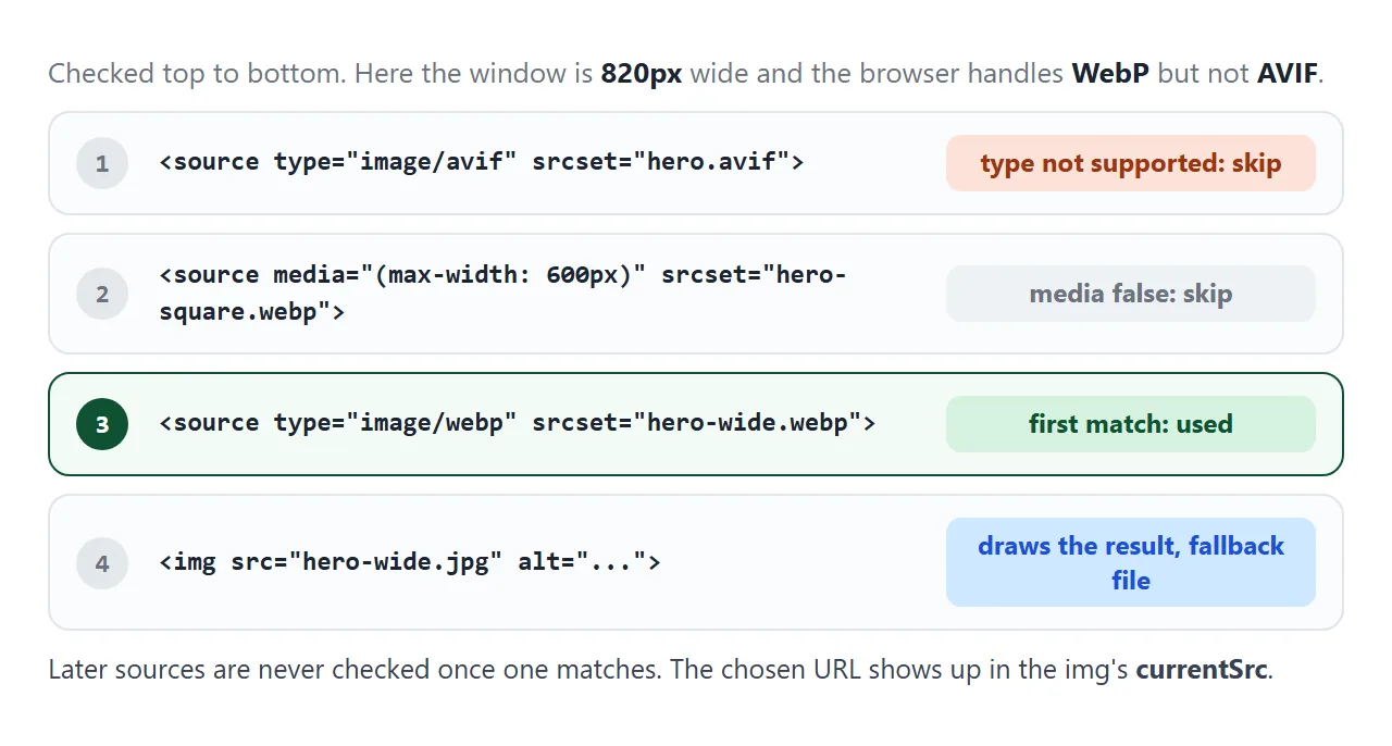
The browser reads the <source> elements from top to bottom:
typenames a file format. If the browser cannot decode it, that source is skipped.mediais a media query. If it is false for the current window, that source is skipped.- The first source that passes both checks is used. Later sources are not considered.
- The
<img>inside is required. It supplies the fallback file, thealttext, and the element that is actually drawn and styled.
Each <source> can carry its own srcset and sizes, so art direction and size choice combine. Media queries work the same way here as in CSS, covered in media queries.
Reading currentSrc
The attribute values never change, so reading img.src tells you nothing about the choice. img.currentSrc holds the URL the browser actually used, and it updates when a different file loads.
<!doctype html>
<html lang="en">
<head>
<meta charset="utf-8">
<meta name="viewport" content="width=device-width, initial-scale=1">
<title>picture with media and type</title>
<style>
body { margin: 0; padding: 14px; font-family: system-ui, sans-serif; background: #f4f5f7; color: #1d2330; }
label { display: block; font-size: 14px; margin-bottom: 6px; }
input[type=range] { width: 100%; }
ol { font: 12.5px/1.5 ui-monospace, Consolas, monospace; background: #fff; border-radius: 8px; padding: 10px 10px 10px 34px; margin: 10px 0; }
li { padding: 2px 4px; border-radius: 4px; overflow-wrap: anywhere; }
li.skip { color: #9aa3b2; text-decoration: line-through; }
li.win { background: #d6f2df; color: #0f5132; font-weight: 700; }
.out { font-size: 14px; margin-bottom: 10px; }
.out b { color: #0f5132; }
picture img { display: block; max-width: 100%; max-height: 220px; width: auto; height: auto; border-radius: 8px; }
</style>
</head>
<body>
<label for="bp">Phone breakpoint: <b id="bpOut"></b> (this frame is <b id="vw"></b> wide)</label>
<input id="bp" type="range" min="300" max="1000" step="10" value="480">
<ol id="steps">
<li class="skip"><source type="image/x-future" ...> skipped: unknown format</li>
<li id="s2"></li>
<li id="s3"><img src="hero-wide.png" alt="..."></li>
</ol>
<div class="out">currentSrc: <b id="chosen">...</b></div>
<picture>
<source id="future" type="image/x-future">
<source id="phone">
<img id="hero" alt="Sample hero image">
</picture>
<script>
// Build a stand-in image as an SVG data: URI
function art(w, h, color, label) {
const svg = `<svg xmlns="http://www.w3.org/2000/svg" width="${w}" height="${h}">
<rect width="100%" height="100%" fill="${color}"/>
<text x="50%" y="56%" font-family="sans-serif" font-size="${h / 8}" text-anchor="middle">${label}</text></svg>`;
return 'data:image/svg+xml,' + encodeURIComponent(svg);
}
const files = {
[art(640, 320, '#fde2da', 'hero-future')]: 'hero-future (never used)',
[art(300, 300, '#d4f5dc', 'hero-square.png')]: 'hero-square.png',
[art(640, 220, '#cfe8ff', 'hero-wide.png')]: 'hero-wide.png',
};
const [future, square, wide] = Object.keys(files);
const bp = document.getElementById('bp');
const phone = document.getElementById('phone');
const hero = document.getElementById('hero');
document.getElementById('future').srcset = future; // browser does not know this type, skips it
phone.srcset = square;
hero.src = wide;
function update() {
// The first <source> whose media and type match wins; otherwise the <img>
phone.media = `(max-width: ${bp.value}px)`;
document.getElementById('bpOut').textContent = bp.value + 'px';
document.getElementById('vw').textContent = window.innerWidth + 'px';
document.getElementById('s2').textContent =
`<source media="(max-width: ${bp.value}px)" srcset="hero-square.png">`;
}
function report() {
const name = files[hero.currentSrc];
document.getElementById('chosen').textContent = name;
document.getElementById('s2').className = name === 'hero-square.png' ? 'win' : '';
document.getElementById('s3').className = name === 'hero-wide.png' ? 'win' : '';
}
hero.addEventListener('load', report); // fires each time the chosen file changes
bp.addEventListener('input', update);
window.addEventListener('resize', update);
update();
</script>
</body>
</html>
const img = document.querySelector('picture img');
img.addEventListener('load', () => console.log(img.currentSrc));
The load event fires each time a new file is chosen, so it is the right moment to read currentSrc. The Network panel in the developer tools shows the same thing from the other side: one file downloaded.
Details that trip people up
Three behaviours from our own testing are worth knowing before you debug.
The browser may keep a bigger file. When we shrank the slot in Chrome after a large file had loaded, it kept showing the large file. It already had it. Check the small case in a fresh tab opened at the small size.
Test files as data: URIs mislead. With every candidate written as a data: URI, Chrome picked the largest one every time in our test. The demos above build their test images as blob: URLs for that reason, which behaved like normal files.
width and height on the <img> apply to every source. If a phone crop has different proportions, give that <source> its own width and height, or the crop is stretched.
When it does not work
| What you see | Cause | Fix |
|---|---|---|
| Phones download the largest file | sizes is missing, so it counts as 100vw |
Write sizes to match the real column width |
| The wrong file after changing the layout | sizes still describes the old layout |
Update sizes along with the CSS |
| The choice looks random | w and x mixed in one list, which the spec does not allow |
Use one kind of descriptor per srcset |
| Shrinking the window keeps the big file | The browser reuses a file it already has | Test in a fresh tab at the small size |
| Every test shows the biggest candidate | Candidates are data: URIs |
Test with real files or blob: URLs |
| The phone crop is squashed | width and height on the <img> apply to it |
Add width and height to that <source> |
The <source> for a new format never loads |
The browser does not support that type |
Keep a supported fallback in the <img> |
Share it as a link
Which file loads depends on the screen that opens the page, so the only real test is someone else's phone. A screenshot shows only your own screen's choice.
To send the working version, paste the page into a NOS document and choose Create share link. HTML to link walks through it.
The page renders as written and its scripts run, so the people you send it to see the file their own screen picks, with currentSrc printed next to it. If you change the code later, the same link shows the new version.