margin-left: auto tells the browser to put all the free space on that side into the left margin. In a flex row, that pushes the item, and every item after it, to the right end.
Put it on the Sign in link of a navigation bar and the logo stays left while the link moves right.
Try it. Pick which link gets the auto margin.
<!doctype html>
<html lang="en">
<head>
<meta charset="utf-8">
<meta name="viewport" content="width=device-width, initial-scale=1">
<title>margin-left: auto in a flex row</title>
<style>
  body { margin: 0; padding: 16px; font-family: system-ui, sans-serif; background: #f4f5f7; color: #1d2330; }
  nav {
    display: flex; align-items: center; gap: 6px;
    padding: 10px; border-radius: 12px; background: #fff;
    box-shadow: 0 4px 14px rgba(0, 0, 0, .08);
  }
  nav a { padding: 6px 8px; border-radius: 8px; font-size: 14px; color: #1d2330; text-decoration: none; }
  nav .logo { font-weight: 800; }
  nav .cta { background: #2563eb; color: #fff; }
  /* the one rule this demo is about */
  nav .push { margin-left: auto; outline: 2px dashed #16a34a; }
  .controls { margin-top: 16px; display: flex; flex-wrap: wrap; gap: 6px; font-size: 13px; }
  .controls button { font: inherit; padding: 6px 10px; border: 1px solid #c9cdd4; border-radius: 8px; background: #fff; cursor: pointer; }
  .controls button.on { background: #1d2330; color: #fff; border-color: #1d2330; }
  pre { margin: 14px 0 0; padding: 10px 12px; border-radius: 8px; background: #1d2330; color: #d6f2df; font-size: 13px; }
</style>
</head>
<body>
<nav id="nav">
  <a class="logo" href="#">Acme</a>
  <a href="#">Docs</a>
  <a href="#">Pricing</a>
  <a class="cta" href="#">Sign in</a>
</nav>

<div class="controls" id="controls">
  <span>margin-left: auto on</span>
  <button data-i="-1">none</button>
  <button data-i="1">Docs</button>
  <button data-i="2">Pricing</button>
  <button data-i="3" class="on">Sign in</button>
</div>
<pre id="code"></pre>

<script>
  const links = document.querySelectorAll('#nav a');
  const buttons = document.querySelectorAll('#controls button');
  const code = document.getElementById('code');

  function pick(i) {
    links.forEach((a, n) => a.classList.toggle('push', n === i));
    buttons.forEach((b) => b.classList.toggle('on', Number(b.dataset.i) === i));
    code.textContent = i < 0
      ? '/* no auto margin: items pack to the left */'
      : '/* ' + links[i].textContent + ' */\nmargin-left: auto;';
  }

  buttons.forEach((b) => b.addEventListener('click', () => pick(Number(b.dataset.i))));
  pick(3);
</script>
</body>
</html>
The same idea works on any side: margin-right: auto pushes things left, margin-top: auto pushes things down in a column, and auto on both sides centres.
How auto margins share free space
An auto margin never has a size of its own. The browser first lays out the boxes, measures the space that is left, and hands that space to the auto margins.
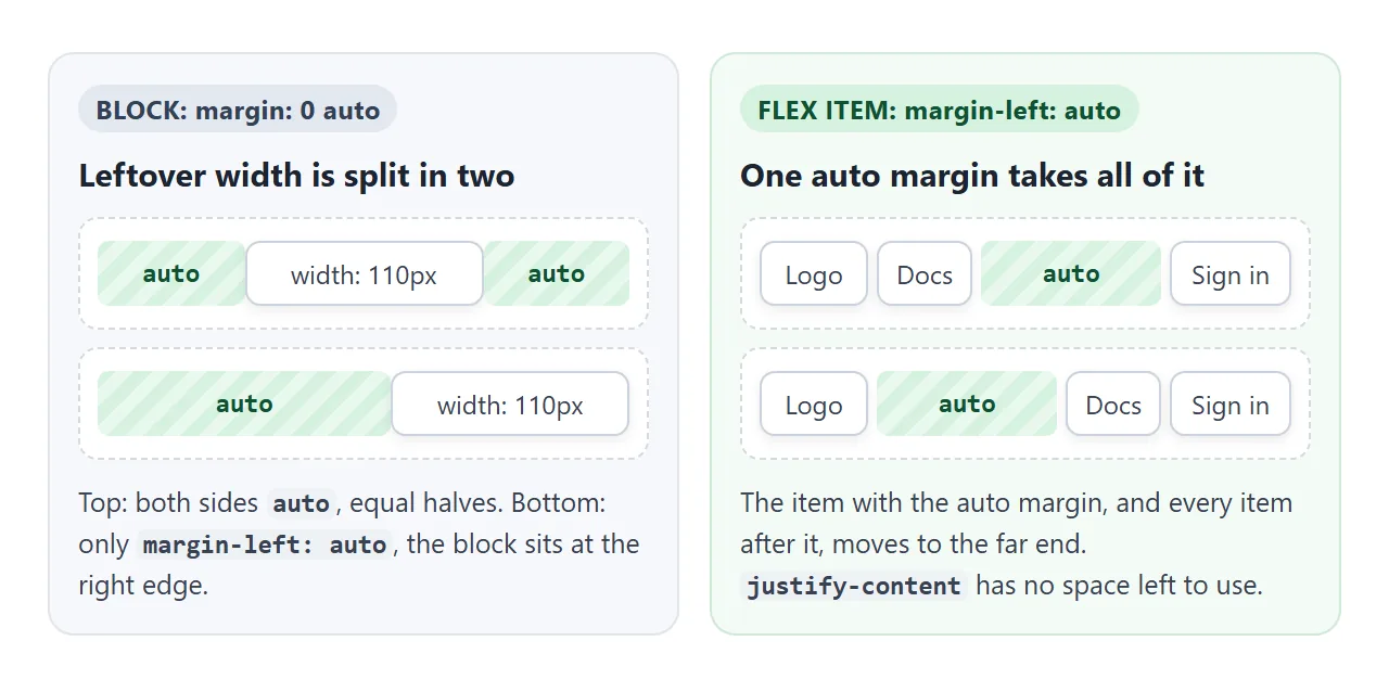
- A block in normal flow with a set
widthormax-width: the leftover width goes to its auto margins. Two auto margins split it equally, which centres the block. One auto margin takes all of it. - A flex item: the free space in the row goes to auto margins before
justify-contentruns. With one auto margin in the row,justify-contenthas nothing left to place. - No leftover space: the auto margin is 0 and nothing moves.
Where an auto margin does something depends on the box:
| Box | Auto left and right | Auto top and bottom |
|---|---|---|
| Block in normal flow | Shares leftover width (needs a width) | Counts as 0 |
| Flex item | Shares free space in the row | Shares free space in the column or line |
| Grid item | Shares free space in its grid area | Shares free space in its grid area |
Absolute, with inset: 0 and a size |
Centres horizontally | Centres vertically |
Inline element, such as span |
Counts as 0 | No effect on layout |
margin: 0 auto for horizontal centring
The most common use is centring a page column. Set a maximum width and let both side margins be auto:
.page {
  max-width: 640px;
  margin: 0 auto;
}
The block needs a width smaller than its parent. Without one, a block stretches to fill the parent, the leftover width is 0, and so are the margins.
margin: auto does not centre the block vertically in normal flow, because auto top and bottom margins count as 0 there.
For every way to centre, both axes included, see how to center a div.
Push items right in a flex row
In a flex row, one auto margin splits the items into two groups. Put margin-left: auto on the first item of the right-hand group:
nav { display: flex; gap: 8px; }
nav .search { margin-left: auto; }
Everything before .search stays left, and .search plus everything after it goes right. The gap still applies between items.
A few variations:
- Logo left, everything else right:
margin-right: autoon the logo does the same job from the other side. - One item in the middle:
margin-left: autoandmargin-right: autoon the same item. It sits in the middle of the space between its neighbours, not always the middle of the row. - Three groups: put an auto margin on the first item of the middle group and on the first item of the right group. The free space is split equally between them.
If an item has flex-grow (for example flex: 1 on a search box), it takes the free space first and the auto margin gets 0. justify-content covers the other way to distribute space, where every gap is treated the same.
margin-top: auto in a column
Turn the direction around and the same trick pushes things down. In a flex column, margin-top: auto on the last child moves it to the bottom.
<!doctype html>
<html lang="en">
<head>
<meta charset="utf-8">
<meta name="viewport" content="width=device-width, initial-scale=1">
<title>margin-top: auto in a column</title>
<style>
  body { margin: 0; padding: 14px; font-family: system-ui, sans-serif; background: #f4f5f7; color: #1d2330; }
  label { display: inline-flex; align-items: center; gap: 6px; font-size: 14px; margin-bottom: 12px; cursor: pointer; }
  .row { display: grid; grid-template-columns: repeat(3, 1fr); gap: 8px; }
  .card {
    display: flex; flex-direction: column;  /* stack the card's parts */
    padding: 10px; border-radius: 10px; background: #fff;
    box-shadow: 0 4px 14px rgba(0, 0, 0, .08);
  }
  .card h3 { margin: 0 0 4px; font-size: 15px; }
  .card p { margin: 0 0 10px; font-size: 13px; color: #5b6270; line-height: 1.4; }
  .card button { font: inherit; font-size: 13px; padding: 7px 4px; border: 0; border-radius: 8px; background: #2563eb; color: #fff; }
  /* the auto margin takes the leftover height above the button */
  .bottom .card button { margin-top: auto; }
</style>
</head>
<body class="bottom">
<label><input type="checkbox" id="toggle" checked> margin-top: auto on the buttons</label>
<div class="row">
  <div class="card"><h3>Free</h3><p>One page.</p><button>Start</button></div>
  <div class="card"><h3>Pro</h3><p>Unlimited pages, custom colours and a longer text that wraps onto several lines.</p><button>Buy</button></div>
  <div class="card"><h3>Team</h3><p>Shared folders for five people.</p><button>Ask</button></div>
</div>

<script>
  document.getElementById('toggle').addEventListener('change', (e) => {
    document.body.classList.toggle('bottom', e.target.checked);
  });
</script>
</body>
</html>
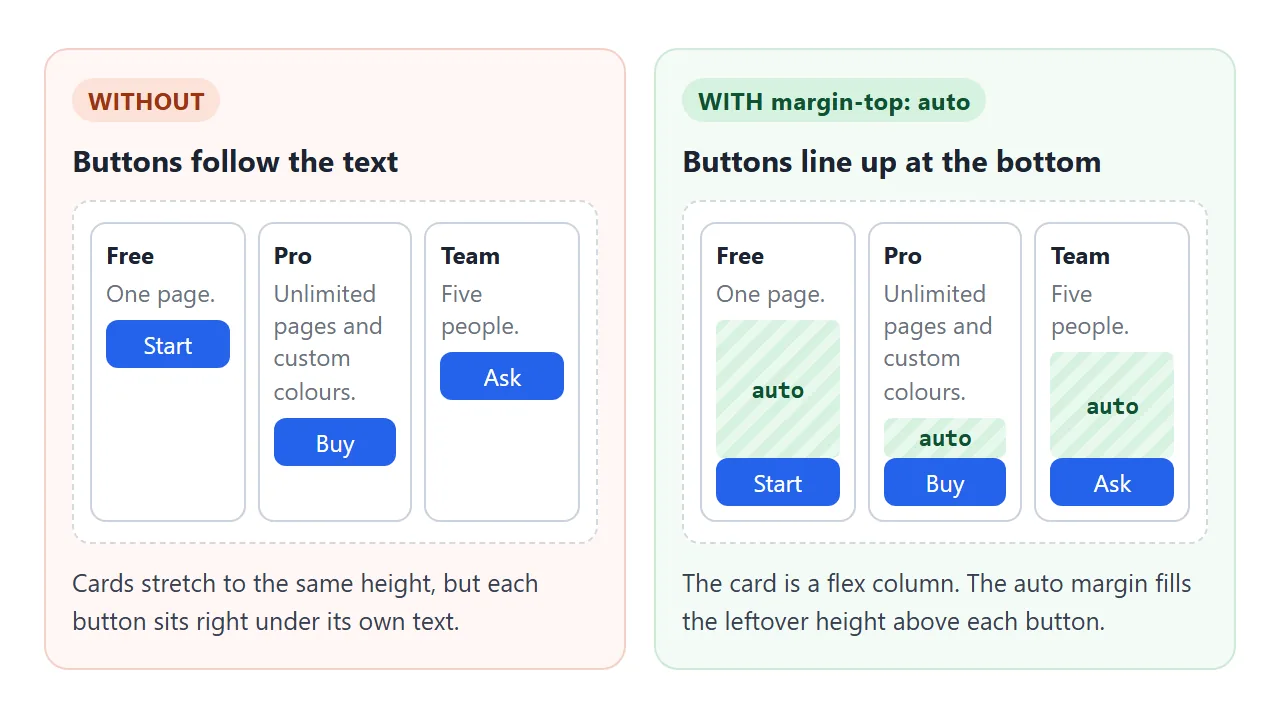
.card { display: flex; flex-direction: column; }
.card button { margin-top: auto; }
This works because the cards in a grid or flex row stretch to the height of the tallest one, so the shorter cards have empty height to give.
The same pattern keeps a footer at the bottom of a short page; sticky footer shows the full version.
Margin collapsing and how to stop it
Vertical margins between blocks in normal flow collapse. Two margins that touch become one, the size of the larger:
h2 { margin-bottom: 30px; }
p  { margin-top: 20px; }   /* the gap is 30px, not 50px */
A child's top margin can also collapse through its parent, so the margin shows up above the parent instead of inside it. Horizontal margins never collapse, and margins of flex and grid items do not collapse either.
| To stop collapsing | Why it works |
|---|---|
| Make the parent flex or grid | Margins of flex and grid items do not collapse |
display: flow-root on the parent |
It starts a new block formatting context |
| Padding or border on the parent | Something now separates the margins |
Use gap instead of margins |
gap is space between items, not a margin |
The CSS box model has a live demo that measures each collapsing case.
Negative margins
A margin can be negative. A negative value pulls instead of pushing.
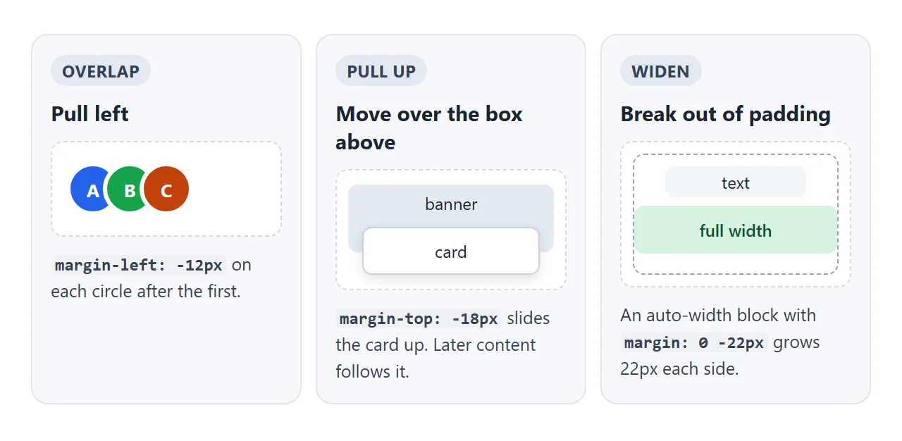
margin-leftnegative: the element moves left, over its neighbour. Avatar stacks use this.margin-topnegative: the element moves up, over the box above. The content after it moves up with it.margin-bottomnegative: the element stays put, but the content after it moves up.- Negative left and right on a block with no width: the block grows wider by that amount on each side. Use it to let one image or banner run past the parent's padding.
Padding cannot be negative. A negative padding value is invalid and the browser ignores it.
When blocks overlap because of a negative margin, give the one that should be on top position: relative. Positioned elements are painted above ordinary blocks, and z-index sets the order between positioned ones.
A finished example: a pricing page
This page uses four margin tricks at once: a centred column, a header pushed right, overlapping avatars, and buttons pinned to the bottom of each card.
<!doctype html>
<html lang="en">
<head>
<meta charset="utf-8">
<meta name="viewport" content="width=device-width, initial-scale=1">
<title>Margins in a finished page</title>
<style>
  * { box-sizing: border-box; }
  body { margin: 0; font-family: system-ui, sans-serif; background: #f4f5f7; color: #1d2330; }

  /* 1. Centred page: fixed max width, auto on both sides */
  .page { max-width: 640px; margin: 0 auto; padding: 14px; }

  /* 2. Header: everything after .actions is pushed right */
  header { display: flex; align-items: center; gap: 8px; margin-bottom: 14px; }
  header b { font-size: 17px; }
  .actions { margin-left: auto; display: flex; align-items: center; }

  /* 3. Avatar stack: negative margin makes each circle overlap the one before */
  .avatar {
    width: 30px; height: 30px; border-radius: 50%; border: 2px solid #f4f5f7;
    display: grid; place-items: center; font-size: 12px; font-weight: 700; color: #fff;
  }
  .avatar + .avatar { margin-left: -10px; }

  /* 4. Cards: a flex column, with the button pushed to the bottom */
  .plans { display: grid; grid-template-columns: repeat(auto-fit, minmax(160px, 1fr)); gap: 10px; }
  .plan { display: flex; flex-direction: column; padding: 14px; border-radius: 12px; background: #fff; box-shadow: 0 4px 14px rgba(0, 0, 0, .08); }
  .plan h3 { margin: 0; font-size: 15px; }
  .plan .price { font-size: 24px; font-weight: 800; margin: 4px 0 8px; }
  .plan ul { margin: 0 0 12px; padding-left: 18px; font-size: 13px; color: #5b6270; line-height: 1.5; }
  .plan button { margin-top: auto; font: inherit; padding: 8px; border: 0; border-radius: 8px; background: #2563eb; color: #fff; cursor: pointer; }
  .plan button.done { background: #16a34a; }
</style>
</head>
<body>
<div class="page">
  <header>
    <b>Acme</b>
    <div class="actions">
      <span class="avatar" style="background:#2563eb">A</span>
      <span class="avatar" style="background:#16a34a">B</span>
      <span class="avatar" style="background:#c2410c">C</span>
    </div>
  </header>

  <div class="plans">
    <div class="plan"><h3>Free</h3><div class="price">$0</div><ul><li>One page</li></ul><button>Choose</button></div>
    <div class="plan"><h3>Pro</h3><div class="price">$8</div><ul><li>Unlimited pages</li><li>Custom colours</li><li>Share links</li></ul><button>Choose</button></div>
    <div class="plan"><h3>Team</h3><div class="price">$20</div><ul><li>Five people</li><li>Shared folders</li></ul><button>Choose</button></div>
  </div>
</div>

<script>
  document.querySelectorAll('.plan button').forEach((b) => {
    b.addEventListener('click', () => {
      document.querySelectorAll('.plan button').forEach((x) => { x.classList.remove('done'); x.textContent = 'Choose'; });
      b.classList.add('done');
      b.textContent = 'Selected';
    });
  });
</script>
</body>
</html>
.page:max-width: 640pxwithmargin: 0 auto..actions:margin-left: autopushes the avatar group to the right of the header..avatar + .avatar:margin-left: -10pxoverlaps each circle with the one before..plan button:margin-top: autolines up every button at the bottom of its card.
When it does not work
| What you see | Cause | Fix |
|---|---|---|
margin-left: auto does nothing |
The block has no width, so no space is left | Set width or max-width, or make the parent display: flex |
| The item moves right but a gap stays | Another item has flex-grow |
Remove flex-grow, or accept that it takes the space |
margin: 0 auto does not centre a span |
Auto margins count as 0 on inline elements | Use display: block with a width, or centre from the parent |
margin: auto does not centre vertically |
Normal flow treats auto top and bottom as 0 | Make the parent flex or grid |
margin-top: auto does nothing |
The parent is not a flex column, or has no spare height | display: flex and flex-direction: column on the parent |
| The gap between blocks is smaller than both margins added | Vertical margins collapse | Use a flex or grid parent with gap |
| The page scrolls sideways | A negative margin pushed a block past the screen | Keep it inside a padded parent, or use overflow-x: clip on a wrapper |
Share it as a link
Margin behaviour is easier to see than to describe, especially on a phone where the row is narrow and the space runs out. A screenshot shows one width only.
To send the working version, paste the page into a NOS document and choose Create share link. HTML to link walks through it.
The page renders as written and its scripts run, so the people you send it to can resize it, tick the boxes and click the buttons themselves. If you change the code later, the same link shows the new version.