To make keyboard Tab follow what people see in a flex or grid layout, add reading-flow to the container.
Use flex-visual on a flex container, and grid-rows or grid-columns on a grid. The HTML stays as it is, and focus visits the children in layout order.
Try it. Box C is moved to the front with order: -1. Click Start, press Tab, then turn the checkbox on and do it again.
<!doctype html>
<html lang="en">
<head>
<meta charset="utf-8">
<meta name="viewport" content="width=device-width, initial-scale=1">
<title>reading-flow: flex-visual</title>
<style>
  body { margin: 0; padding: 14px; font-family: system-ui, sans-serif; background: #f4f5f7; color: #1d2330; }
  .bar { display: flex; flex-wrap: wrap; gap: 8px 14px; align-items: center; font-size: 13px; }
  .badge { padding: 3px 8px; border-radius: 99px; font-weight: 700; font-size: 12px; }
  .yes { background: #d6f2df; color: #0f5132; } .no { background: #fde2da; color: #9a3412; }

  /* the flex container: C is moved to the front with order */
  .row { display: flex; flex-wrap: wrap; gap: 8px; margin-top: 10px; padding: 10px;
         background: #fff; border: 1px solid #d5d9e0; border-radius: 10px; }
  .row.visual { reading-flow: flex-visual; }  /* Tab follows what you see */
  .row button { width: 64px; height: 56px; border: 0; border-radius: 10px; color: #fff;
                font: 700 18px system-ui, sans-serif; cursor: pointer; }
  .row button:focus-visible { outline: 3px solid #f59e0b; outline-offset: 2px; }
  #c { order: -1; }
  .start { margin-top: 10px; font: inherit; font-size: 13px; }
  pre { margin: 10px 0 0; padding: 10px; background: #fff; border-radius: 10px;
        font: 12.5px/1.6 ui-monospace, Consolas, monospace; white-space: pre-wrap; }
</style>
</head>
<body>
<div class="bar">
  <label><input type="checkbox" id="toggle"> <code>reading-flow: flex-visual</code></label>
  <span class="badge" id="support"></span>
</div>

<button class="start" id="start">Start here, then press Tab</button>
<div class="row" id="row">
  <button style="background:#2563eb">A</button>
  <button style="background:#0f766e">B</button>
  <button style="background:#c2410c" id="c">C</button>
  <button style="background:#7c3aed">D</button>
</div>
<pre id="out"></pre>

<script>
  const row = document.getElementById('row');
  const out = document.getElementById('out');
  const ok = CSS.supports('reading-flow', 'flex-visual');
  const badge = document.getElementById('support');
  badge.textContent = ok ? 'This browser supports reading-flow' : 'This browser ignores reading-flow';
  badge.className = 'badge ' + (ok ? 'yes' : 'no');

  let path = [];
  function show() {
    out.textContent = 'HTML order:   A B C D\n' +
      'Visual order: C A B D\n' +
      'Tab path:     ' + (path.join(' ') || '(click Start, then press Tab)');
  }

  row.addEventListener('focusin', (e) => { path.push(e.target.textContent); show(); });
  document.getElementById('start').addEventListener('focus', () => { path = []; show(); });
  document.getElementById('toggle').addEventListener('change', (e) => {
    row.classList.toggle('visual', e.target.checked);
    path = []; show();
  });
  show();
</script>
</body>
</html>
The badge at the top tells you whether your browser applies reading-flow. If it says the property is ignored, the Tab path stays A B C D with the box on or off.
Why Tab jumps around, and the fix
order, flex-direction: row-reverse, grid-row, grid-column and grid-area all change where an item is drawn. None of them change the HTML. Keyboard focus follows the HTML, so the focus ring can jump backwards and forwards across the screen.
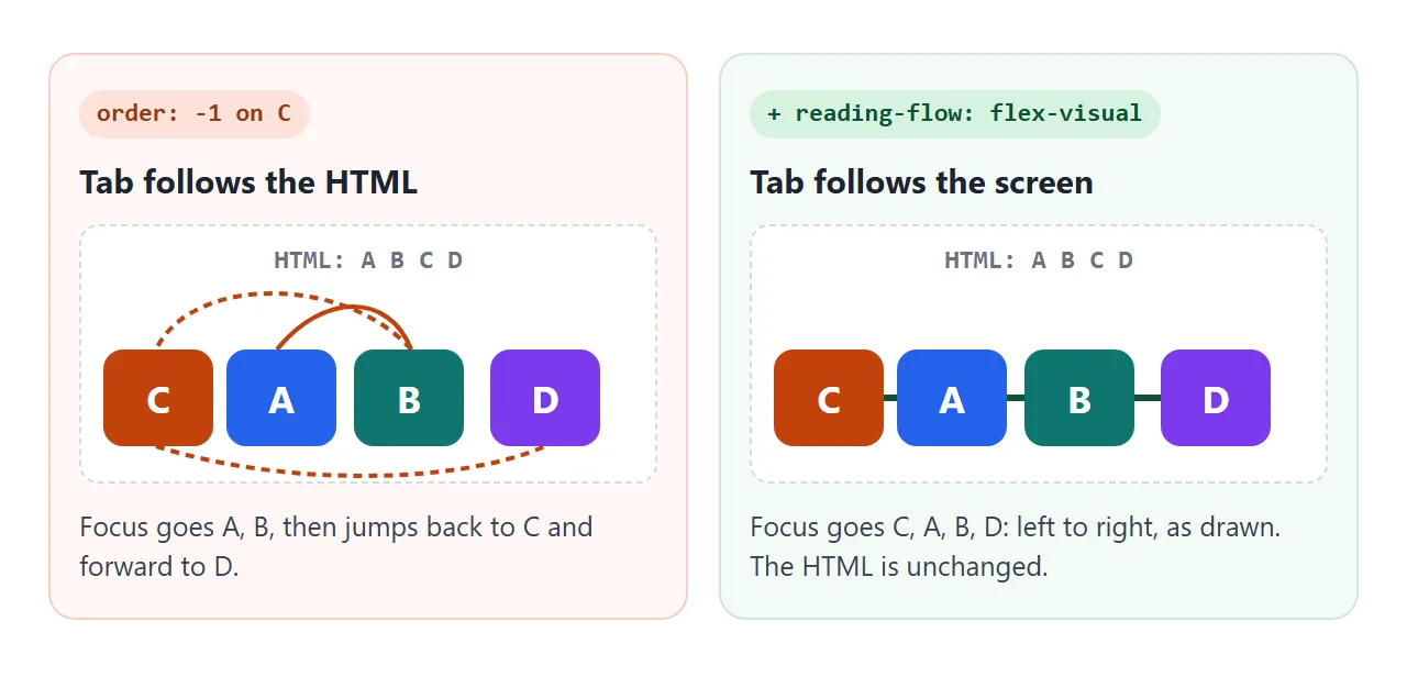
For someone using a mouse, this never shows. For someone moving through the page with Tab, the next stop can land somewhere they did not expect. The CSS order guide covers how order sorts items and where it is still safe to use.
The fix is one property. reading-flow goes on the flex or grid container, not on the items.
.toolbar {
  display: flex;
  reading-flow: flex-visual;
}
.toolbar .help { order: -1; }
It only affects the container's direct children. A button nested inside a moved child goes along with that child. In our Chromium test, two buttons inside one grid item stayed together, in their HTML order, at the item's place in the flow.
Shift+Tab walks the same path backwards. Elements with tabindex="-1" stay out of the path, as they do everywhere else. The tabindex guide explains why a positive tabindex is not a good way to patch the order instead.
The values, flex and grid
The flex values work only on flex containers, and the grid values only on grid containers. source-order also works on a plain block container.
| Value | Container | Tab order |
|---|---|---|
normal |
any | HTML order (the default) |
flex-visual |
flex | Visual order, in the writing direction |
flex-flow |
flex | The flex-flow direction |
grid-rows |
grid | Row by row, then left to right |
grid-columns |
grid | Column by column, then top to bottom |
grid-order |
grid | HTML order adjusted by order and reading-order |
source-order |
block, flex, grid | HTML order adjusted by reading-order |
flex-visual and flex-flow only differ when the direction is reversed. In our test with row-reverse and items X1, X2, X3, flex-visual went X3, X2, X1, left to right as drawn. flex-flow went X1, X2, X3, starting from the right-hand edge where the flex line begins.
In a grid, placement properties can put any item in any cell. Pick grid-rows when the page reads across, and grid-columns when each column is a group read top to bottom.
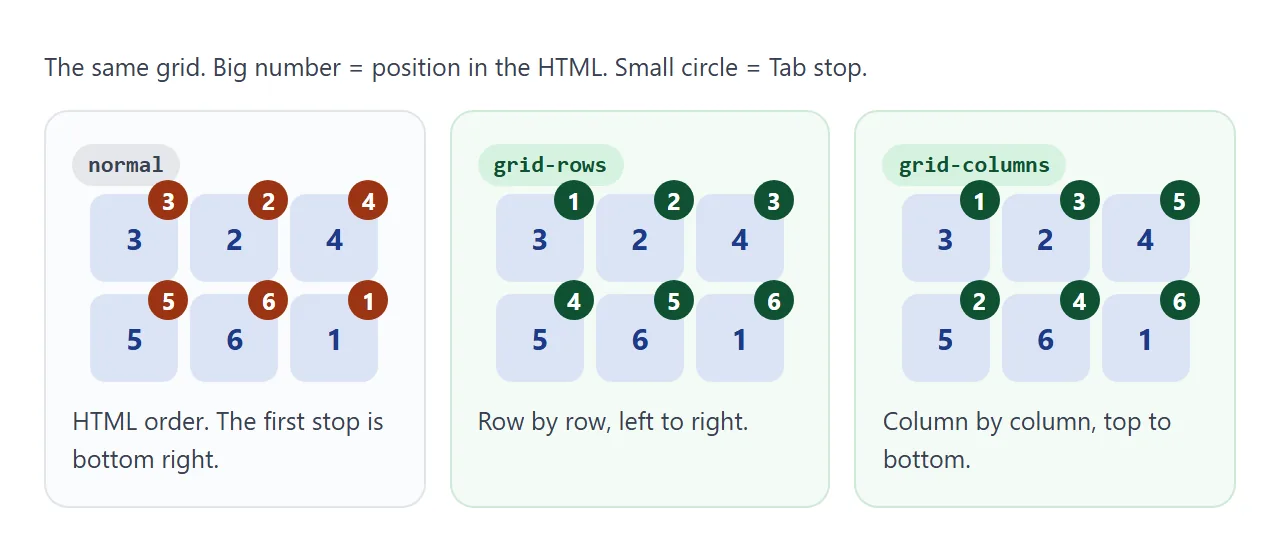
Switch the values below and press Tab through the grid. Item 1 comes first in the HTML but is drawn in the bottom right corner.
<!doctype html>
<html lang="en">
<head>
<meta charset="utf-8">
<meta name="viewport" content="width=device-width, initial-scale=1">
<title>reading-flow values in a grid</title>
<style>
  body { margin: 0; padding: 14px; font-family: system-ui, sans-serif; background: #f4f5f7; color: #1d2330; }
  .bar { display: flex; flex-wrap: wrap; gap: 8px 12px; align-items: center; font-size: 13px; }
  select, .start { font: inherit; font-size: 13px; }
  .note { font-size: 12px; color: #9a3412; }

  /* six buttons placed out of source order */
  .grid { display: grid; grid-template-columns: repeat(3, 1fr); gap: 8px; margin-top: 10px;
          padding: 10px; background: #fff; border: 1px solid #d5d9e0; border-radius: 10px; }
  .grid button { height: 58px; border: 0; border-radius: 10px; background: #2563eb; color: #fff;
                 font: 700 15px system-ui, sans-serif; cursor: pointer; }
  .grid button small { display: block; font: 600 10px ui-monospace, Consolas, monospace; opacity: .85; }
  .grid button:focus-visible { outline: 3px solid #f59e0b; outline-offset: 2px; }
  #b1 { grid-area: 2 / 3; }   /* first in HTML, drawn bottom right */
  #b2 { grid-area: 1 / 2; }
  .grid.pull #b5 { reading-order: -1; }  /* ignored while reading-flow is normal */
  pre { margin: 10px 0 0; padding: 10px; background: #fff; border-radius: 10px;
        font: 12.5px/1.6 ui-monospace, Consolas, monospace; white-space: pre-wrap; }
</style>
</head>
<body>
<div class="bar">
  <label><code>reading-flow:</code>
    <select id="mode">
      <option>normal</option>
      <option>grid-rows</option>
      <option>grid-columns</option>
      <option>grid-order</option>
    </select>
  </label>
  <label><input type="checkbox" id="pull"> <code>reading-order: -1</code> on 5</label>
  <button class="start" id="start">Start here, then press Tab</button>
  <span class="note" id="note"></span>
</div>

<div class="grid" id="grid">
  <button id="b1">1<small>HTML 1st</small></button>
  <button id="b2">2<small>HTML 2nd</small></button>
  <button id="b3">3<small>HTML 3rd</small></button>
  <button id="b4">4<small>HTML 4th</small></button>
  <button id="b5">5<small>HTML 5th</small></button>
  <button id="b6">6<small>HTML 6th</small></button>
</div>
<pre id="out"></pre>

<script>
  const grid = document.getElementById('grid');
  const out = document.getElementById('out');
  const mode = document.getElementById('mode');
  if (!CSS.supports('reading-flow', 'grid-rows')) {
    document.getElementById('note').textContent = 'This browser ignores reading-flow: every value gives HTML order.';
  }

  let path = [];
  function show() {
    out.textContent = 'reading-flow: ' + mode.value +
      (grid.classList.contains('pull') ? ', item 5 has reading-order: -1' : '') + '\n' +
      'Tab path: ' + (path.join(' ') || '(click Start, then press Tab)');
  }
  grid.addEventListener('focusin', (e) => { path.push(e.target.id.slice(1)); show(); });
  document.getElementById('start').addEventListener('focus', () => { path = []; show(); });
  document.getElementById('pull').addEventListener('change', (e) => {
    grid.classList.toggle('pull', e.target.checked);
    path = []; show();
  });
  mode.addEventListener('change', () => {
    grid.style.readingFlow = mode.value;
    path = []; show();
  });
  show();
</script>
</body>
</html>
reading-order for single items
reading-order goes on one child. It takes a whole number, like order, and moves that child earlier (negative) or later (positive) in the reading sequence.
.grid { display: grid; reading-flow: source-order; }
.grid .skip-link { reading-order: -1; }
It counts whenever the container's reading-flow is not normal. Children are sorted by reading-order first, and the reading-flow value decides the order among equal values. In the grid example, tick the checkbox: item 5 jumps to the front for every value except normal.
Browser support we measured
We tested on 26 September 2026 by pressing Tab in real browsers through Playwright, and by checking CSS.supports().
- Applied
reading-flowandreading-order: the Chromium build that ships with Playwright, Google Chrome and Microsoft Edge. - Ignored both: the Firefox and WebKit builds that ship with Playwright. Tab followed the HTML for every value, and
CSS.supports()returned false.
WebKit is the engine behind Safari. We did not test Safari itself, screen readers, or phones. Support changes over time, so check an up-to-date compatibility table before you rely on it.
A fallback that stays consistent
A browser that does not know reading-flow still applies order and grid placement. The safe pattern is to move items only where reading-flow is available, and to write the HTML in a sensible reading order for everyone else.
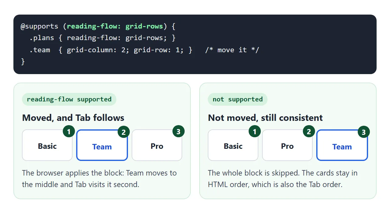
- Put the HTML in the order that makes sense when nothing is moved.
- Add
reading-flowto the container. - Put the
orderor grid placement rules inside an@supportsblock forreading-flow. - Press Tab through it in a browser that supports it and one that does not.
.plans { display: grid; grid-template-columns: repeat(3, 1fr); }

@supports (reading-flow: grid-rows) {
  .plans { reading-flow: grid-rows; }
  .plans .team { grid-column: 2; grid-row: 1; }
}
When the layout can match the HTML at every screen size, you do not need any of this. Named areas with grid-template-areas can often keep the HTML in reading order and still rearrange the page.
A finished example: pricing cards
The HTML lists Basic, Pro, Team. On wide screens Team moves to the middle. In the narrow layout it moves to the top. Both moves sit inside @supports, and the panel compares the visual order with your Tab path.
<!doctype html>
<html lang="en">
<head>
<meta charset="utf-8">
<meta name="viewport" content="width=device-width, initial-scale=1">
<title>Pricing cards with reading-flow</title>
<style>
  body { margin: 0; padding: 14px; font-family: system-ui, sans-serif; background: #f4f5f7; color: #1d2330; }
  .bar { display: flex; flex-wrap: wrap; gap: 8px 14px; align-items: center; font-size: 13px; margin-bottom: 10px; }
  .start { font: inherit; font-size: 13px; }

  /* HTML order is Basic, Team, Pro. The layout puts Team in the middle. */
  .plans { display: grid; grid-template-columns: repeat(3, 1fr); gap: 10px; }
  .plan { background: #fff; border: 1px solid #d5d9e0; border-radius: 12px; padding: 12px; }
  .plan h3 { margin: 0 0 4px; font-size: 15px; }
  .plan p { margin: 0 0 10px; font-size: 13px; color: #5b6270; }
  .plan button { display: inline-block; padding: 7px 12px; border-radius: 8px; background: #1d2330;
            color: #fff; border: 0; font: inherit; font-size: 13px; cursor: pointer; }
  .plan button:focus-visible { outline: 3px solid #f59e0b; outline-offset: 2px; }
  .team { border: 2px solid #2563eb; }
  .team button { background: #2563eb; }

  /* narrow layout: one column, recommended plan first */
  .plans.narrow { grid-template-columns: 1fr; }

  /* reorder only where Tab can follow; other browsers keep the HTML order */
  @supports (reading-flow: grid-rows) {
    .plans { reading-flow: grid-rows; }
    .plans:not(.narrow) .team { grid-column: 2; grid-row: 1; }
    .plans.narrow .team { order: -1; }
  }

  pre { margin: 10px 0 0; padding: 10px; border-radius: 10px; background: #fff;
        font: 12.5px/1.6 ui-monospace, Consolas, monospace; white-space: pre-wrap; }
  pre.match { border-left: 5px solid #16a34a; } pre.miss { border-left: 5px solid #ea580c; }
</style>
</head>
<body>
<div class="bar">
  <label><input type="checkbox" id="narrow"> Narrow layout</label>
  <button class="start" id="start">Start here, then press Tab</button>
</div>

<div class="plans" id="plans">
  <div class="plan"><h3>Basic</h3><p>One person, three pages.</p><button type="button">Choose Basic</button></div>
  <div class="plan"><h3>Pro</h3><p>Custom domain and more pages.</p><button type="button">Choose Pro</button></div>
  <div class="plan team"><h3>Team</h3><p>Recommended. Shared editing.</p><button type="button">Choose Team</button></div>
</div>
<pre id="out"></pre>

<script>
  const plans = document.getElementById('plans');
  const out = document.getElementById('out');
  const cards = [...plans.querySelectorAll('.plan')];
  const name = (el) => el.querySelector('h3').textContent;
  let path = [];

  // visual order: top to bottom, then left to right
  function visualOrder() {
    return [...cards].sort((a, b) => {
      const ra = a.getBoundingClientRect(), rb = b.getBoundingClientRect();
      return Math.abs(ra.top - rb.top) > 4 ? ra.top - rb.top : ra.left - rb.left;
    }).map(name);
  }

  function show() {
    const seen = visualOrder();
    const done = path.length >= cards.length;
    const same = done && path.slice(0, cards.length).join() === seen.join();
    out.className = done ? (same ? 'match' : 'miss') : '';
    out.textContent =
      'reading-flow supported: ' + (CSS.supports('reading-flow', 'grid-rows') ? 'yes' : 'no') + '\n' +
      'Visual order: ' + seen.join(' > ') + '\n' +
      'Tab path:     ' + (path.join(' > ') || '(click Start, then press Tab)') +
      (done ? (same ? '\nTab follows what you see.' : '\nTab does not follow what you see.') : '');
  }

  plans.addEventListener('focusin', (e) => { path.push(name(e.target.closest('.plan'))); show(); });
  document.getElementById('start').addEventListener('focus', () => { path = []; show(); });
  document.getElementById('narrow').addEventListener('change', (e) => {
    plans.classList.toggle('narrow', e.target.checked);
    path = []; show();
  });
  show();
</script>
</body>
</html>
- Supporting browsers: Team is in the middle, or on top when narrow, and Tab visits it there.
- Other browsers: the cards stay Basic, Pro, Team. The layout is less polished, but Tab and the screen agree.
When it does not work
| What you see | Cause | Fix |
|---|---|---|
| Tab still follows the HTML | The browser does not support reading-flow |
Wrap the reordering in @supports so the layout matches the HTML there |
| No effect in a supporting browser | The value does not match the layout, such as grid-rows on flex |
flex-visual for flex, grid-rows or grid-columns for grid |
| No effect on a nested link | reading-flow only reorders direct children |
Put it on the container whose children are moved |
reading-order is ignored |
The container has no reading-flow, or normal |
Set reading-flow on the parent, such as source-order |
| Reversed row tabs right to left | flex-flow follows the flex direction |
Use flex-visual |
| Focus jumps to a far corner first | A positive tabindex somewhere on the page |
Remove it, use 0 or -1 |
Share it as a link
Tab order is something people need to try, not read about. A screenshot cannot be tabbed through, and an .html attachment may open as plain code on a phone.
To send a working version, paste the page into a NOS document and choose Create share link. HTML to link walks through it. The page renders as written and its scripts run.
The people you send it to can press Tab through it in their own browser. If you change the code later, the same link shows the new version.