justify-self moves one grid item left, center or right inside its own cell. justify-items does the same for every item, from the grid container. They are grid tools. In flexbox they are ignored, and margin-left: auto is the tool instead.
Try it. The top buttons set justify-items on the grid. The bottom buttons set justify-self on the orange item only.
<!doctype html>
<html lang="en">
<head>
<meta charset="utf-8">
<meta name="viewport" content="width=device-width, initial-scale=1">
<title>justify-items and justify-self playground</title>
<style>
  * { box-sizing: border-box; }
  body { margin: 0; padding: 16px; font-family: system-ui, sans-serif; background: #f4f5f7; color: #1d2330; }
  .controls { display: flex; flex-wrap: wrap; gap: 6px; margin-bottom: 8px; font-size: 13px; }
  .controls b { width: 100%; }
  button { font: inherit; padding: 6px 10px; border: 1px solid #c9ced8; border-radius: 8px; background: #fff; cursor: pointer; }
  button.on { background: #1d4ed8; border-color: #1d4ed8; color: #fff; }

  .grid {
    display: grid;
    grid-template-columns: repeat(3, 1fr);
    grid-auto-rows: 52px;
    gap: 8px;
    margin-top: 10px;
  }
  /* dashed outlines of the cells: placed in the same cells, always full width */
  .slot { justify-self: stretch; border: 2px dashed #b8c0cc; border-radius: 10px; }
  .item {
    align-self: center; margin: 0 4px;
    padding: 8px 10px; border-radius: 8px;
    background: #1d4ed8; color: #fff; font-weight: 700;
  }
  #pick { background: #c2410c; }  /* the one item with its own justify-self */
  code { display: block; margin-top: 12px; padding: 8px 10px; border-radius: 8px; background: #1d2330; color: #e5e7eb; font-size: 13px; white-space: pre; overflow-x: auto; }
</style>
</head>
<body>
<div class="controls" id="ji">
  <b>justify-items (on the grid: every item)</b>
  <button class="on">stretch</button><button>start</button><button>center</button><button>end</button>
</div>
<div class="controls" id="js">
  <b>justify-self (on the orange item only)</b>
  <button class="on">auto</button><button>start</button><button>center</button><button>end</button><button>stretch</button>
</div>

<div class="grid" id="grid"></div>
<code id="css"></code>

<script>
  const grid = document.getElementById('grid');
  const names = ['One', 'Two', 'Three', 'Four', 'Five', 'Six'];

  // build 6 cells: an outline and an item in the same row and column
  names.forEach((n, i) => {
    const area = (Math.floor(i / 3) + 1) + ' / ' + (i % 3 + 1);
    const slot = document.createElement('div');
    slot.className = 'slot'; slot.style.gridArea = area;
    const item = document.createElement('div');
    item.className = 'item'; item.textContent = n; item.style.gridArea = area;
    if (n === 'Two') item.id = 'pick';
    grid.append(slot, item);
  });
  const pick = document.getElementById('pick');

  function show() {
    const self = pick.style.justifySelf;
    document.getElementById('css').textContent =
      '.grid { display: grid; justify-items: ' + grid.style.justifyItems + '; }\n' +
      '.two  { justify-self: ' + self + '; }' + (self === 'auto' ? '\n/* auto: follow justify-items */' : '');
  }

  // one group of buttons sets one property on one element
  function group(id, el, prop) {
    const btns = document.querySelectorAll('#' + id + ' button');
    btns.forEach((b) => b.addEventListener('click', () => {
      btns.forEach((x) => x.classList.remove('on'));
      b.classList.add('on');
      el.style[prop] = b.textContent;
      show();
    }));
    el.style[prop] = btns[0].textContent;
  }
  group('ji', grid, 'justifyItems');
  group('js', pick, 'justifySelf');
  show();
</script>
</body>
</html>
Notice that no button changes the column widths. These properties only move the item within the space its cell already has.
justify-items vs justify-self
The two properties set the same thing from two places. justify-items goes on the grid and applies to all its items. justify-self goes on one item and overrides the container value for that item.
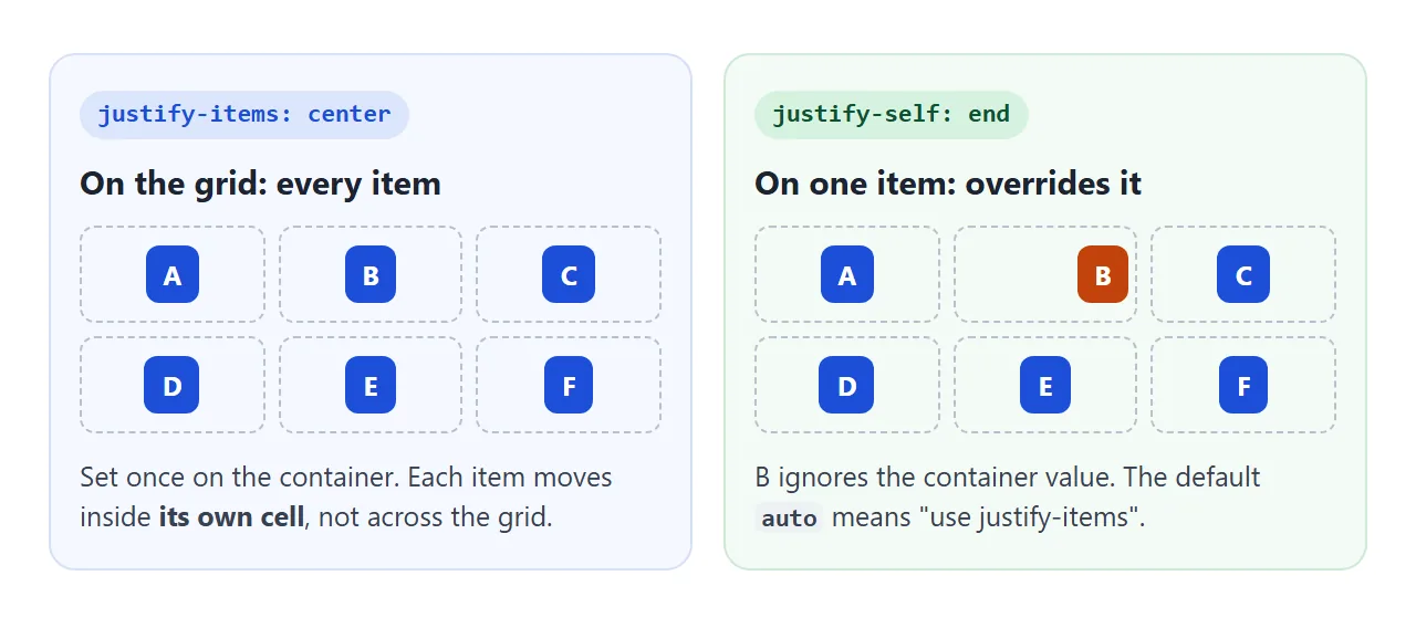
.grid {
  display: grid;
  grid-template-columns: repeat(3, 1fr);
  justify-items: center;   /* every item centered in its cell */
}
.grid .special {
  justify-self: end;       /* this one sits at the right edge */
}
The value auto on justify-self is the default. It means "use whatever the grid's justify-items says".
The values and what they do
These values work the same way on both properties. "Cell" means the grid area the item occupies, which can span several columns.
| Value | Where the item sits | Its width |
|---|---|---|
normal (default) |
Fills the cell | Stretched, unless it has a width |
stretch |
Fills the cell | Stretched, unless it has a width |
start |
Left edge of the cell | Its content width |
center |
Middle of the cell | Its content width |
end |
Right edge of the cell | Its content width |
Left and right above assume left-to-right text. start and end follow the writing direction, so in a right-to-left page start is the right edge.
One difference between normal and stretch: an image in a grid is not stretched by normal. It keeps its own width and sits at the start. Set justify-self: stretch if you want it to fill the cell.
Why justify-self does nothing in flexbox
A grid gives each item a cell, so an item has room to move inside it. A flex line has no cells. The items sit in a row and share the leftover space, so there is nothing for one item to align within.
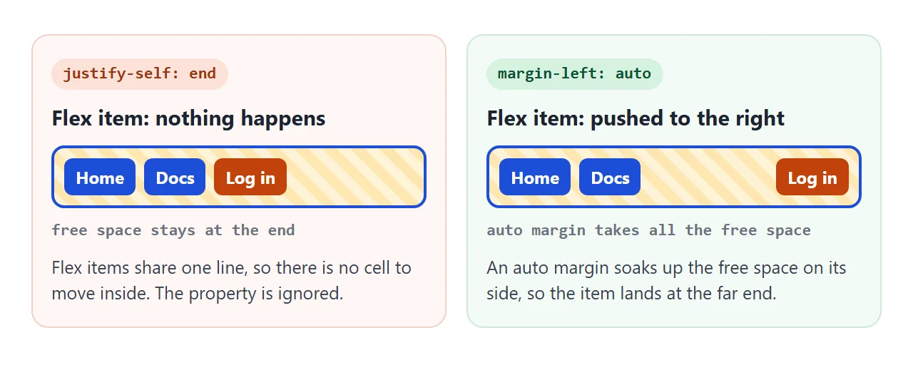
The flexbox answer is an auto margin. margin-left: auto on an item takes all the free space on its left and pushes it, and everything after it, to the end of the row.
<!doctype html>
<html lang="en">
<head>
<meta charset="utf-8">
<meta name="viewport" content="width=device-width, initial-scale=1">
<title>justify-self in flex vs grid</title>
<style>
  * { box-sizing: border-box; }
  body { margin: 0; padding: 16px; font-family: system-ui, sans-serif; background: #f4f5f7; color: #1d2330; }
  .controls { display: flex; flex-wrap: wrap; gap: 6px; font-size: 13px; }
  button { font: inherit; padding: 6px 10px; border: 1px solid #c9ced8; border-radius: 8px; background: #fff; cursor: pointer; }
  button.on { background: #1d4ed8; border-color: #1d4ed8; color: #fff; }
  h3 { font-size: 14px; margin: 16px 0 6px; }

  .bar {
    padding: 8px; border: 2px solid #1d4ed8; border-radius: 10px;
    background: repeating-linear-gradient(45deg, #fff3d6 0 8px, #fde7b0 8px 16px);
  }
  .flex { display: flex; gap: 8px; }
  .grid { display: grid; grid-template-columns: auto auto 1fr; gap: 8px; }
  .item { padding: 8px 12px; border-radius: 8px; background: #1d4ed8; color: #fff; font-weight: 700; }
  .last { background: #c2410c; }

  /* the two rules the buttons switch on */
  .use-js .last { justify-self: end; }
  .use-ml .last { margin-left: auto; }

  code { display: block; margin-top: 12px; padding: 8px 10px; border-radius: 8px; background: #1d2330; color: #e5e7eb; font-size: 13px; white-space: pre; overflow-x: auto; }
</style>
</head>
<body>
<div class="controls">
  <button id="js">justify-self: end</button>
  <button id="ml">margin-left: auto</button>
</div>

<h3>display: flex</h3>
<div class="bar flex" id="flex">
  <div class="item">Home</div><div class="item">Docs</div><div class="item last">Log in</div>
</div>

<h3>display: grid (third column is 1fr)</h3>
<div class="bar grid" id="grid">
  <div class="item">Home</div><div class="item">Docs</div><div class="item last">Log in</div>
</div>

<code id="css"></code>

<script>
  const body = document.body;
  const css = document.getElementById('css');

  function show() {
    const rules = [];
    if (body.classList.contains('use-js')) rules.push('justify-self: end;');
    if (body.classList.contains('use-ml')) rules.push('margin-left: auto;');
    css.textContent = '.last { ' + (rules.join(' ') || '/* nothing yet */') + ' }\n' +
      '/* flex: only margin-left moves it.\n   grid: both do. */';
  }

  // each button toggles one rule on the orange item in both rows
  [['js', 'use-js'], ['ml', 'use-ml']].forEach(([id, cls]) => {
    const b = document.getElementById(id);
    b.addEventListener('click', () => {
      b.classList.toggle('on', body.classList.toggle(cls));
      show();
    });
  });
  show();
</script>
</body>
</html>
nav { display: flex; gap: 8px; }
nav .login { margin-left: auto; }   /* pushed to the right */
To move all flex items along the row together, use justify-content on the container. The justify-content guide shows each value.
align-self and place-self
justify-self works along the row, left and right. align-self works up and down. In a grid both apply to the same cell, so you can put an item in any corner.
place-self sets both in one line. The first value is align-self, the second is justify-self.
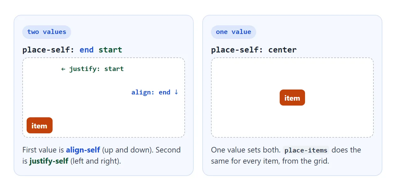
.badge  { place-self: start end; }  /* top right of its cell */
.avatar { place-self: center; }     /* one value = both axes */
place-items is the matching shorthand on the grid container. place-items: center is a short way to center every item in its cell. align-self also works in flexbox, and the align-items guide covers that side.
A finished example: a profile form
This card uses the properties together. The header is a single grid cell holding two items: the avatar with place-self: center and the badge with place-self: start end.
<!doctype html>
<html lang="en">
<head>
<meta charset="utf-8">
<meta name="viewport" content="width=device-width, initial-scale=1">
<title>Profile form aligned with justify-self and place-self</title>
<style>
  * { box-sizing: border-box; }
  body { margin: 0; padding: 16px; font-family: system-ui, sans-serif; background: #eceef1; color: #1d2330; }
  .card { max-width: 460px; margin: 0 auto; background: #fff; border-radius: 14px; box-shadow: 0 4px 16px rgba(0, 0, 0, .08); overflow: hidden; }

  /* header: one cell, two items stacked in it */
  .head {
    display: grid; height: 120px; padding: 10px;
    background: linear-gradient(135deg, #1d4ed8, #7c3aed);
  }
  .avatar, .badge { grid-area: 1 / 1; }
  .avatar { place-self: center; width: 64px; height: 64px; border-radius: 50%; background: #fff; display: grid; place-items: center; font: 700 22px system-ui; color: #1d4ed8; }
  .badge  { place-self: start end; padding: 4px 8px; border-radius: 99px; background: #fde68a; font-size: 12px; font-weight: 700; }

  /* form: labels in column 1, fields in column 2 */
  form {
    display: grid; grid-template-columns: max-content 1fr;
    gap: 10px 12px; align-items: center; padding: 16px;
  }
  label { justify-self: end; font-size: 14px; color: #4b5563; }
  input, select { font: inherit; padding: 8px; border: 1px solid #c9ced8; border-radius: 8px; min-width: 0; }
  .save { grid-column: 2; justify-self: end; font: inherit; font-weight: 700; padding: 8px 16px; border: 0; border-radius: 8px; background: #1d4ed8; color: #fff; cursor: pointer; }

  /* "off" switches the alignment rules back to the grid defaults */
  .off .avatar, .off .badge { place-self: stretch; }
  .off label, .off .save { justify-self: stretch; }

  .toggle { display: block; margin: 12px auto 0; font: inherit; font-size: 13px; padding: 6px 10px; border: 1px solid #c9ced8; border-radius: 8px; background: #fff; cursor: pointer; }
  #out { max-width: 460px; margin: 8px auto 0; font-size: 13px; color: #0f5132; min-height: 18px; }
</style>
</head>
<body>
<div class="card" id="card">
  <div class="head">
    <div class="avatar">JL</div>
    <div class="badge">Pro</div>
  </div>
  <form id="form">
    <label for="n">Name</label><input id="n" name="name" value="Jo Lee">
    <label for="e">Email</label><input id="e" name="email" type="email" value="jo@example.com">
    <label for="r">Role</label>
    <select id="r" name="role"><option>Designer</option><option>Engineer</option></select>
    <button class="save">Save</button>
  </form>
</div>
<button class="toggle" id="toggle">Turn alignment off</button>
<p id="out"></p>

<script>
  const card = document.getElementById('card');
  const toggle = document.getElementById('toggle');

  toggle.addEventListener('click', () => {
    const off = card.classList.toggle('off');
    toggle.textContent = off ? 'Turn alignment on' : 'Turn alignment off';
  });

  // demo only: show what would be sent instead of sending it
  document.getElementById('form').addEventListener('submit', (e) => {
    e.preventDefault();
    const data = new FormData(e.target);
    document.getElementById('out').textContent = 'Would send: ' + [...data].map(([k, v]) => k + '=' + v).join(', ');
  });
</script>
</body>
</html>
- Labels: the form has two columns.
justify-self: endon each label puts it right next to its field. - Save button:
grid-column: 2puts it under the fields, andjustify-self: endkeeps it at its own width on the right. - Two items in one cell: both have
grid-area: 1 / 1, and each usesplace-selfto take a different corner.
The form does not send anything. The demo shows what it would send.
For full page layouts, the CSS Grid guide sets up the columns these items sit in.
When it does not work
| What you see | Cause | Fix |
|---|---|---|
| Nothing moves in a flex row | justify-self is ignored on flex items |
margin-left: auto on the item |
justify-items does nothing |
The container is display: flex |
Use justify-content, or switch to grid |
| The item still fills the column | Value is stretch or normal |
Use start, center or end |
stretch does not widen it |
The item has a set width | Remove the width |
| Changing the value moves nothing | The column is only as wide as the item, e.g. max-content |
Give the column spare room, e.g. 1fr |
place-self puts it in the wrong corner |
Values in the wrong order | Up-down value first, then left-right |
An auto margin beats justify-self |
Auto margins take the space first | Remove the margin |
Share it as a link
Alignment is easier to show than to describe. A screenshot shows one state, but the person you send it to cannot click the buttons and watch the item move.
To send the working version, paste the page into a NOS document and choose Create share link. HTML to link walks through it.
The page renders as written and its scripts run, so others can try each value themselves. If you change the code later, the same link shows the new version.